


Born from salt of the earth farmers, the Allen family began their chapter as vignerons in Wrattonbully, where the battle for the “Barristers Block” was fought – and won. Returning victorious to their Adelaide Hills ancestral roots in 2006, you’ll find their spiritual home in a converted Woodside dairy, a place to meet and create memories.
Barristers Block is a ‘colourful’ Australian story, grounded in the harsh realities of farming during the nineties and a six-year legal battle to save their vineyards. Thus, they affectionately named their winery Barristers Block.
Byerlee Design took on the rebrand project for Barristers Block, a well-established and iconic Adelaide Hills wine brand. The objective was to realign the brand with the modern wine market and give their packaging a complete overhaul, whilst maintaining brand coherence throughout their product portfolio.
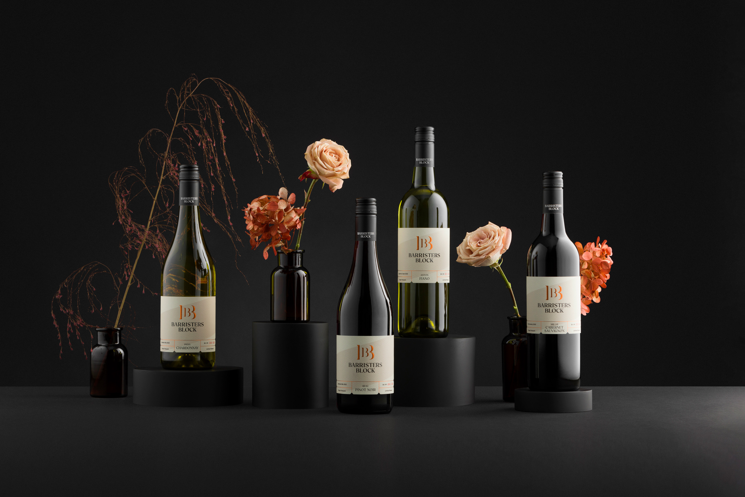
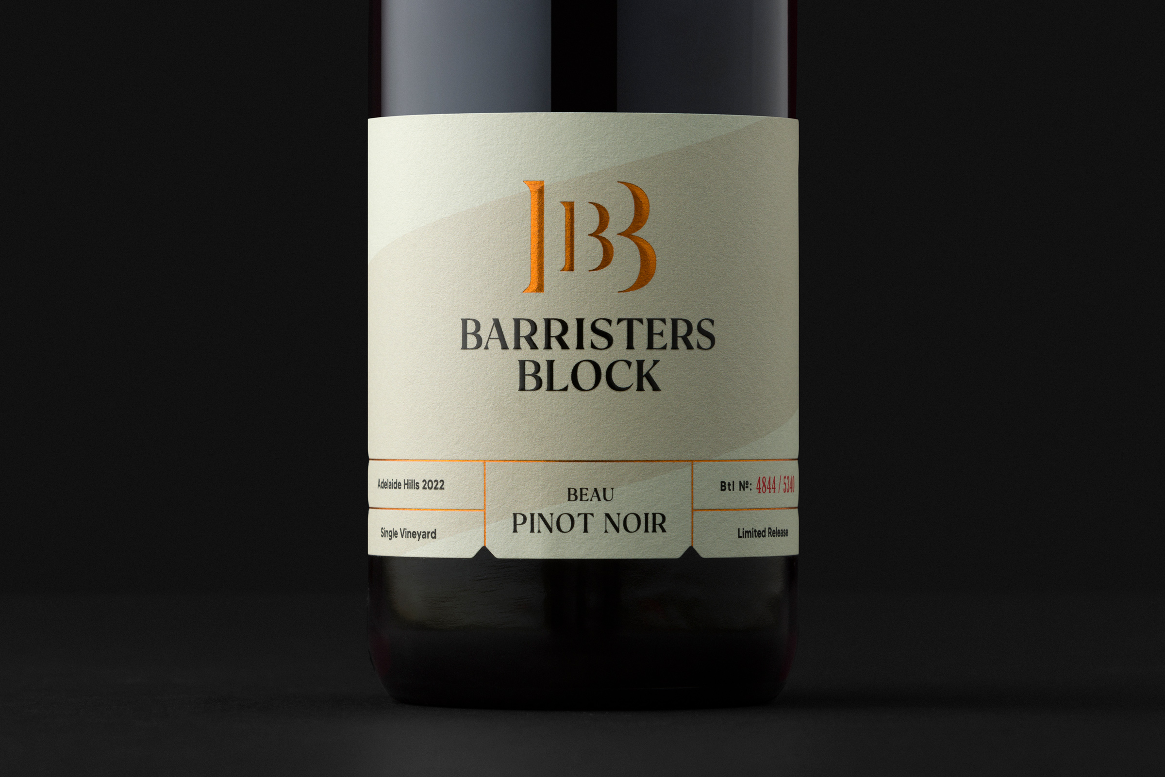
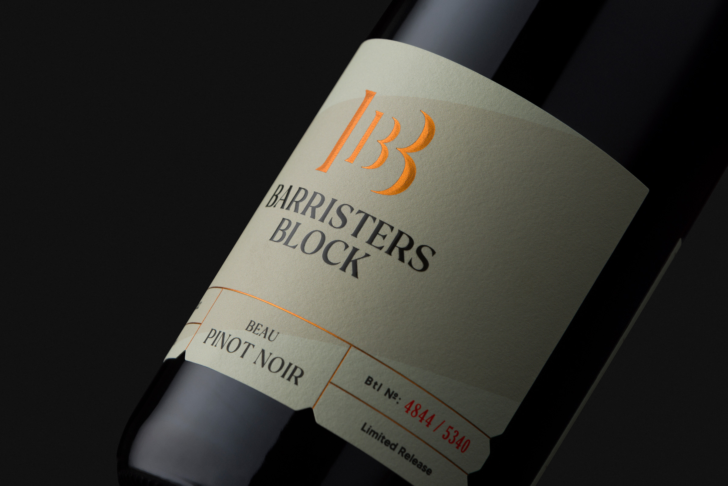
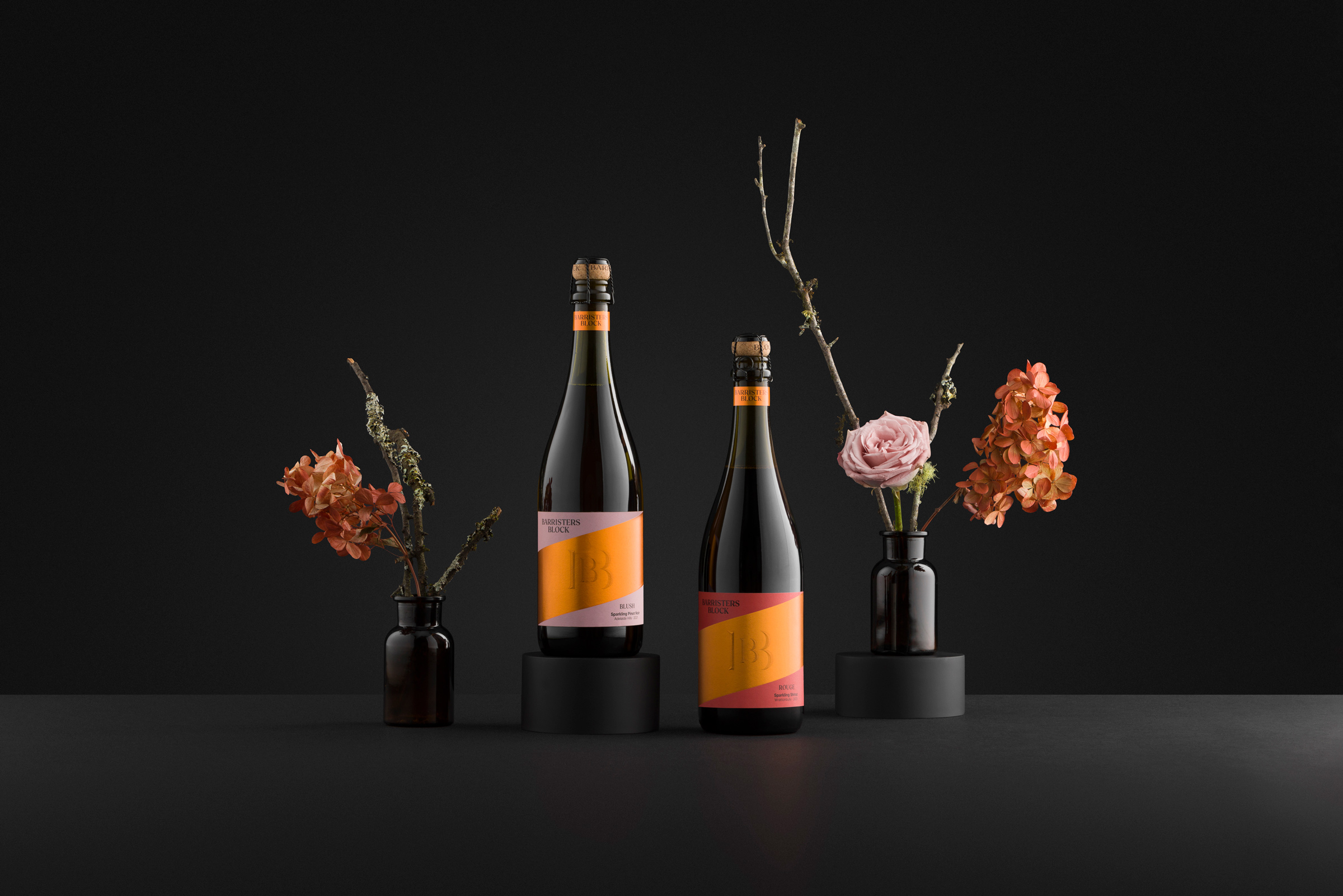
A refreshed logo was introduced but a familiar feel was retained for recognition. The product portfolio was then conceptualised into distinct ranges, each showcasing characteristics relevant to different price points and category types whilst remaining identifiable as part of the overall brand.
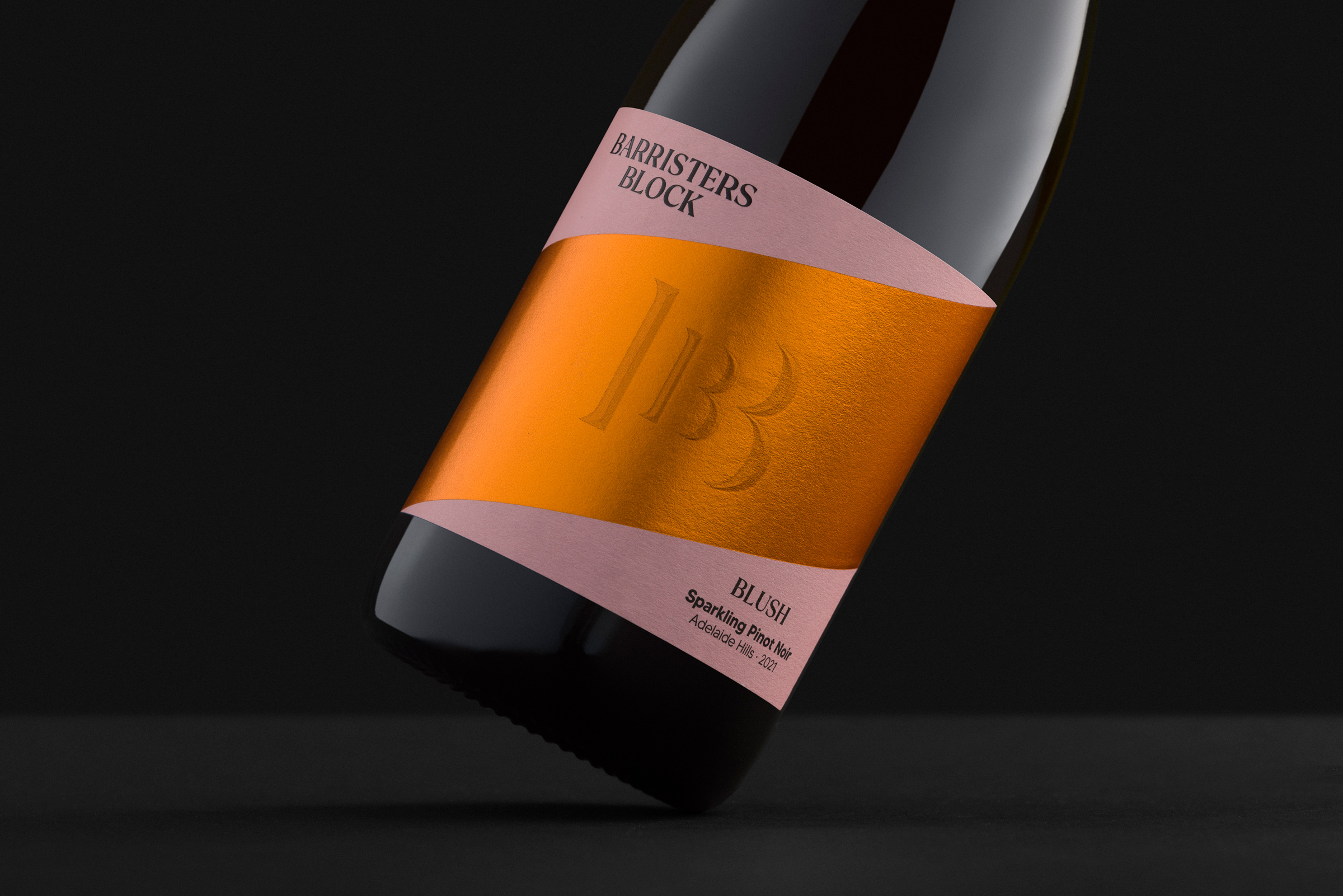
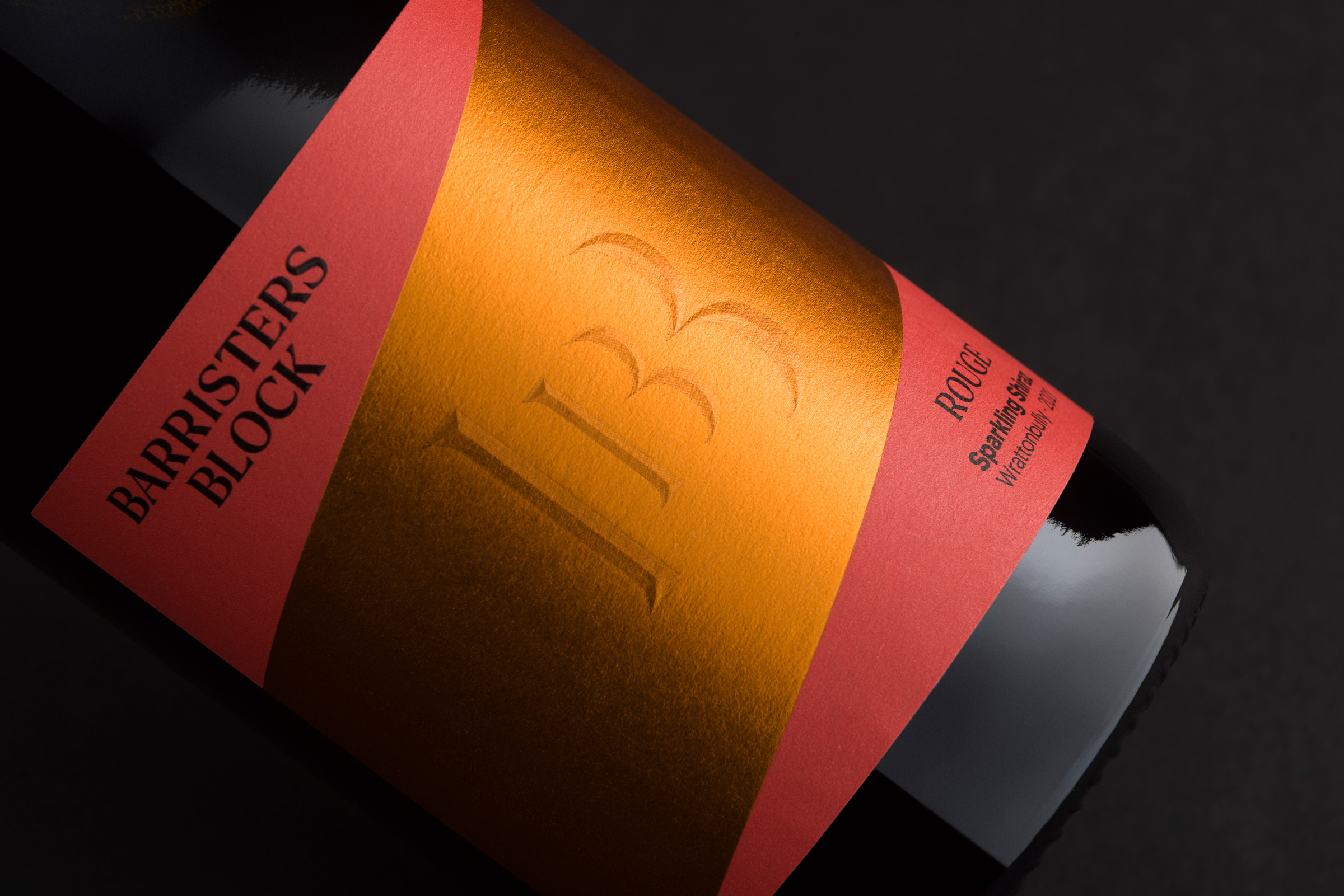
Previously, Barristers Block applied labels to their bottles at an angle, which provided unique identifiability in the market. However, this approach presented challenges with application inconsistencies amongst various bottle sizes. To retain the brand’s distinctive diagonal aesthetic, Byerlee Design implemented a diagonally placed sash, consistently applied across all labels within a rectangular label. This further enhanced the brand’s identifiability by equipping the labels with a consistent element, whilst streamlining production processes.
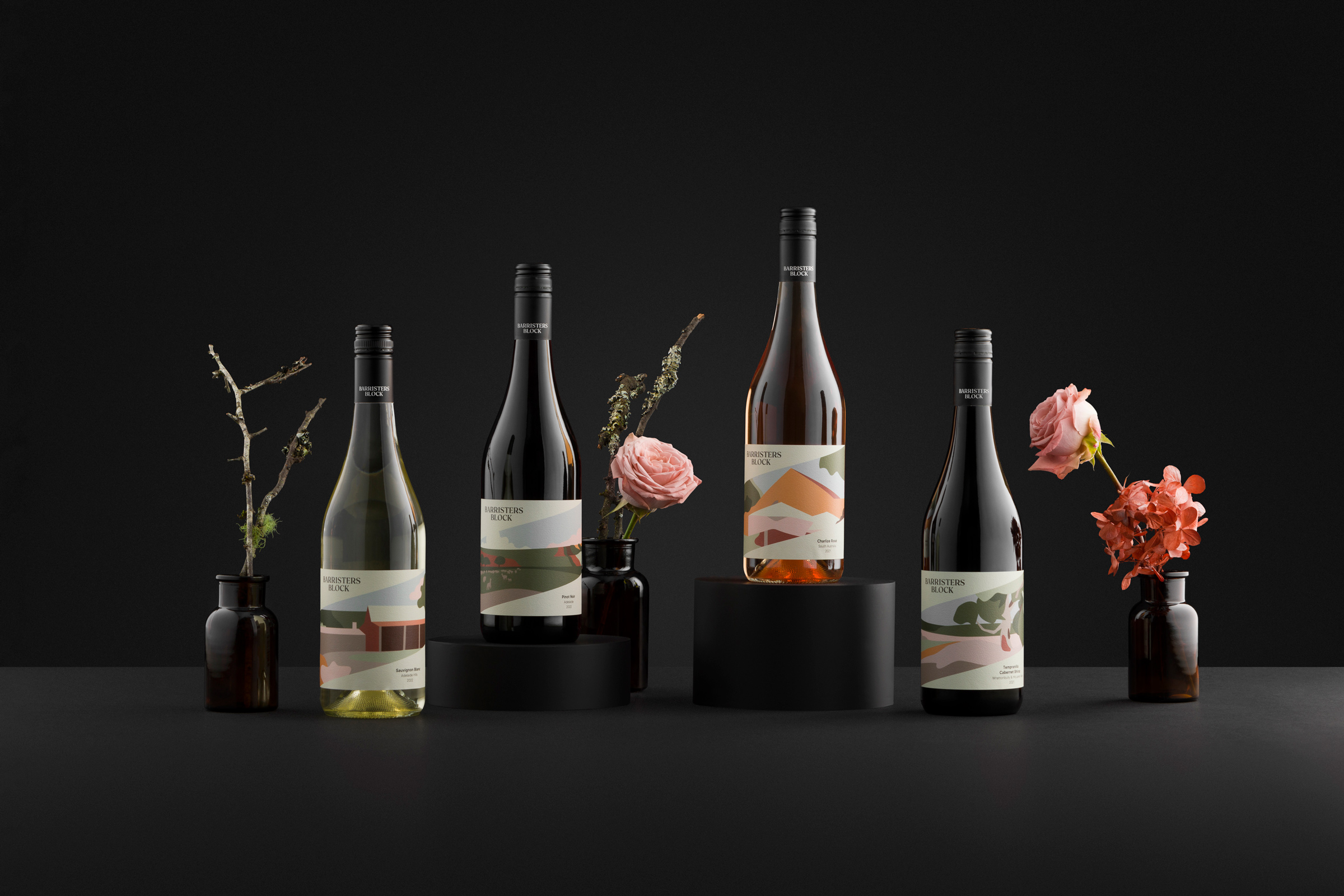
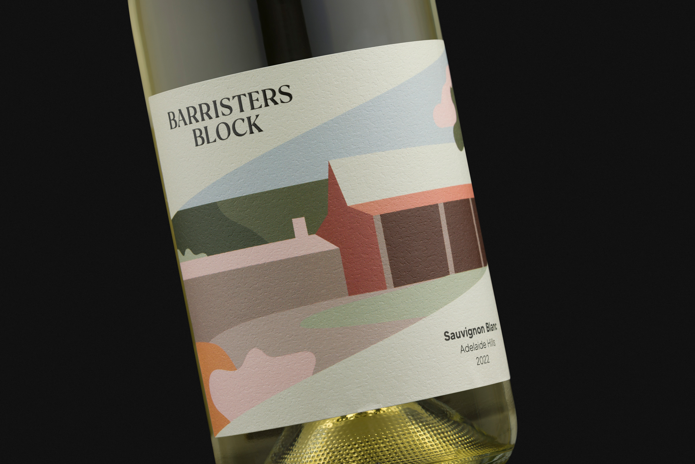
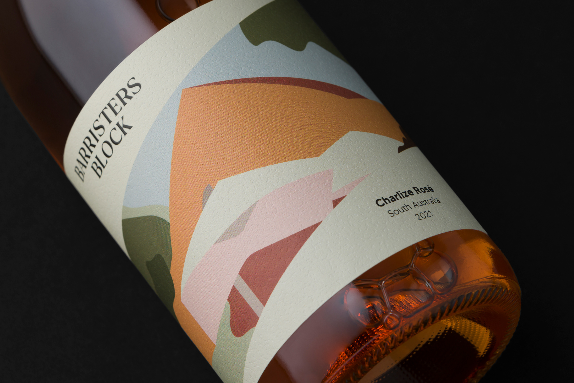
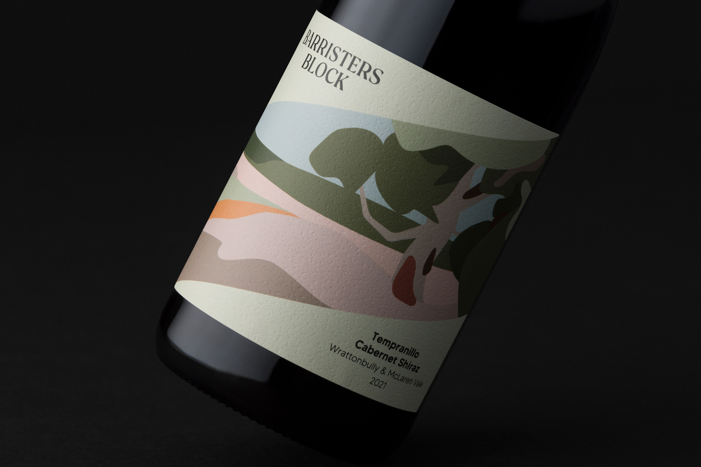
To visually represent Barristers Block’s association with the Adelaide Hills, a renowned cool-climate wine region, Byerlee Design integrated textured stock, copper foil and a fresh colour palette into the branding. These elements pay homage to the rustic farm buildings, lush gardens, and cool country air of Barristers Block’s cellar door property, capturing the essence of the Adelaide Hills. This sense of place is celebrated heavily on their core range labels via contemporary illustrations of the property’s scenery.
Further to the brand’s new identity, a sharpened approach to the brand story and each wine’s taste note was strategised and communicated clearly across all products.
Barristers Block has received overwhelmingly positive feedback from the market since the rebrand, further confirming the successful realignment of their brand within the modern wine market.
CREDIT
- Agency/Creative: Byerlee Design
- Article Title: Barristers Block Wines Rebrand by Byerlee Design
- Organisation/Entity: Agency
- Project Type: Packaging
- Project Status: Published
- Agency/Creative Country: Australia
- Agency/Creative City: Adelaide
- Market Region: Global
- Project Deliverables: Brand Creation, Brand Design, Brand Guidelines, Brand Redesign, Brand Strategy, Illustration, Packaging Design
- Format: Bottle
- Substrate: Glass Bottle
- Industry: Food/Beverage
- Keywords: wine, wine brand, winery, McLaren vale, david byerlee, barristers block, adelaide hills, wine label, rebrand
-
Credits:
Art Director: David Byerlee
Illustrations: David Byerlee


