


Bridging Product Identity with Brand Heritage: DoorDash Crimson
At the heart of the DoorDash Crimson card is a deceptively simple premise: Help delivery drivers get paid instantly, without fees, after every job. But while the product solves a real financial problem, the design solution had to do more. It needed to feel premium, personal, and unmistakably DoorDash.
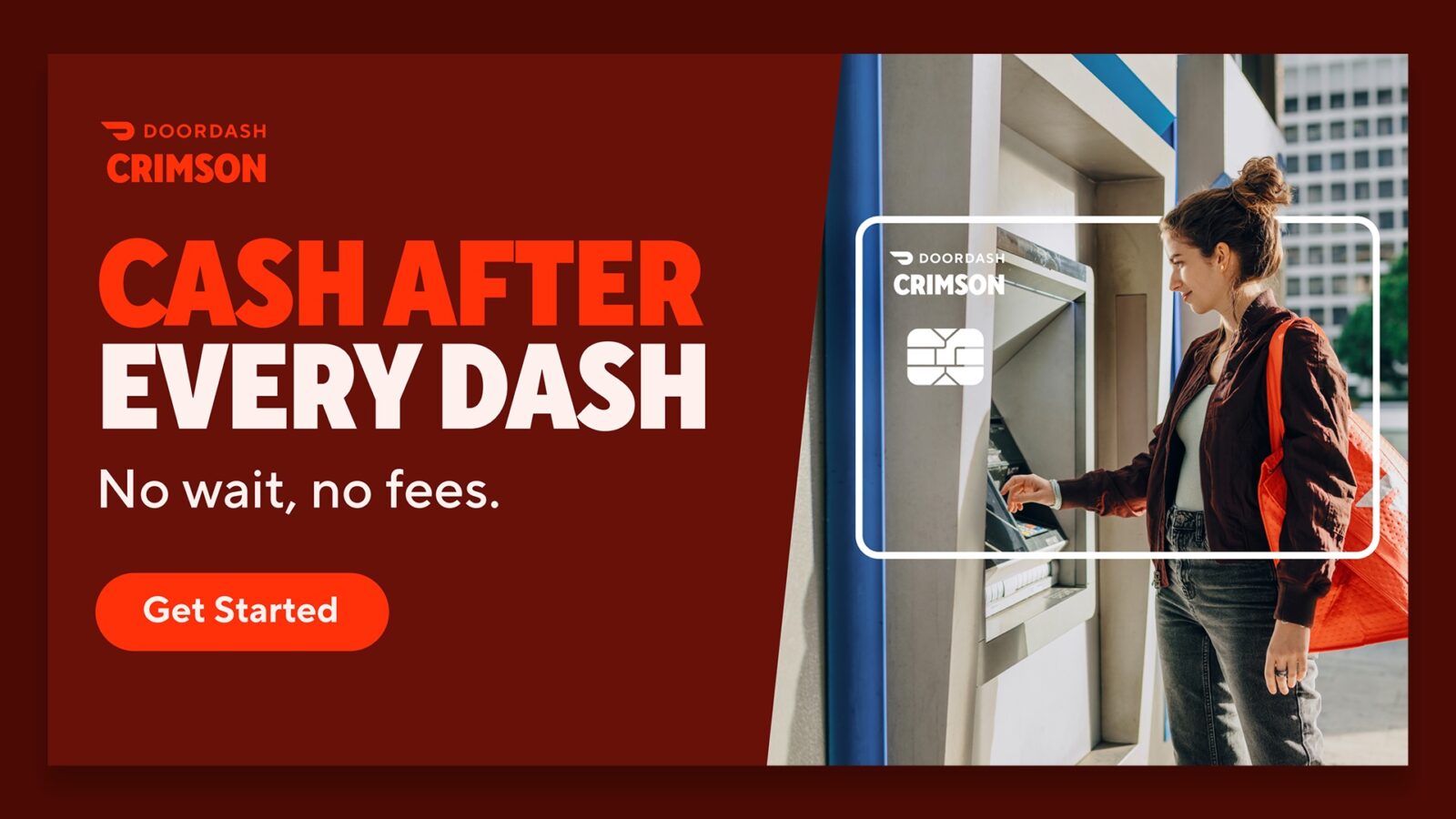
The DoorDash Crimson card reimagines an everyday payment tool into a utility with dignity and deeply rooted brand relevance. Developed as a prepaid Visa card for Dashers, Crimson unlocks automatic deposits after every completed delivery. No waiting, no fees, no financial limbo. Just cash after every dash. This immediacy is baked into the product experience across its visuals, materials, and user interactions.
Visually driven by movement and place
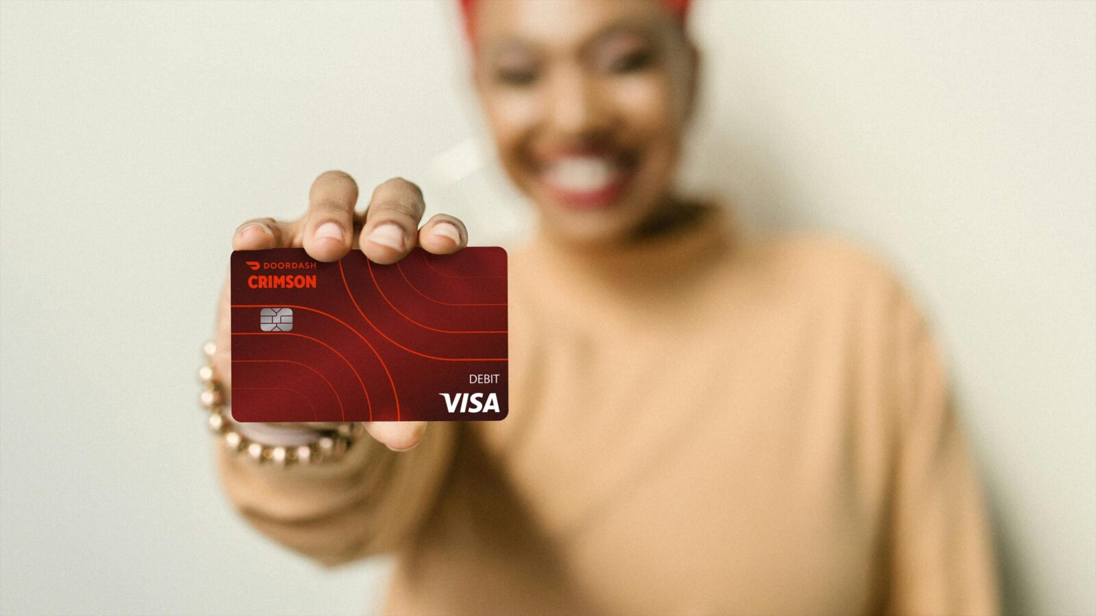
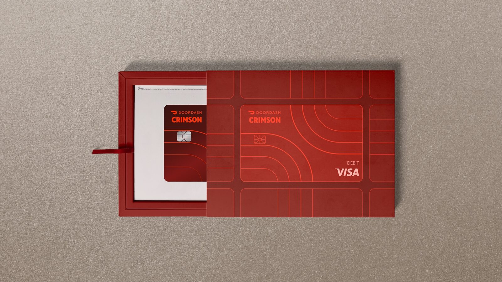
The updated card features design elements that intentionally connect to the parent brand while honoring its distinct purpose. The concentric lines echoing the DoorDash logo represent roads—a meaningful symbol for drivers. This thoughtful connection between product purpose and brand identity creates both visual and emotional coherence. And, of course, the signature Crimson color ensures instant brand recognition. It telegraphs urgency, speed, power and pride. A matte finish and minimalist typography create a sleek, modern profile that feels less like a default corporate card and more like a badge of identity.
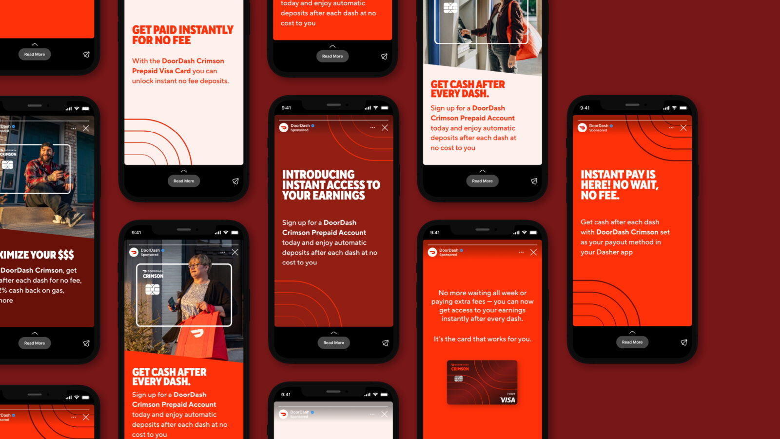
Functional meets emotional
The experience design extended beyond the card to the full digital journey. From the moment a user signs up to receiving the card and activating it, every step reflects the same clarity and confidence.
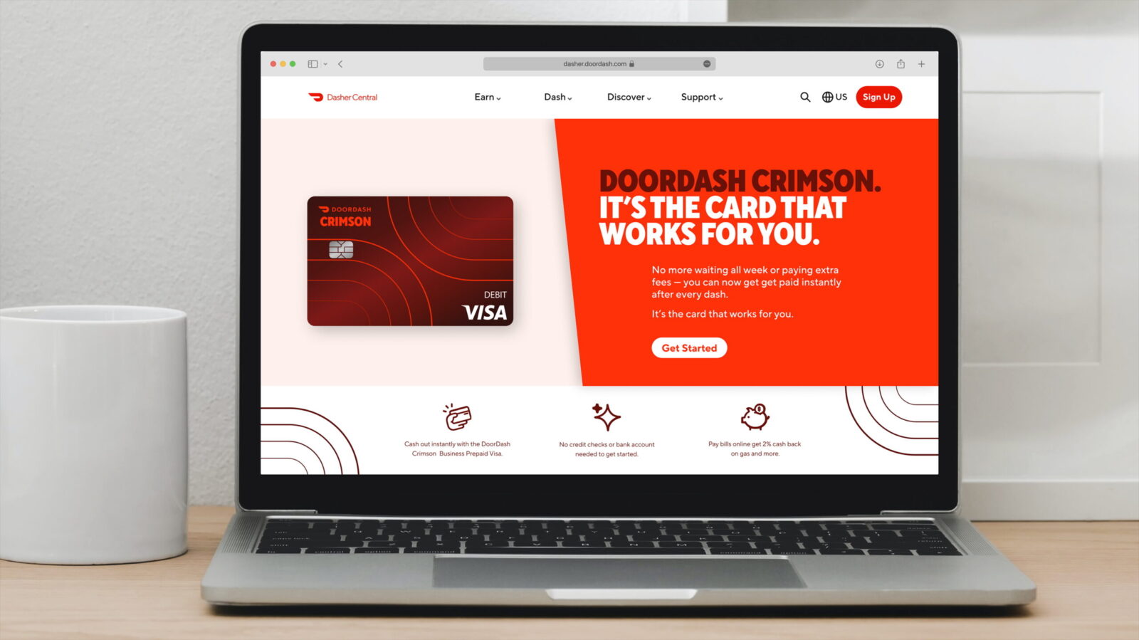
Website and mobile designs lean into bold, benefit-first messaging:
– “No wait, no fees.”
– “Instant pay is here.”
– “Get cash after every dash.”
Every piece of copy reinforces the card’s value proposition in plain language. App screens, ads and landing pages use a consistent visual palette, with deep red backgrounds, clean sans-serif type, and curved graphic overlays, to ensure continuity. Even in small-scale executions like Instagram Stories, the look and tone feel unmistakably tied to the Crimson identity.
A sub-brand that honors the MVPs
The DoorDash Crimson card creates a distinct sub-brand identity while maintaining clear connection to a parent brand’s visual heritage, reflecting DoorDash’s brand values through design choices that are as considered as they are consistent.
– It shows strategic design thinking that bridges functional benefits, such as expanded Dasher perks, and marries it with emotional connection.
– It honors DoorDash drivers, acknowledging their speed, reliability, and central role in the company’s success, while solving a key financial pain point.
– And finally, it illustrates how product design can reinforce brand values by making the user experience more personal and meaningful.
CREDIT
- Agency/Creative: Barrett Hofherr
- Article Title: Barrett Hofherr Designs DoorDash Crimson as a Premium Instant Pay Card for Dashers
- Organisation/Entity: Agency
- Project Status: Published
- Agency/Creative Country: United States of America
- Agency/Creative City: San Francisco
- Market Region: California (USA)
- Project Deliverables: Product Design
- Industry: Professional Services
- Keywords: WBDS Agency Design Awards 2025/26 , DoorDash Crimson, DoorDash, Barrett Hofherr
-
Credits:
Chief Creative Officer, Barrett Hofherr: Jamie Barrett
Head of Design, Barrett Hofherr: Ted Bluey
Designer, Barrett Hofherr: Annika Ide
Creative Director/Copywriter, Barrett Hofherr: Julie Blakley
Head of Production, Barrett Hofherr: Conor Duignan
Client: DoorDash Crimson
Senior Manager, Business Leadership: DoorDash, William DyRyk
Manager, Partnership Marketing: DoorDash, Francesca Pinelli
Senior Manager, Business Lead: DoorDash, Josh Lybarger


