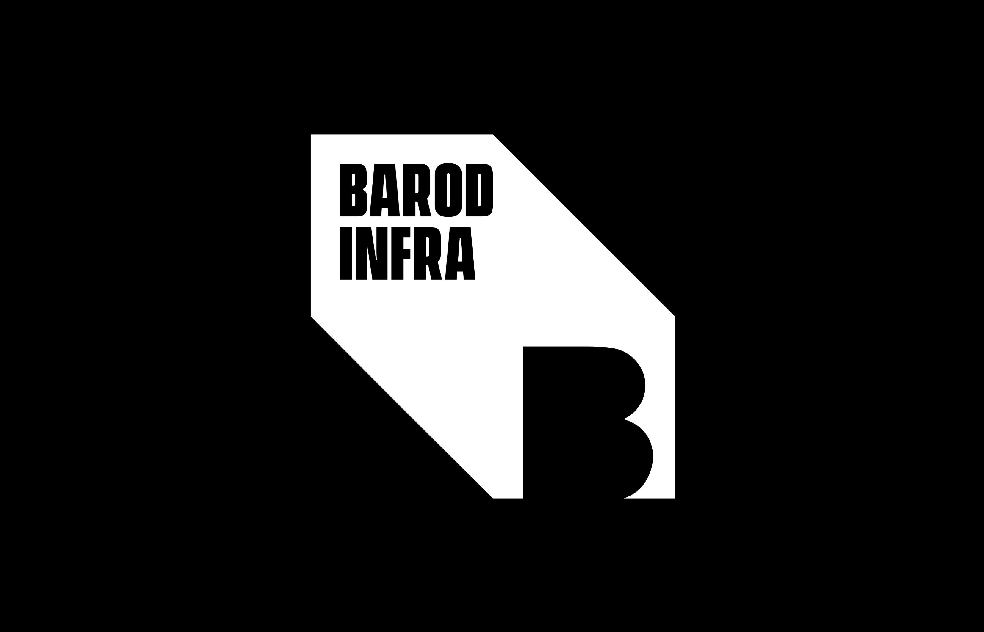
Barod Infra is a new player in the infra development space, having their first projects coming up in Indore, India. The client was looking for a brand identity/ logo design that would reflect the company’s values and commitment to quality, safety, and sustainability.
It’s goal was to build high-end residential and corporate works, with the objective of promoting improved quality of life and the corporate environment through customized, technological, innovative and intelligent constructions.
The design development started with understanding the client and how they wanted their company to be perceived. The logo was designed considering words such as Trust, Dependable, Unique, Big Player. What emerged was an identity with strong geometric inspiration and a brand logo that pointed towards a new height. The Block shape gives the strength of an infra company.
The logo features a solid, modern design that captures the company’s spirit of innovation, integrity and excellence, and the typography used is clean and professional.
We have developed an identity with a uniform, vibrant and bold visual language, which represents the new phase of the company, in addition to being fully expandable for various developments, online or offline.
In addition to the logo, we also developed a visual identity system, including guidelines for the use of the new logo and visual elements, as well as messaging and tone of voice recommendations to ensure consistency in all company communications.

CREDIT
- Agency/Creative: Lemon Yellow
- Article Title: Barod Infra Visual and Brand Identity
- Organisation/Entity: Agency
- Project Type: Identity
- Project Status: Published
- Agency/Creative Country: India
- Agency/Creative City: Mumbai
- Market Region: Asia
- Project Deliverables: Brand Creation, Brand Design, Brand Identity, Branding
- Industry: Construction
- Keywords: #construction ,#homes ,#infra ,#realty ,#property
-
Credits:
Creative Director: Tejol Kolwalkar


