


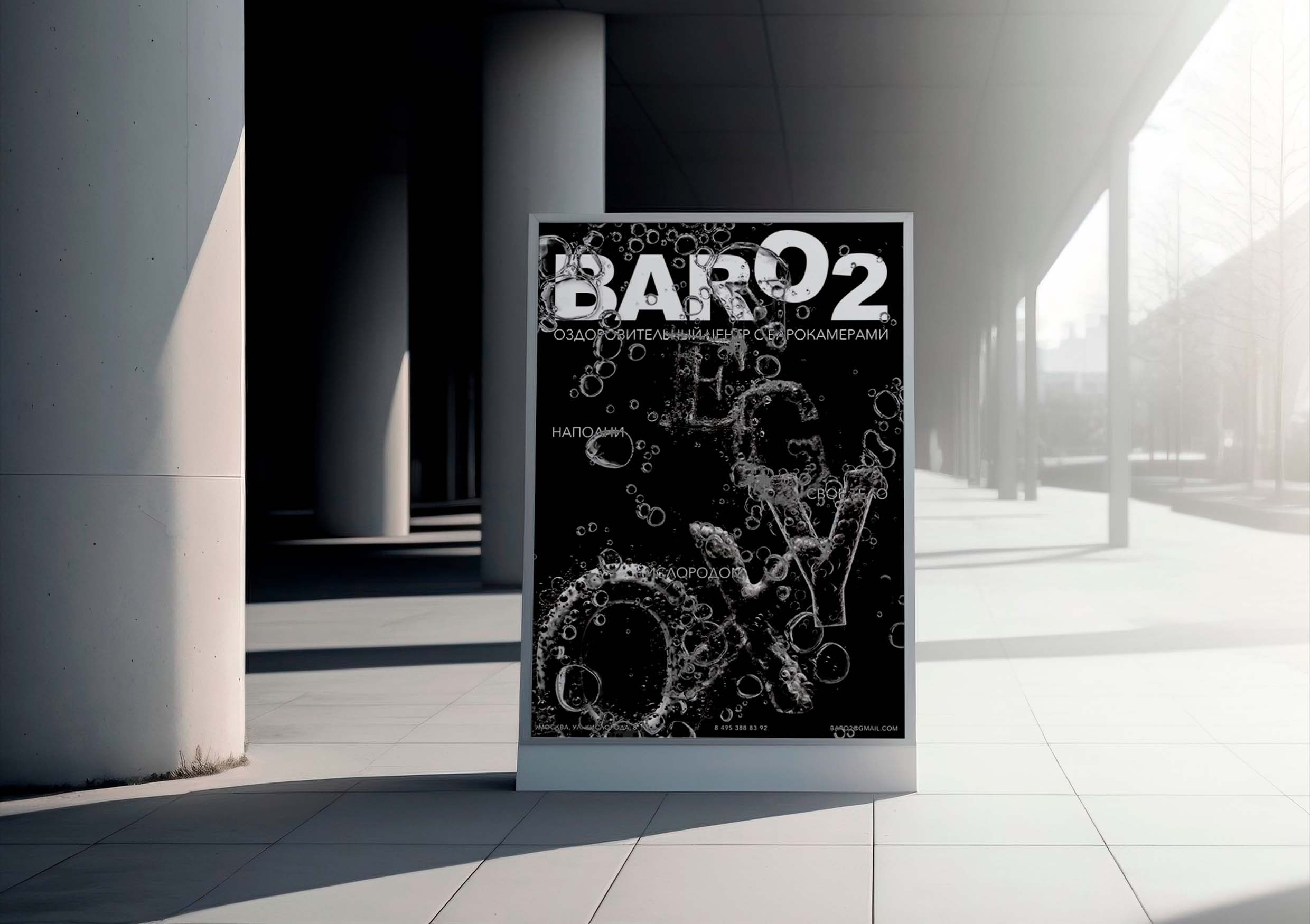
BarO2 is a wellness center with pressure chambers, providing an opportunity to undergo a course of treatment, and then relax in the bar with oxygen cocktails. The pressure chamber is an innovative effective method of rehabilitation, prevention of diseases with the help of oxygen saturation of blood plasma – a high–tech wellness method used in a wide range of problematic conditions of the body associated with hypoxia (low oxygen content in the body).
A distinctive feature of the center is the presence of an oxygen bar. You can comfortably spend time in it while waiting for your reception. The menu has several flavors of oxygen cocktails, as well as a small department of household goods, where you can buy a cocktail preparation kit and saturate your body with oxygen in any place convenient for the patient.
The target audience is wealthy people aged 30 to 40 years, because it is at this age that diseases that can be cured with the help of a pressure chamber are more often manifested.
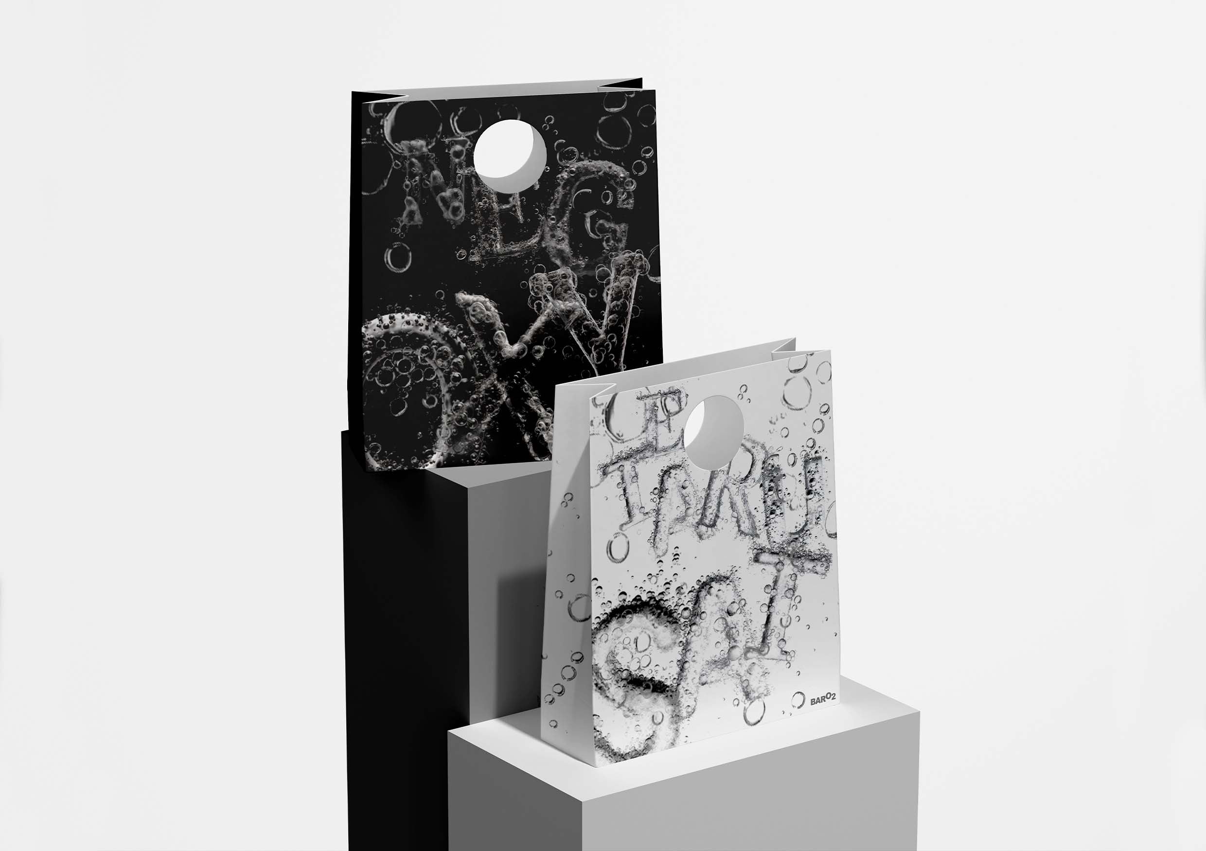
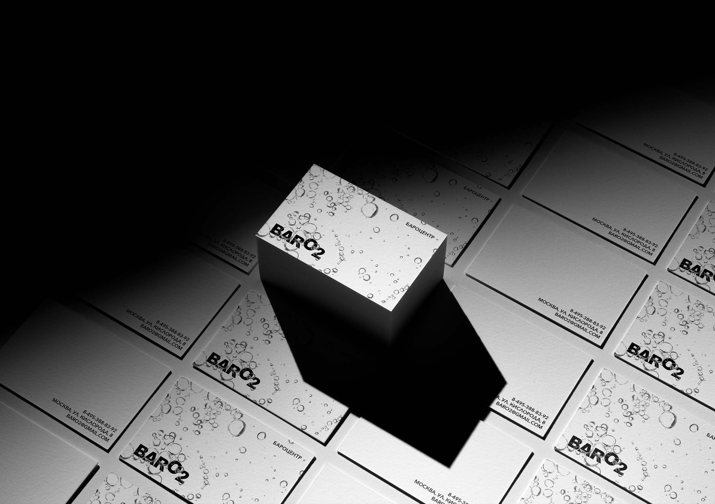
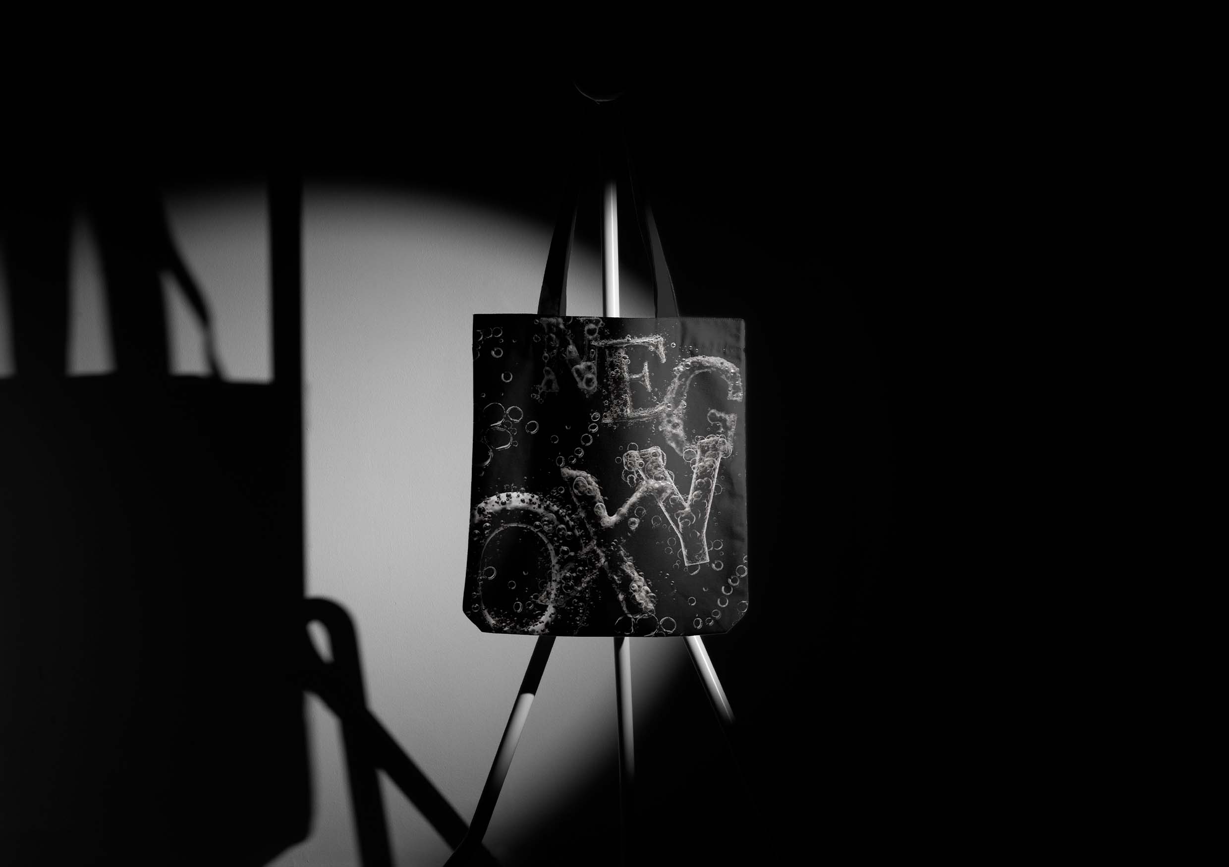
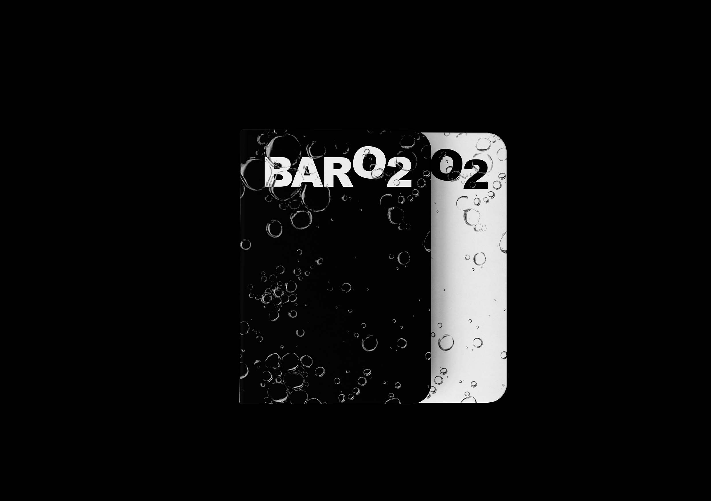
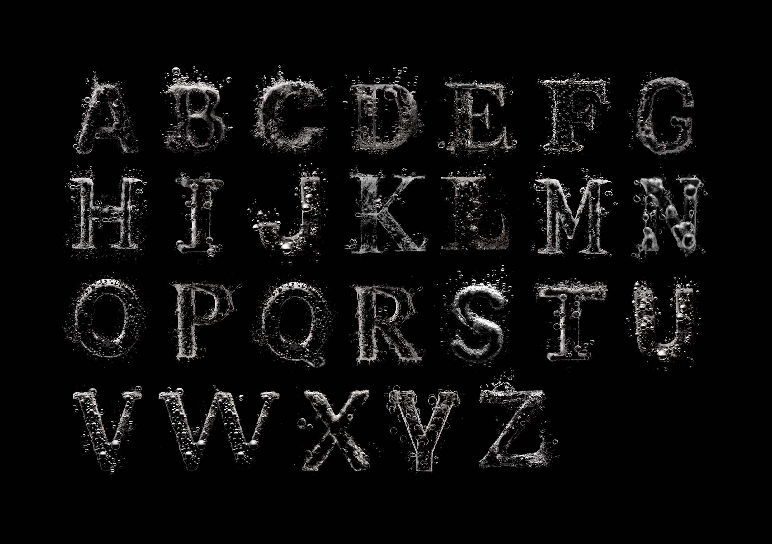
The idea of the corporate identity is based on oxygen bubbles. Oxygen is the main element on which the treatment in the barocenter is built, so bubbles have become the basis of the brand’s style. They have formed a corporate font that works as accidental typography. By analogy with the division of the barocenter into the space of the bar and the pressure chamber zones, the color palette is divided into black and white. The corporate font works the same in different colors.
The idea of weightlessness and airiness is also embedded in the laconic logo, where the letter “O”, as if filled with oxygen, tries to fly out from the general row of letters.
Special thanks should be expressed to the Russian Higher School of Economics (HSE School of Art and Design) and personally to the curator of the project Tatiana Dunaeva.
CREDIT
- Agency/Creative: Natalia Reshetnikova
- Article Title: BarO2 Brand Identity by Natalia Reshetnikova
- Organisation/Entity: Student
- Project Type: Identity
- Project Status: Non Published
- Agency/Creative Country: Russia
- Agency/Creative City: Natalia Reshetnikova
- Market Region: Global
- Project Deliverables: Brand Identity
- Industry: Health Care
- Keywords: Natalia Reshetnikova, brand identity, BARO2
-
Credits:
Tutor: Tanya Dunaeva


