


Bottling the Bareksten Borealis
Few spirits have travelled as far and as triumphantly as Bareksten. The brand has been crowned the world’s best gin on multiple occasions — most notably at the prestigious San Francisco World Spirits Competition, where it has won Double Gold four timesand earned the title World’s Best London Dry Gin. In 2022, Bareksten Navy Strength Gin was awarded Best Spirit of the Year at the London Spirits Competition.
Now, Bareksten expands its universe with a new series of Gin and Vodka: Bareksten Borealis — inspired by the mysterious, shimmering phenomenon of the Aurora Borealis. A light that has danced over the Nordic sky for centuries, equal parts science and mythology, beauty and enigma.
A Sub-Brand Born of Darkness, Light, and the Norwegian Wild
As part of our continued stewardship of the Bareksten brand, we developed this new sub-brand for international release. Where the original Bareksten identity evokes the deep, dark forests of Norway, Bareksten Borealis introduces a more ethereal dimension — a world where light moves like breath and colour behaves like weather.
Borealis is Bareksten seen through the lens of the Arctic night:
Quiet, magnetic, unpredictable, and impossibly beautiful.
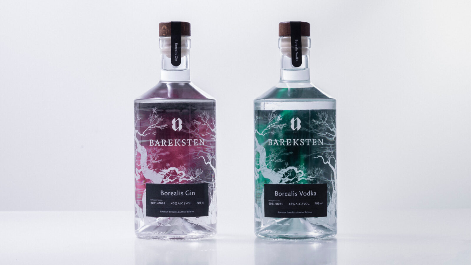
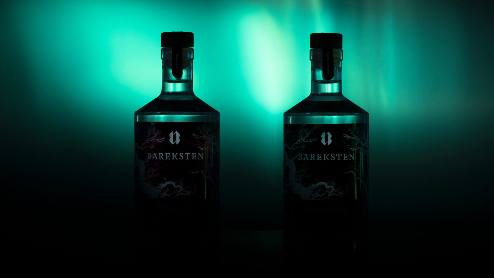
Design: A Bottle Charged With Light
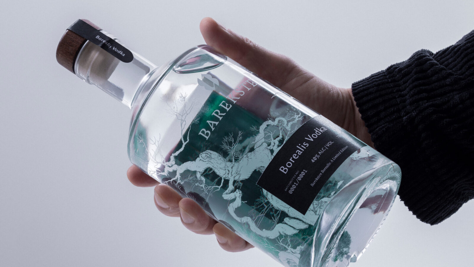
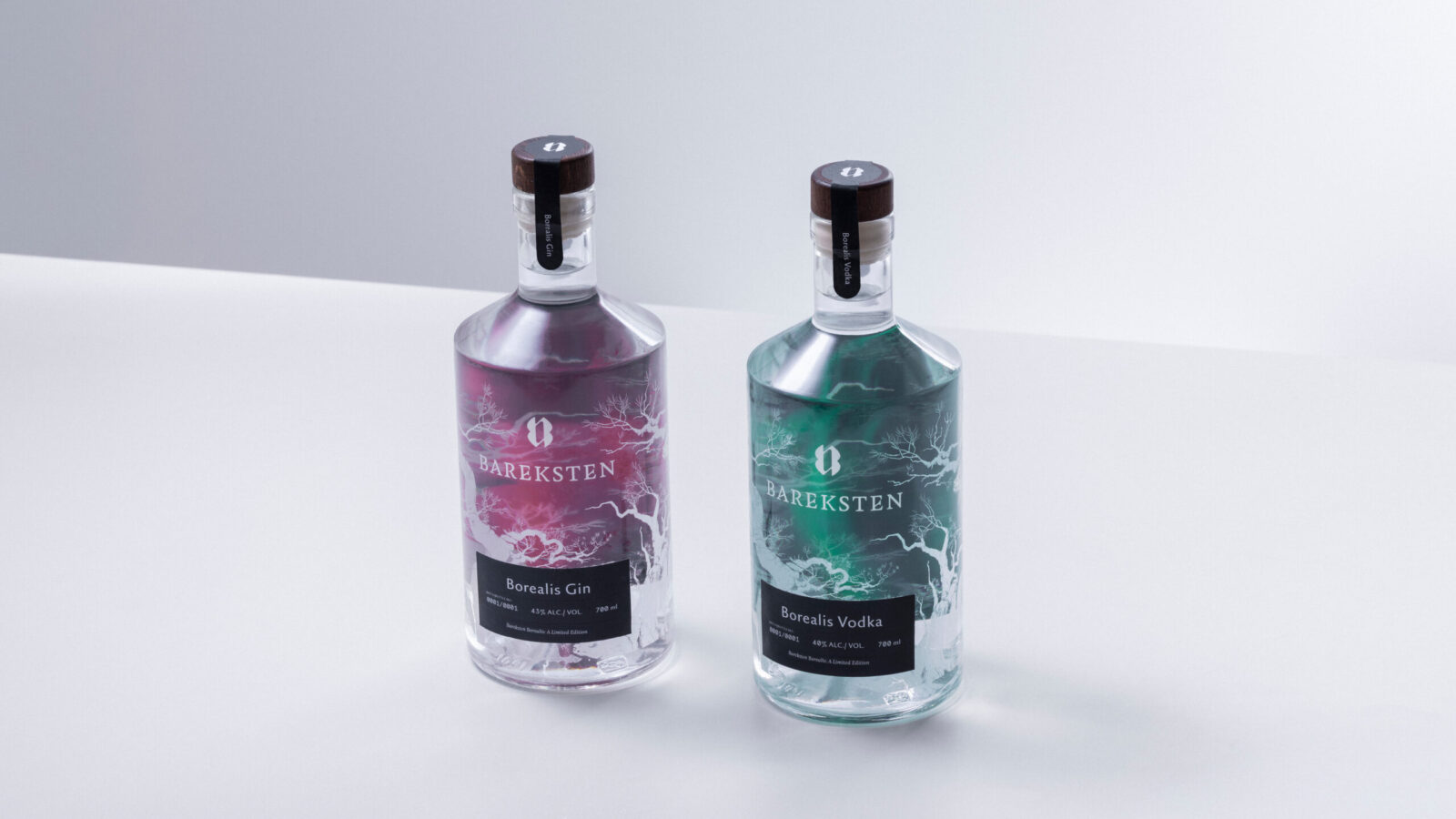
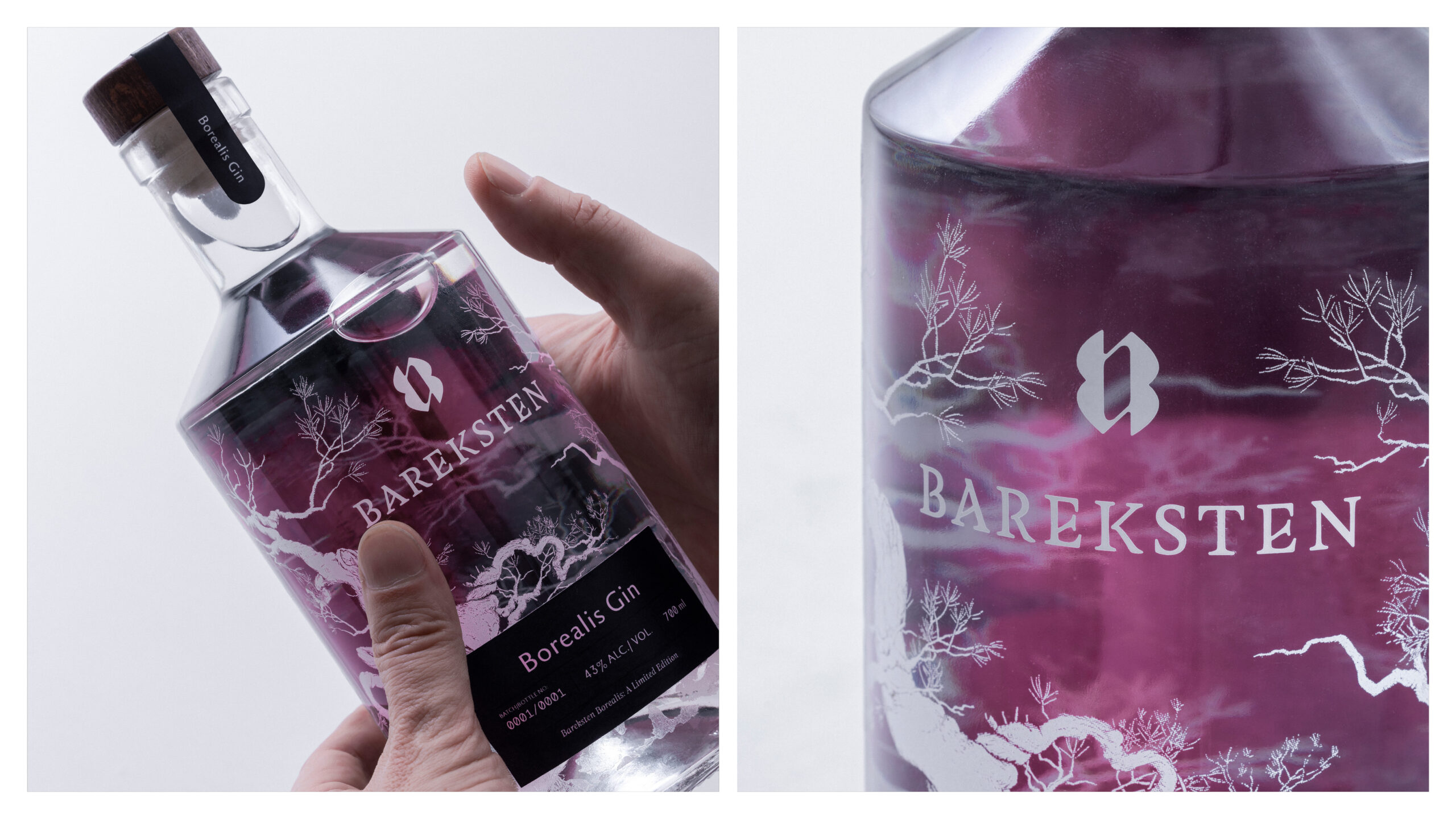
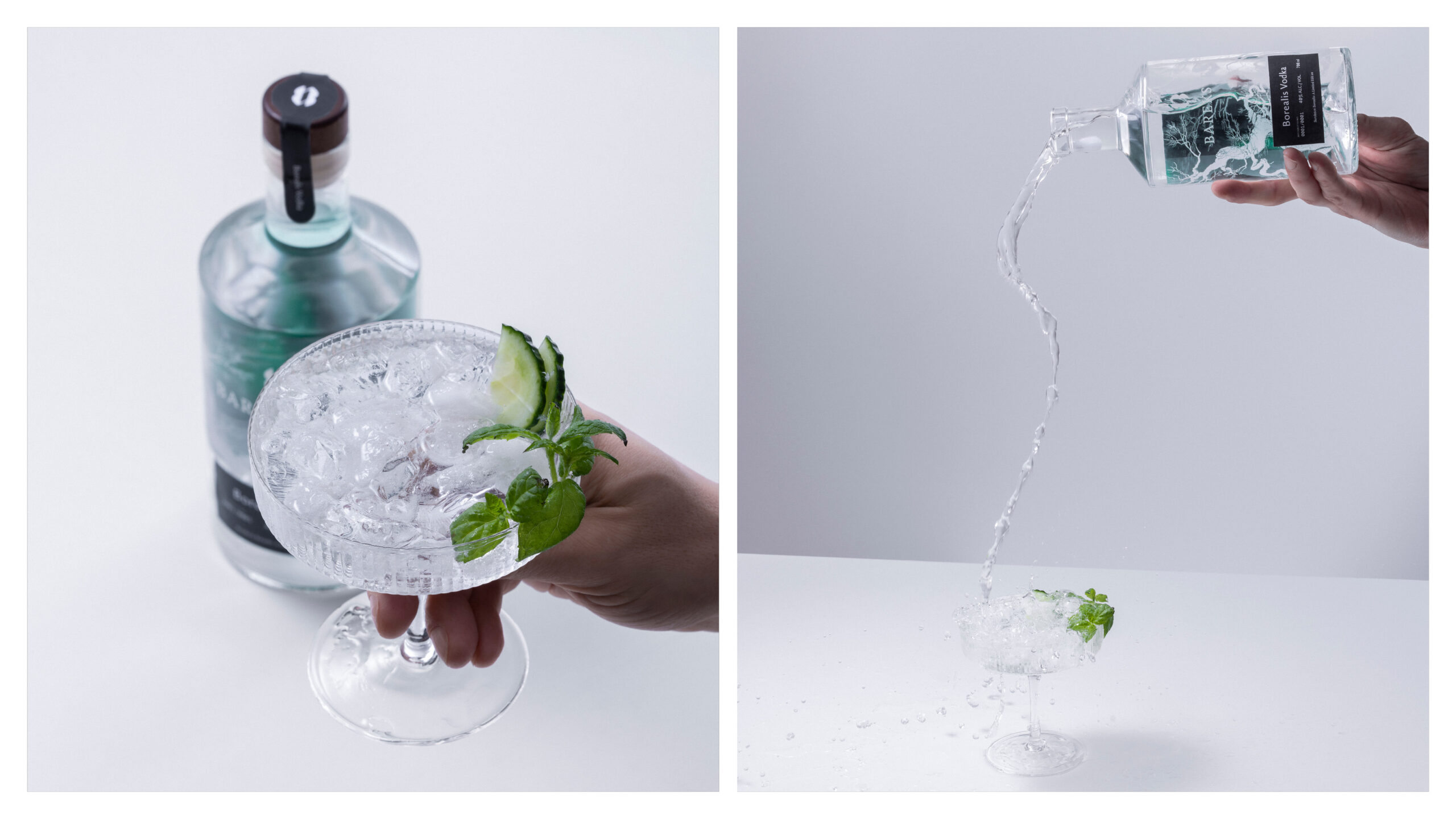
We retained Bareksten’s iconic bottle shape but reinterpreted it in clear glass — a deliberate contrast to the original matte-black silhouette. Around it, we added a frosted pattern inspired by Norwegian forests, soft and spectral, as trees glimpsed through cold night air.
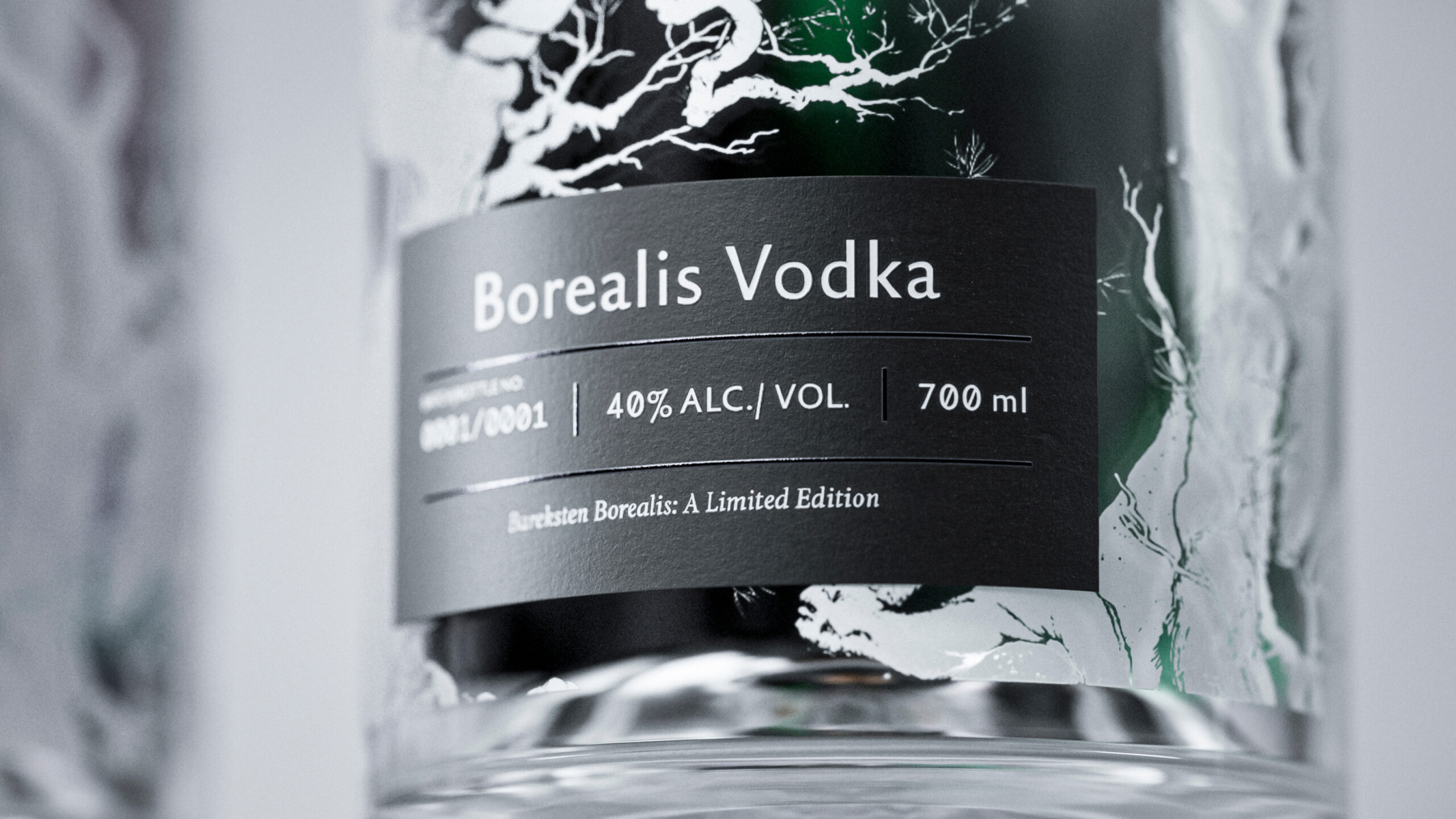
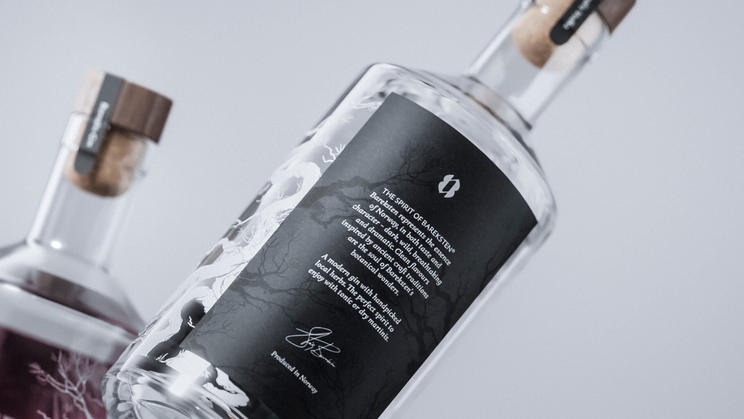
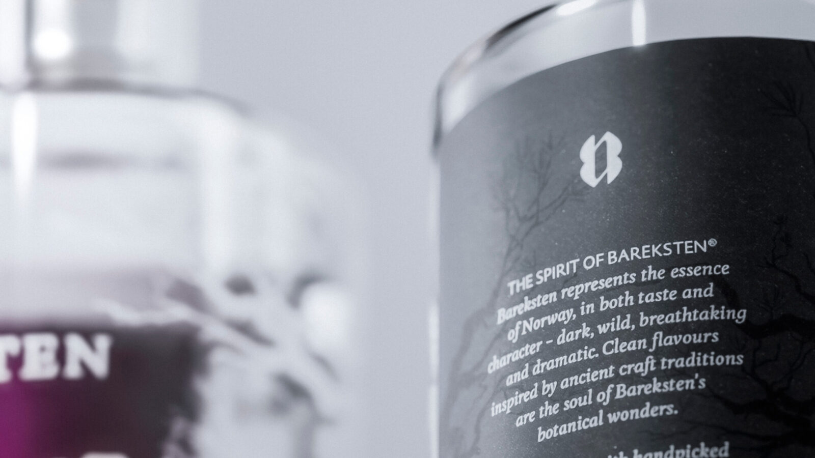
The front label remains minimal and low, consistent with Bareksten’s design DNA.
But the back label is where the magic happens.
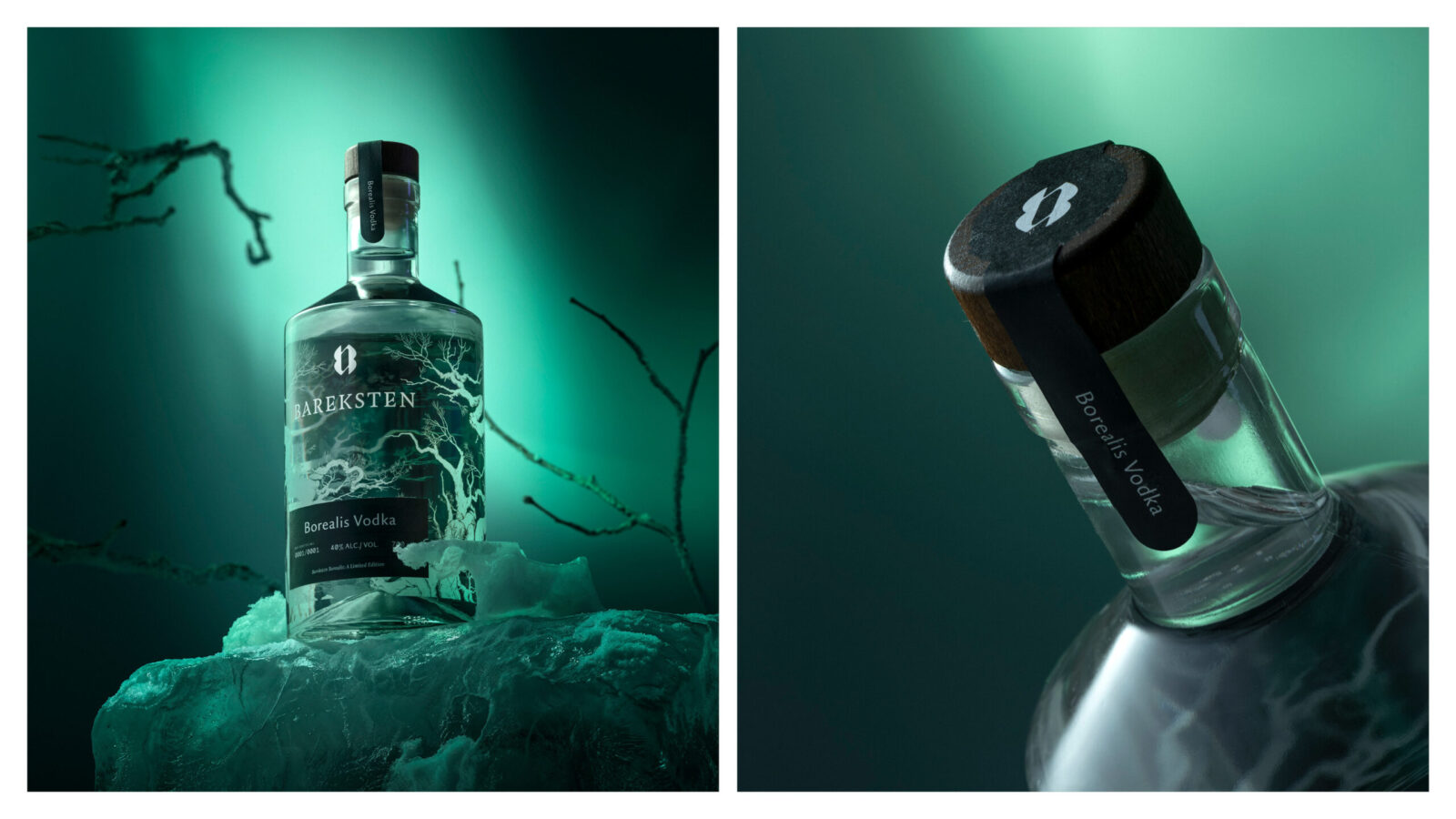
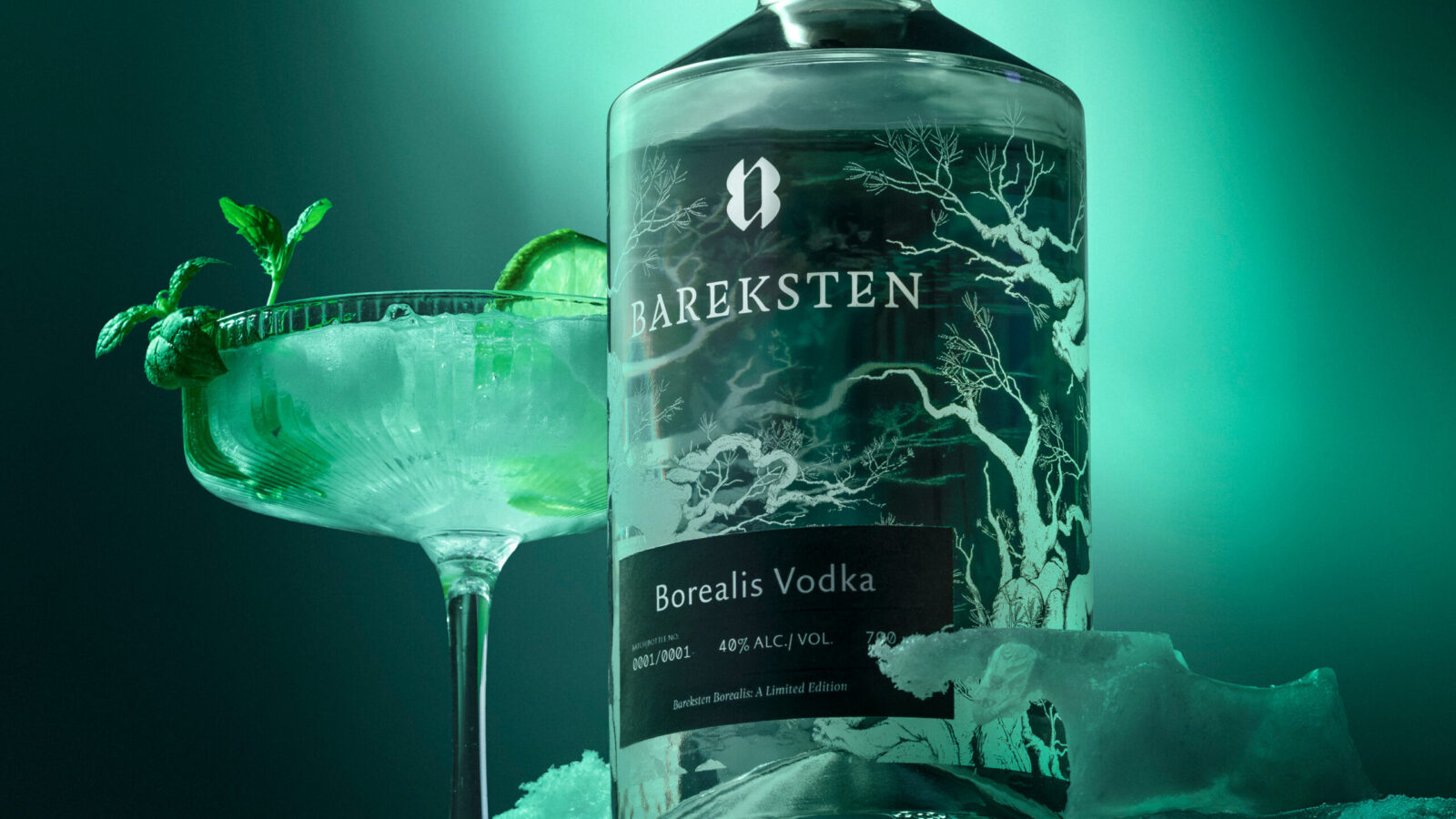
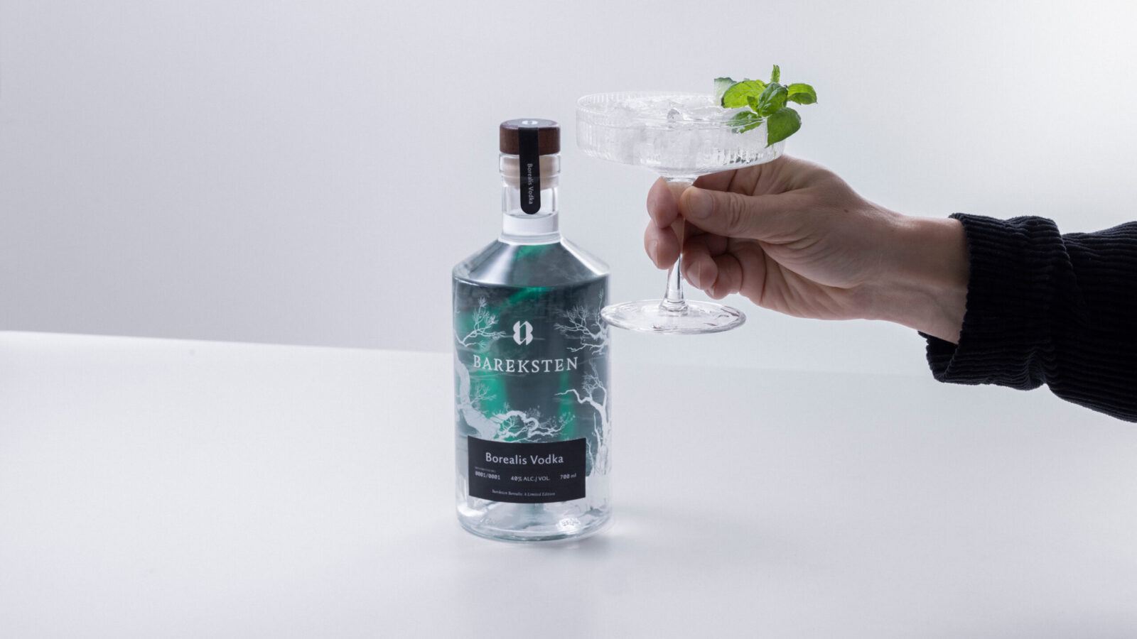
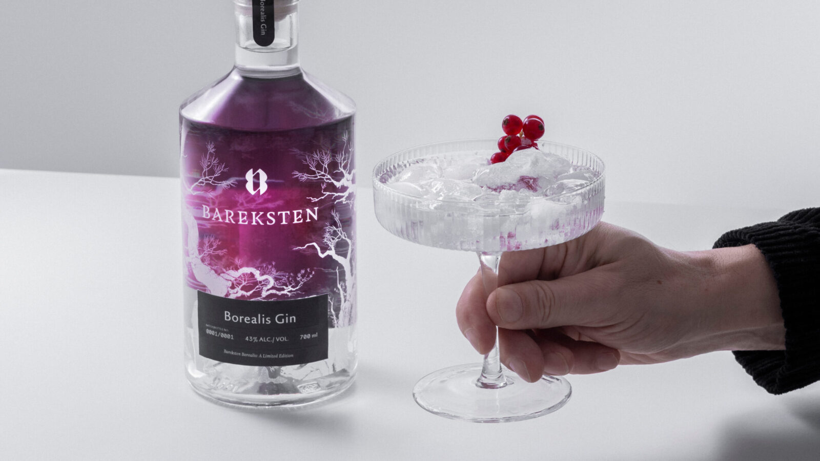
A nearly full-coverage, double-sided printed illustration of the Northern Lights spans the entire back of the bottle — in two colour variations: one for gin and one for vodka
As the liquid refracts the artwork, the light inside the bottle seems to shift and shimmer, creating something that feels less like packaging and more like a tiny atmospheric phenomenon.
A luminous glow emerges — a drinkable aurora — echoing the way a fresh cocktail can glow in the dark of a Nordic night.
The result is emotional, almost cinematic; a bottle that behaves like the natural wonder it represents.
Differentiation: Distinct, Yet Deeply Bareksten
Bareksten Borealis stands apart from competitors through its unique print technique, vivid internal glow, and poetic interaction with light.
It is clearly differentiated from Bareksten’s core line — yet unmistakably connected through the silhouette, the restrained label architecture, and the deep Nordic narrative.
This balance between difference and DNA makes Borealis instantly recognisable, both as a new expression and as a faithful member of the Bareksten family.


CREDIT
- Agency/Creative: KIND (Conceptual Branding AS)
- Article Title: Bareksten Borealis Launches as a Radiant New Spirit Expression Designed by Kind
- Organisation/Entity: Agency
- Project Status: Published
- Agency/Creative Country: Norway
- Agency/Creative City: Bergen
- Project Deliverables: Packaging Design, Photography, Product Photography
- Industry: Food/Beverage
- Keywords: WBDS Agency Design Awards 2025/26 spirit, gin, vodka, borealis
-
Credits:
CEO, Creative Director: Tom Emil Olsen
Design Director: Knut Harald Longva
Senior Designer: Emil Olsen
Senior Designer: Agnieszka Gawlik
Senior Designer: Mihail Mihaylov
Senior Designer: Lorenzo Galbiati
Senior Designer: Saurabh Kumar
Graphic Designer: Piotr Deres
Graphic Designer: Clara Auda
Graphic Designer: Mats Hope
Director of Photography: Christoffer Meyer
Photographer & Cinematographer: Isak Norum
Cinematographer: William James Campbell
Key Account Manager: Marianne Erdal Holm
Project Manager: Laure Mediavilla
Strategic Brand Director: Thomas Danielsen
COO, Key Account Manager: Beate Myren Romslo


