


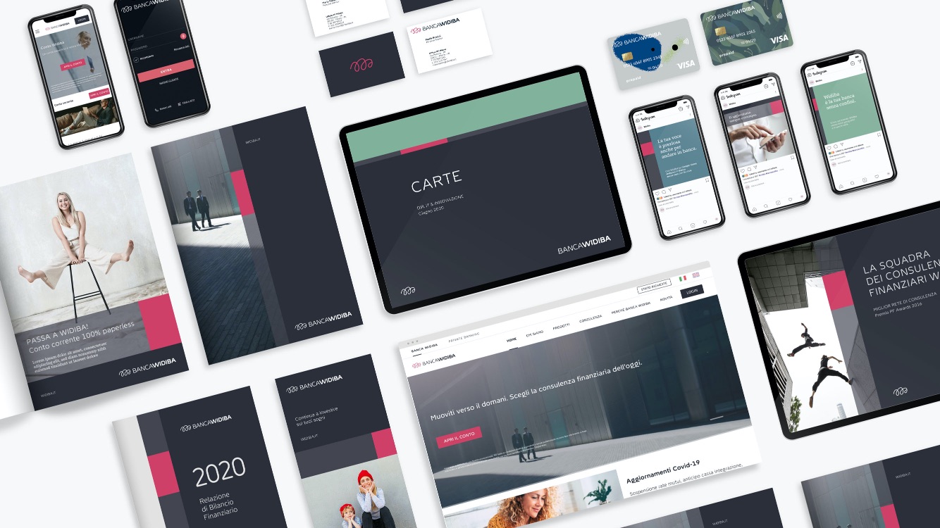
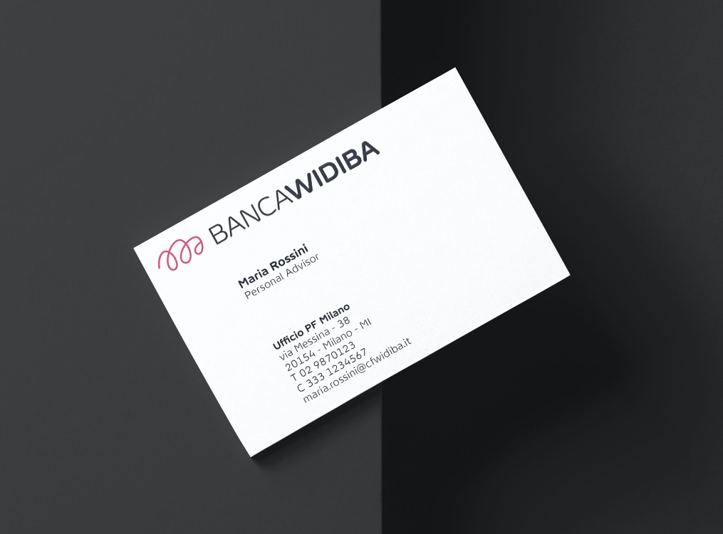
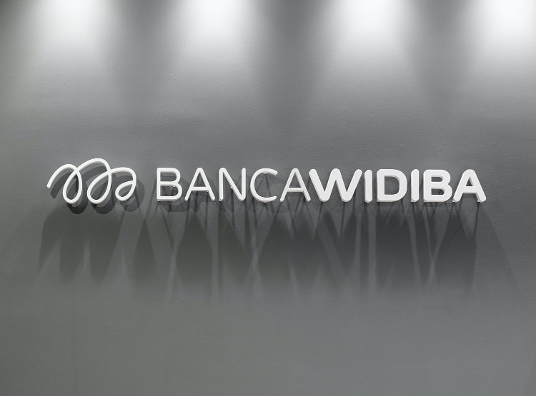
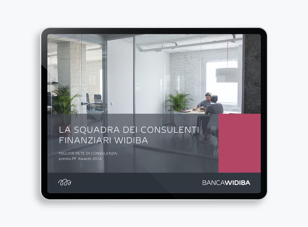
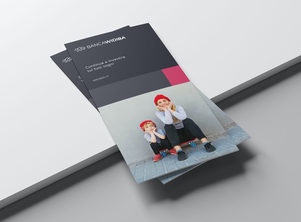
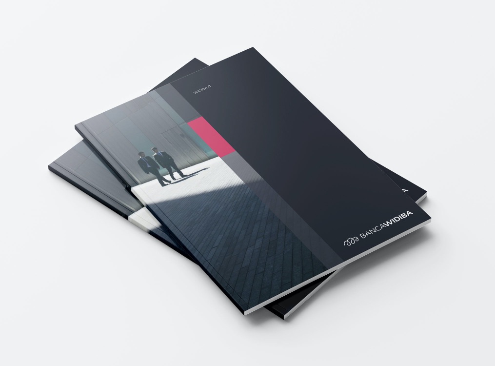
Banca Widiba has deeply changed during those years growing and strengthening its position on the market. The new brand signature is characterized by the re-design of the logo in a thinner version, the addition of the word “Banca” that together with the use of the all caps for the logotype is able to let it appear more authoritative and sophisticated. The new identity system is respectful of Widiba visual language that has been always defined by dynamism, organization and contemporaneity. The graphic format is a responsive system built by some rectangular shapes adapting to different medias.
CREDIT
- Agency/Creative: jekyll & hyde
- Article Title: Banca Widiba Rebranding
- Organisation/Entity: Agency
- Project Type: Identity
- Project Status: Published
- Agency/Creative Country: Italy
- Agency/Creative City: Milano
- Market Region: Global
- Project Deliverables: Brand Identity
- Industry: Financial
- Keywords: WBDS Awards, Agency
-
Credits:
Creative Director: Margherita Monguzzi
Creative Director: Marco Molteni
Graphic Designer: Elena Bonanomi
Graphic Designer: Cecilia Della Longa
head of user experience & front end at Banca Widiba: Giuseppe Conte
FEEDBACK
Relevance: Solution/idea in relation to brand, product or service
Implementation: Attention, detailing and finishing of final solution
Presentation: Text, visualisation and quality of the presentation


