


The Bitree brand identity, presents a thoughtful and cohesive visual system designed to encapsulate the essence of a modern link management platform. The identity emphasizes clarity, connectivity, and professionalism, aligning with Bitree’s mission to streamline digital link organization for users.
Brand Essence
Bitree positions itself as a solution for users seeking to manage and share multiple digital links efficiently. The brand identity reflects this by focusing on simplicity and user-centric design, ensuring that the platform is both approachable and functional.
Logo Design
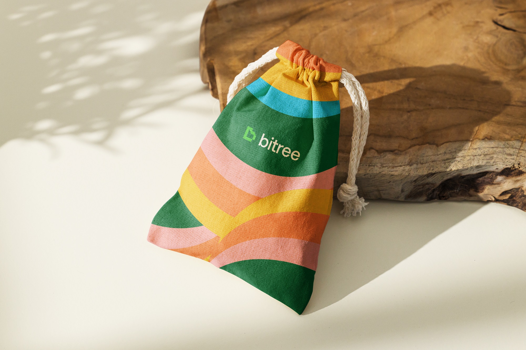
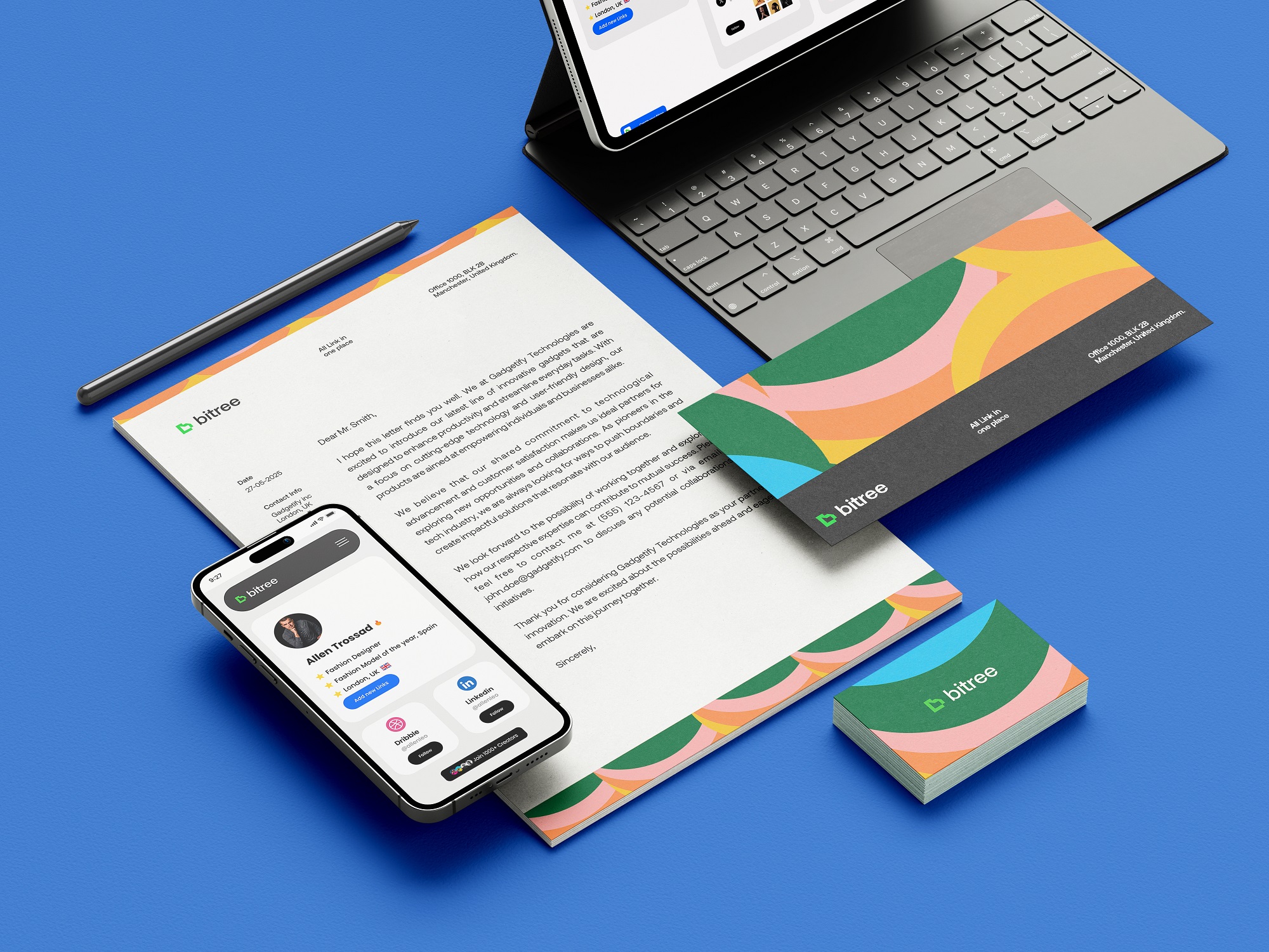
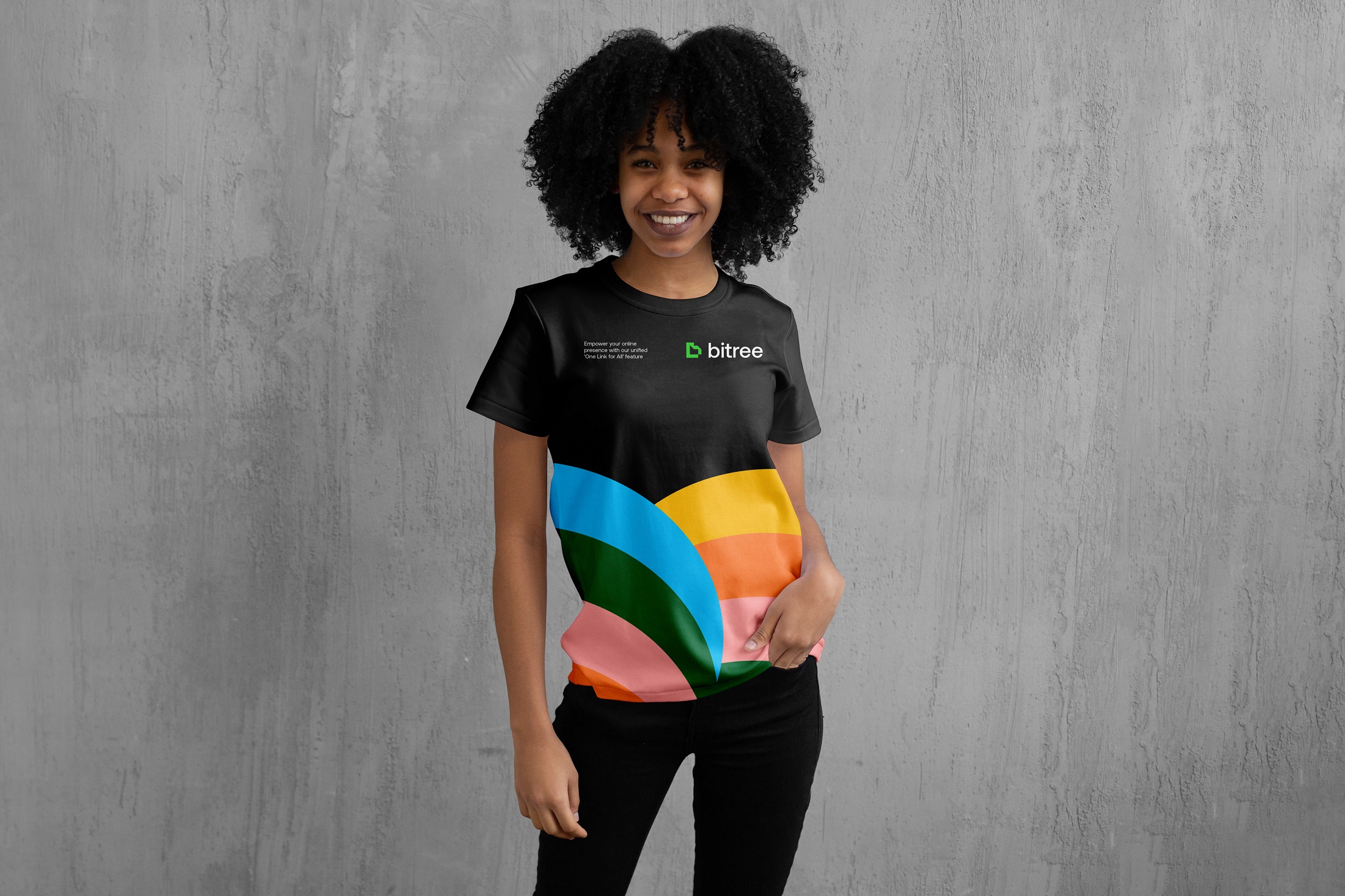
The Bitree logo is a minimalist wordmark that exudes modernity and clarity. Its clean lines and straightforward typography make it versatile across various applications, from digital interfaces to print materials. The simplicity of the logo ensures that it doesn’t overshadow user content, maintaining focus on the links and information users wish to share.
Typography
The typographic choices in Bitree’s brand identity favor legibility and modern aesthetics. Sans-serif fonts are employed to convey a sense of openness and accessibility, aligning with the platform’s goal of simplifying digital link management. The consistent use of typography across different brand materials reinforces brand recognition and coherence.
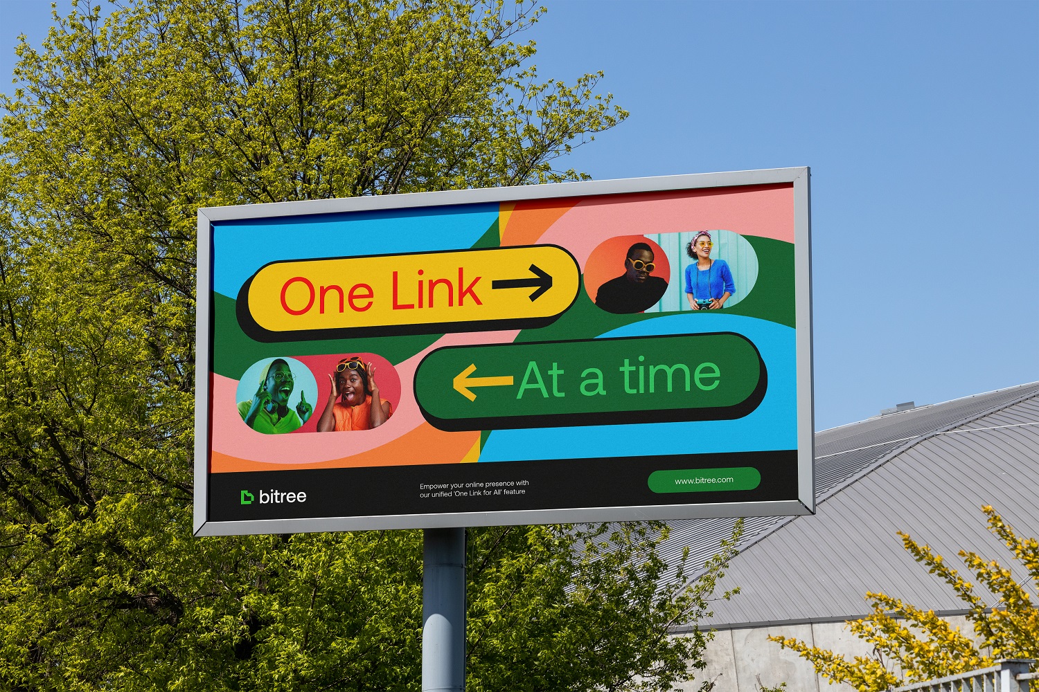
Color Palette
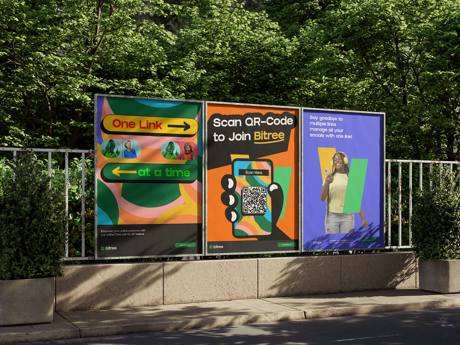
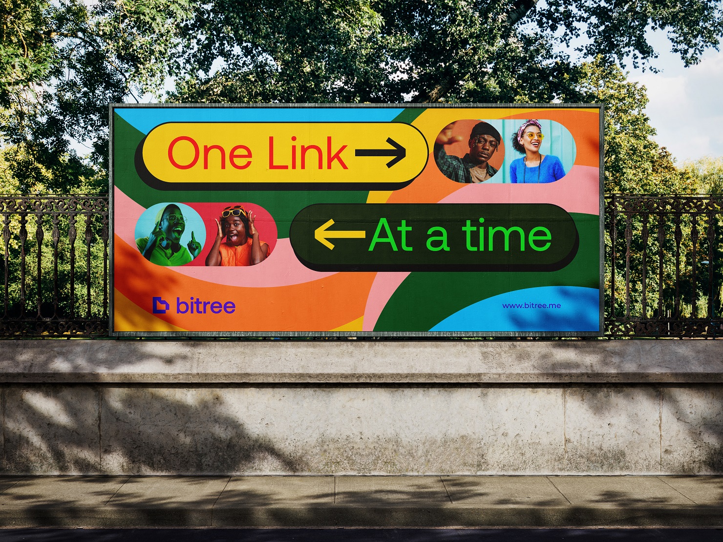
Bitree’s color palette is composed of neutral and calming tones, primarily utilizing shades of green and white. This choice evokes a sense of growth and tranquility, subtly reinforcing the brand’s name and its association with trees and branching links. The restrained use of color ensures that the platform remains a neutral backdrop, allowing user content to take center stage.
Visual Elements
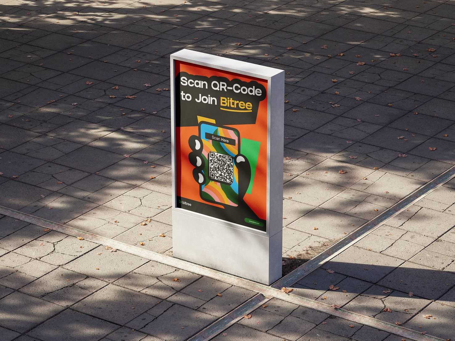
The brand identity incorporates subtle graphical elements that hint at connectivity and organization, such as lines and nodes reminiscent of branching structures. These elements are used sparingly to avoid clutter, maintaining the platform’s clean and user-friendly interface. The visual language supports the brand’s narrative of linking and structuring digital content seamlessly.
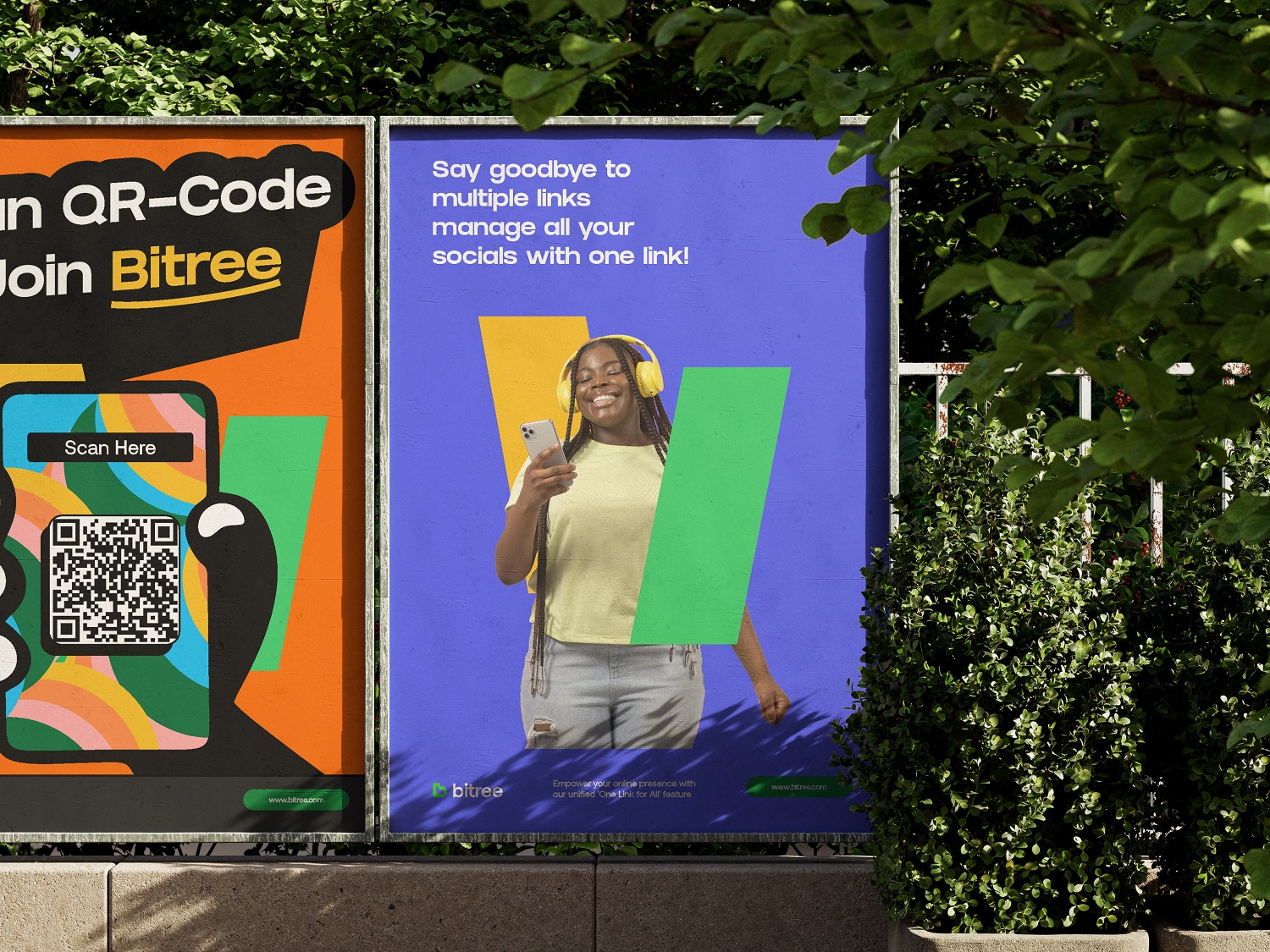
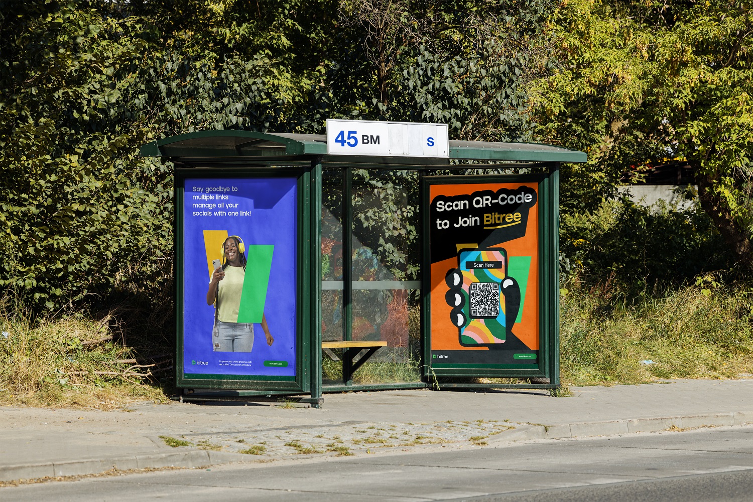
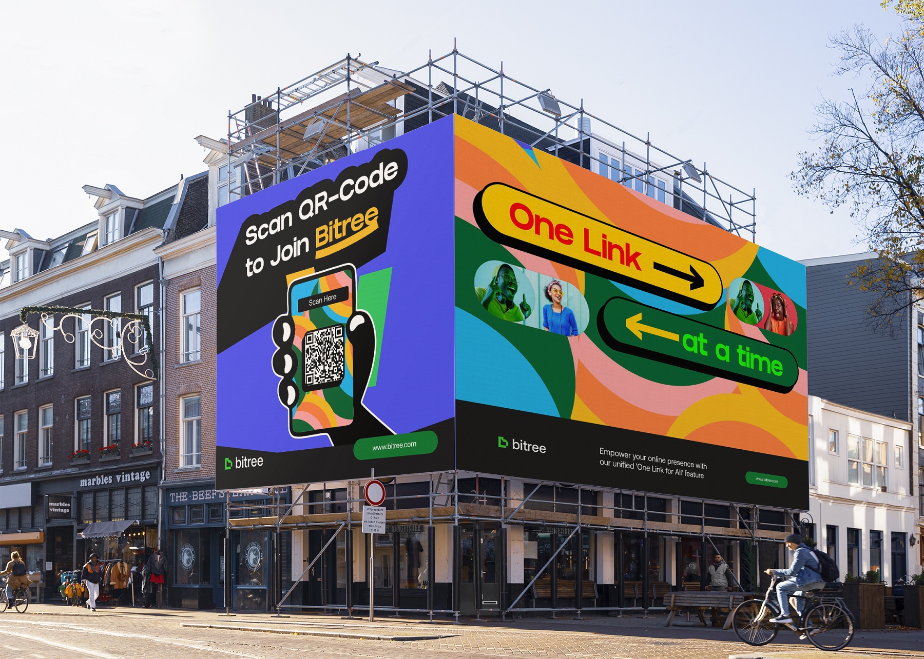
Application and Consistency
Across various touchpoints—be it the website, mobile application, or marketing materials—Bitree’s brand identity maintains consistency. The uniform application of design elements ensures a cohesive user experience, reinforcing trust and reliability. The adaptability of the brand’s visual components allows for scalability as the platform evolves and expands its offerings.
Conclusion
Bitree’s brand identity is a testament to thoughtful design that prioritizes user experience. By focusing on simplicity, clarity, and subtle visual cues, the brand effectively communicates its purpose and values. The identity not only serves the functional needs of the platform but also establishes a strong foundation for future growth and user engagement.
CREDIT
- Agency/Creative: Bamidele Segun
- Article Title: Bamidele Segun Designs a Scalable Identity for Bitree to Simplify Link Management
- Organisation/Entity: Freelance
- Project Type: Identity
- Project Status: Published
- Agency/Creative Country: Nigeria
- Agency/Creative City: Lagos
- Market Region: Africa, Europe, Middle East, South America, Global
- Project Deliverables: Art Direction, Brand Design, Brand Naming, Logo Design
- Industry: Technology
- Keywords: Branding, Youthful Branding, Brand identity, Technology, AI, Brand design
-
Credits:
Brand Designer: Bamidele Segun


