Blindtiger Design – Bale Breaker Brewing Co.
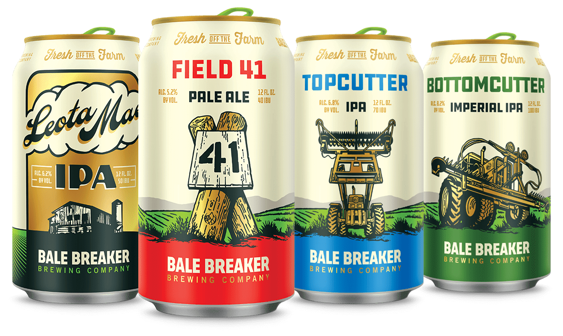
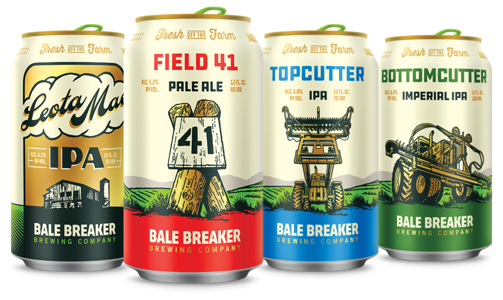
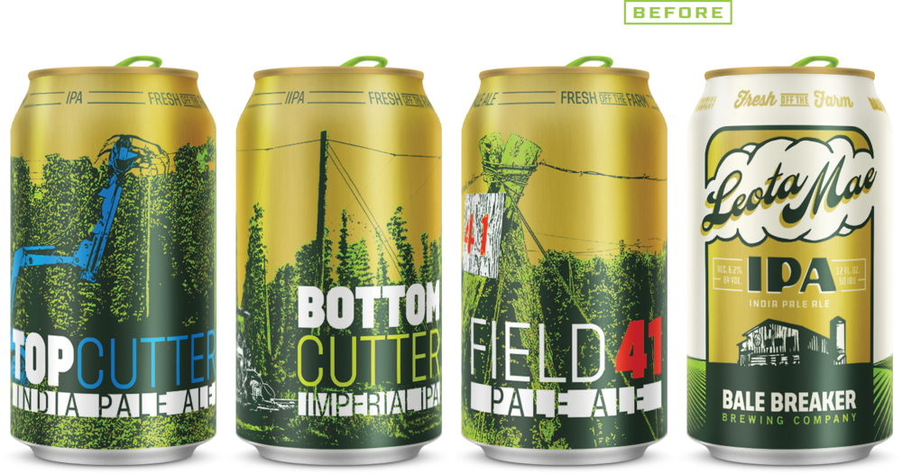
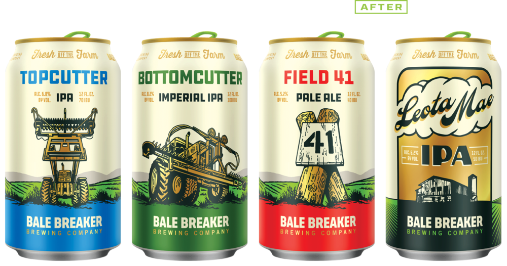
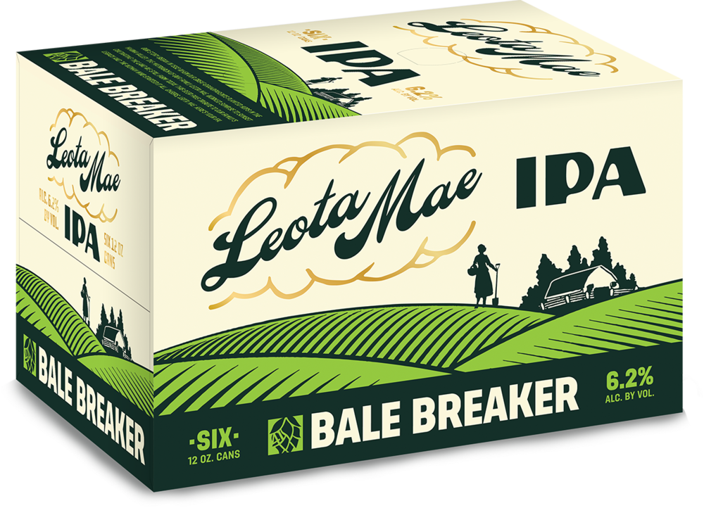
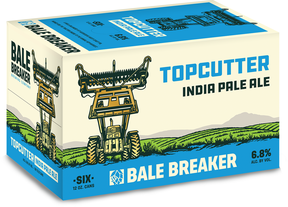
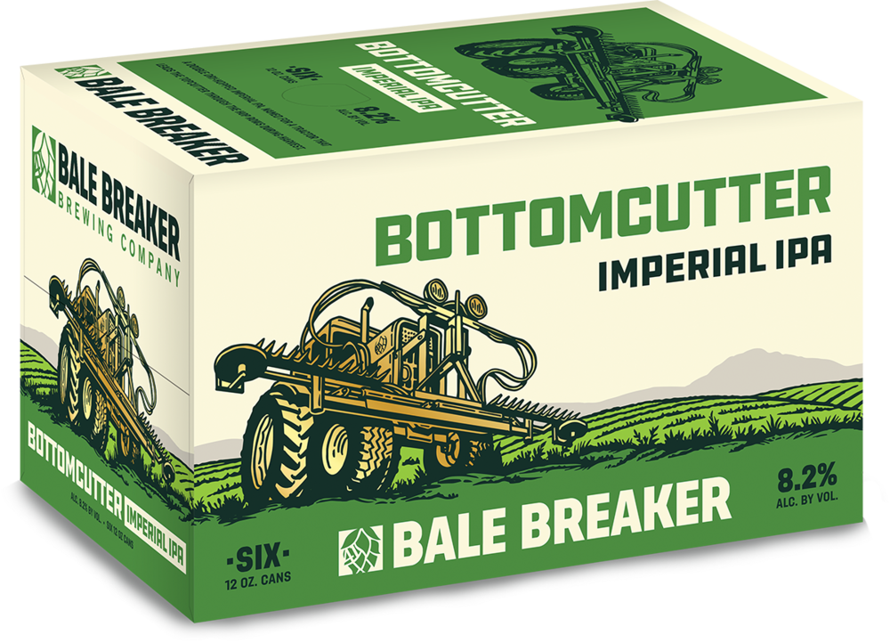
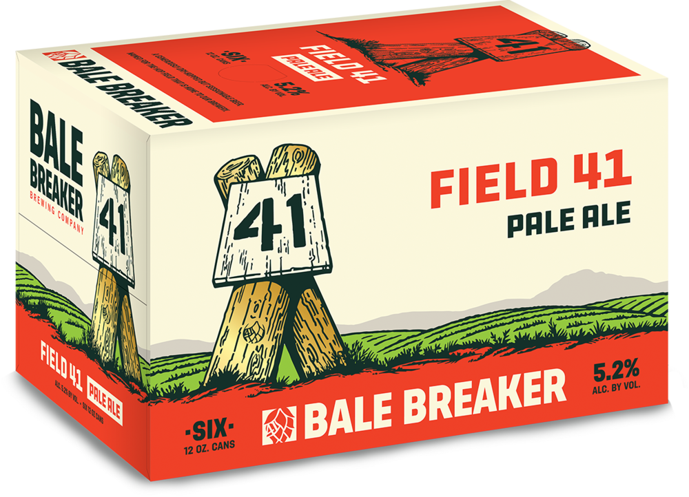
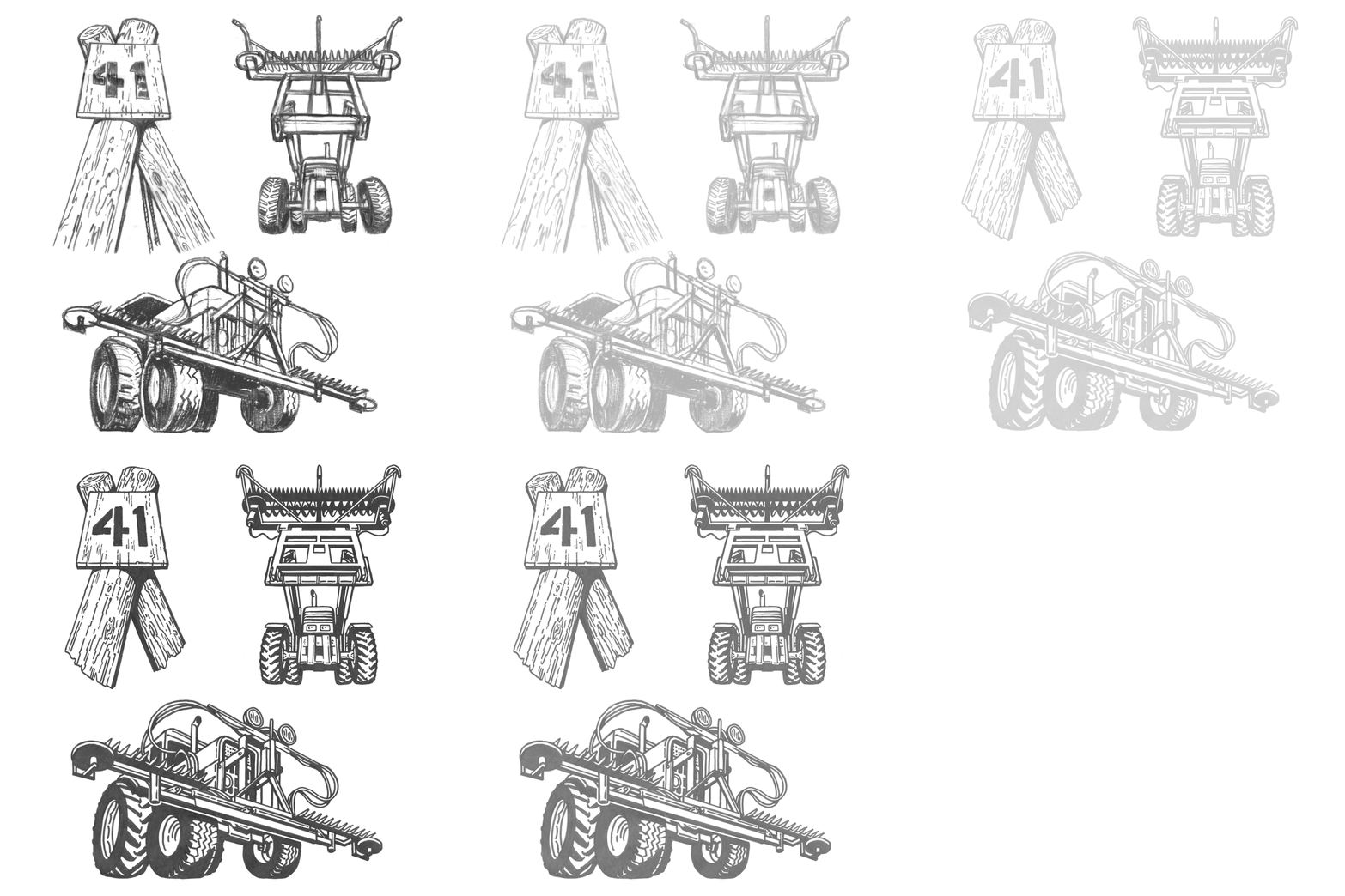
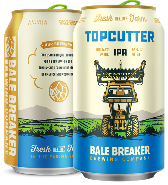
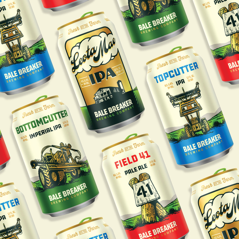
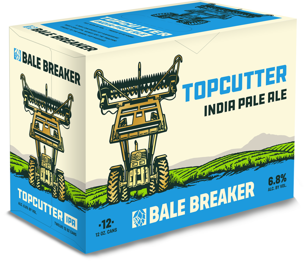
Five years ago, Bale Breaker Brewing launched their first two canned offerings, Field 41 Pale Ale and Topcutter IPA. Since then, so much has changed–both with the brewery and the market. Bottomcutter and Leota Mae IPAs later joined the core canned lineup and Bale Breaker has experienced rapid growth, rocketing to become the fifth largest independent brewery in Washington state. Working closely with them since before they even had a name, it’s been a wild ride.The original cans were successful launch into the Washington beer scene. The prominent gold began radiating from more and more coolers across the state. But as they added beers to their lineup, and shelves became increasingly crowded, it became increasingly difficult for consumers to quickly differentiate between their offerings. The state of label design also changed drastically during those first five years and it was clearly time to modernize Bale Breaker’s offerings.Another focus of the redesign was to bring each beer’s namesake more to the forefront. For a brewery uniquely located in the middle of their family hop farm, the farming equipment is a big part of their story. These custom illustrations helped us pay homage to Bale Breaker’s history and location.The redesign process resulted in cans with modern appeal that are also able to honor the past. Each beer has a strong, identifiable icon that easily extends to merch, social media and print pieces. The color coding used in the original cans has been strengthened, giving further clarity to the lineup. Boxes for the 6-packs and Topcutter 12-packs were introduced, adding another dimension to the new look. Not wanting to abandon the equity the brand had built around the color, gold accents are used throughout the designs along with a thick gold band on the side of the can containing the brewery logo.
CREDIT
- Agency/Creative: Blindtiger Design
- Article Title: Bale Breaker Can Redesign
- Organisation/Entity: Agency Commercial, Published
- Project Type: Packaging
- Agency/Creative Country: United States America
- Market Region: North America
- Format: Can
- Substrate: Metal


