


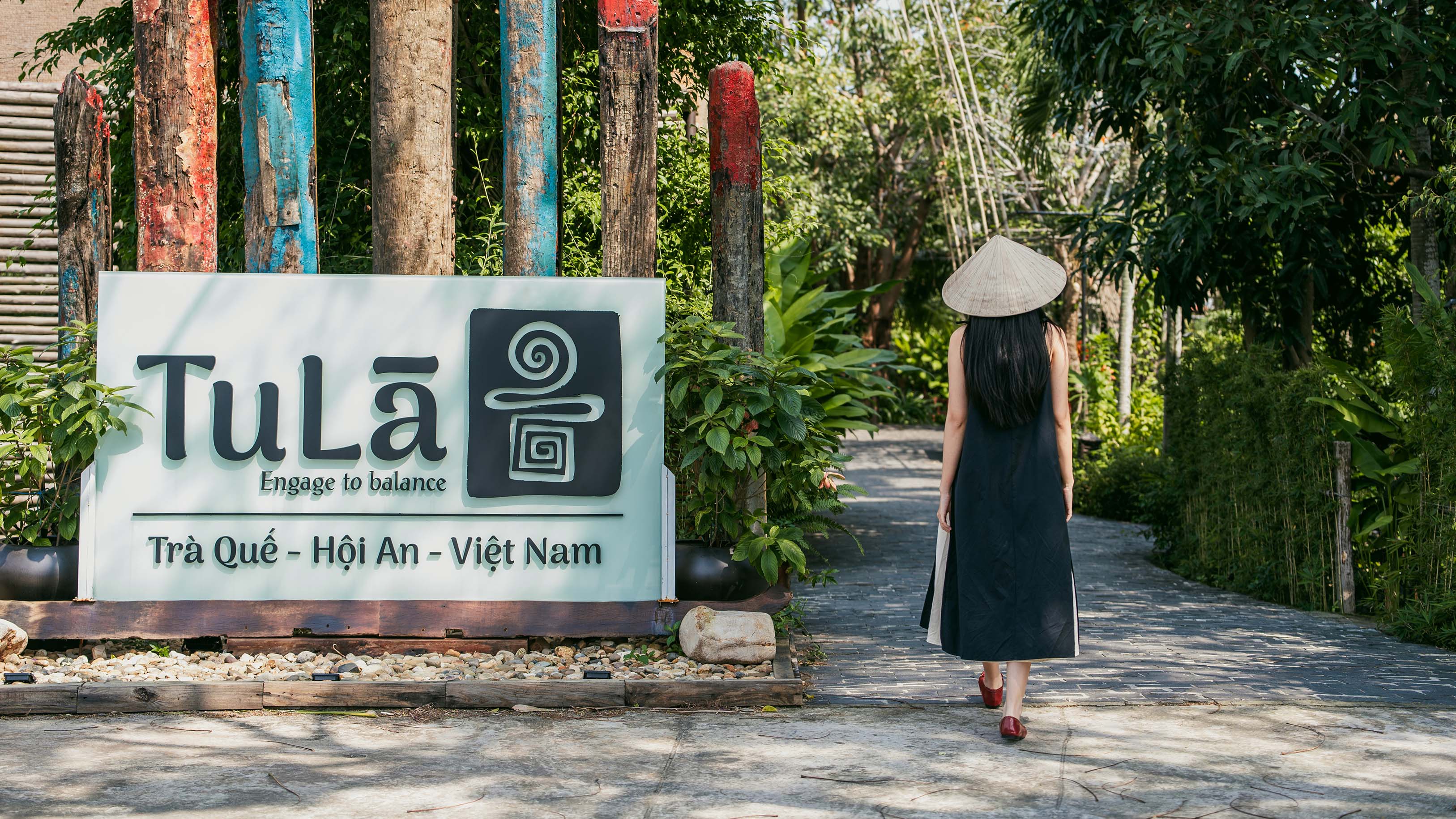
Nestled among leafy trees, Tula Spa proudly unites nature and humanity. Drawing upon the abundant flora of Vietnam, Tula Spa offers not only wellness treatments but an immersive experience that reconnects guests to the natural world.
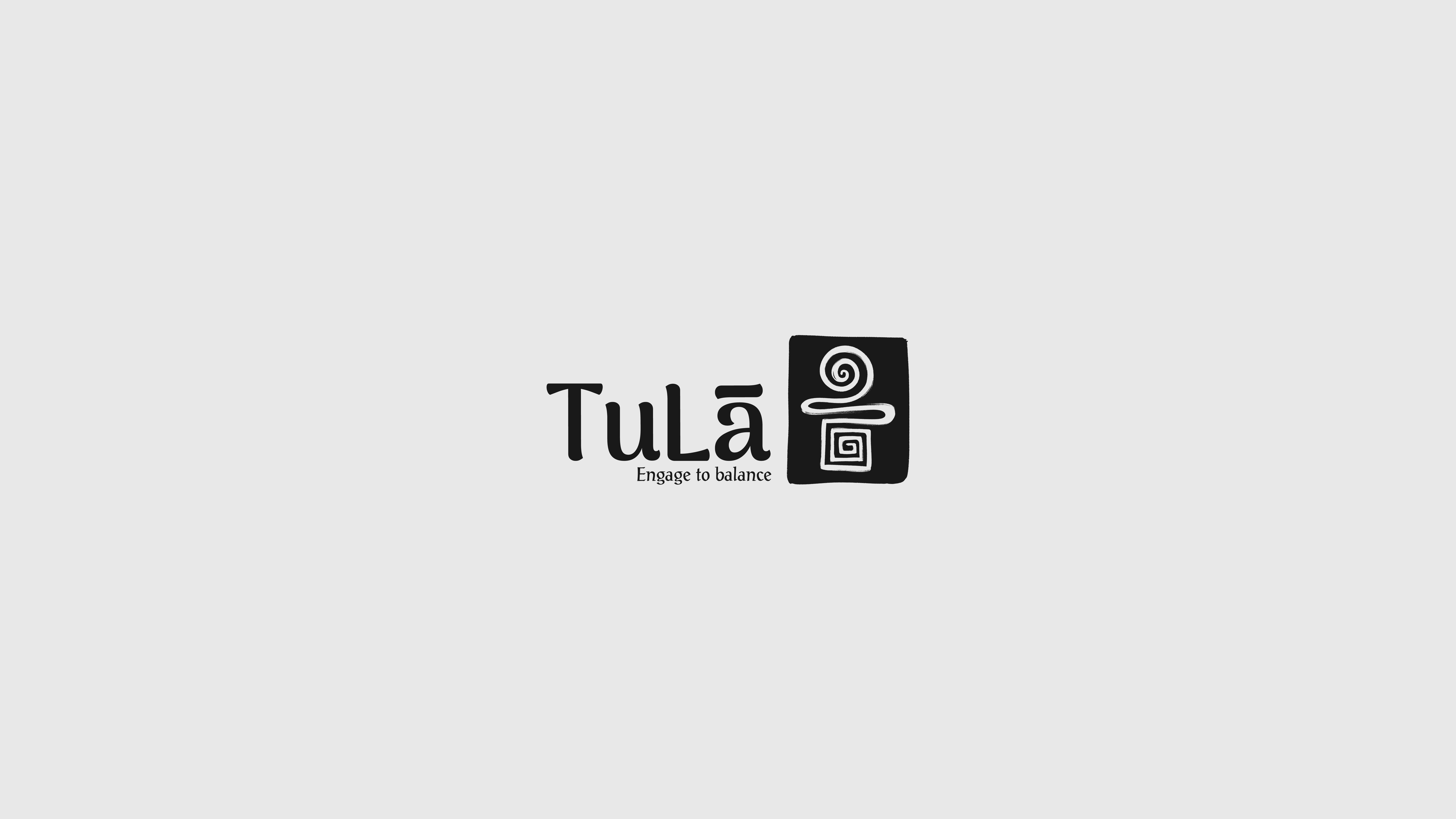
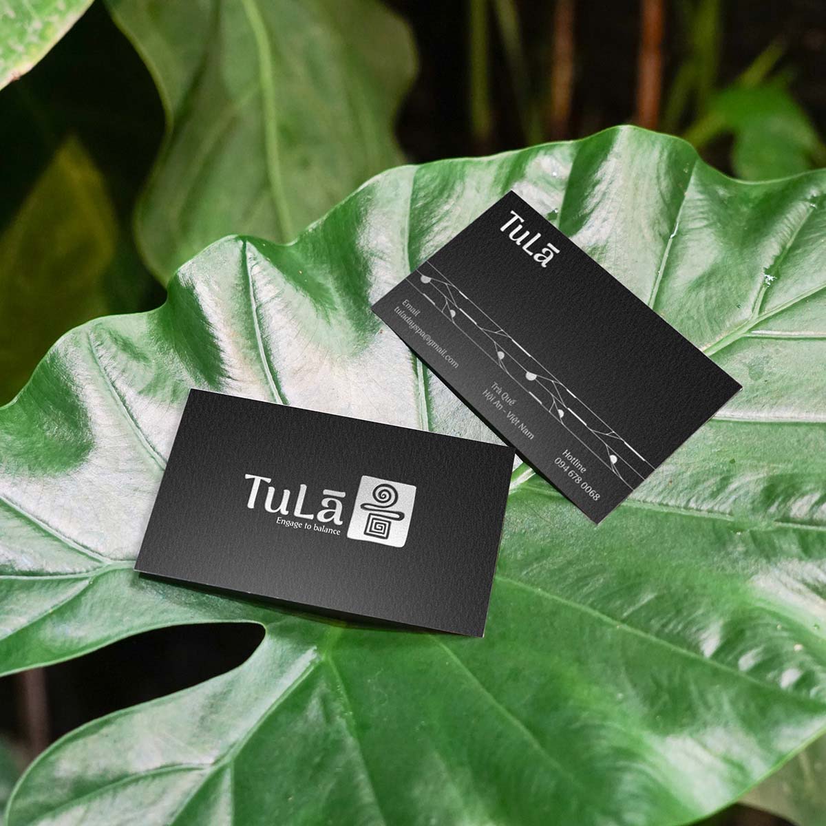
TuLa Day Spa is built on the philosophy of “Round head on top – Square feet below” embodying the balance between softness, relaxation, and stability, professionalism. This philosophy is not only a guiding principle in service quality but is also reflected in the brand identity, helping TuLa establish an image that is luxurious, sophisticated, yet approachable and trustworthy.
Flexibility and Creativity (Round head on top)
The “round top” symbolizes open-mindedness, adaptability, creativity, and fluid thinking. It can also represent wisdom, clarity, and a harmonious connection with nature.
Stability and Strength (Square feet below)
The “square base” signifies a solid foundation, resilience, balance, and discipline. It can represent ethics, strong life principles, or a physically and mentally healthy foundation.
The brand identity emphasizes the harmony between these two aspects: the soul needs flexibility to grow, but it also requires stability and endurance to preserve its core values. This philosophy is relevant in various aspects of life, from personal development to principles in art, architecture, feng shui, and even therapeutic medicine.
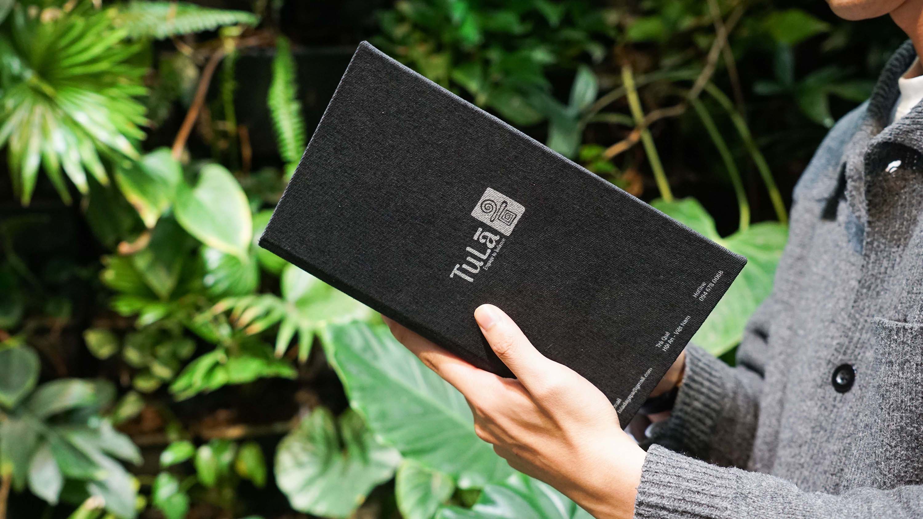
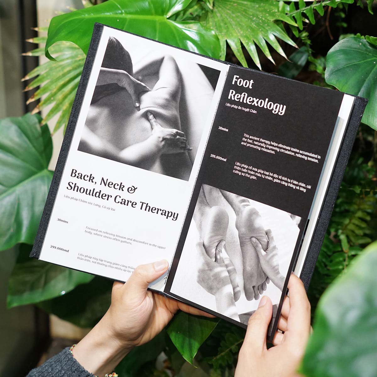
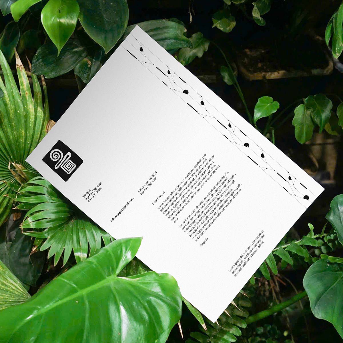
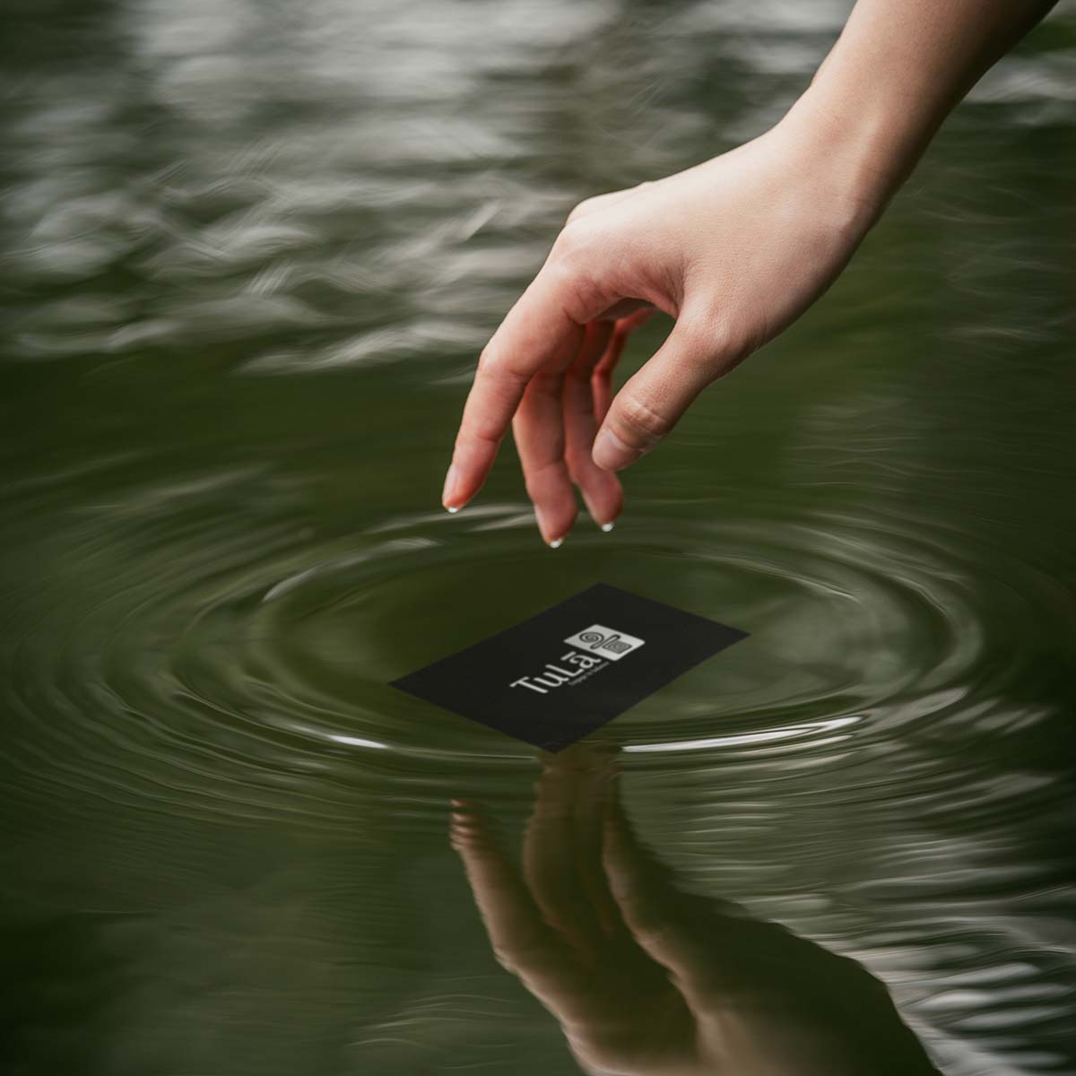
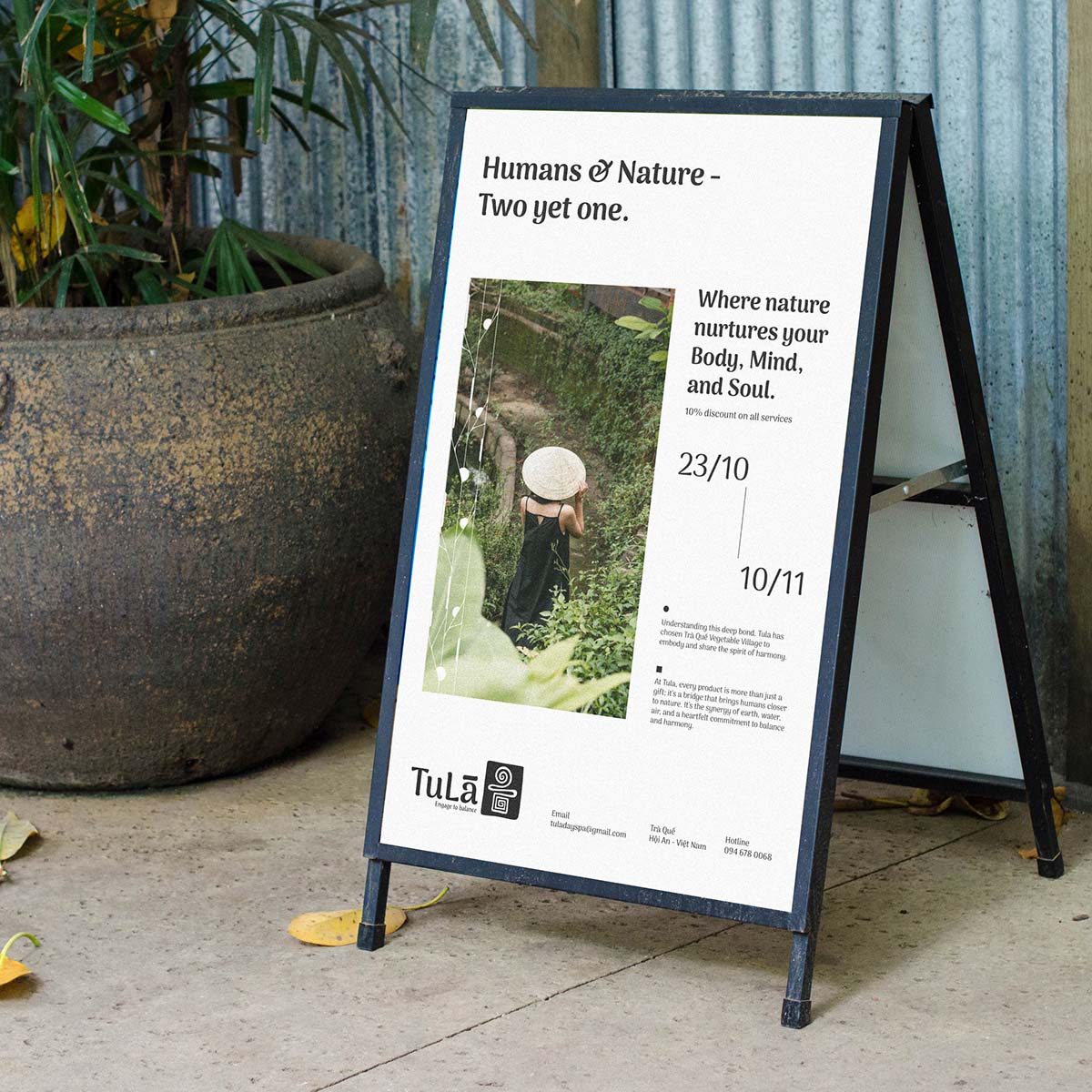
The primary color palette is black and white, reflecting closeness and sophistication. Black represents mystery, professionalism, and depth, while white symbolizes purity, minimalism, and relaxation. This contrast creates a harmonious whole, perfectly reflecting the balance the brand embodies.
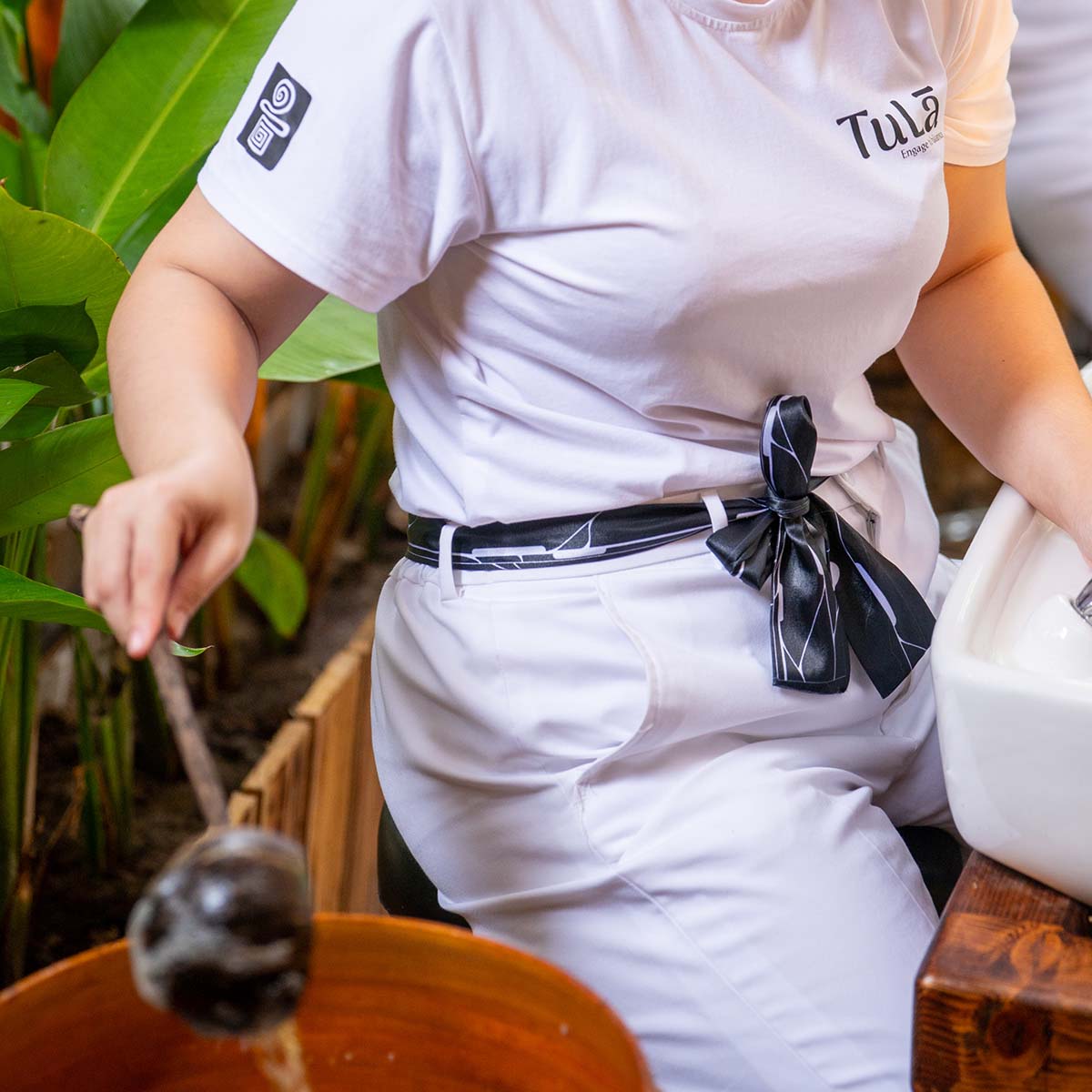
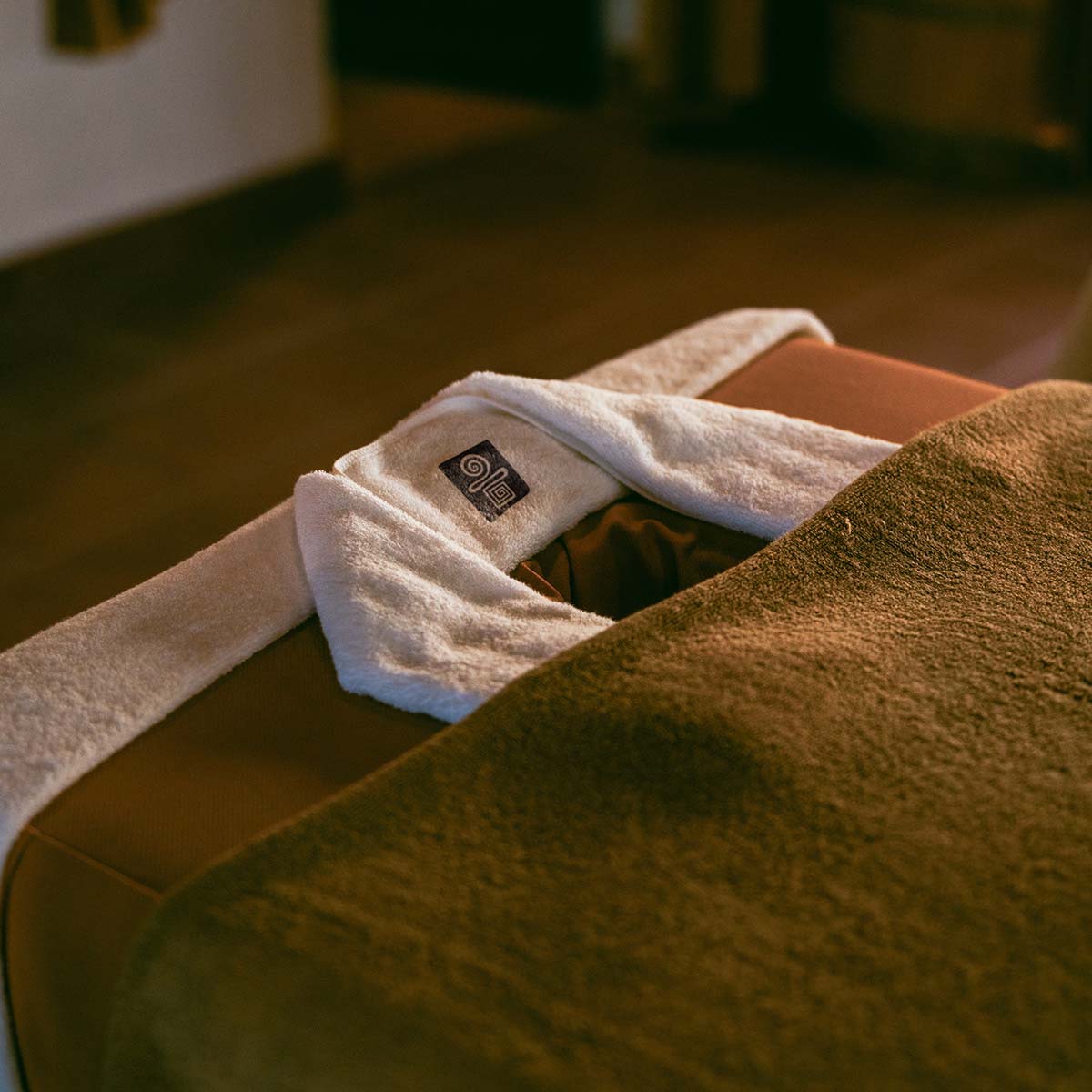
From spa interiors and staff uniforms to product packaging, everything follows a minimalist and elegant aesthetic, allowing customers to experience a sense of tranquility and completeness the moment they step into TuLa Day Spa.
CREDIT
- Agency/Creative: LN Hung
- Article Title: Balancing Nature and Sophistication: Tula Spa’s Branding by LN Hung
- Organisation/Entity: Agency
- Project Type: Graphic
- Project Status: Published
- Agency/Creative Country: Vietnam
- Agency/Creative City: AgenC
- Market Region: Asia
- Project Deliverables: Brand Identity
- Industry: Hospitality
- Keywords: Brand Identity, Spa Branding.
-
Credits:
Art Director: Le Ngoc Hung


