In a bustling city Kurashiki Okayama, Japan, sisters Yumi and Hito grew tired of their mundane jobs. One day, they shared a daring idea: starting a bakery. Driven by passion, they bid farewell to their old careers. With savings and unwavering determination, they opened “bakery two.”
Early mornings became their routine as flour danced in the air. Yumi’s artistic flair crafted delightful pastries and Osouzai bread , while Hito’s precision ensured perfection. Locals were drawn to the bakery’s warmth and the sisters’ genuine smiles.
Our brief was to create an identity that reflects their personality such as Yumi who is very playful, easy going and help making Osouzai pan and Hito who is the perectionist and in charge of the quality of the breads that are sold in the bakery.
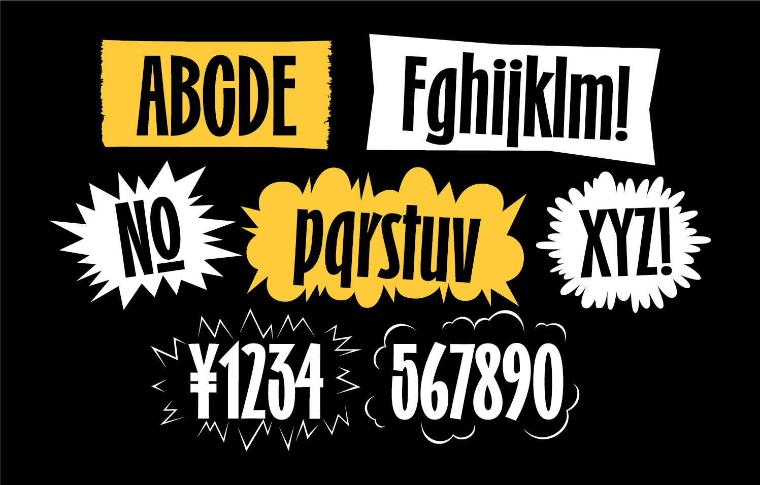
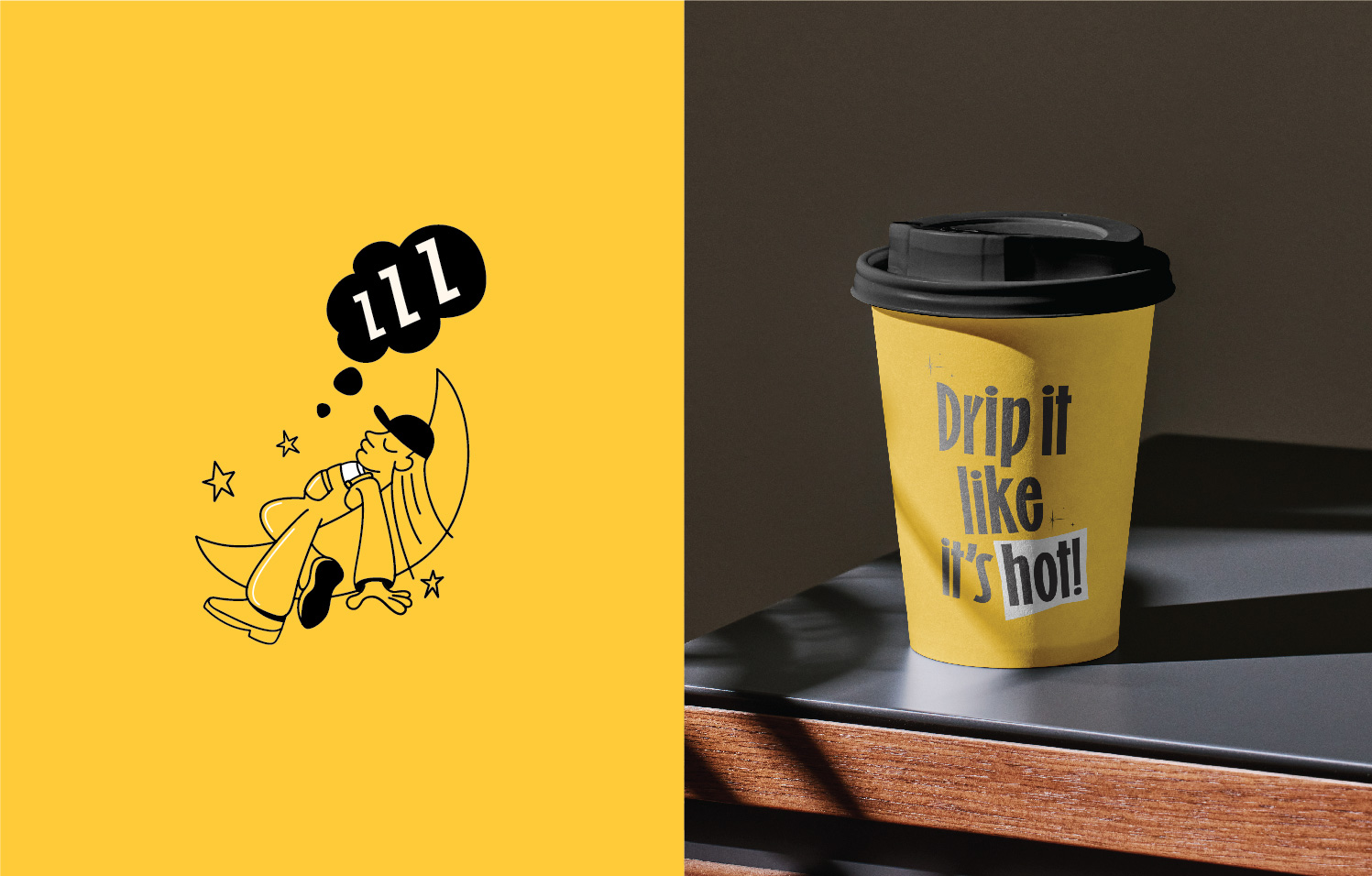
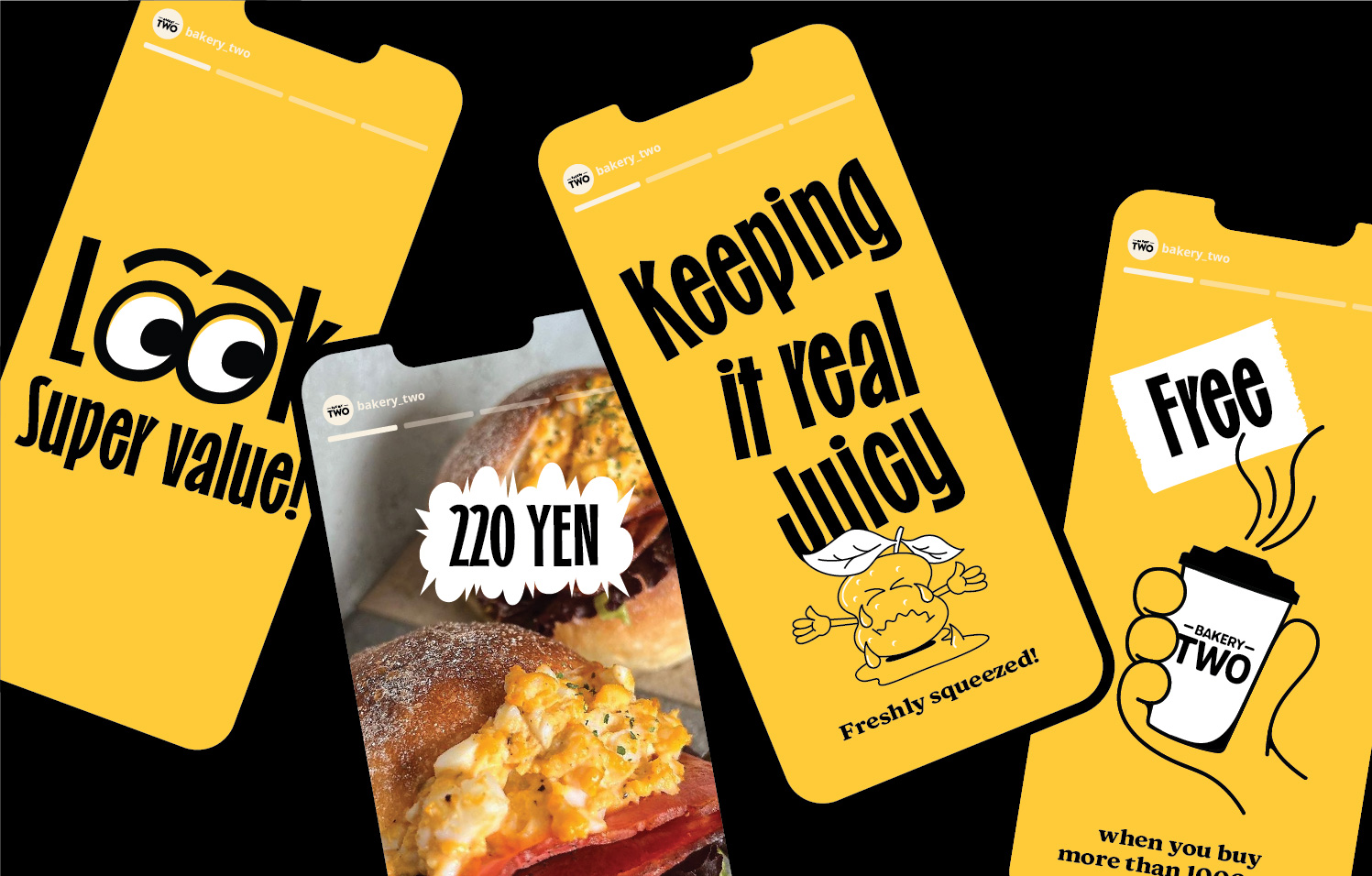
So we decided to illustrate these two character as center piece in the identity. Incorporating a mascot into your bakery’s identity can be a fun and effective way to connect with customers, strengthen your branding, and create a unique and recognisable presence in the local market. We portrayed how their daily job look like and used them in the different touch points.Incorporating yellow and black into a bakery’s identity can create a visually striking and emotionally appealing brand that sets the establishment apart and leaves a lasting impression on customers. Tone of voice we wanted to be fun and playful, also show what these sisters play hip-hop in the bakery, so we were inspired by these famous lyrics.


CREDIT
- Agency/Creative: Stamp Work
- Article Title: Bakery Two Brand Identity by Stamp Work
- Organisation/Entity: Agency
- Project Type: Identity
- Project Status: Published
- Agency/Creative Country: Japan
- Agency/Creative City: Kurashiki
- Market Region: Asia
- Project Deliverables: Brand Identity
- Industry: Food/Beverage
- Keywords: Brand Identity, typography, illustration
-
Credits:
Graphic Designer: Jin Fujiwara


