Forbes famously monikered Bagrry’s as a “Cereal Killer” brand. And for good reason! The homegrown company has managed to give stiff competition to giants like PepsiCo to become India’s second-biggest breakfast-cereal maker after Kellogg’s. Bagrry’s is an innovative venture that created a niche for itself against MNC competition. They were the first to launch muesli in India, back in 1994.
Bagrry’s grabbed attention when former US President, Mr. Bill Clinton, was served its muesli during his visit to India in the year 2000. As of 2022, the company is present across 70,000 retail outlets and exports to eight countries.
Our association with Bagrry’s began just before the pandemic, in early 2020. Up until then, all efforts related to brand packaging were managed in house. We were brought in to give the overall range a packaging refresh for existing products and a way to seamlessly introduce new variants or categories.
Today, most brands navigate a hybrid retail environment that blends both physical and digital realms. This blend offers brands a chance to innovate and rise above the clutter.
The digital retail space, notably, allows us to present our brands in a context uniquely our own, freeing us from the constraints of traditional category cues. It even paves the way to reimagine the concept of ‘Front of Pack’ and ‘Back of Pack’.
In physical retail, steering clear of the ‘me too’ brand mentality becomes even more pivotal. Products of the same sub-category are typically grouped together, making it vital for a brand to leap off the shelves to captivate a consumer’s attention.
Yet, many brands paradoxically choose to mirror the visual style of category leaders, adhering almost religiously to ‘category cues’. This often results in a ‘sea of sameness’, where distinct brand identifiers like colours and forms are misconstrued as category cues.
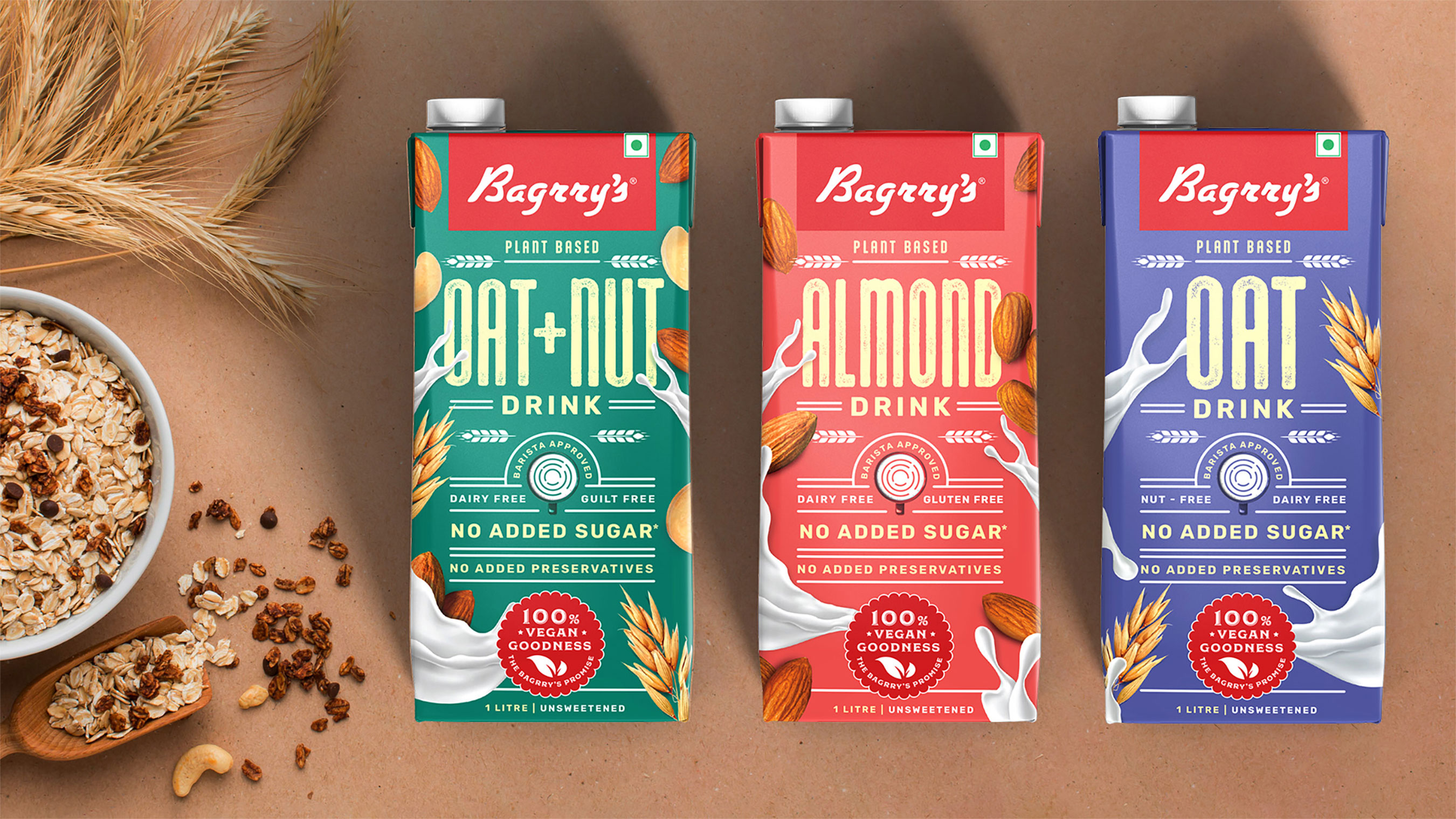
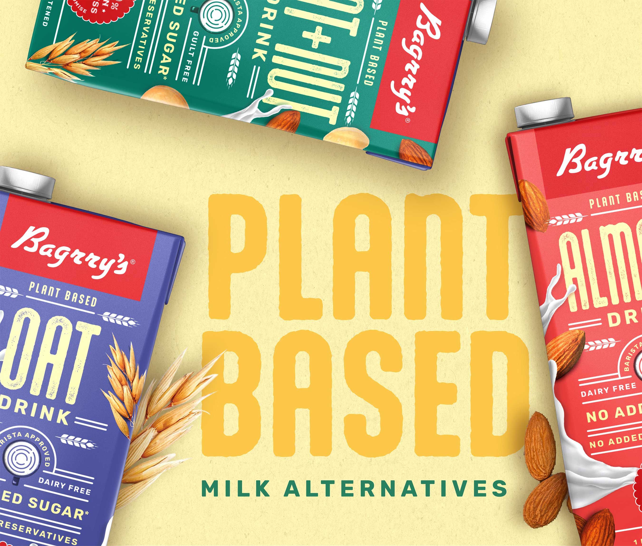
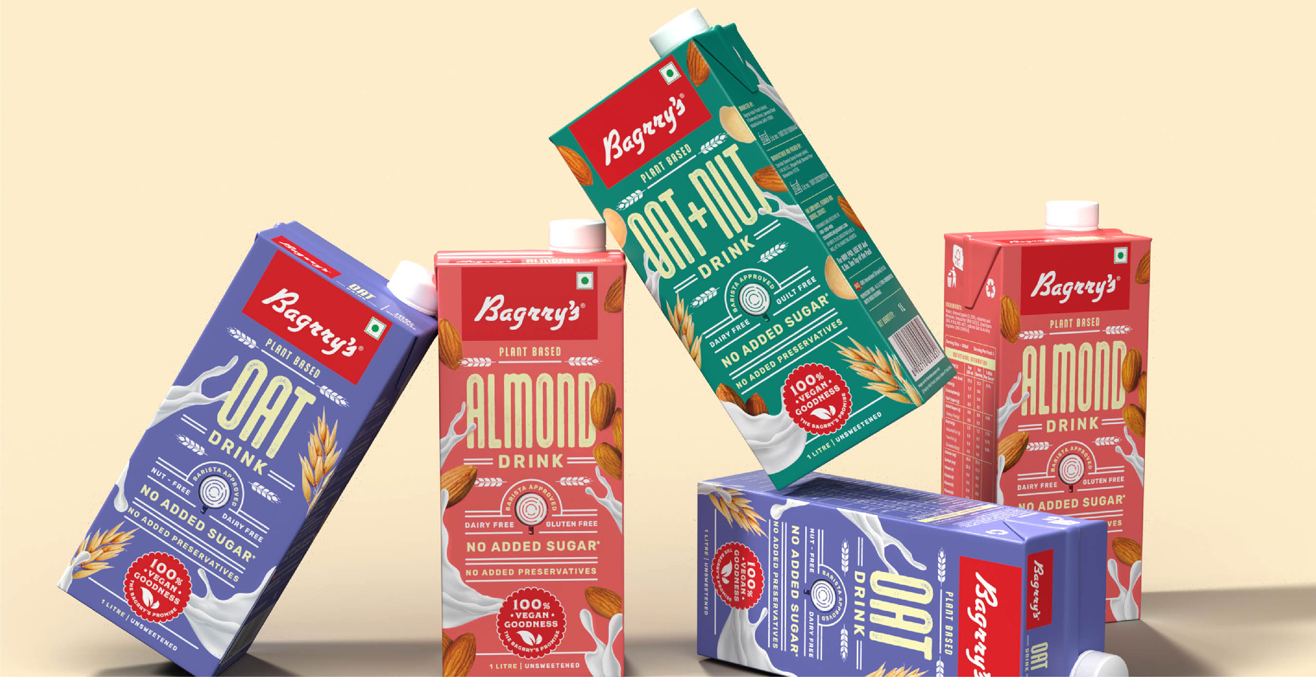
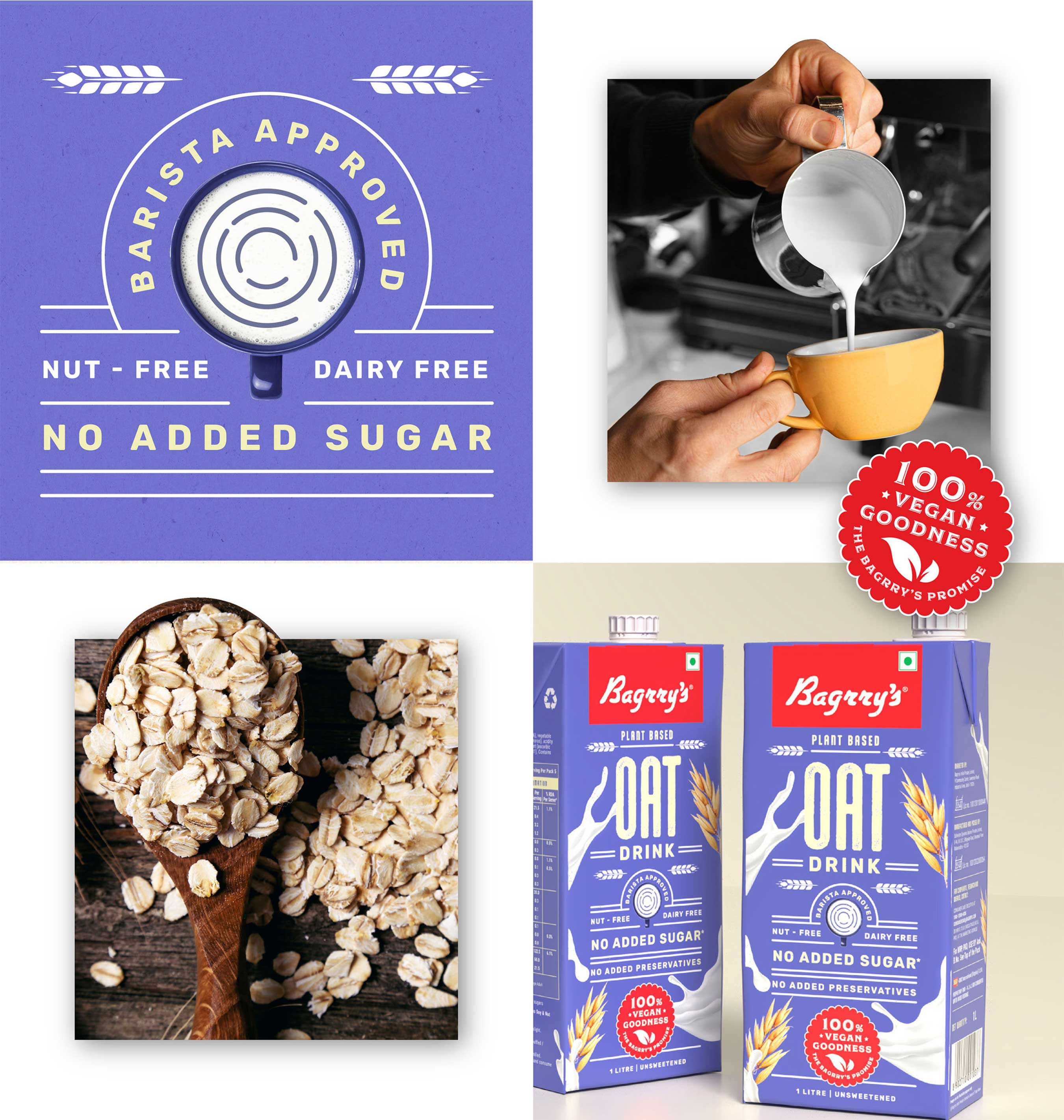
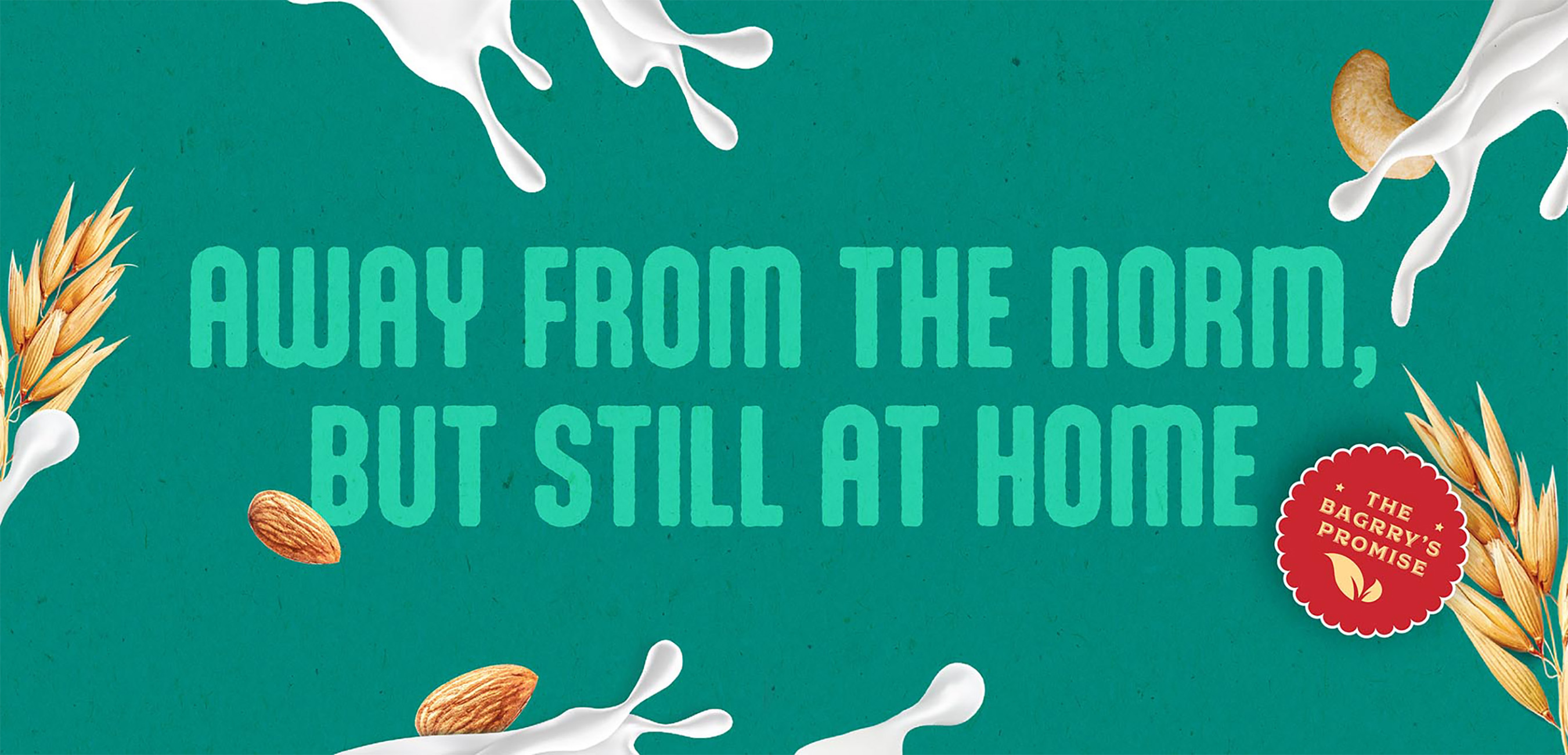
Our typography-led packaging design for Bagrry’s is more than just a design choice; it’s a strategic move that narrates a story. It pays homage to the brand’s legacy in the breakfast category while signalling their thrilling foray into plant-based milk alternatives.
By doing this, we’re not merely launching a new range. We’re showcasing the brand’s capacity to innovate within the structure of an established legacy. It’s our way of declaring, ‘We’re the Bagrry’s you trust, and we’re ready to surprise you.’

CREDIT
- Agency/Creative: Stratedgy
- Article Title: Bagrry’s Vegan Range Positioning and Packaging Strategy by Stratedgy
- Organisation/Entity: Agency
- Project Type: Packaging
- Project Status: Published
- Agency/Creative Country: India
- Agency/Creative City: Mumbai
- Market Region: Asia
- Project Deliverables: Packaging Design, Packaging Guidelines
- Format: Box
- Industry: Food/Beverage
- Keywords: vegan, milk, packaging, beverage, design
-
Credits:
Creative Director: Krupa Sheth Kapadia
Lead Designer: Anuja Mehta


