


Badger Hair Oil Packaging Rebrand
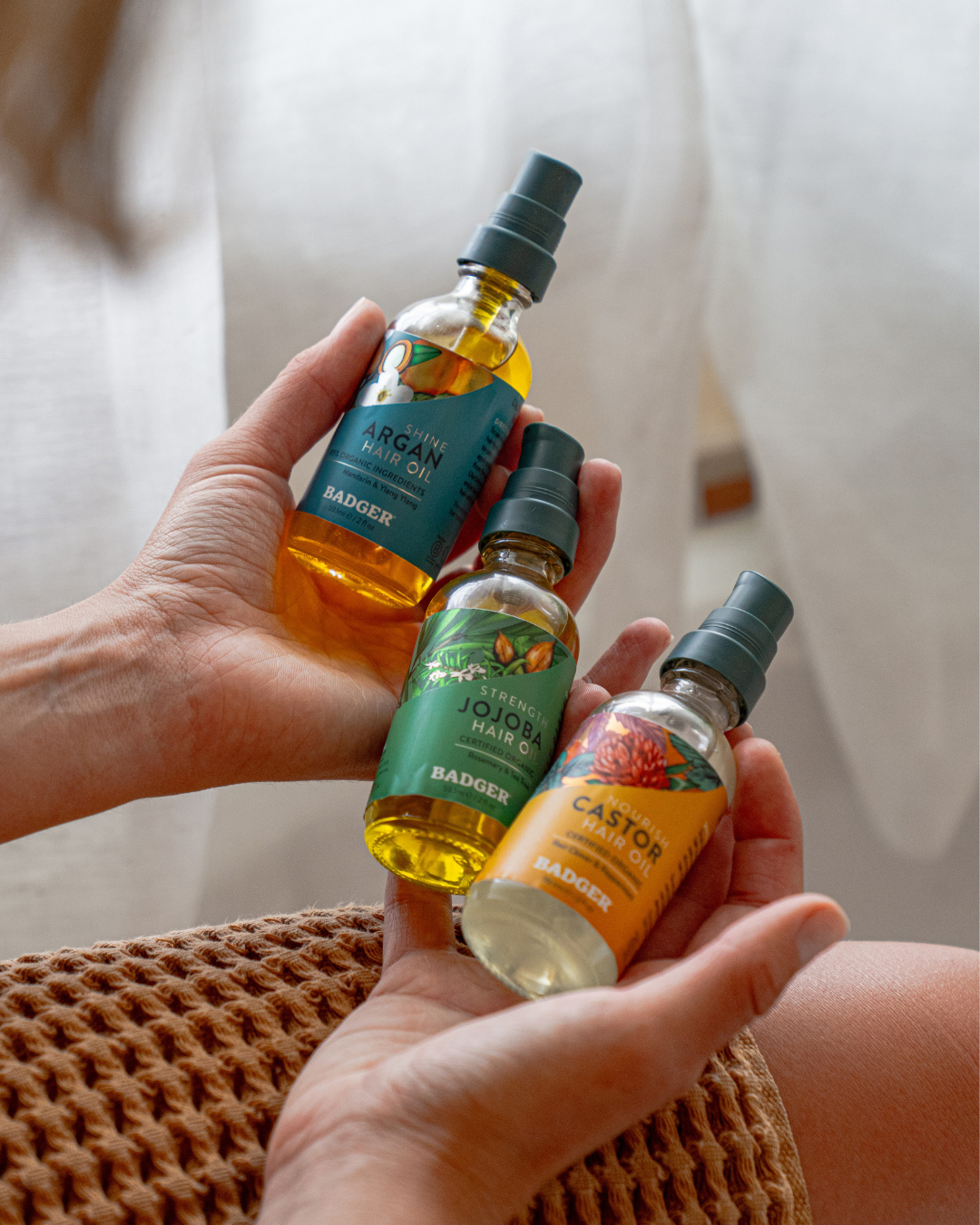
Badger is a mission-driven family-owned company located in the woods of New Hampshire. They blend the finest organic plant extracts, exotic oils and beeswax. On their journey to create a healthier world, they wanted to rebrand their Hair Line of packaging which included the Jojoba Hair Oil. The new improved formula needed packaging that featured the hero of the product: the organic ingredients.
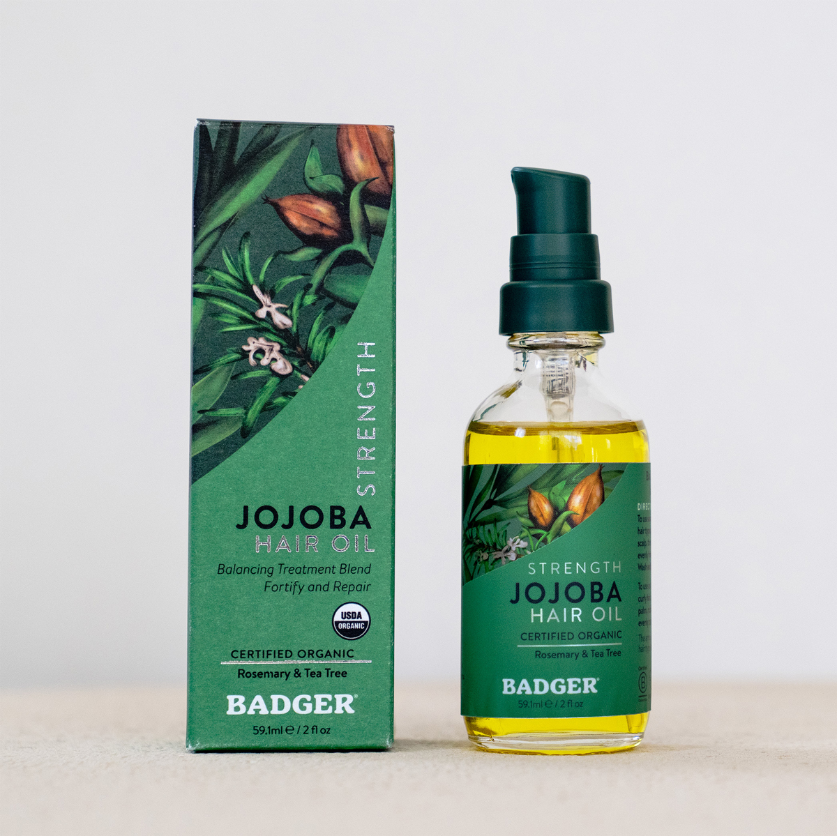
The new look focuses on a premium aesthetic and a more luxury feel. We elevated the box packaging and product label with original hand painted ingredients. Each illustration is carefully painted playing off the nourishing details of each organic plant. When the product itself is so masterfully created, the branding and packaging should follow suit. After all, its the packaging on the shelf that grabs the customers eye and entices them in to buy the product. A well-designed label is clean, quickly conveys the product information while also telling a story and making you feel a certain way.
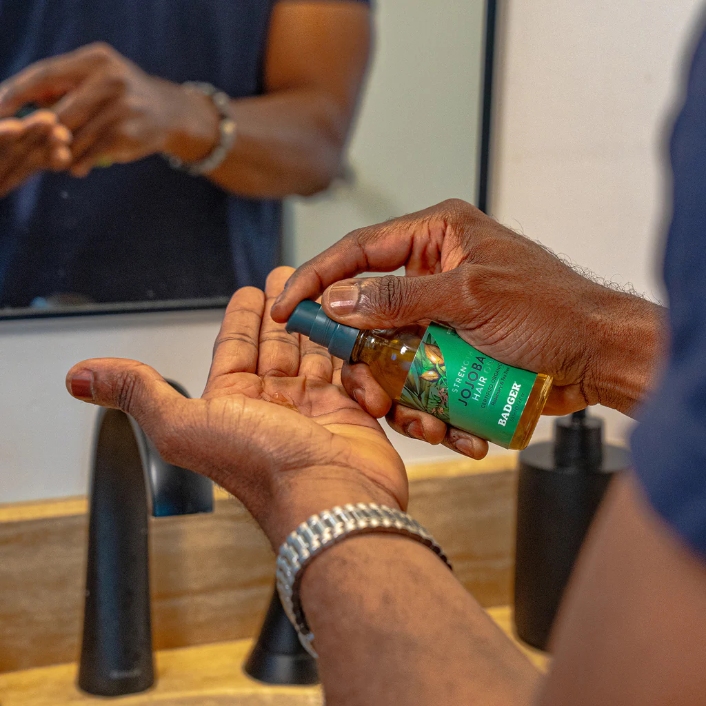
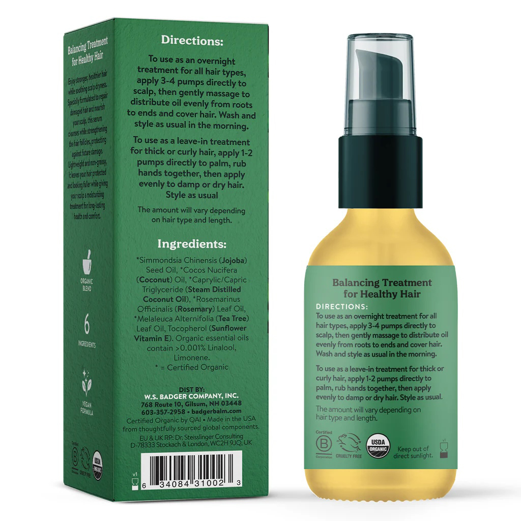
Say hello to stronger hair and a hydrated, soothed scalp. This lightweight, non-greasy serum is specially formulated to repair the look of damaged hair, strengthen hair follicles, and deeply hydrate while providing long-lasting moisture to soothe your dry, irritated scalp. Featuring organic jojoba oil as the hero ingredient, this blend cleanses your scalp and hair with organic tea tree oil and rosemary oil while strengthening your hair follicles with organic coconut oil, protecting your hair against future damage. USDA Certified Organic, vegan, and cruelty-free — because your hair deserves the very best!
New Look, New Formula—Same Badger Care!
We’ve given our Jojoba Hair Oil a fresh new update—inside and out!
Say hello to our revitalized packaging that reflects what we value most: simplicity, strength, and sustainability.
Then: Our classic label with a traditional apothecary vibe
Now: A modern, botanical-inspired design that highlights the certified organic ingredients inside.
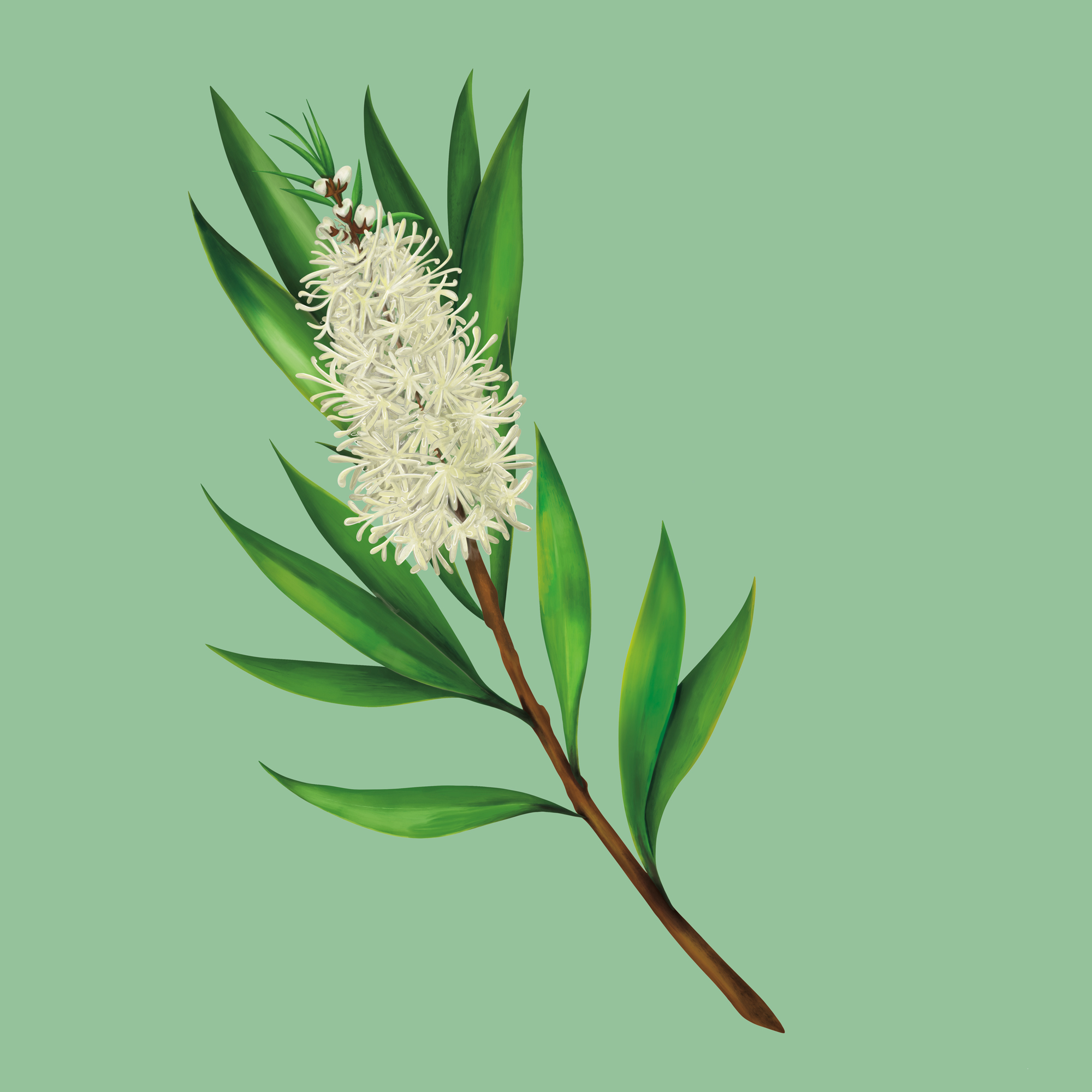
But this isn’t just a glow-up—our new formula is expertly crafted to deliver even more strength and nourishment, with the same clean ingredients you trust. Infused with rosemary & tea tree, it’s perfect for a stronger, healthier scalp and strands.
Fresh look. Improved formula. Same heart.
Illustration Style Overview:
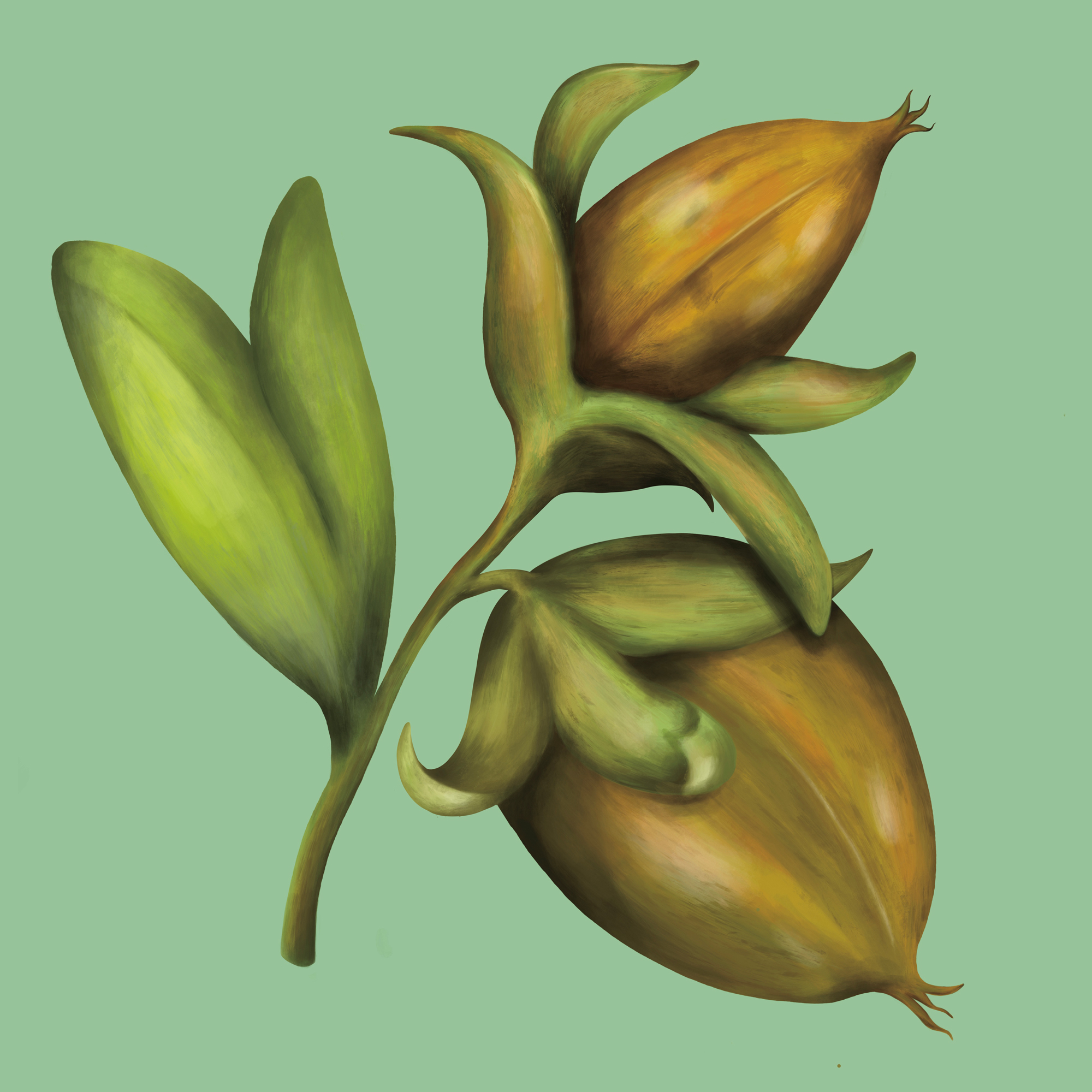
Botanical Realism: The plant is drawn with attention to anatomical accuracy—notice the detailed flower structure, vein placement on the leaves, and natural color transitions. It captures the true essence of the plant species while slightly idealizing it for visual appeal.
Painterly Digital Art: The shading and highlights appear hand-painted, likely created using digital brushes that emulate traditional media like gouache or watercolor. The gradients are smooth, not overly vectorized, giving a soft, natural finish.
Clean, Minimal Background: The solid, muted green background allows the plant to take center stage. This is a popular choice in modern product or packaging design, where botanical elements are featured as hero visuals against simple, non-distracting backdrops.
Natural, Earthy Palette: The greens, whites, and browns are rich but slightly muted—giving it an organic, trustworthy, and clean beauty feel that aligns well with wellness and sustainable product branding.
Visual Design & Style
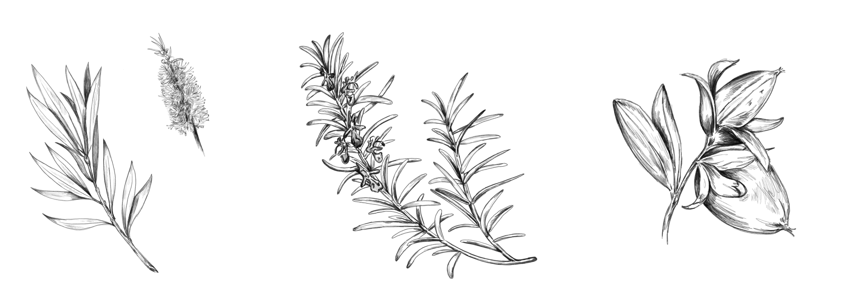
Botanical Artwork Focus: The packaging features detailed, digitally painted illustrations of jojoba seeds, rosemary, and tea tree—the key ingredients in the formula. These botanicals wrap around the label and box, acting as a rich, visual storytelling element that communicates the purity and plant-based nature of the product.
Painterly Realism: The illustrations are done in a realistic-yet-artistic style, with soft shading, layered textures, and organic detailing. This evokes trust, earthiness, and care, aligning with the clean beauty space.
Matte Green Color Palette: The primary green tones (muted sage and deep forest) convey calm, natural strength, and organic wellness. The matte effect on the box (or simulated in the render) gives a tactile, earthy look that complements the product’s positioning as certified organic.
Typography & Layout
Minimal Serif & Sans Serif Mix: The product name uses a combination of all-caps serif (for “STRENGTH”) and clean sans-serif (for “JOJOBA HAIR OIL”). This contrast adds elegance while keeping it approachable and modern.
Hierarchy of Information: The text is well-balanced, guiding the eye from product type and benefit (“Balancing Treatment Blend,” “Fortify and Repair”) to certification (“USDA Organic”) and key ingredients. Everything is clear and intentional.


CREDIT
- Agency/Creative: Hoot Design Studio
- Article Title: Badger Hair Oil Packaging Rebrand by Hoot Design Studio
- Organisation/Entity: Freelance
- Project Type: Packaging
- Project Status: Published
- Agency/Creative Country: United States
- Agency/Creative City: York
- Market Region: North America
- Project Deliverables: Brand Design, Digital Painting, Drawing, Graphic Design, Illustration, Label Design, Packaging Design, Painting, Rebranding
- Format: Box
- Industry: Beauty/Cosmetics
- Keywords: skincare, beauty, oil, packaging, skin, hair care, illustration, painting, botanicals, flowers, brand identity, branding design, rebrand, rebranding, digital painting, illustrator, beauty packaging, cosmetic packaging, cosmetics, label design, herbal, natural, organic
-
Credits:
Jen Borror: Jen Borror


