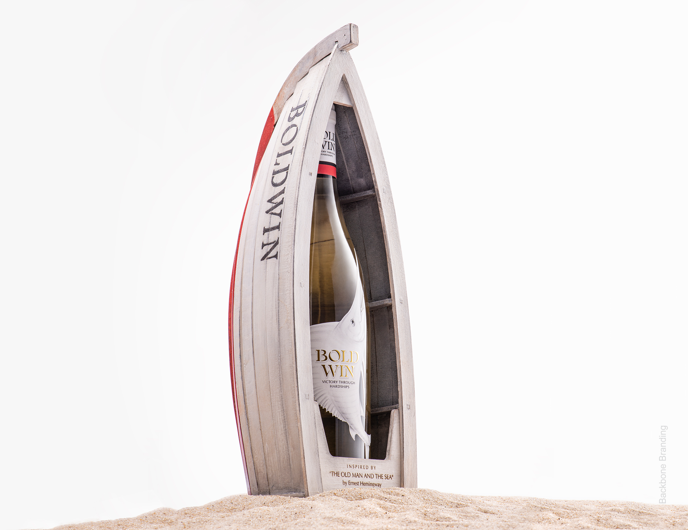
Challenge: The challenge for this self-promotional project was to create a product that would reflect the path our agency has undergone since its foundation. We aimed to express the road of seemingly endless difficulties, source of our inspiration, strength for not giving up and triumph over any hardship that occurred on the way through simple packaging.
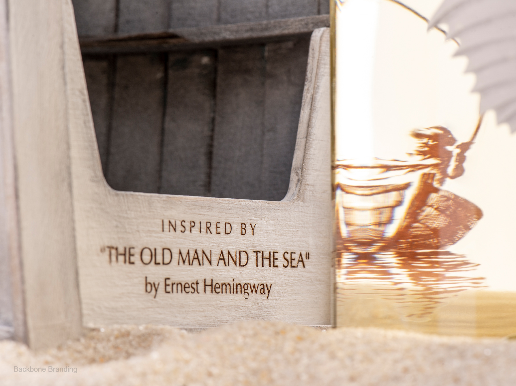
Solutions: We found the solution in the novel “The Old man and the Sea” by Ernest Hemingway that describes this journey in a most explicit and accurate way. The journey of the old man to the open sea is the bright representation of the pathway of our agency through the raging waves of difficult years. We drew parallels with the man not having any catch for the last 84 days with the tough and “desperate” days that we also went through during those years.
The arrogance of Santigo’s (the old man) younger years, where he was “el campeón”- the champion, is now transformed into humility, maturity and apprehension that he is standing before Someone bigger than himself and his destiny and victory is not dependent on himself alone.
Likewise, we are humbled by the years of hardships and endless struggle, understanding that real victory and triumph is the one over ourselves, over our fears and over our own failures.
The compassionate love and respect of the old man towards the sea and his deep appreciation of everything surrounding him symbolizes our passion towards our work, towards design and Nature – the infinite source of our inspiration. Everyone needs to find something worth fighting for, and we found ours. We love what we do and that encourages us to wake up every day and continue that battle with love, dignity and respect. We strive for new challenges and achievements, for better and higher standards, creating beauty and aiming to make a change in the world. We respect the challenges we face as the old man respects his challenges, which is the guarantee of our success.
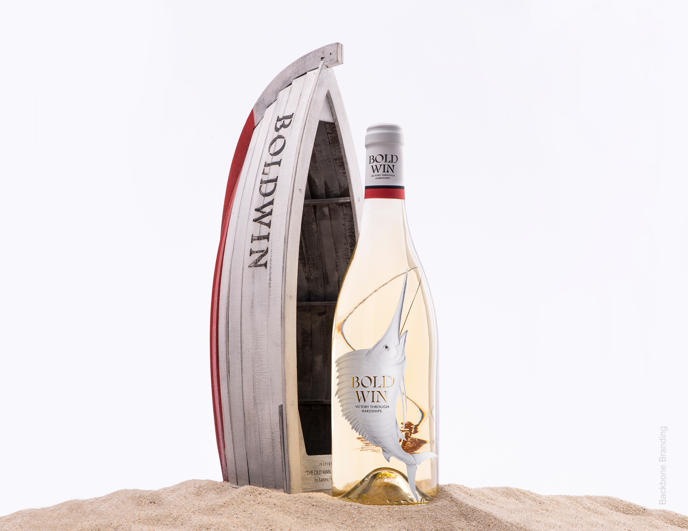
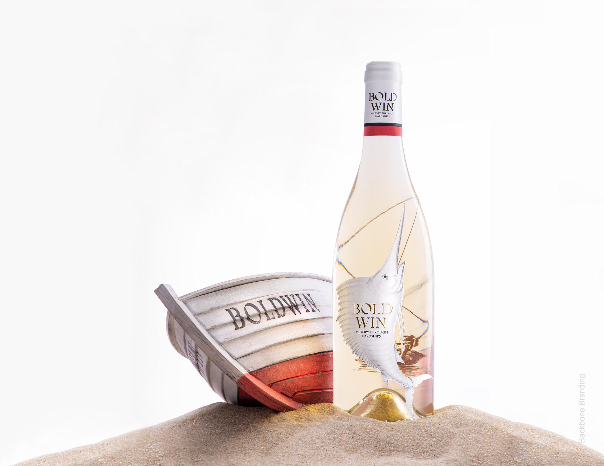
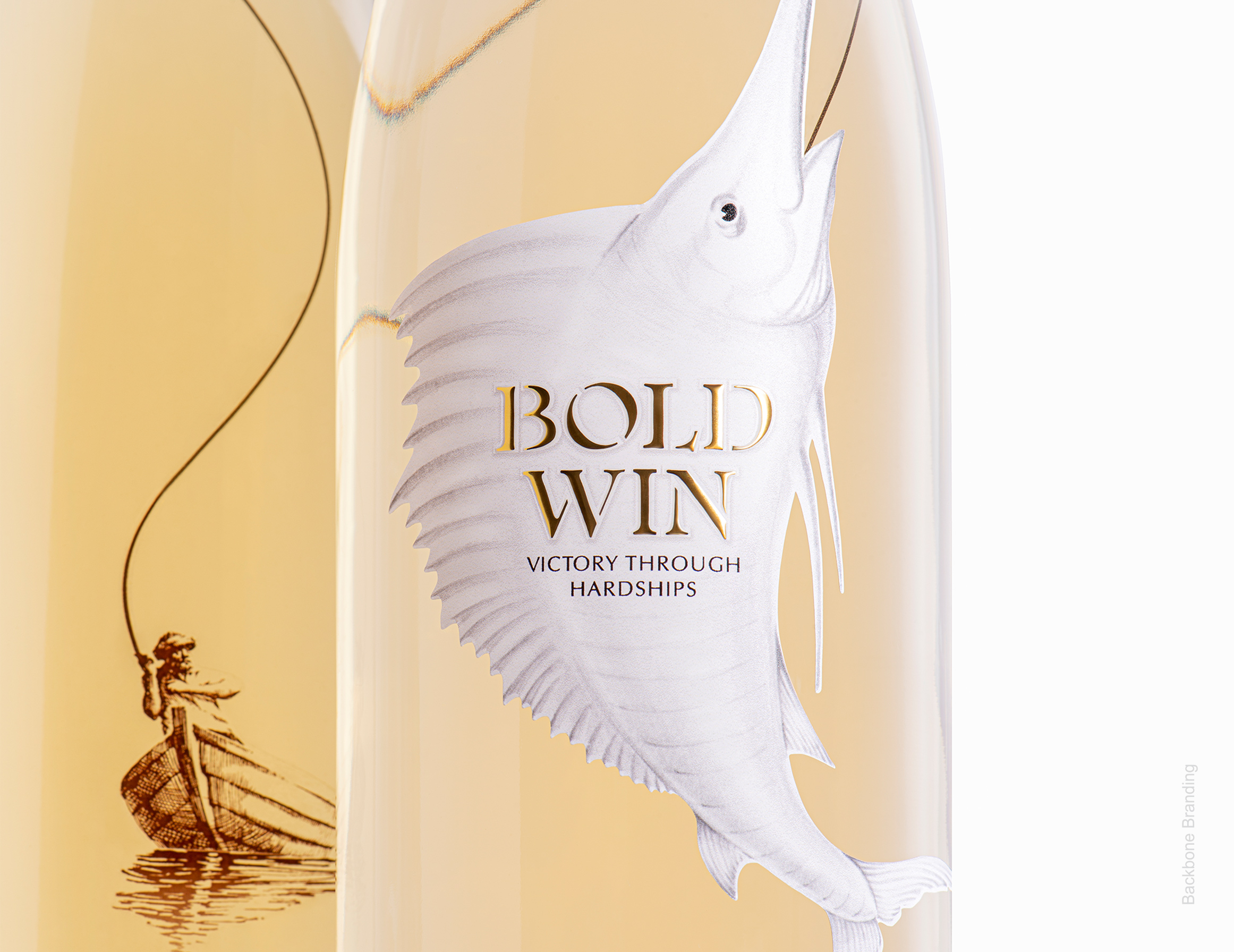
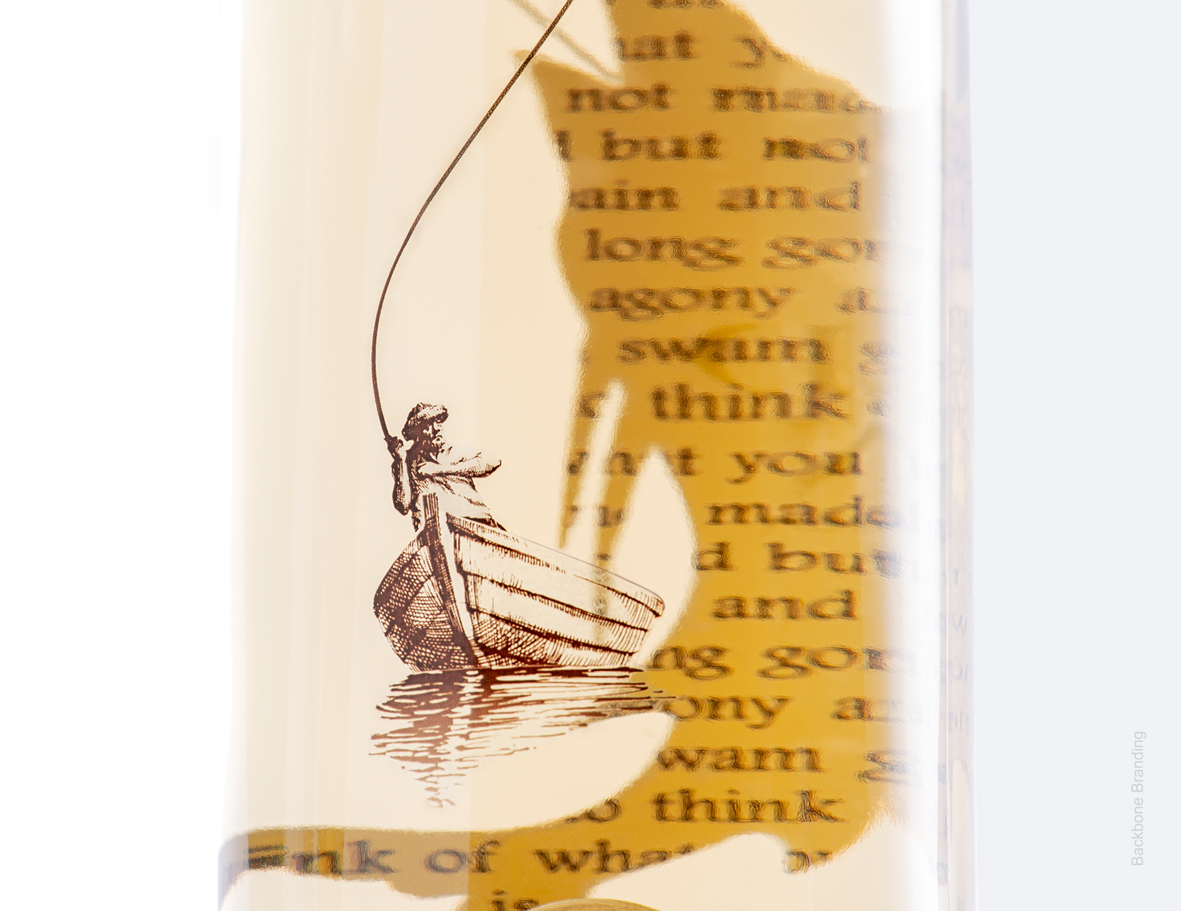
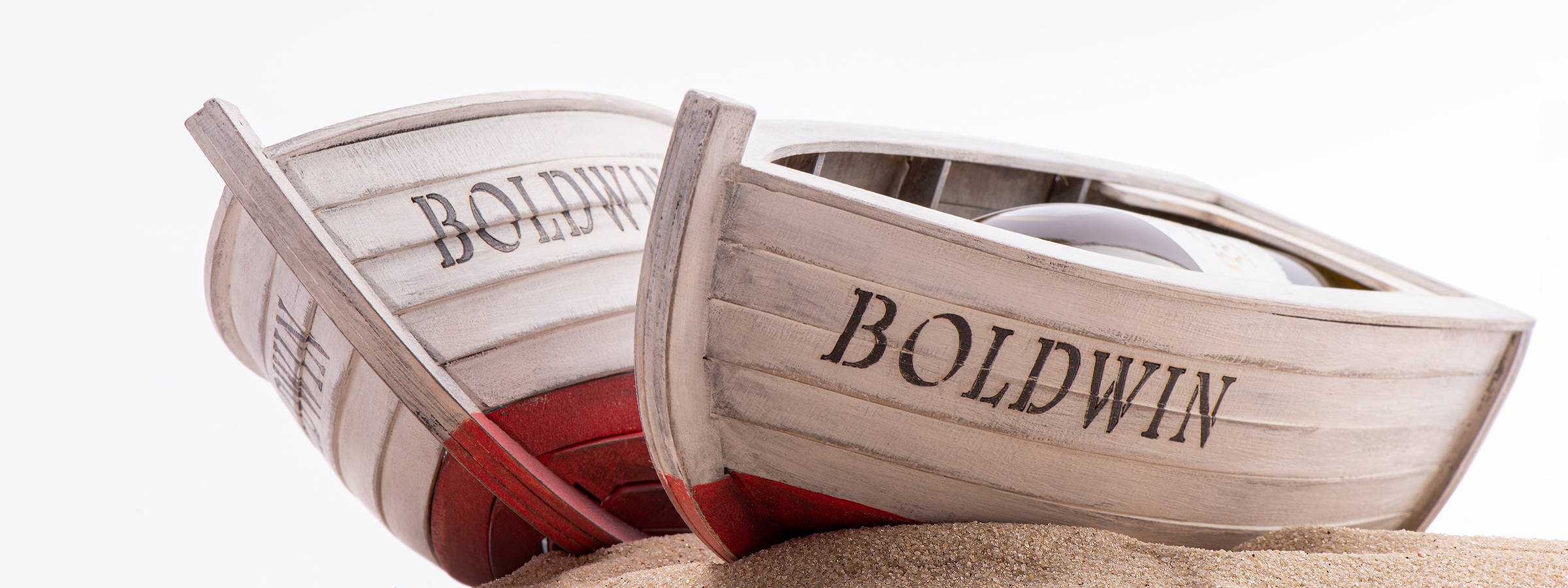
Results: The bottle of white wine is the expression of the sea, with marlin – as the label on one side connected with the old man with the harpoon to the other side of the bottle.
That is the illustration of our victory over challenges that are times larger than our possibilities and resources. Persistence and consistency are the warrantors of victory through hardships, and we know that.
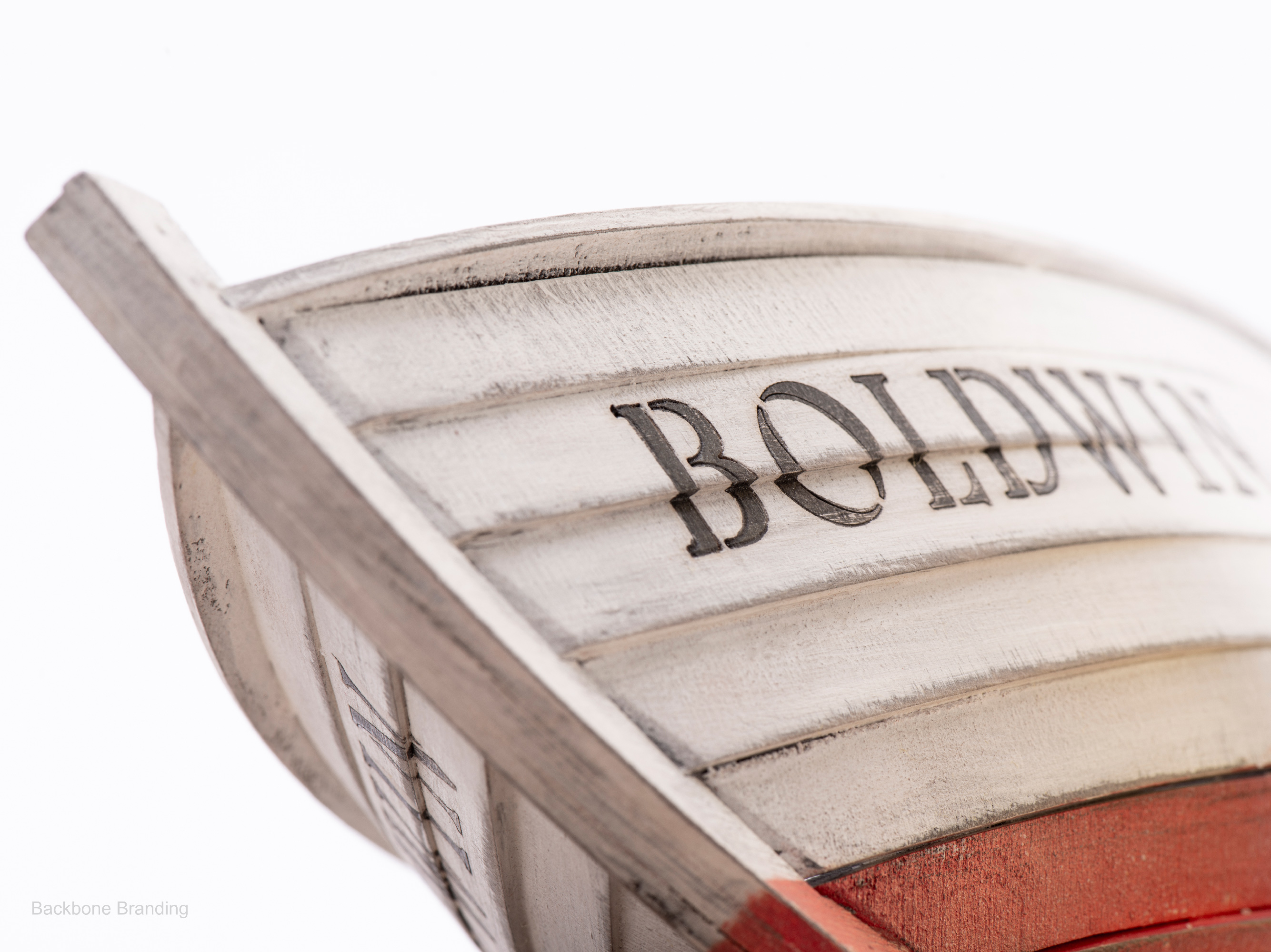
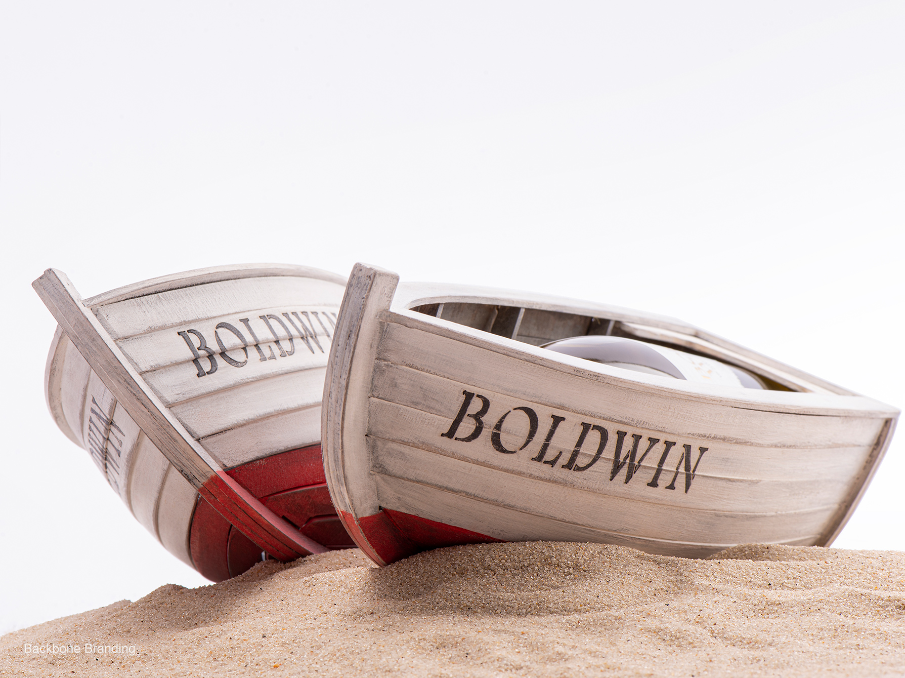
The packaging of the bottle is the ship itself, which symbolizes our everyday choice of departing in the open sea and striving for the things that are worth fighting for. If you look through the bottle from the side of the old man and his ship, you will see quotes from the story of Hemingway on the backside of the label of marlin. These texts symbolize the process of overcoming every challenge and difficulty: that stories make us who we are.
The name ”Bold Win” is chosen to praise the fighters and encourage them to fight until victory.
CREDIT
- Agency/Creative: Backbone Branding
- Article Title: Backbone Branding’s Self-Promotion Bold Win Wine Project
- Organisation/Entity: Agency
- Project Type: Product
- Project Status: Published
- Agency/Creative Country: Armenia
- Agency/Creative City: Yerevan
- Market Region: Europe
- Project Deliverables: Brand Naming, Design, Product Design
- Industry: Food/Beverage
- Keywords: Bold Win, Backbone Branding, Self Promotion, Wine
-
Credits:
Brand Strategist: Lusie Grigoryan
Creative Director: Stepan Azaryan
Product Designer: Enok Sargsyan
Illustrator: Marietta Arzumanyan
Designers: Stepan Azaryan and Marietta Arzumanyan
Video Creator: Sahak Zarbabyan, Boris Vardanyan


