The Brief: Just say the word Tomacho, doesn’t it simply uplift your mood and make you smile? These shiny red fruits truly inspire us and spark our creativity. Therefore for a project about tomato derived products , we wanted to create a whole story around this main ingredient, and express through our design our love for the number 1 most popular fruit in the world!
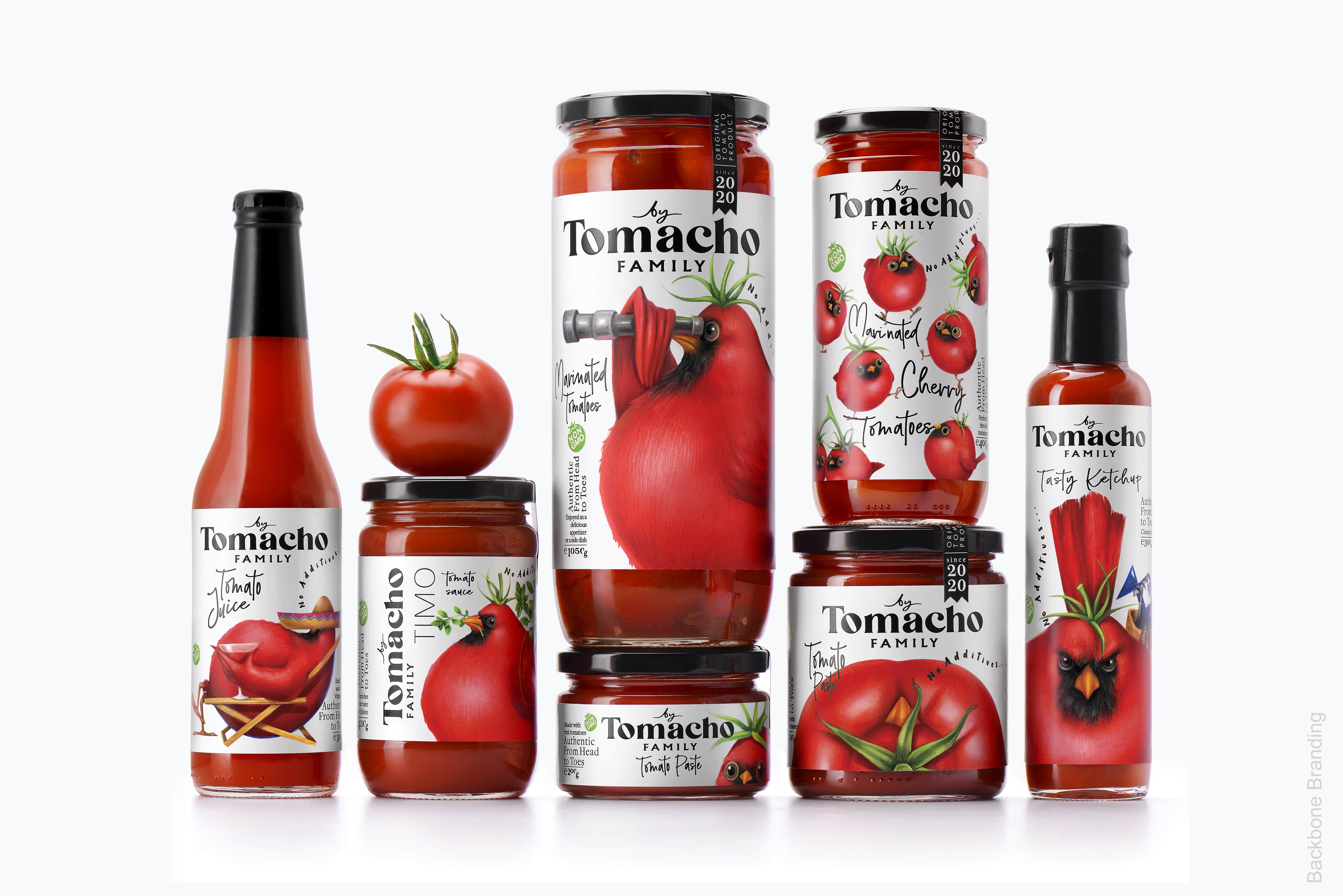
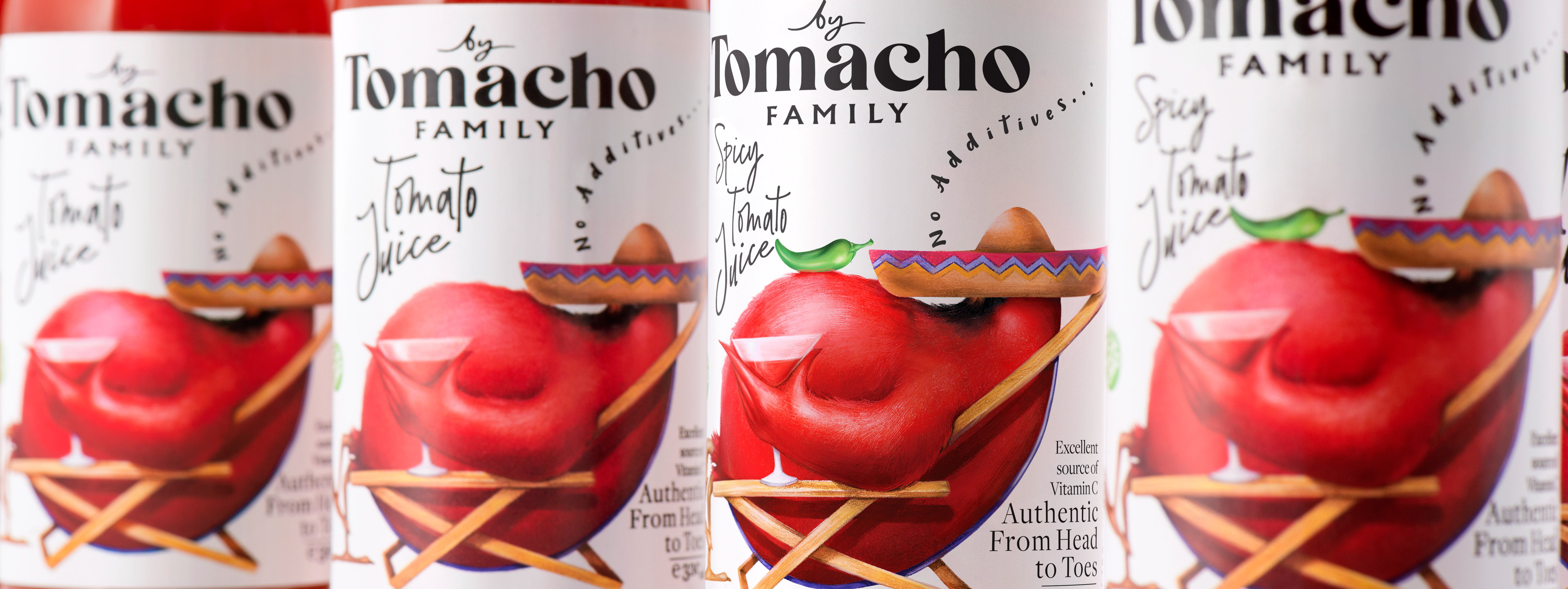
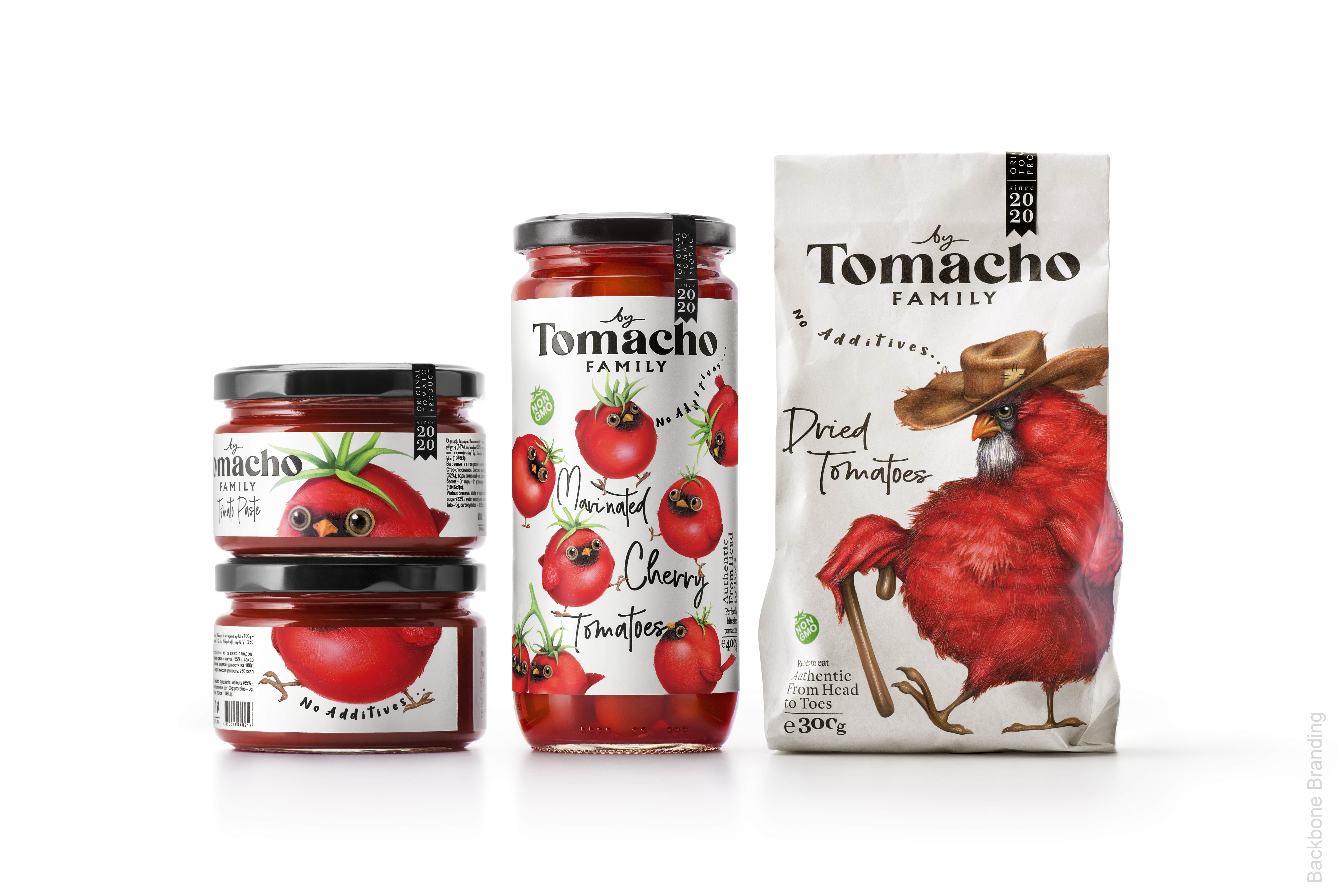
The Solution: We gave our imagination a challenge by asking it this question: if this brand’s tomatoes were characters with their own distinctive personality traits, how would they act, what they look like and how would they spend their day. Consequently, we have made these tomatoes come to life by giving them a personality traits and moods. We have created specific hand drawn characters depicting each of the 10 types of tomato product within the line.We have imagined each character at a precise stage of their lives, from the baby cherry tomatoes, to the wrinkly and dried out tomato in oil. Adding to this that all of these different tomatoes in a multitude of life stages and physical forms all belong to the same family: Tomacho. We have chosen this ” Tomacho” naming for our brand in order to reflect on the high quality of the tomatoes. In fact, the red blooded nature of the Macho character suits the bright red colour that characterises a tomato.
But also, the “macho” qualification perfectly sums up the story line that we have created for our characters. In fact, the “Tomachoes” are brave beings, proud to be a part of such a high ranking family.
The Patriarch of the family, takes his duty of protecting his family very seriously, and spends his time safeguarding them in the field. He makes sure that GMO, pesticides and any other artificial substance would stay away from his fresh and healthy children, so that they mature and ripen in the most natural way possible. Our “Tomachoes” are brave beings ready for anything in order to keep their intact superior reputation, and their genuine and all natural composition Hence their family Motto which they yell out loud and clear “Authentic from Head to Toe”. Given that tomato derived products are constantly present in our kitchen pantry, our goal was to create a design approach that was equally as popular and approachable as the product it contained. For this new line, we wanted to establish a strong link with the consumer by visually grabbing his attention and making him engage with the product thanks to its humorist and unique design concept.
CREDIT
- Agency/Creative: Backbone Branding
- Article Title: Backbone Branding Help the Tomacho Family of Tomatoes from Head to Toe
- Organisation/Entity: Agency, Published Commercial Design
- Project Type: Packaging
- Project Status: Published
- Agency/Creative Country: Armenia
- Market Region: Europe
- Project Deliverables: Brand Architecture, Brand Creation, Brand Identity, Brand Naming, Brand Strategy, Branding, Illustration, Packaging Design, Research, Tone of Voice
- Format: Bottle, Jar, Sachet
- Substrate: Glass Bottle, Glass Jar, Pulp Paper
- Keywords: WBDS Agency Design Awards 2020/21


