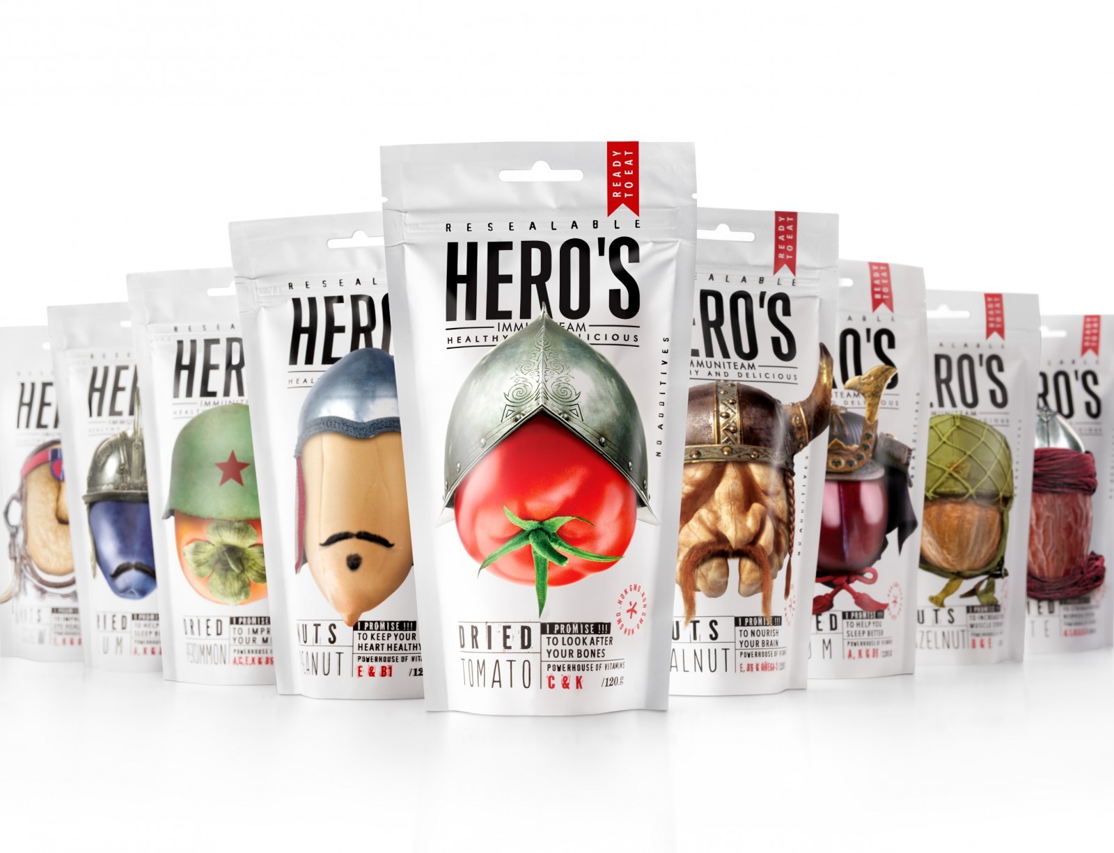
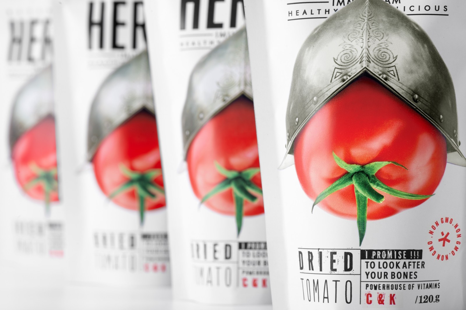
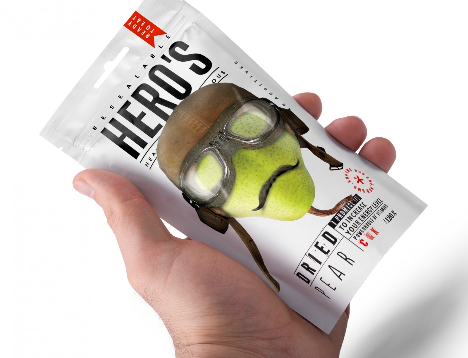
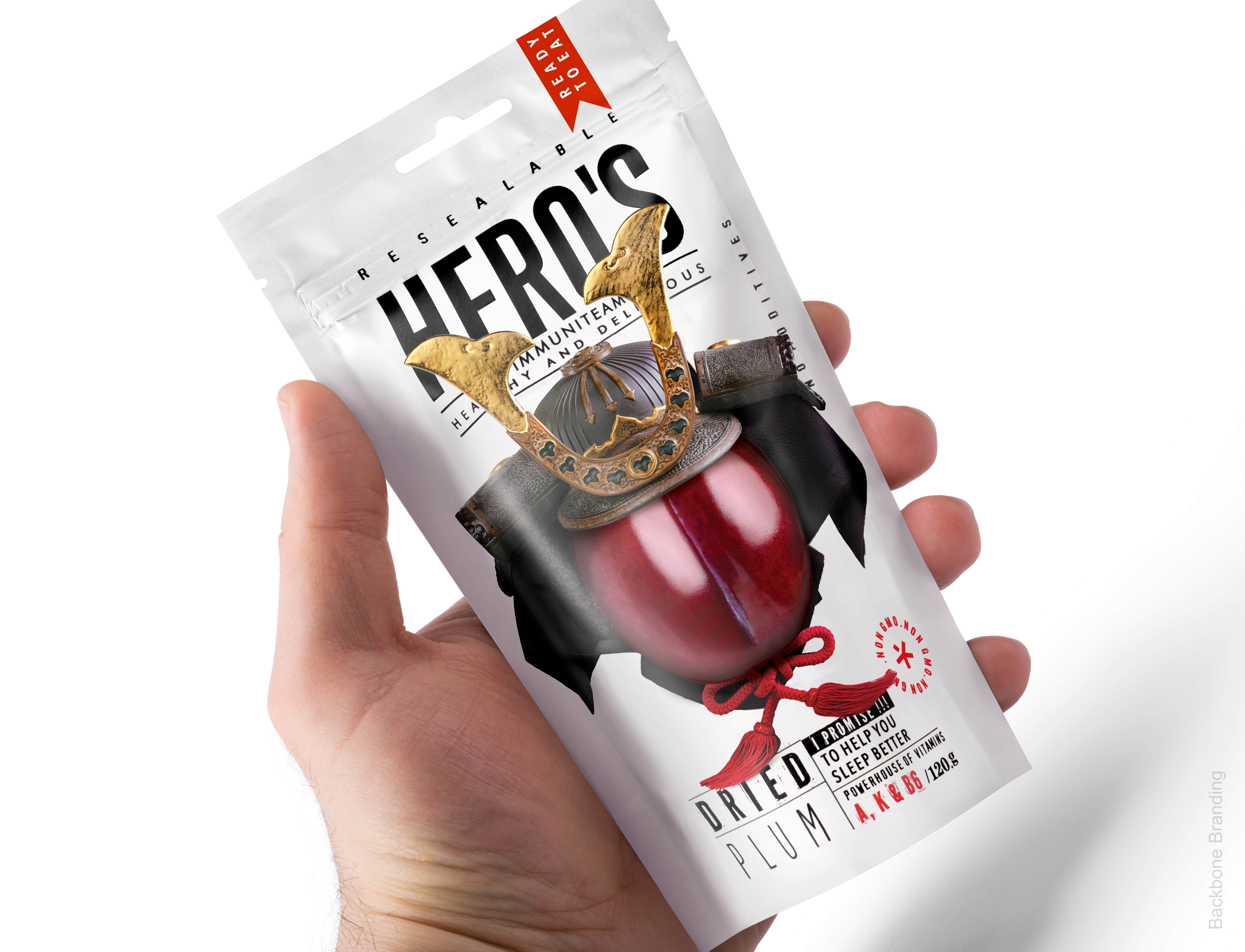
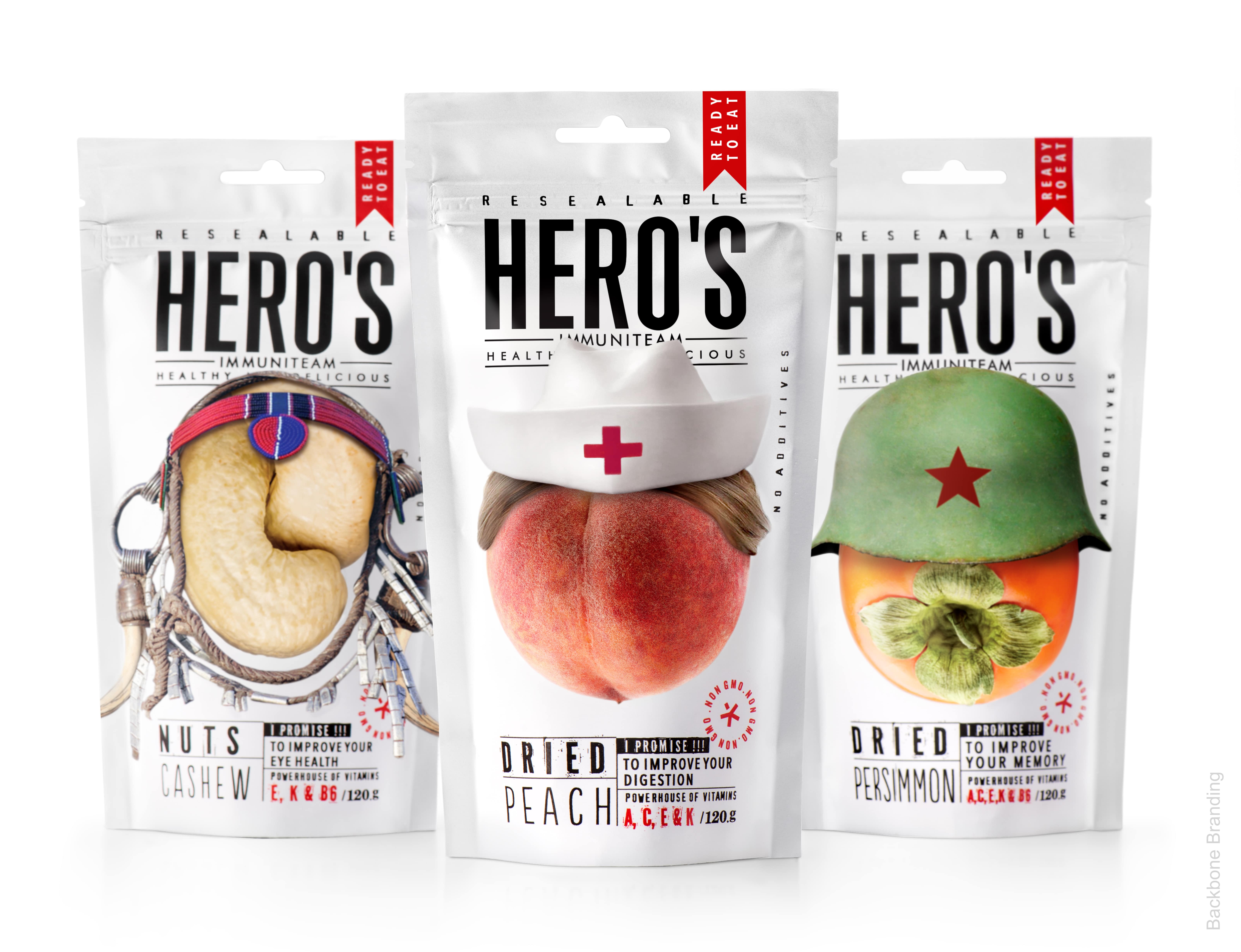
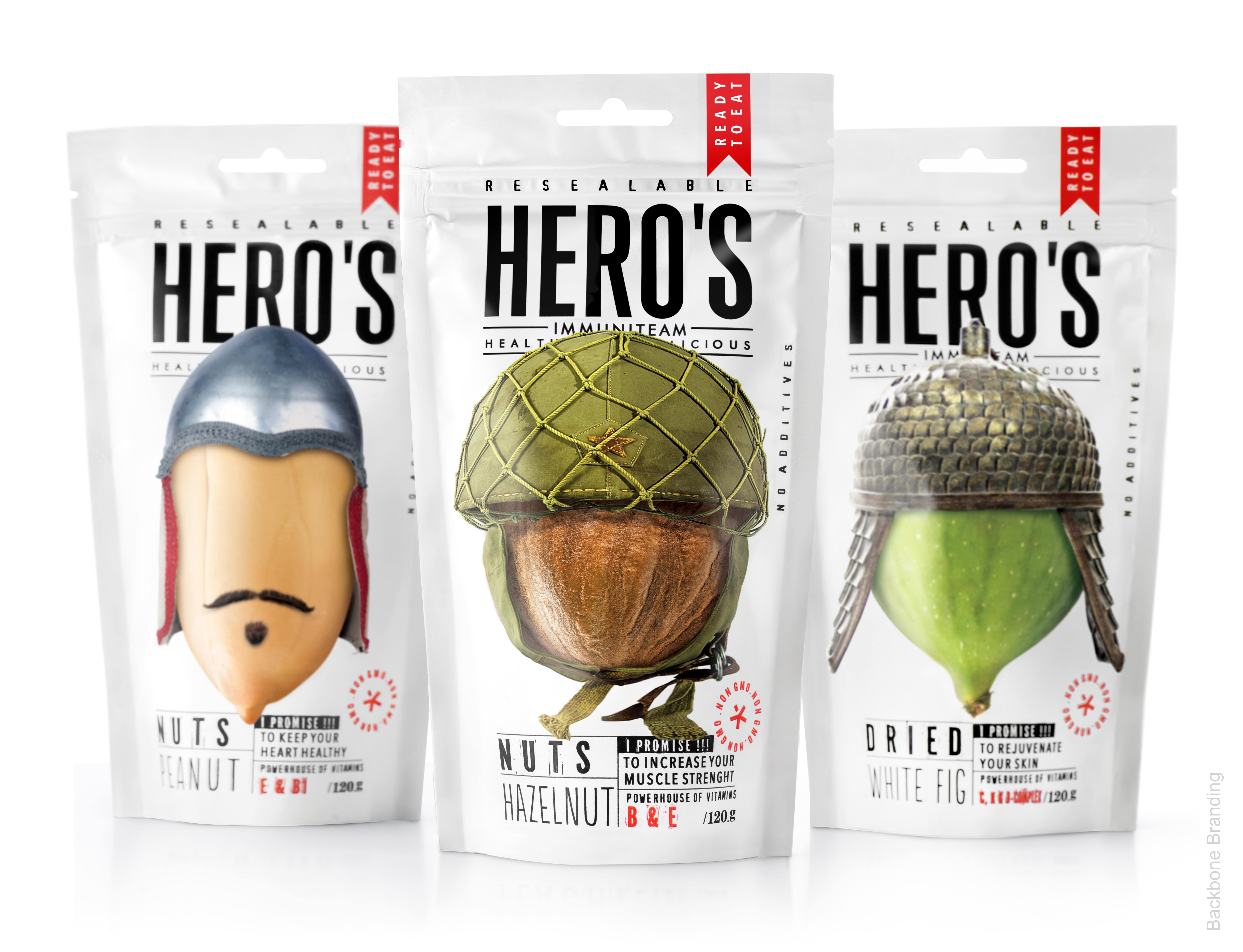
The Brief: Labeled as super foods, the popularity of nuts and dried fruits has been on the rise these past few years. When approached to create the branding and packaging design for a line of 16 different varieties of nuts and dried fruits, we wanted to emphasise and focus on their nutritive and health benefits as well as their role in fortifying the immune system.
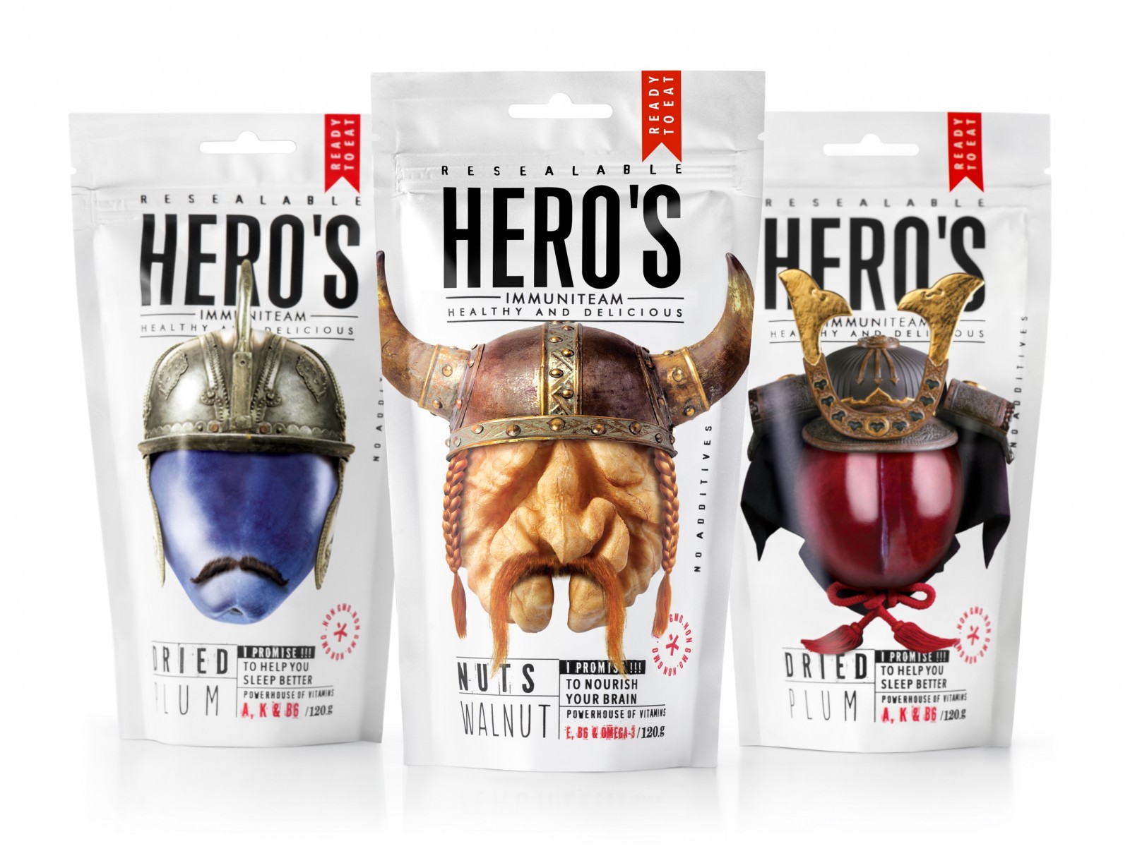
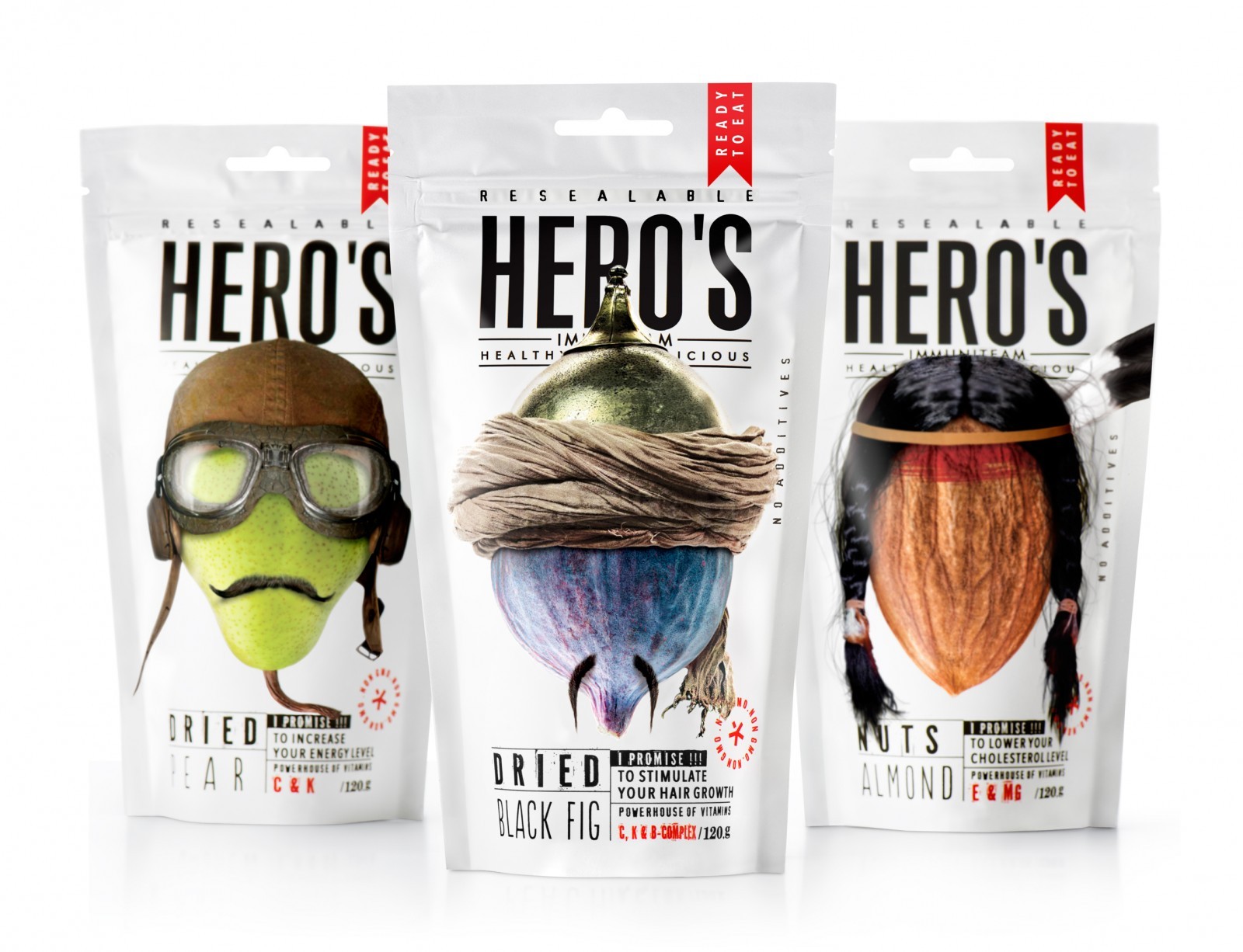
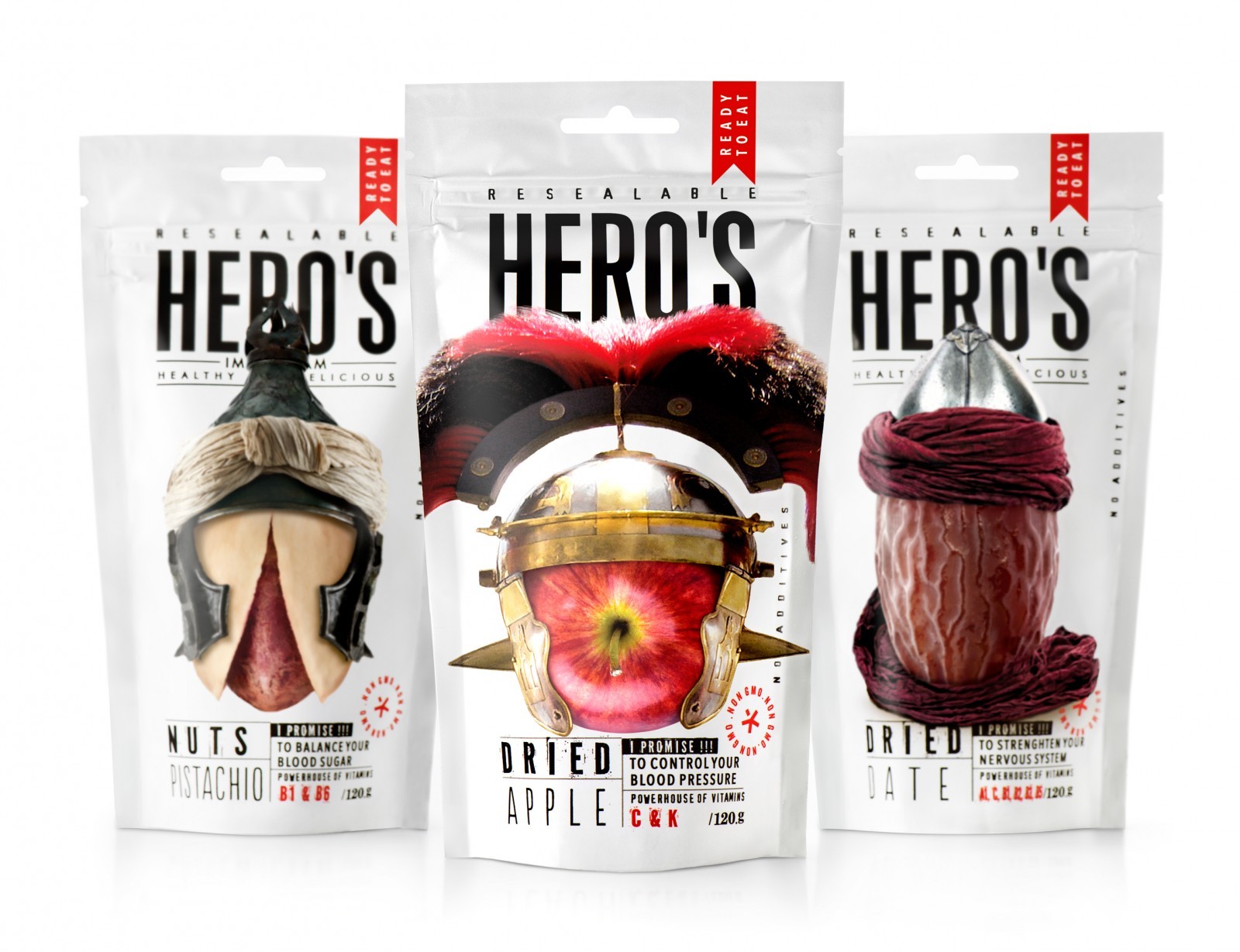
The Solution: In order to visually convey this quality, we have imagined each of these 16 types as heroic characters. All of them are wearing their specific headgear ready to guard and protect. However, none of them is holding arms, because these are pacific heroes, instead of destruction and war their mission is to repair and make our bodies healthier and our immunity stronger.
These heroes hold a positive message: their power is used for good, for the protection of our organism and the insurance of our well-being. Usually heroes are singled out after the battle is over and won. However, these nutritious foods are heroes in action, their win is a sure thing. And it is a guaranteed fact that they will be boosting our immune system and get it ready to fight back any disease or infectious threats that might invade our bodies.
The Result: These 16 different types of Heroes are all part of a squad called ‘’immuniteam’’. They all come from different historical eras and have various origins and ethnicity. This reminds us that these foods are for everybody. Our human bodies all function the same way, no matter where we come from, what race we are and when we were born. We are all humans with the same needs, the same organs that have and always had the same functioning mechanism. Also, we are all exposed to the same viruses and illnesses. To make it user friendly, we have chosen to specify on the packaging the exact benefits of each type of snack as well as the specific vitamins that it provides. The amount inside each package equals the size of 2 portions for average individual’s intake on average.
As for the Naming, we intentionally opted for the possessive form of the word ‘’Hero’’: Hero’s. Adding to this choice, the bold font was selected for the brand’s name on top but also for the description of the type of the Nut/dried fruit figuring at the bottom of the packaging. The choice of the same bold font visually links these 2 descriptions together and makes them stand out to the eye. This aims to designate that the food in question belongs to the Hero, therefore meaning that the consumer himself is a Hero. We wanted to get this specific message across: when you make the right choice, and eat these superfoods, you do well to your body and make it strong and therefore you become the Hero yourself.
CREDIT
- Agency/Creative: Backbone Branding
- Article Title: Backbone Branding Create Hero’s an ‘Immuniteam” of Super Foods Fighting for Your Health
- Organisation/Entity: Agency, Published Commercial Design
- Project Type: Packaging
- Project Status: Published
- Agency/Creative Country: Armenia
- Market Region: Europe
- Project Deliverables: Brand Architecture, Brand Creation, Brand Experience, Brand Naming, Brand Strategy, Branding, Illustration, Packaging Design, Research
- Format: Pouch
- Substrate: Plastic
- Keywords: WBDS Agency Design Awards 2020/21


