


Baby on Board is a child-focused mobility service designed to create a calming and emotionally supportive travel experience for both young passengers and their parents. Rooted in the idea of offering a gentle “breathing space” during every ride, the brand identity embraces softness, simplicity and safety as its core visual principles. Beyond its functional purpose, the brand aims to foster empathy — acknowledging that when children feel at ease, parents can finally rest and regain their own sense of balance.
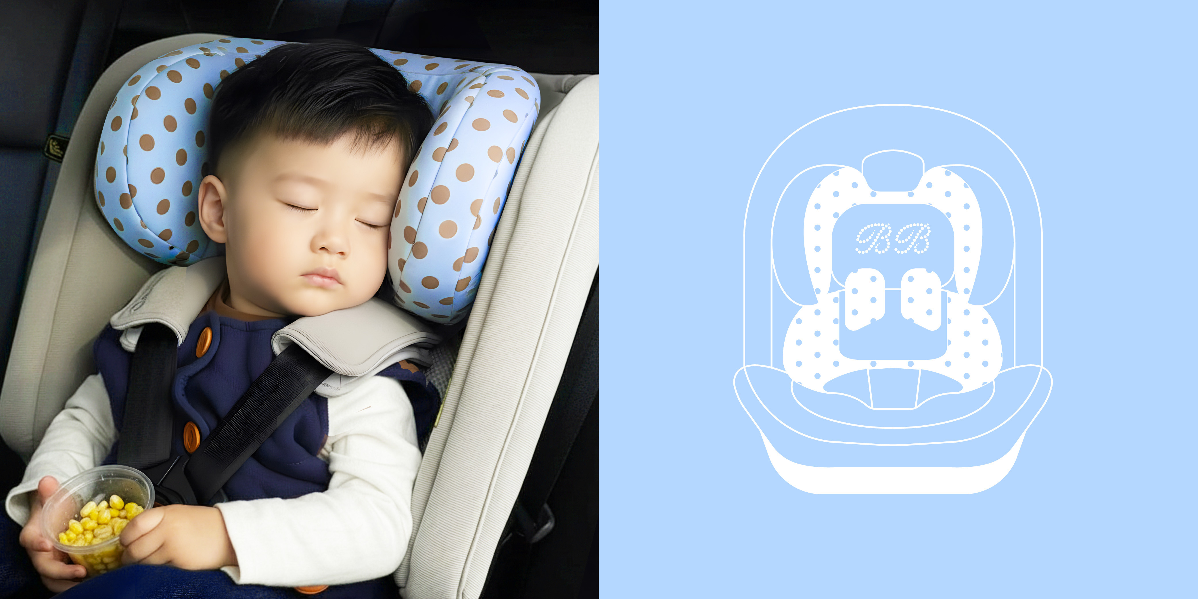
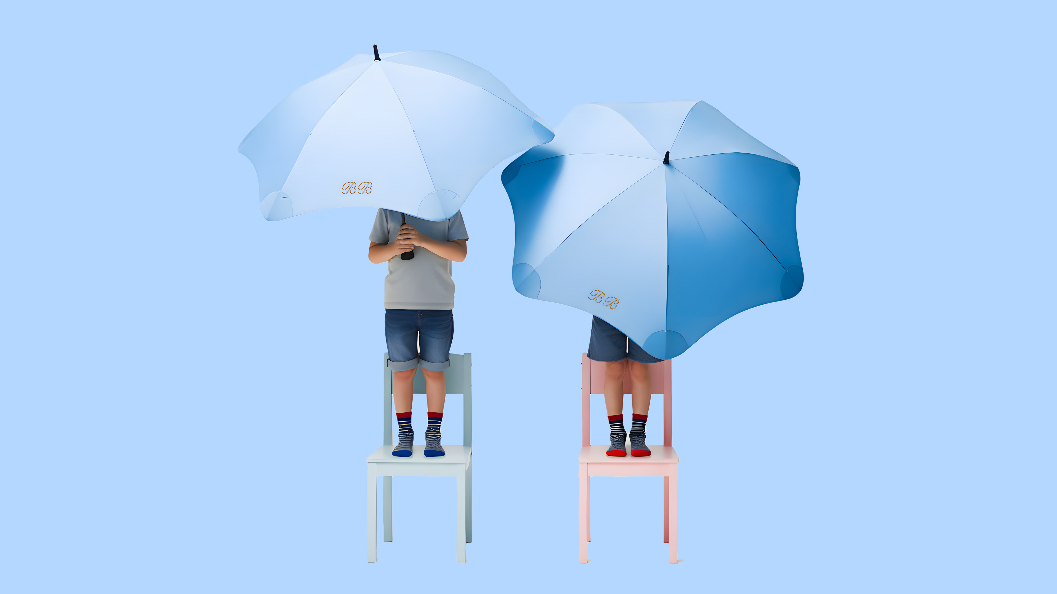
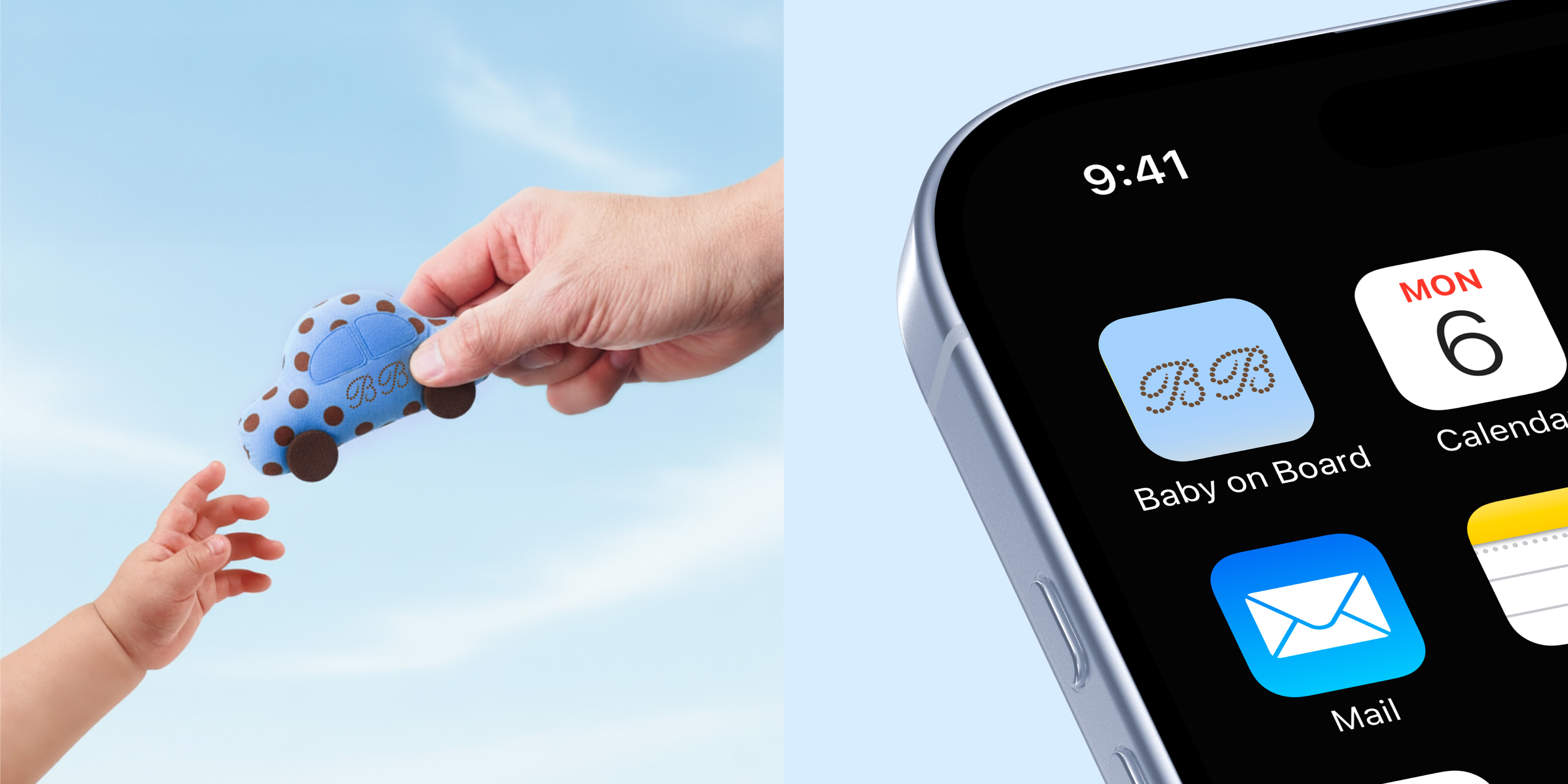
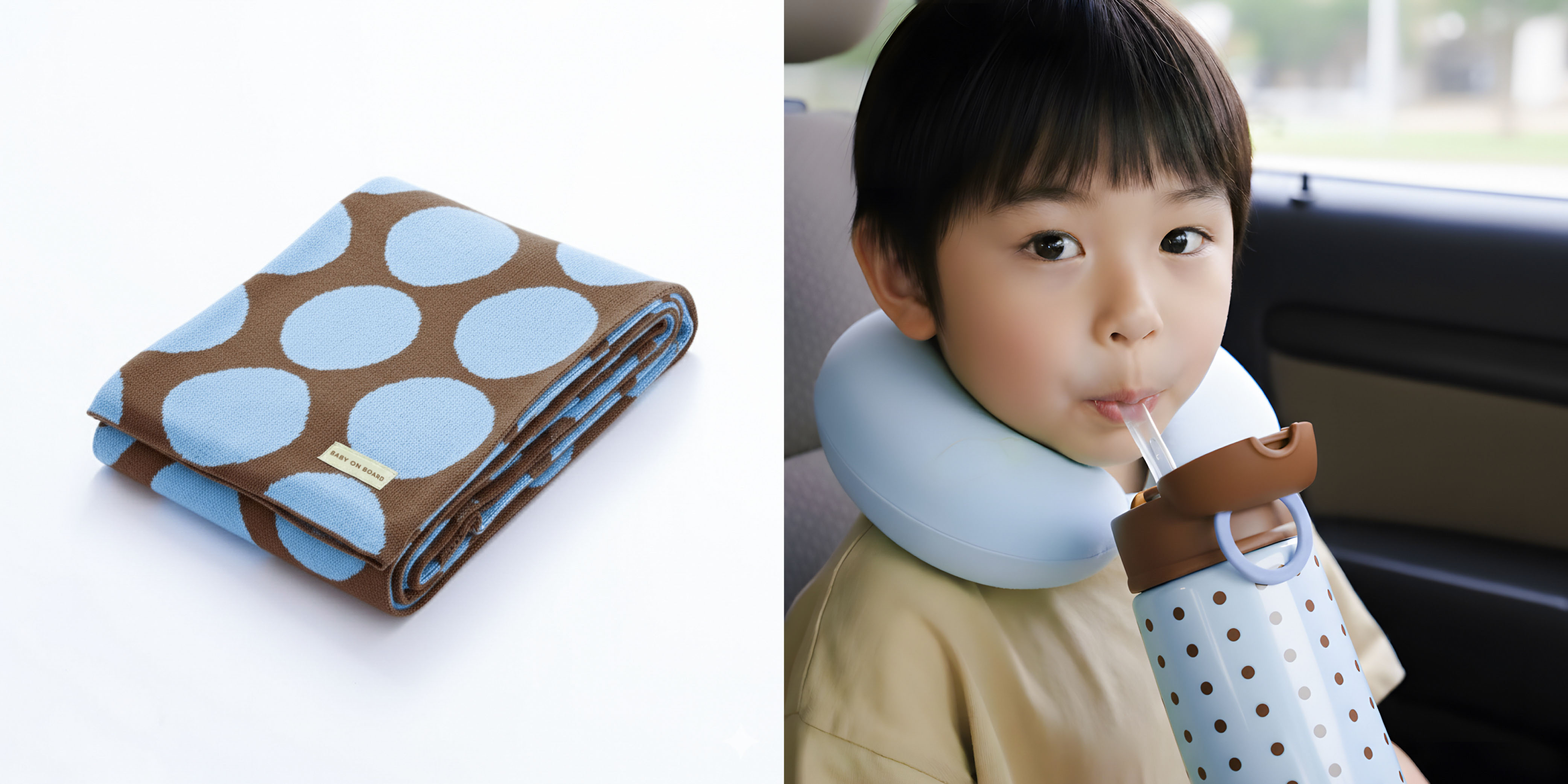
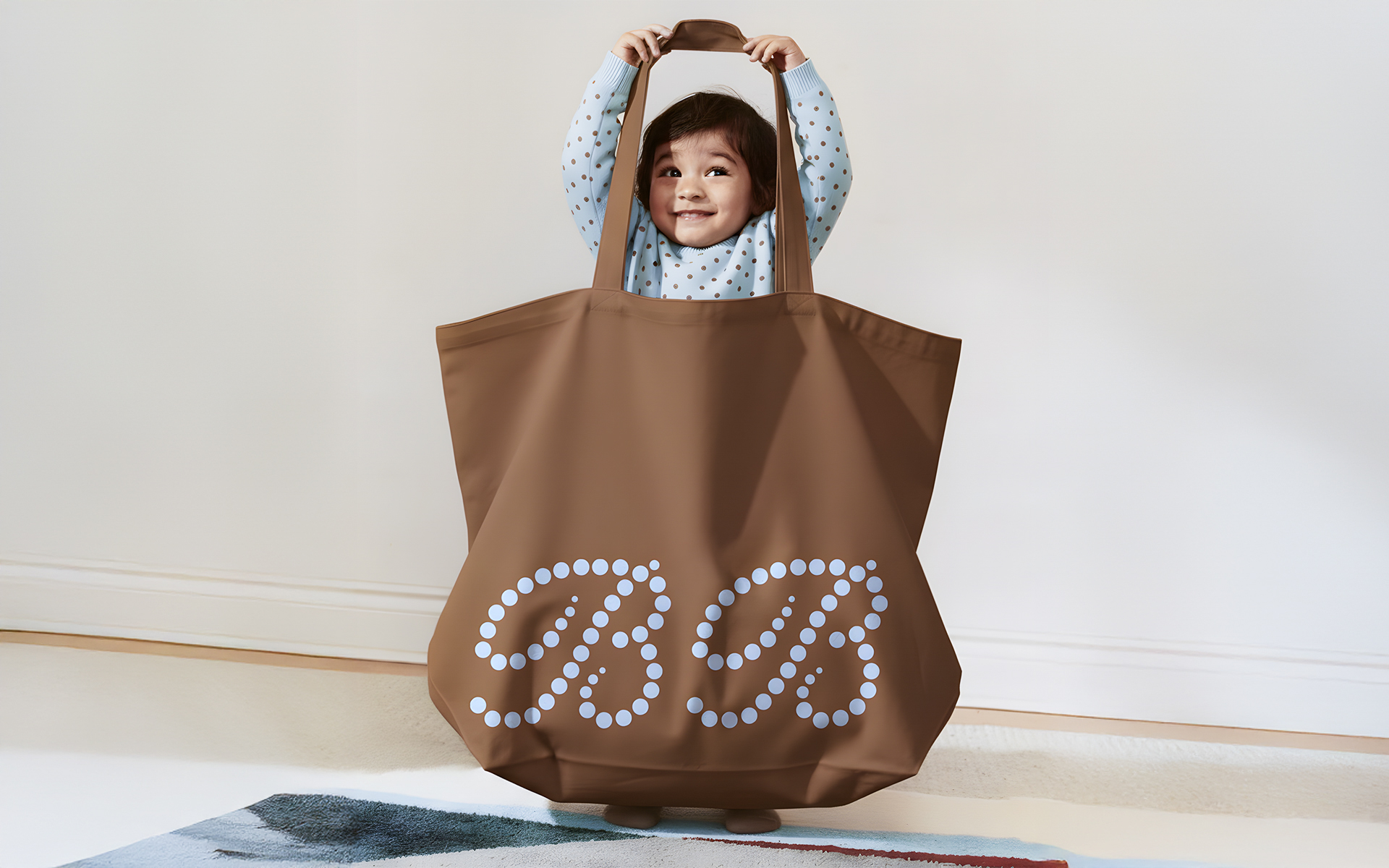
The concept is built around low-stimulus visual communication: pastel tones, warm sky-blue and chestnut hues, airy layouts and rounded forms — all intentionally developed to reduce sensory overload for children while providing reassurance and comfort for parents. This approach translates into a visual language that feels nurturing, familiar and emotionally grounding, ensuring that every brand interaction supports a sense of calm.
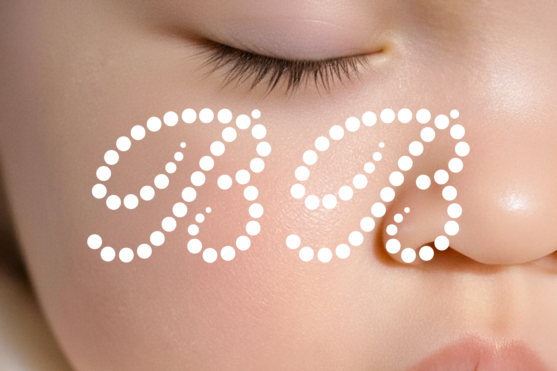
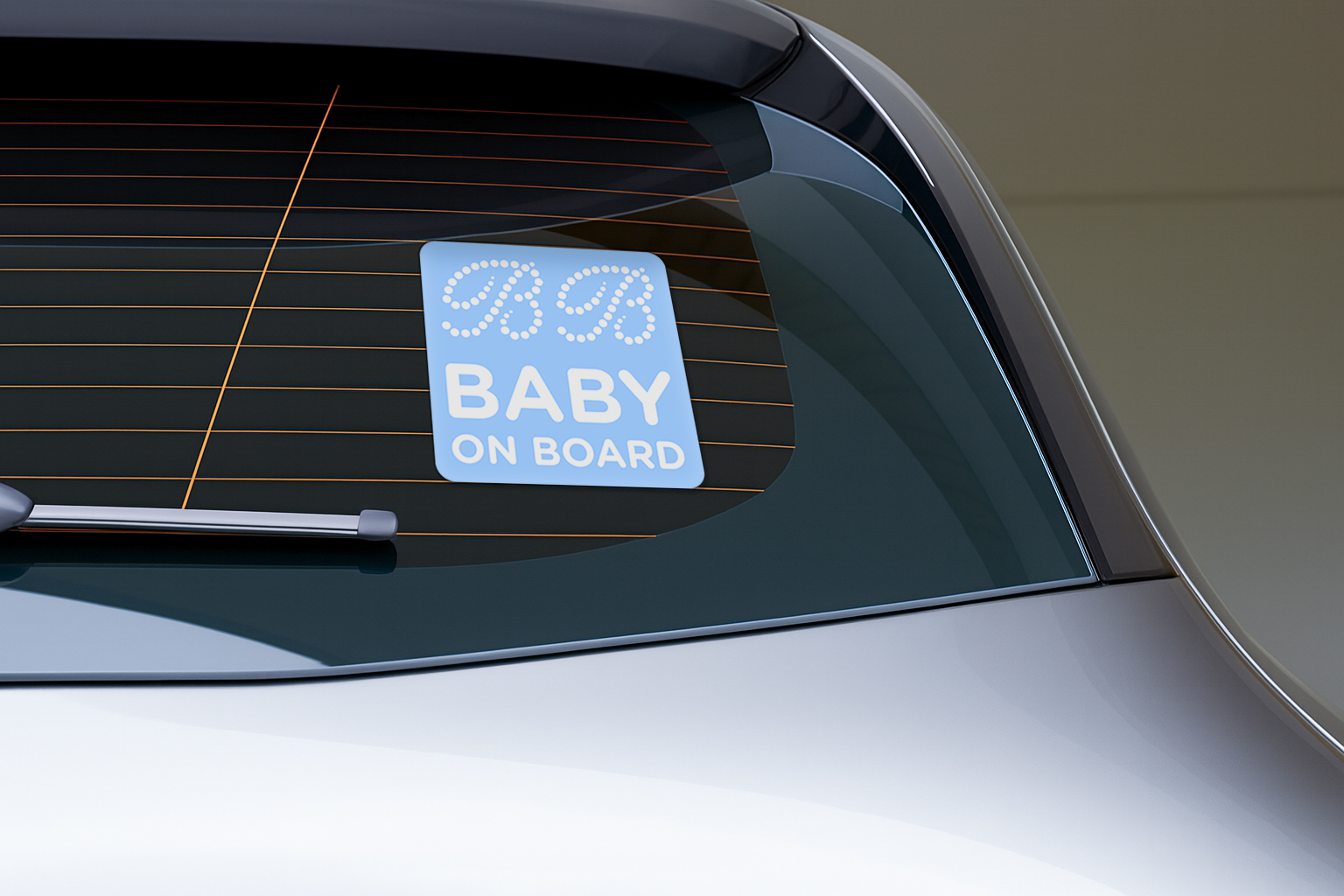
The logo system evolves from the initials “BB”, symbolizing Baby On Board, Baby, and the signature Baby Blue. Formed through rounded dots, the mark expresses childlike warmth, softness and protection, while the internal negative space represents the brand’s central idea — a gentle moment to breathe. This symbolic simplicity reinforces the brand’s promise of emotional ease and physical safety.
A structured yet flexible visual system expands the identity through spacious layouts, soft geometry and a dotted visual rhythm that acts as a subtle heartbeat. Applications are designed to adapt across formats while preserving a calm, uncluttered aesthetic. Motion graphics further extend the experience with slow, breathable transitions, adding a soothing layer of movement that mirrors the brand’s sensory intentions.
The resulting identity positions Baby On Board as a brand that not only cares for children, but also genuinely supports parents — transforming each journey into a peaceful and restorative moment for the whole family.


CREDIT
- Agency/Creative: Khoart
- Article Title: Baby on Board — A Calming Brand System for Little Travelers & Their Parents
- Organisation/Entity: Student
- Project Type: Identity
- Project Status: Published
- Agency/Creative Country: Vietnam
- Agency/Creative City: Ho Chi Minh City
- Market Region: Asia, Europe, Global
- Project Deliverables: 2D Design, Brand Design, Brand Identity, Branding, GIF Animation, Graphic Design, Identity System, Logo Design, Motion Graphics
- Industry: Professional Services
- Keywords: Branding, Brand Identity, Visual Identity, Logo Design, Creative Direction, Design Direction, Identity System, Application, Motion Design, GIF Animation, Baby, Baby on board, Kids, Baby Blue, Polka Dots, Dots
-
Credits:
Brand Identity & Design Direction: Khoa Ng
Visual System & Art Direction: Định Định
Design Review: Xon Xao Studio


