Harbour to home
Kind has developed the new brand and communication strategy for the merger between three Norwegian maritime veterans, Torbas, Seaprime Group and Lyng Group. The merger forms an unwavering rock of a company, gathered under the new brand name, Babord.
A celebrated hero. An unsung bauta.
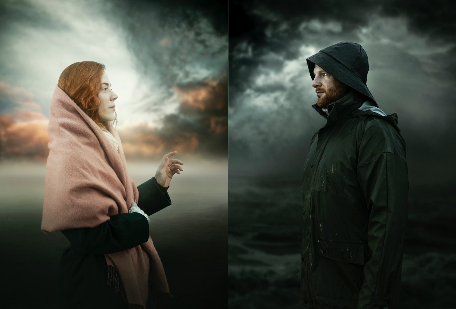
Light and dark. Fire and water. In nature, as in life, there are many seemingly opposite or contrary forces that turn out to be complementary or interdependent. Balanced partners bound together through all of time. In traditional Norwegian culture, this duality is present in the relationship between the celebrated seafaring hero and the unsung loved one who remains at home. The forces that pull these two apart and then bring them together again, the tides of life and love, underpin the Babord way of thinking. Babord celebrate both the heroes of the sea, and the unsung Bauta, the one who stays at home at the heart of the community: the hunters and the homemakers.
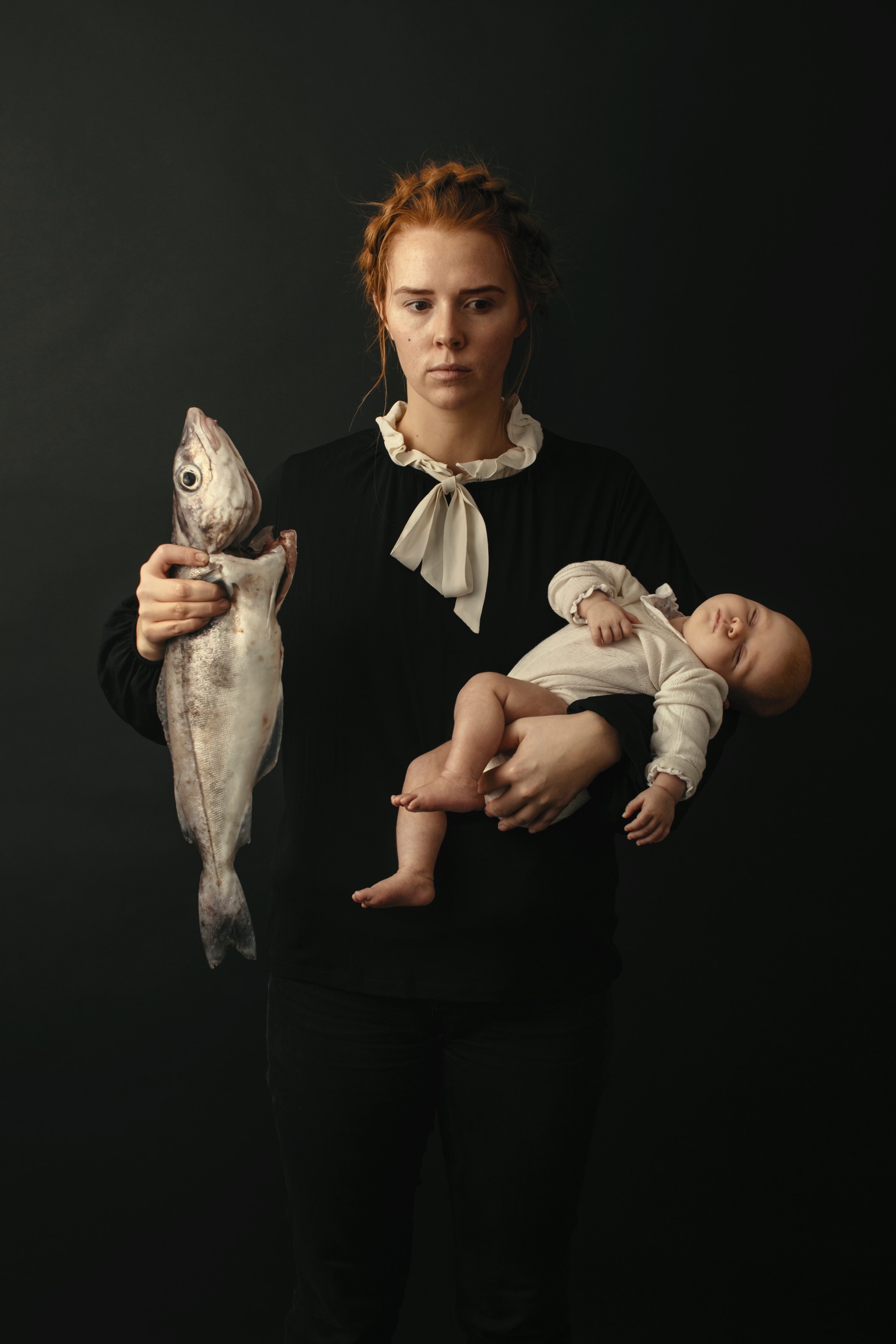
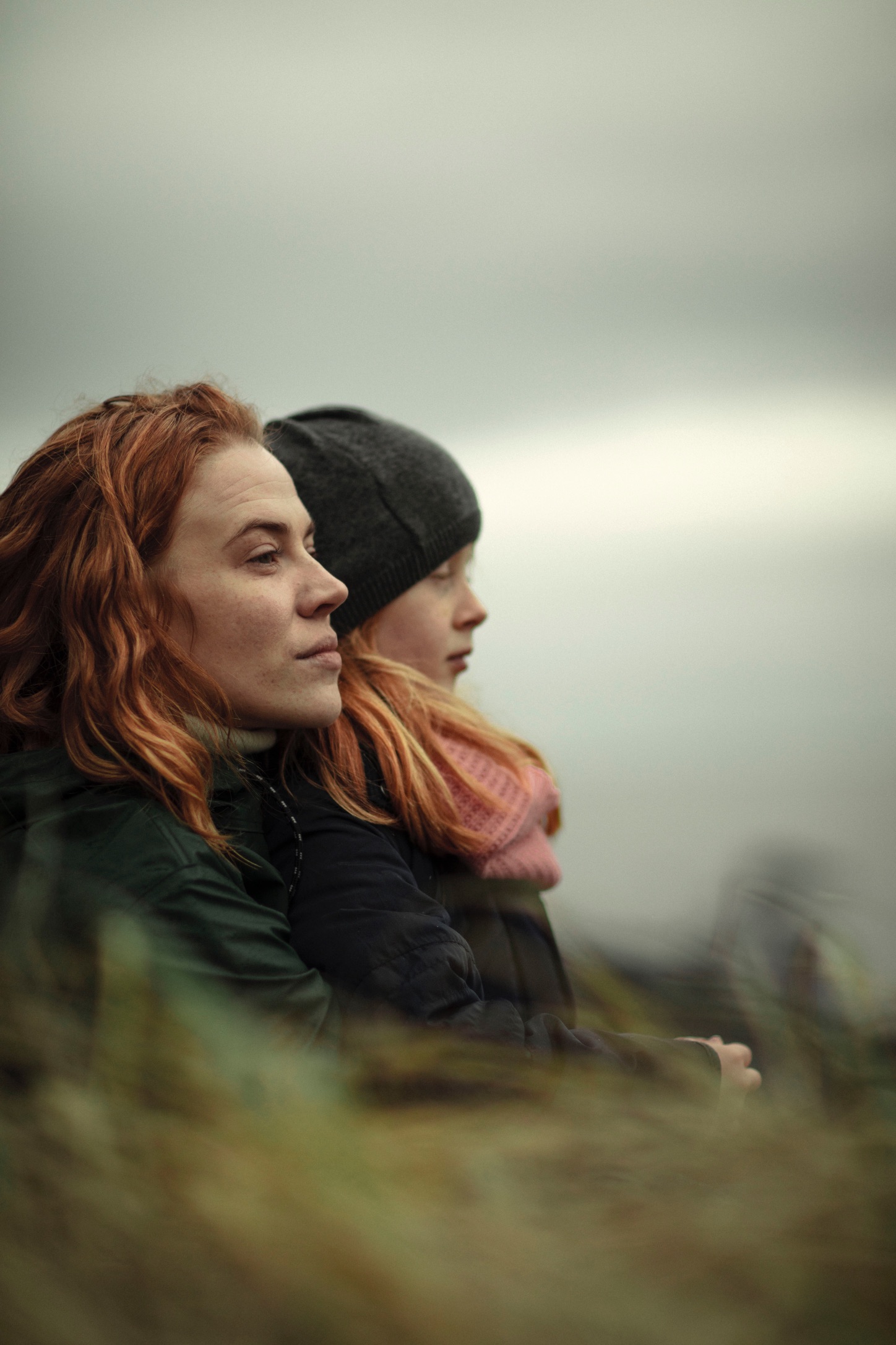
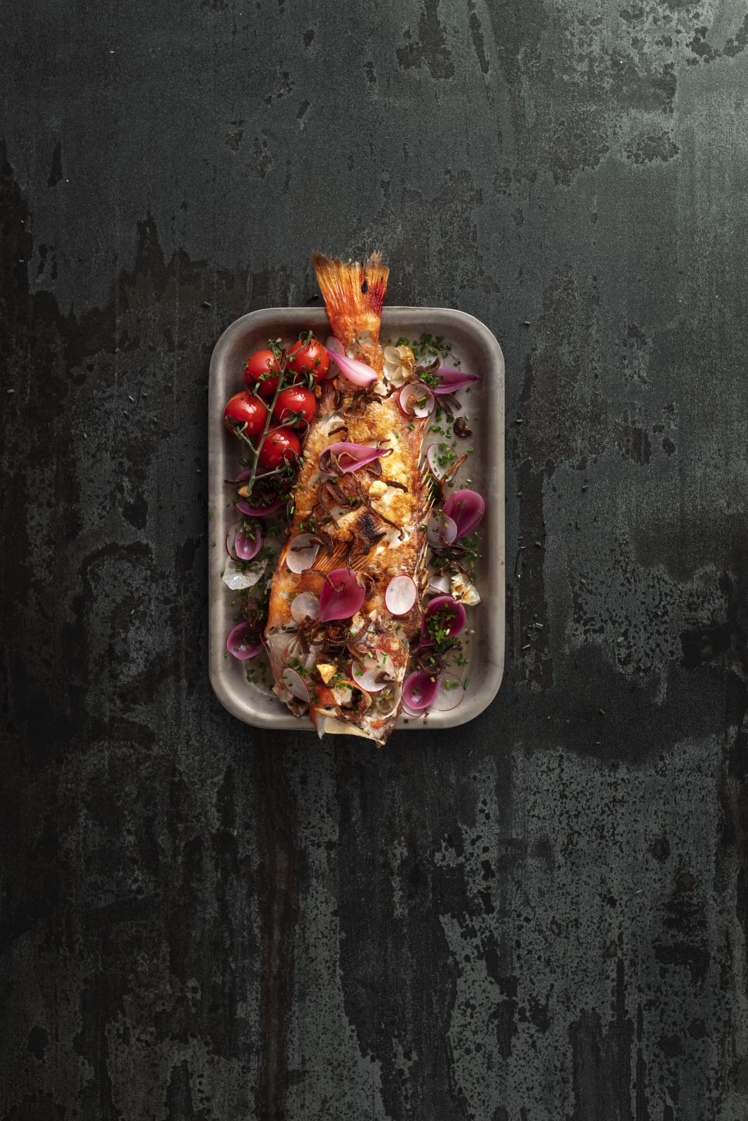
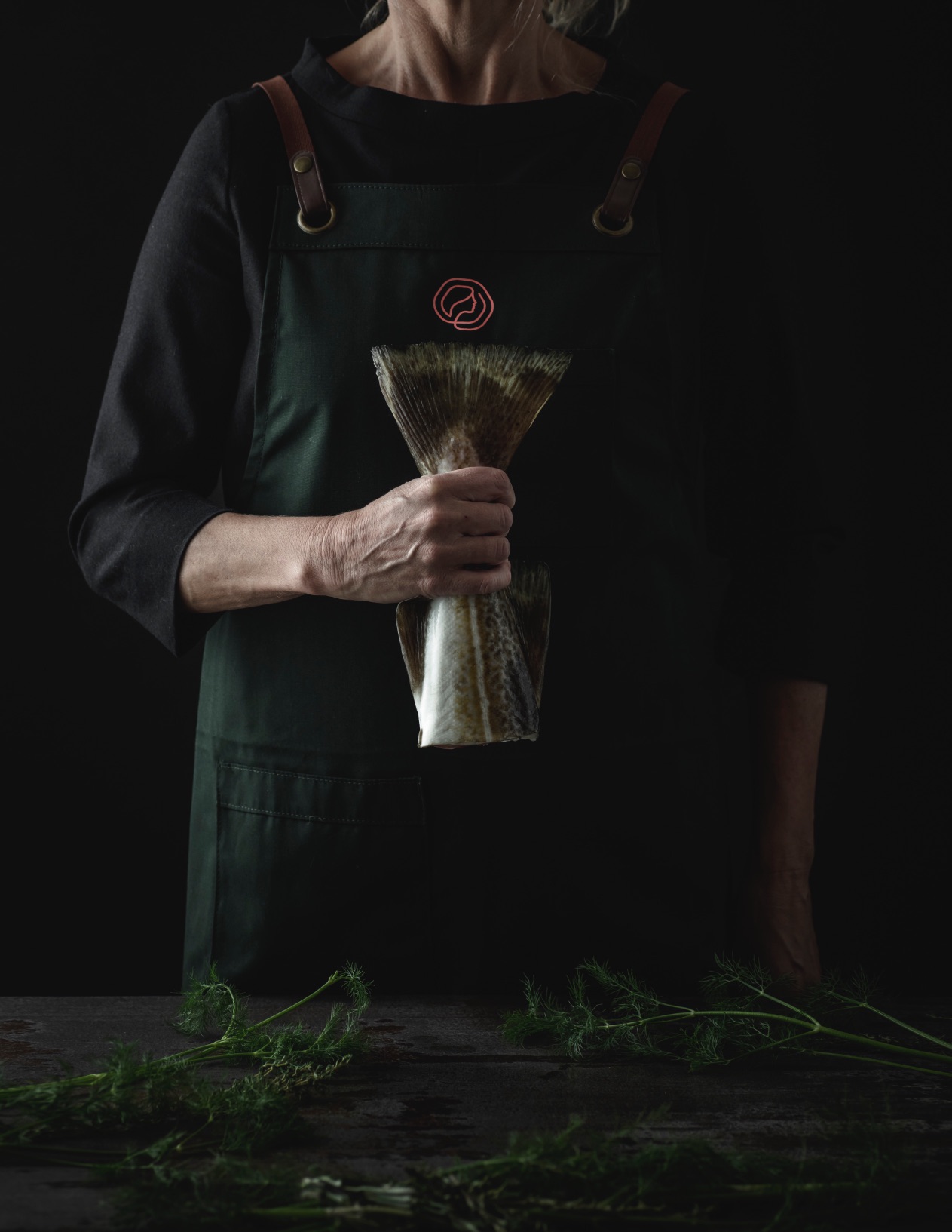
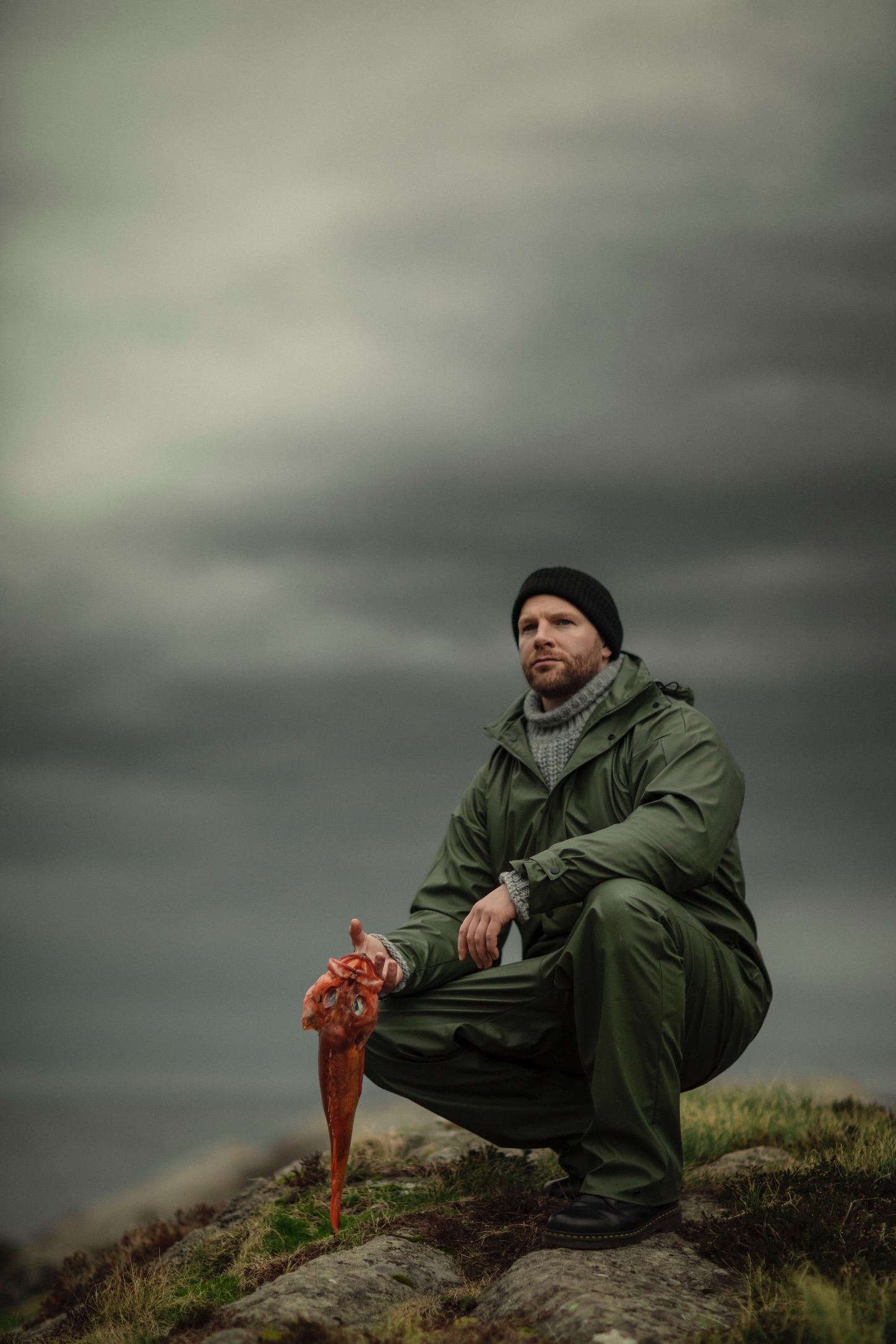
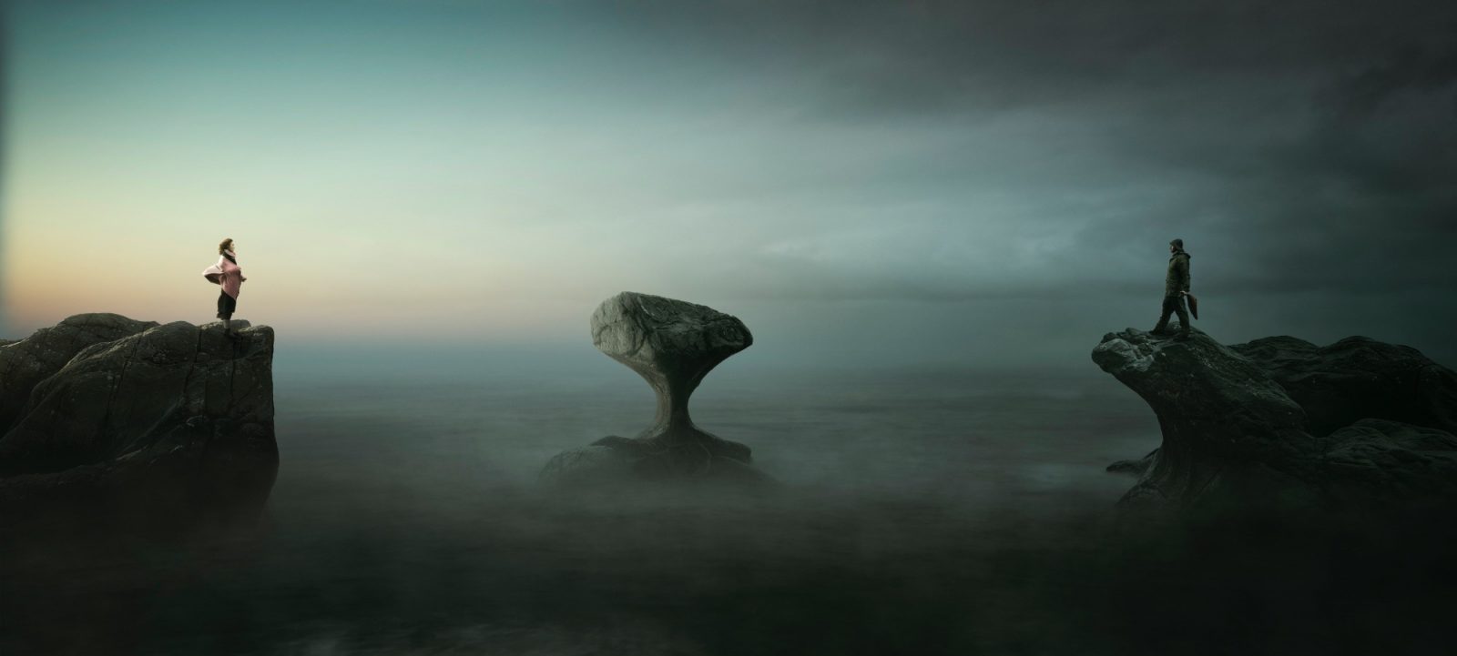
With the brand photography we have focused on three aspects. Conceptual images capturing the brand story, natural images from the area and delicious food photography. The concept around the fisherman’s wife, and the fisherman returning home is the core of the conceptual imagery.
A main concept image was created. Here we have the woman on the left, looking outwards – the same direction as the symbol. The sky behind her is at dawn, and pink is present in the clouds. Kannesteinen, a rock formation from Måløy is in the middle and the fisherman is in the right, with a darker sky as a background. The formations was created by the waves, and is situated at the shore, creating a symbol of earth meeting sea for the locals.
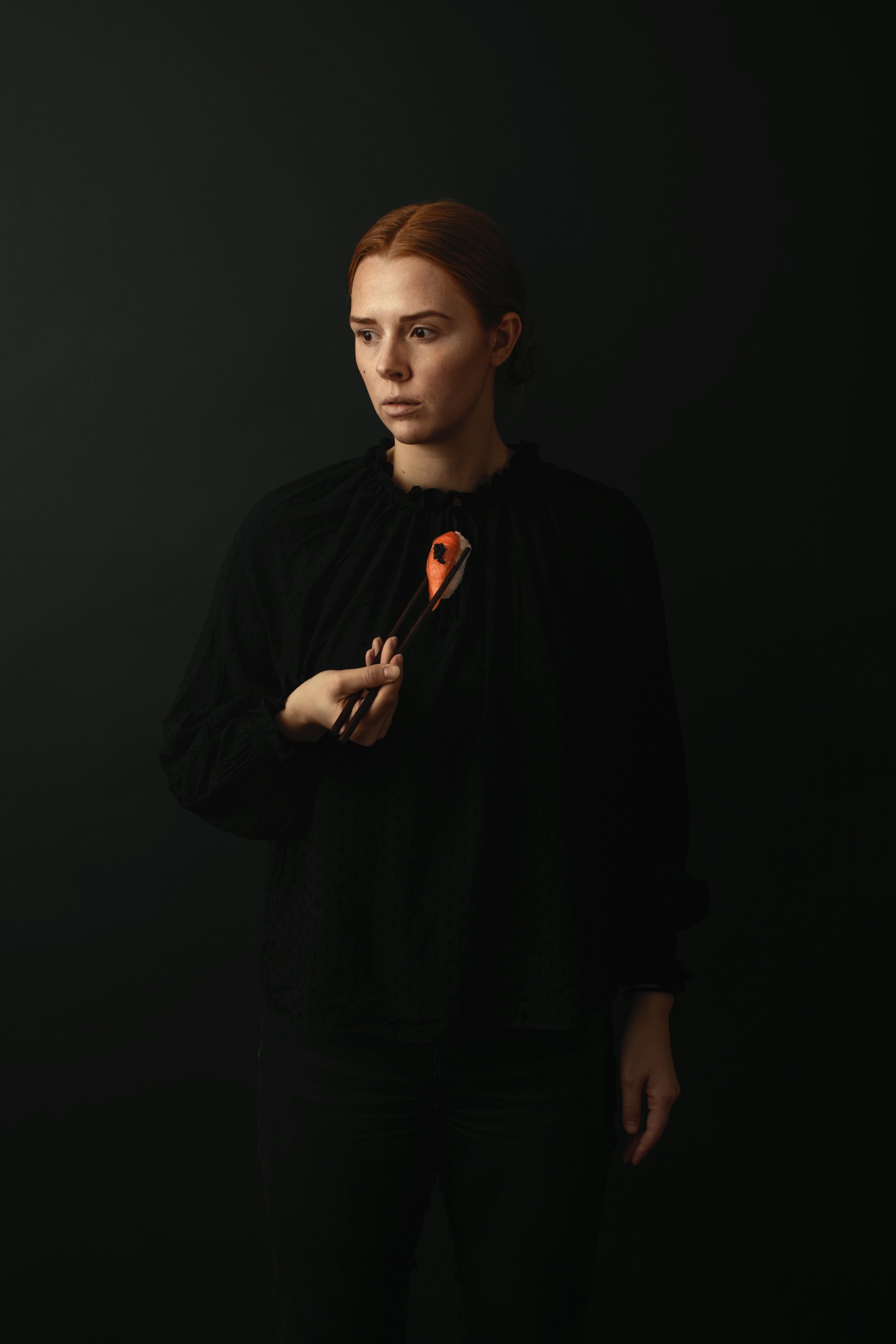
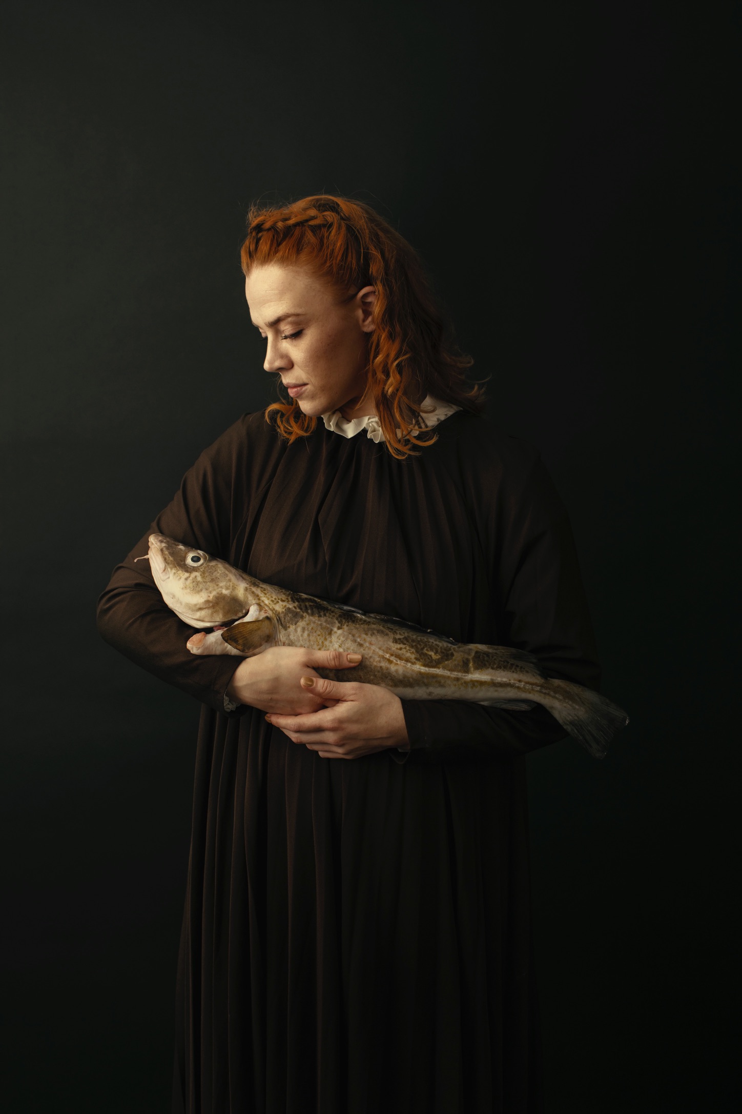
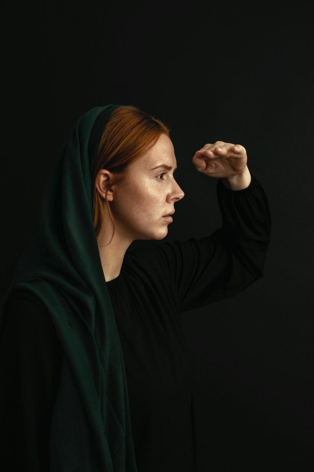
A set of images with a baroque style was captured. With two women, mimicking the symbol. They are holding a child, a dish or a fish, while wearing costumes from the era. They are used to create a conceptual brand, that clearly stands out from the rest.
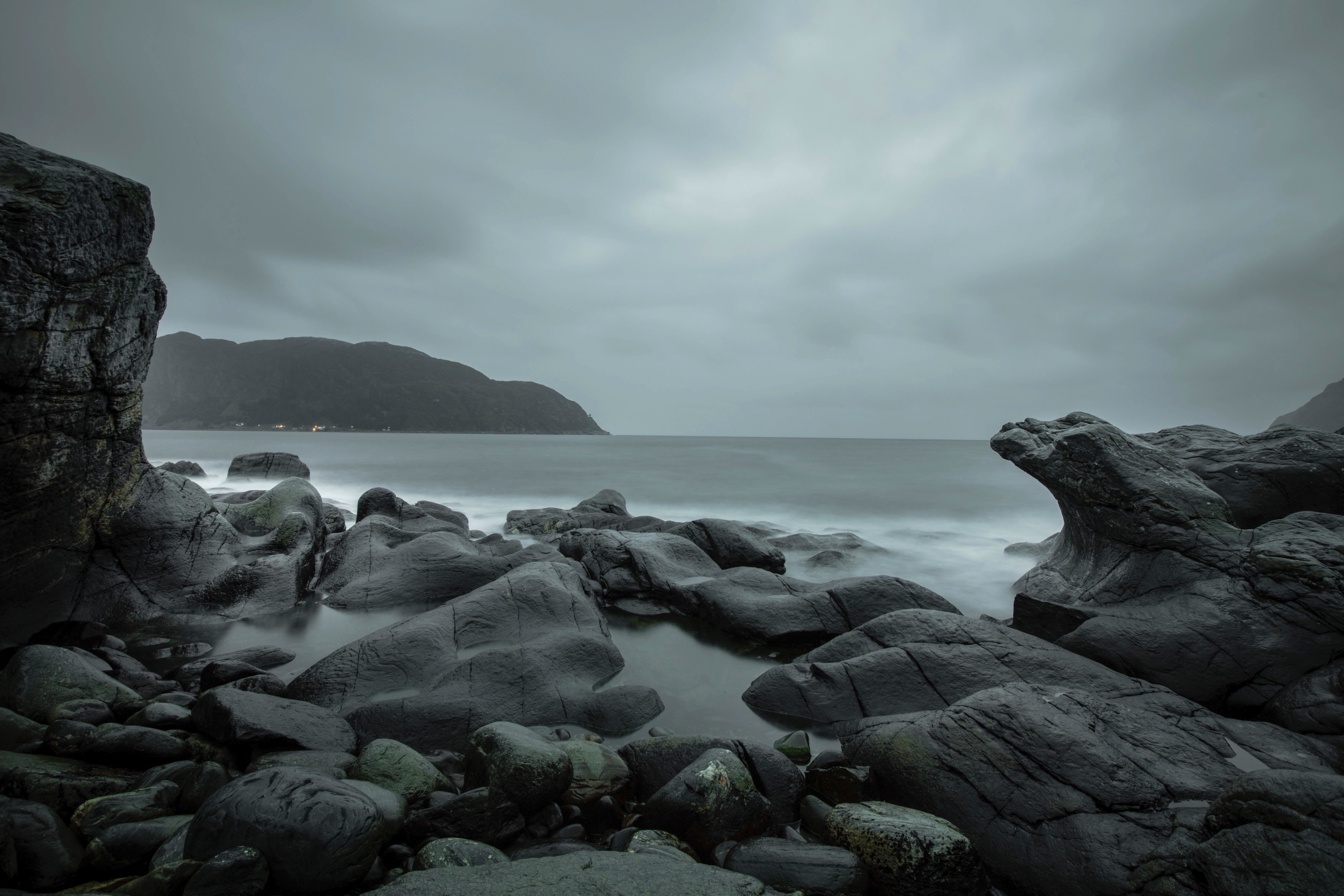
The images from the area are all graded green, with hints of pink tones. A set of models are interacting with the nature, to add a touch of warmth and presence to the scenes.
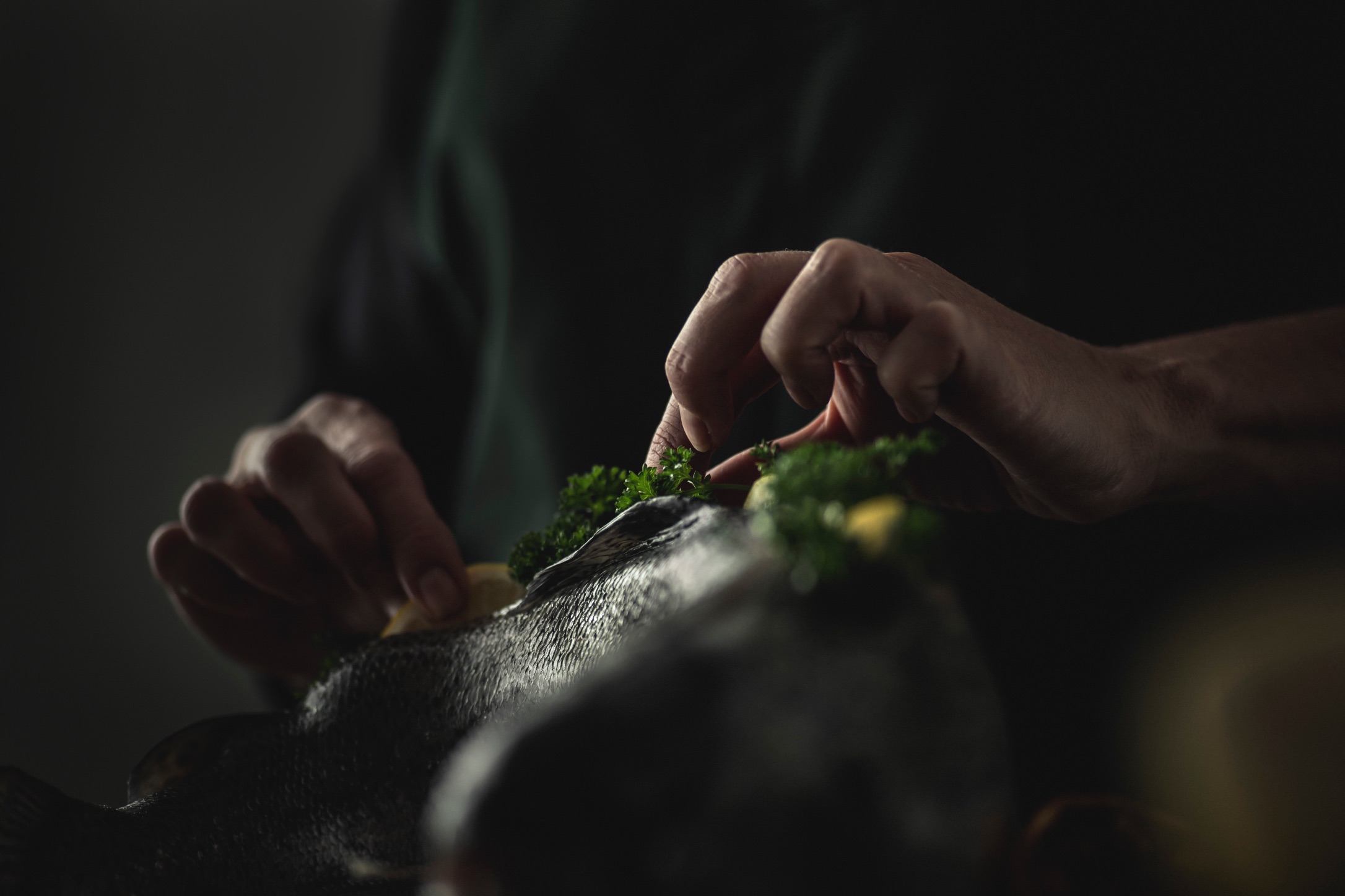
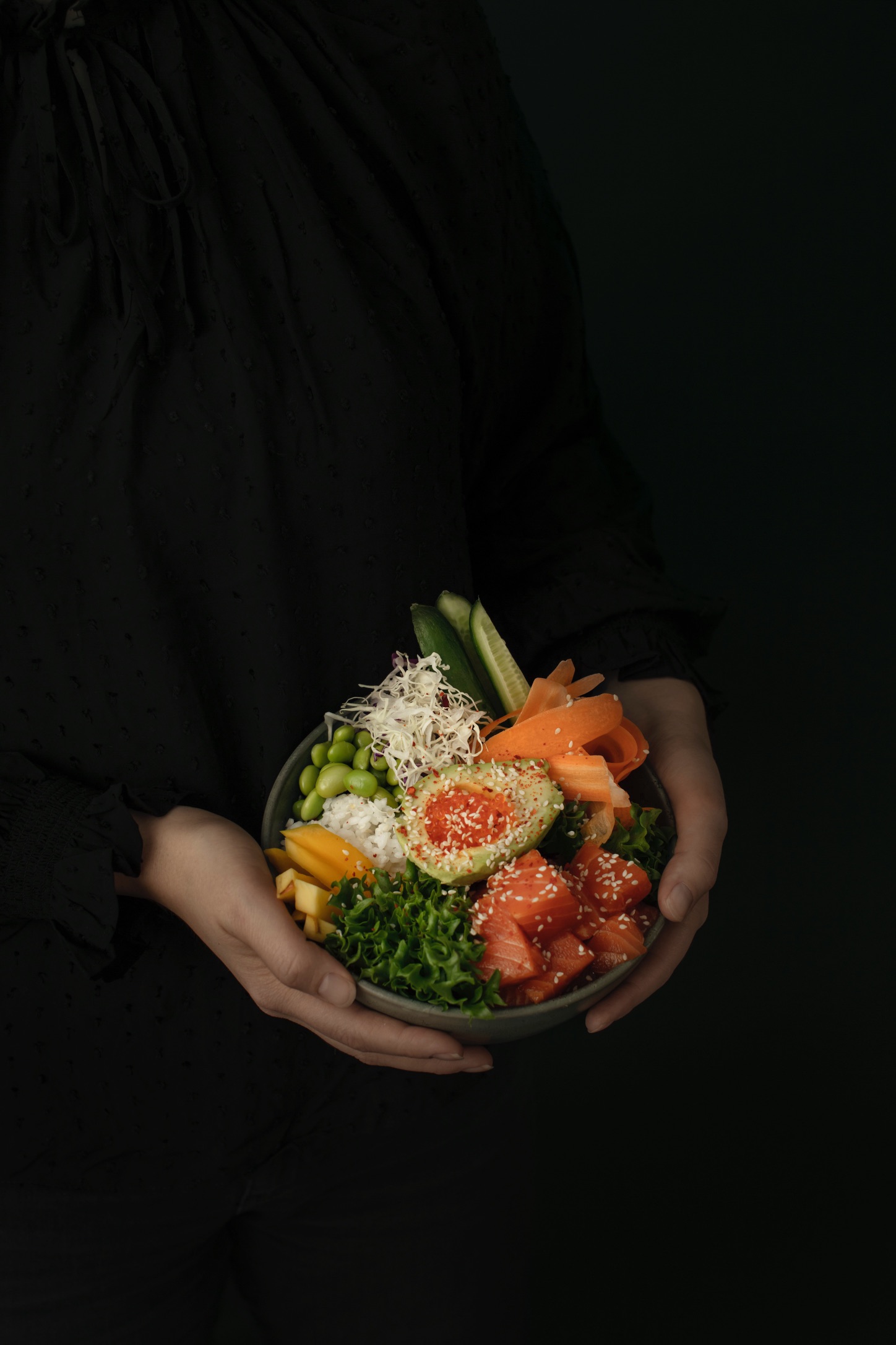
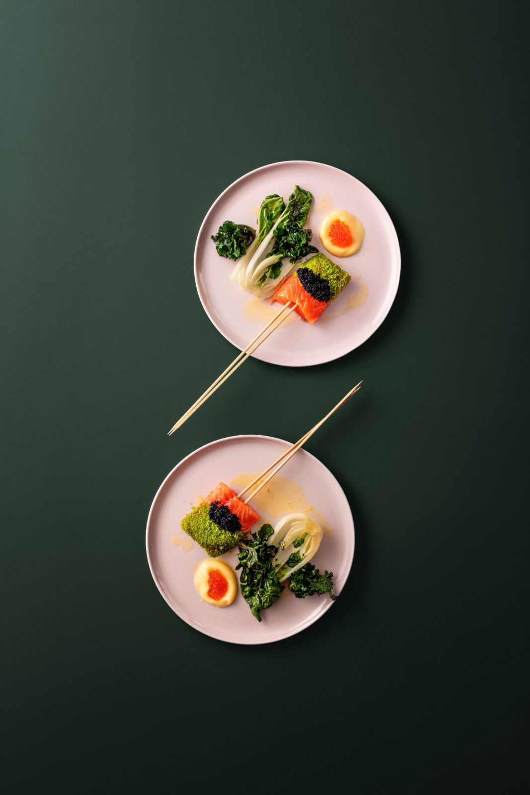
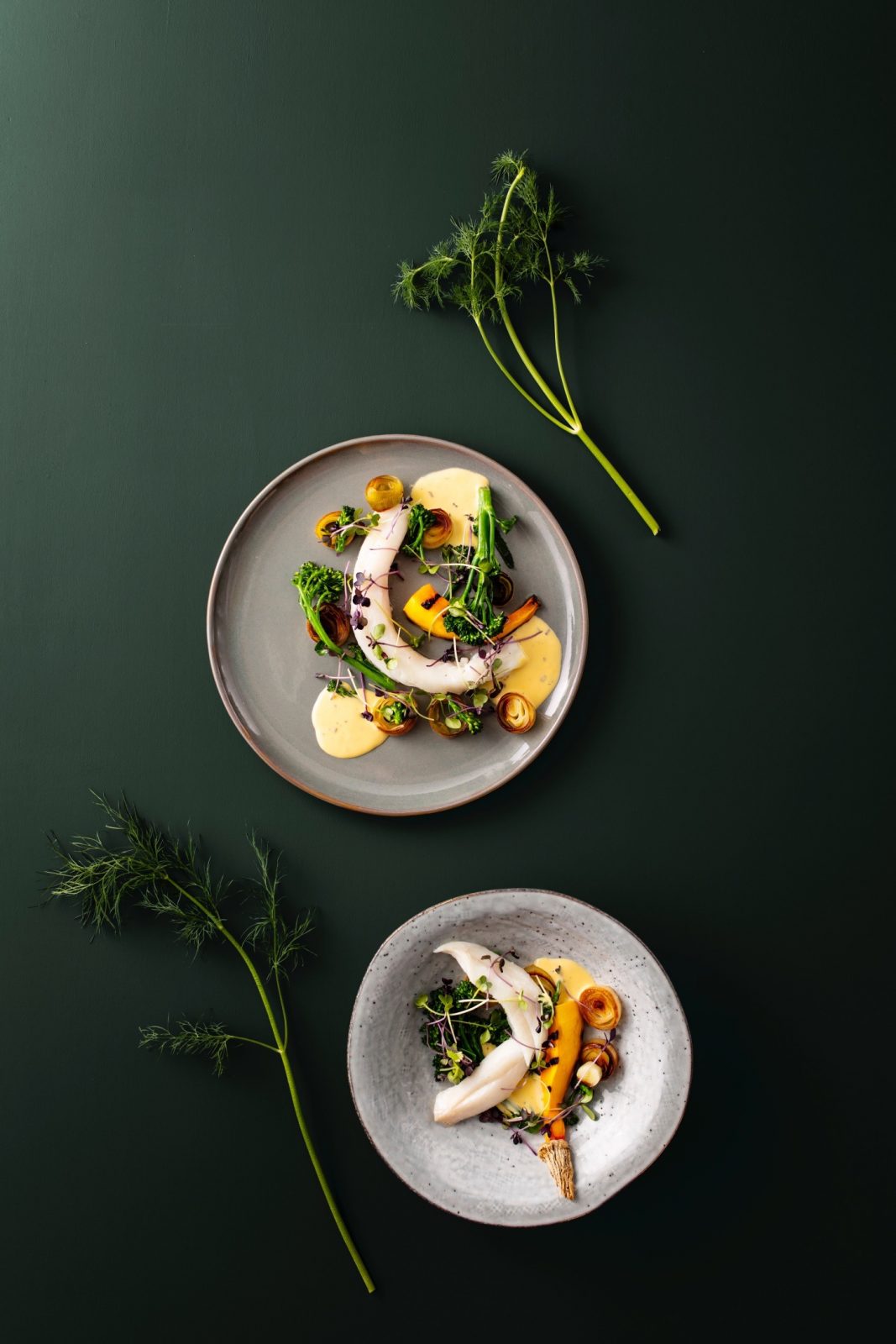
The food photography combines the gritty with the high-end. The brand colors has been used in the background and in the plates. It is a high-quality fish, so the dishes prepared are luxurious. Still, they are ambiguous of their presence, as we wanted to create inspiration, not traditionally Norwegian dishes. The fishes are always in the focus, and the rest of the ingredients compliments it through contrasting colors.
CREDIT
- Agency/Creative: KIND
- Article Title: Babord Photography for Identity by Kind
- Organisation/Entity: Agency
- Project Type: Photography
- Project Status: Published
- Agency/Creative Country: Norway
- Agency/Creative City: Bergen
- Market Region: Global
- Project Deliverables: Photography, Photography Styling
- Industry: Food/Beverage
- Keywords: WBDS Agency Design Awards 2021/22
-
Credits:
Creative Director: Tom Emil Olsen
Design Director & Senior Designer: Knut Harald Longva
Photographer: Christoffer Meyer
Designer: ristine Flatland Larsen
Project Manager: Beate Myren Romslo
Strategic Brand Consultant: Thomas Danielsen


