Kind has developed the new brand and communication strategy for the merger between three Norwegian maritime veterans, Torbas, Seaprime Group and Lyng Group. The merger forms an unwavering rock of a company, gathered under the new brand name, Babord.
A celebrated hero. An unsung bauta. The concept of yin and yang is recognised the world over. In traditional Norwegian culture, this duality is captured in the relationship between the celebrated seafaring hero and the unsung loved one who remains at home.
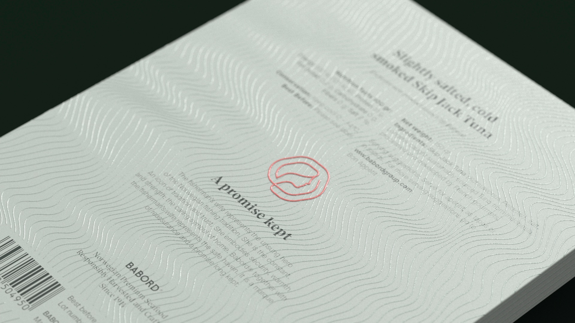
The fisherman’s wife represents the unsung bauta of the Norwegian fishing tradition. She is the constant. An icon of tradition and trust. She embodies security, warmth, and strength: the caring symbol of home. Babord® together with the fisherman’s wife represent the safe haven. It is a marque of reassurance and a promise long kept.
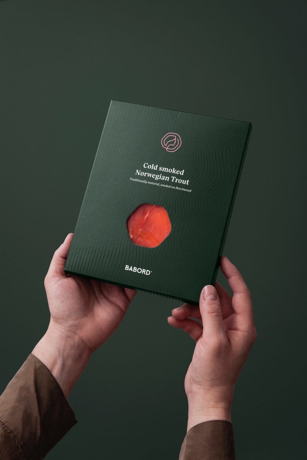
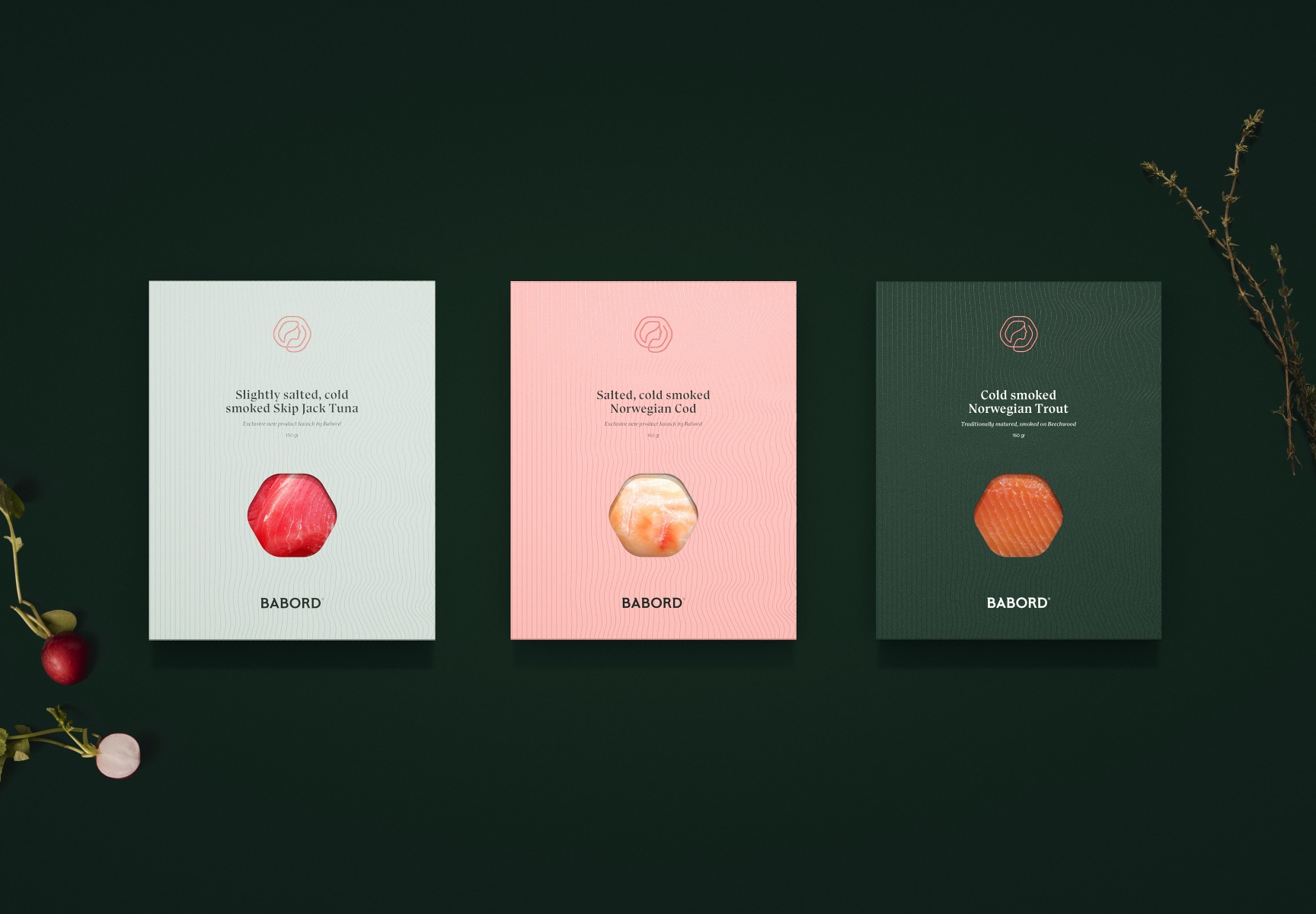
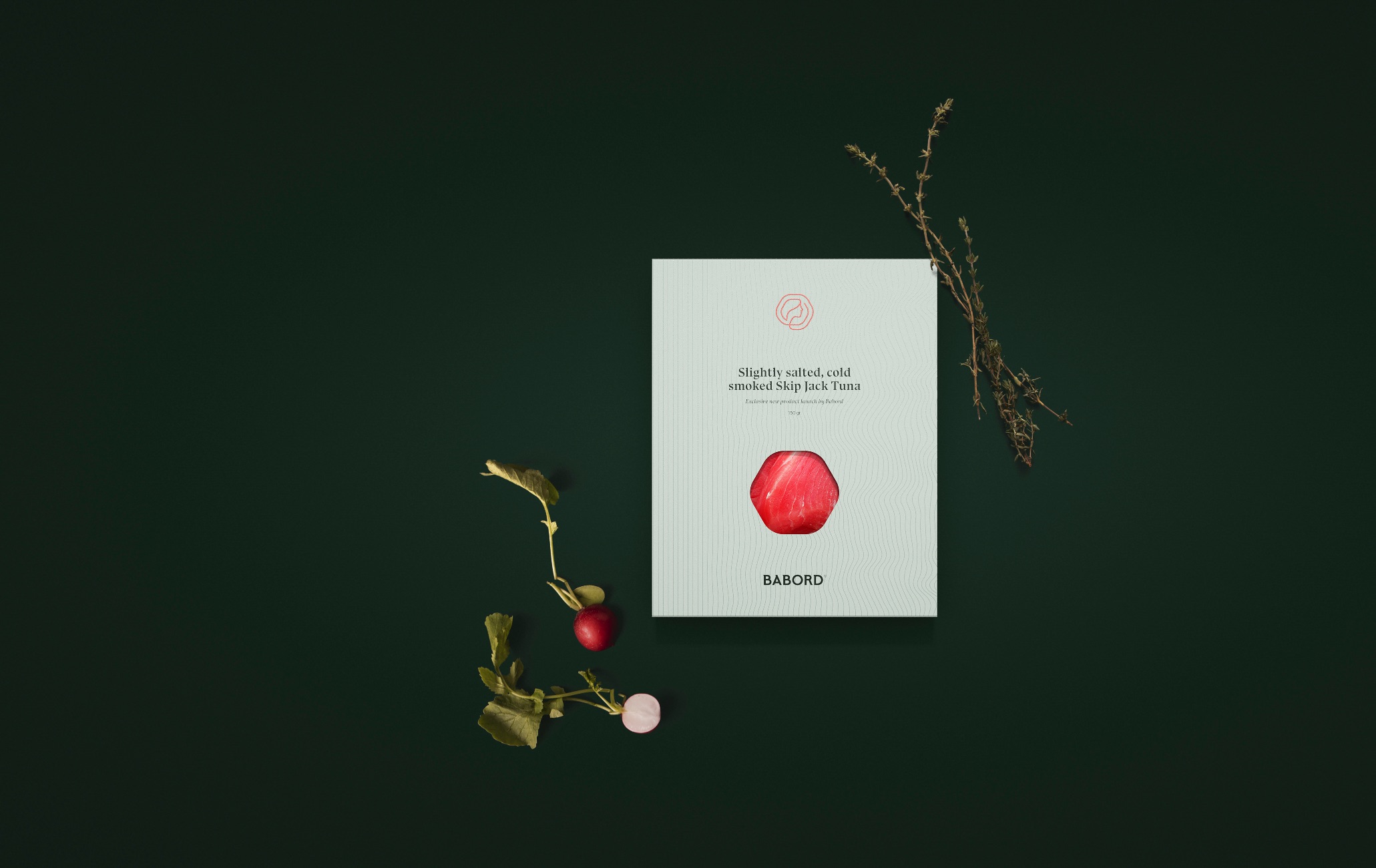
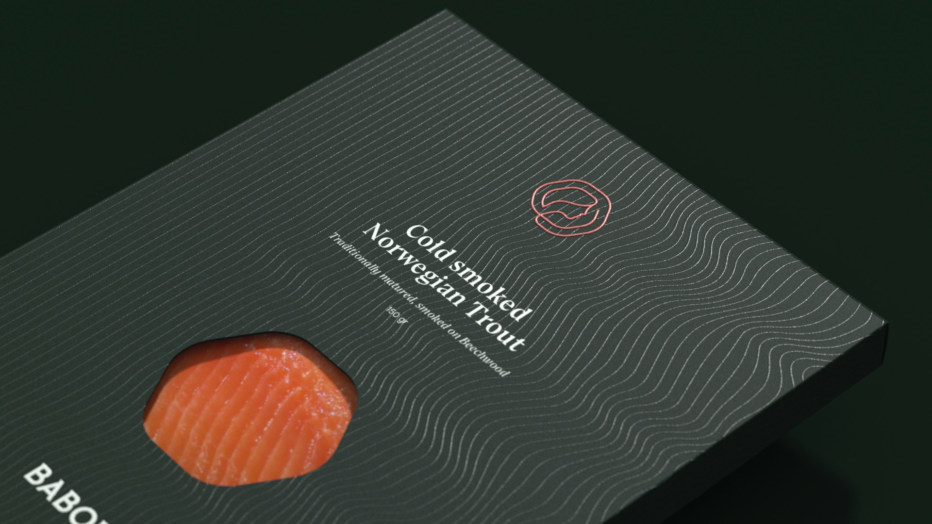
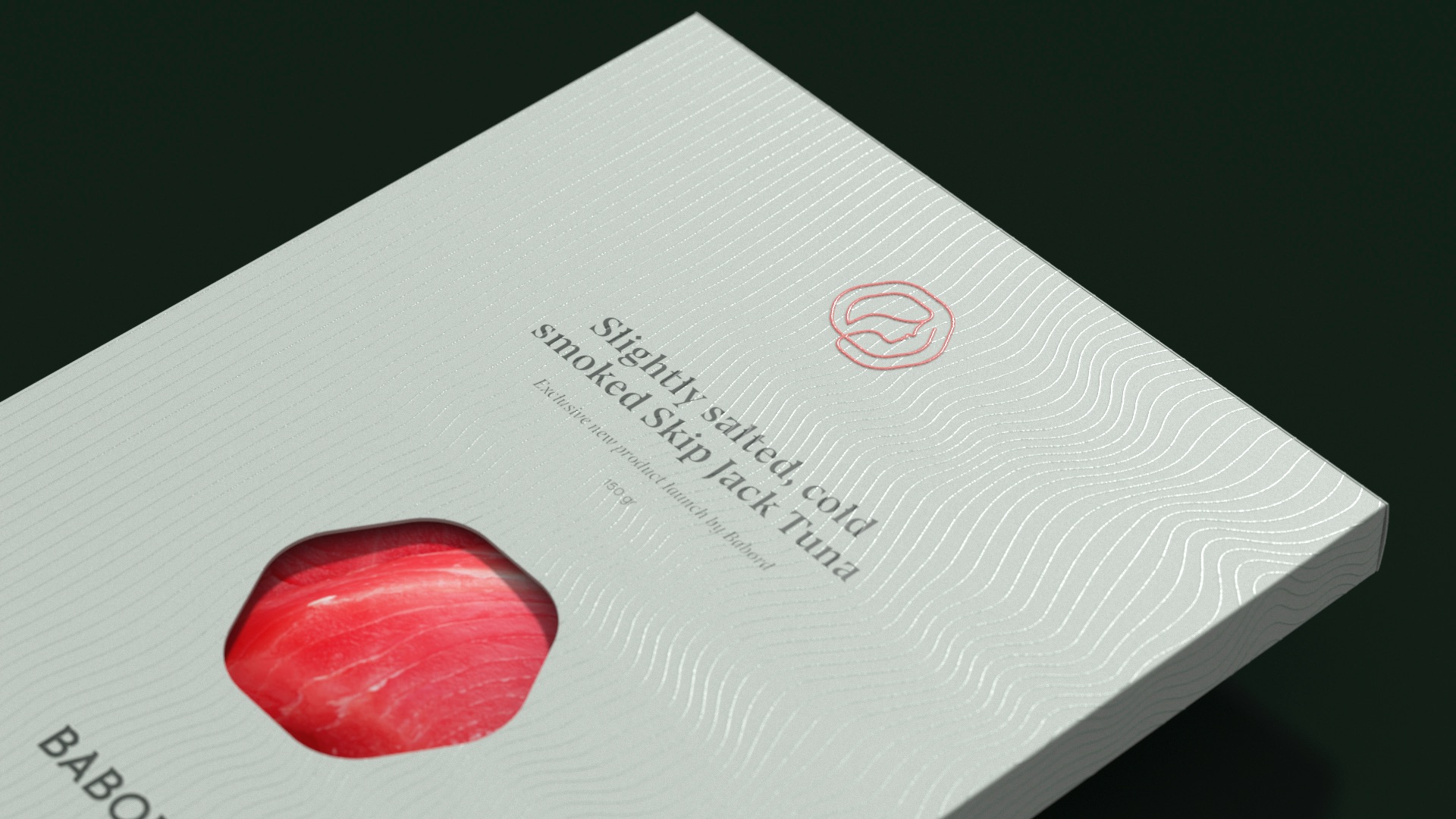
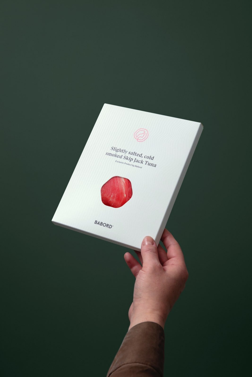
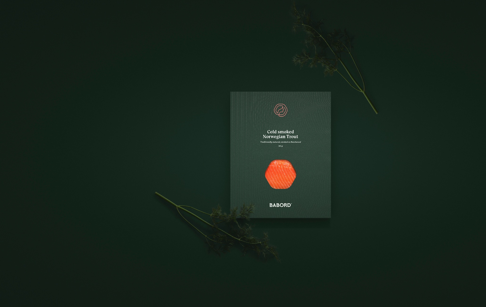
With the rebrand, the company wanted create packaging for giveaways. These would be handed out at trade fairs, to workers and to visitors. It was important to create handy packaging, that would fit fine cuts of cold smoked filets. The first three products to be released are Smoked Skip Jack Tuna, Norwegian Cod and Trout.
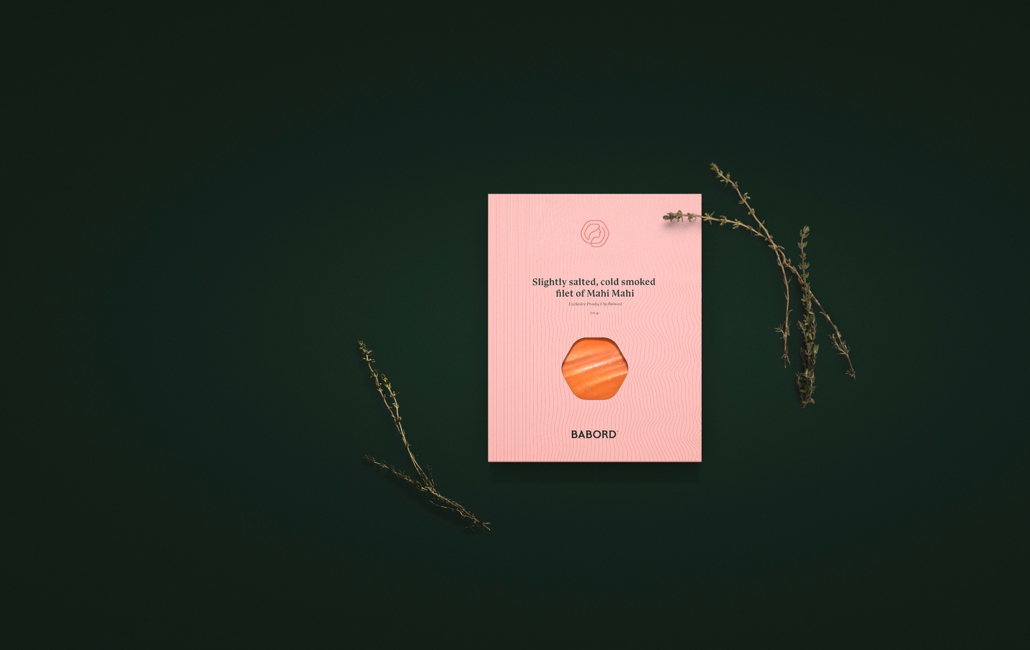
The Babord brand colors are used for the main color of the packaging, and specifically chosen to contrast and compliment the colors of the different filets.
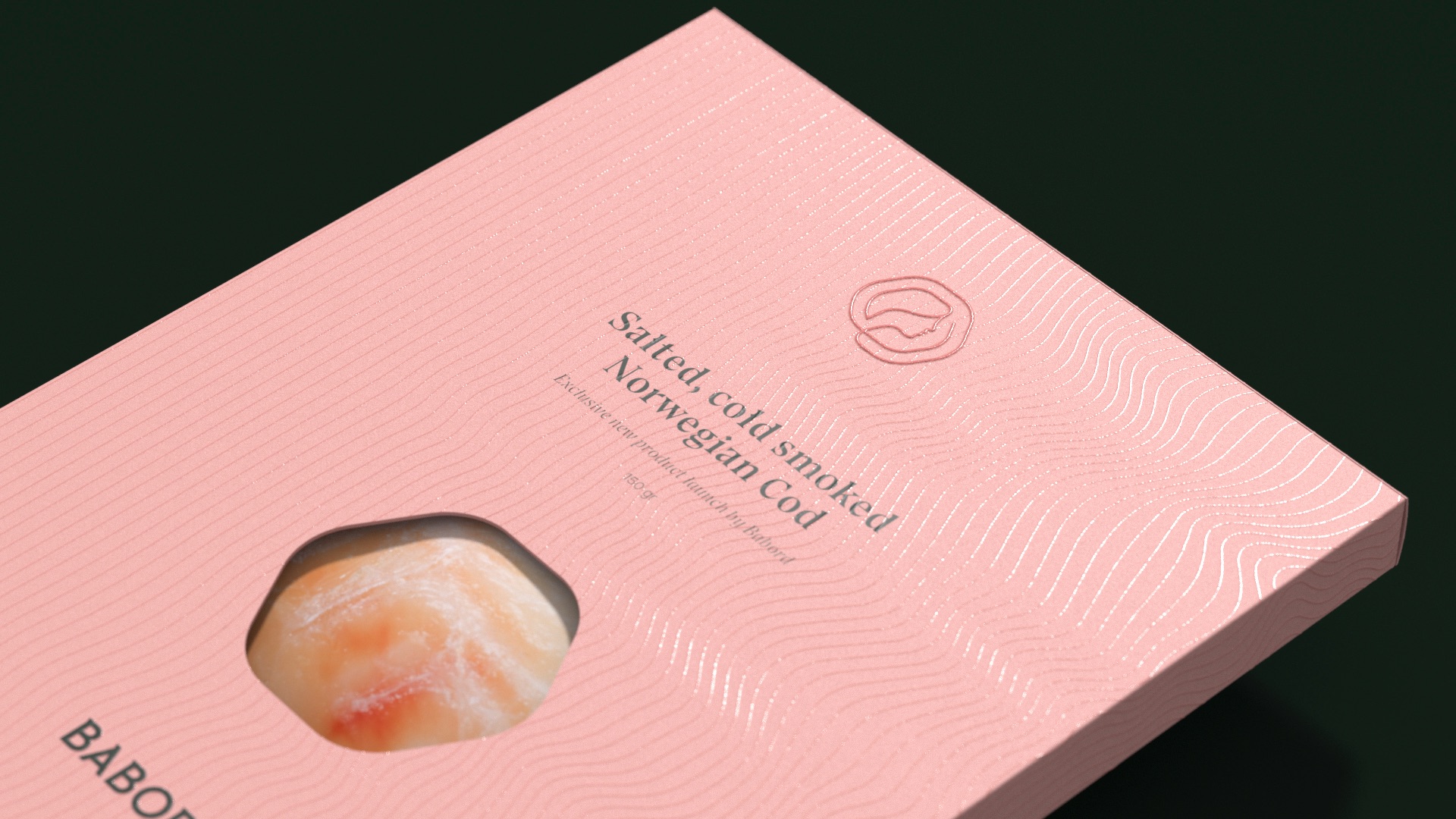
The rounded outer shape of the Babord icon has been used to create a cut out on the pack, that shows the fillet inside. A lined wave pattern, that increasingly get more wavy, wraps around the packaging in a discreet spot varnish finish.
The design elements are positioned in a line, in the center on the boxes. It starts with the symbol on top of the pack, and finishing on the Babord logotype on the bottom. The typographic elements and positioning of the text and cut-out ties the boxes together, adds diversity to the range.
The boxes worked well for their purpose, and their convenient and slim folded structure makes them convenient to bring to fairs around Europe.
The groups business is built on trust. Traceability is not an option. It’s a demand. Babord Groups sustainable harvesting traditions run way deeper than the cold clear waters they fish. Trust, traceability, tradition – this trinity ensures that Babord always deliver superior seafood, responsibly harvested and carefully processed, from harbour to home.
CREDIT
- Agency/Creative: KIND
- Article Title: Babord Packaging Design Creation by Kind
- Organisation/Entity: Agency
- Project Type: Packaging
- Project Status: Published
- Agency/Creative Country: Norway
- Agency/Creative City: Bergen
- Market Region: Global
- Project Deliverables: Packaging Design
- Format: Box
- Substrate: Pulp Carton, Pulp Paper
- Industry: Food/Beverage
- Keywords: WBDS Agency Design Awards 2021/22
-
Credits:
Creative Director: Tom Emil Olsen
Design Director & Senior Designer: Knut Harald Longva
Senior Designer: Agnieszka Gawlik
Designer: Kristine Flatland Larsen


