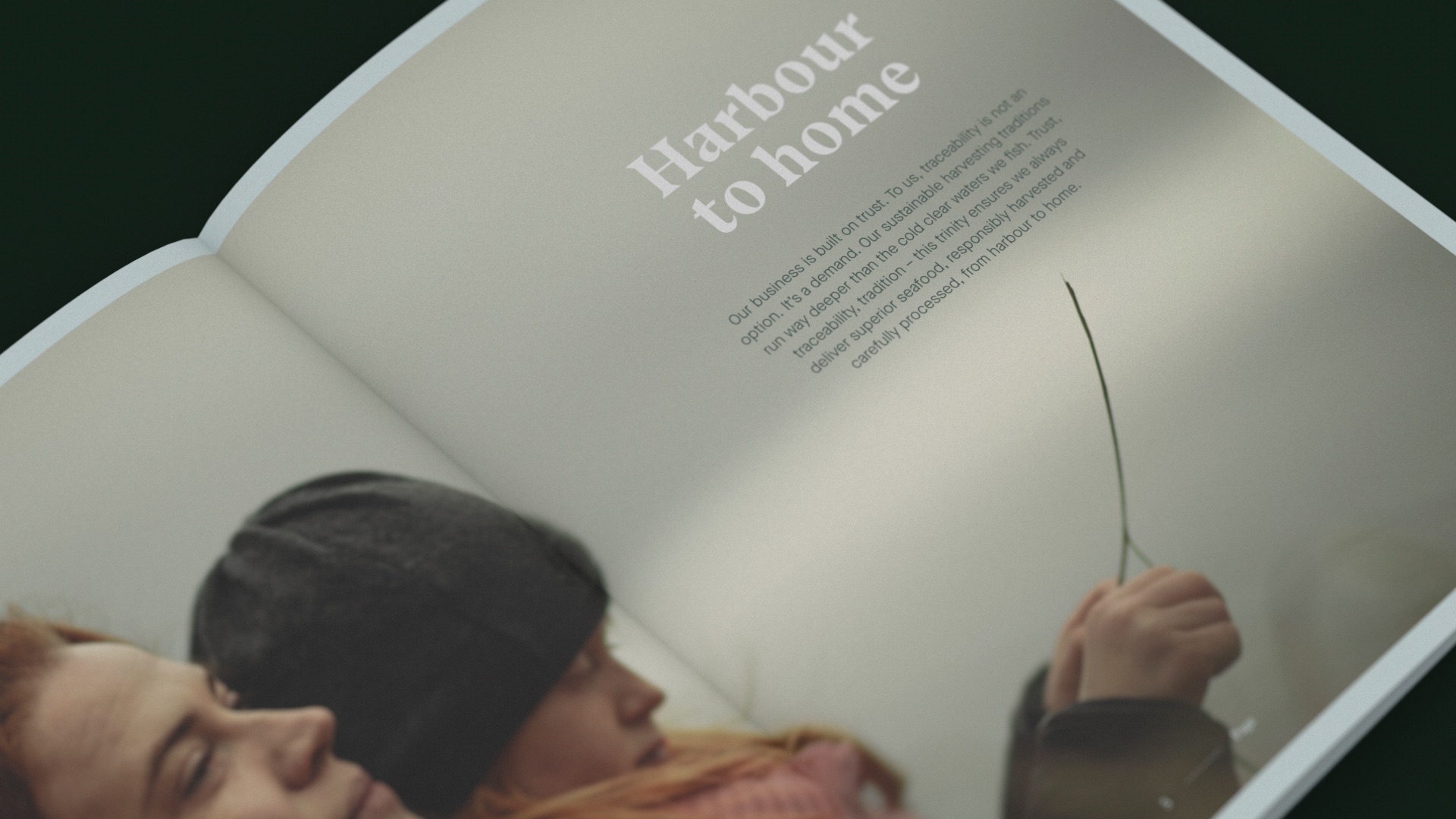
Harbour to home
Kind has developed the new brand and communication strategy for the merger between three Norwegian maritime veterans, Torbas, Seaprime Group and Lyng Group. The merger forms an unwavering rock of a company, gathered under the new brand name, Babord.
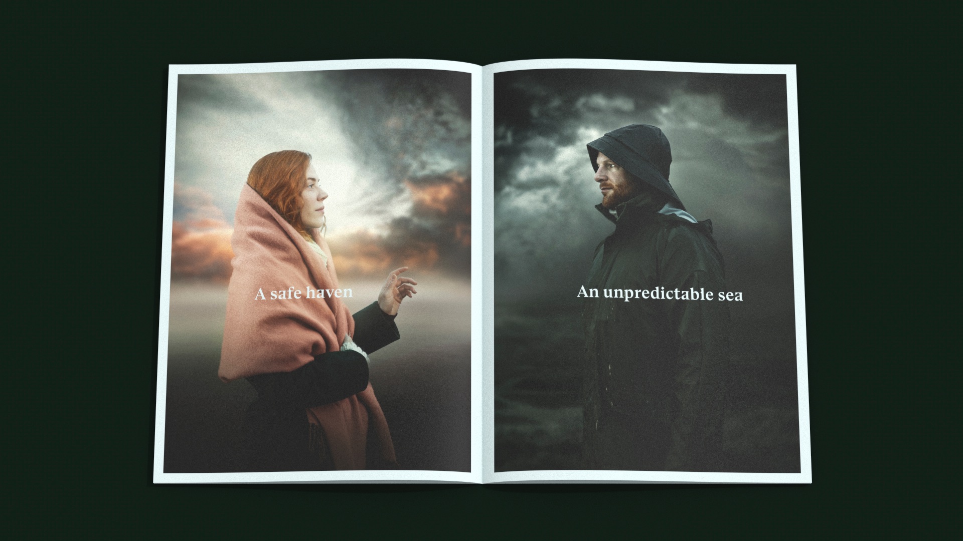
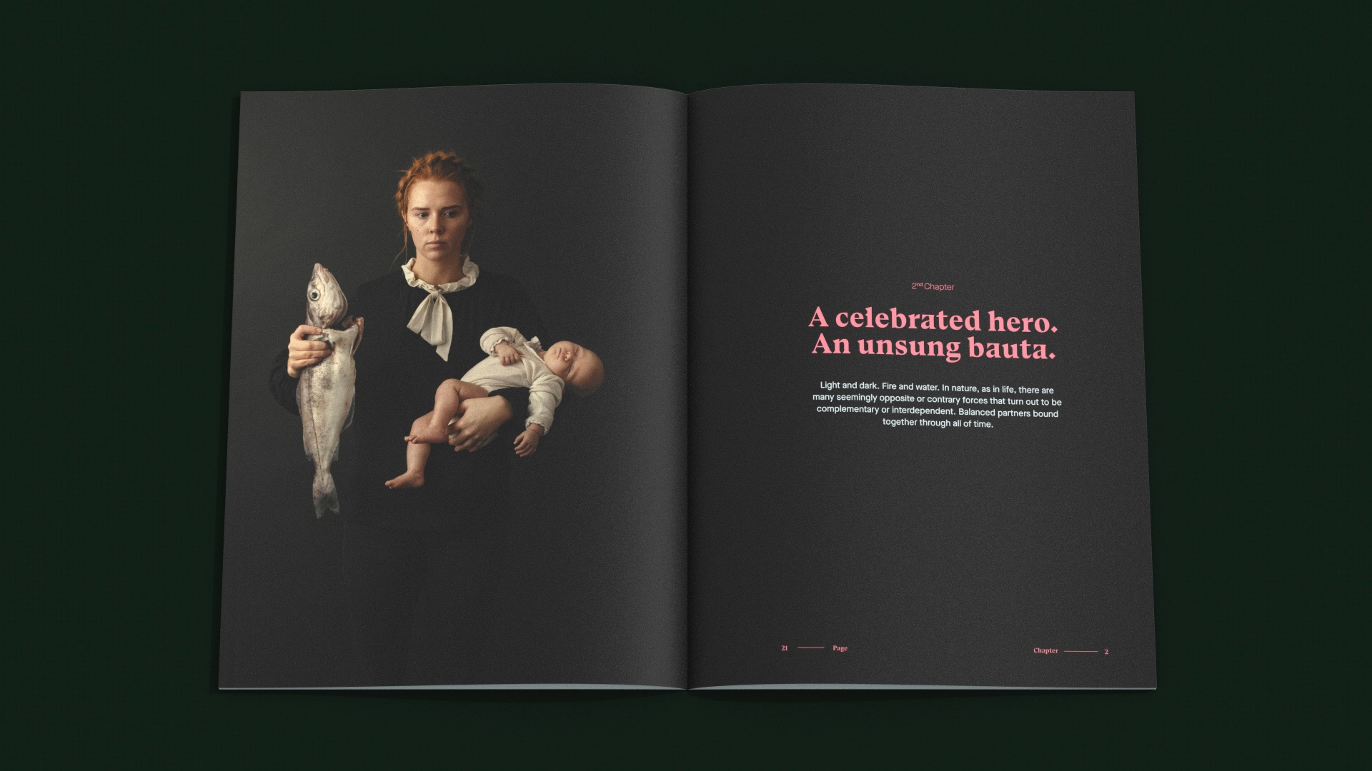
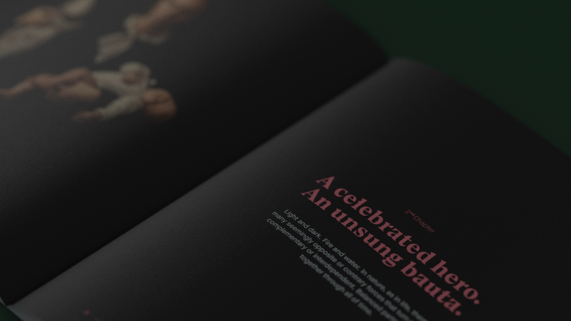
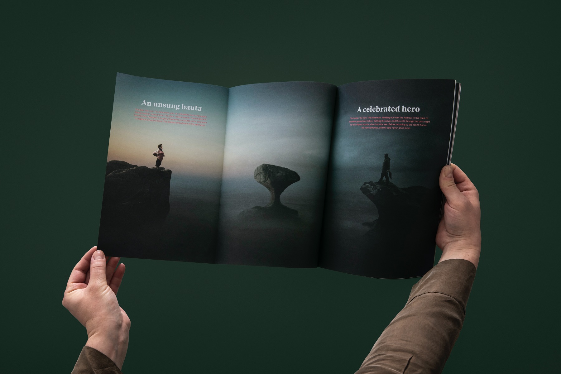
A celebrated hero. An unsung bauta. The concept of yin and yang is recognised the world over. In traditional Norwegian culture, this duality is captured in the relationship between the celebrated seafaring hero and the unsung loved one who remains at home.
The fisherman’s wife represents the unsung bauta of the Norwegian fishing tradition. She is the constant. An icon of tradition and trust. She embodies security, warmth, and strength: the caring symbol of home. Babord® together with the fisherman’s wife represent the safe haven. It is a marque of reassurance and a promise long kept.
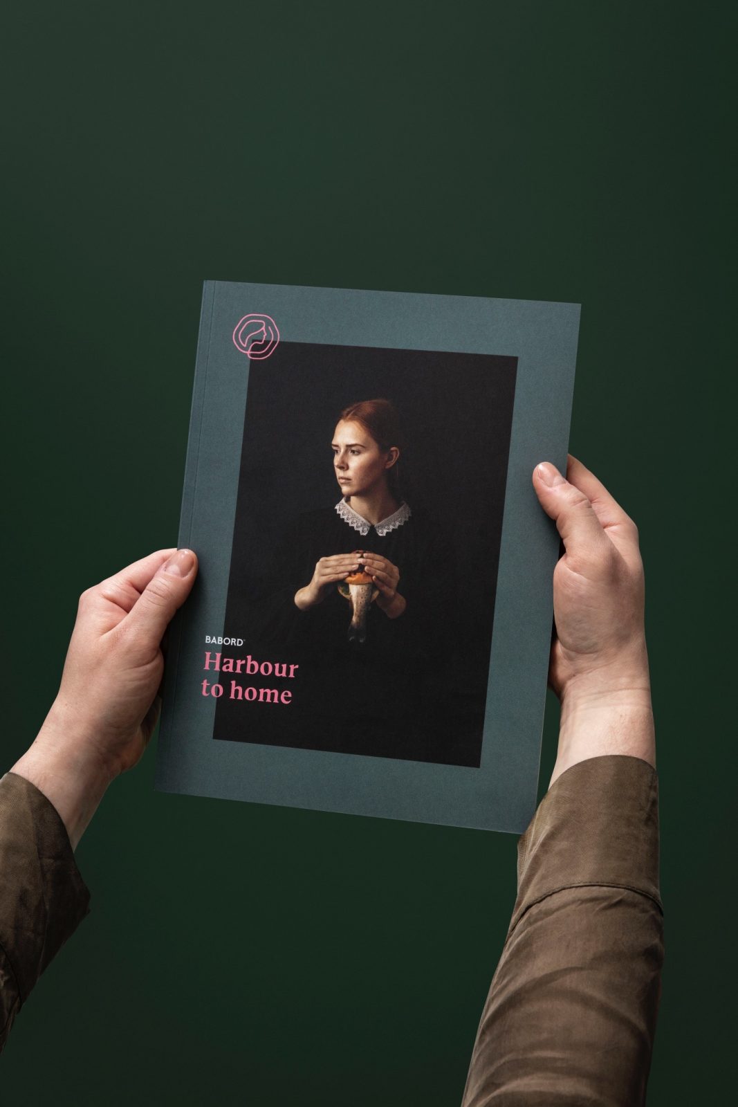
With the rebrand, the company wanted to something to gather the new brand elements and to give away at trade shows, internally to staff and to other visitors. This resulted in a brochure that communicates the emotional brand story of the unsung bauta.
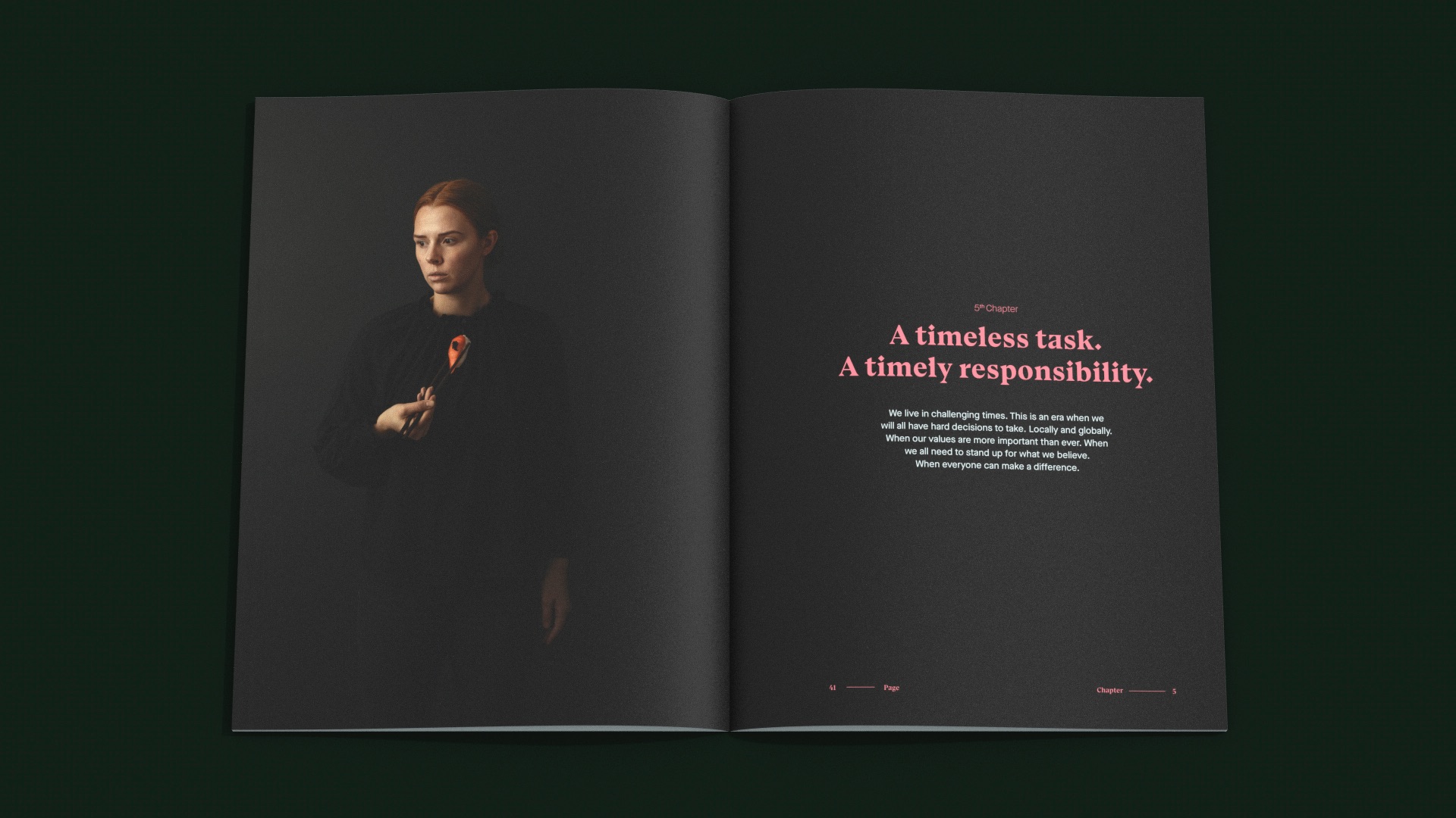
Custom photography was captured for the brand and the brochure. This consists of images of the scenery at Måløy, concept images of the fisherman and his wife, and food photography. Through the brochure all are used, to show the contrast and connection between the imagery.
The book opens with a trifold. Here the main concept image gets to show its full potential, and the brand story of the unsung bauta is presented. The fisherwoman is standing in the left page, looking outwards to the right. On the far right is a fisherman, and between them is the Kannestein, a iconic rock formation that is situated in Måløy.
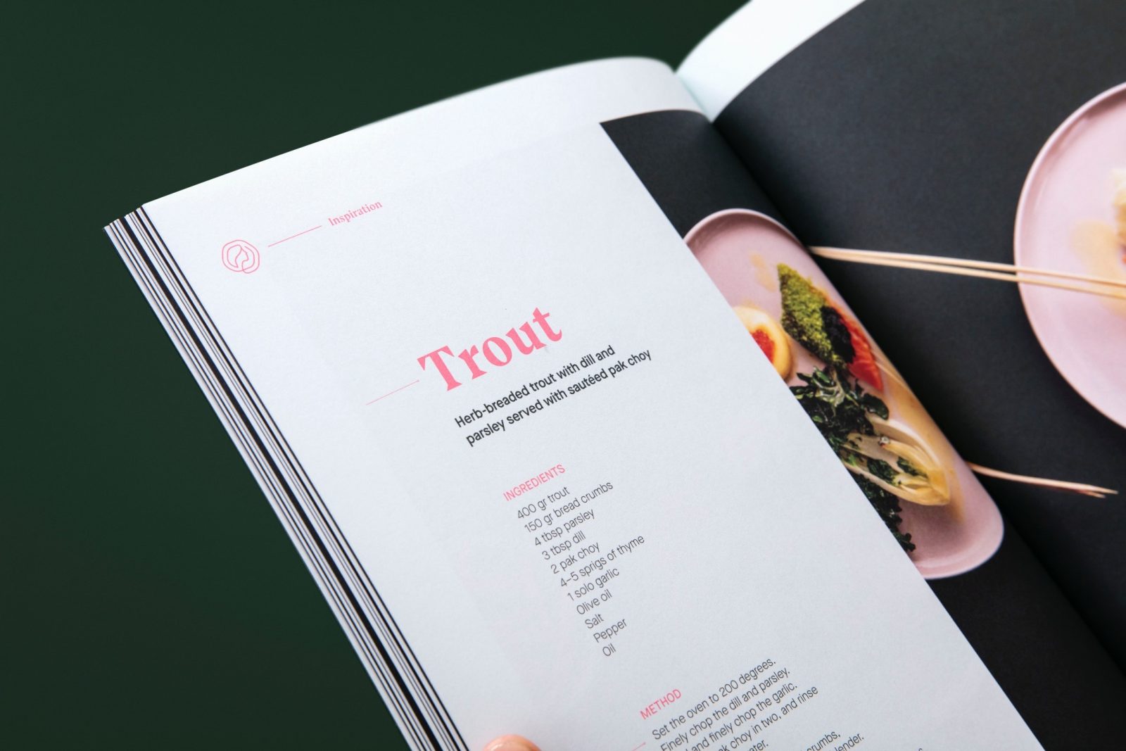
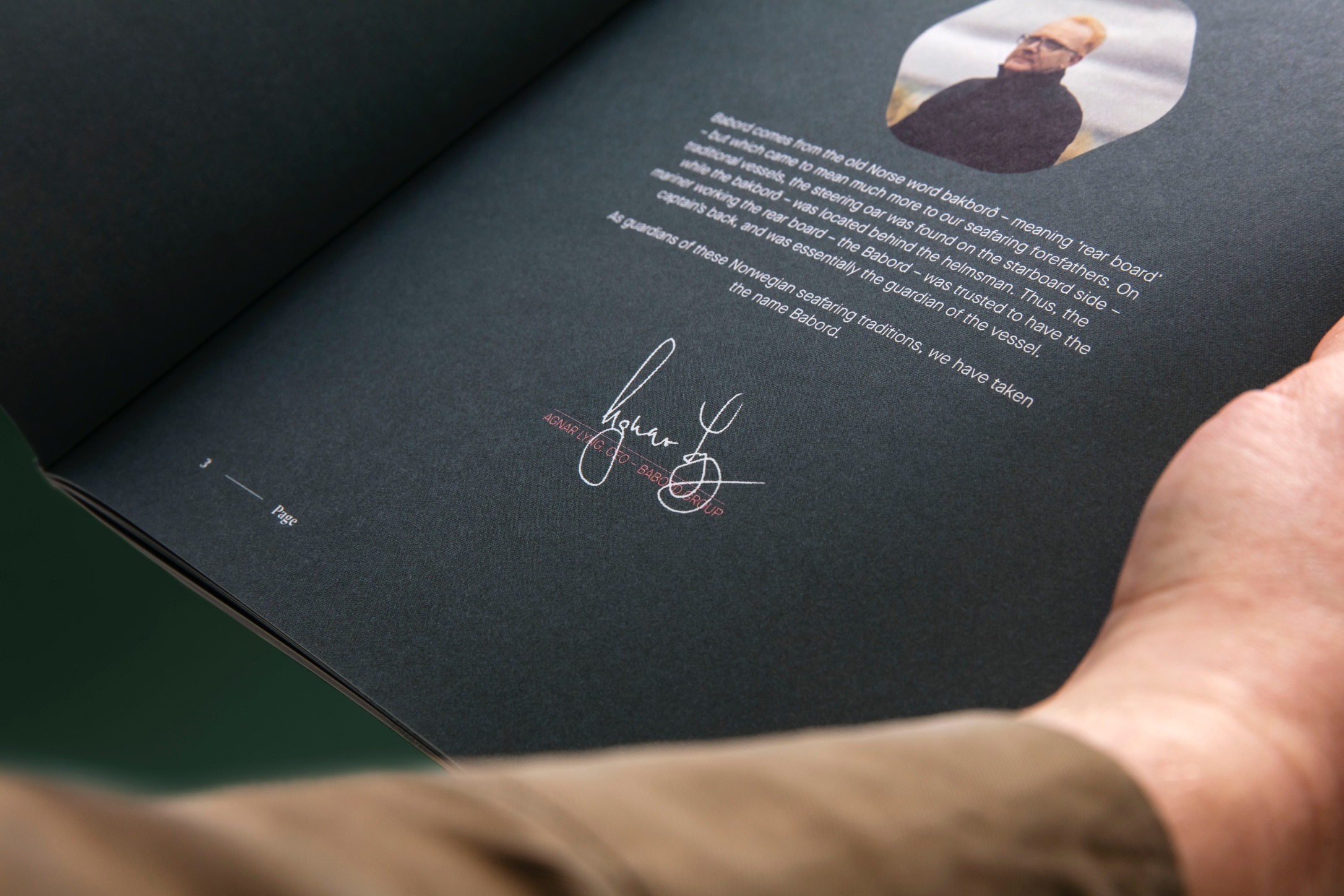
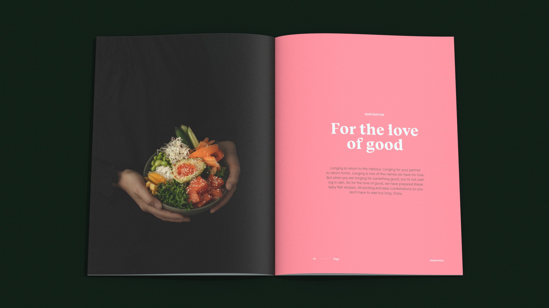
The first 6 chapters consists of texts about the brand, the brand history, and the heritage of Norwegian fishing. Concept images and scenery is mixed to show a diverse brand, tying all the parts together. In the end of the magazine, one will find a set of recipes. We wanted to show the Babord product in a different and interesting way, and have created intriguing recipes in collaboration with Adam Bjerck, a top Chef in Bergen.
The design followes the new Babord brand guidelines, and is unapologetically different other big fishing brands. The brochure is dark green, bright pink and pale mint. The design is left aligned, except on the first pages of each chapters.
The brochures have been used as an important brand element and distributed to strengthen the brand through communicating a more emotional brand story on trade shows.
CREDIT
- Agency/Creative: KIND
- Article Title: Babord Graphic Design for Communication by Kind
- Organisation/Entity: Agency
- Project Type: Graphic
- Project Status: Published
- Agency/Creative Country: Norway
- Agency/Creative City: Bergen
- Market Region: Global
- Project Deliverables: Graphic Design
- Industry: Food/Beverage
- Keywords: WBDS Agency Design Awards 2021/22
-
Credits:
Creative Director: Tom Emil Olsen
Design Director & Senior Designer: Knut Harald Longva
Senior Designer: Agnieszka Gawlik
Photographer: Christoffer Meyer
Project Manager: Beate Myren Romslo
Designer: Kristine Flatland Larsen


