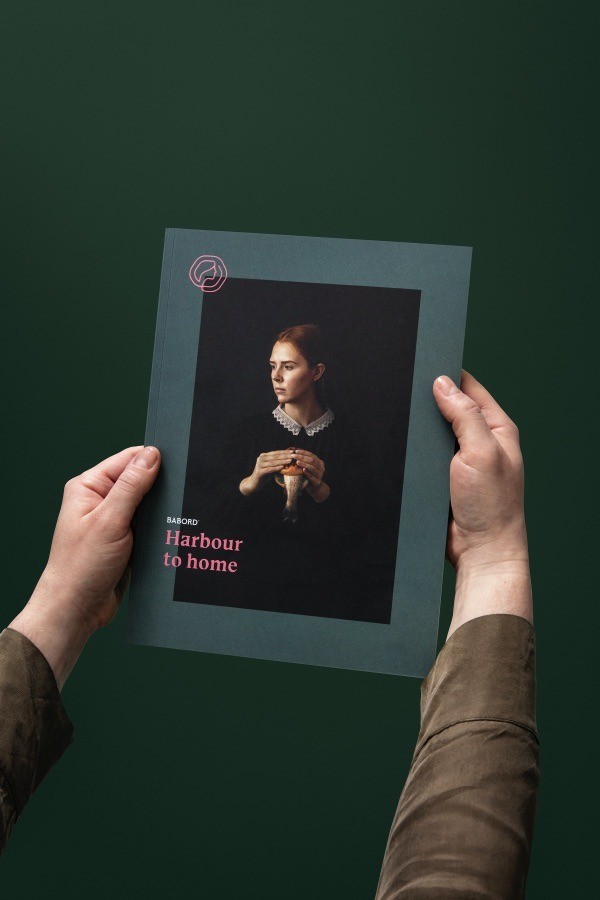
Harbour to home
Kind has developed the new brand and communication strategy for the merger between three Norwegian maritime veterans, Torbas, Seaprime Group and Lyng Group. The merger forms an unwavering rock of a company, gathered under the new brand name, Babord.
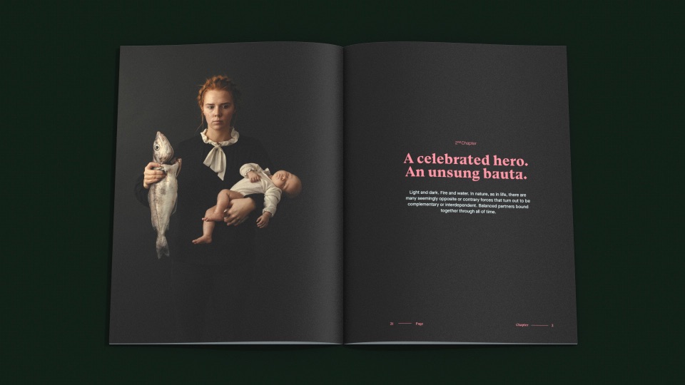
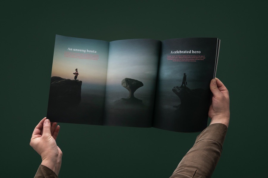
A celebrated hero. An unsung bauta.
Light and dark. Fire and water. In nature, as in life, there are many seemingly opposite or contrary forces that turn out to be complementary or interdependent. Balanced partners bound together through all of time.
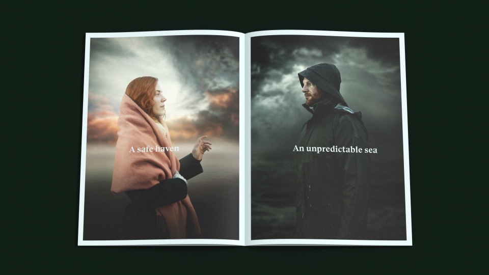
This concept of yin and yang is recognised the world over. In traditional Norwegian culture, this duality is captured in the relationship between the celebrated seafaring hero and the unsung loved one who remains at home. The forces that pull these two apart and then bring them together again, the tides of life and love, underpin the Babord way of thinking. Babord celebrate both the heroes of the sea, and the unsung Bauta, the one who stays at home at the heart of the community: the hunters and the homemakers.
The name: Babord (The guardian)
Babord comes from the old Norse word bakbor – meaning ‘rear board’ – but which came to mean much more to our seafaring forefathers. On the traditional boats, the steering oar was found on the starboard side of the vessel – while the bakbor – was located behind the helmsman. Thus, the mariner working the rear board – the Babord – was trusted to have the captain’s back, and was essentially the guardian of the vessel.
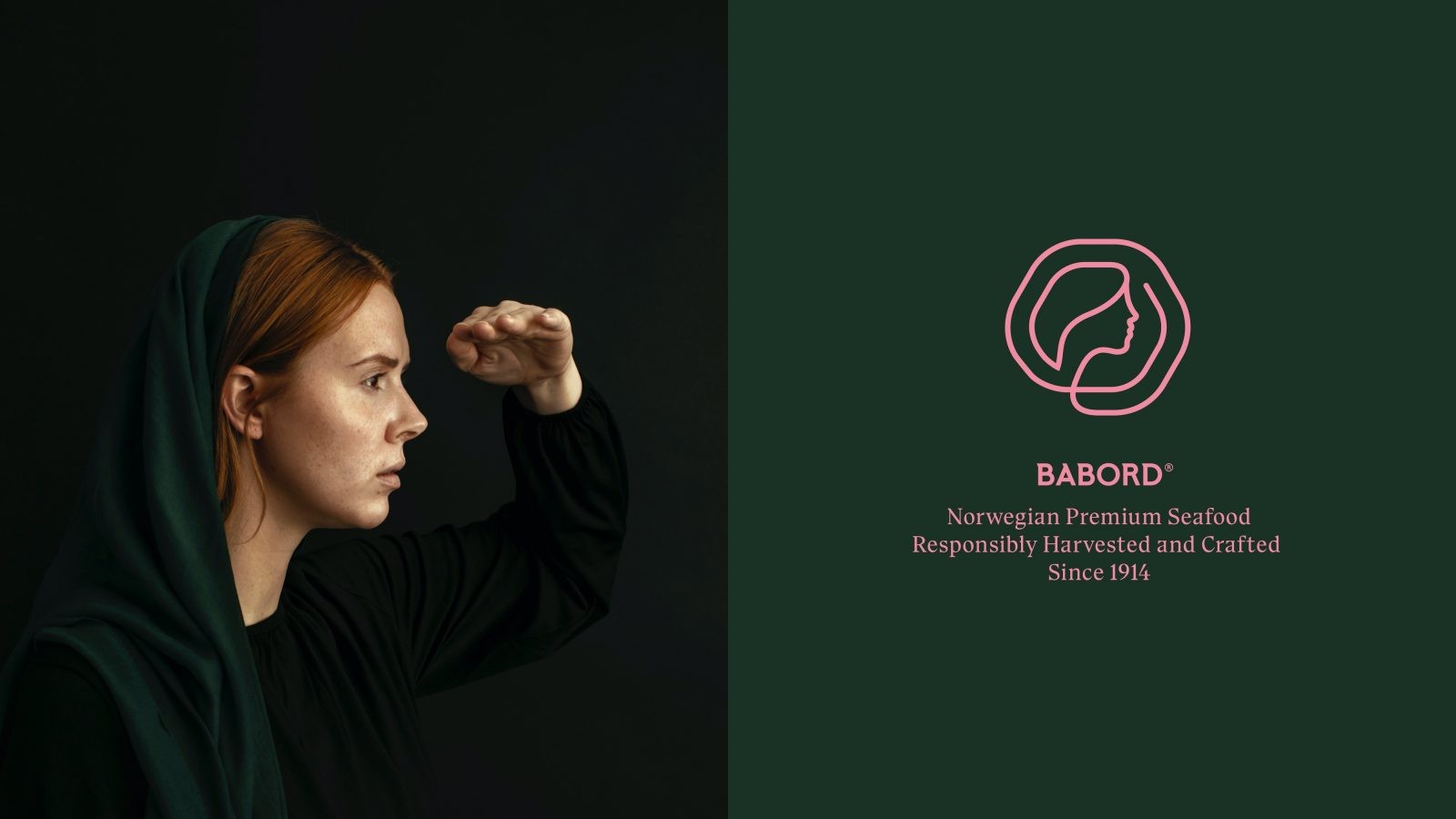
As guardians of these Norwegian seafaring traditions, the company have taken the name Babord.
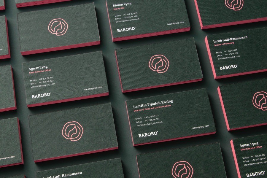
The Marque: A promise kept
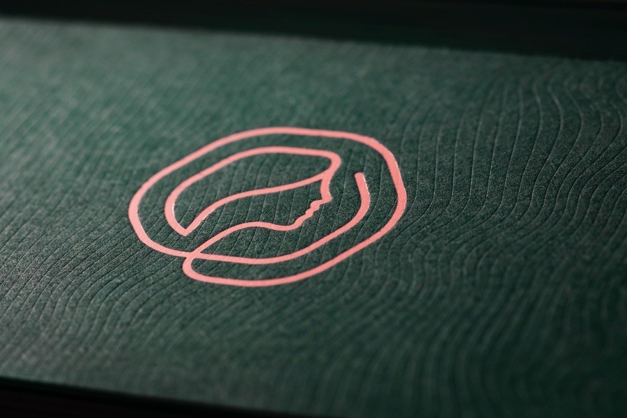
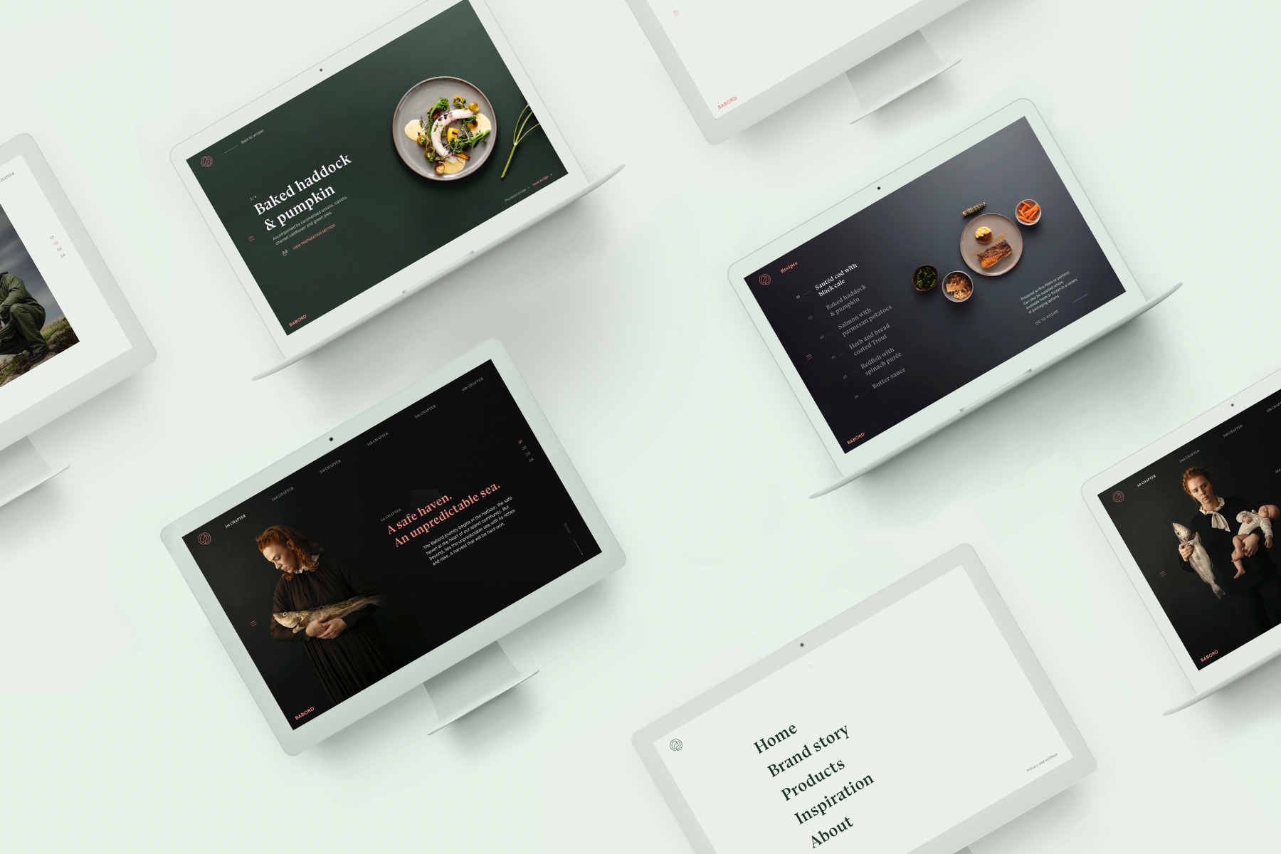
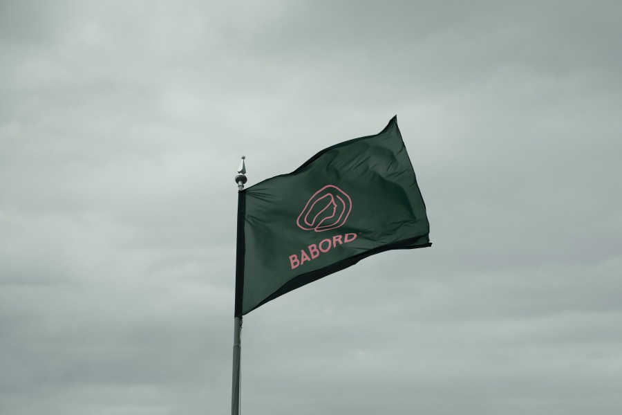
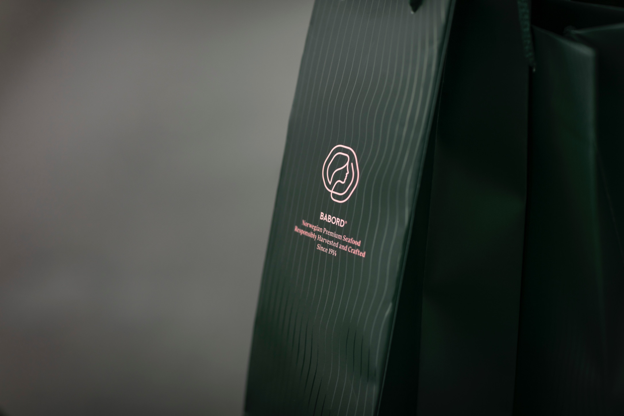
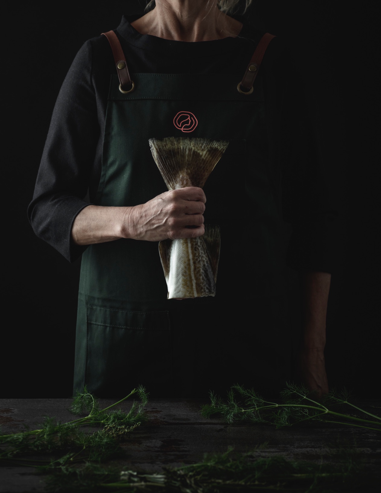
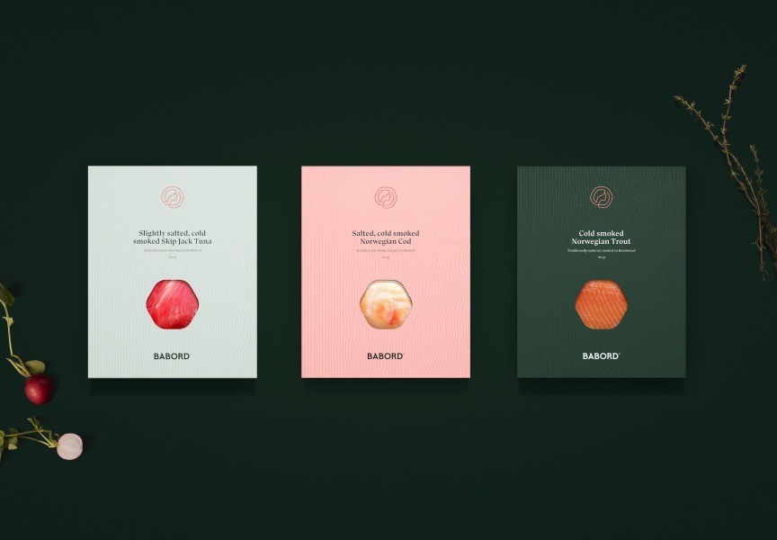
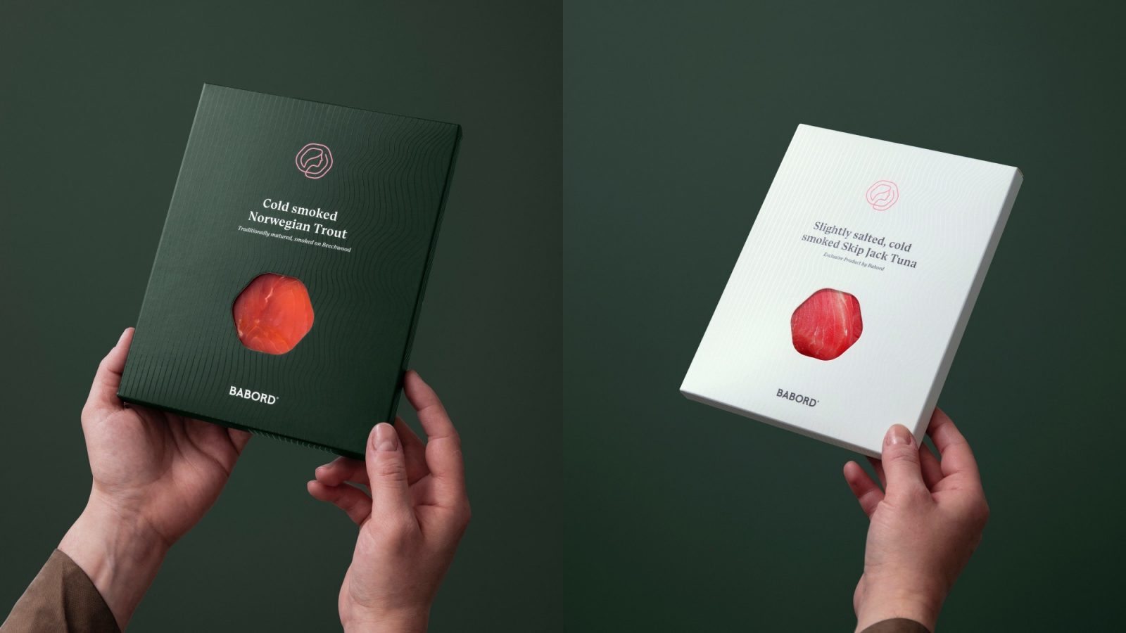
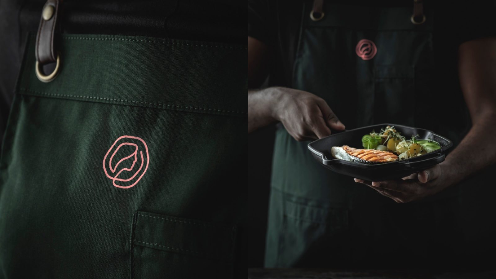
The fisherman’s wife represents the unsung bauta of the Norwegian fishing tradition. She is the constant. An icon of tradition and trust. She embodies security, warmth and strength: the caring symbol of home. Babord® together with the fisherman’s wife represent the safe haven. It is a marque of reassurance and a promise long kept.
The Slogan: Harbour to home
The groups business is built on trust. Traceability is not an option. It’s a demand. Babord Groups sustainable harvesting traditions run way deeper than the cold clear waters they fish. Trust, traceability, tradition – this trinity ensures that Babord always deliver superior seafood, responsibly harvested and carefully processed, from harbour to home.
CREDIT
- Agency/Creative: KIND
- Article Title: Babord Brand Redesign by Kind
- Organisation/Entity: Agency
- Project Type: Identity
- Project Status: Published
- Agency/Creative Country: Norway
- Agency/Creative City: Bergen
- Market Region: Global
- Project Deliverables: Brand Identity
- Industry: Food/Beverage
- Keywords: WBDS Agency Design Awards 2021/22
-
Credits:
Creative Director: Tom Emil Olsen
Design Director & Senior Designer: Knut Harald Longva
Senior Designer: Agnieszka Gawlik
Designer: Kristine Flatland Larsen
Senior Designer: Carl Bugge
Photographer: Christoffer Meyer
Project Manager: Beate Myren Romslo
Strategic Brand Consultant: Thomas Danielsen


