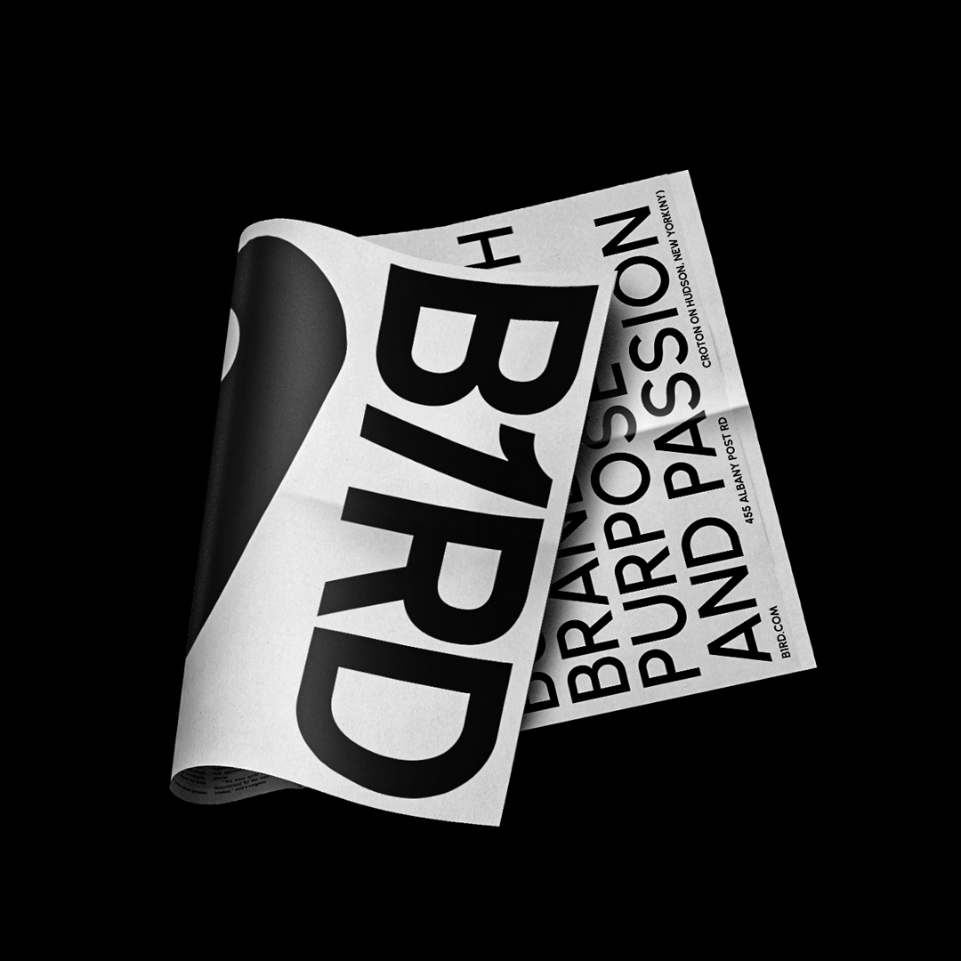
Bird is a studio specializing in graphics work and visual effects for films, series, and corporate identities in the United States of America.
After studying the client’s brief and with the help of some research about the nature of the brand, i found that the brand’s name itself is the key to a solid and clear design solution, I Started with exploring different styles and directions for a modern and elegant typeface that perfectly matches the brand mission and vision.
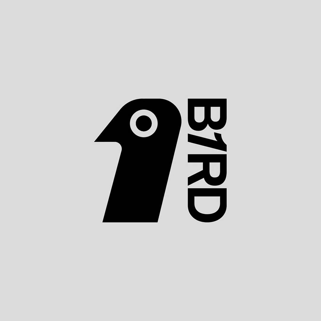
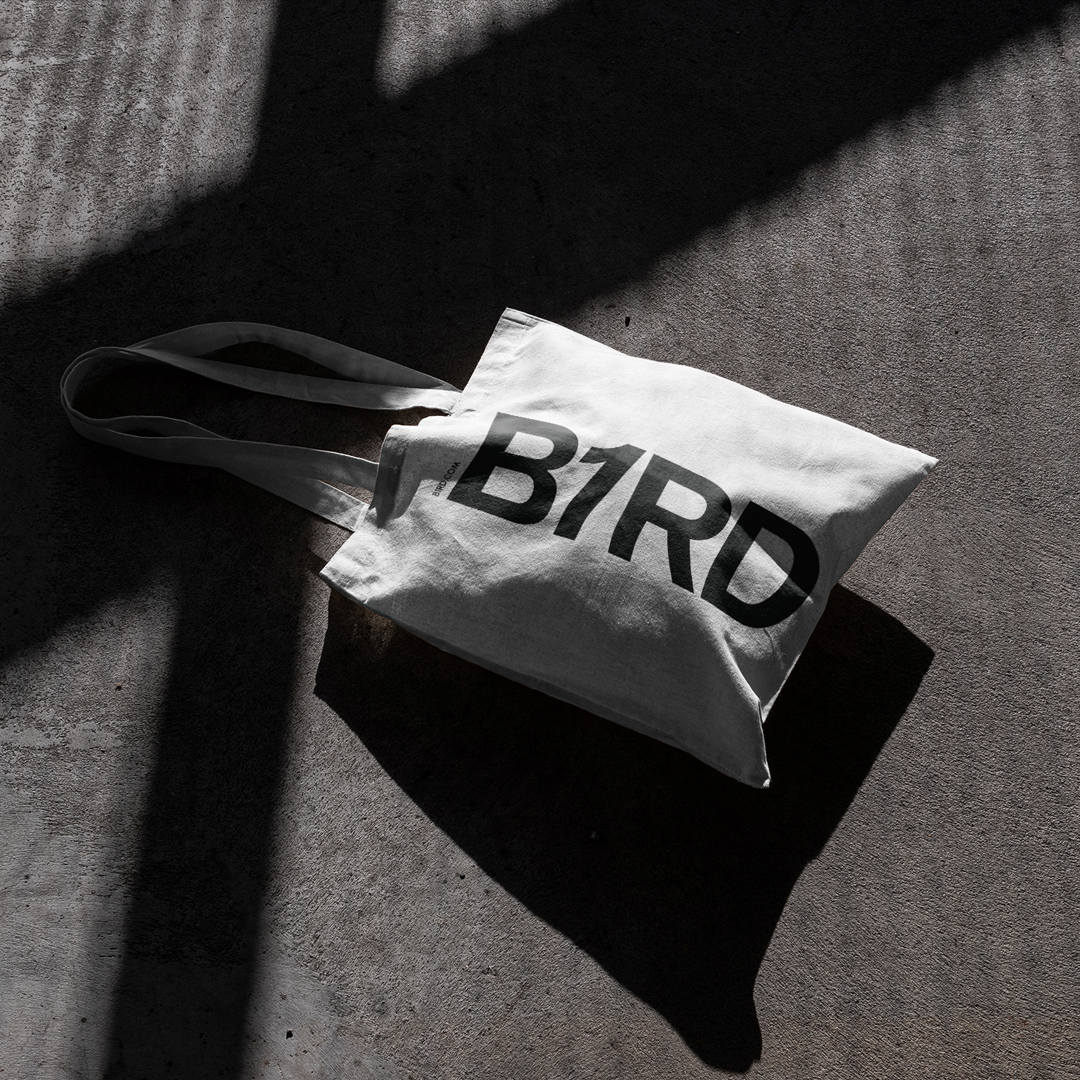
We modified the wordmark to be more unique in shape as it would be the main graphic element used in the visual identity along.
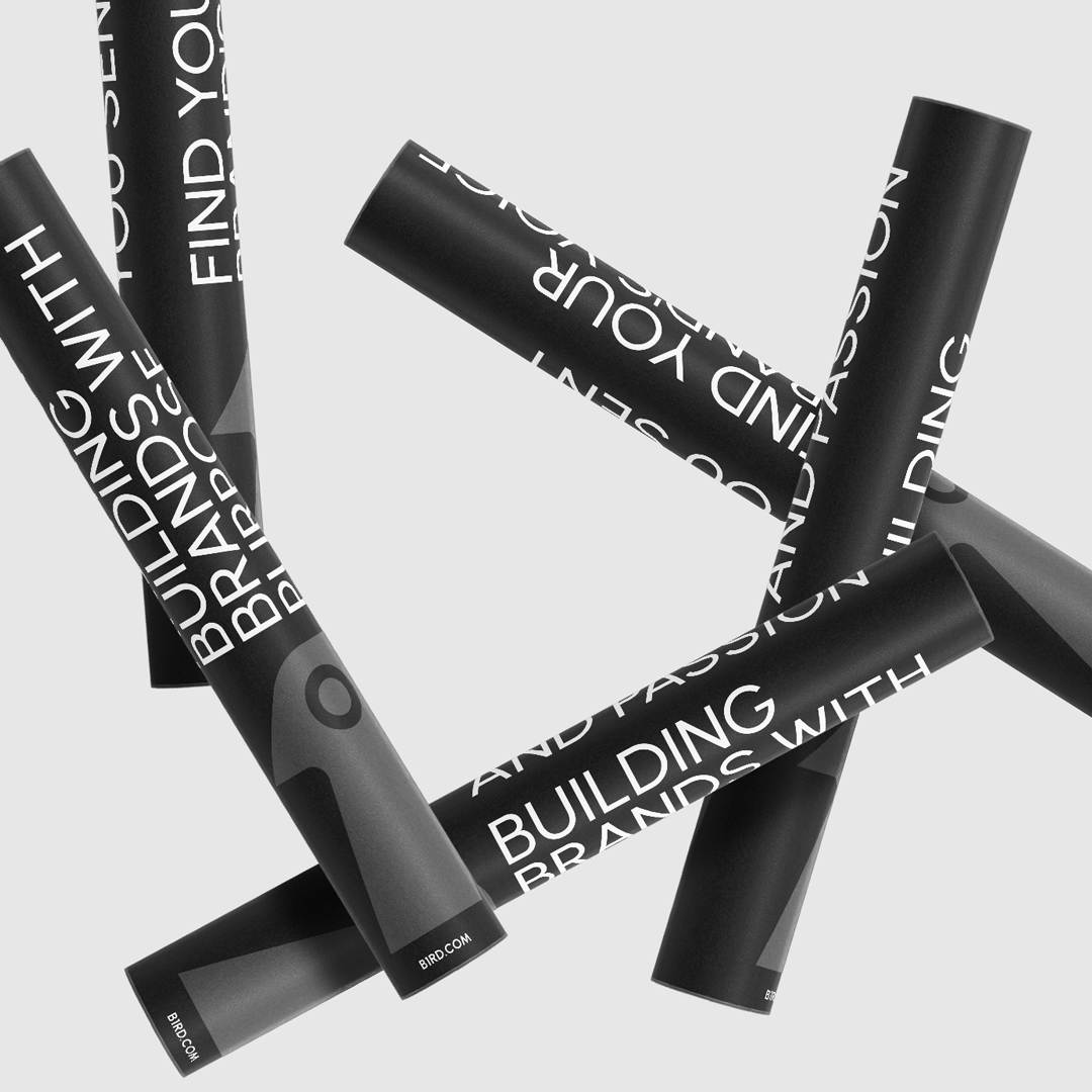
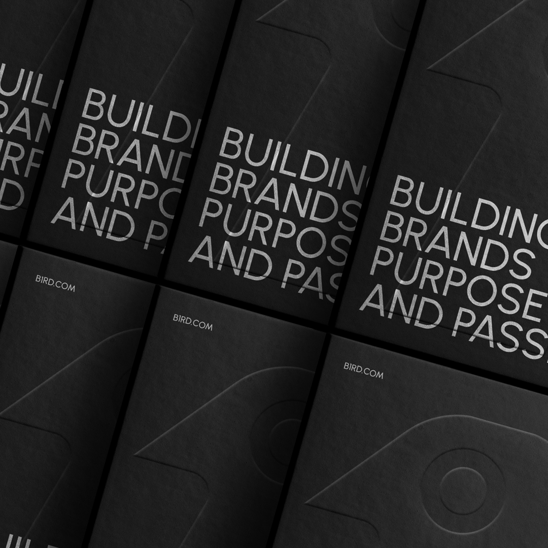
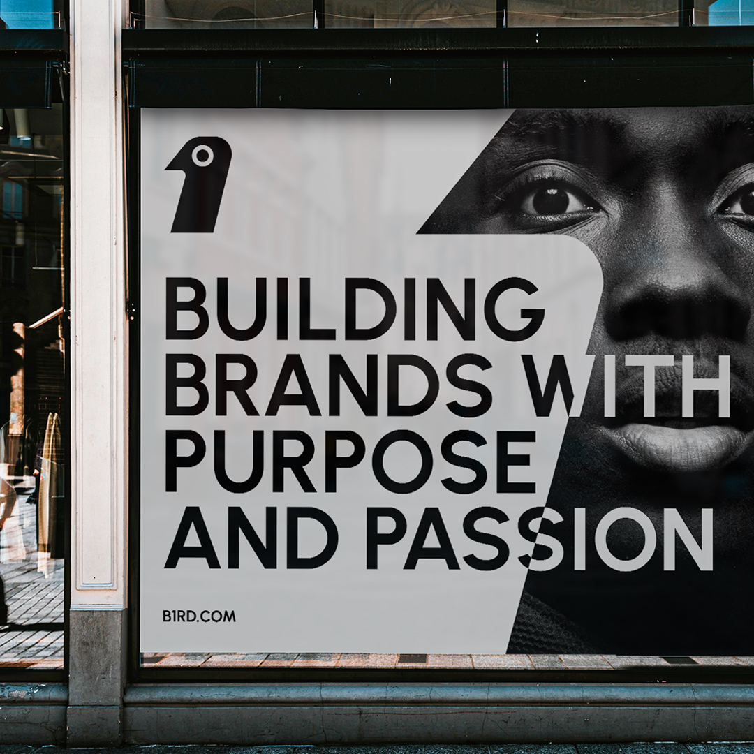
Among the work team’s interest was to reach the best possible shape for the brand. We eventually came up with the creation of a sign, which is the shape of the bird, which also symbolises the number one, in addition to drawing the word for the brand, which is Bird, with the letter i replaced by one number.
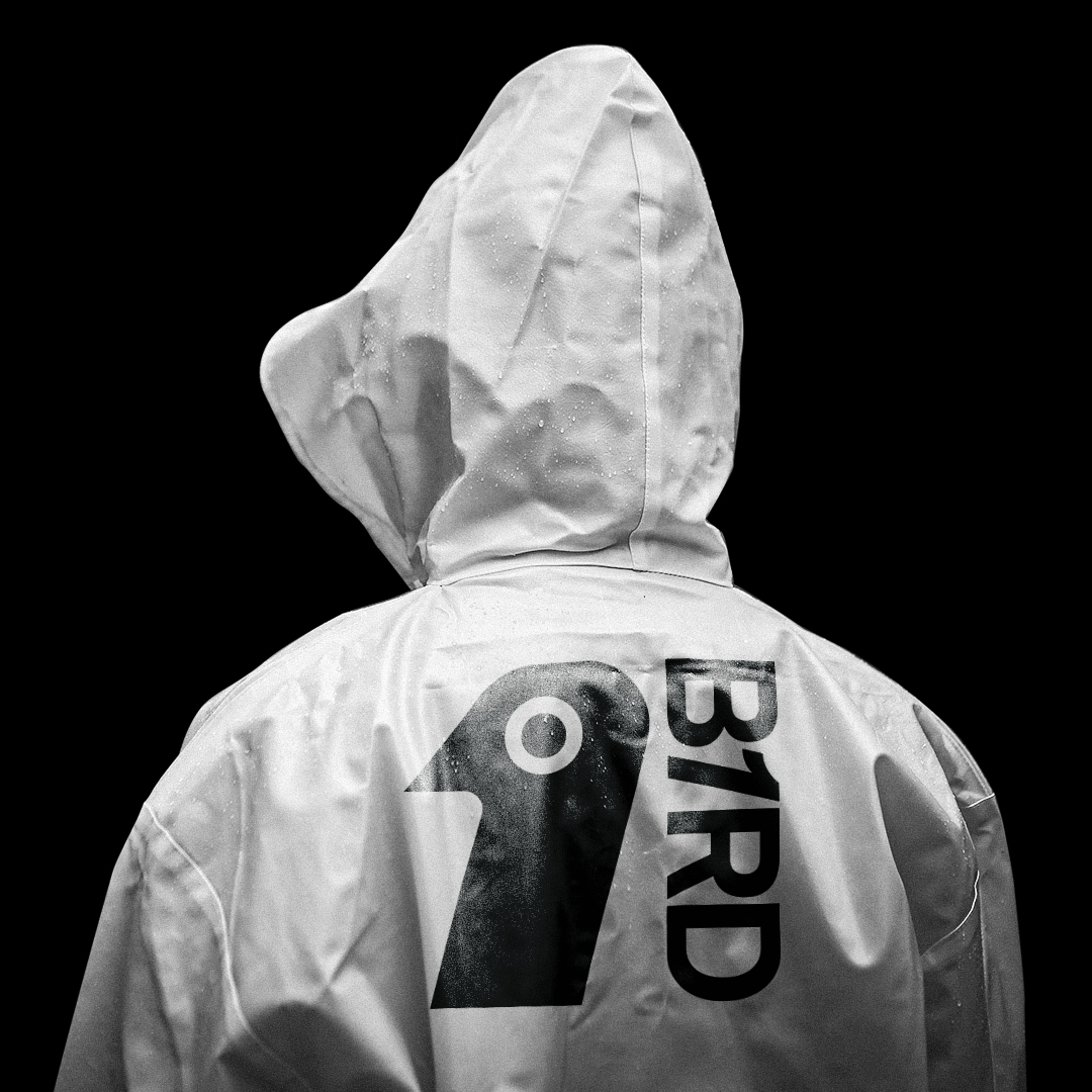
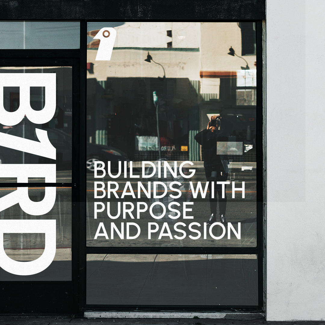
We, as a team, came up with a very distinctive brand of a bird, and at the same time you see it as number one, and this was the brief that was required to be implemented. As the brand visual identity and vision were matched elegantly, we started working on collateral, stationery items and the brand’s online presence assets, in conclusion, we felt that avoiding a Logomark and redesigning the logo as a wordmark was the perfect decision of various design choices we had through the process. In the end, the brand became inspiring and distinctive to people and won the admiration of many


CREDIT
- Agency/Creative: kledart
- Article Title: B1RD Brand Design by kledart
- Organisation/Entity: Freelance
- Project Type: Graphic
- Project Status: Published
- Agency/Creative Country: Egypt
- Agency/Creative City: Cairo
- Market Region: North America
- Project Deliverables: Advertising, Brand Design, Graphic Design, Identity System, Logo Design
- Industry: Entertainment
- Keywords: logo, brand, branding, logodesign, graphicdesign, graphic, brandidentity, identity,
-
Credits:
khaled ahmed: khaled ahmed


