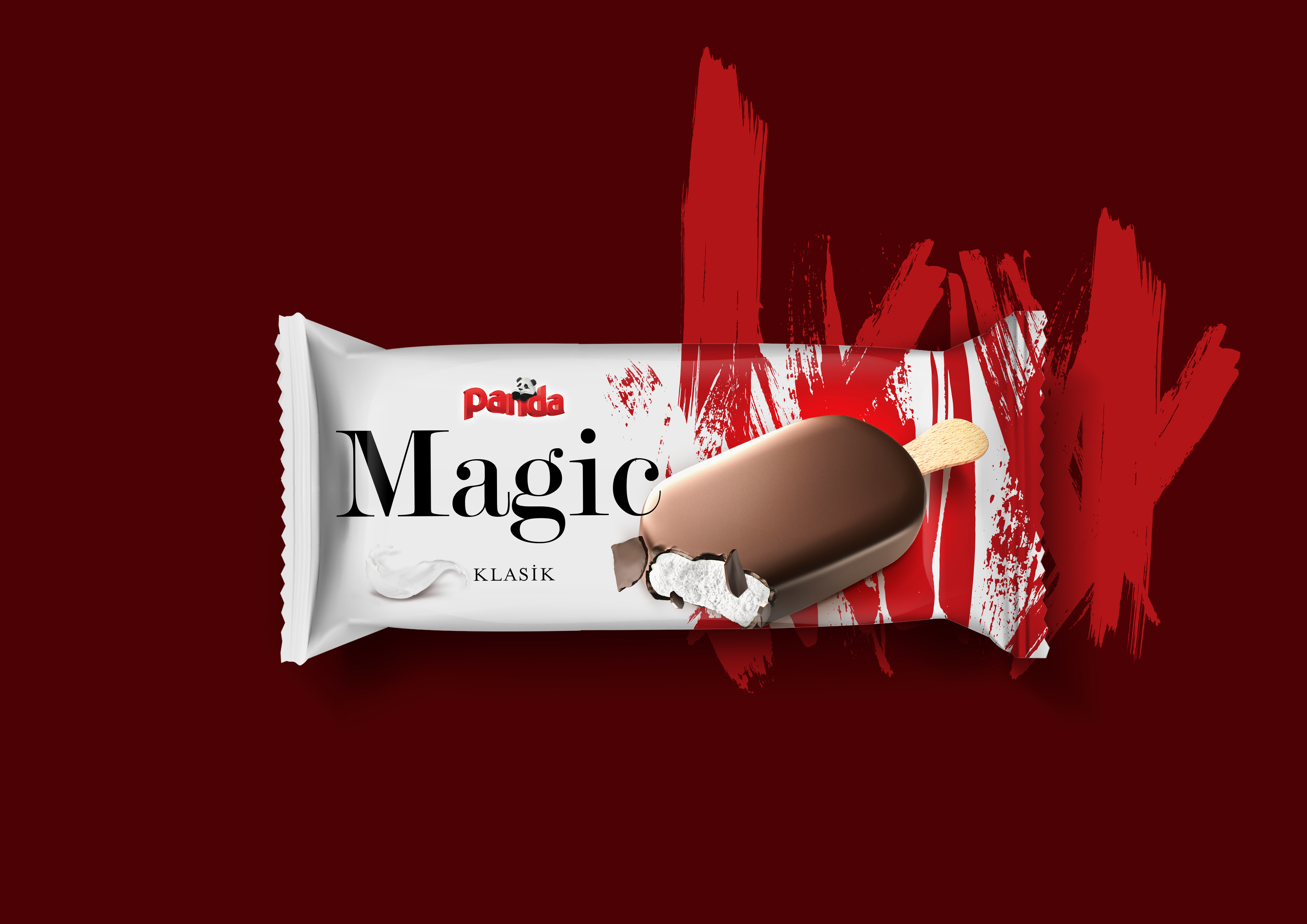
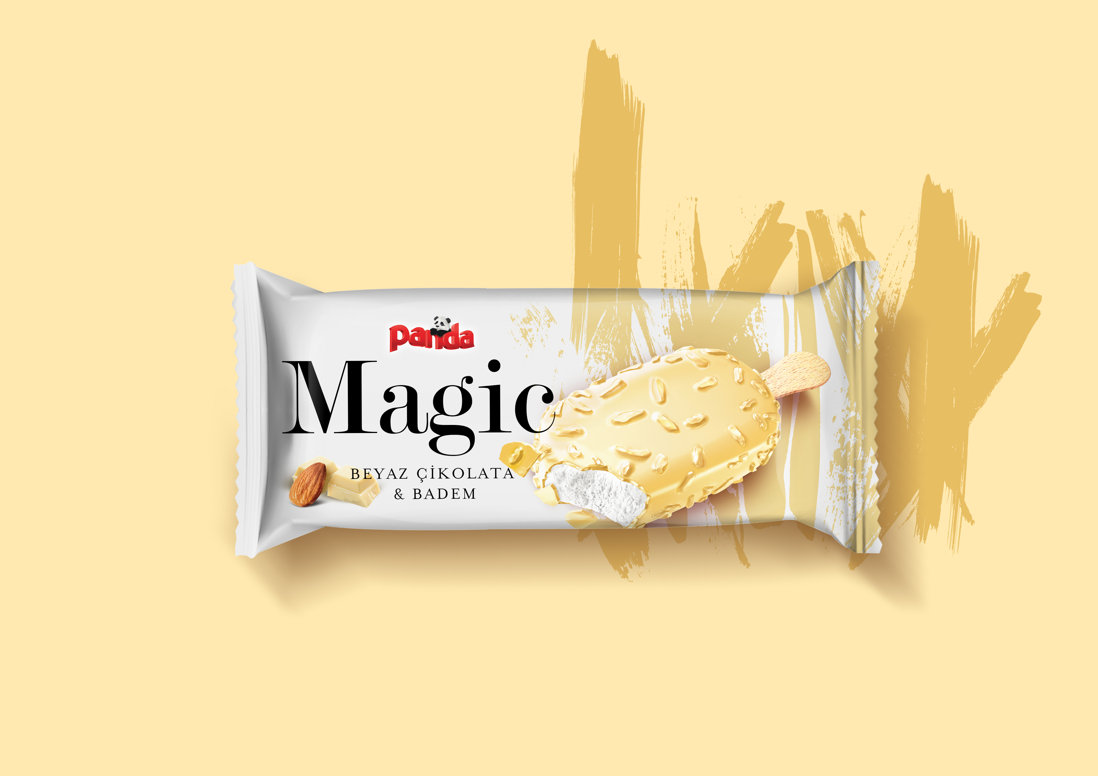
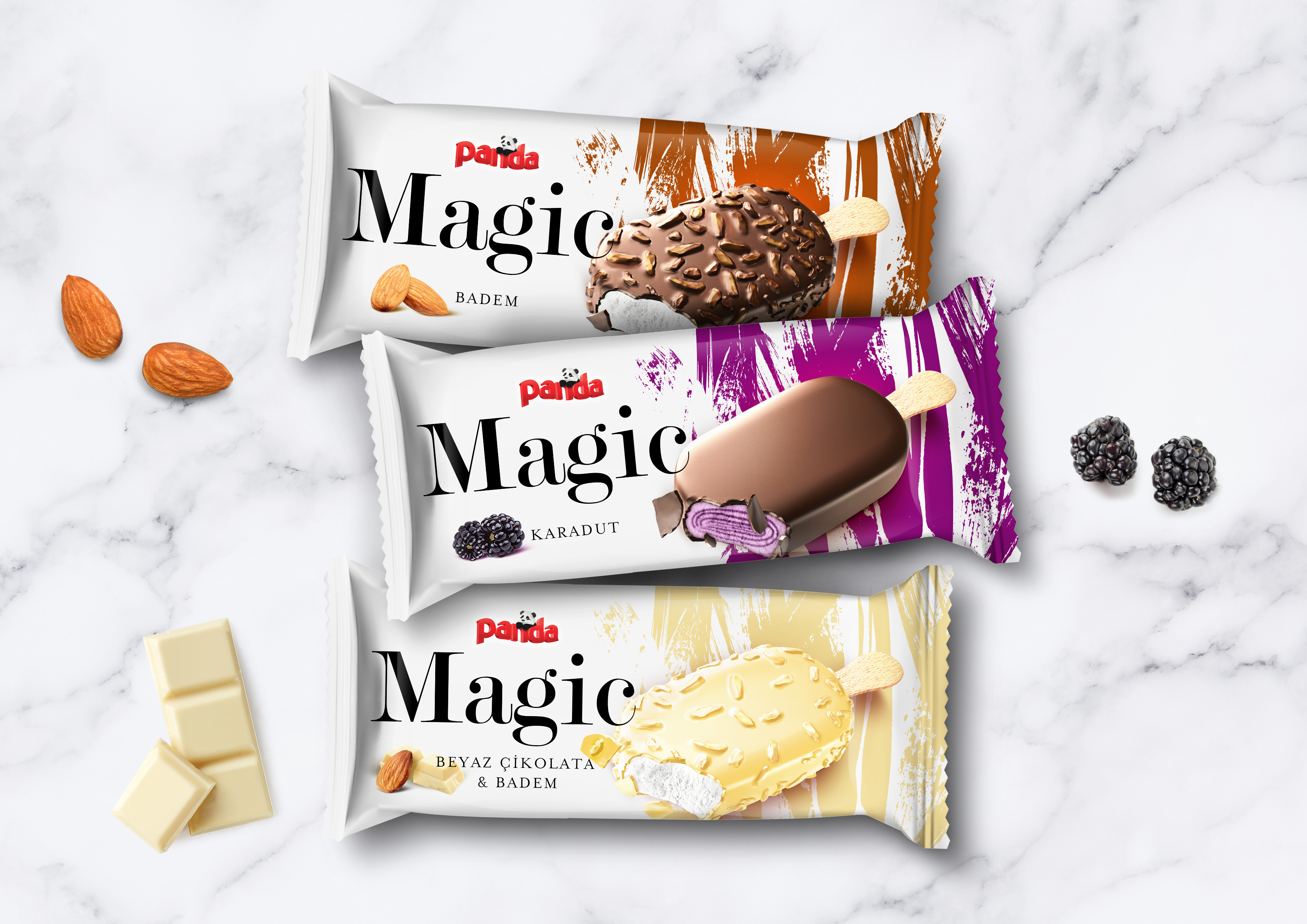
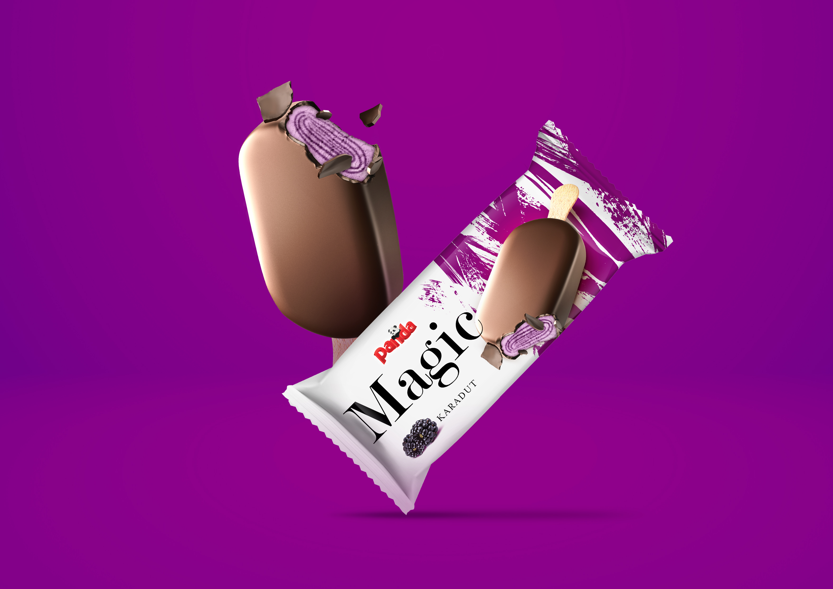
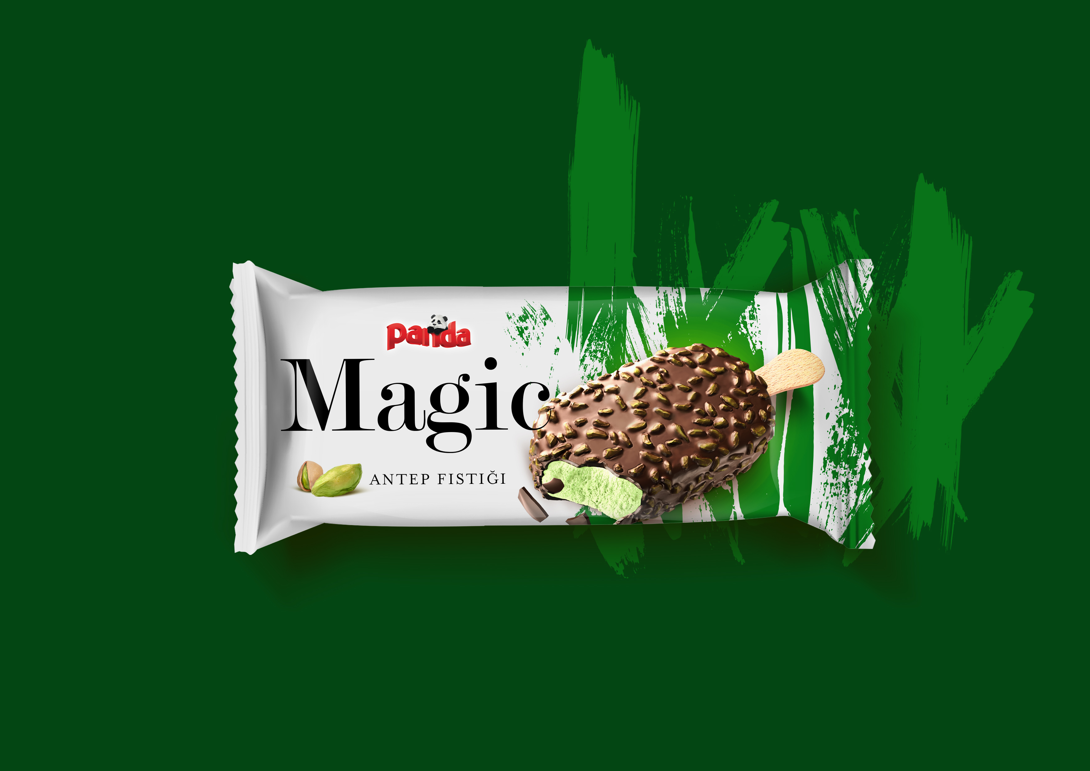
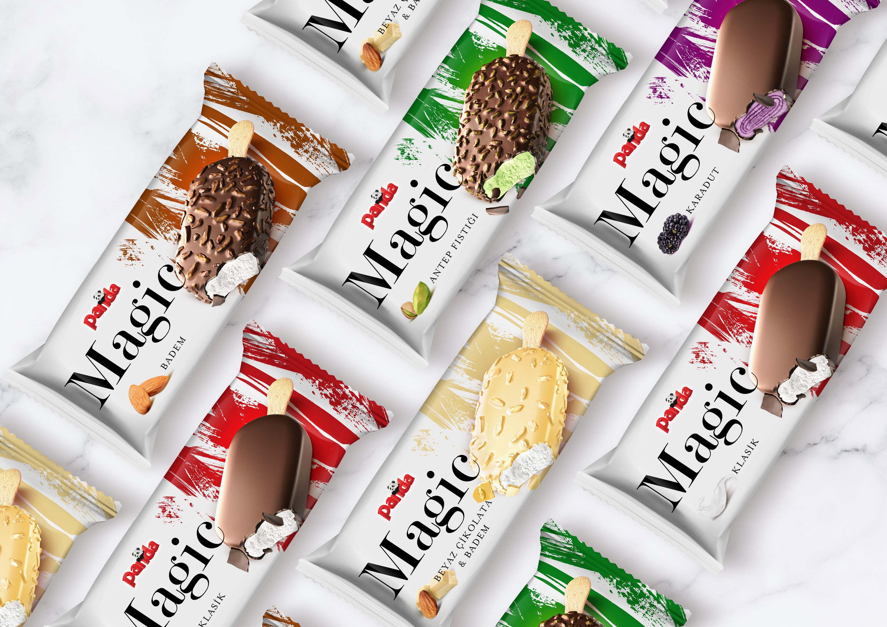
Turkey’s most popular ice cream brand Panda, refresh the design of the Magic family of products in the premium category. While the strategy and design of B12 Creative Branding were completely changed, a variety with “White Chocolate and Almond” was added to the Magic family. While the entire design has a matte white color, the product types are separated with special colors. In order to leave a valuable feeling, brush strokes were determined as visual identity as if they were released by the artist under the ice cream. These brush strokes were used with a metalized color and hologram, resulting in a strong effect. The great typography stylishly complements the product. While all the white areas attract attention as matte, bright areas emphasize contrast and refer to the magic in the product’s name.
CREDIT
- Agency/Creative: B12 Creative Branding
- Article Title: B12 Creative Branding Refresh the Packaging Design of Panda Magic Premium Ice Cream
- Organisation/Entity: Agency, Published Commercial Design
- Project Type: Packaging
- Agency/Creative Country: Turkey
- Market Region: Europe
- Project Deliverables: Brand Architecture, Branding, Graphic Design, Illustration, Packaging Design, Rebranding
- Format: Sachet
- Substrate: Plastic


