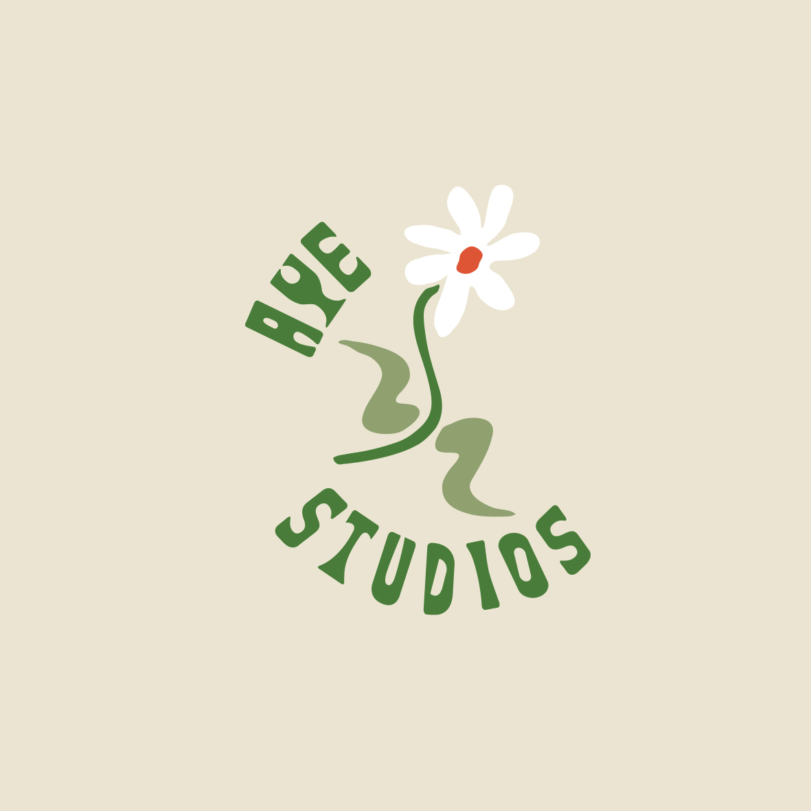
Logo and illustration to be used on company Website and Social media accounts. This was Fun little logo and illustration job for an environmentally minded digital brand strategy agency in New Zealand. The main thing was to get a cross the theme nurturing and “hands on” touch that the company wants to portray to existing and future clients. The client also wanted to get a cross a caring, soft and delicate image to portray the idea of care in what they do.
The colour pallet was heavily influenced by the earth and nature, With soft grounded colours. There is a subtle 1970’s vibe that was deliberately place through the whole branding that reflects the harmonious nature of the company
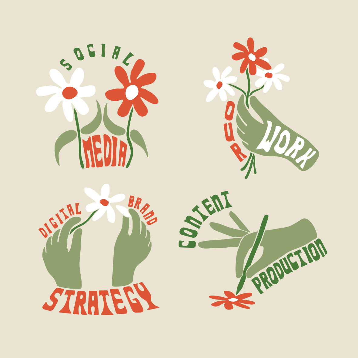
The main logo was a flower which represents the growth and nurturing principles of tAye studios and is an iconic graphic that could be used in different ways across the whole brand.
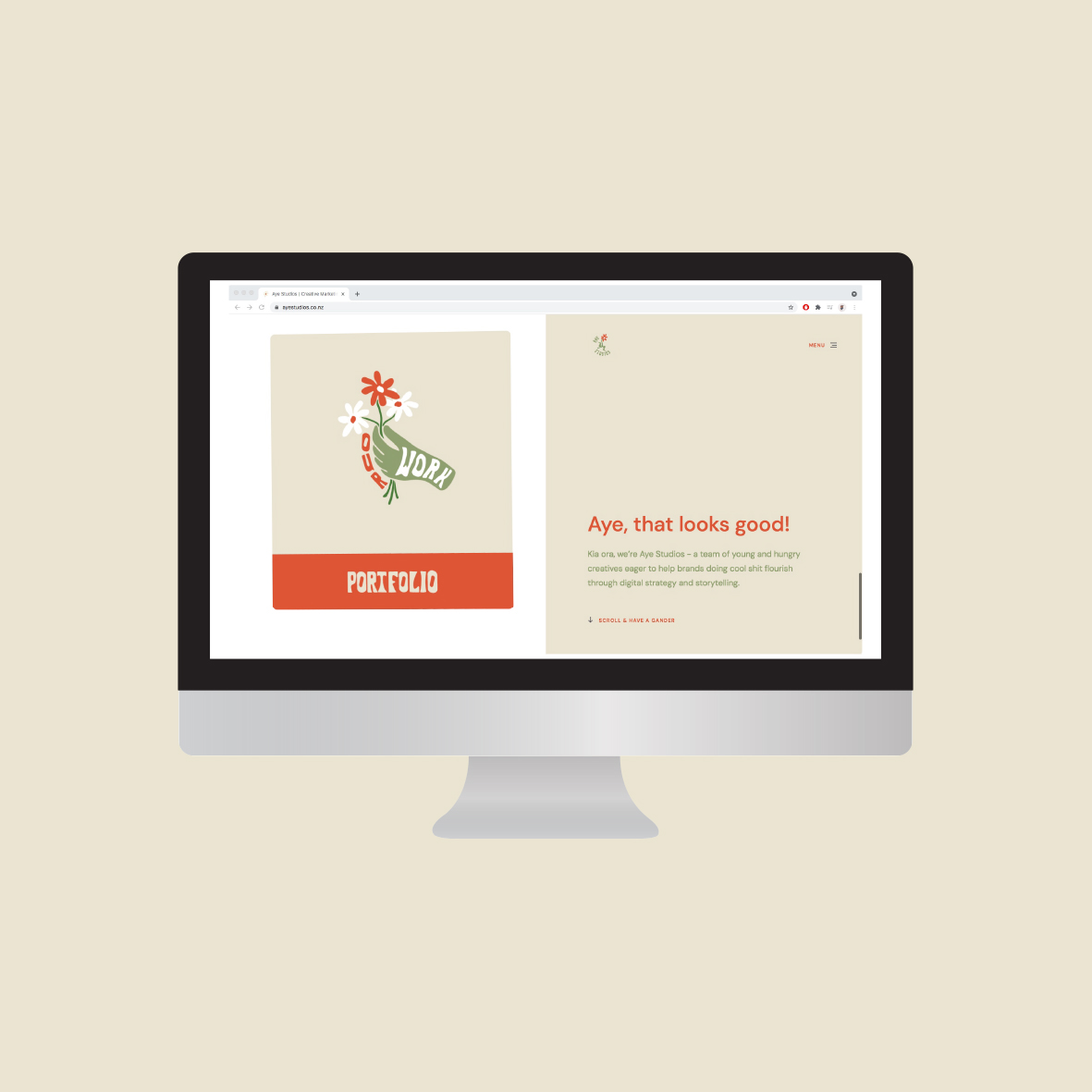
With the website menu icons i took the flowers and put them into different contexts to represent the category they were placed in.
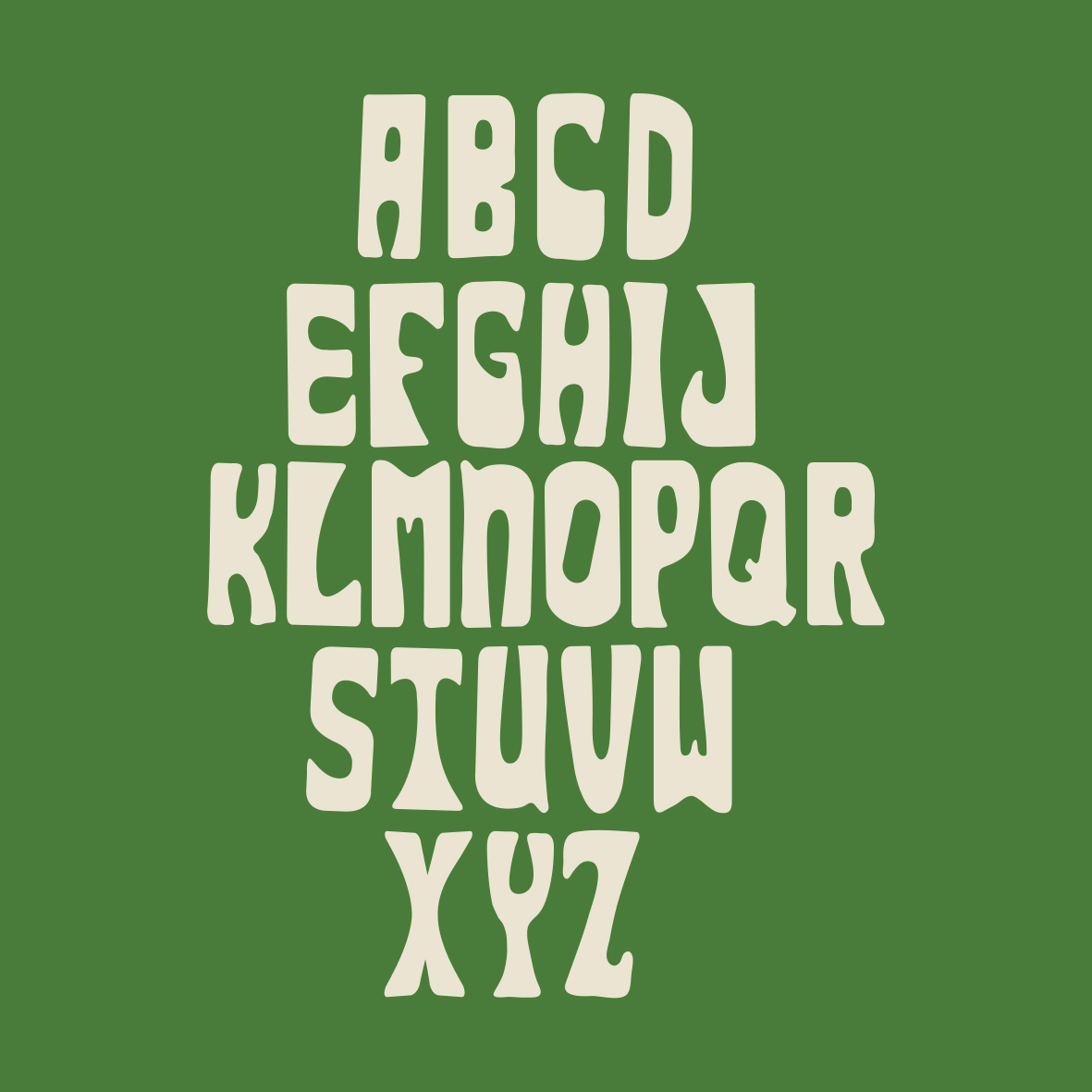
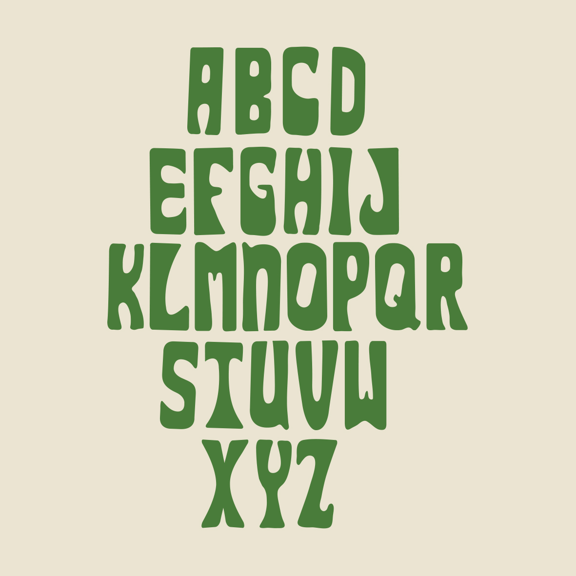
A custom typeface was also created to work along side as well as part of all of the illustrations.This is where the 1970’s theme is really obvious, the type is reflective of a lot of Bold 1970’s typefaces created for a lot of political and environmental Posters throughout that decade.
I think the illustrations, tyre and colour pallette all work cohesively together to create an authentic and original branding especially for the industry they’re in.
CREDIT
- Agency/Creative: Max Blackmore
- Article Title: Aye Studios Identity and Illustration by Designer Max Blackmore
- Organisation/Entity: Agency
- Project Type: Graphic
- Project Status: Published
- Agency/Creative Country: New Zealand
- Agency/Creative City: auckland
- Market Region: Oceania
- Project Deliverables: 2D Design
- Industry: Information
- Keywords: Digital marketing strategy
-
Credits:
Designer: Max Blackmore
Client: Aye Studios


