An urban celebration of individual expression puts AXE back into growth for the first time in recent years.
Ambition
Unilever’s AXE brand, known as LYNX in the UK, Ireland, Australia and New Zealand, is marketed in 60+ countries worldwide, with global retail sales of c. €1.4bn. As the world’s best-selling male grooming brand, it is truly iconic and has transcended generation after generation of young guys.
Founded on a rich heritage of fragrance and personality, AXE supports guys on their journey through their mid-teens to early twenties – helping them feel more confident, empowered and attractive through one of the most challenging stages of their growth and development.
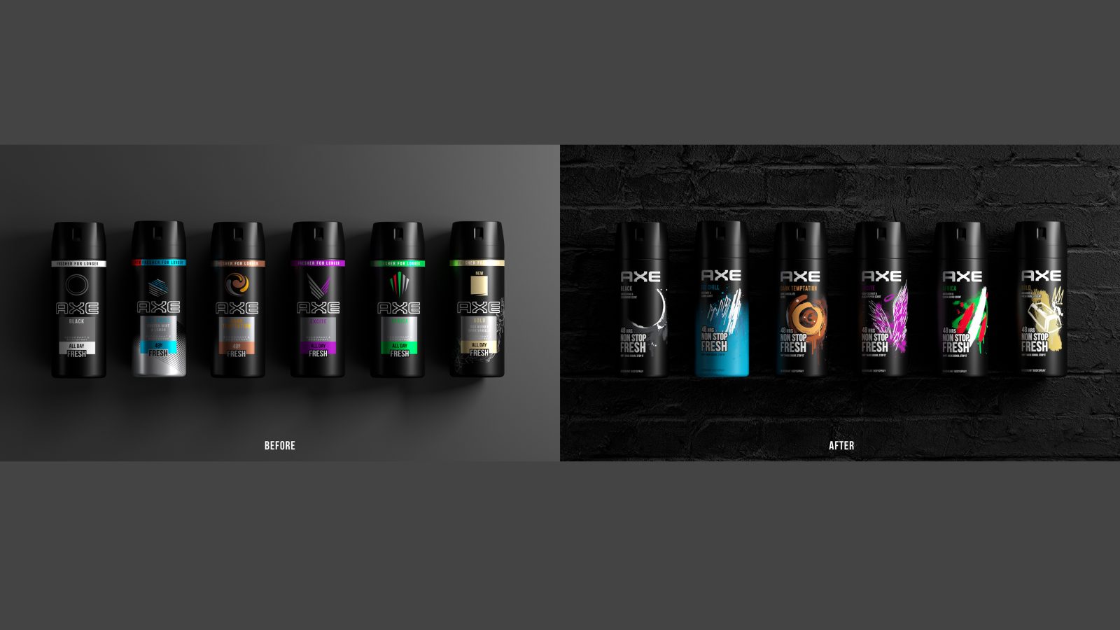
However, in recent years, the constantly evolving ‘trends-fuelled’ consumer landscape, combined with challenges from new brands and own label, has culminated in a gradual year-on-year decline for AXE. – leaving the brand striving to keep up with the pace to remain relevant and connected to its consumers. Research conducted by the client specifically showed that AXE had average stand out and low variant differentiation making it hard to navigate.
We were asked to create a unique visual and emotive expression for the brand to:
re-energise and re-engage with its core Gen-Z consumers
drive positive brand reappraisal to put AXE back into growth
It was vital we respected the heritage and personality of each variant to retain recognition across all product formats and diverse markets and delivered vibrancy and colour while respecting the brand’s black legacy.
Insight
Our primary target audience was GenZ guys (11-19 yrs), but with a secondary target being mums who buy for their sons. To drive consumer re-appraisal, the brand had to speak to GenZ in ‘their language’.
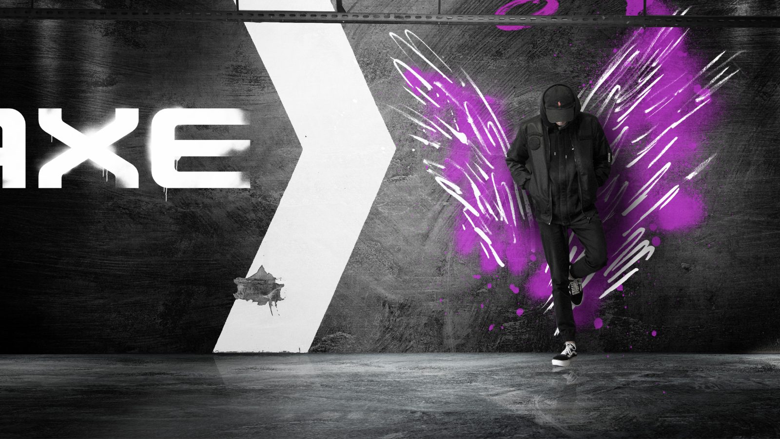
Our approach built on developing a deep understanding of this ‘trends-fuelled’ landscape and popular brands targeting the same guys, as well as how they show up – which was big, bold and impactful. Couple this with the fact that GenZ celebrate diversity and that many AXE customers establish a loyalty to ‘their fragrance’, we uncovered a rich opportunity to bring individual expressiveness and creativity to AXE through popular urban and street art influences.
Idea
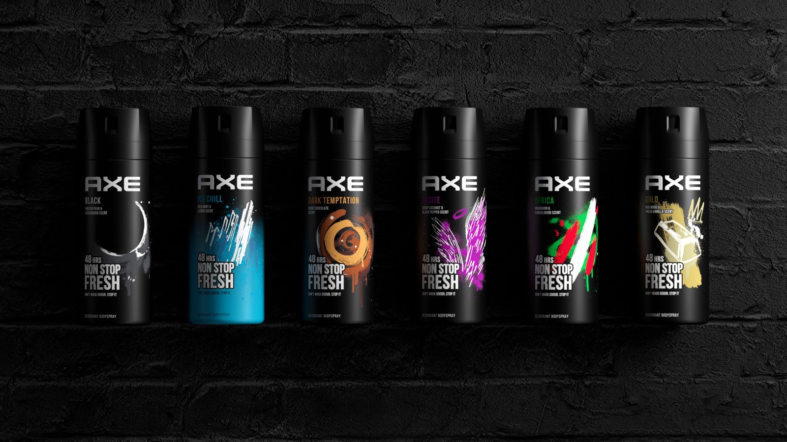
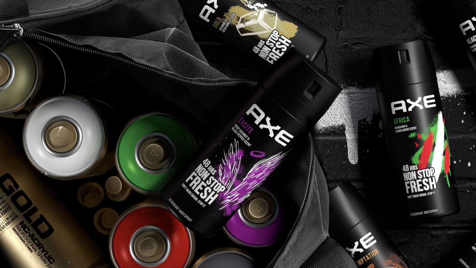
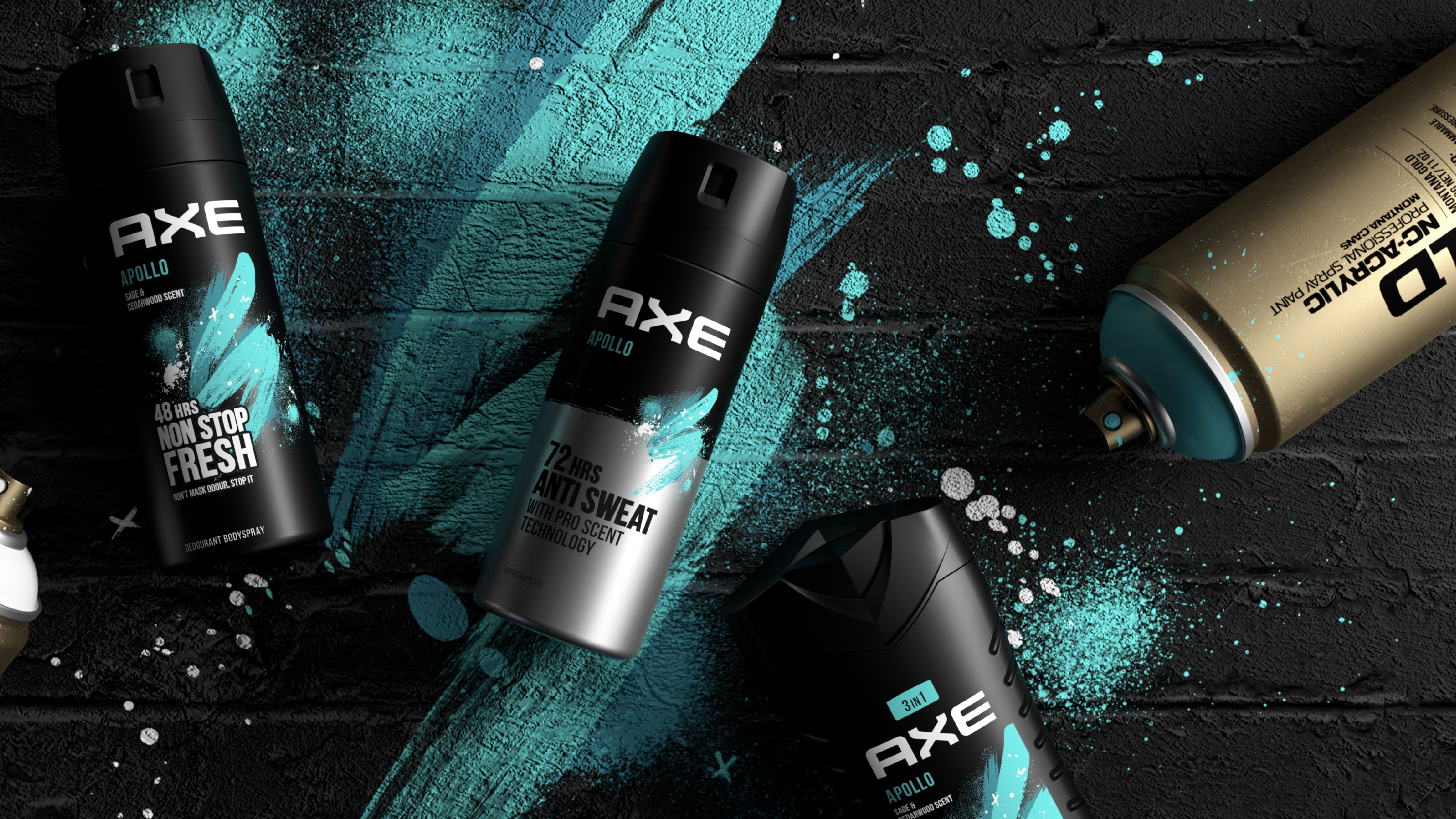
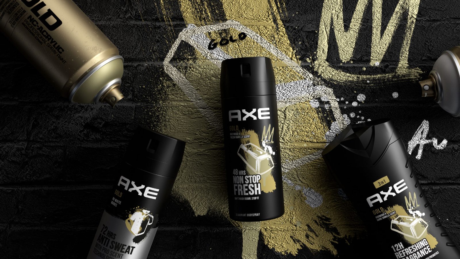
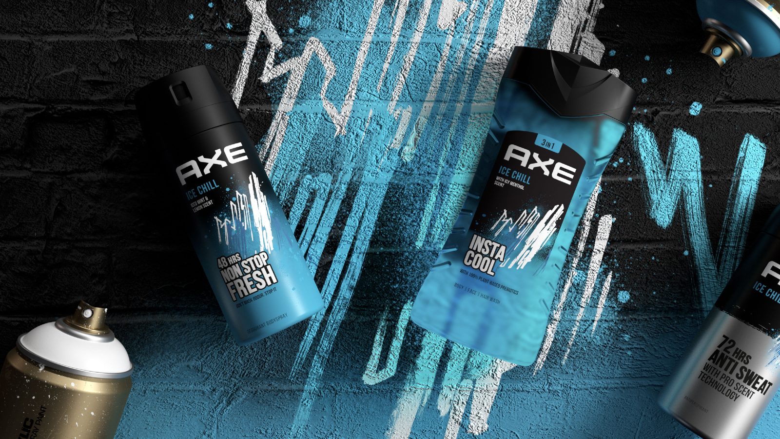
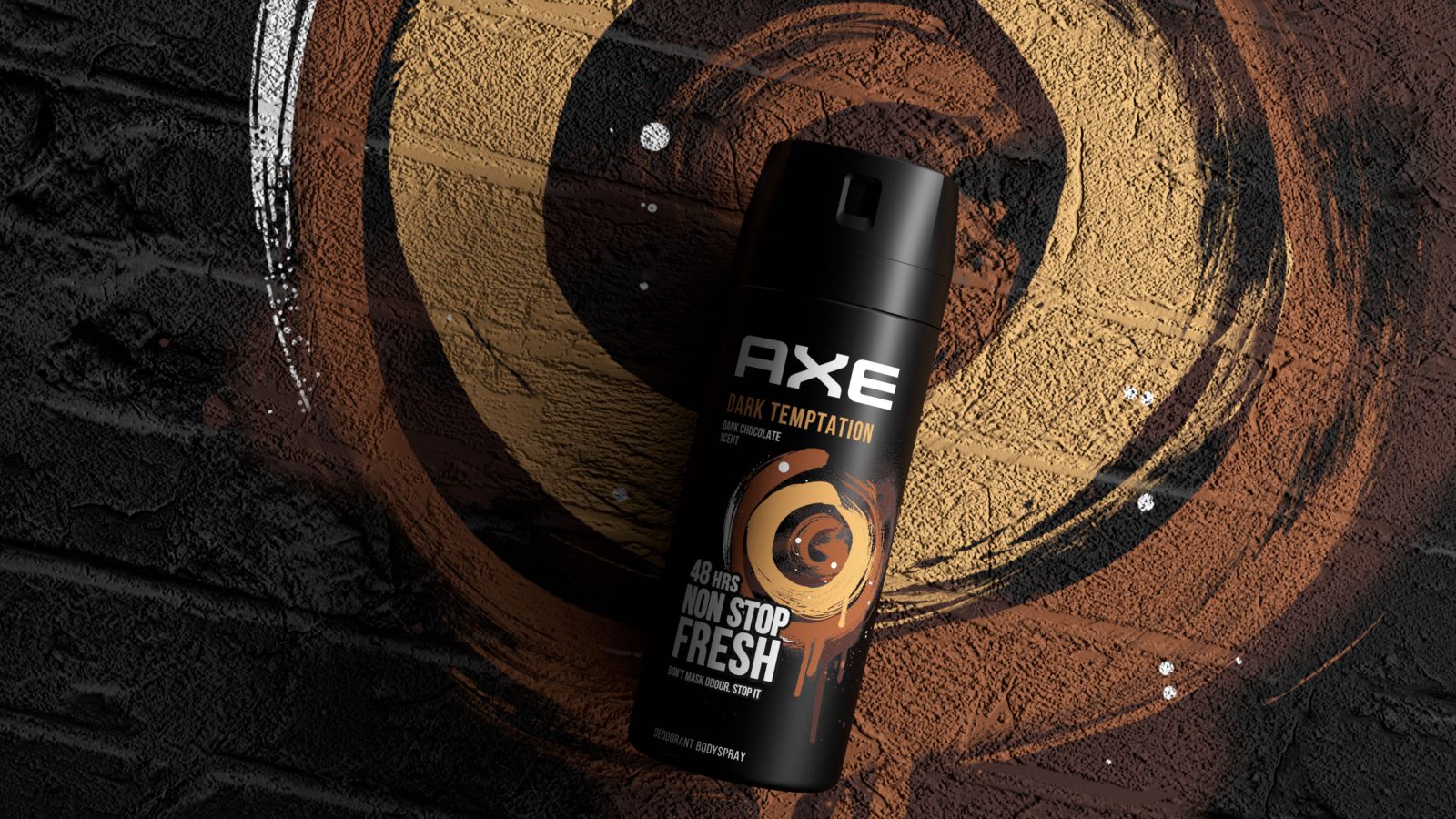
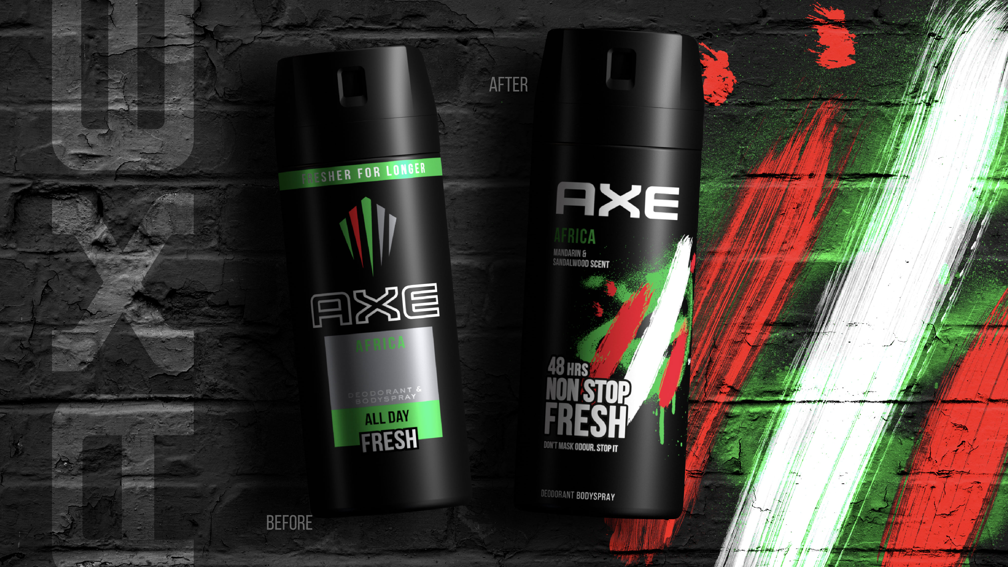
We commissioned talented illustrator, painter and urban artist, Ben Tallon, to create a series of bespoke artworks to bring to life our vision to deliver ‘Urban Art in the Hands’ of every consumer.
This not only enabled the personality, character and heritage of each iconic AXE fragrance to shine, but also transcended language across the brand’s key global markets. And importantly, in a way that truly resonates with GenZ.
Client-initiated qualitative research highlighted that the street-art was disruptive and spontaneously cued a feeling of AXE promoting individuality, creativity and scent exploration. It was also, importantly,
aspirational yet accessible.
“It’s the cool brand for the cool kids at school.”
“It had an ‘out-there’ sort of feeling, different to the other ones.”
“It says explosive, youth, rebelliousness.”
We invested a huge amount of time and expertise in technically implementing each illustration within the constraints of the printing process to maintain the spirit of the idea, as well as the beauty and integrity of Ben’s original artworks.
Impact
Our new visual identity ultimately delivers a youthful and expressive vibrancy, fulfilling the original challenge of re-connecting with our core consumer through a unique and ownable tone of voice for the brand, while technically, successfully translating across all fragrance variants and SKU formats.
Following the brand’s global relaunch, AXE/LYNX is now in growth for the first time in recent years – which has been firmly attributed to the packaging presence at shelf and consumer reaction the brand.
The new design is seen as cool, young, imaginative and surprising, which makes AXE more relevant to GenZ guys. And tangible improvements have been made in brand recognition, correct
identification of variant and purchase intent (+4ppts, +6ppts and +7ppts respectively).
CREDIT
- Agency/Creative: PB Creative
- Article Title: AXE Global Packaging Redesign by PB Creative
- Organisation/Entity: Agency
- Project Type: Packaging
- Project Status: Published
- Agency/Creative Country: United Kingdom
- Agency/Creative City: London
- Project Deliverables: Packaging Design
- Industry: Health Care
- Keywords: WBDS Agency Design Awards 2022/23
-
Credits:
Illustrator and Artist: Ben Tallon


