


Overview: Van Der Hout Jewelry was founded by Karen Van Der Hout who honed her craft in fine jewelry as a second generation New York City industry veteran. In creating Van Der Hout Jewelry, Karen passionately wanted to design beautiful genuine gold and diamond pieces that everyone could afford.
Their business had grown from a successful business out of the founder’s home, to an instagram account to a full-fledged direct-to-consumer online jewelry business. As the business has grown so has the need for creating a professional and cohesive look across all the brand touchpoints.
The clear inconsistencies across their platforms and packaging created a less than ideal premium shopping experience but more importantly causes pause for concern with potential new customers.
The ask: This Toronto-based jewelry design brand needed a refresh to create a more clear and galvanized impression on their company. To create an identity that was a bit more fun without compromising a premium impression of their brand (as they didn’t want to alienate their existing core consumer).
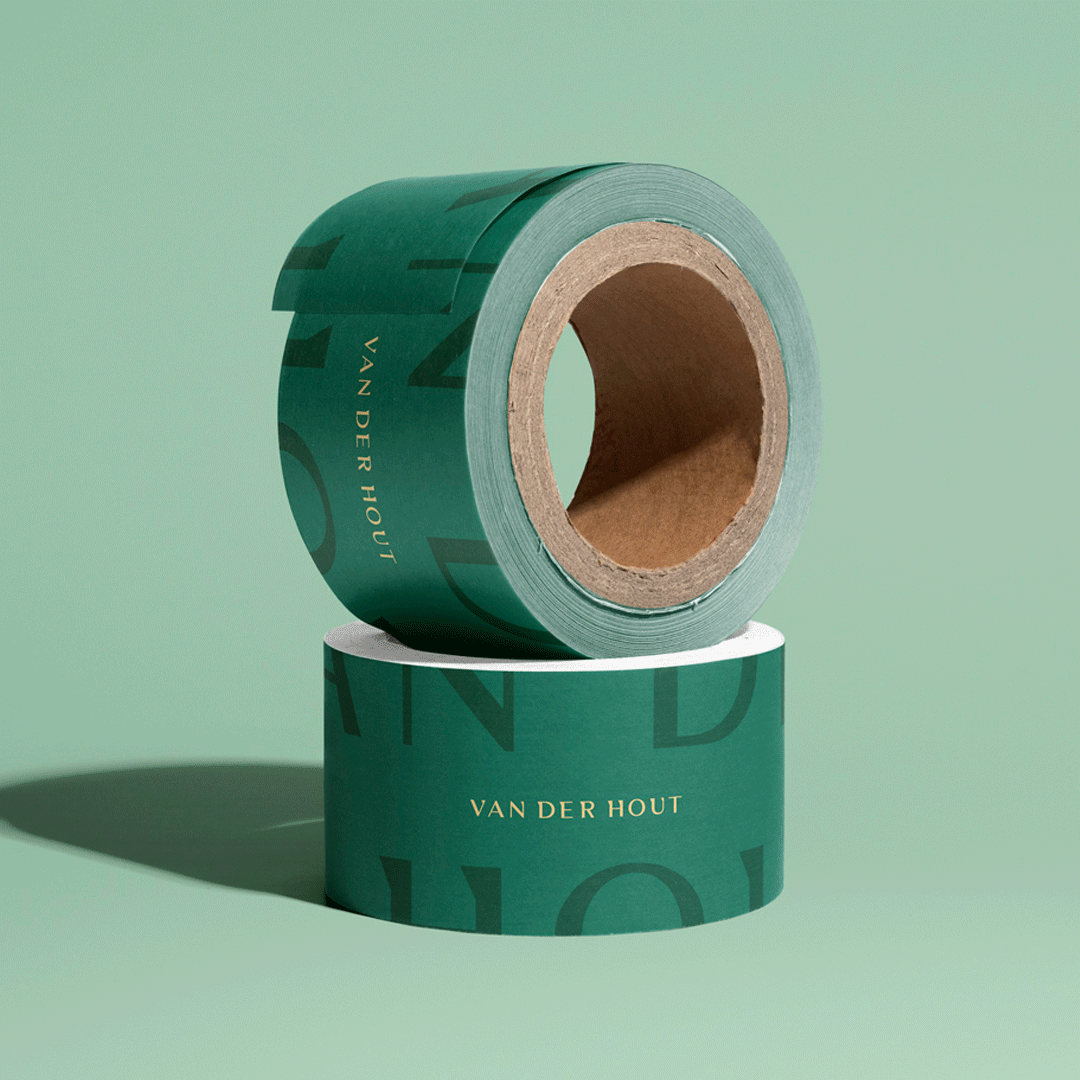
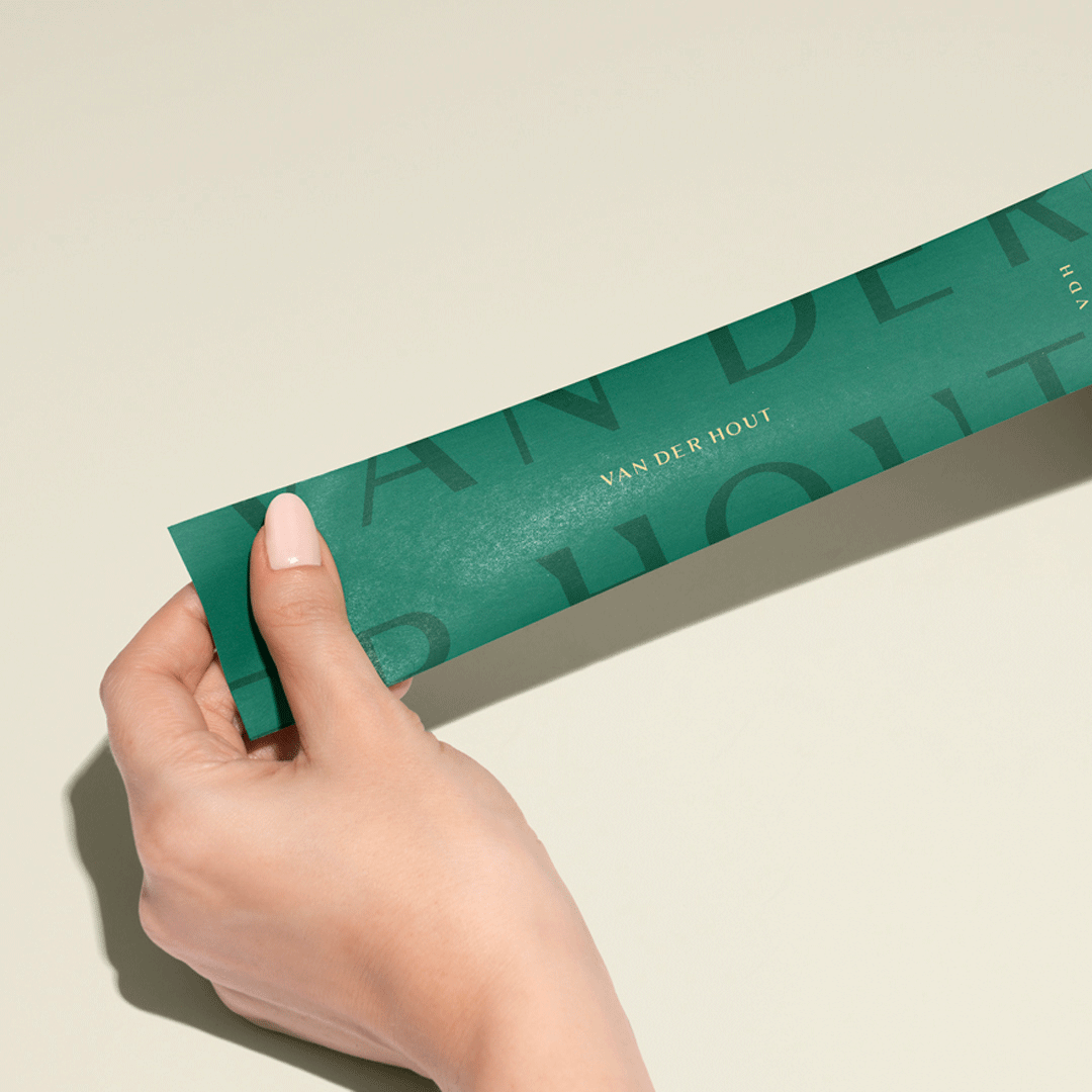
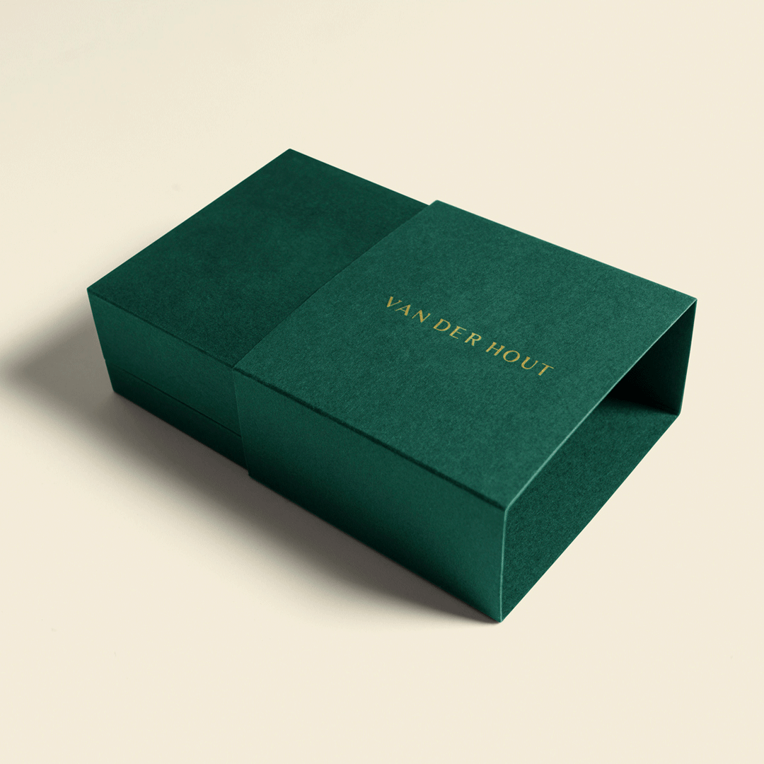
Awake needed to create a cohesive look and feel for Van Der Hout Jewelry across key consumer touch points including a general guideline the client and their growing network of suppliers could apply as their business grows and evolves
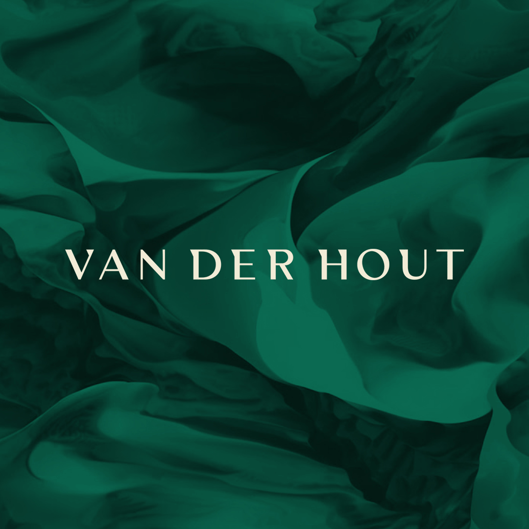
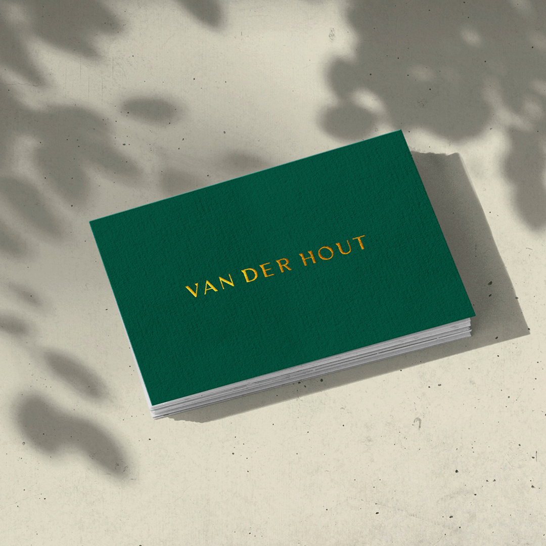
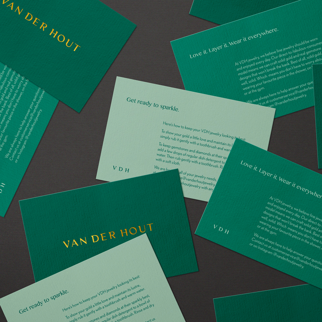
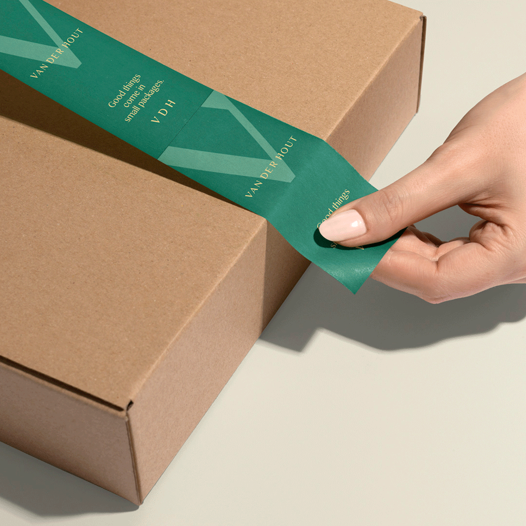
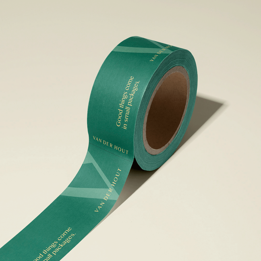
Result: The resulting timeless mark and palette straddles both worlds (fun & premium – complete with a bespoke wordmark) and positions them as a more serious contender in the competitive world of online jewelry sales.
The custom typeface was inspired by the V in Van Der Hout as well as the natural “V” shape that occurs when you wear a necklace. This “V” was used to create “serifs” on the typeface that produced a unique and strategically-driven wordmark. The newly created “V” was treated as a graphic element to amplify the brand and to create visual interest in collateral.
A photoshoot to produce a library of assets was created to produce content for the website and for their social channels. This was also a way for the brand to more clearly connect with their demographic and visually give a point-of-view about the way to wear the jewelry (a more-is-more, stacked direction).
vanderhoutjewelry.com
CREDIT
- Agency/Creative: Awake Studio
- Article Title: Awake Studio Create Brand Identity Redesign for Van Der Hout Jewelry
- Organisation/Entity: Agency, Published Commercial Design
- Project Type: Identity
- Agency/Creative Country: Canada
- Market Region: North America
- Project Deliverables: Brand Creation, Brand Guidelines, Brand Identity, Brand Redesign, Brand Refinement, Brand Rejuvenation, Branding, Graphic Design, Identity System, Packaging Design, Photography, Rebranding, Tone of Voice
- Industry: Fashion
- Keywords: Toronto, design, branding, jewelry, rejuvenation, visual identity, change, serif, symbol, logo, palette, green


