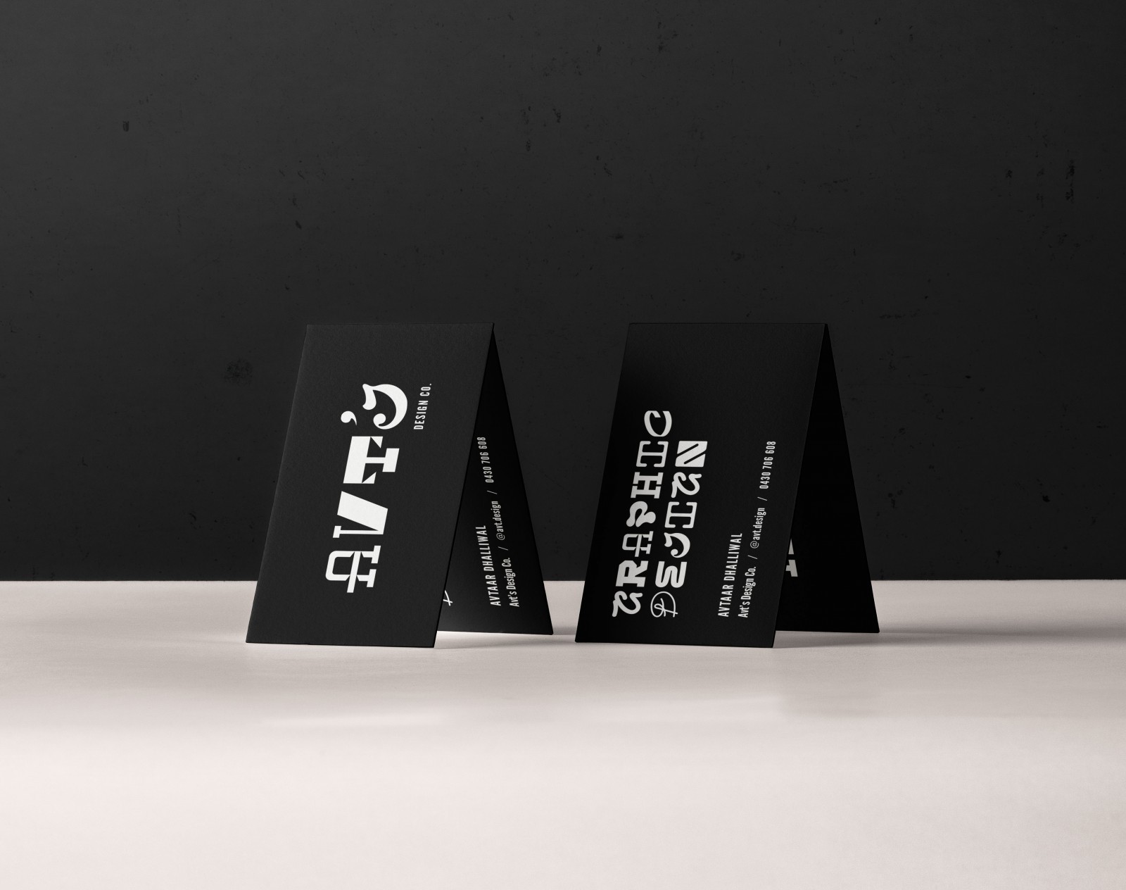
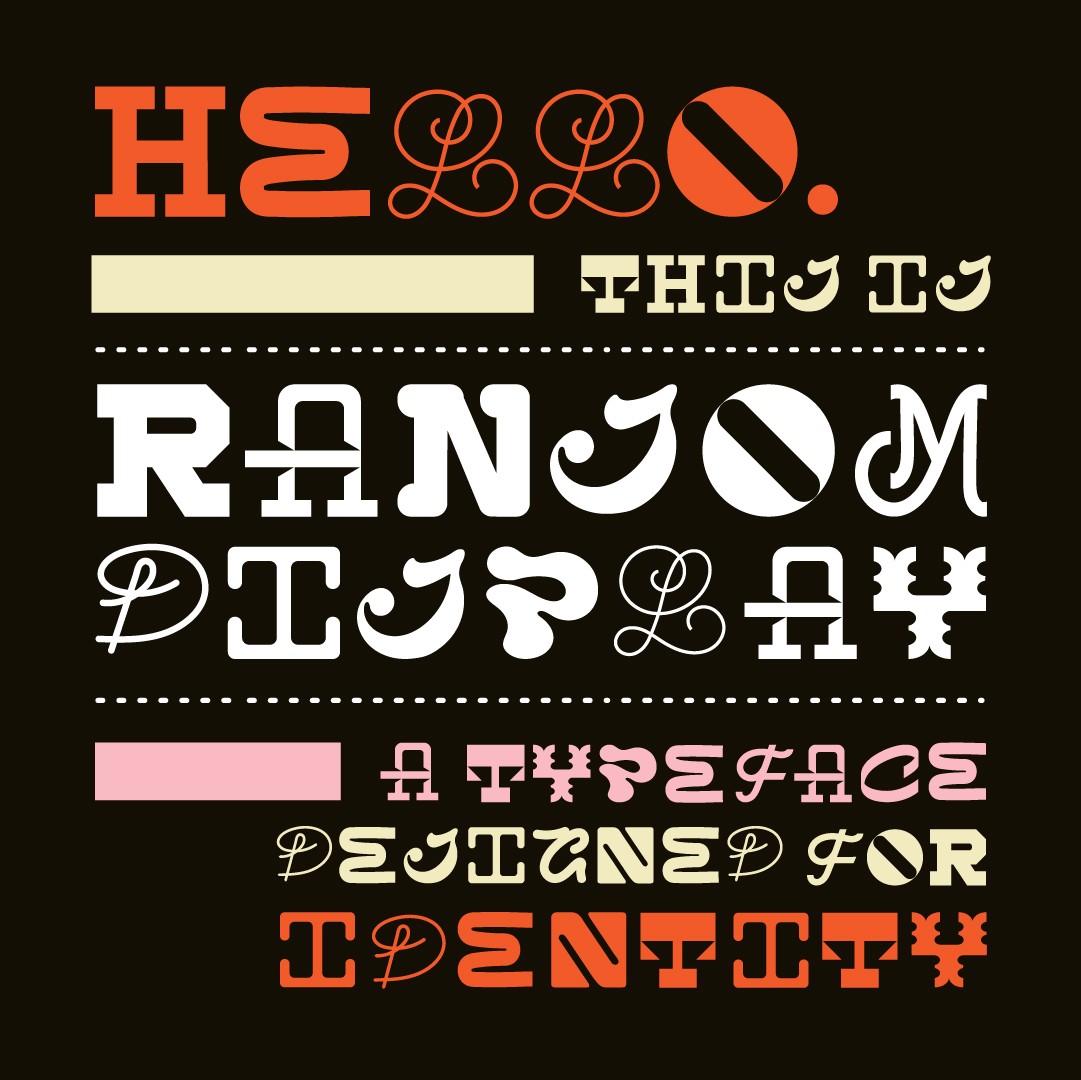
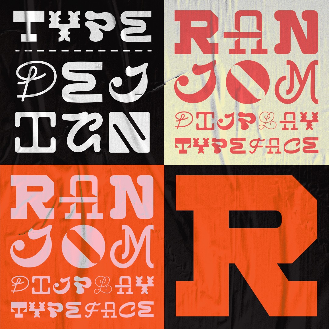
“Ransom Display” is an uppercase display typeface designed exclusively as the predominant element in my personal identity- “Avt’s Design Co.” The identity design is reflective of what I value as a designer; distinction, simplicity, and an emphasis on type.
The mixed-and-matched, “ransom” nature of the typeface was a direction chosen to signify my love for all things typography, it’s heavy influence on my work, and to achieve a unique, memorable branding.
All characters were hand-drawn, designed to represent their own unique font style; and while every letter is drastically different to the next, certain design decisions were made to ensure a degree of consistency to the chaos. For example, all characters occupy the same amount of visual space, and fit within the same dimensions; even though they each have a different weight. Another parameter I worked against was creating weight “classes” to bring cohesiveness to the overall typeface; note how the “E” and “H” are part of the same weight class, while the “I” and “A” are in a class of their own. This was by far the biggest challenge of the project – balancing the differences of 26 type styles with the level of cohesion required for a working font.
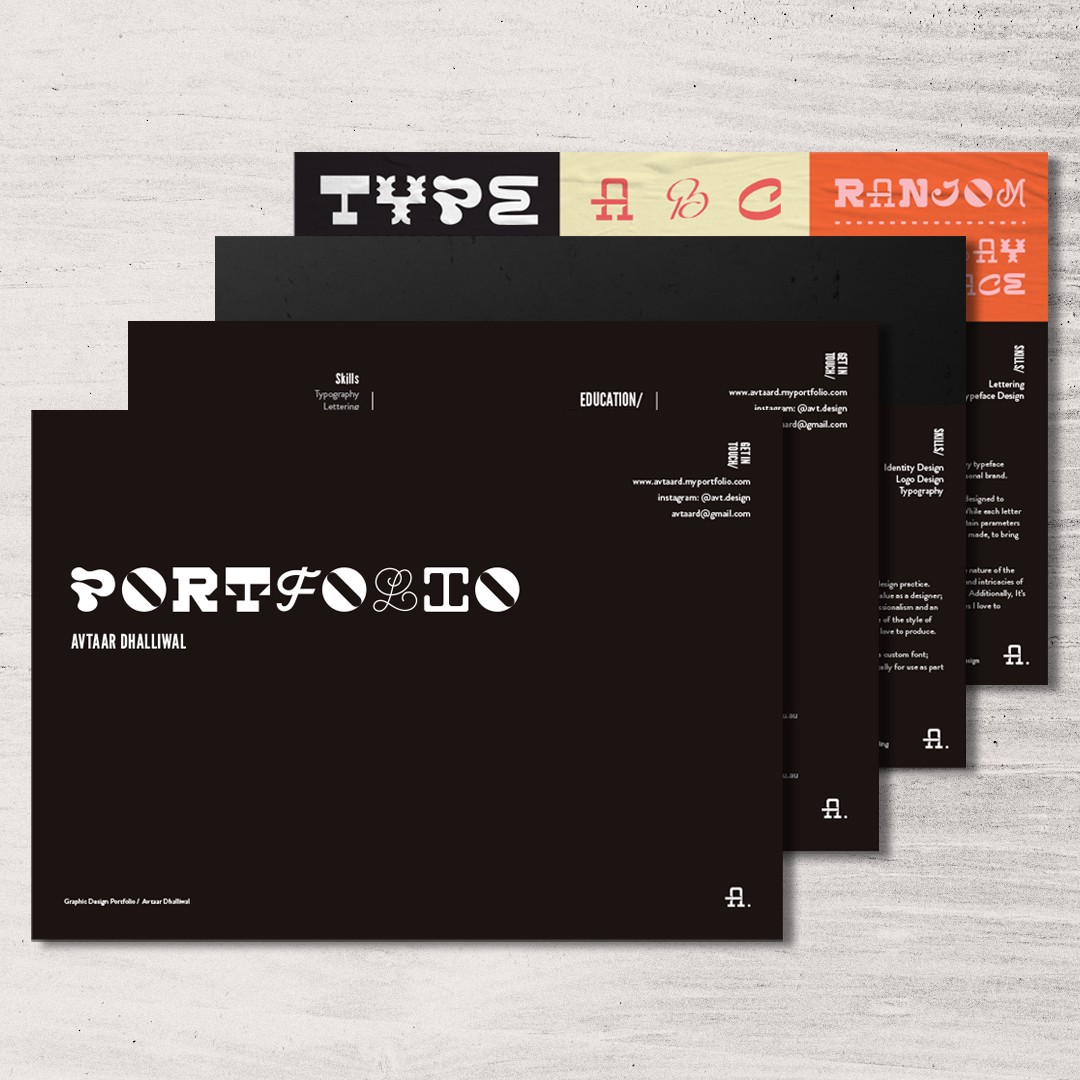
As for how I chose to present the typeface, I drew on a combination of swiss typographic style and bauhas for influence, but also kept modern trends in mind- note the colour palette of muted black, saturated orange, pastel pink and off-white. I tried to maintain a balance between showing the typeface clearly for what it is, showing it in use as part of a poster design or marketing material, and showing it in context of my branding.
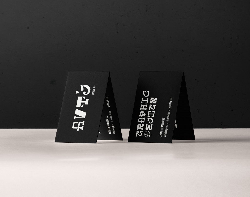
When it comes to the identity design itself, I wanted Ransom Display to be the hero, and to have nothing to compete with given it’s busyness and complex nature. The use of a monochromatic palette on the business cards helps achieve this, and helps maintain a simple, clear idea of the message behind my identity. Printed in white ink, on 700gsm textured black paper stock, the cards were intended to make a statement, and have a premium/ memorable feel.
In short, the project is a system that represents me finding my own voice as a designer.
CREDIT
- Agency/Creative: Avtaar Dhalliwal - Melbourne Polytechnic
- Article Title: Avtaar Dhalliwal’s Ransom Display, Finding a Voice as a Designer
- Organisation/Entity: Conceptual Work - Typography -Typography for Identity
- Project Status: Published
- Keywords: WBDS Student Design Awards 2020/21


