


Tina Tsung Design – Autozone
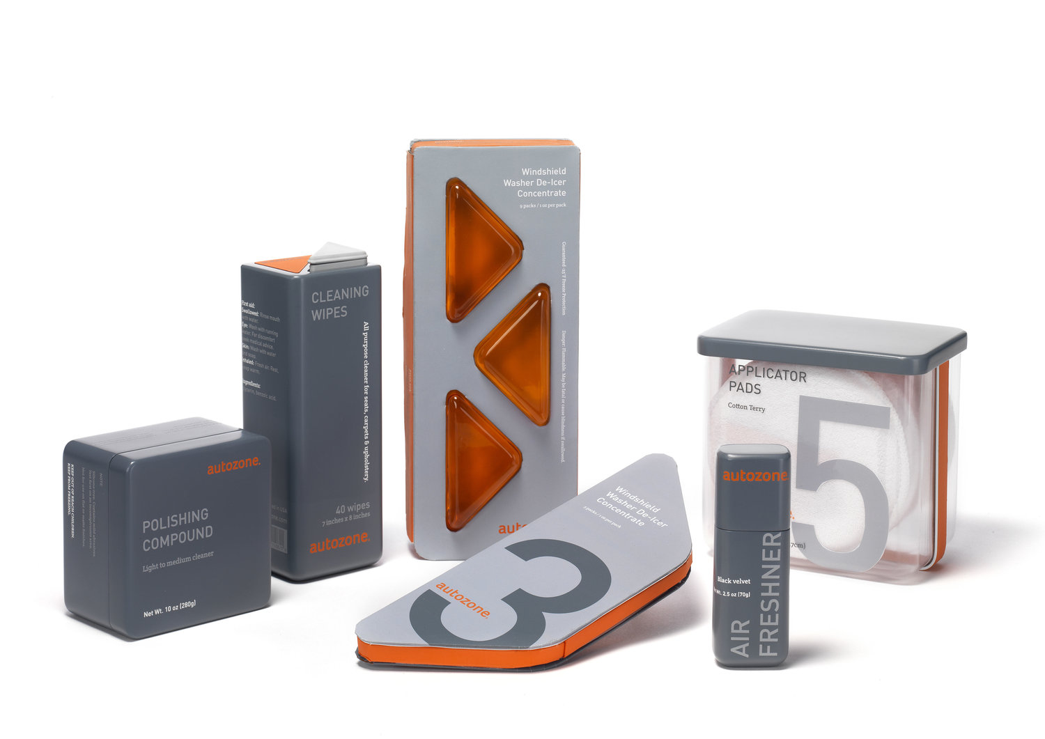
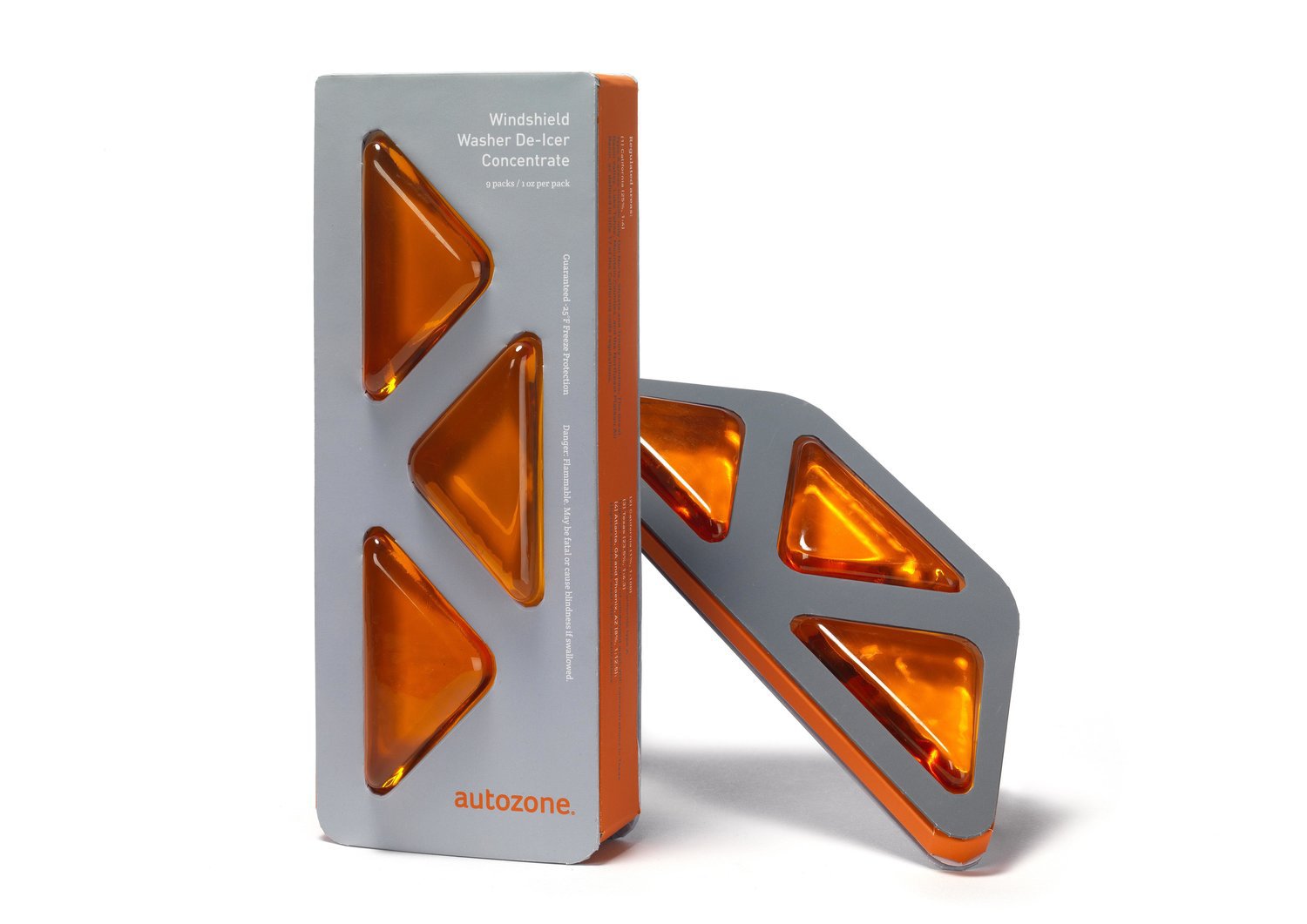
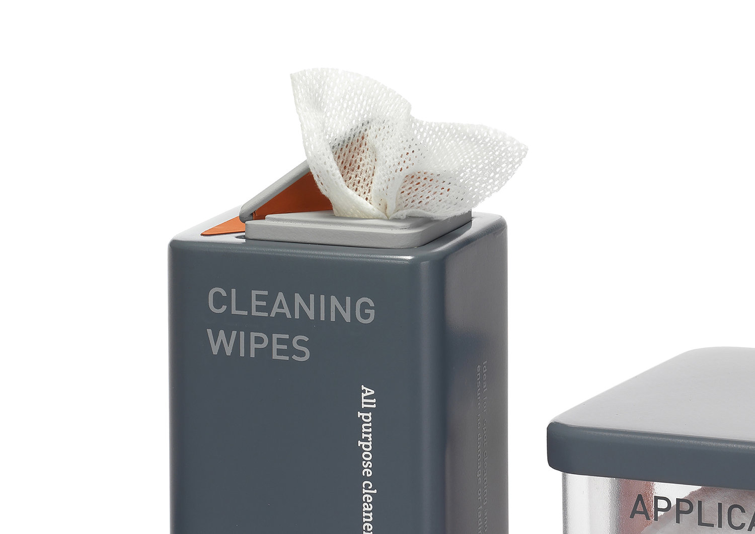
The AutoZone redesign brings the sense of efficient, all-inclusive and present image to the automotive parts industry, and creates a credible and clear zone wherever, and whenever you need any assistance in car repairing. After the redesign, AutoZone is not only the second large retailer of after-market automotive parts and accessories in the United States but also provides an uplifting purchase experience for you.The new design language developed from the windshield washer de-icer concentrate packaging. the current packaging is a bottle with measures on the side, which isn’t effective to use. To create a packaging which provides an effective user experience is the main task. The final design is small packs which allow users to mix the washer liquid quickly and more accurately. Furthermore, the final packaging design showcases the product strongly yet has enough space to put the product information. The major color on the packaging of the automobile cleaning line is warm dark gray with white and light gray text and the new AutoZone orange as the accent color.
CREDIT
- Agency/Creative: Tina Tsung Design
- Article Title: Autozone Rebranding and Packaging for Efficient User Experience
- Organisation/Entity: Freelance, Non Published Concept Design
- Project Type: Packaging
- Agency/Creative Country: United States America
- Market Region: North America
- Format: Box
- Substrate: Plastic


