


Hortibö decided to rethink a new communication strategy that would reflect the quality of its products in order to reach more public.
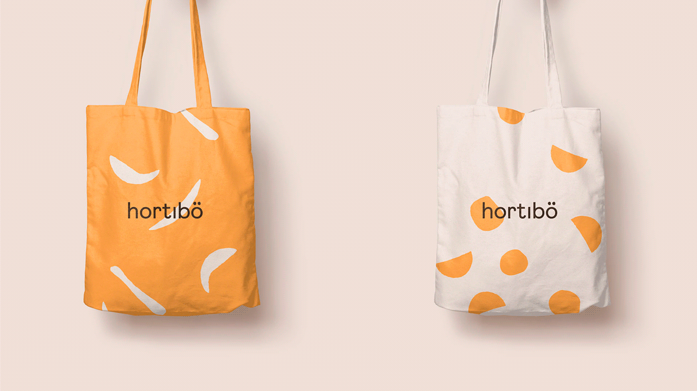
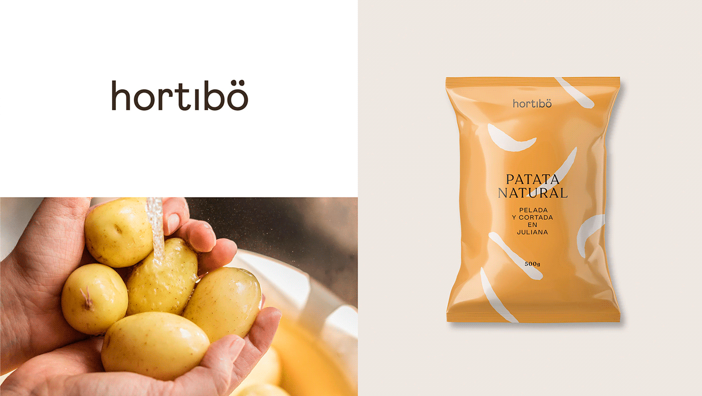
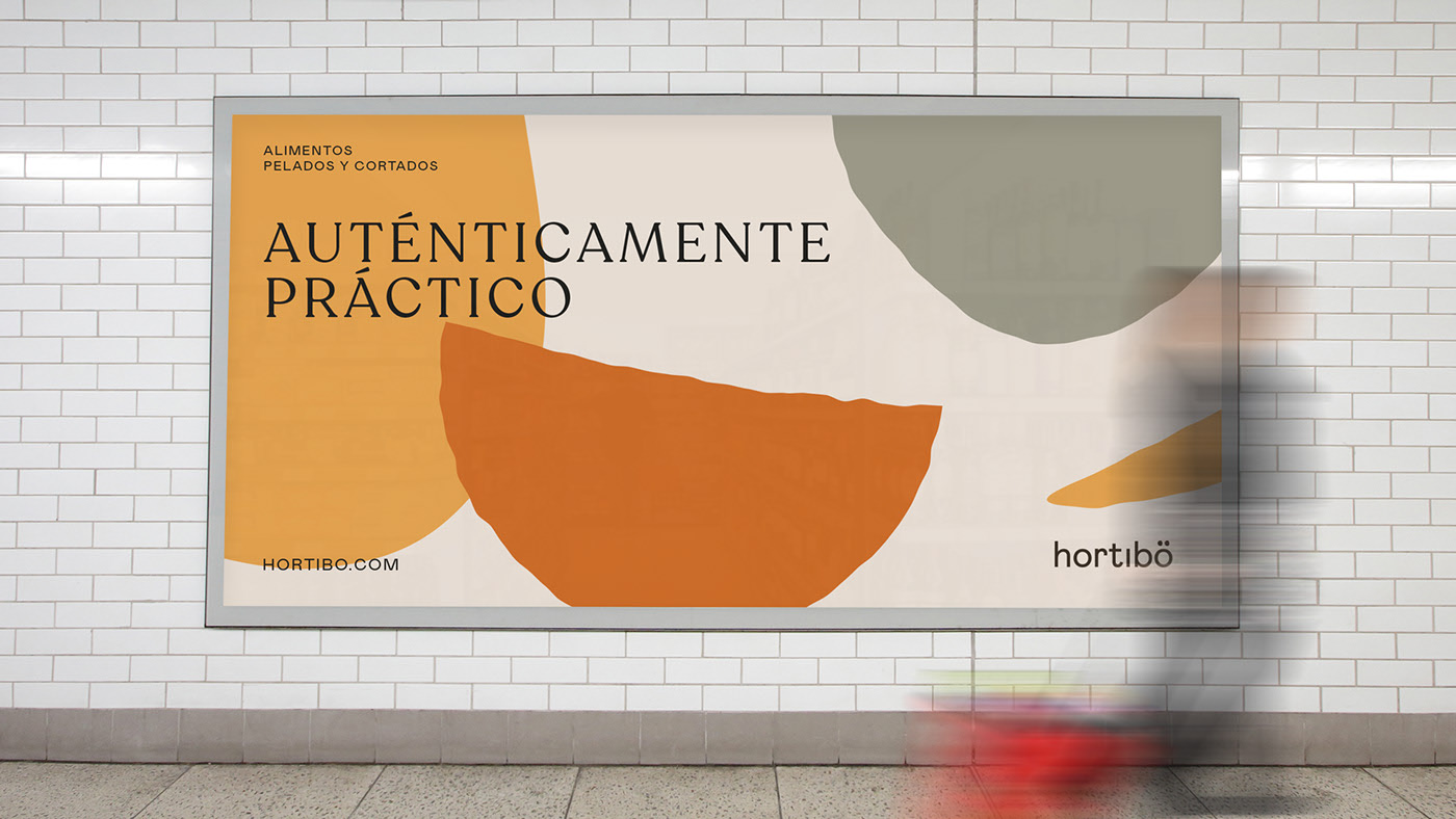
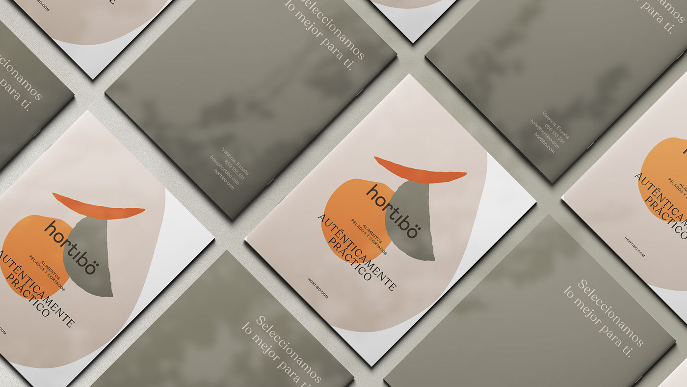
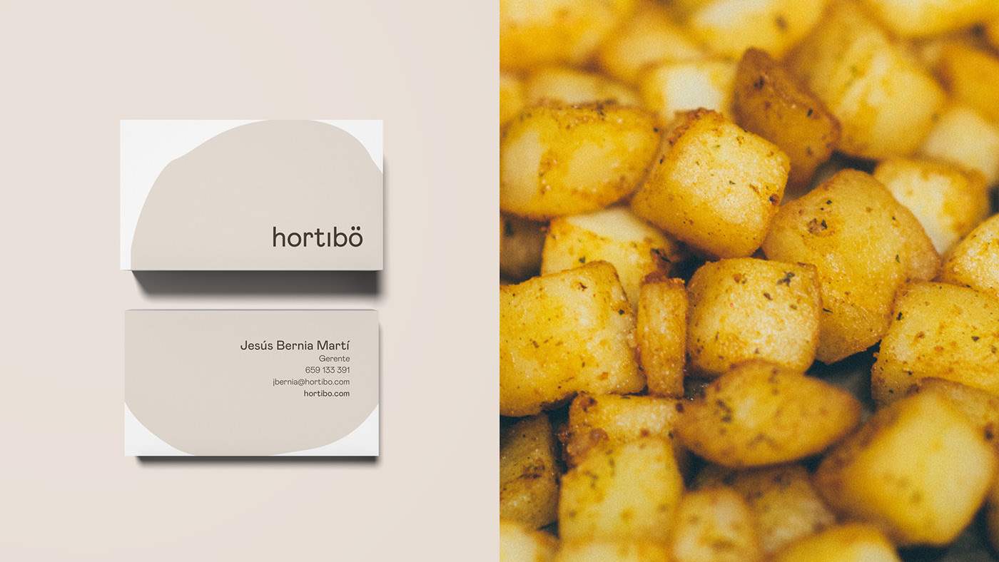
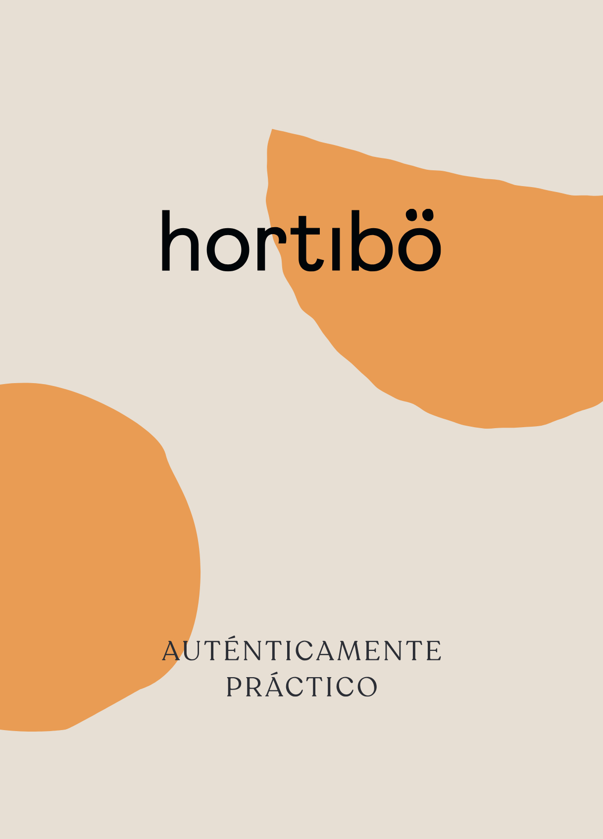
They rethink the name and then the branding. Our solution was to provide a very elegant, synthetic and direct logo to compensate for a look & feel created with organic forms made manually, which reflect the careful and artisanal process that hortibö follows to manipulate its products.
CREDIT
- Agency/Creative: SERENA STUDIO, S.L.
- Article Title: Authentically Practical
- Organisation/Entity: Agency, Published Commercial Design
- Project Type: Identity
- Agency/Creative Country: Spain
- Market Region: Europe
- Project Deliverables: Brand Design, Brand Guidelines, Brand Identity, Brand Naming, Brand Redesign, Brand Refinement, Brand Rejuvenation, Brand Strategy, Brand World, Branding, Graphic Design, Illustration, Packaging Design, Rebranding, Research
- Industry: Food/Beverage
- Keywords: quality, products, elegant, direct, organic, forms, artisanal
FEEDBACK
Relevance: Solution/idea in relation to brand, product or service
Implementation: Attention, detailing and finishing of final solution
Presentation: Text, visualisation and quality of the presentation


