Squad Ink – Cherry Bird Orchards Cider
“Cherry Bird Orchards Cider is crafted with mountain-fresh cherries and apples, picked and pressed in sunny Orange, Australia. This refreshing premium cider has a carefully balanced sweetness resulting in a clean, crisp taste making it the perfect cider for all occasions.
We were engaged by a reputable Australian cherry grower to create a premium craft cider set to launch in Australia and China. We were faced with the challenge of designing for two very different markets with different consumer sets and drinking rituals.
Understanding how consumers perceive imported products in China was where we started. The Chinese cider market is still relatively underdeveloped, however we have noticed a trend where female drinkers are moving towards fashionable alcoholic fruit sodas as an alternative to Chinese wine and beer. Research supported that imported craft products in China are measured by the perception of authenticity of origin paired with shelf appeal. For us, the success of this product in both markets requires having a very clear brand story that was rooted in authenticity, yet still carrying a vibrant personality that radiated on the shelf. It had to be true to the grower and the cider category in order for us to earn the trust of the local Aussies as well as the discerning Chinese shoppers.
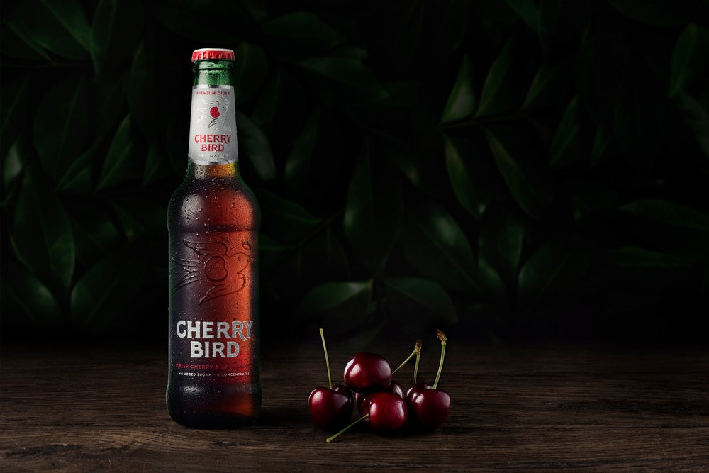
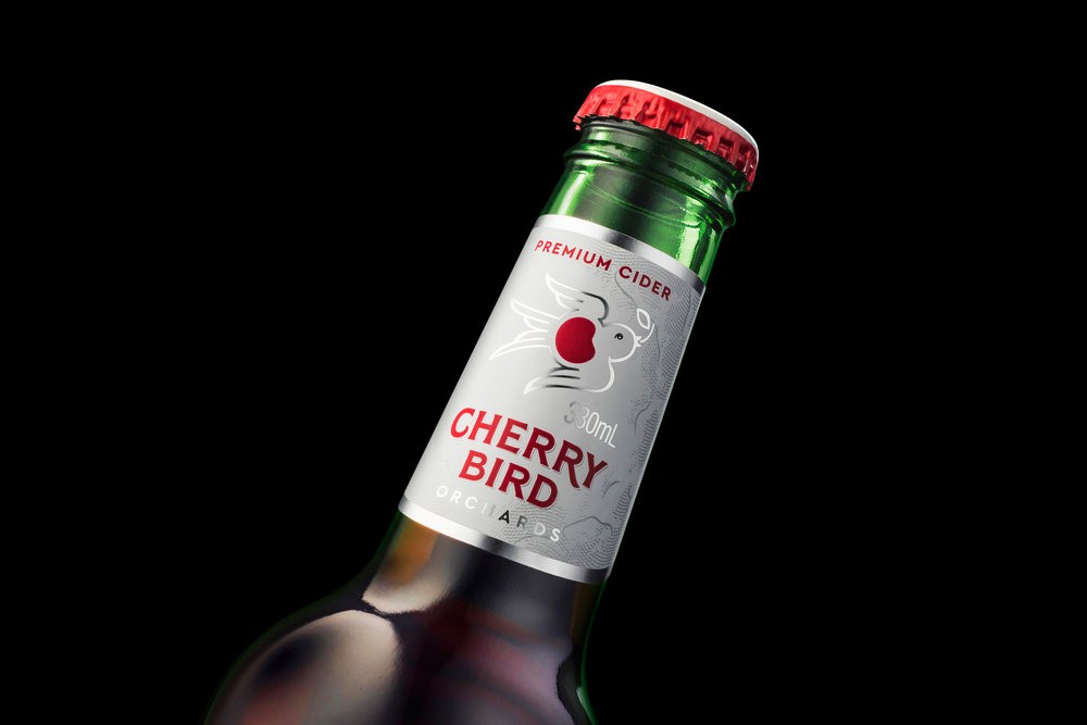
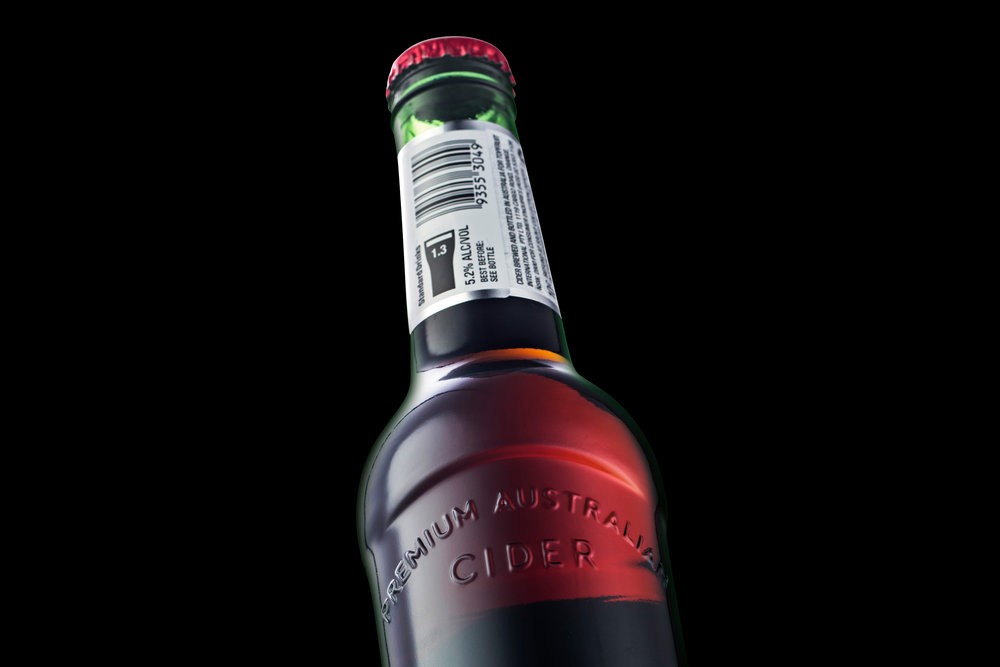
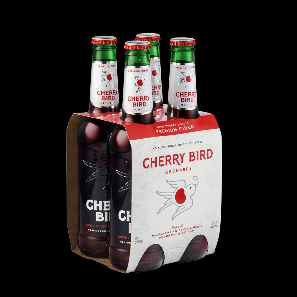
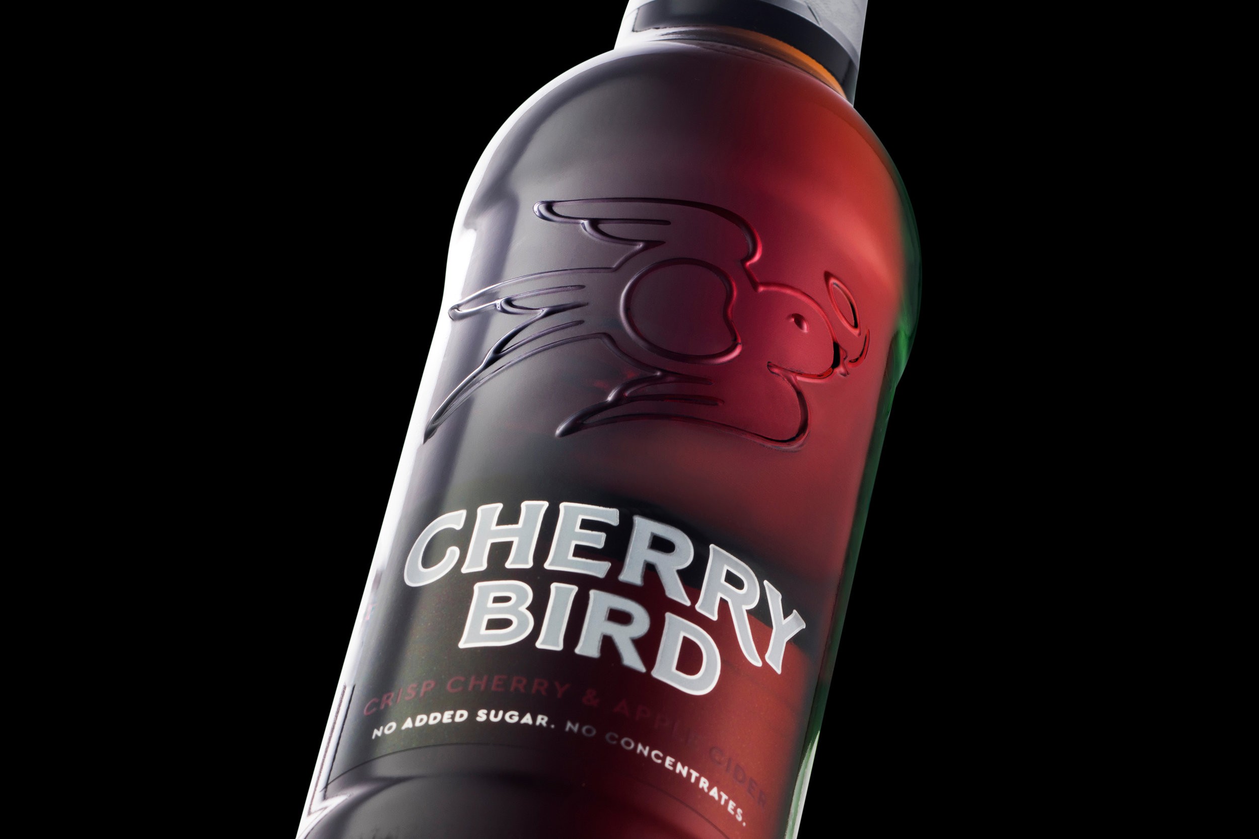
The packaging concept overcomes language barriers through the use of the Cherry Bird motif that sings out of the embellished glass creating a clean, minimal aesthetic that cuts right through the heavily saturated Australian craft cider market. The idea of the bird graphic evolved out of friendly banter with growers who complained about a particular bird on the orchard getting at their beloved cherries. It was perfect!… this greedy little thief stealing their precious fruit was the perfect link to the orchards, the fruit and the growers. The playfulness of the brand story through the cherry bird created a nice point of difference on the shelf in China, in comparison to the premium European beer and cider brands that were defined by traditional heritage cues and common themes.
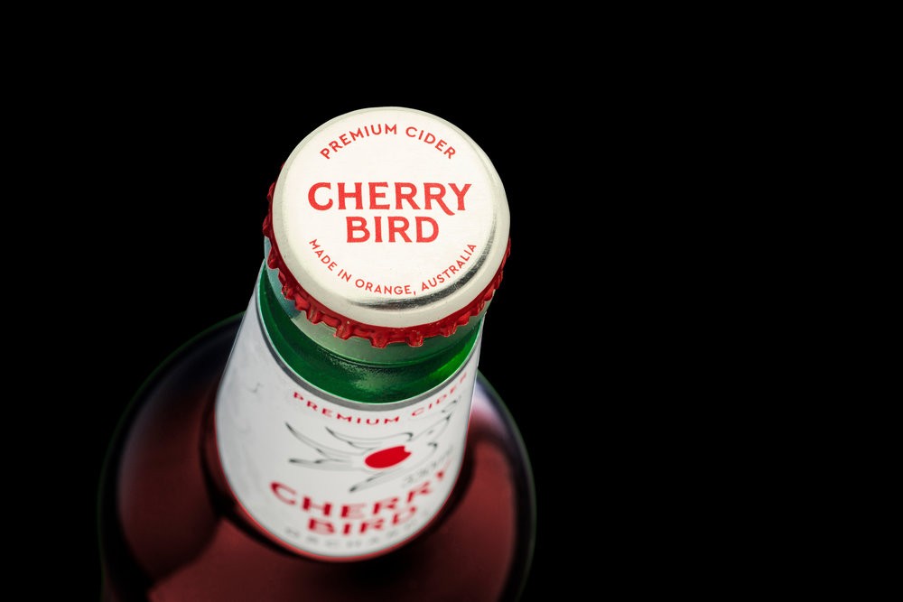
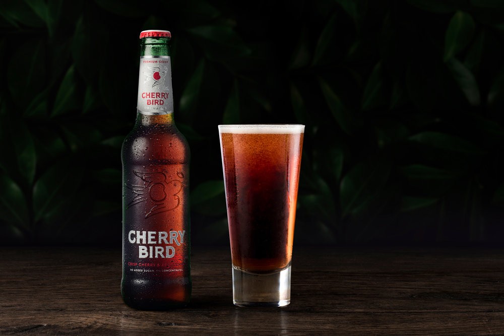
Cherry Bird Orchards Cider is a true artisanal product so it was important to show as much of the liquid as possible. We opted for a green tint glass to enhance the blush cider colour and to increase shelf life. The white neck label, a solution used by premium European brands common in China helps position Cherry Bird in a premium space while driving the proposition of being light and refreshing to Australian consumers who are seeking a sessionable ‘day time’ cider.
We embraced the cherry red to create vibrancy and standout and for the obvious appeal of the chinese market. We were careful not overuse the red so we opted for its usage as a highlight colour paired with white and the shimmer of silver. This supported the need to break down barriers of the liquid being rich and sweet with a crisp and refreshing appeal.
The result is an authentically Australian brand that is premium and credible yet offers a playful twist with global appeal.”
