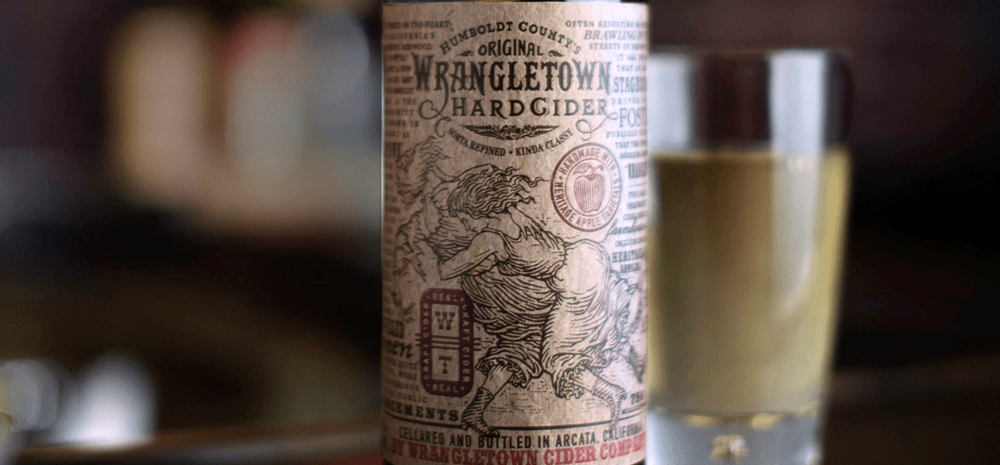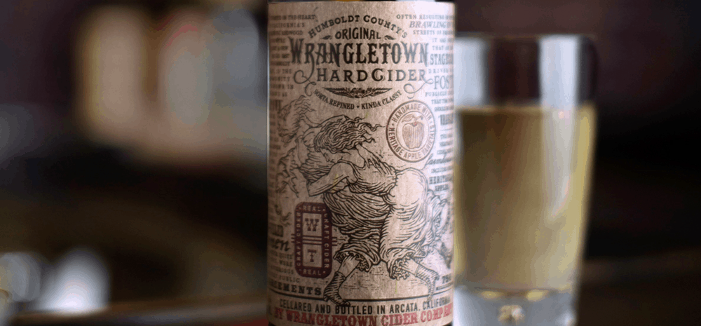
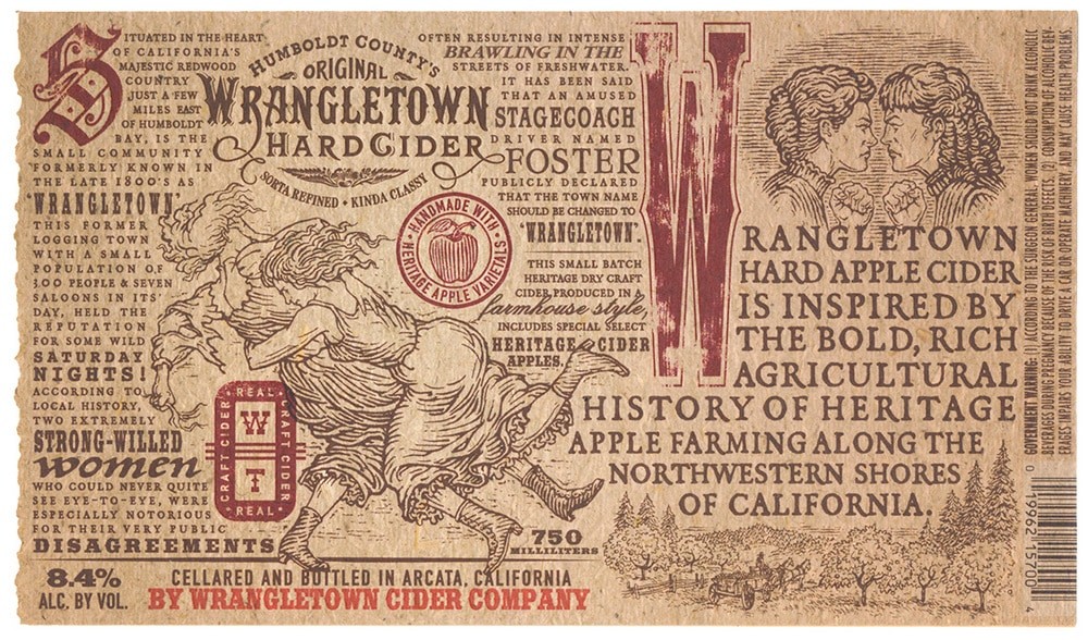
“Today, it’s a small quiet Humboldt County community named Freshwater, but around the turn of the century it was better known as Wrangletown. And while Wrangletown was small, it was anything but quiet — miners, loggers, and seven saloons, were the perfect formula to breed public disagreements.
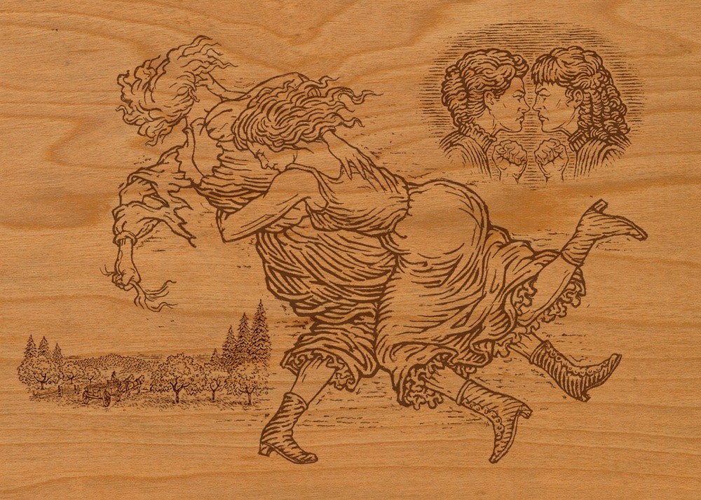
Two of Wrangletown’s most notoriously disagreeable women provide the focal point for this package. The unique town history not only provided the inspiration for the old-west look, it became a prominent element of the packaging.”
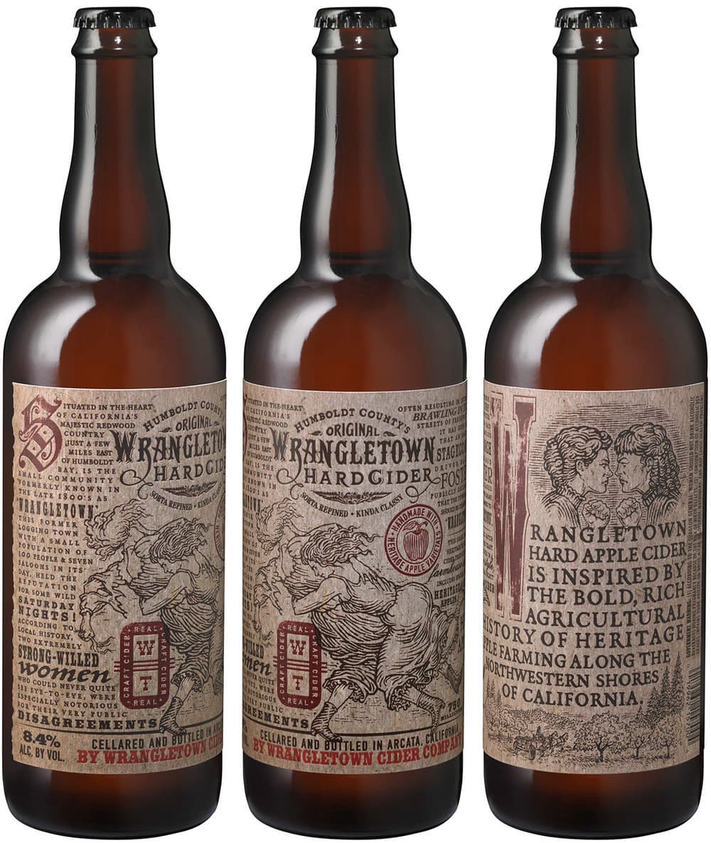
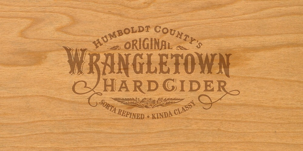
“The proprietary, hand-lettered brandmark and the custom woodcut style illustrations were created to roughly reflect the old west look and feel of print design in the late 1800’s. The use of multiple typefaces also evokes the era, and gives the sense that the printer used every piece of wood-type in his drawer — not an uncommon practice back when printers doubled as designers.
We think it all adds up to a “sorta refined, kinda classy” package.”
CREDIT
- Agency/Creative: Auston Design Group
- Article Title: Auston Design Group – Wrangletown Hard Cider
- Project Type: Packaging


