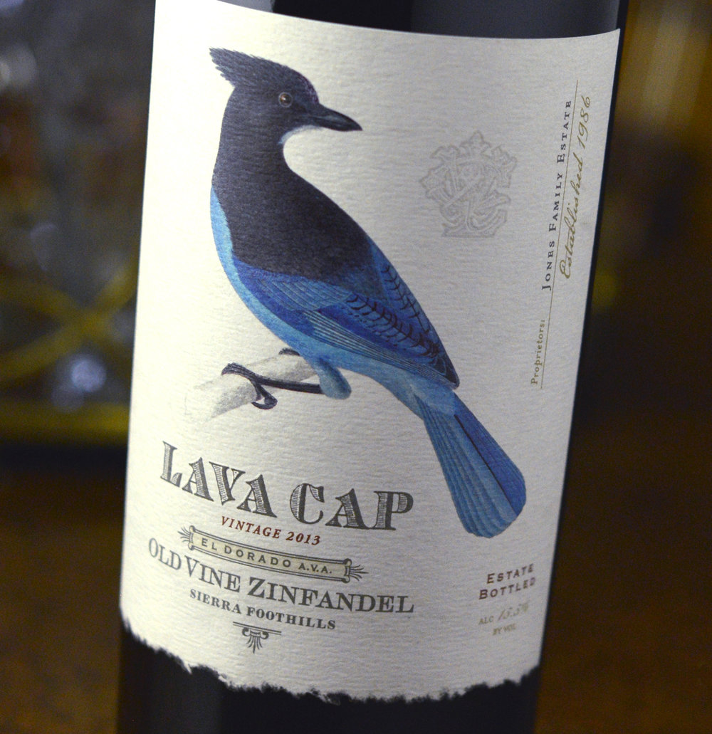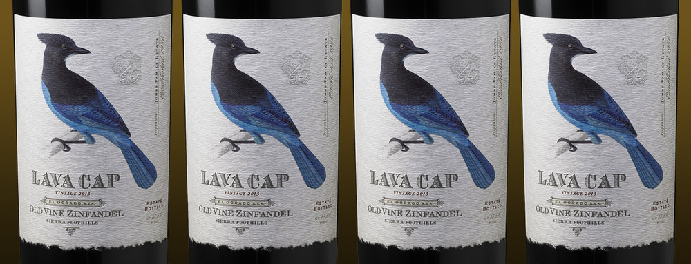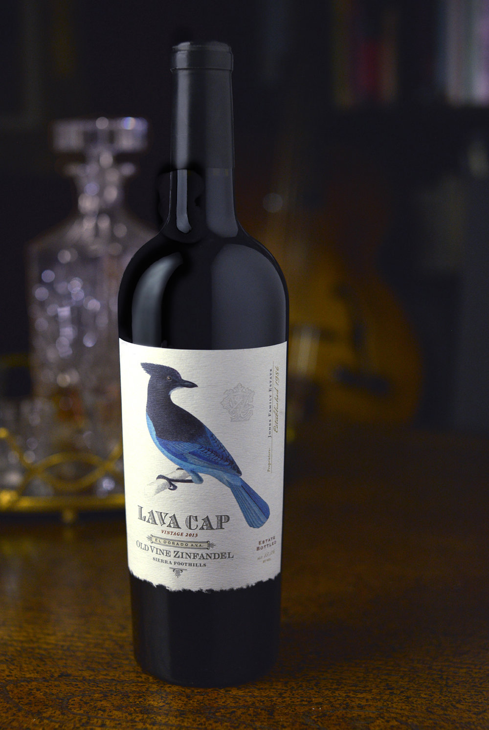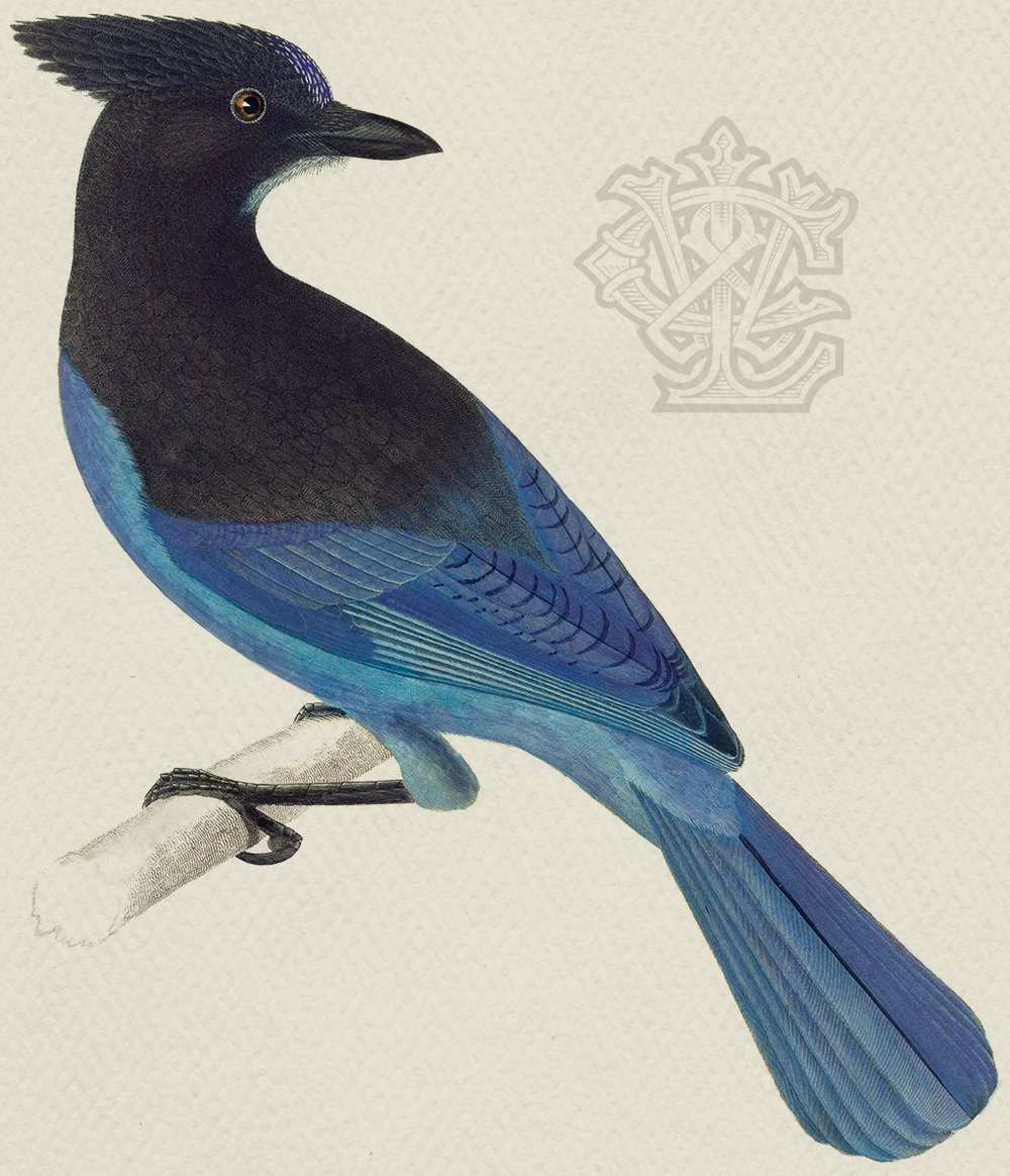
” For years, visitors to Lava Cap Winery would ask founders Charlie and Noreen Jones, “Where’s the bird?” The bird in question was a stellar jay featured on Lava Cap’s first label. Not only was it emblematic of Lava Cap’s Sierra Foothills locale, it had a bit of a cult following among the winery’s visitors. A prior label change had eliminated the bird, as well as the casual Sierra Foothill vibe.ADG was brought in to create a package and brand identity that reconnected Lava Cap with its past, gave the brand an authentic Sierra Foothills feel and perhaps, most importantly, brought back the stellar jay as the icon for the brand and winery.The stellar jay was the easy part, but communicating Lava Cap’s unique location through their brand identity was a bit trickier. The goal was to develop a slightly funky, retro look, without coming off as trendy. The typography and custom monogram were created to mimic the look of graphics from the late 1800s, which along with the 19th-century scientific illustration of the jay, delivers the visual cues that let people know that Lava Cap brings a unique approach. Lava Cap’s new package evokes an image that’s far different than the more buttoned-up Napa look—it’s a little rougher around the edges with an approachable, slightly down-home feel.Printed at CCL Label in Sonoma, the label was printed on Bright White Felt, features 4-color process, 4 spot colors, emboss and deboss, plus a custom diecut to simulate the deckle edge of a handmade paper.”


CREDIT
- Agency/Creative: Auston Design Group
- Article Title: Auston Design Group – Lava Cap Winery
- Project Type: Packaging
- Format: Bottle
- Substrate: Glass


