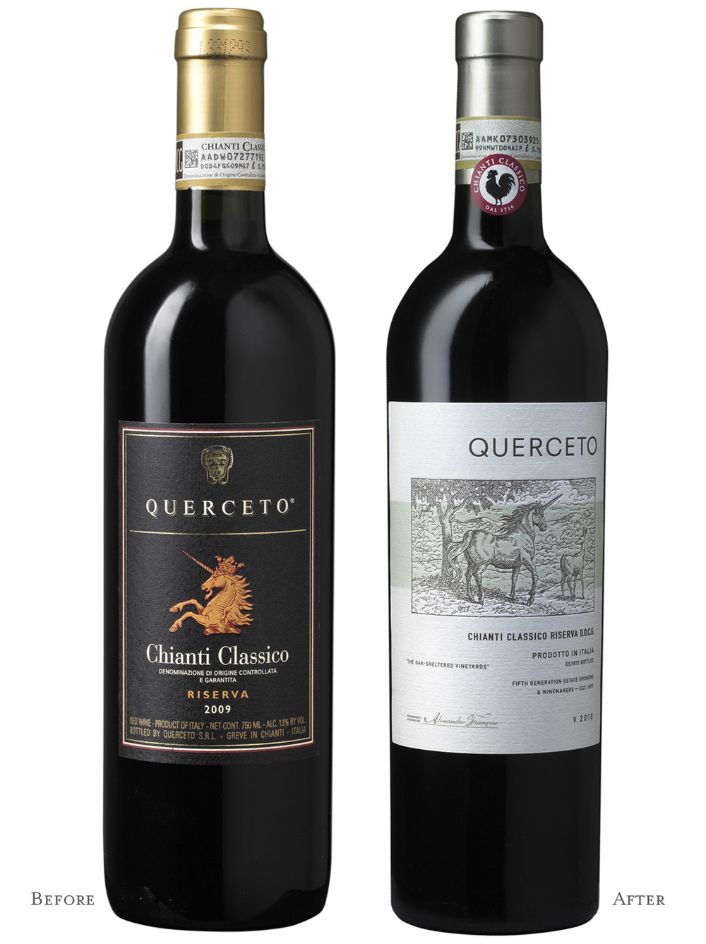
“Castello di Querceto had everything that one could want in an Italian producer — family-owned for five generations, a 13th-century castle, high-quality vineyards and winemaking. Yet, brand sales had been declining for several years. It was clear that Querceto’s packaging wasn’t effectively communicating their quality and brand story.
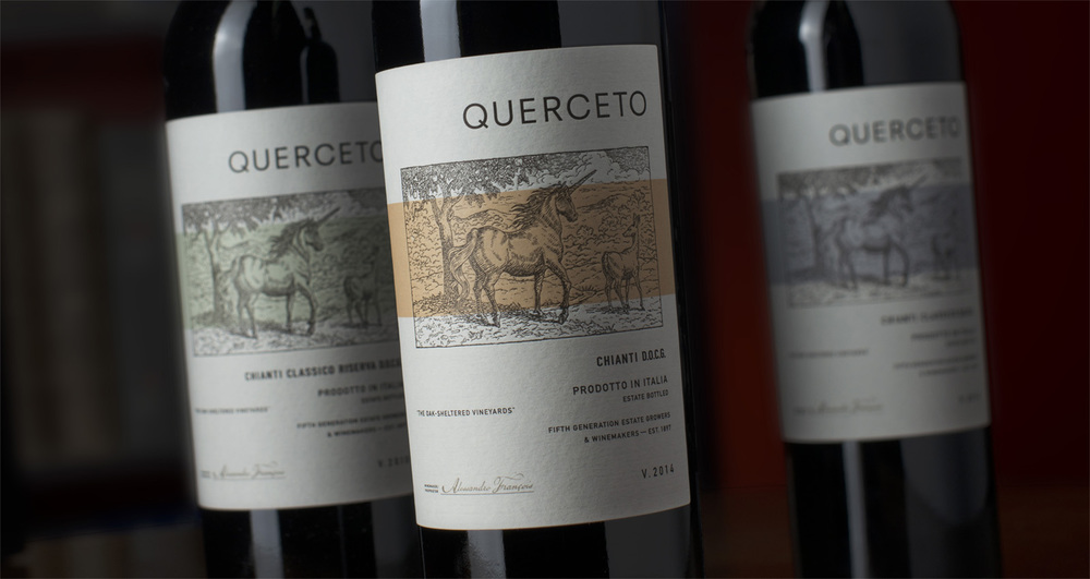
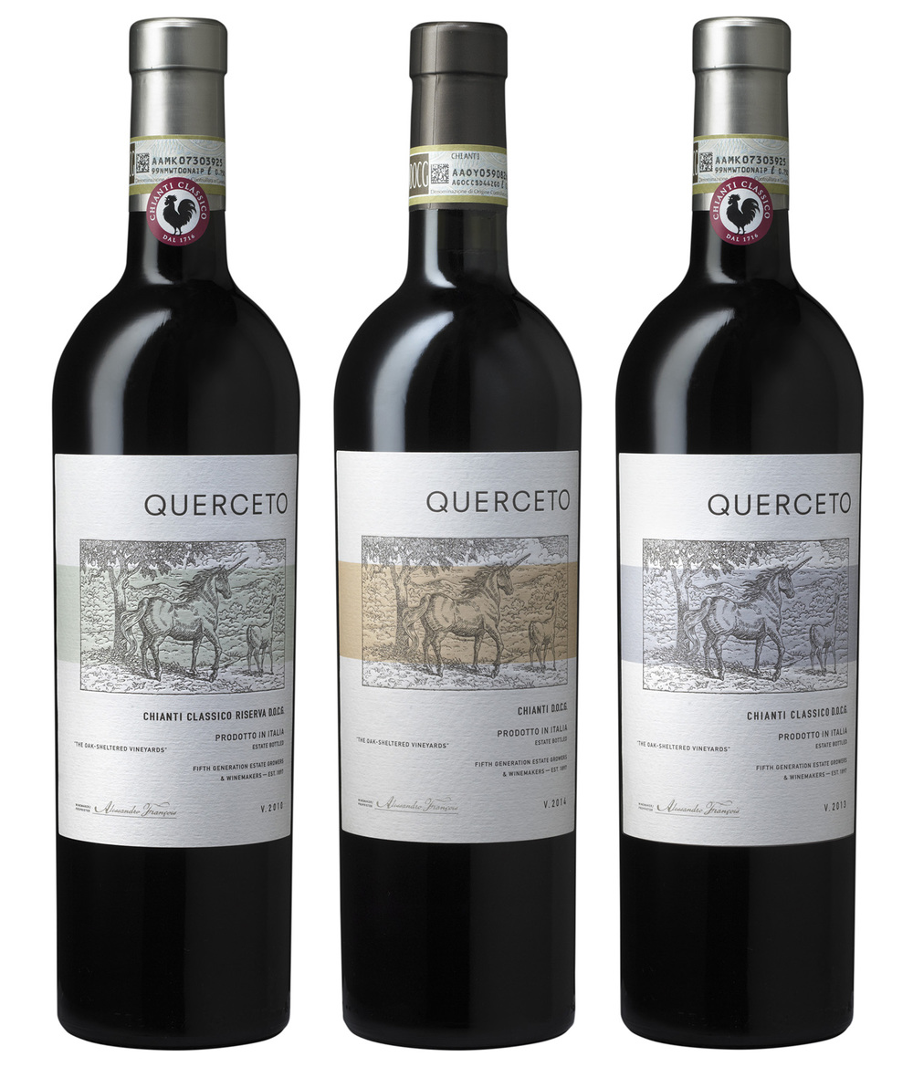
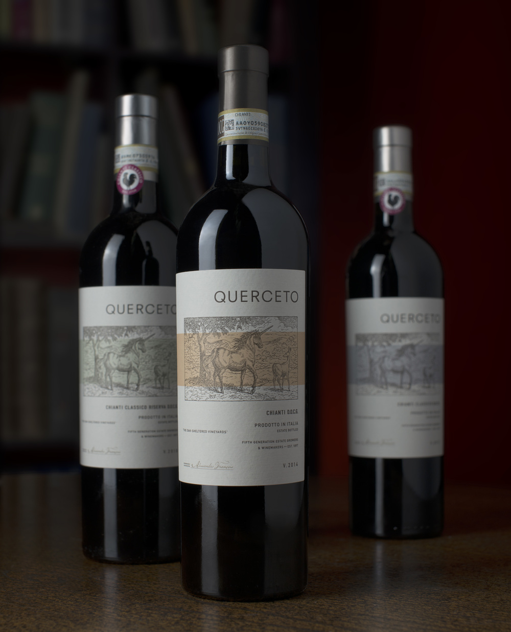
The brand name translates to “little oak forest” and comes from the winery’s location in a wooded hillside in Tuscany. ADG was contacted to bring modern sensibilities to Querceto’s brand. By leveraging and highlighting aspects of the brand’s existing story our design solution is minimalist, with a contemporary typographical layout. The custom illustration is done in a 19th Century wood-engraving style, to create balance with the modern aspects of the label and pay homage to the long history of the brand. Rich in symbolism, the unicorn in the oak forest is representative of the unicorn in the family’s centuries-old coat-of-arms and creates a new iconic image for the brand.
As with all ADG labels, printing techniques played a large role in the label coming to life. With this label, the debossed brandmark and sculpturally debossed illustration are indicative of the letterpress print method of a bygone era and help give the label a high-end tactile quality.”


CREDIT
- Agency/Creative: Auston Design Group
- Article Title: Auston Design Group – Castello di Querceto
- Project Type: Packaging
- Substrate: Glass


