Aurora – Branding the world’s most exclusive salmon
Under the fabled Northern Lights, also known as Aurora Borealis, a delegation of Japan’s leading seafood experts came to Norway. They had one goal: to find the finest sushi-grade salmon in the world. Above the Arctic Circle, where the winters are long and the summers are mild, they found Aurora Salmon®. Japan’s most demanding sushi chefs have been using it ever since.
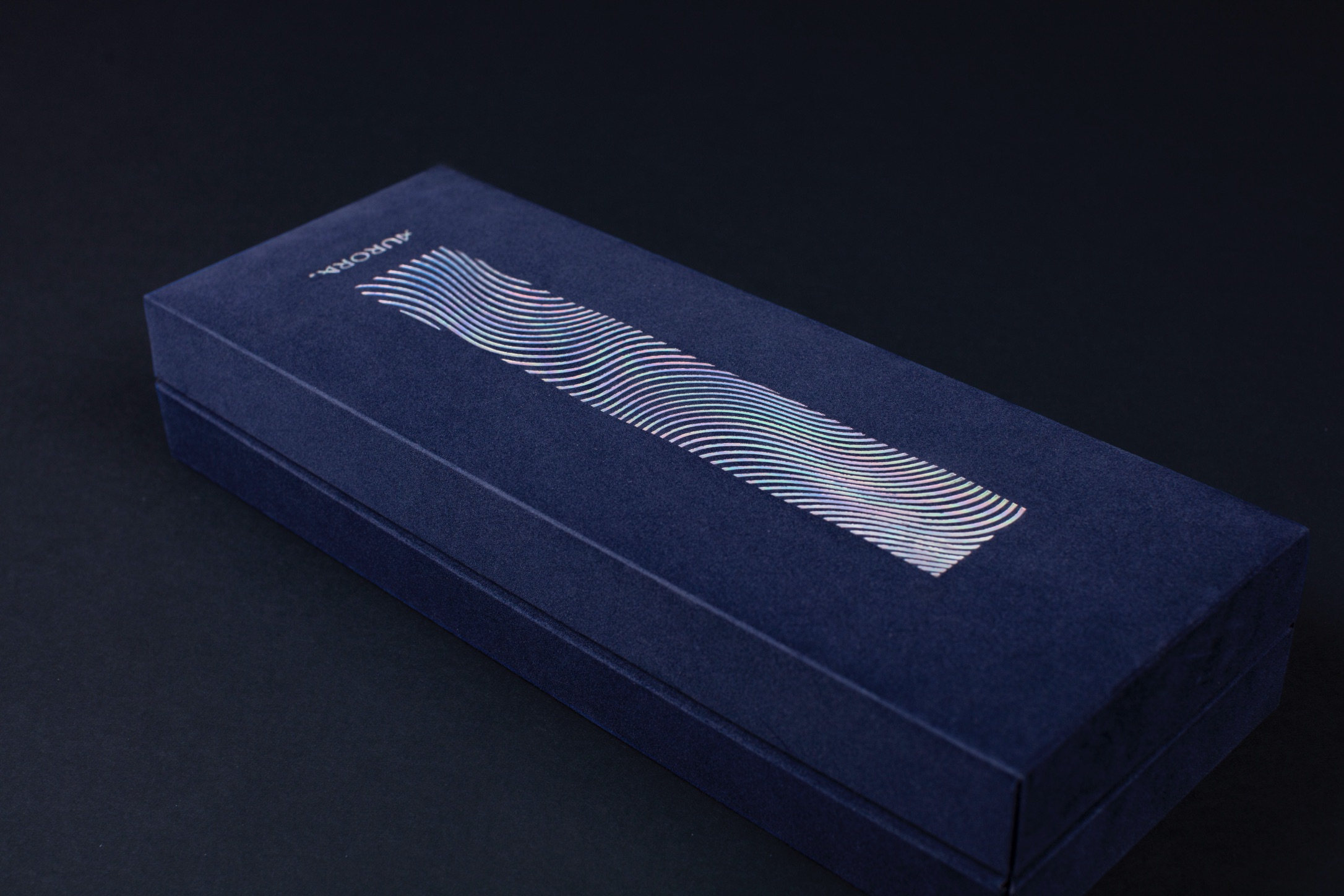
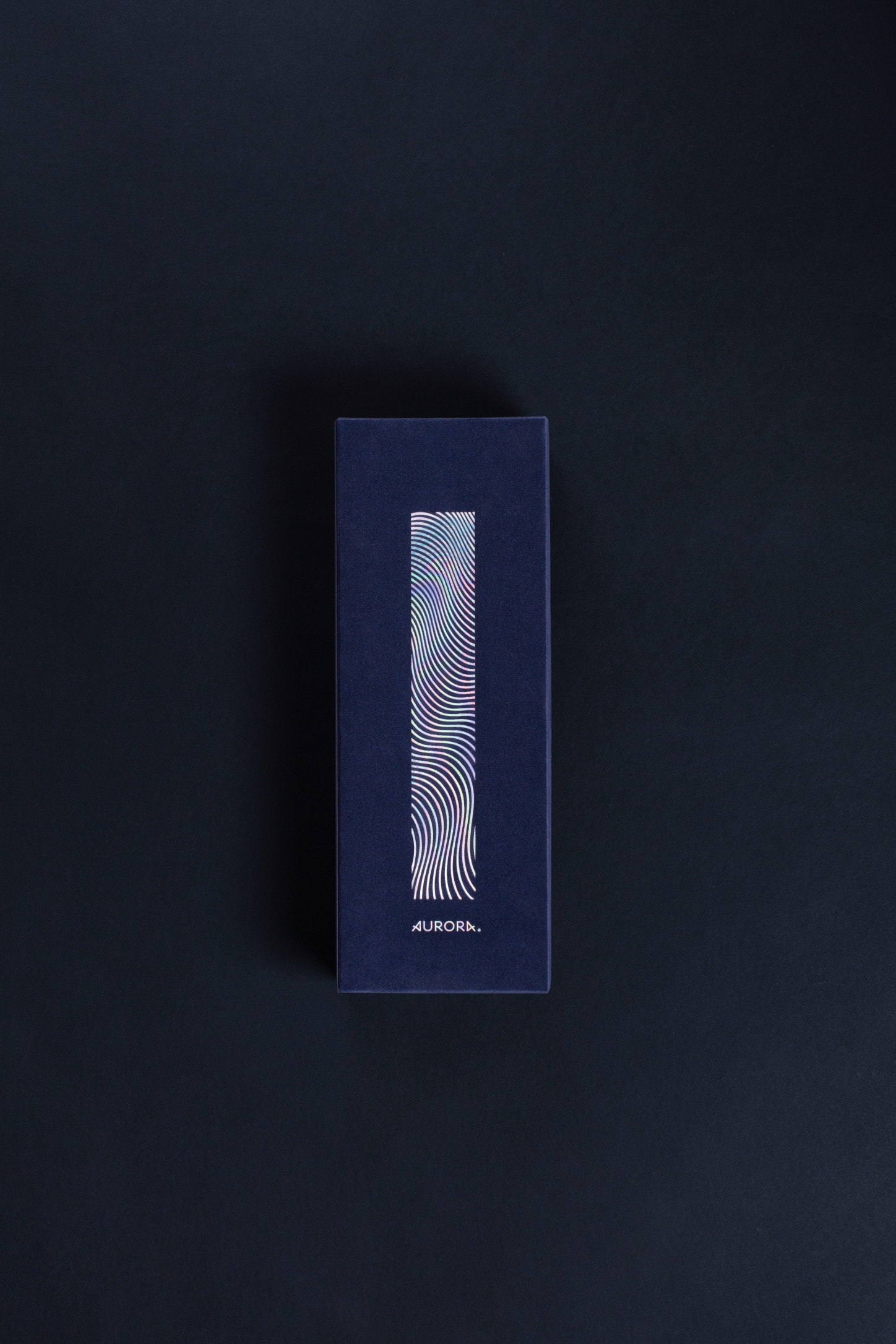
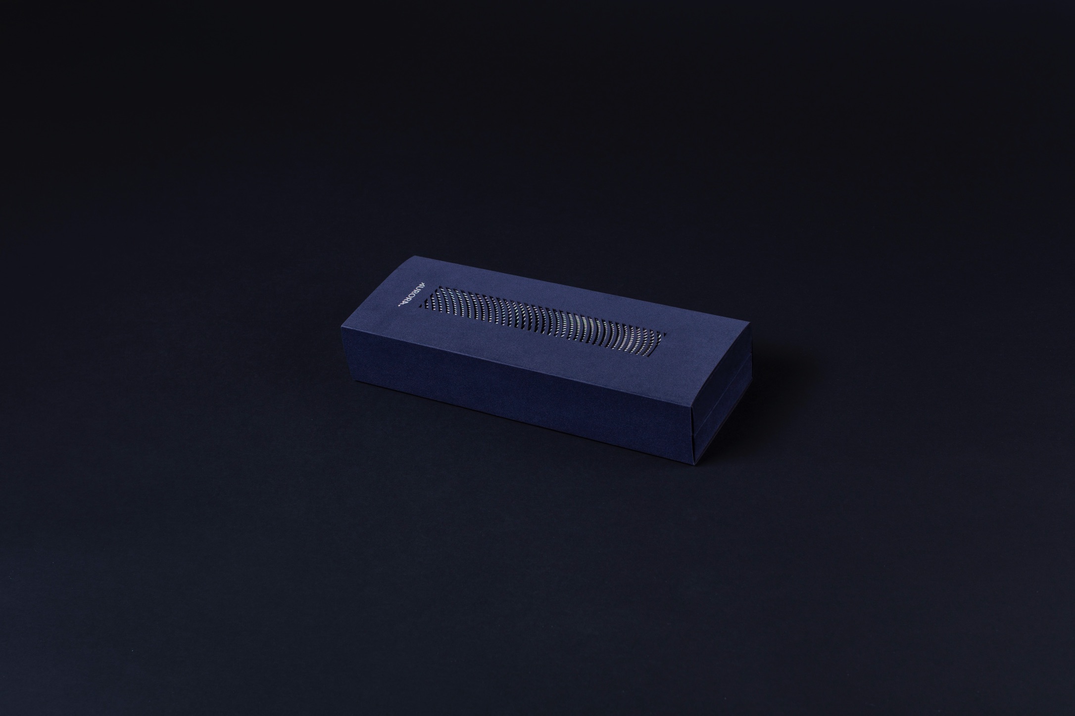
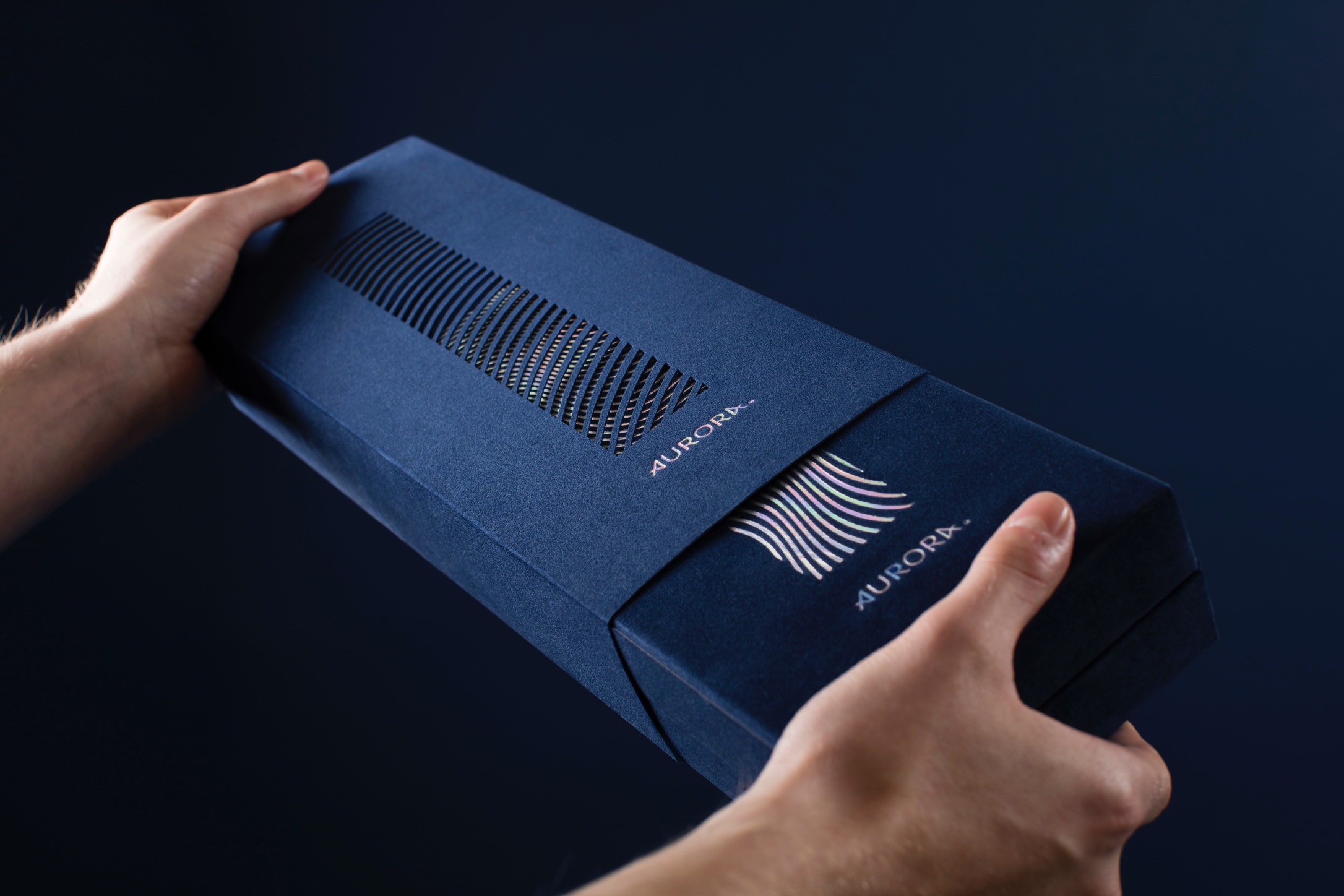
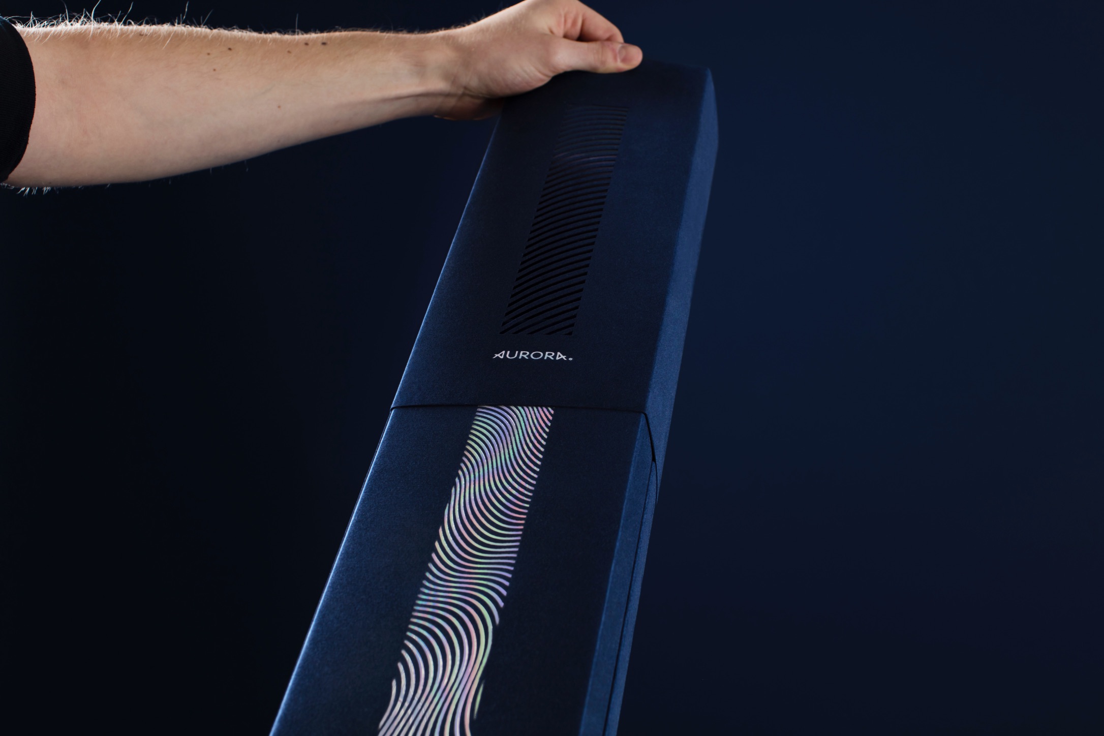
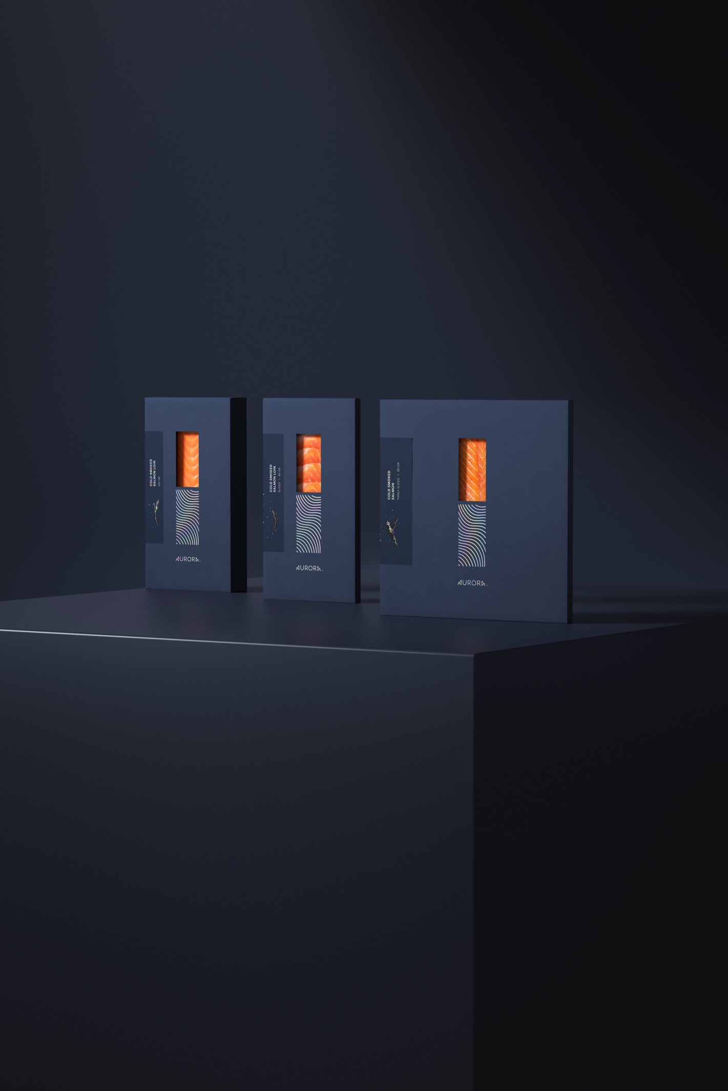
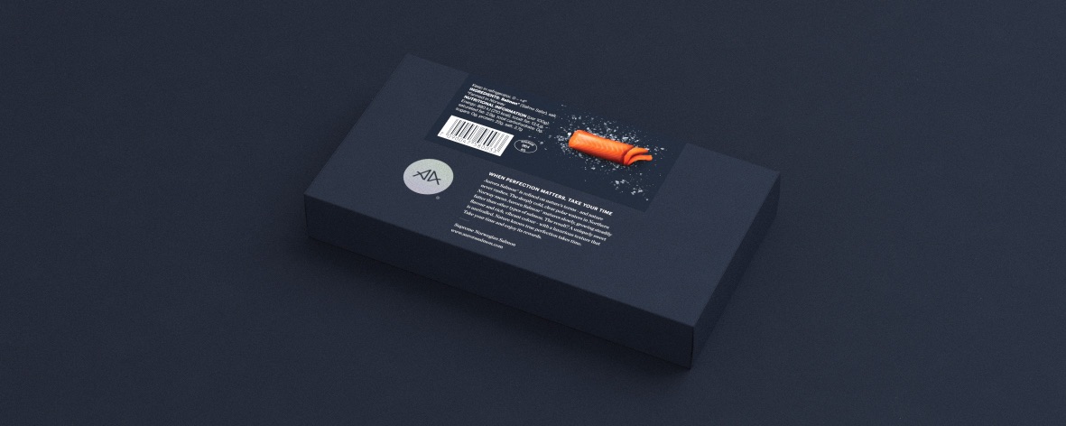
An exclusive product needs an exclusive look. The magnificent display of light was the inspiration for the brand visuals. The flow of Aurora Borealis and the texture of Aurora Salmon was used to create a smooth, wavy graphic, which was used as a unifying element of the identity. The pattern also mimics the smooth swimming of a fish, ocean currents and the beautiful texture found in Aurora Salmon.
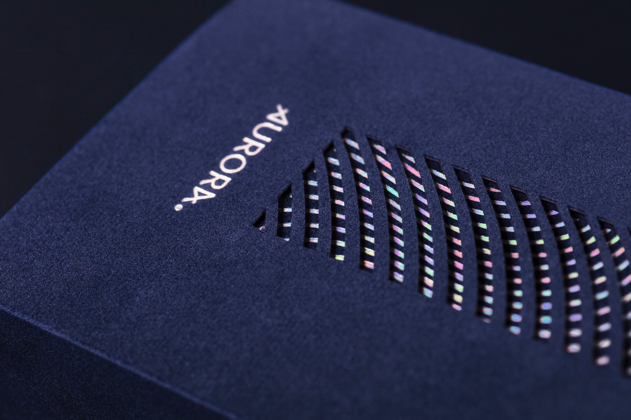
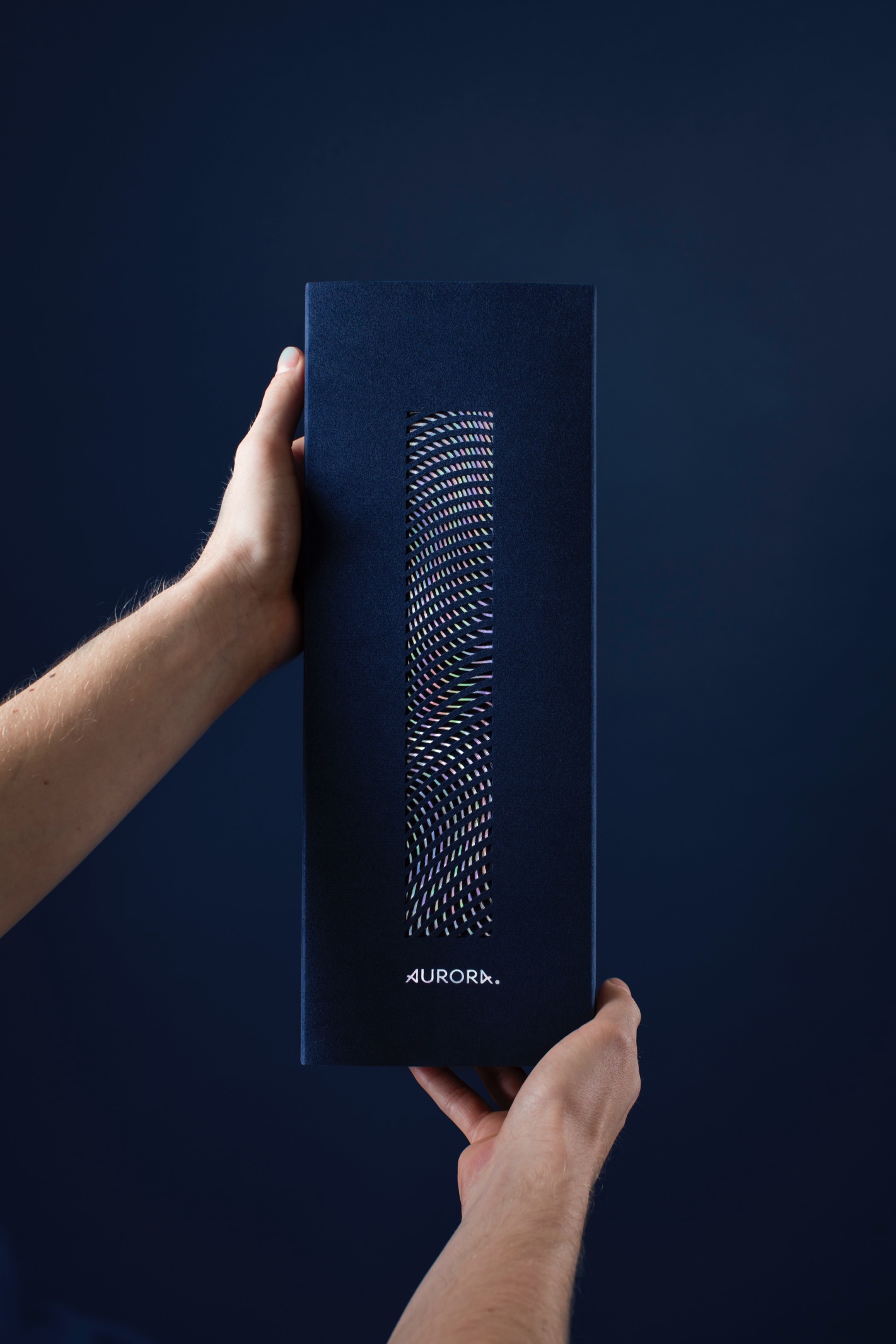
The deep blue colour of the night sky is used as the base for the design to dance upon. The dark hue is accompanied with vibrant holographic foil, which brings in the movement and undefinable colour spectre of the Northern Lights. The exclusive design comes to life when the salmon is unwrapped. The laser cut top cover gives creates a moiré effect when removed and mimics the movement of the northern lights.
The logo is built around symmetry, with an ‘A’ on both the beginning and the end of the word, they nestle the logo between them. The two A’s have also been used as its own symbol, leaning towards each other. The custom typography was inspired by Norse lettering. A bent in the letters give a flow to the type, drawing a link back to the dancing of the light.
“Yes, the visuals are stunning but it’s the fact that they are rooted in such a deep understanding of our brand’s essence, thats why the magic happens. This is the reason Kind is unique. They make feelings come to life and people are blown away.” Pål Erik M. Michelsen – Brand & Marketing Director, Lerøy Seafood

CREDIT
- Agency/Creative: KIND
- Article Title: Aurora Packaging Design Creation by Kind
- Organisation/Entity: Agency
- Project Type: Packaging
- Project Status: Published
- Agency/Creative Country: Norway
- Agency/Creative City: Bergen
- Market Region: Global
- Project Deliverables: Packaging Design
- Format: Box
- Substrate: Pulp Carton, Pulp Paper
- Industry: Food/Beverage
- Keywords: WBDS Agency Design Awards 2021/22
-
Credits:
Creative Director: Tom Emil Olsen
Design Director & Senior Designer: Knut Harald Longva
Senior Designer: Agnieszka Gawlik
Senior Designer: Carl Bugge
Photographer: Christoffer Meyer
Project Manager: Beate Myren Romslo
Strategic Brand Consultant: Thomas Danielsen
Designer: Torgeir Stige


