


The Brief: Aurea Honey is a premium-grade honey brand that aims to offer consumers a natural, additive-free, and high-quality product. The healing properties of honey and its ability to improve health and overall well-being have become the basis and inspiration for a new brand concept that would emphasize the significance of honey. The mission is to convey the complex and fascinating process of honey production, showcasing the brand’s meticulous attention to detail and commitment to delivering unmatched flavor and quality.
The Creative Concept: The goal and, at the same time, the challenge of branding was to present Aurea in its pure form without any frills. The whole branding was to be built around the splendor of gold and connect it to honey, where it becomes a symbol of opulence, nourishment, and revitalization.
Naming: As gold was the main detail of the branding, “Aurea” was an ideal choice for such a premium honey brand. Derived from the Latin word for “golden,” Aurea perfectly encapsulates the radiant and precious nature of honey. The name evokes images of gleaming riches and luxury, inviting consumers to indulge in a truly golden experience.
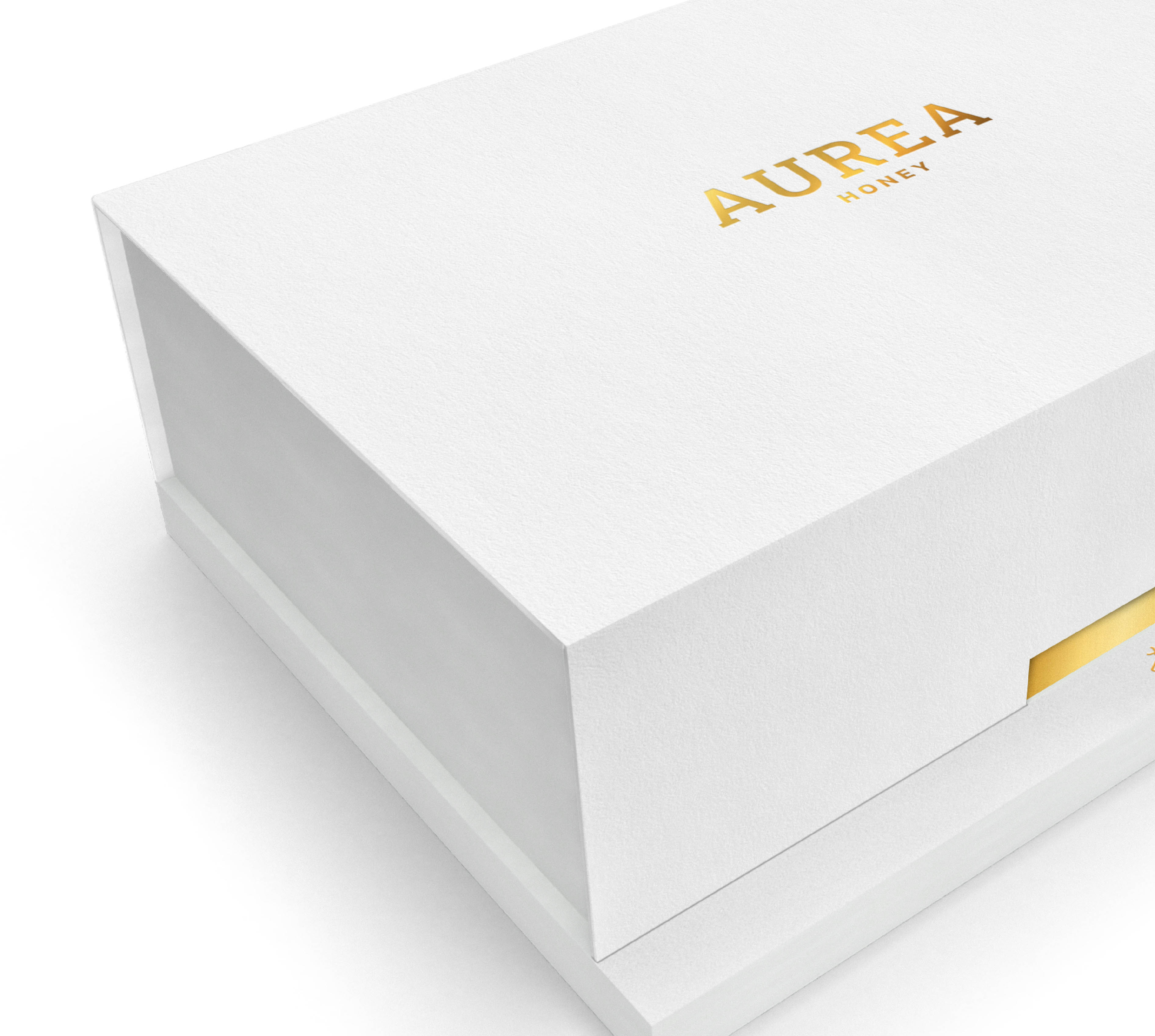
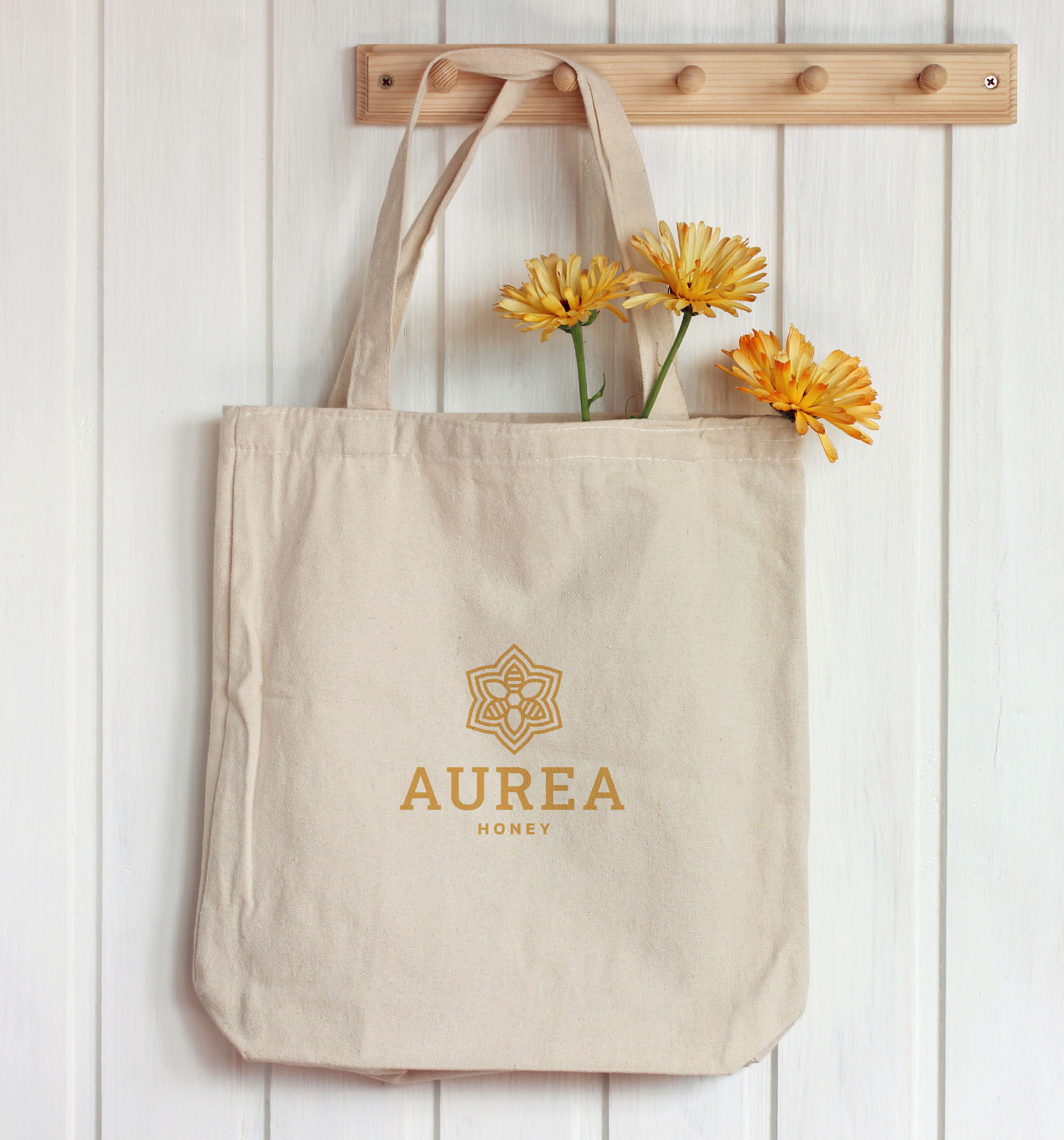
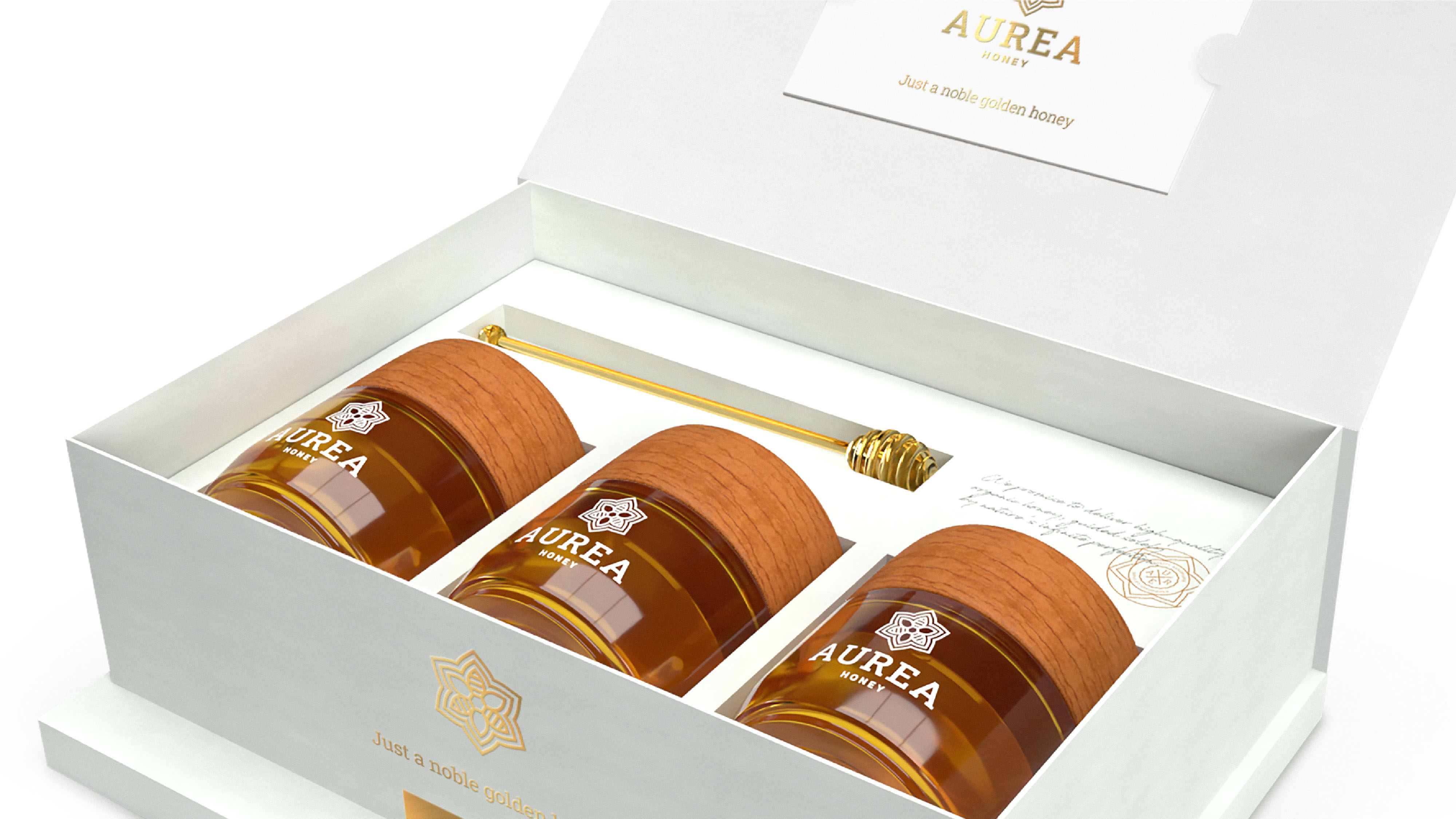
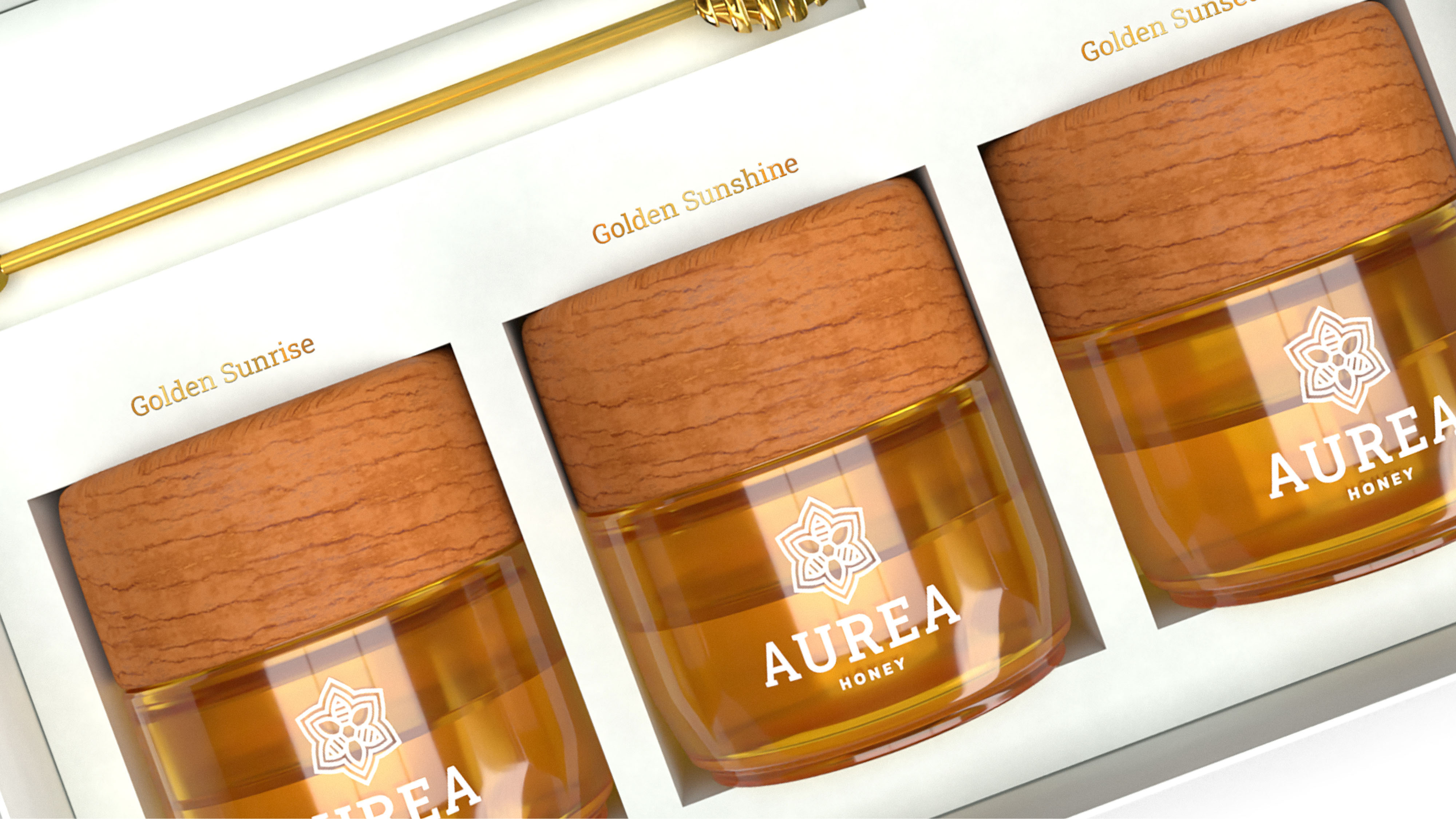
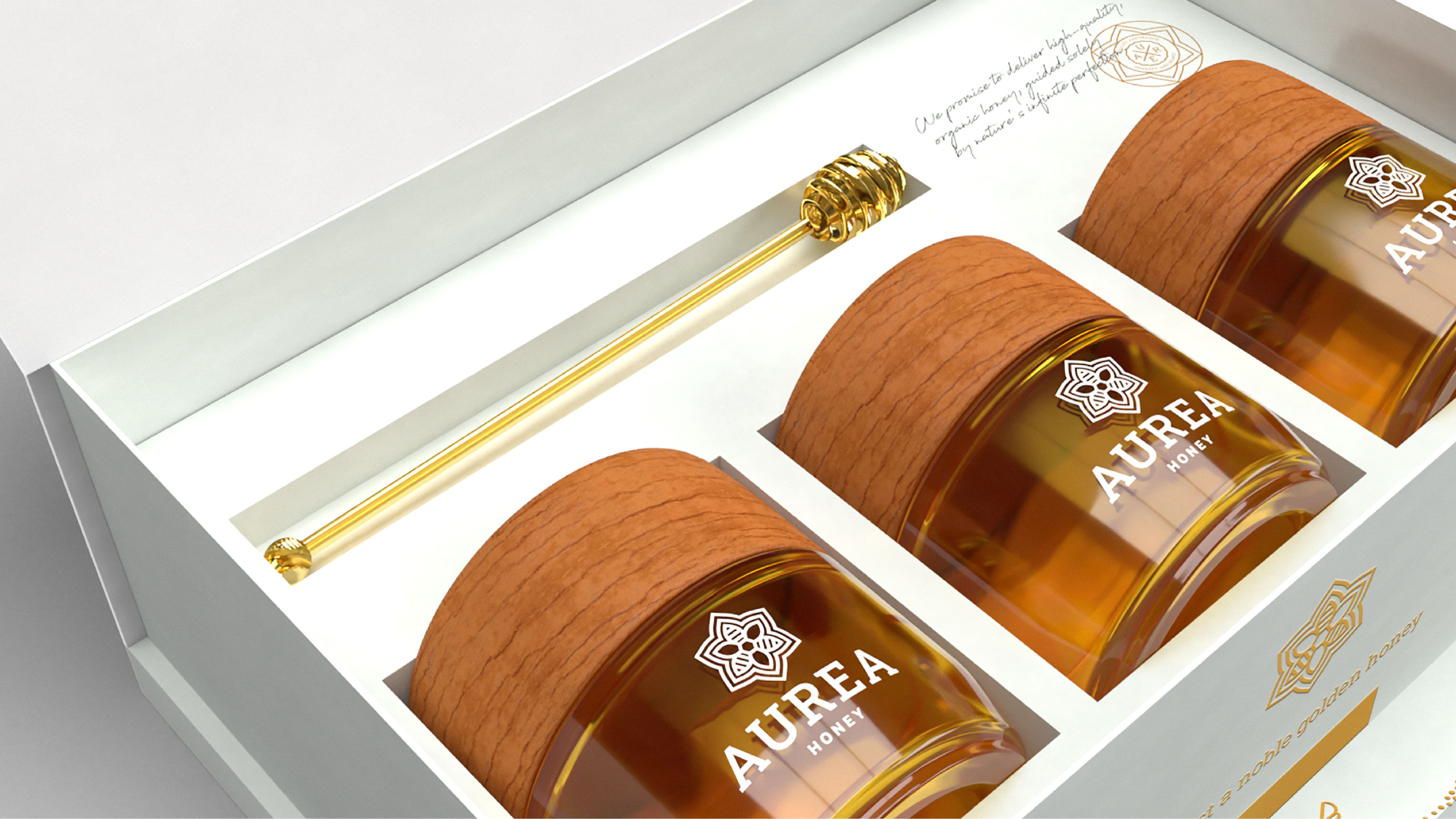
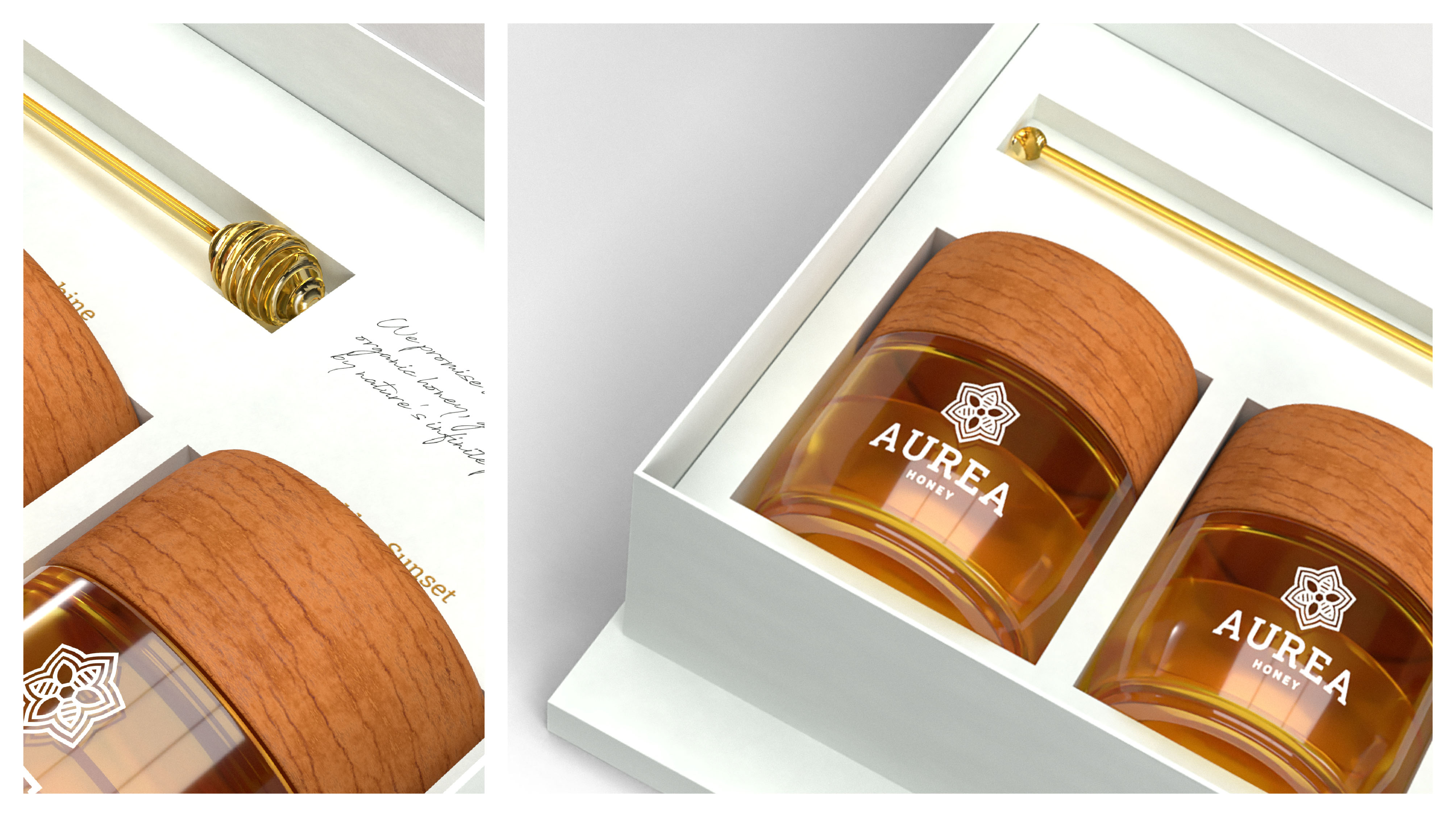
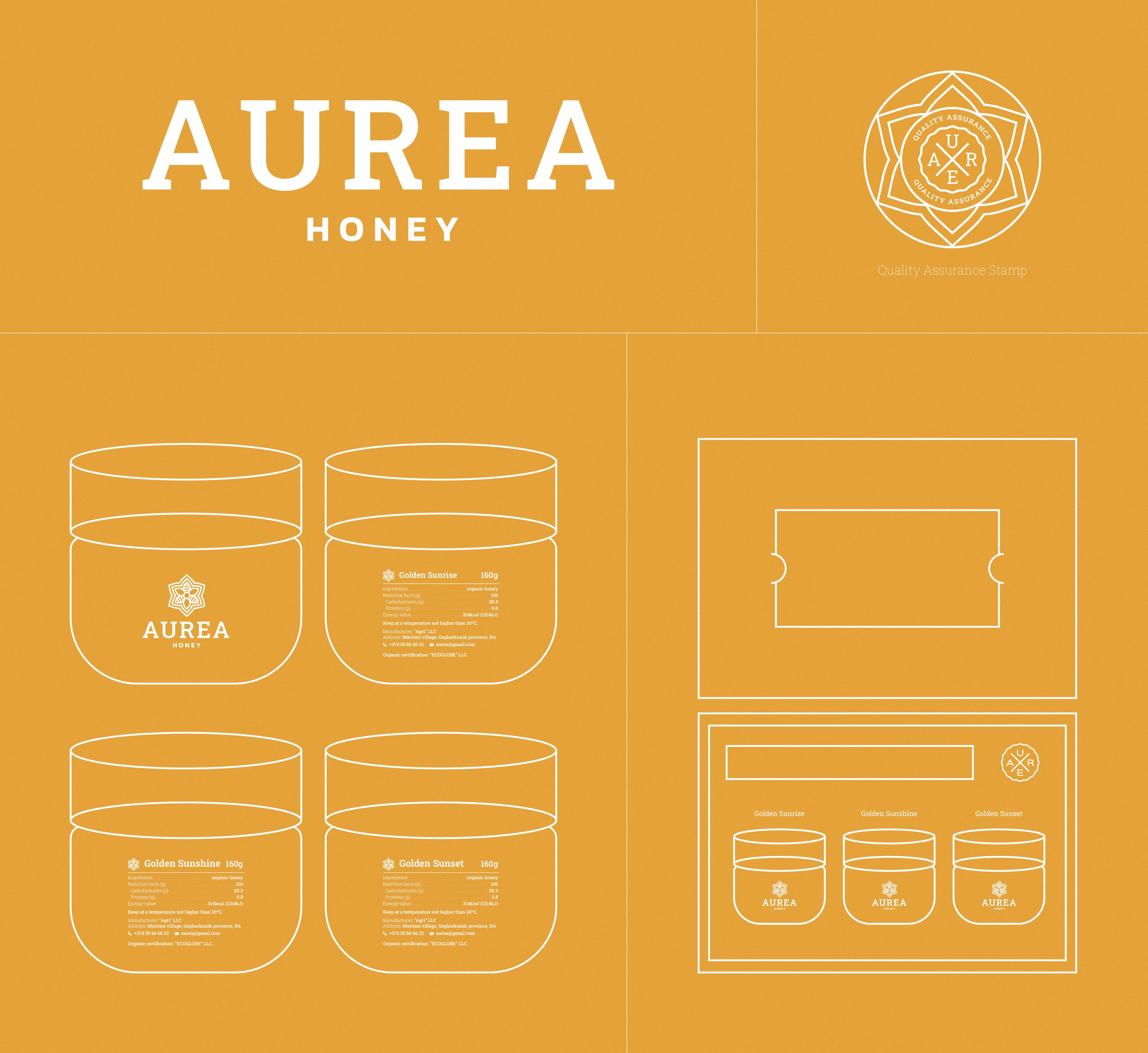
Logo Design: The Aurea Honey logo is a visual perfection that combines elements of flower petals, a bee, and gold, all performed in minimalistic design, symbolizing their harmonious union. The logo features a stylized pattern with the word “Aurea” elegantly scripted. The design process also included packaging that features three jars of Aurea honey with a golden spoon and a short message from the brand. A hidden game in the package invites you to play a game of colors with Golden Sunrise, Golden Sunshine, and Golden Sunset honey—three honey jars with different colors and taste intensities.
The Result: The branding, as promised, delivered the concept of premium-quality honey, with a captivating name, a mesmerizing logo design and packaging, and storytelling that reveals the motifs of Aurea and its connection to gold. Aurea Honey stands as a testament to the extraordinary journey of honey production, inviting consumers to savor its pure flavor and experience its rejuvenating properties.
CREDIT
- Agency/Creative: Non Gravity
- Article Title: Aurea: Branding and Packaging Design by Non Gravity
- Organisation/Entity: Agency
- Project Type: Packaging
- Project Status: Published
- Agency/Creative Country: Armenia
- Agency/Creative City: Yerevan
- Market Region: Global
- Project Deliverables: 3D Modelling, Brand Creation, Brand Design, Brand Identity, Brand Naming, Branding, Design, Graphic Design, Label Design, Logo Design, Packaging Design, Product Design
- Format: Box, Jar
- Substrate: Glass, Glass Jar
- Industry: Food/Beverage
- Keywords: Branding, Packaging Design, Logo Design, Product Design, Brand Naming, Brand Concept Creation
-
Credits:
Brand Strategist: Karen Vardanyan
Creative Director: Diana Nerkararyan
Art Director: Arusik Ghazaryan
Designer: Levon Chkolyan
Content Writer: Anush Bichakhchyan
Project Management: Mariana Madoyan


