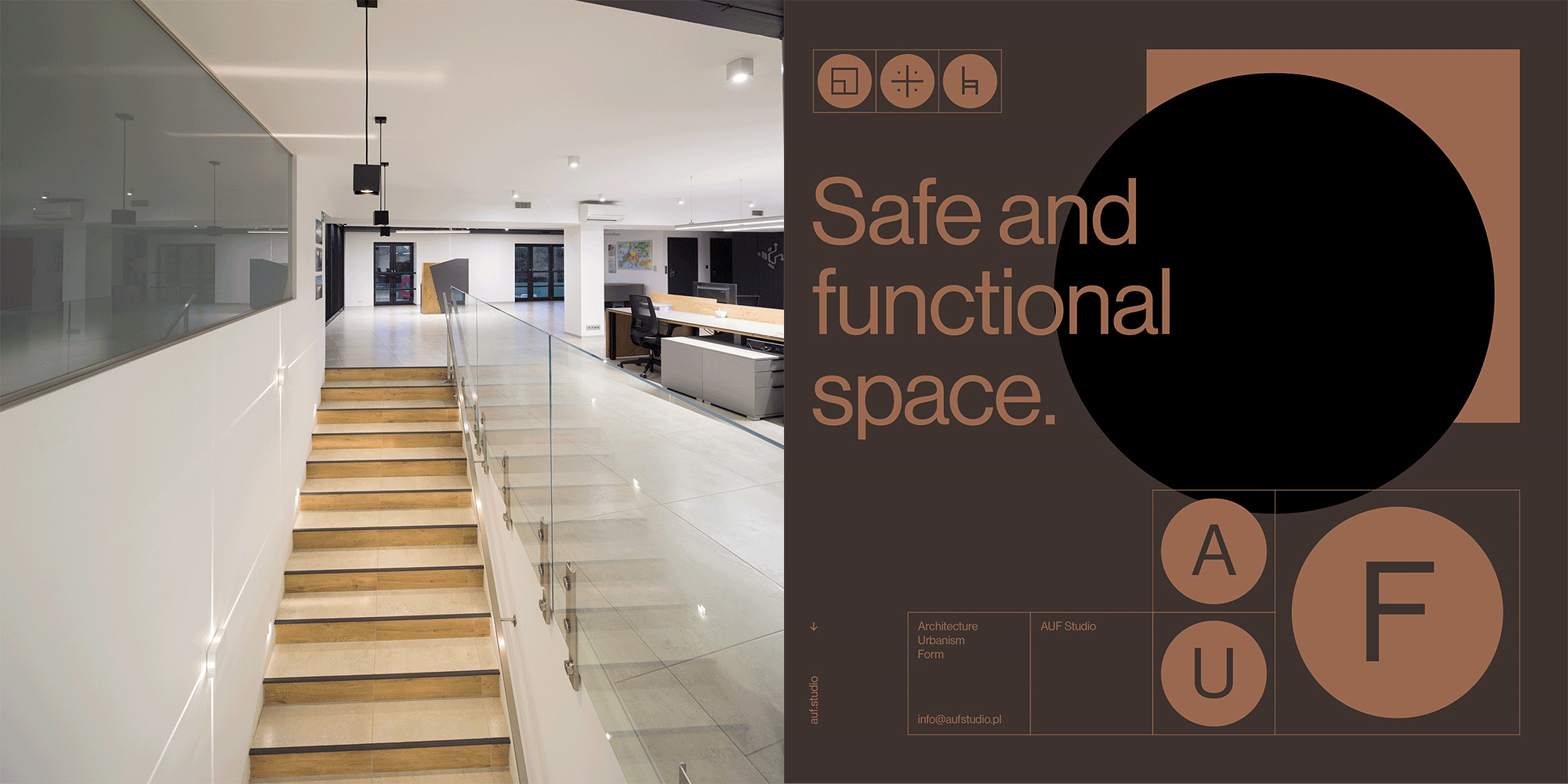
AUF Studio is an architectural studio with over 30 years of experience. They work in a wide range of projects, from comprehensive projects, single-family homes, small office buildings, to small architecture and product design.
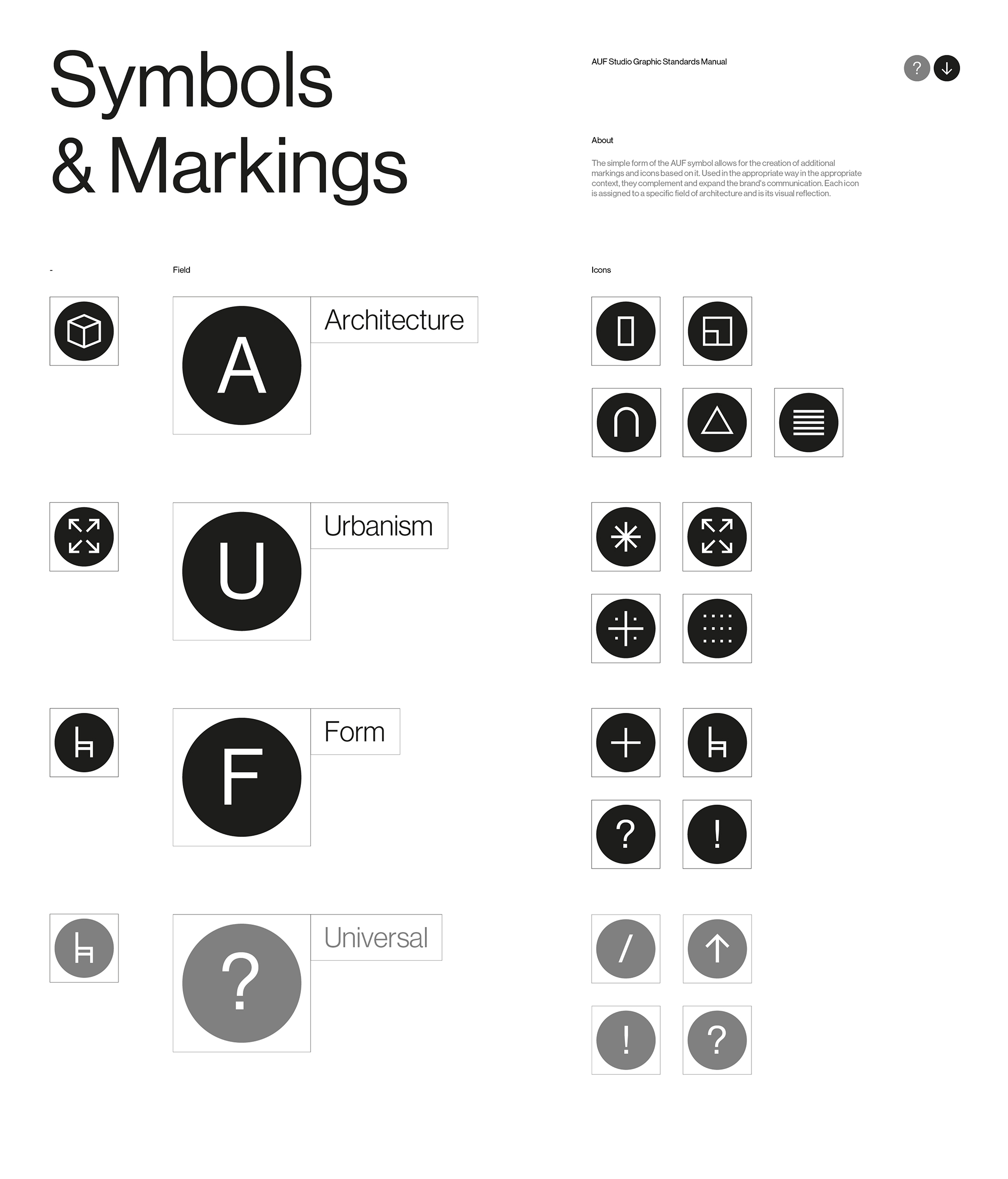
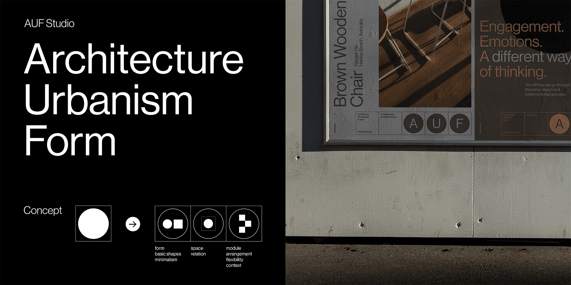
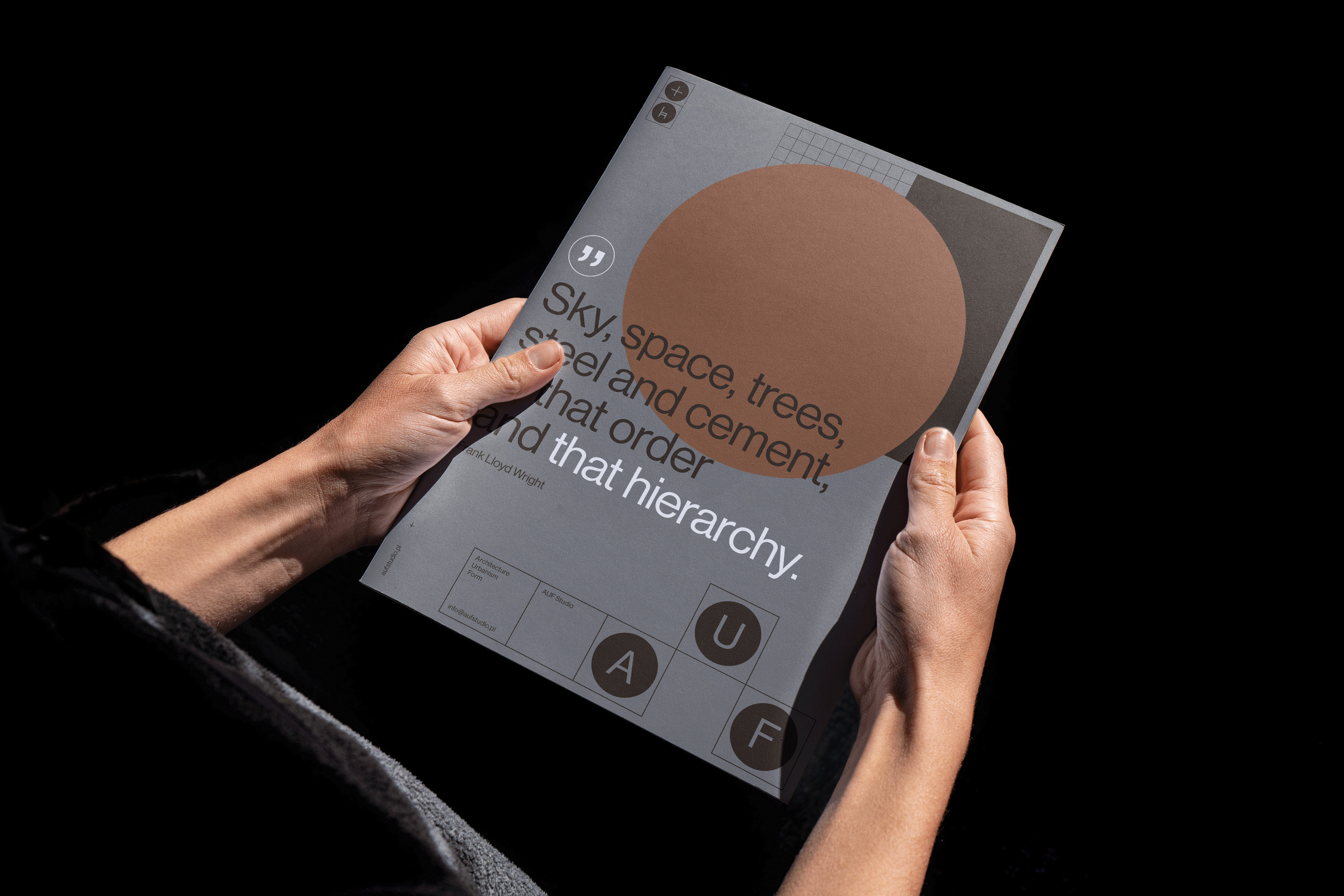
The brand name AUF consists of three letters, which are an abbreviation for Architecture, Urbanism and Form. The name itself, in its form and sound, is strong and recognizable. That’s why we decided that the AUF symbol would be an integral and flexible part of a larger system, and its simple form would be the best carrier for the brand identity.
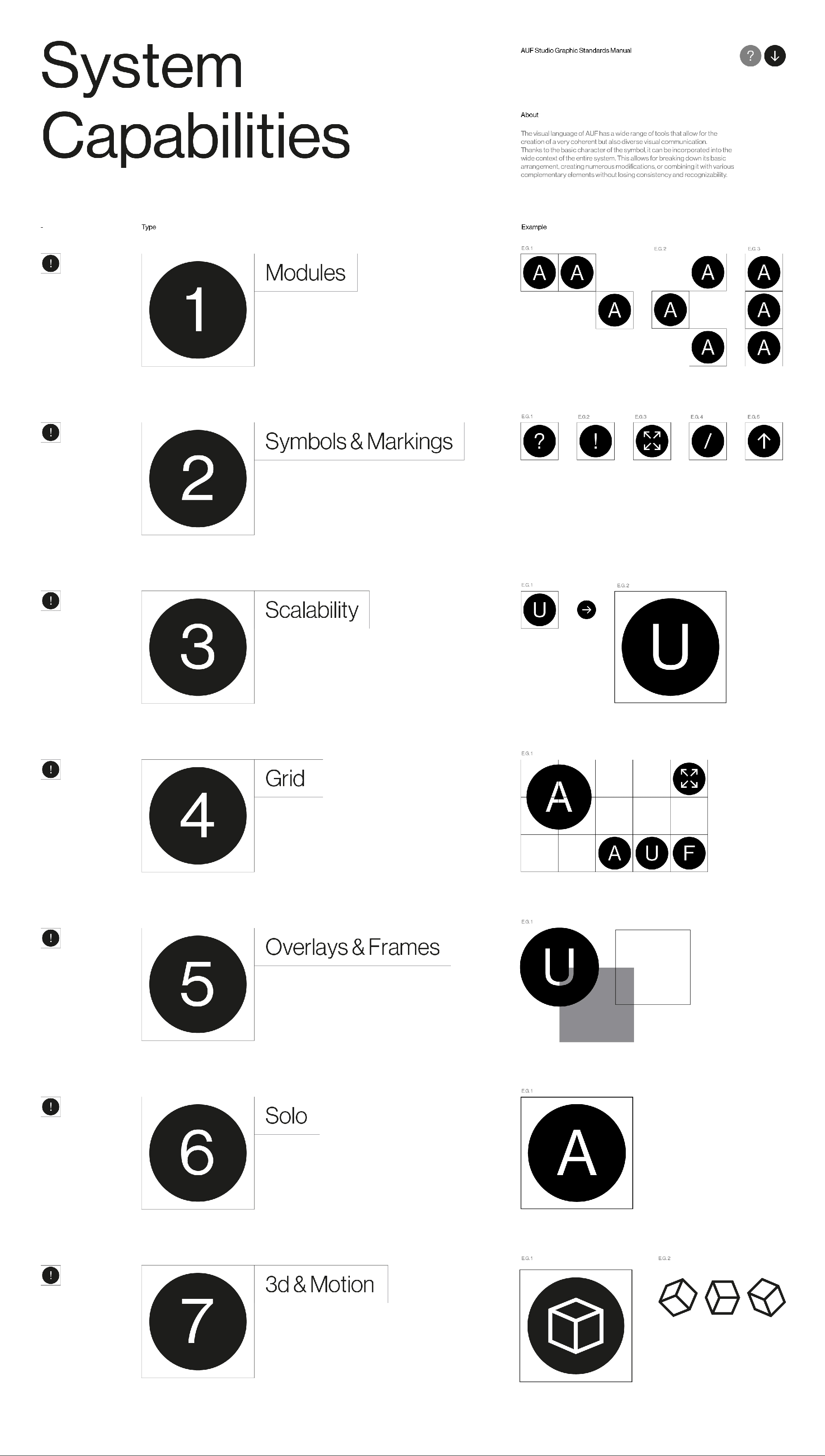
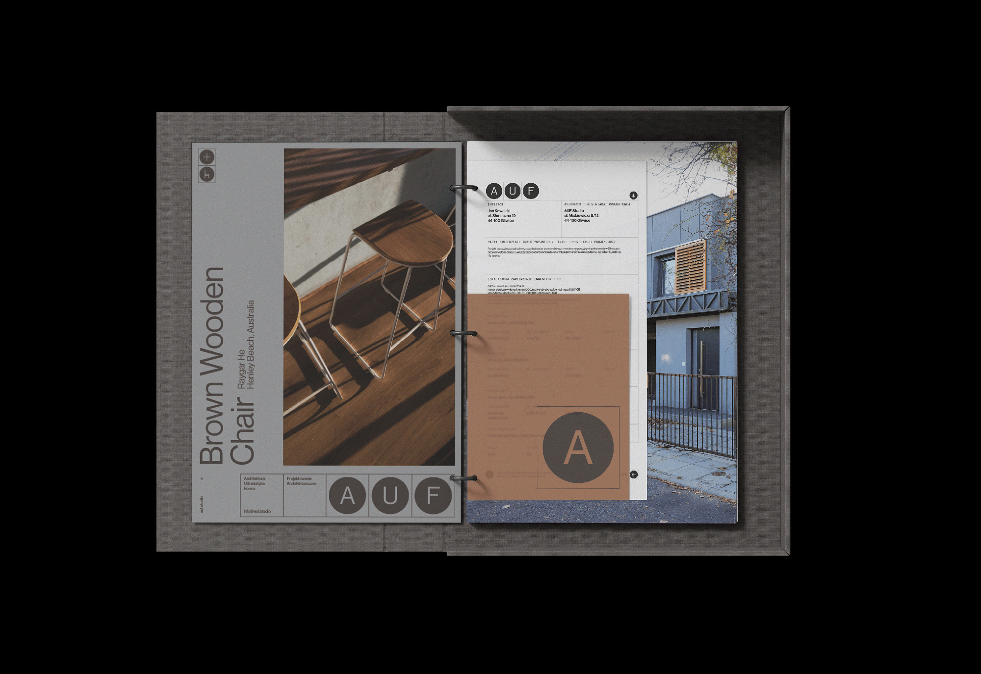
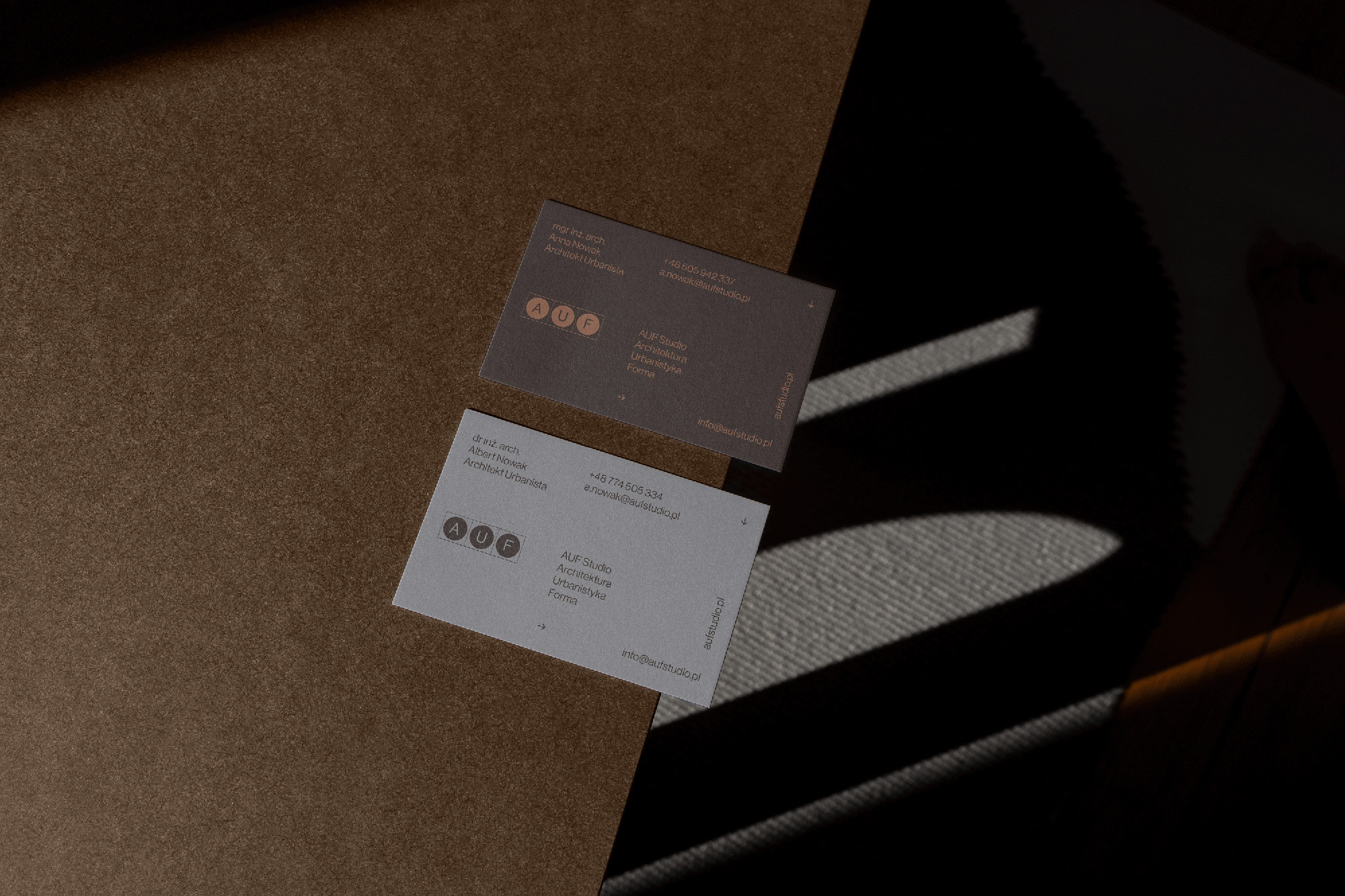
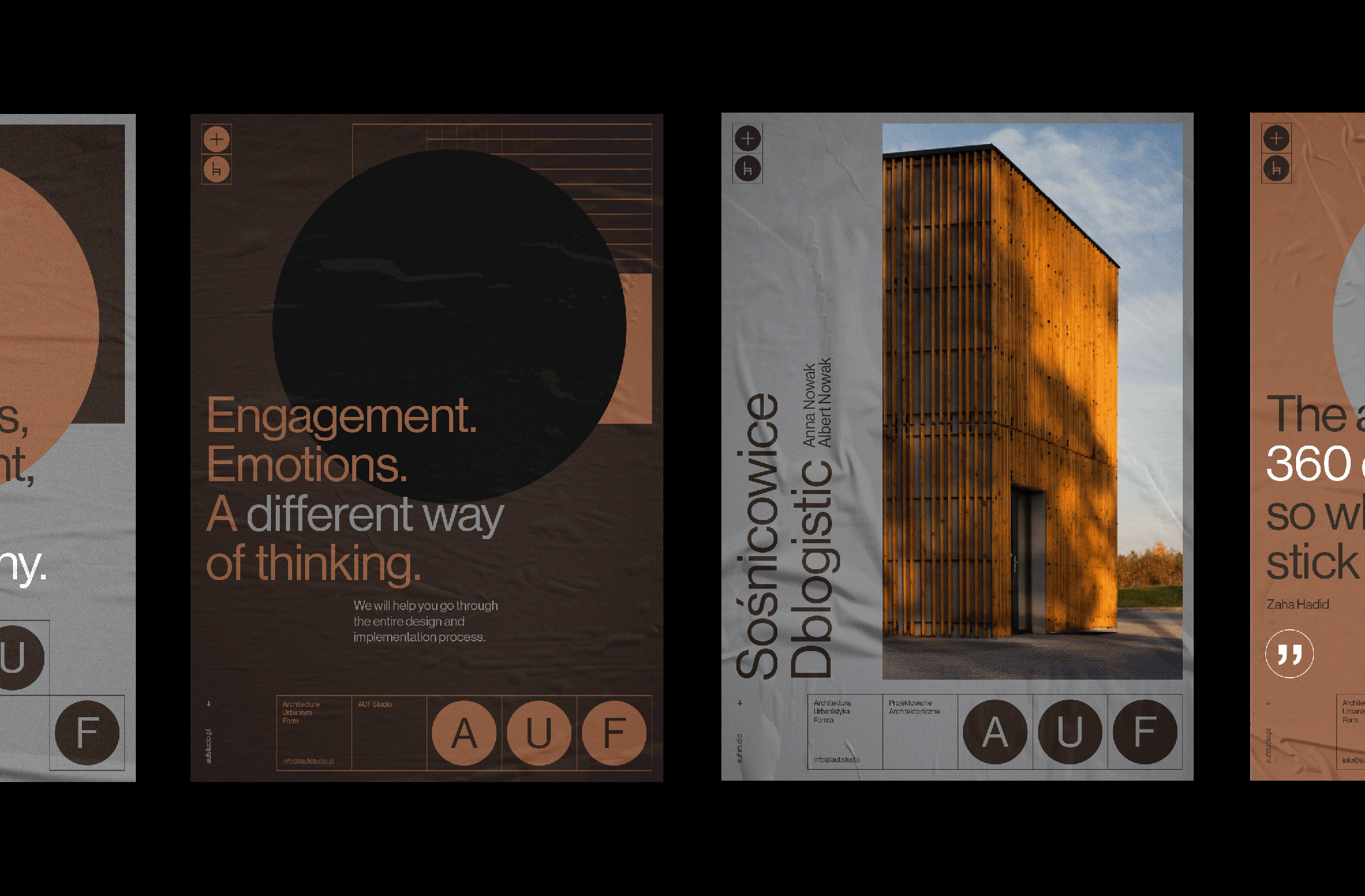
The AUF symbol consists of the letters “A”, “U” and “F” incorporated into basic forms such as a square and a circle. Relationships between these individual elements refer to space, order, and project context. The simple form of the symbol allows for a wide range of transformations without loss of integrity.
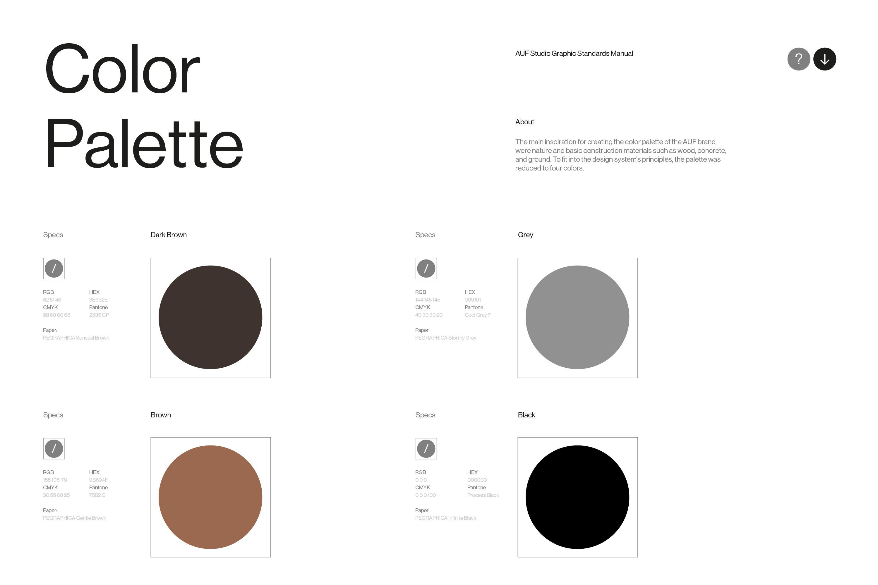
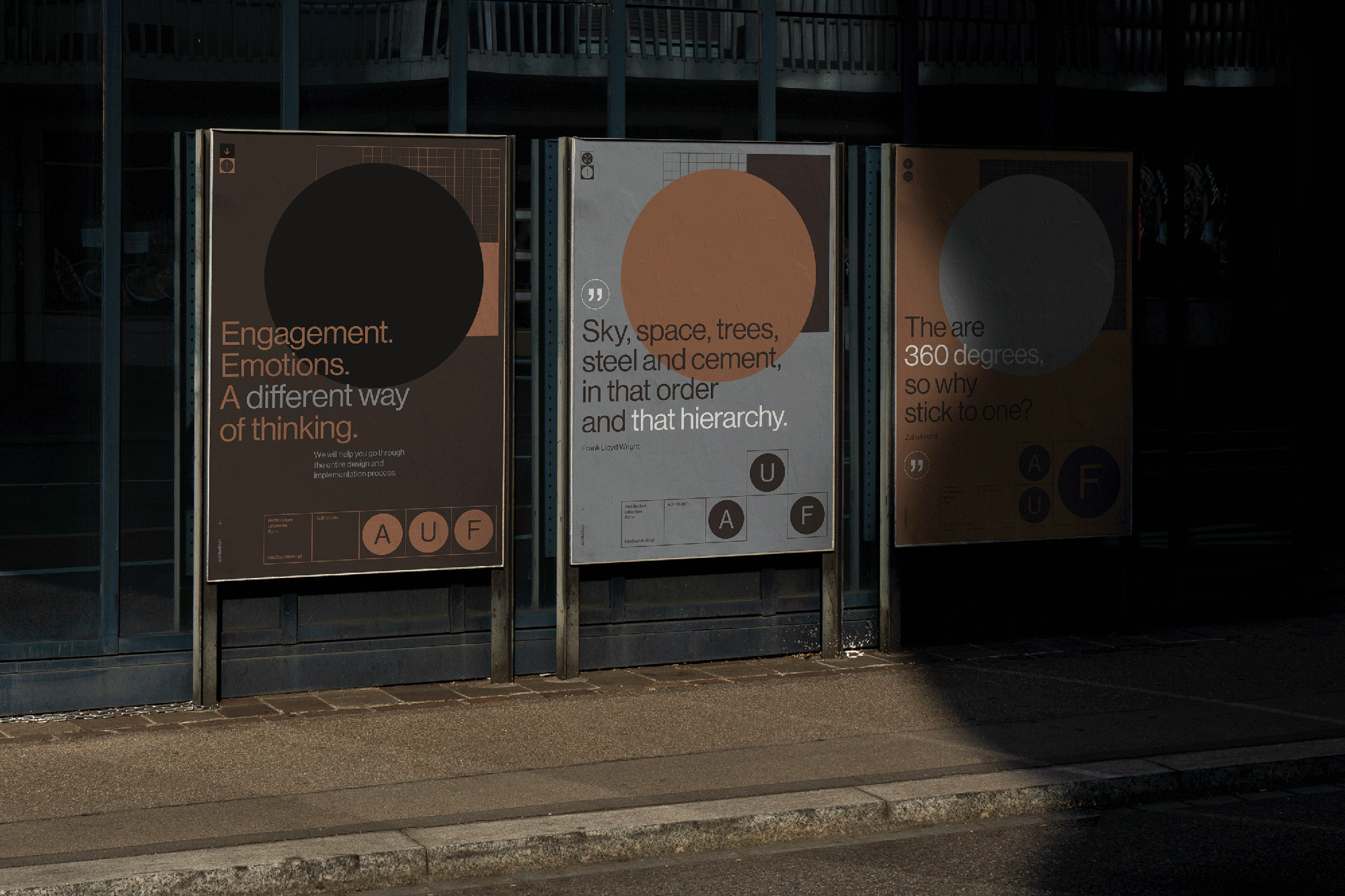
The visual language consists of reduced and simple elements, from typography, to a reduced color palette, minimalist icons, and finally a simple symbol. What provides uniqueness here is the dynamics and changeability of the arrangement and relationships of these elements in the system. The symbol “floats” across the grid in various compositions. Based on strict system assumptions and precise layout grid, we build increasingly engaging and surprising variations of compositions.
Thanks to simple forms, we also have the possibility of a smooth transition from 2D to 3D, thereby communicating the key moment in design when the project becomes a reality. Spatial thinking, form play and the vision characteristic of the brand owners become clear.
Last but not least, the visual language (color, typography and form) is also a strong reference and tribute to modernism and the Bauhaus ideas, which laid the foundations for contemporary architecture.
CREDIT
- Agency/Creative: markiewicz.studio
- Article Title: AUF Architectural Studio Branding
- Organisation/Entity: Agency
- Project Type: Identity
- Project Status: Published
- Agency/Creative Country: Poland
- Agency/Creative City: markiewicz.studio
- Market Region: Europe
- Project Deliverables: Brand Identity, Brand Strategy, Logo Design, Motion Graphics, Research
- Industry: Construction
- Keywords: architect architecture bauhaus branding brown concrete logo minimal print simple
-
Credits:
Art direction & Graphic Design: Michau0142 Markiewicz
Motion Design: Edyta Mucha


