


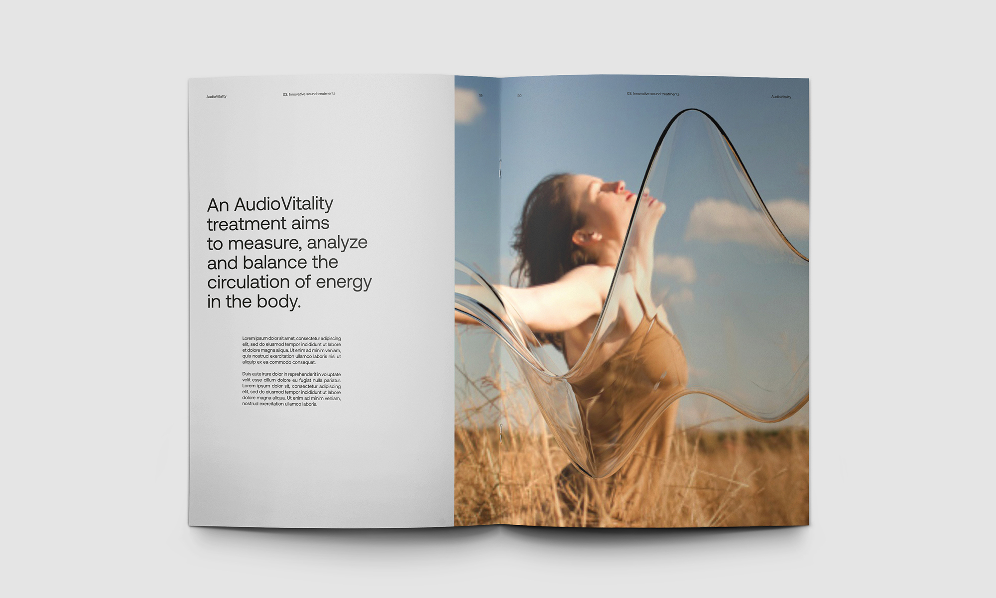
Context: For more than 15 years, AudioVitality has been breaking new ground in the medical use of low frequency sound vibration technology. A recognized treatment by complementary health insurance companies in Switzerland, this technology aims to measure, analyze and balance the circulation of energy in the body using patented sounds. Pleasant, relaxing and non-intrusive, these treatments are uniquely calibrated for each individual. AudioVitality tasked Hymn with helping create a visual identity on par with the technological revolution their product represents and increase awareness of their method’s potential, at a time when more and more people are prioritizing their well-being.
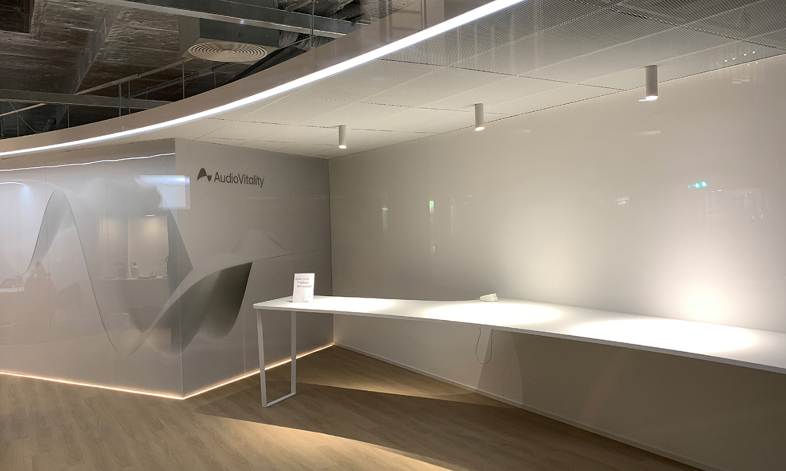
Challenge: AudioVitality wanted a new, iconic logo to symbolize and certify their revolutionary technology, similar to the powerful symbols used to represent Wi-Fi or Bluetooth. Their new icon needed to visually express the benefits of sound vibrations in a contemporary, inspiring way. The company also wanted their updated design system to be flexible enough to allow for the development of additional products, services, or sister brands. We were also asked to plan for how this identity would be brough to life in brick-and-mortar AudioVitality therapy centers, which are poised to open all over the globe.
Solution: We quickly realized that the visual representation of sound went hand in hand with movement, and that motion design was the perfect tool for developing AudioVitality’s new visual identity.
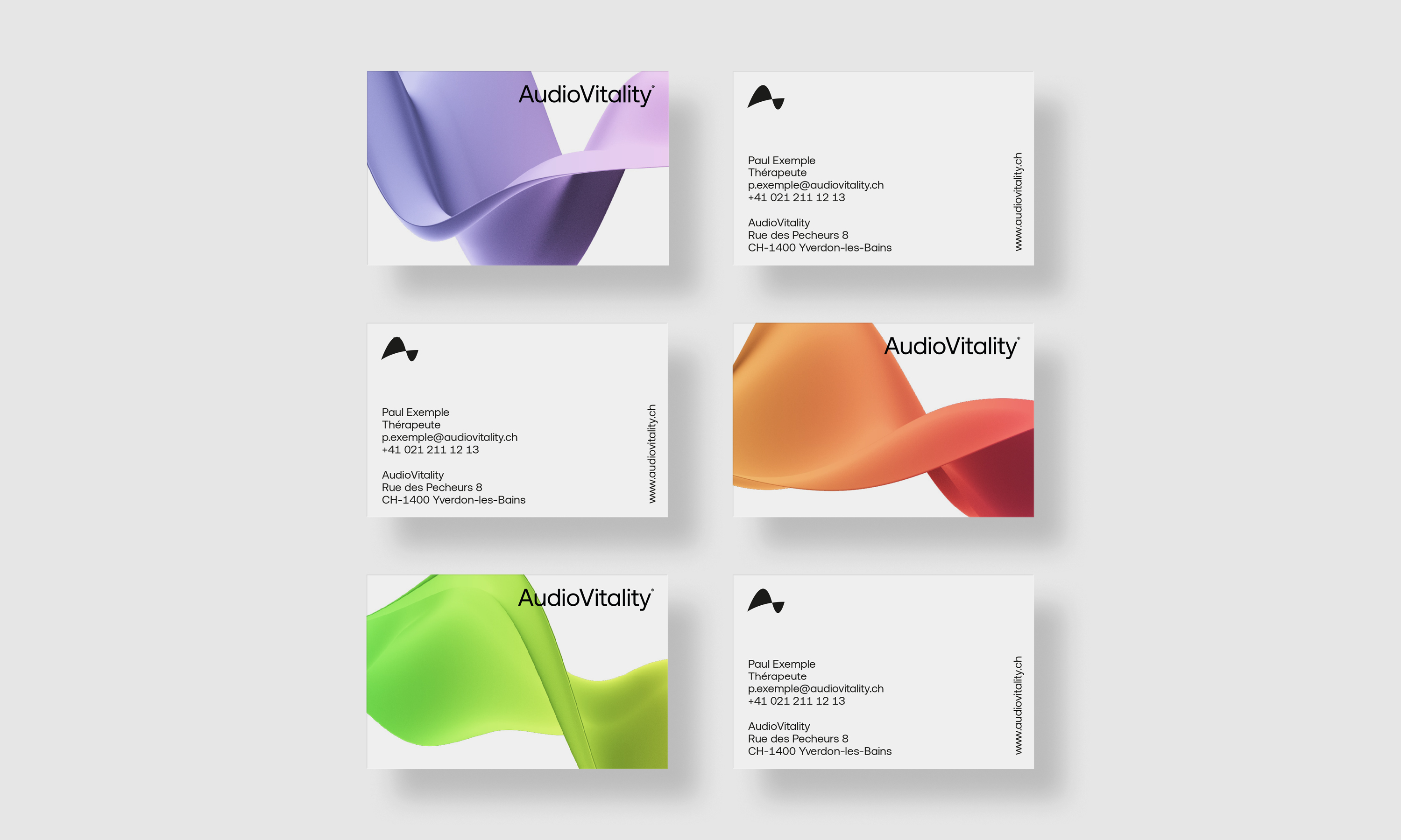
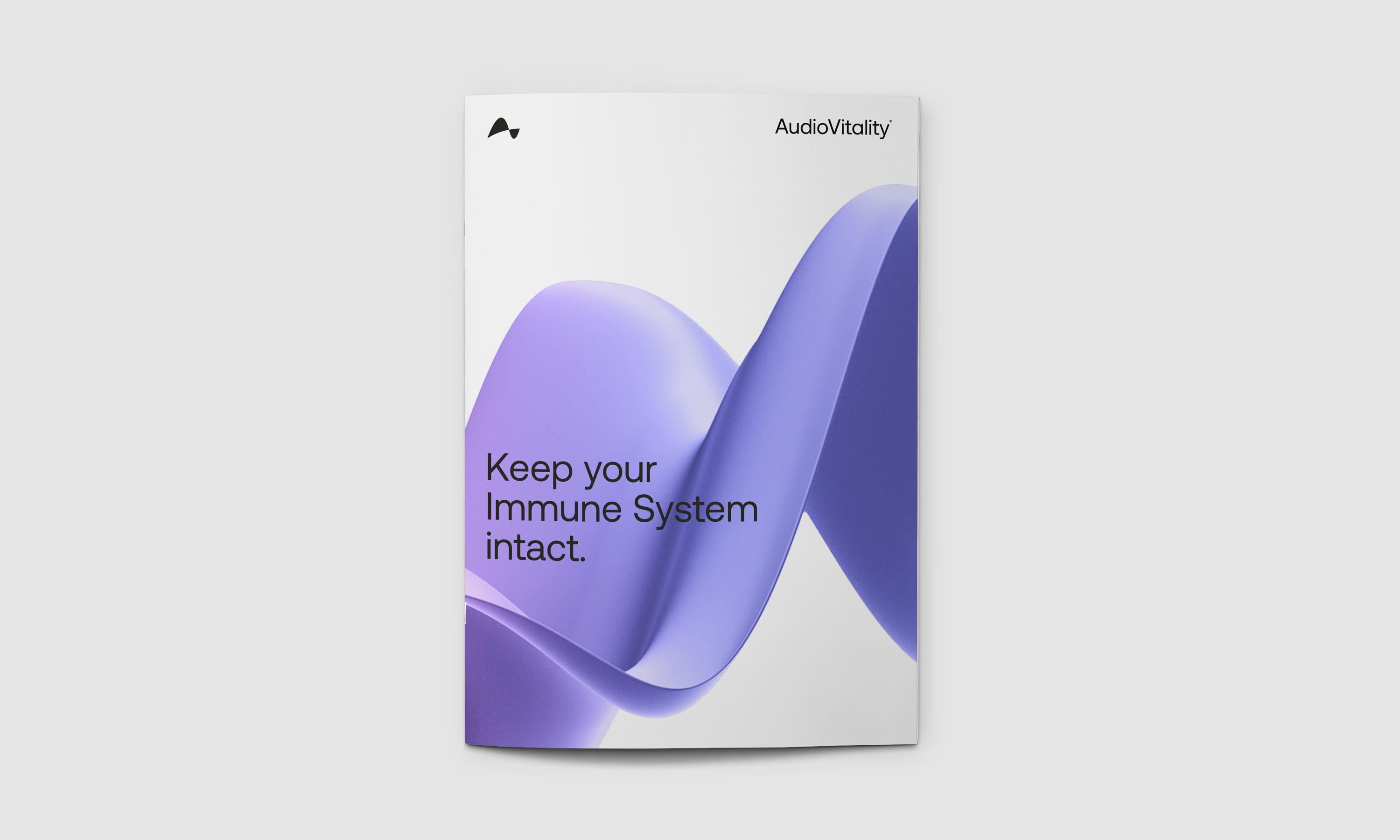
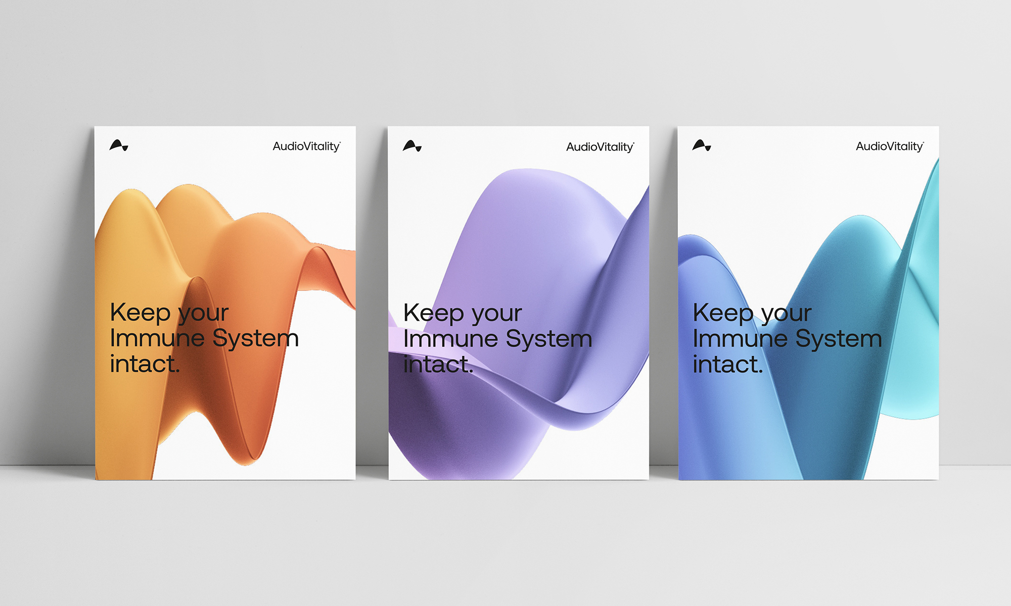
The key graphic elements of this new visual universe are 3-dimensional sound waves depicted in movement, and in colors than span the entire chromatic scale.
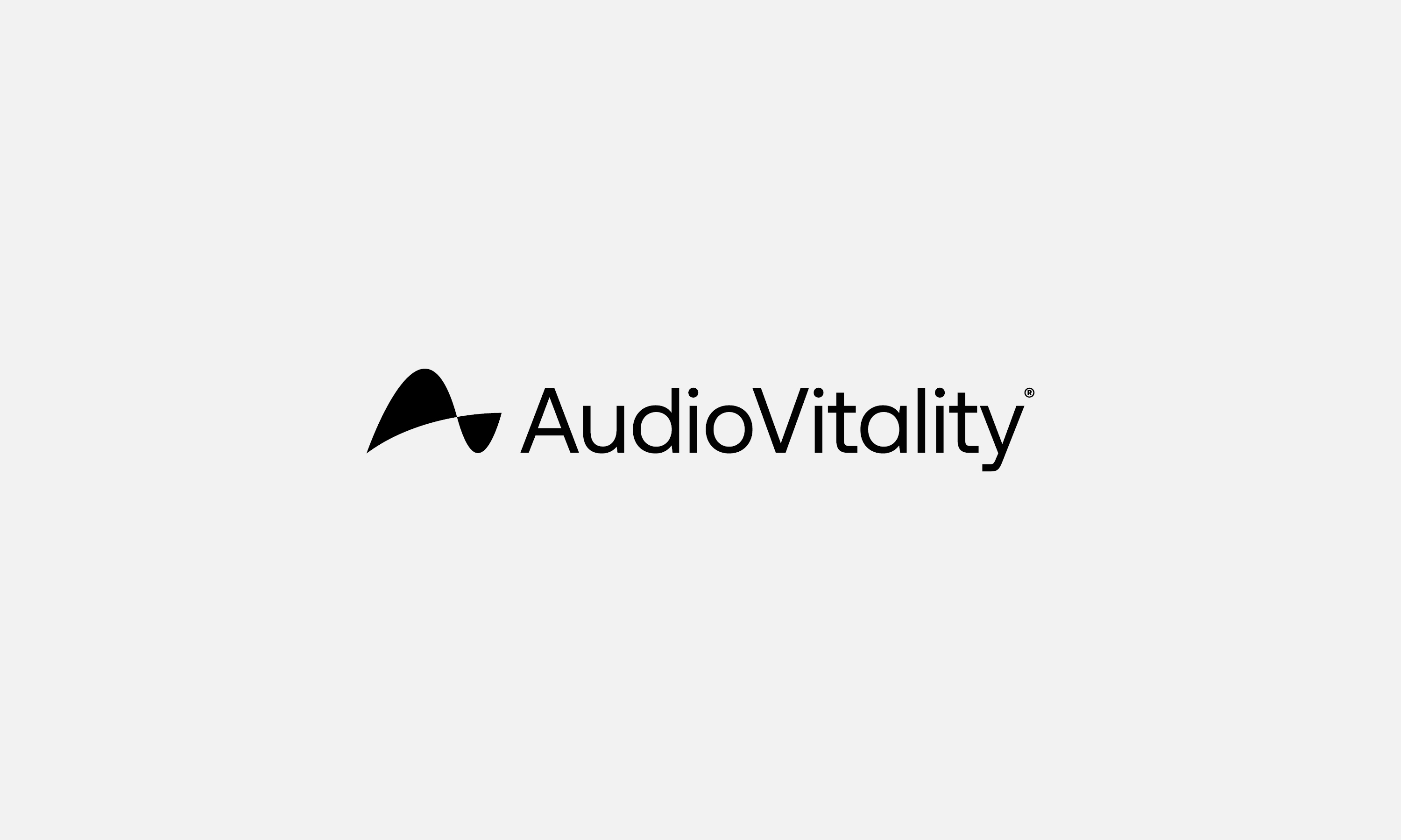
The new AudioVitality logo is designed to represent sound vibrations. Like the other iconic symbols that inspired its design, the logo remains beautifully simple while incorporating the letters “AV,” the concept of sound waves, and a new typography, Aeonik, which is a modern version of the timeless Helvetica font, developed by the London foundry CoType.
We acted as Art Directors to further enhance the brand experience, notably in the context of an architectural proposal for AudioVitality Therapy Centers. We designed treatment rooms called Studios, which represent the marriage of futuristic technology with an ambiance of wellness. All other marketing and company materials, along with the brand’s graphic charter, were updated to reflect the new visual codes developed by our teams.
CREDIT
- Agency/Creative: Hymn
- Article Title: AudioVitality – When Audio Technology Evolves Into an Iconic Brand
- Organisation/Entity: Agency
- Project Type: Identity
- Project Status: Published
- Agency/Creative Country: Switzerland
- Agency/Creative City: Lausanne
- Market Region: Europe
- Project Deliverables: 3D Design, 3D Motion, Architecture Concept, Brand Creation, Brand Design, Brand Experience, Brand Guidelines, Brand Identity, Branding, Environmental Graphics
- Industry: Health Care
- Keywords: therapeutic technology sounds vibration
-
Credits:
Creative Director: Alexandre Henriques
Designer: Anthony Velen


