The book 100 Years of a Northeastern Man by Valderez Ribeiro de Andrade Vasques records an emotional encounter between Mr. Sebastião, a Northeastern man who, contrary to many of his fellow countrymen, decides to stay in his homeland, and someone whose family, many years ago, chose to seek better living conditions in the Southeast. The accounts provoke reflections on the country’s development and present perspectives on happiness based on choices that are often difficult and contrasting.
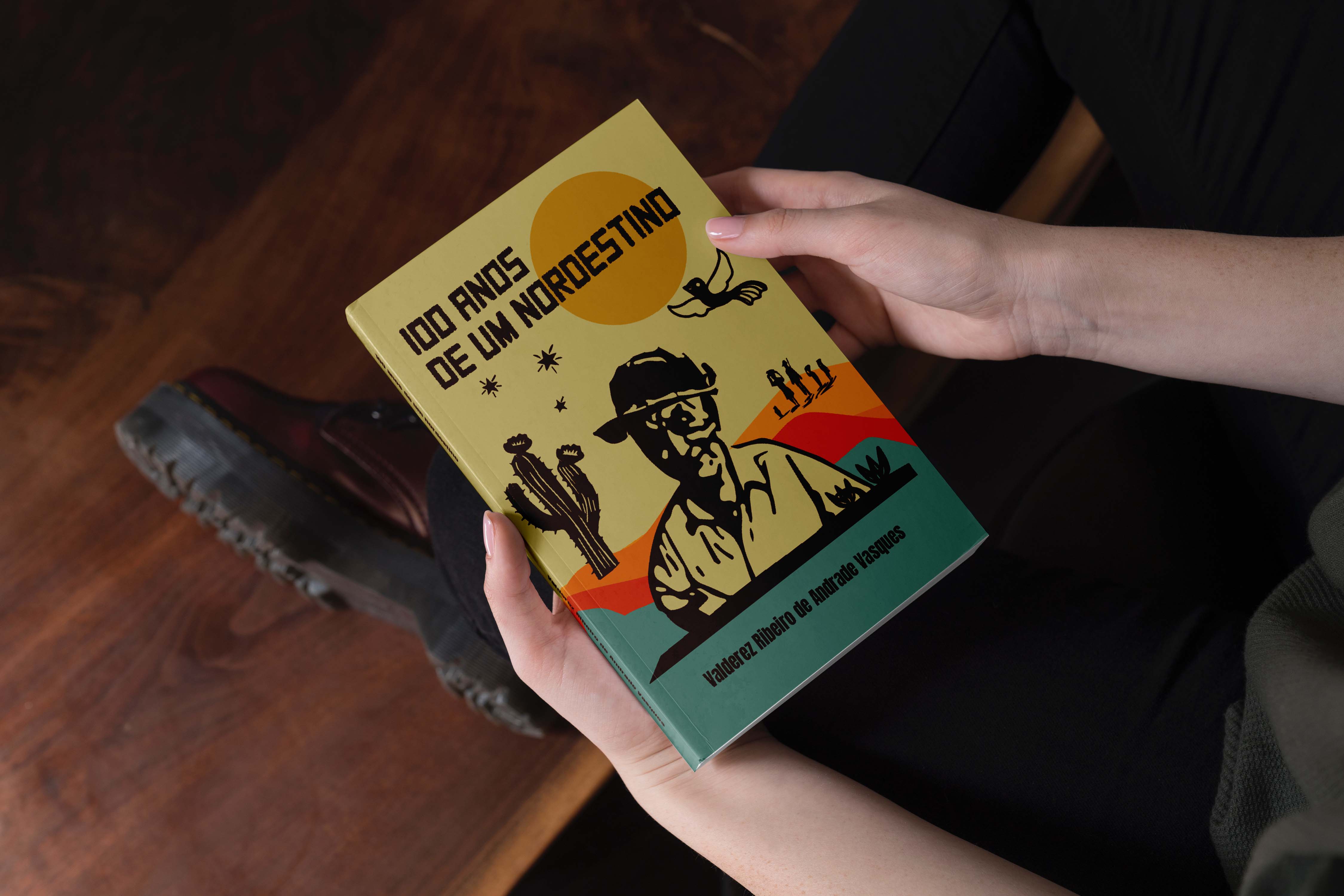
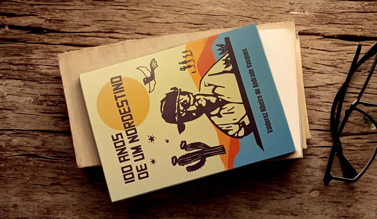
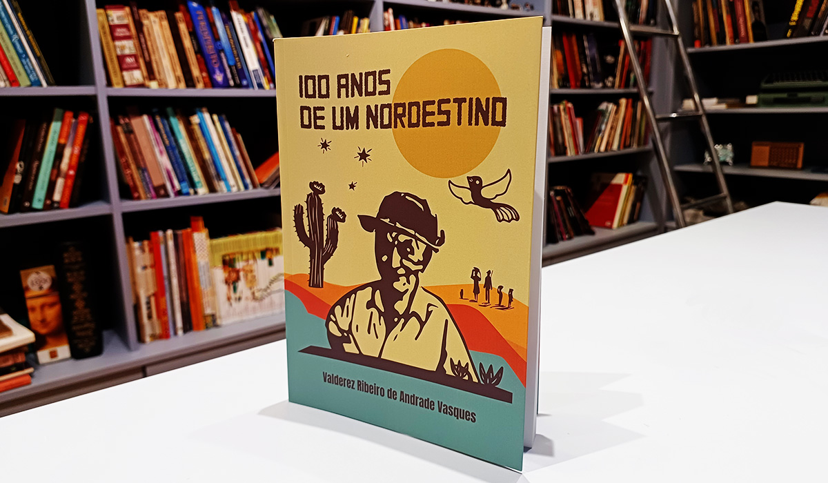
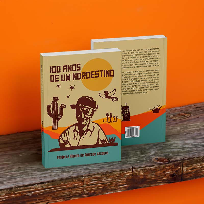
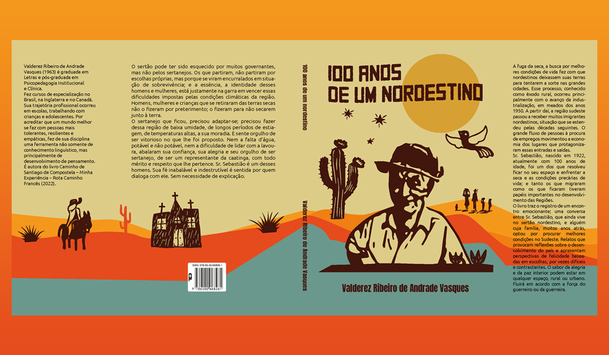
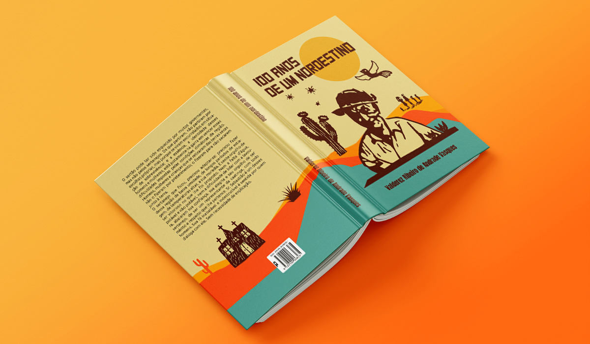
The graphic design of the cover is inspired by the Caatinga landscape—referenced in the colors, shapes, and symbols of its biodiversity—and by Northeastern culture and art, represented in a modern visual language that aligns with the dynamics of large cities.
To create the design, references were sought from other biographical book covers, always considering the character of the project. By selecting a few covers, it was possible to understand how the character and their story were identified in the exposure process. Immersion in culture and art was achieved through research into images, colors, and typography that represent the Northeastern people.
Subsequently, relevant references to be used in the project were analyzed, with significant attention to the character, culture, history, legibility, and readability. During the studies, it became apparent that the use of a photograph would be limiting and not very attractive. Initially, this was because the character was not well-known, and later, it was concluded that other visual elements representing Northeastern culture needed to be incorporated into the cover. To avoid visual clutter, it was decided to replace the photo with an illustration of the author, in the same style as the other visual elements. Woodcut, a technique widely used to illustrate cordel literature, is present throughout the design.
After evaluating the positive and negative aspects, the decision was made for an open, continuous cover, using illustrations that represented the character’s story and Northeastern culture throughout the entire space. The main character received a beautiful illustration, with thicker and more minimalist lines. The cover was constructed with a more earthy and warm color palette. To contrast, a blue was used, which softened the intensity while maintaining harmony.
Several elements of the character’s story were drawn, using the aesthetic of woodcut. The typography has small interferences and noise that represent the complexity of emotions. The cover was delivered in a 23x16cm format, with 8cm flaps, and printed on 240g couché paper. The project was carried out in partnership with Beth Soares, owner of Ateliê de Palavras Publishing House.


CREDIT
- Agency/Creative: Atobá Design
- Article Title: Atobá Design Reflects the Essence of the Brazilian Northeastern Landscape in the Editorial Design of the Book 100 Years of a Northeastern Man
- Organisation/Entity: Agency
- Project Type: Graphic
- Project Status: Published
- Agency/Creative Country: Brazil
- Agency/Creative City: Santos/ São Paulo
- Market Region: South America
- Project Deliverables: 2D Design, Art Direction, Editorial Design, Graphic Design, Illustration
- Industry: Entertainment
- Keywords: Editorial Design, Graphic Design, Art, Illustration, Brazil, Brazilian landscape, Brazilian Culture, South America Design
-
Credits:
Designer: André Reis
Designer: Lívia Buendia
Designer: Maristela Carvalho


