Maria by Maria Rigol Ordi has always stood as a beacon of tradition and excellence in the realm of sparkling wines. Rooted in a rich history of craftsmanship and dedication to quality, it has long been revered by enthusiasts and connoisseurs alike. However, every legacy must evolve, and recently, Maria underwent a transformative redesign that marked a pivotal moment in its illustrious background.
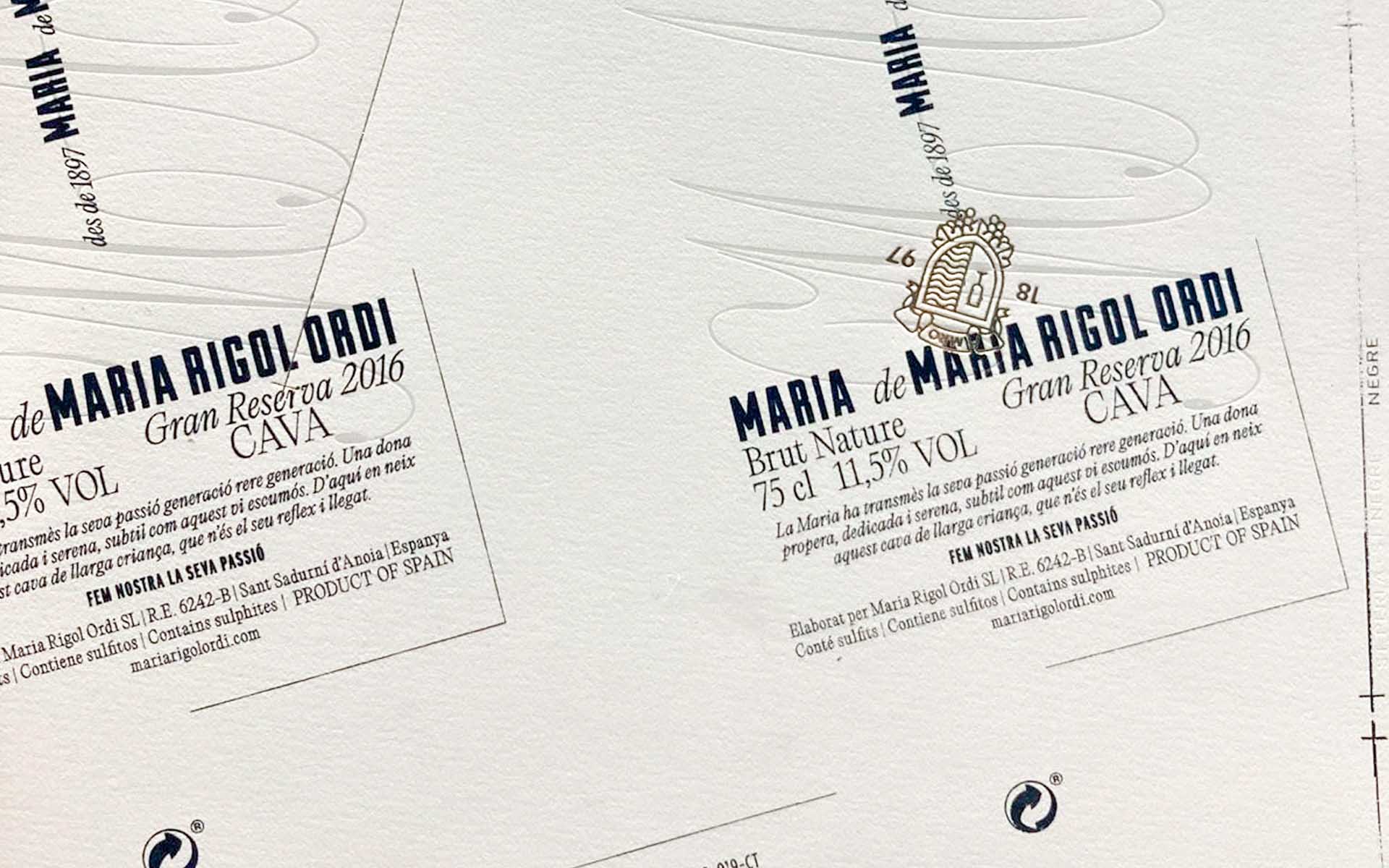
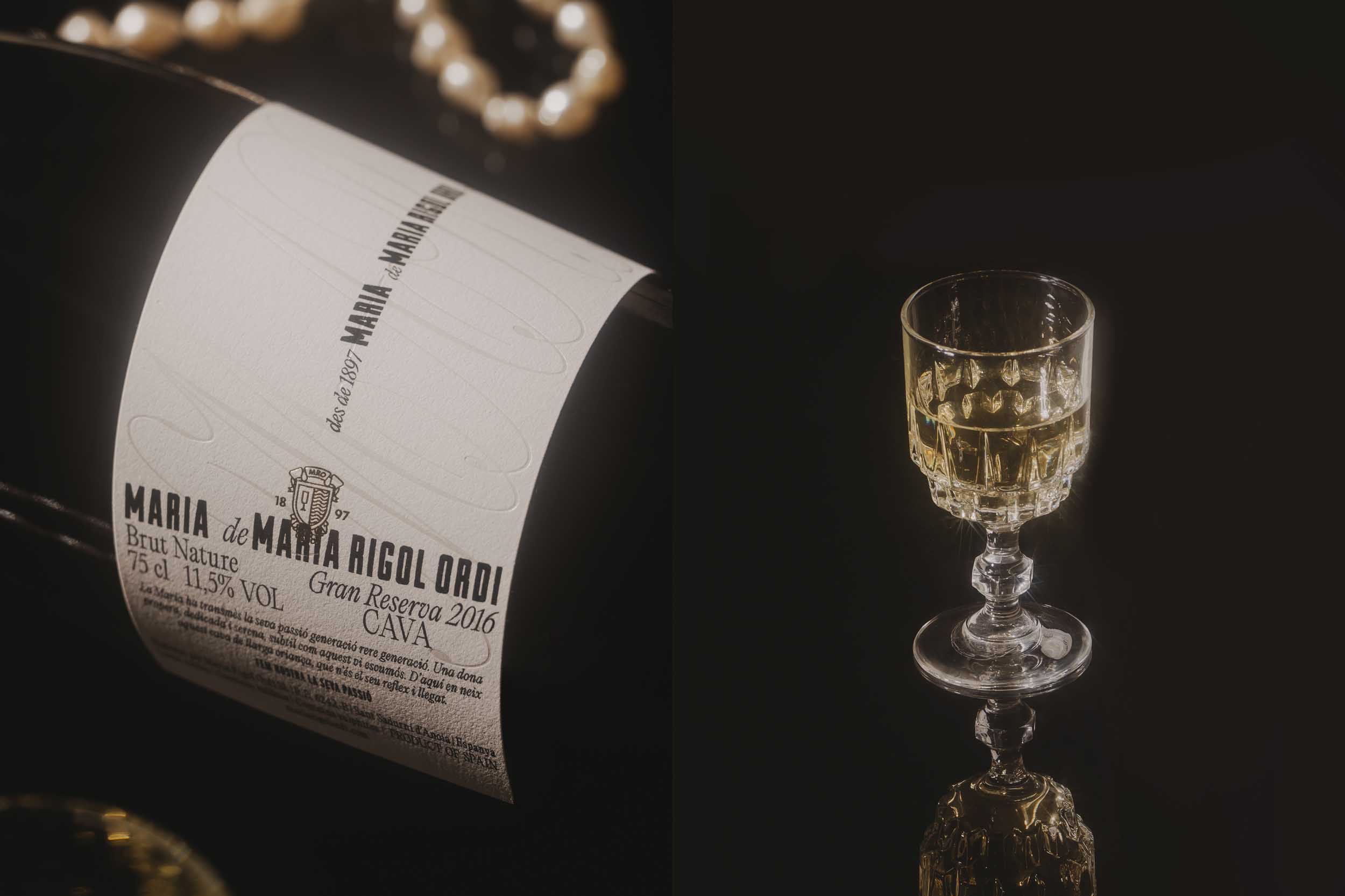
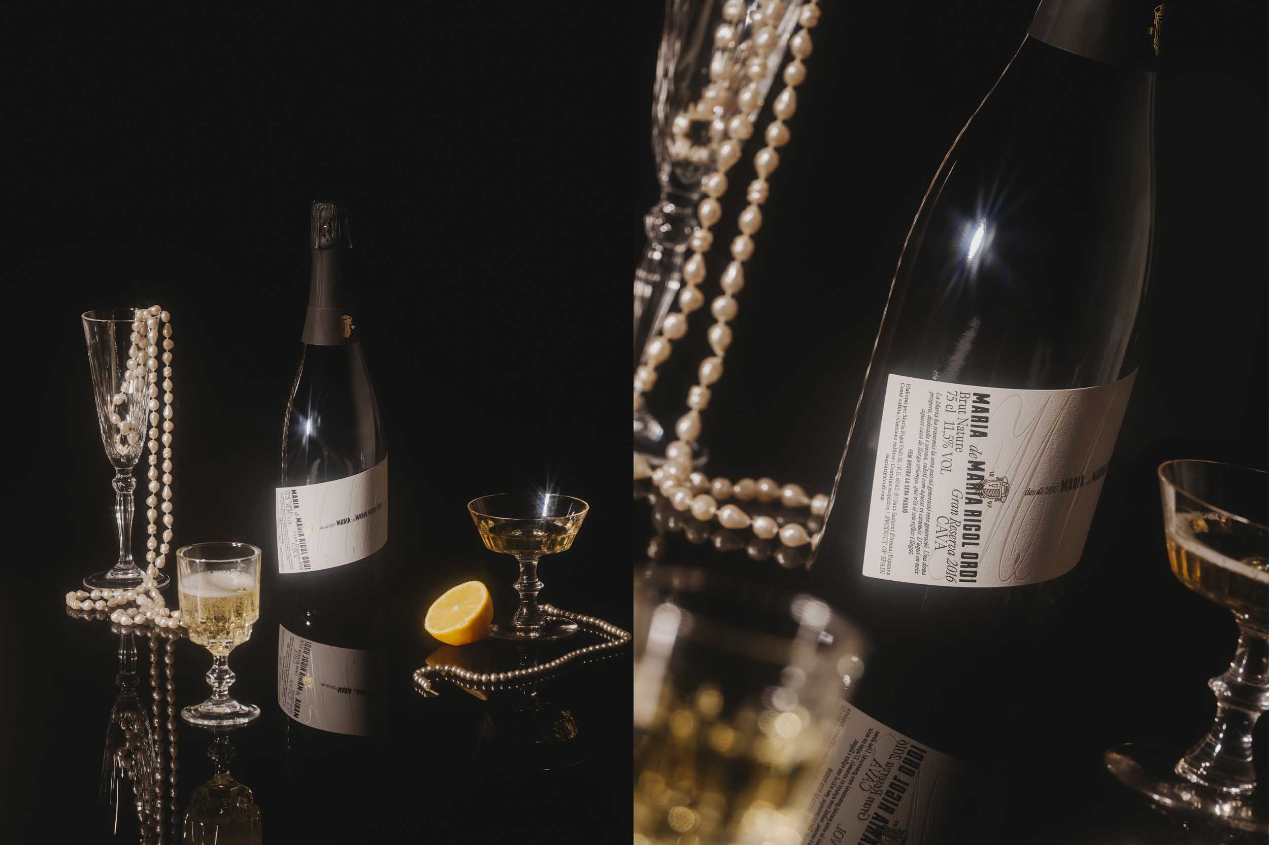
At the heart of this metamorphosis lies the iconic inclined label, a hallmark of Maria’s sparkling wines. This distinctive feature not only sets Maria apart from its counterparts but also serves as a visual embodiment of its commitment to innovation while honoring its traditional roots. With a deep respect for the heritage of the brand, our team embarked on a journey to redefine what it means to embody premium quality in the modern era.
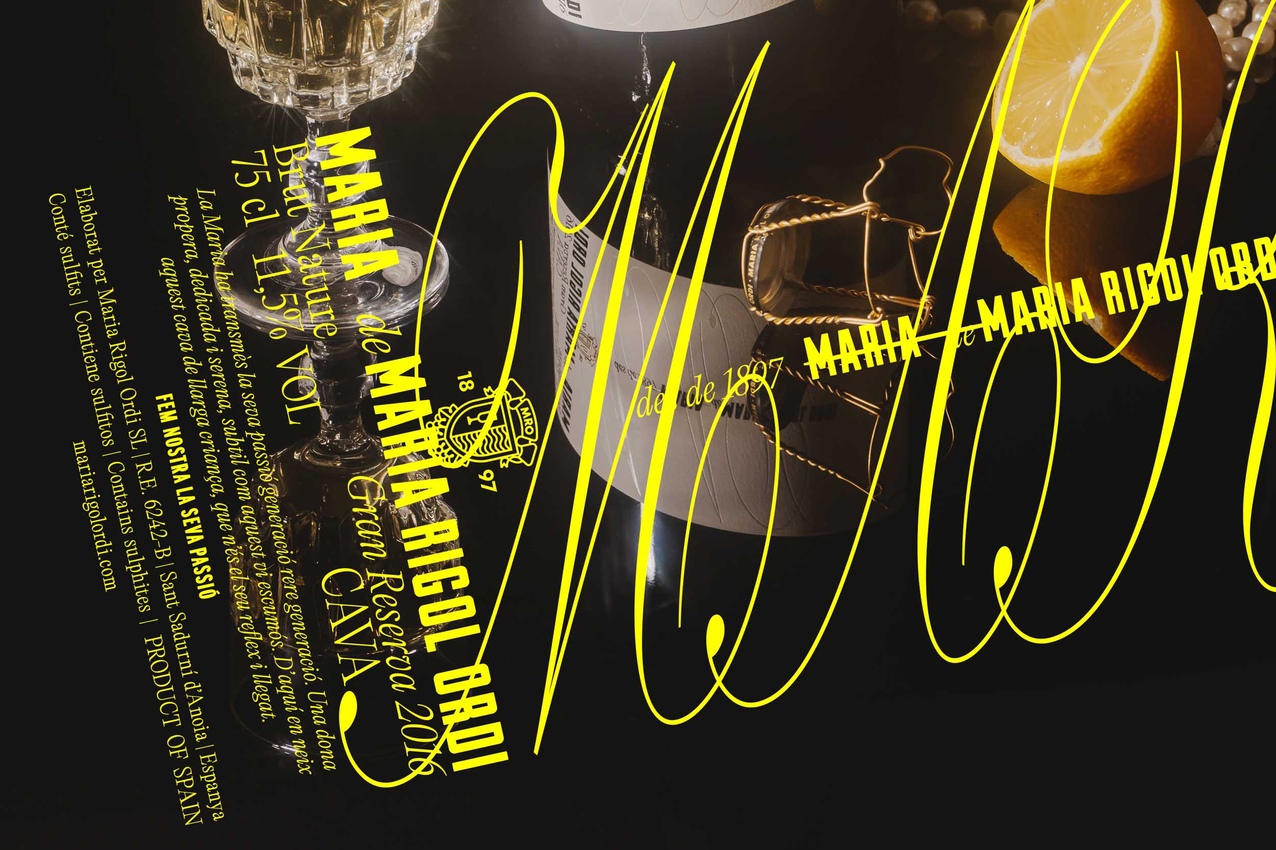
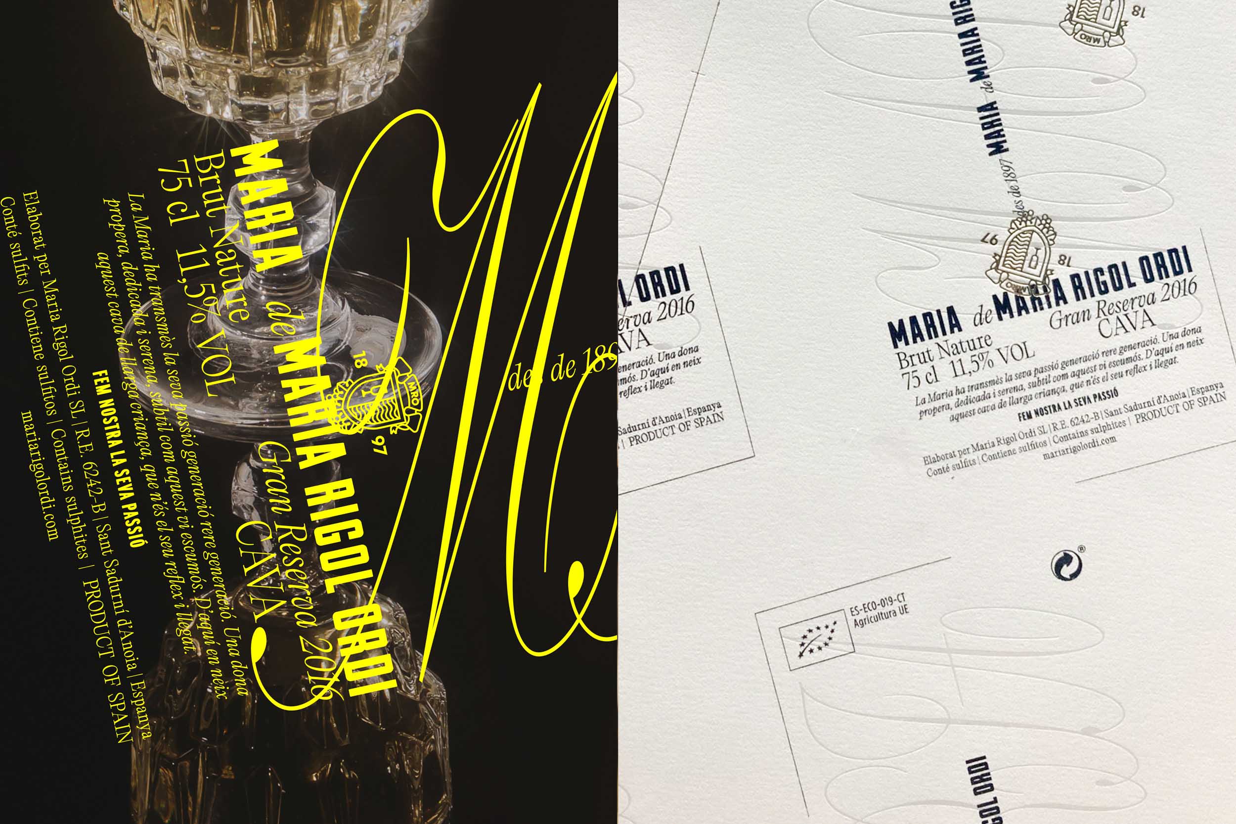
Our objective was clear: to elevate the Gran Reserva to the pinnacle of the collection, setting it apart as the quintessence of excellence. Through meticulous attention to detail and an unwavering dedication to craftsmanship, we meticulously curated a new visual identity that radiates sophistication and elegance. From the carefully selected typography to the refined hierarchy and layout, every element was thoughtfully considered to evoke a sense of luxury and refinement.
Yet, amidst these refinements, we made a conscious decision to preserve one timeless aspect: the classic perpendicular cut. This departure from the conventional straight-edged design is not only characteristic of the Maria brand but also adds a tangible dimension to the wine, inviting consumers to experience it in a truly tactile way. It is this fusion of tradition and innovation that distinguishes Maria as a leader in the world of sparkling wines.
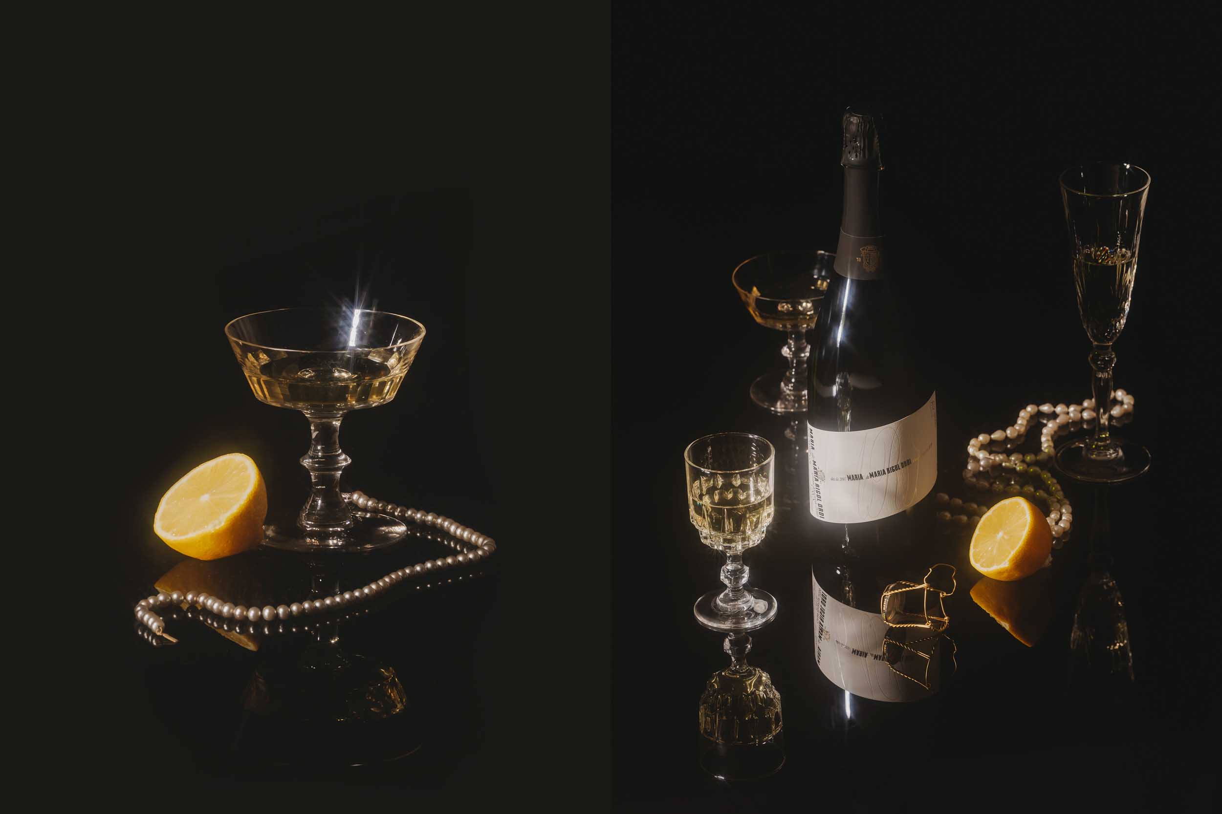
In reimagining the label, we’ve transcended the boundaries of mere packaging; we’ve transformed the Gran Reserva into a symbol of refinement and a testament to its storied history. It’s more than just a sparkling wine; it’s a representation of the brand’s unwavering commitment to excellence and a celebration of its enduring legacy. With its newfound allure and timeless appeal, the Gran Reserva captures the essence of Maria’s journey toward perfection.
CREDIT
- Agency/Creative: Atipus
- Article Title: Atipus Redefining Tradition: The New Face of Maria Rigol Ordi’s Gran Reserva
- Organisation/Entity: Agency
- Project Type: Packaging
- Project Status: Published
- Agency/Creative Country: Spain
- Agency/Creative City: Barcelona
- Market Region: Europe
- Project Deliverables: Art Direction, Graphic Design, Label Design, Photography
- Format: Bottle
- Industry: Food/Beverage
- Keywords: wine, wine label, graphic design, design, photography, label, art direction
-
Credits:
Creative Direction: Atipus
Photographer: Enric Badrinas


