


Brand Athleon
Athleon is more than just a sports brand; It is a high-performance center built on a strategic brand foundation. The project began by delving into the essence of the brand and defining its mission to unleash greatness within athletes through physical training, mental resilience, and disciplined lifestyle systems. The brand’s strategy was based on a clear situation: Athleon is the destination for those who seek not only to train harder but also to live stronger.
The brand building process focused on defining core elements such as vision, mission, values, personality and tone of voice — all designed to connect with aspiring athletes seeking structure, challenge and transformation. This strategic clarity guided every creative decision, from naming to visual execution.
The base font chosen for Athleon plays a key role in expressing the brand’s personality. The modern geometric sans-serif font was chosen for its clarity, strength and versatility with wide, sharp edges, giving a sense of visual power even in short words.
This is in line with the feeling the brand wants to convey.. It conveys confidence and precision fully in line with the brand’s disciplined and goal-oriented personality. The font works well in both digital and print applications, maintaining consistency and readability across touchpoints.
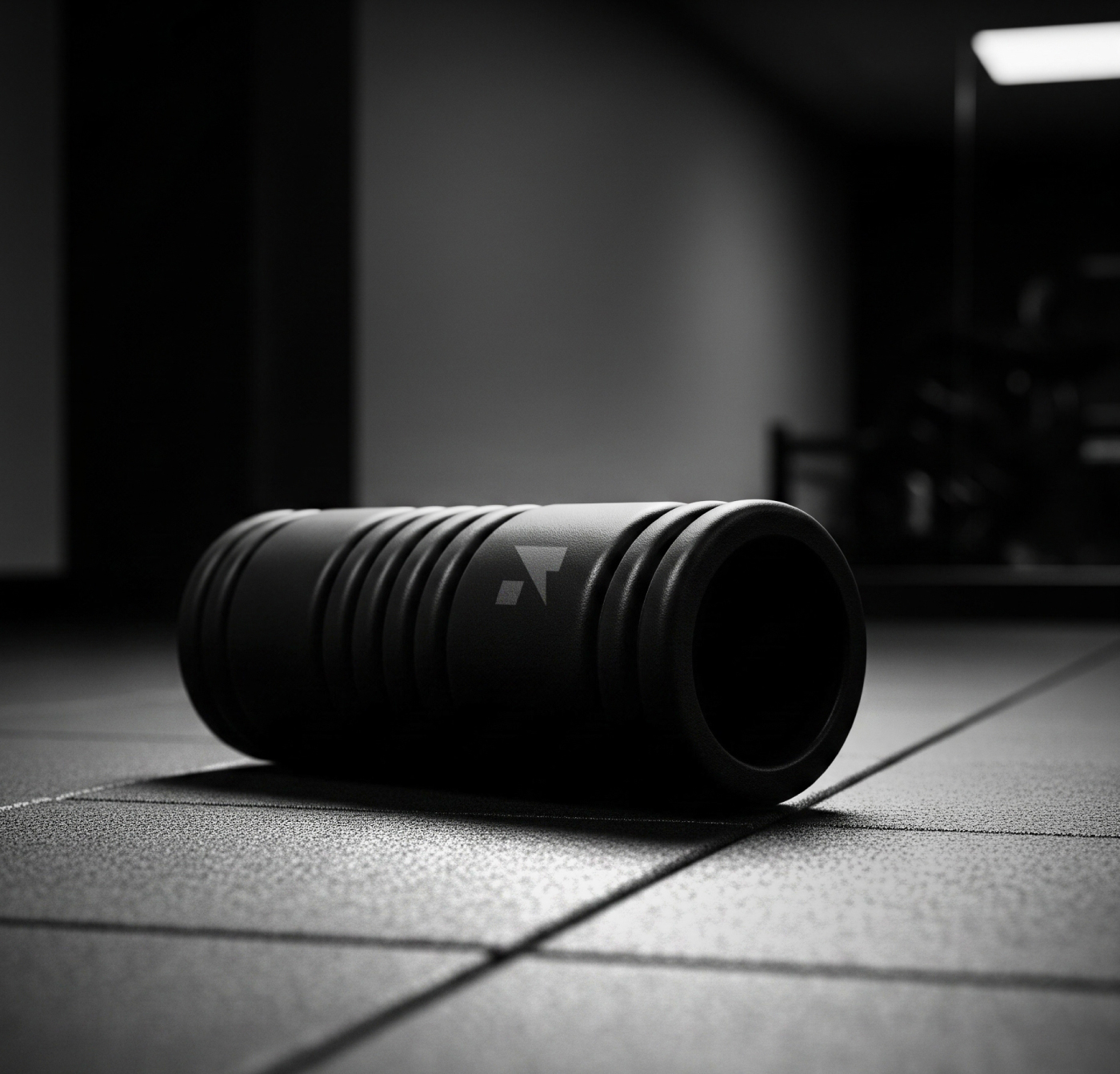
Visually, the identity is designed to reflect strength, discipline, and focus. The logo blends bold typography, cycling athlete-inspired symbol, and thunderbolt shape — key features of elite athletes. The simple monochromatic color palette with strong contrasts reflects the intensity and precision of the training environments. Supporting elements such as custom icons, clean grids, and confident layouts enhance the brand’s modern and serious tone.
Every design decision—from the use of matte textures and directional lighting in prototypes to versatile logo applications on equipment and clothing— was made in support of the strategic goal: to build a reliable, inspiring, and scalable fitness brand.
This project is available for purchase.


CREDIT
- Agency/Creative: Feth ennoure Guerroumi
- Article Title: Athleon Branding Strategy Case Study by Feth ennoure Guerroumi
- Organisation/Entity: Freelance
- Project Type: Identity
- Project Status: Published
- Agency/Creative Country: Algeria
- Agency/Creative City: Algiers
- Market Region: Asia, Europe, Middle East
- Project Deliverables: Brand Design, Brand Guidelines, Brand Identity, Brand Strategy, Branding
- Industry: Health Care
- Keywords: logo, branding, branding strategy, fitness brand, brand identity, visual identity
-
Credits:
Brand Designer: Feth ennoure Guerroumi


