
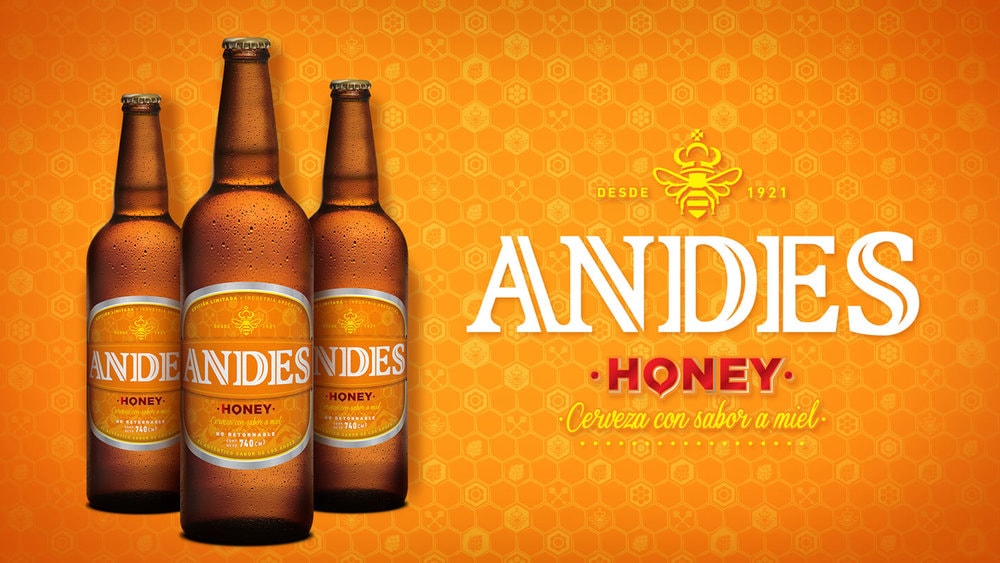
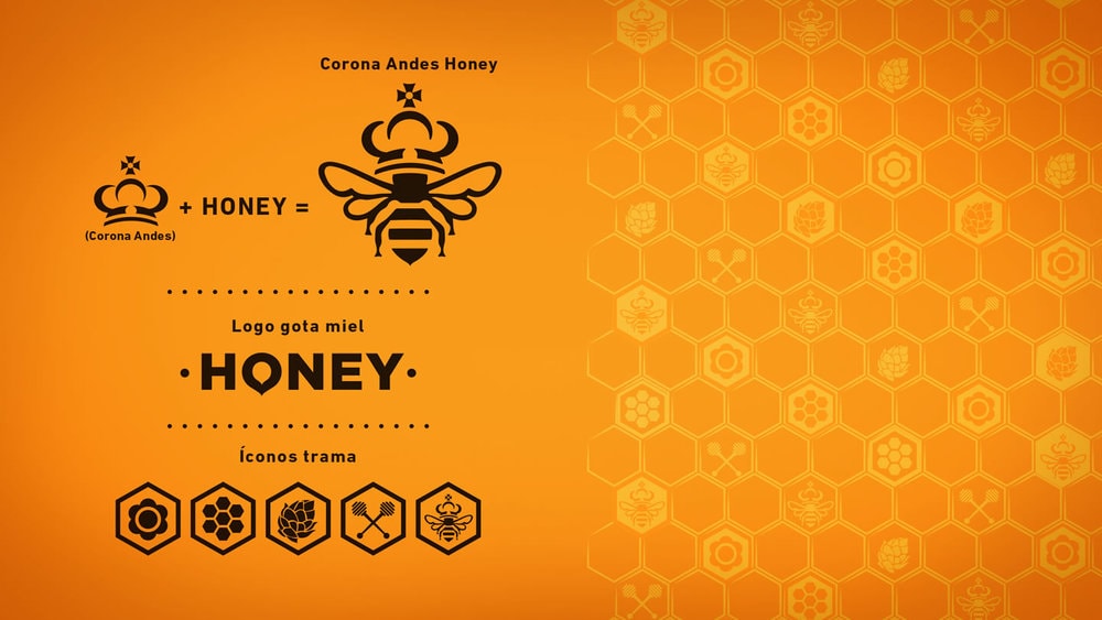
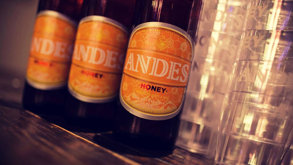
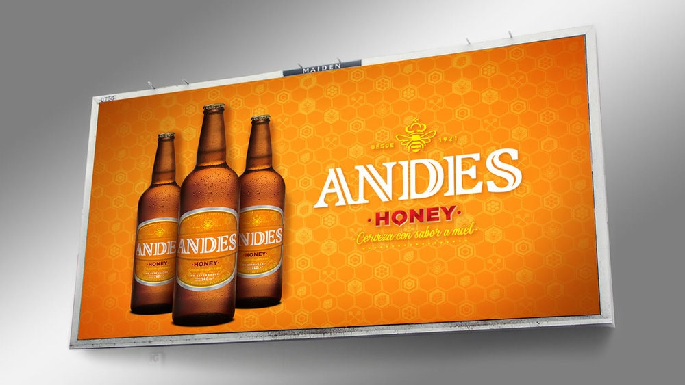
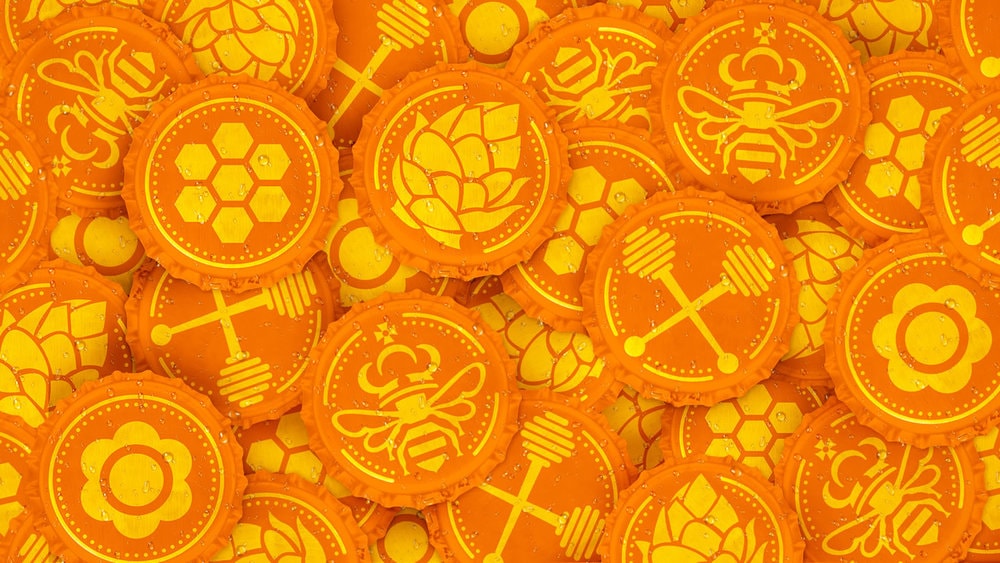
“The brief:. Designing a new limited edition for Andes Brewery.. Bring on board Mendoza’s pride to achieve a strong connection between the local consumer and the brand.. Enhance and convey Mendoza´s people, way of linving and thinking, in an original way.. Add value to the product by transferring emotions and experiences of the brand and associate it with emotions of belonging and location.. Strengthen the position of a large, young and innovative brand with a new proposal for the market. Solution:. Find the items linking Mendoza’s pride with beer and a taste for new things.. Propose a sufficiently rich system of colors, fonts, shapes and icons that could show this balance between the world of honey and beer.. Do not lose sight of the historical consumer brand and in turn to capture young audiences with it. Project development:. The main thing was to get an identity that combines the sweet and innocent world of honey with the imagery of the brand and the beer itself.. The colors choice was a key factor to challenge the typographic system on the beers world, as well as the selection of the graphic and formal figures in an approach to create a delicate balance within both universes.”




CREDIT
- Agency/Creative: ASTOR Branding
- Article Title: ASTOR Branding – ANDES Honey Beer
- Project Type: Packaging
- Substrate: Glass, Pulp Paper


