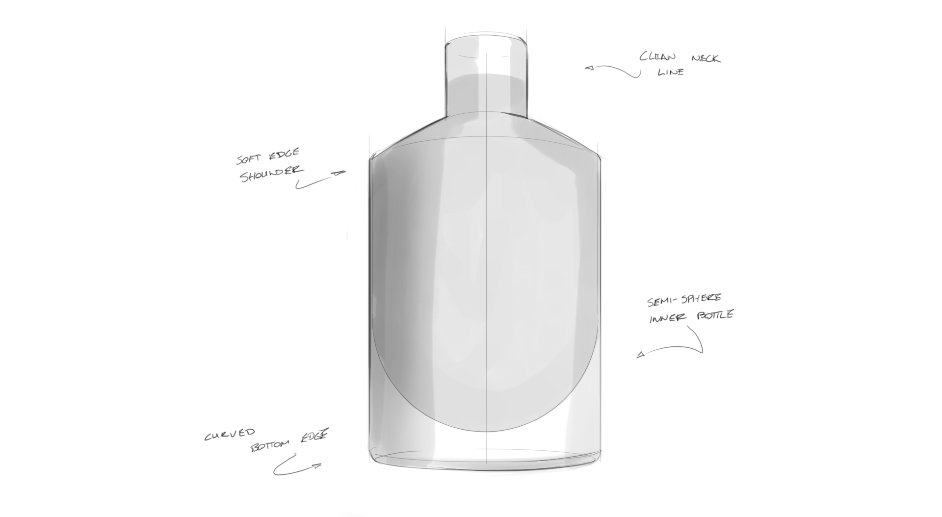
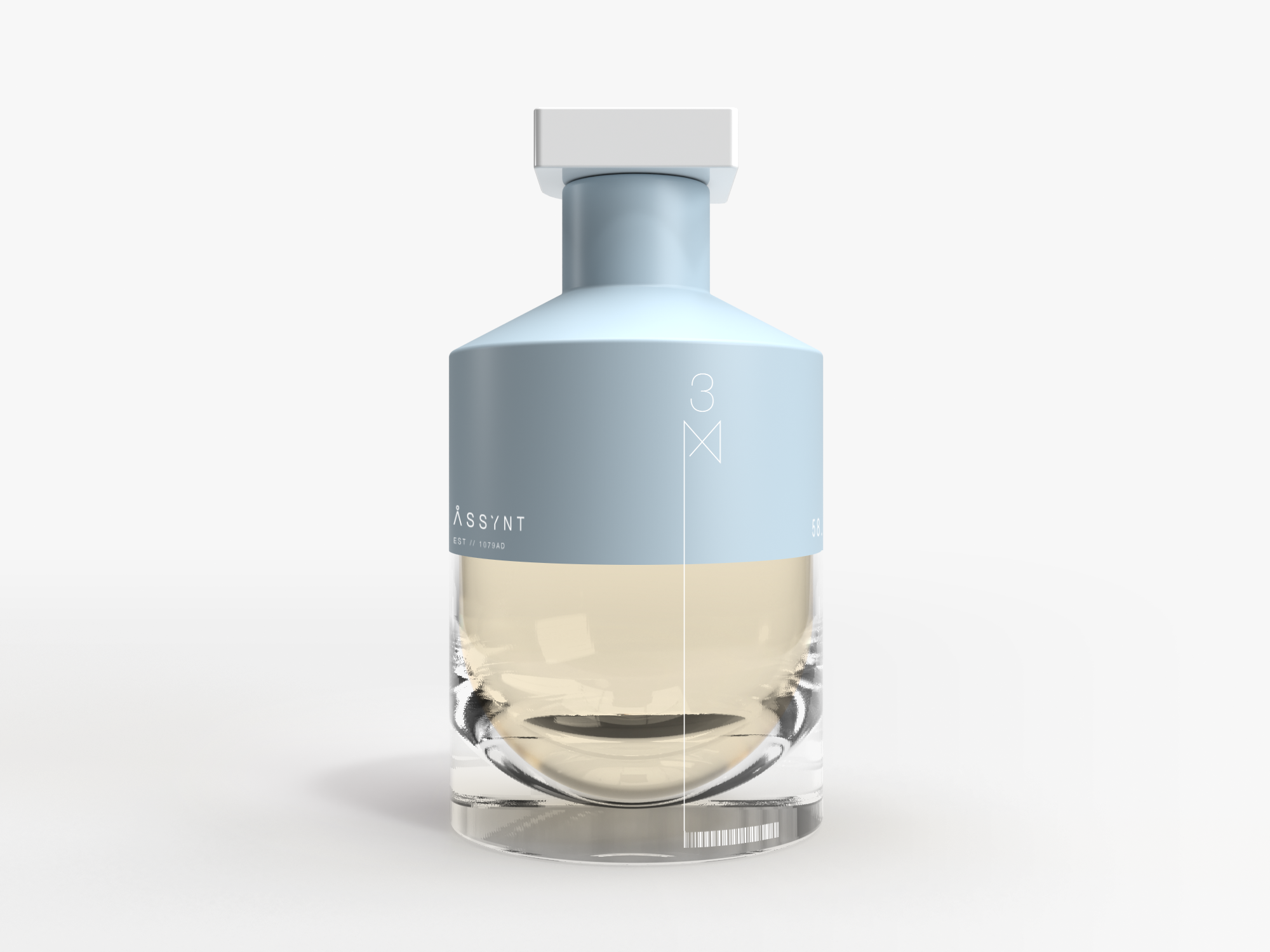
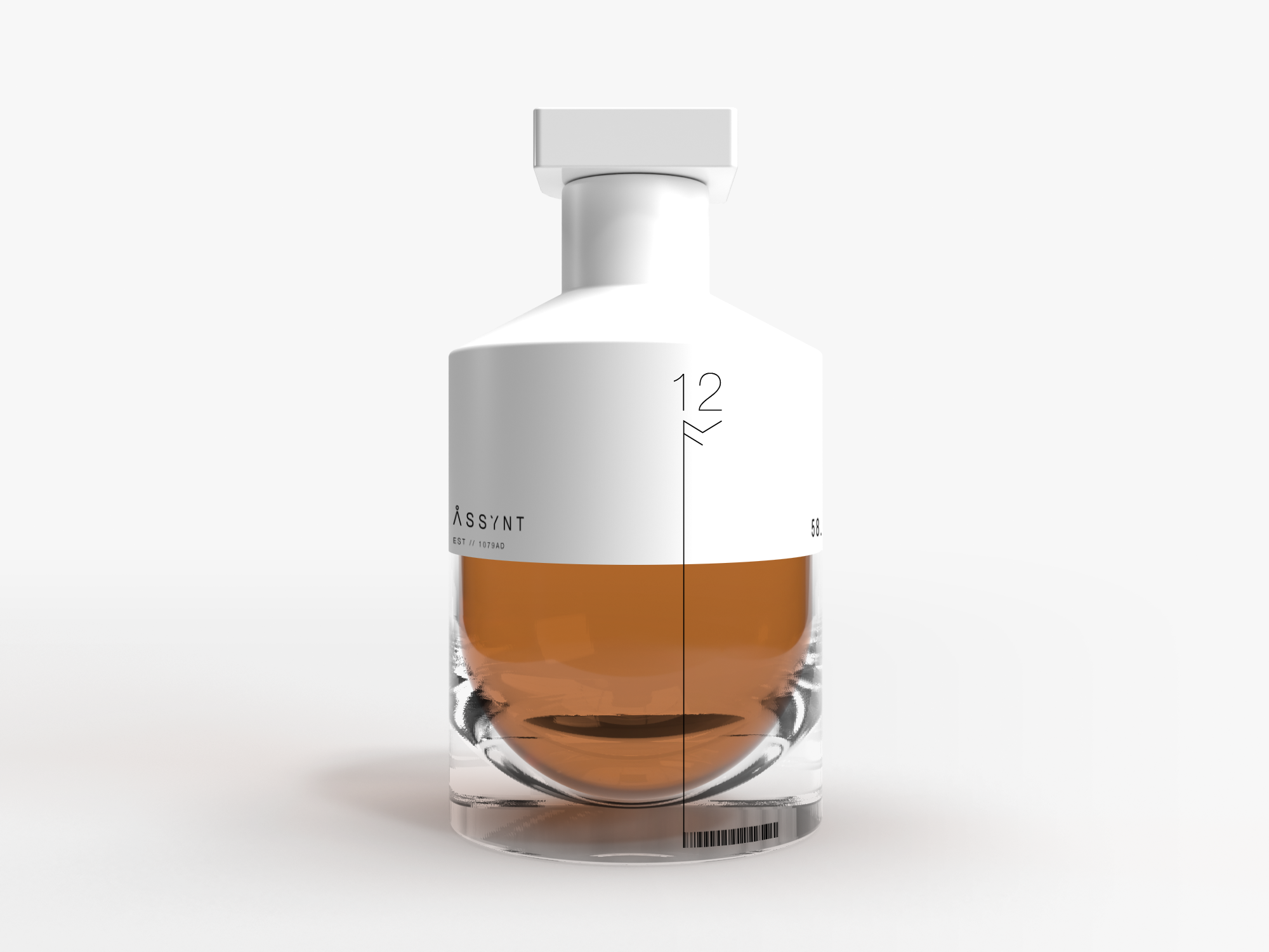
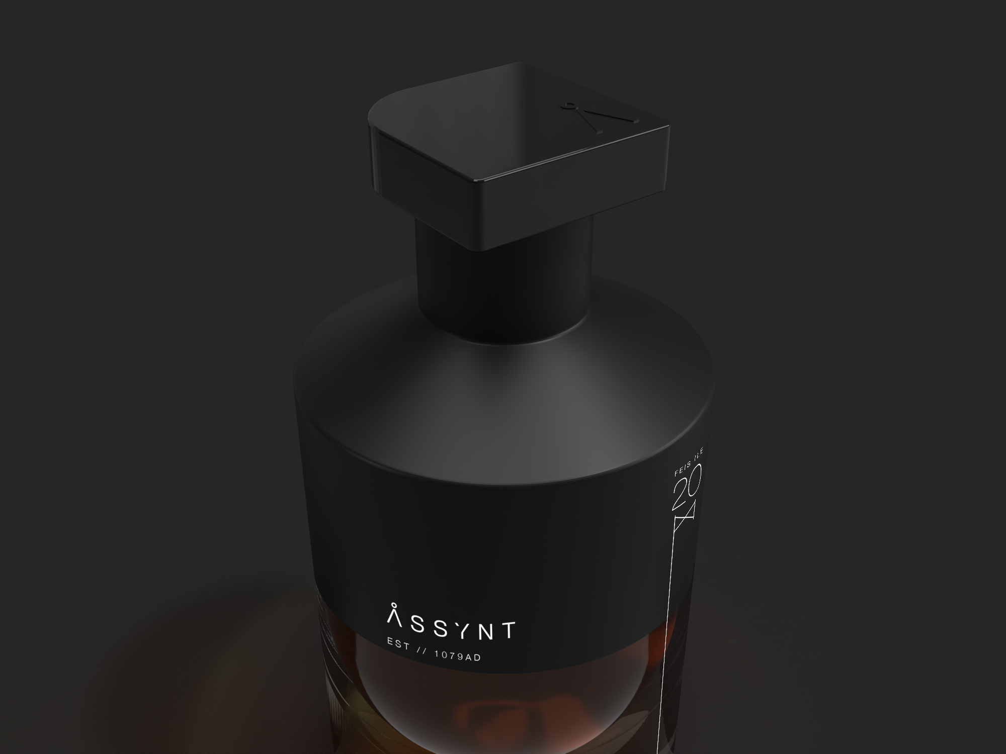
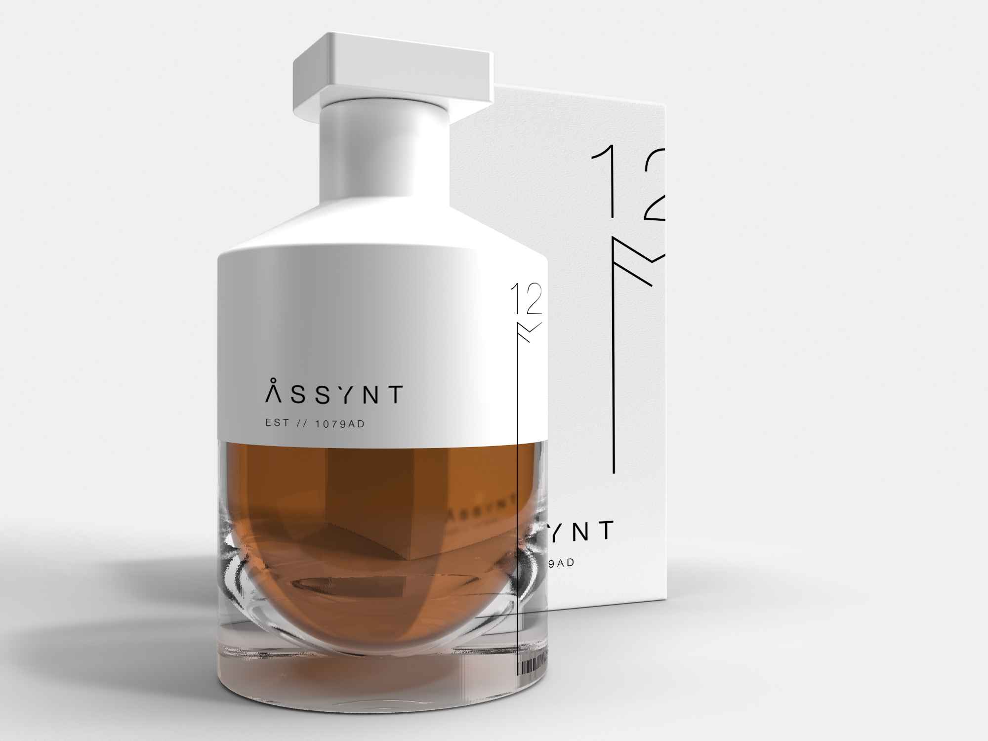
The Assynt brand is inspired by the Scottish highlands and is intended to capture and reflect the essence of the region in a unique dichotomy of ancient scapes and contemporary design.
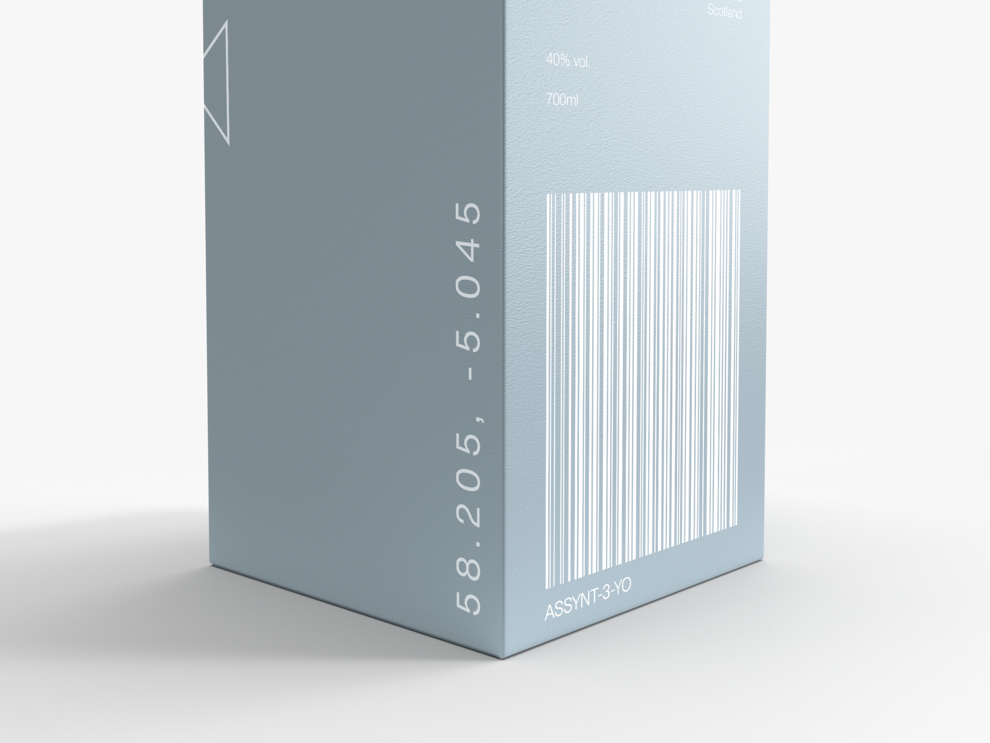
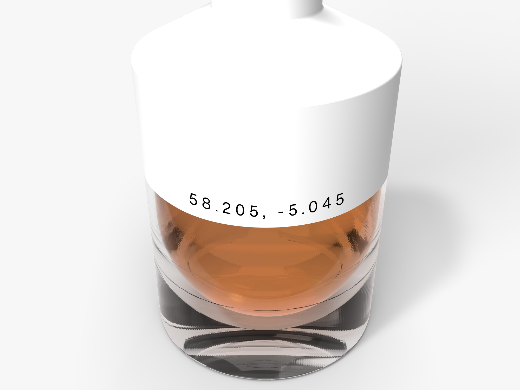
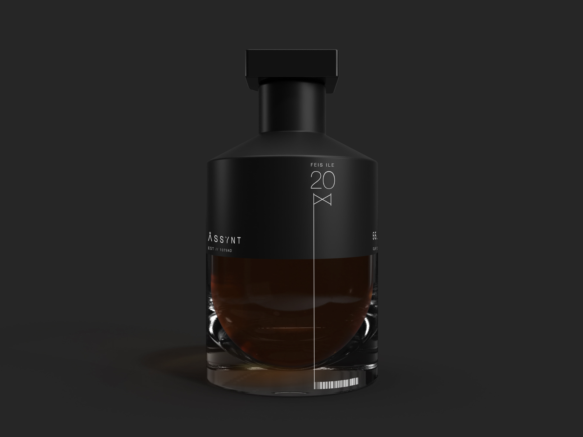
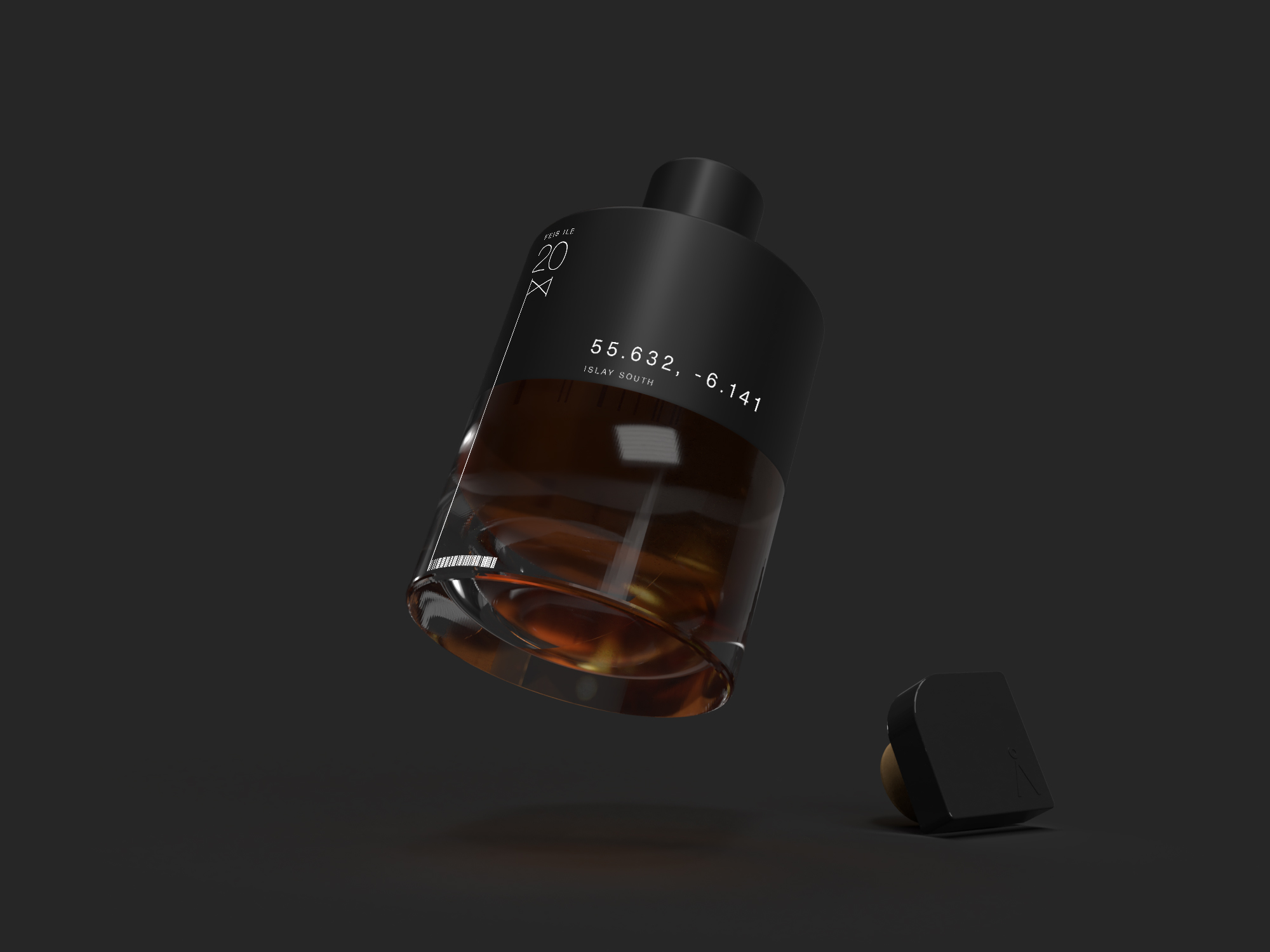
The logo represents the mountains of Sulliven in Sutherland, where some of the design details of the packaging constitute another reference to the source of production: the coordinates of the distillery positioned on the east shore of Lochan Bealach Cornaidh.
The colour palette used for the 3 products is influenced by Scotland’s many personas, ranging from the pale hues of a shoreline morning, to the dark, stormy skies of the mountainous highlands. Each bottle is represented by a runic glyph – an acknowledgement to the Assynt region’s Nordic heritage.
A full concept product line is embodied in this project, along with a special edition distillery release, designed as a collaboration among distilleries for the Islay Feis Ile whisky festival, which was cancelled in 2020 due to the global pandemic. This particular variant was created was to pay homage to the Scottish whisky makers during a difficult time that they would otherwise be celebrating.

CREDIT
- Agency/Creative: SWH.TE
- Article Title: Assynt a Progressive Whisky Brand Concept
- Organisation/Entity: Freelance, Published Self Promotional Design
- Project Type: Packaging
- Agency/Creative Country: United Kingdom
- Market Region: Global
- Project Deliverables: Brand Creation, Brand Design, Brand Identity, Brand Naming, Brand Strategy, Brand World, Branding, Graphic Design, Industrial Design, Packaging Design, Product Naming, Tone of Voice
- Format: Bottle, Box
- Substrate: Ceramic, Glass, Glass Bottle


