Assuane Consulting & Partners is an office that offers advisory, planning, development and execution services in the segments of civil engineering, architecture and urbanism.
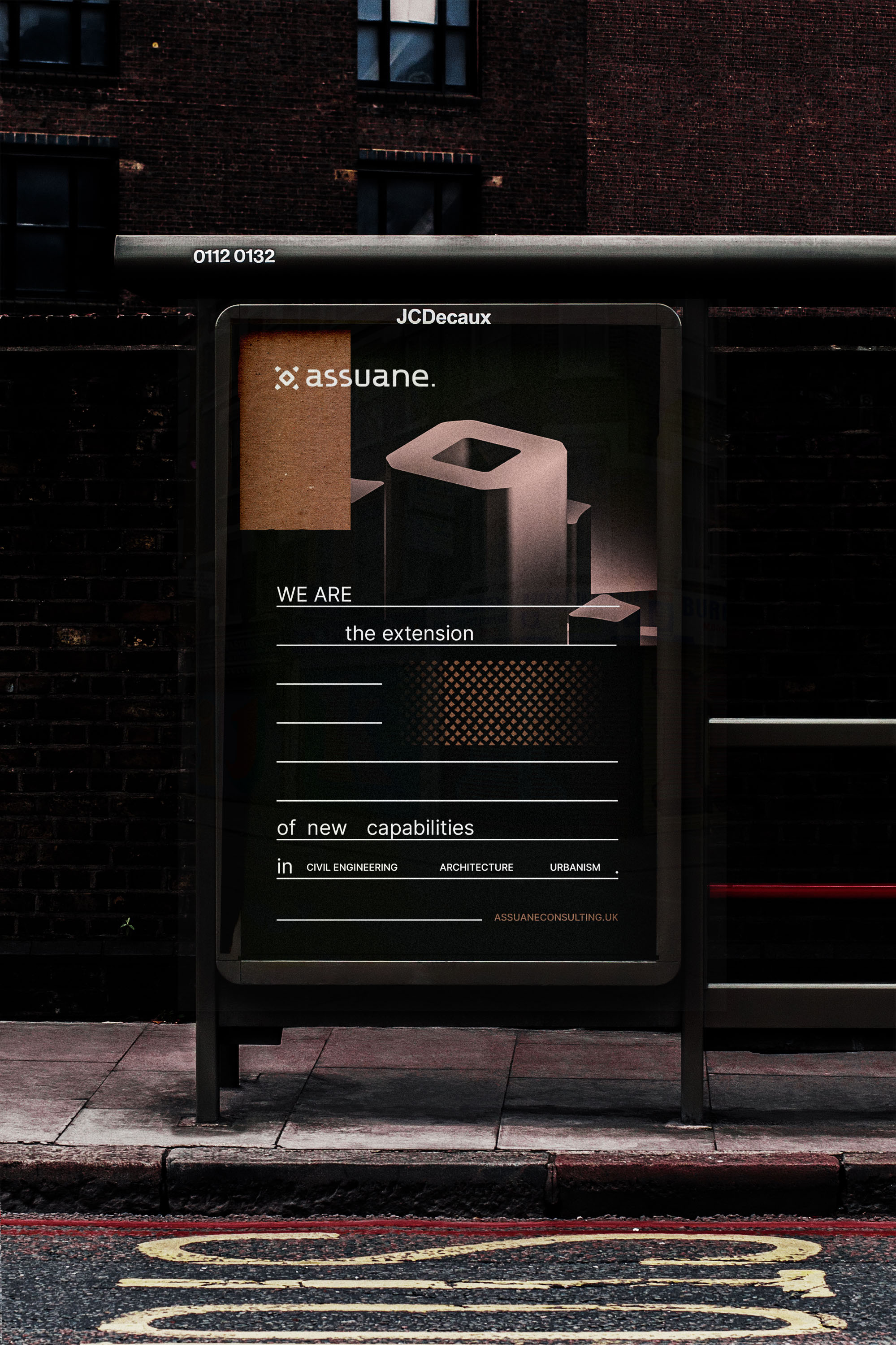
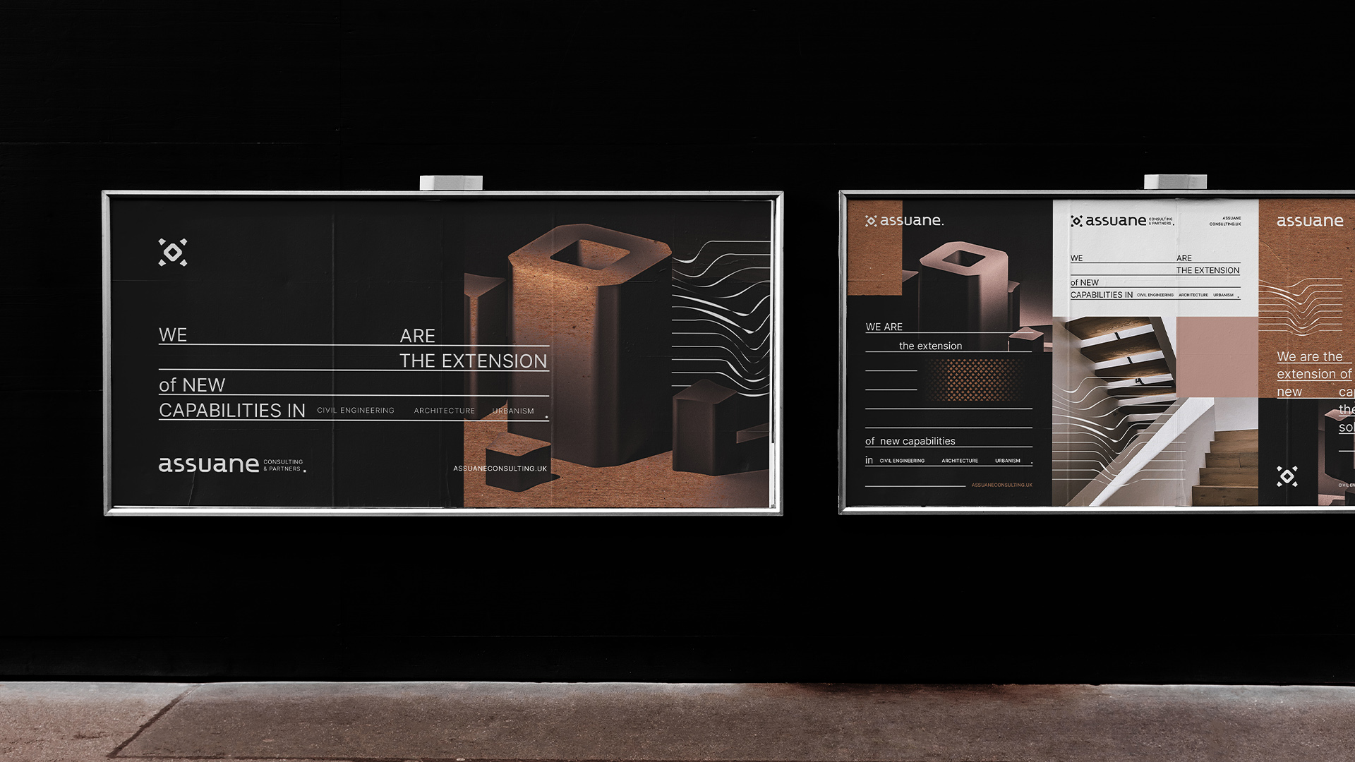
Seeking out the integration of multidisciplinary projects, the office follows the market that demands constant updating and innovation, nurtures its ecosystem of partners to best meet the needs of each client and becomes an extension of new capabilities frequently.
The dynamism in the projects in-house and the synergy between different partners, resources and services, from the start to the end of the project, is able to optimize the development time, improve the experience, and simplify the bureaucracies of a large or small job.
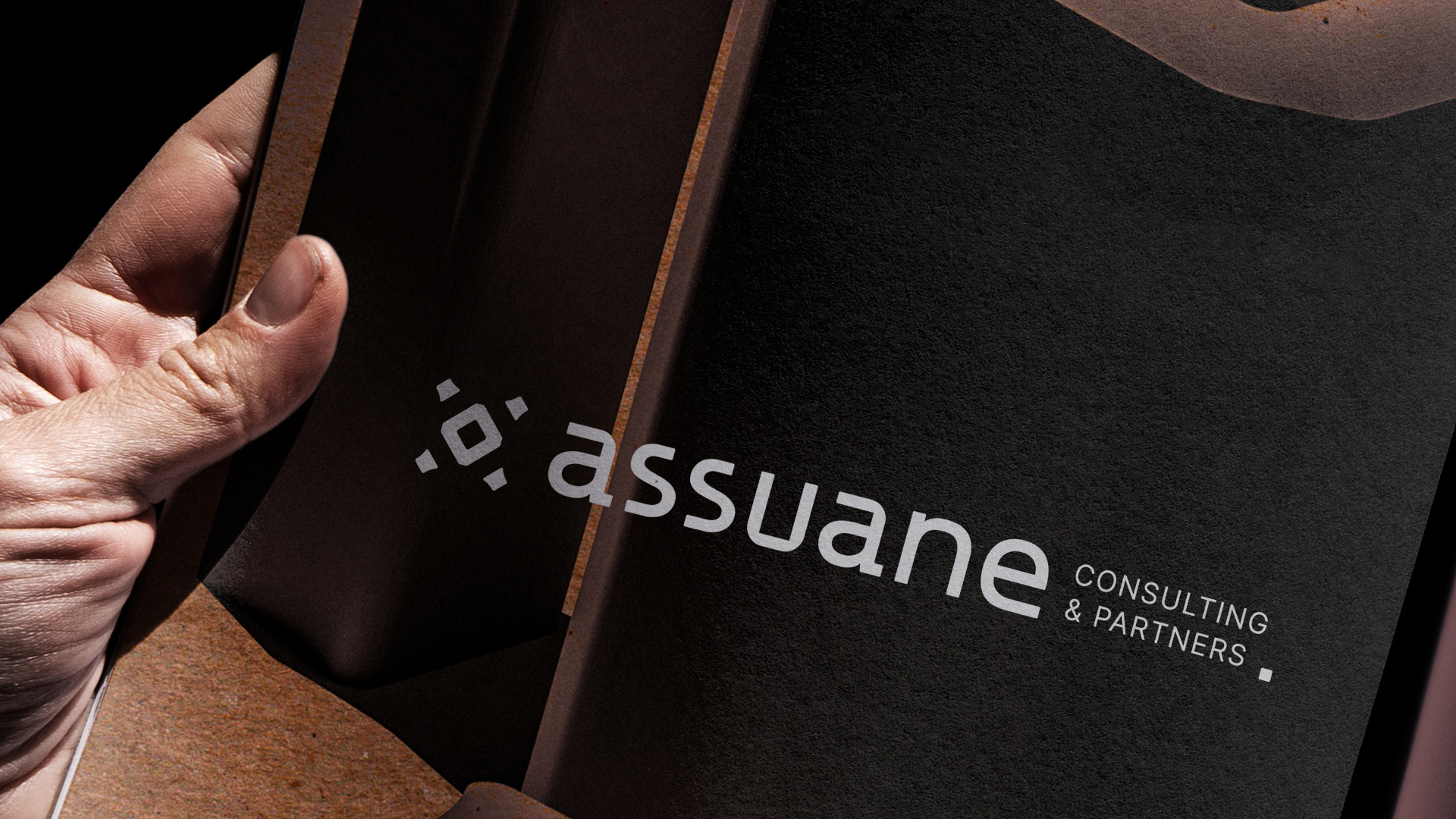
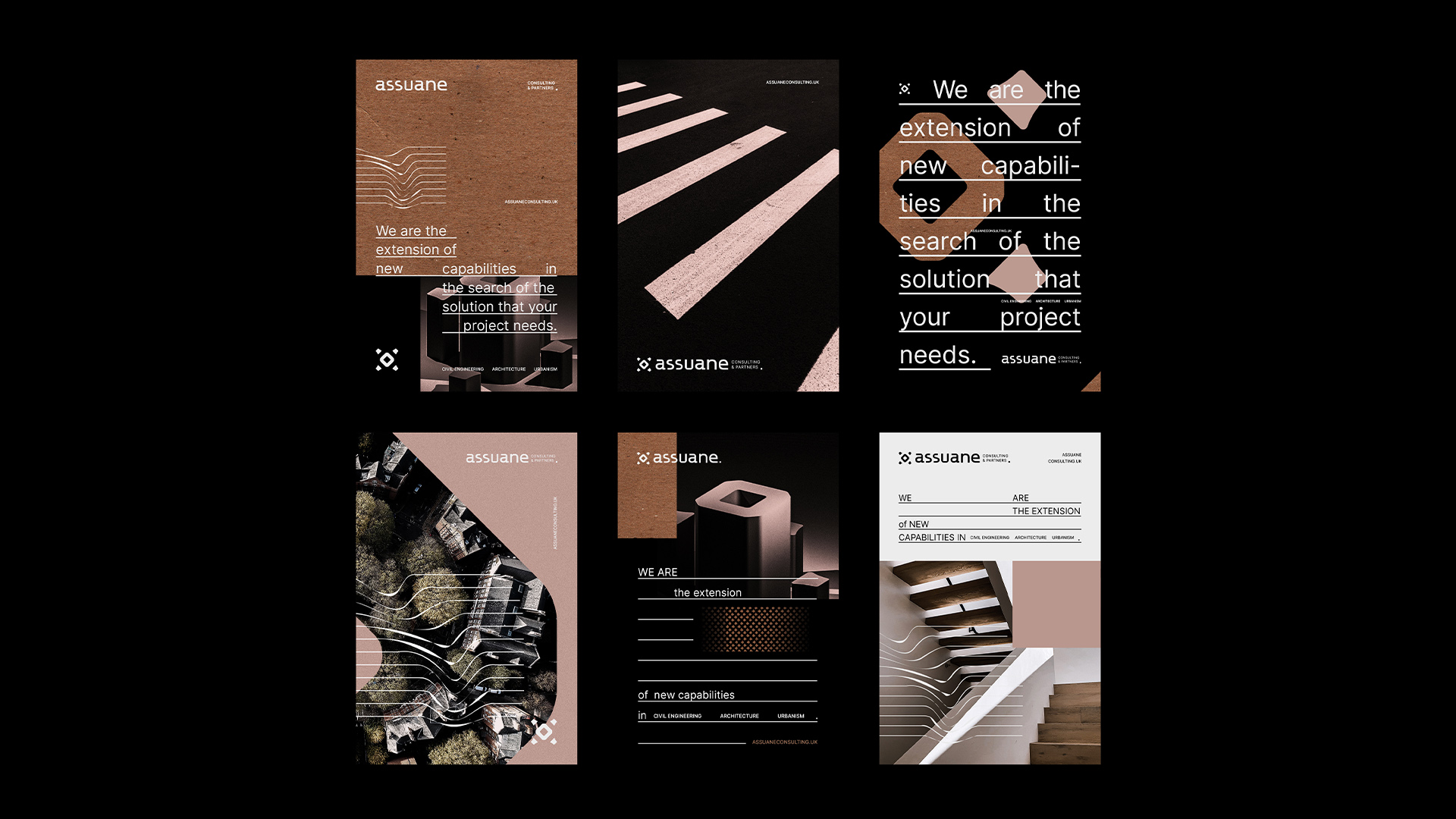
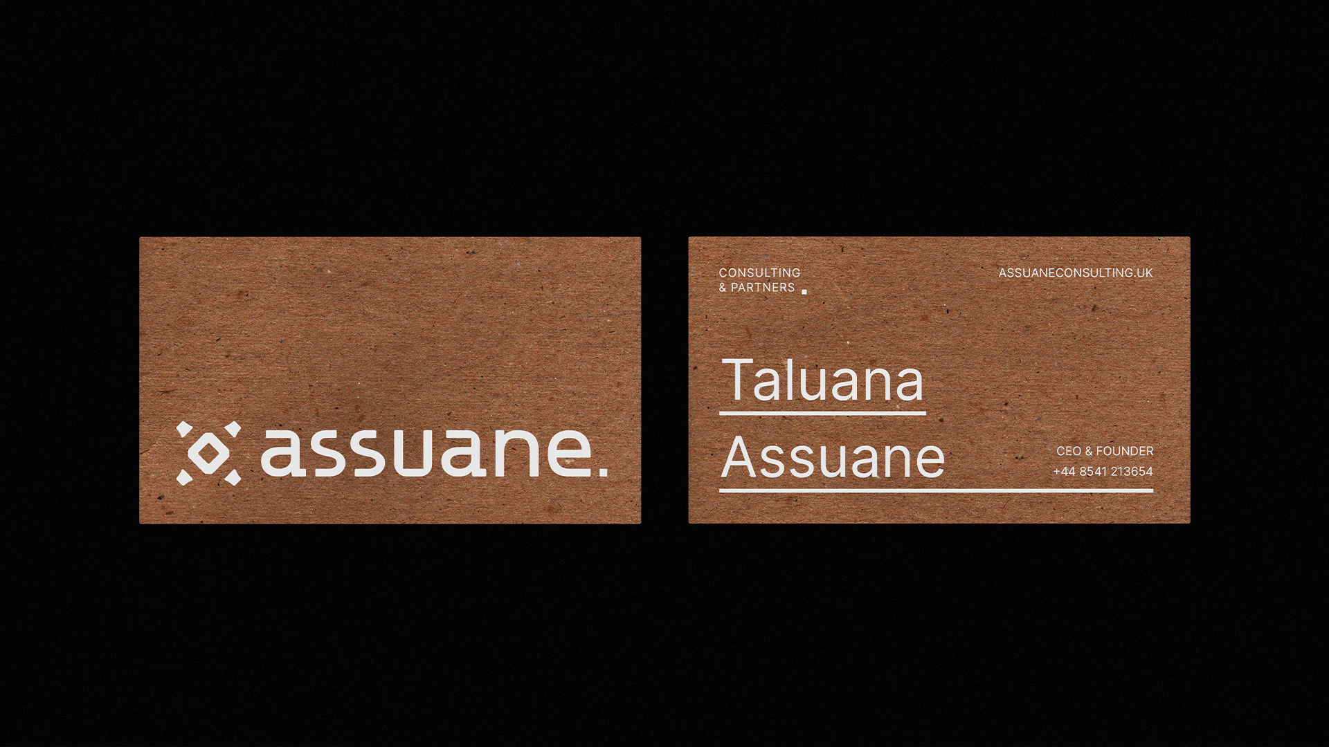
The objective: Update the brand image to something innovative and authentic in its segment, bringing a modern and at the same time timeless conception, using the strongest traits of its essence: the solidity, justified through experience, and mission, to form an ecosystem of partners in a single space to better serve customers.
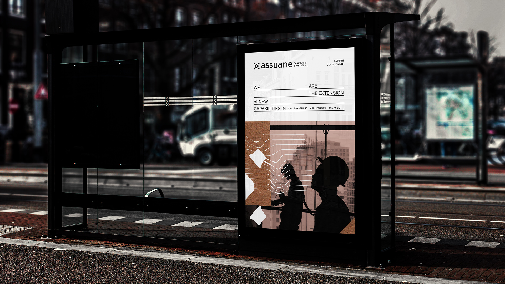
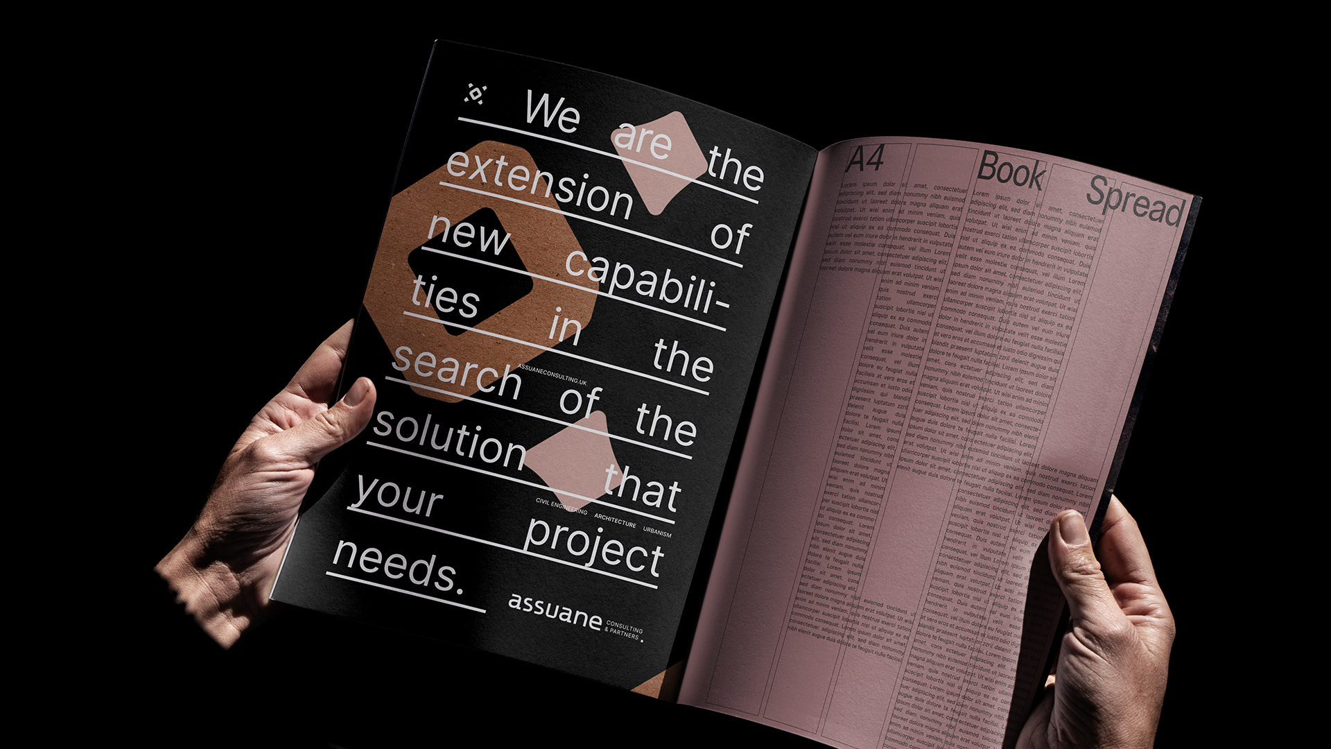
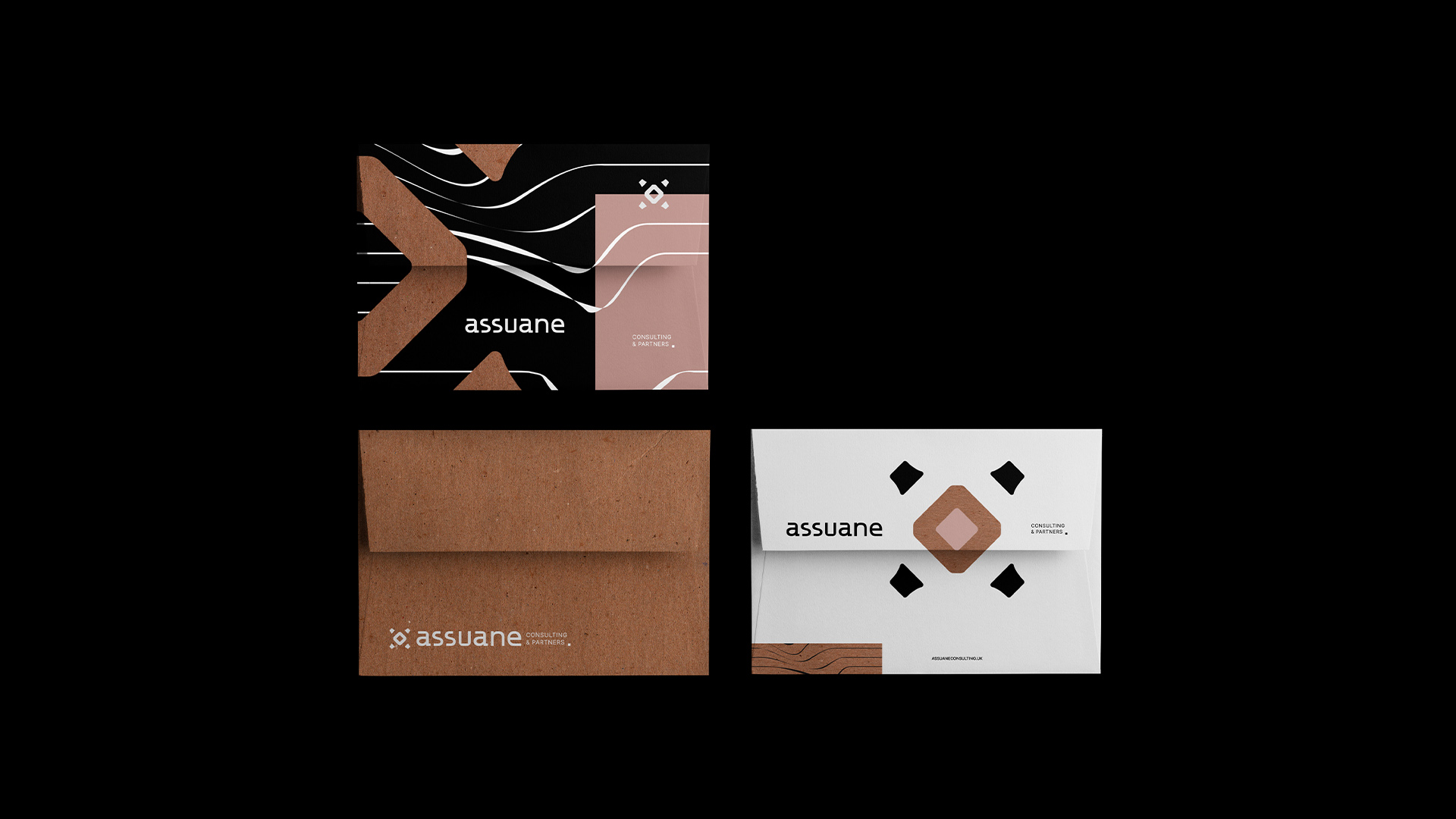
For the development of the identity I have considered: minimalism with purpose ( the complex may not be hard, and the simple may not be simplistic), and the most friendly on/off interface (elements with rounded corners with dynamics, movement and modulability that work for the various uses of the brand.
The symmetrical symbol with round corners, as well as being pleasing to the eye, communicates the genuine harmony of the consulting/advisory service and the partnership between different disciplines present in the company.
The central element is the office, a specific project, or the consulting service work itself, and the smaller elements are the partners or clients.
Independent of the meaning that is attributed to the elements, the way they are arranged is capable of transmitting and contextualizing the brand as a whole in a consistent way. The symbol has as an objective not to limit the range of possibilities of the business, as the company offers several services, in different stages of a single project and in more than one segment, and represent concepts related to: dynamics (internal movement responsible for the stimulus and evolution of something), synergy (simultaneous action or effort; cooperation, work or operation associated), and integration (union of elements in a set) through the curves, layout and angles of the elements.
Translating: The dynamics are present between the different methods and resources, the synergy between partners from different disciplines, and the integration in the expansion of new capabilities as a solution within the office.
CREDIT
- Agency/Creative: Beatriz Ricci
- Article Title: Assuane Consulting & Partners Branding Design by Beatriz Ricci
- Organisation/Entity: Freelance
- Project Type: Identity
- Project Status: Published
- Agency/Creative Country: Brazil
- Agency/Creative City: Navegantes
- Market Region: Europe
- Project Deliverables: Brand Architecture, Brand Creation, Brand Identity, Graphic Design, Logo Design, Type Design, Typography
- Industry: Construction
- Keywords: Architecture, Construction, Consulting, Engineering, Urbanism, Logotype, Visual Identity, Branding, Typography
-
Credits:
Graphic Designer: Beatriz Carol Ricci


