


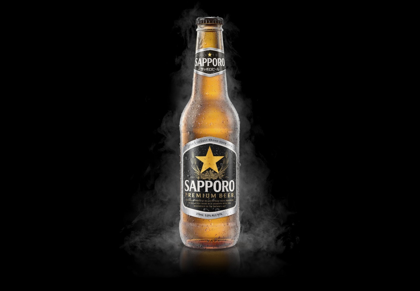
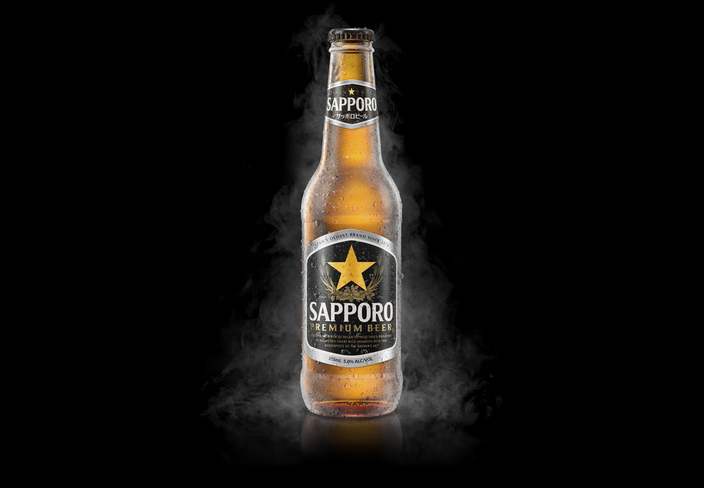
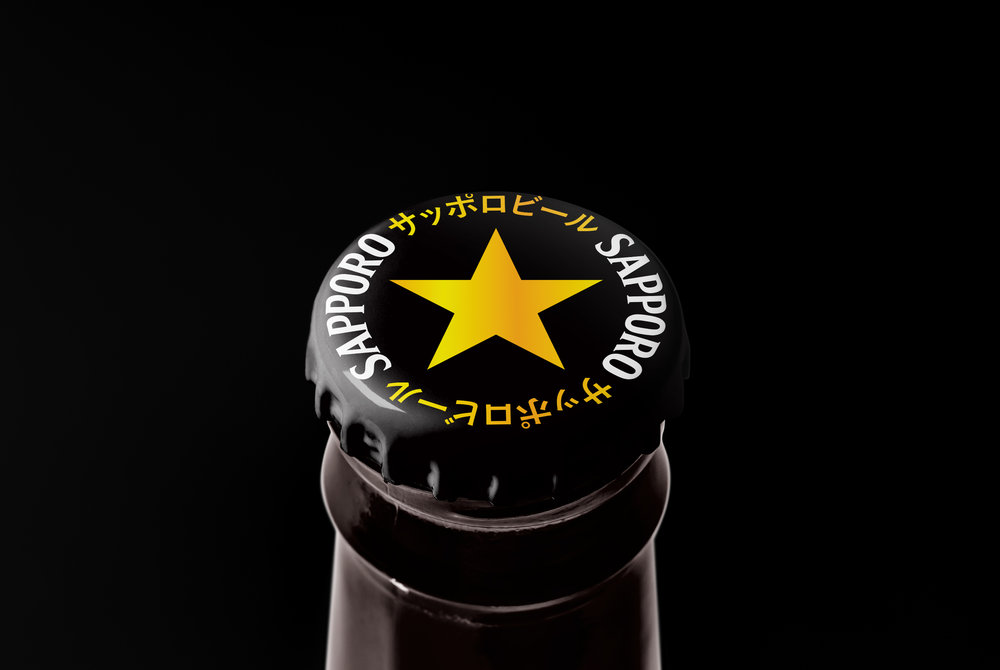
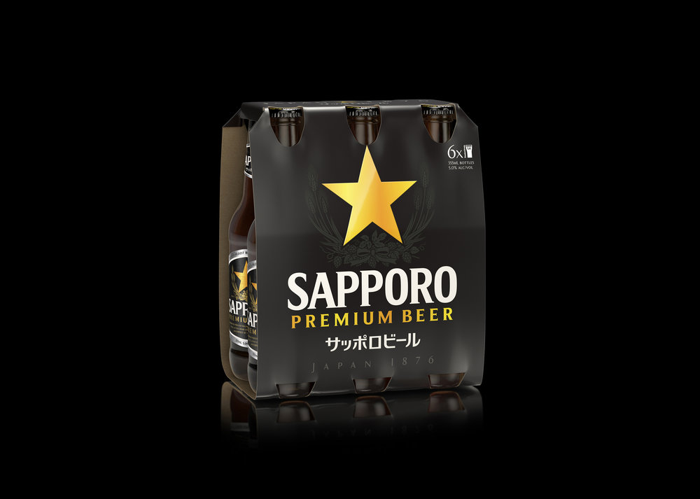
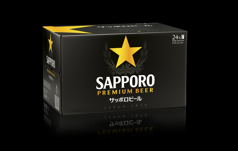
” Born in 1876, Sapporo is the perfection of delicate hops, rich golden malt, and the concept of balance which is central to Japanese life.We were asked to reposition the iconic Sapporo brand for the Australian market, to enable it to better compete with it’s main Japanese rivals. We reworked Sapporo’s iconic symbol and repositioned it as a super premium brand by playing to it’s cultural and visual strengths. The new look strips the brand back to the pure elements of quality and heritage, two things where the Sapporo brand has the edge on its competitors.The new packaging is a confident and modern reflection of the Sapporo brand. By projecting the iconic Sapporo gold star with the sophisticated, minimal black background, we are returning ‘Legendary Biru’ to Australian bars.”
CREDIT
- Agency/Creative: Asprey Creative
- Article Title: Asprey Creative – Sapporo Australia
- Project Type: Packaging
- Format: Bottle, Box
- Substrate: Glass, Pulp Board


