


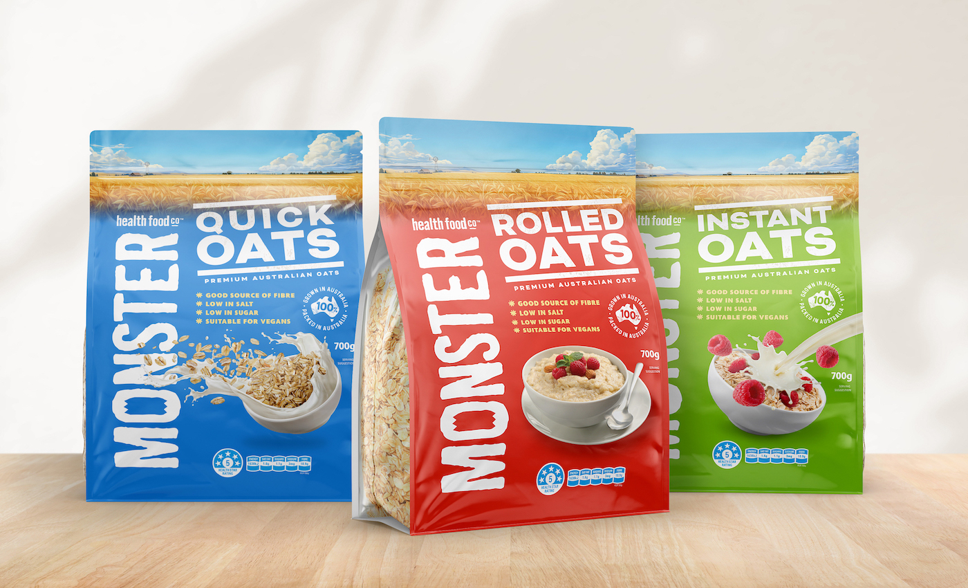
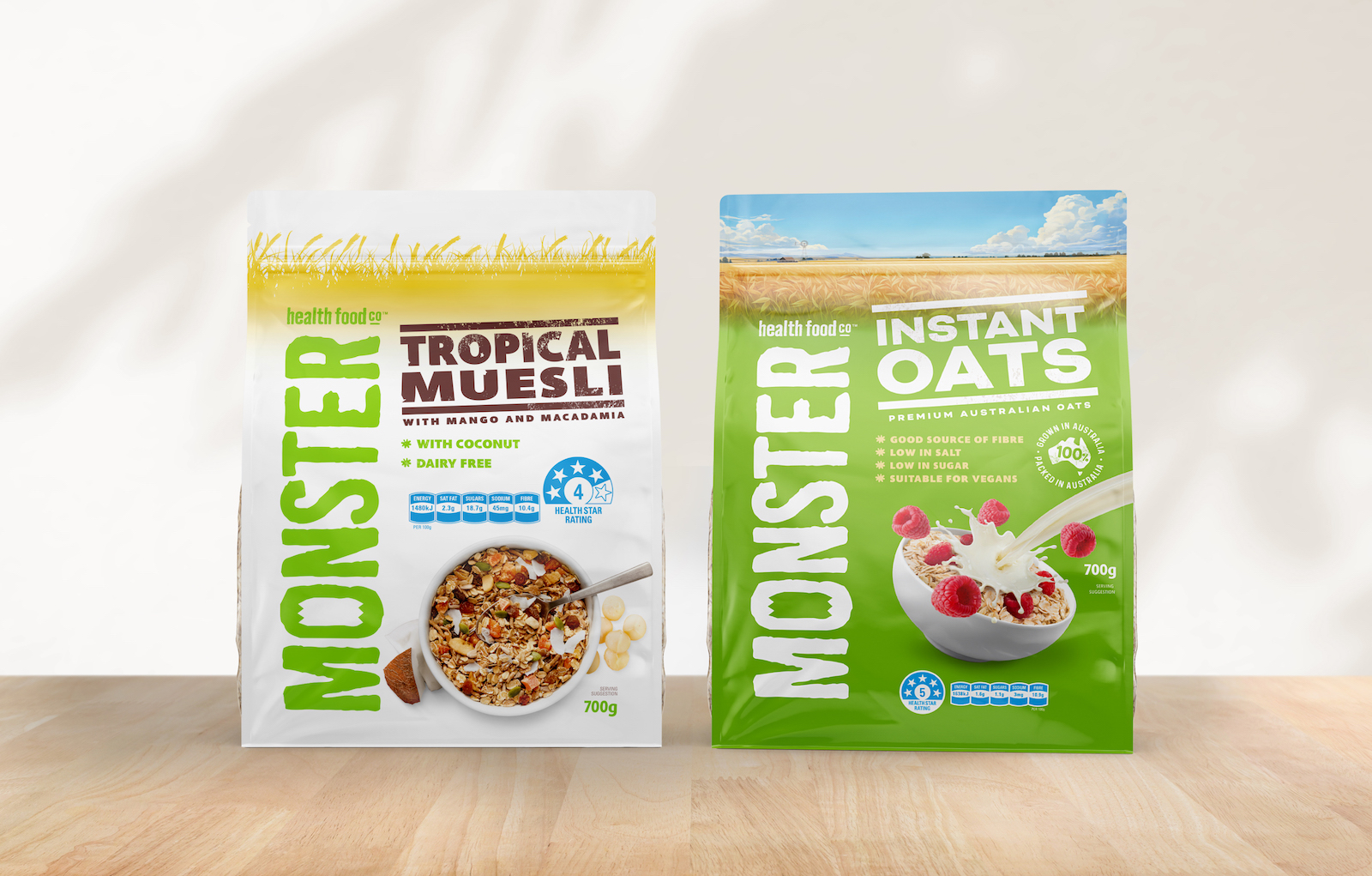
Monster Health Food Co’s muesli range, redesigned by us in 2012, has been in market both here in Australia and throughout Asia for over two decades. Having such a strong brand presence in Asia led to a growing number of enquiries about oats, as the popularity of oats has grown rapidly on the back of the global health trend. A great opportunity for Monster, particularly given the uniqueness of their product being both grown and packed in Australia. This makes their brand highly desirable in many Asian countries where Australian imports are perceived as very high in quality and purity. It was imperative therefore that we not only leveraged off the existing Monster packaging, but made this range bold, dynamic and unashamedly Australian.
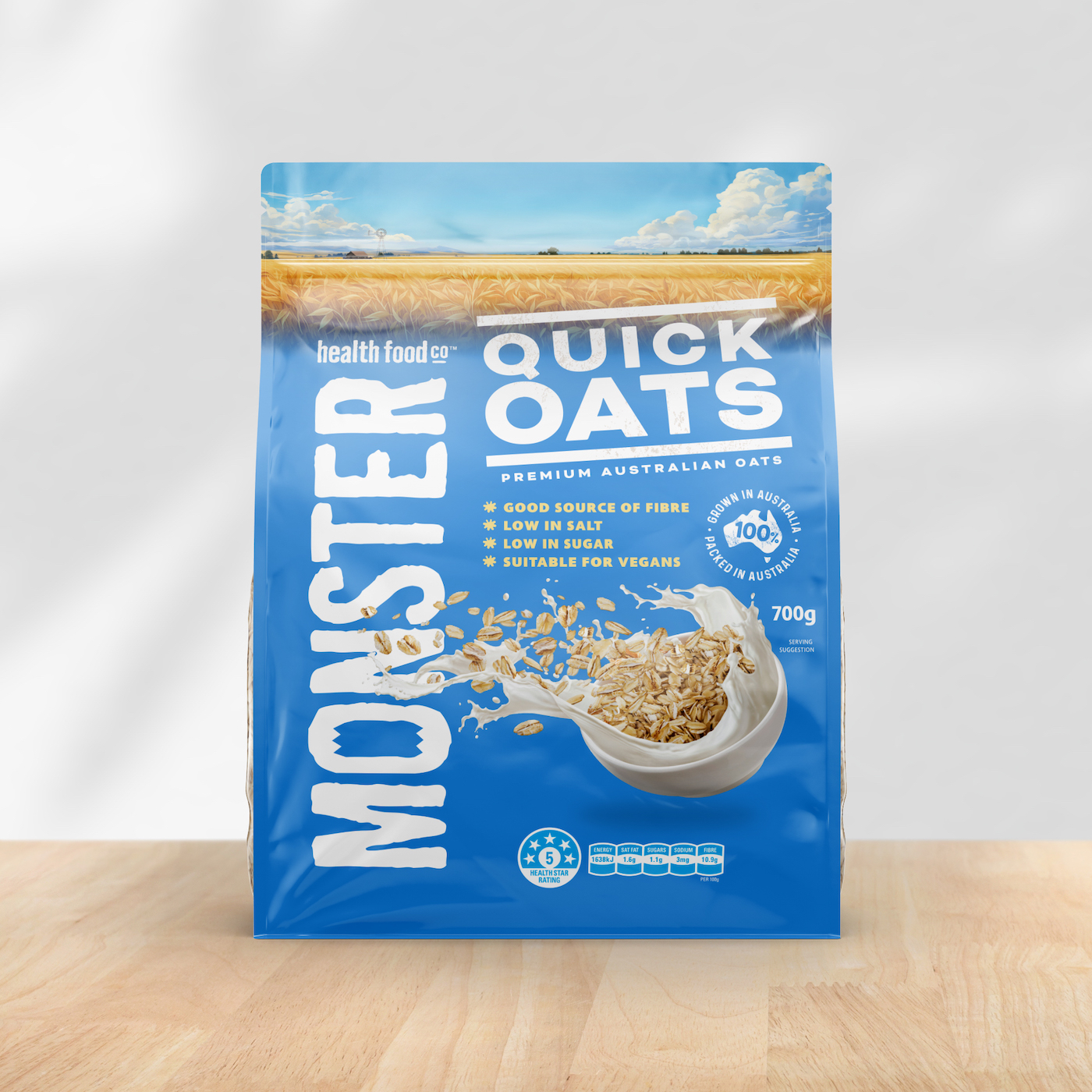
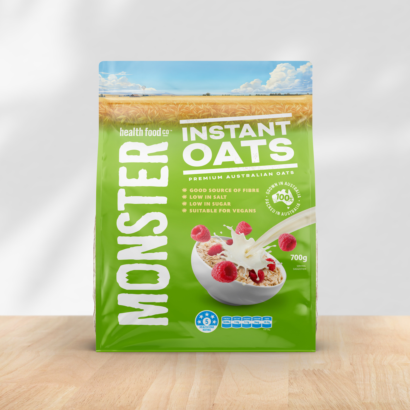
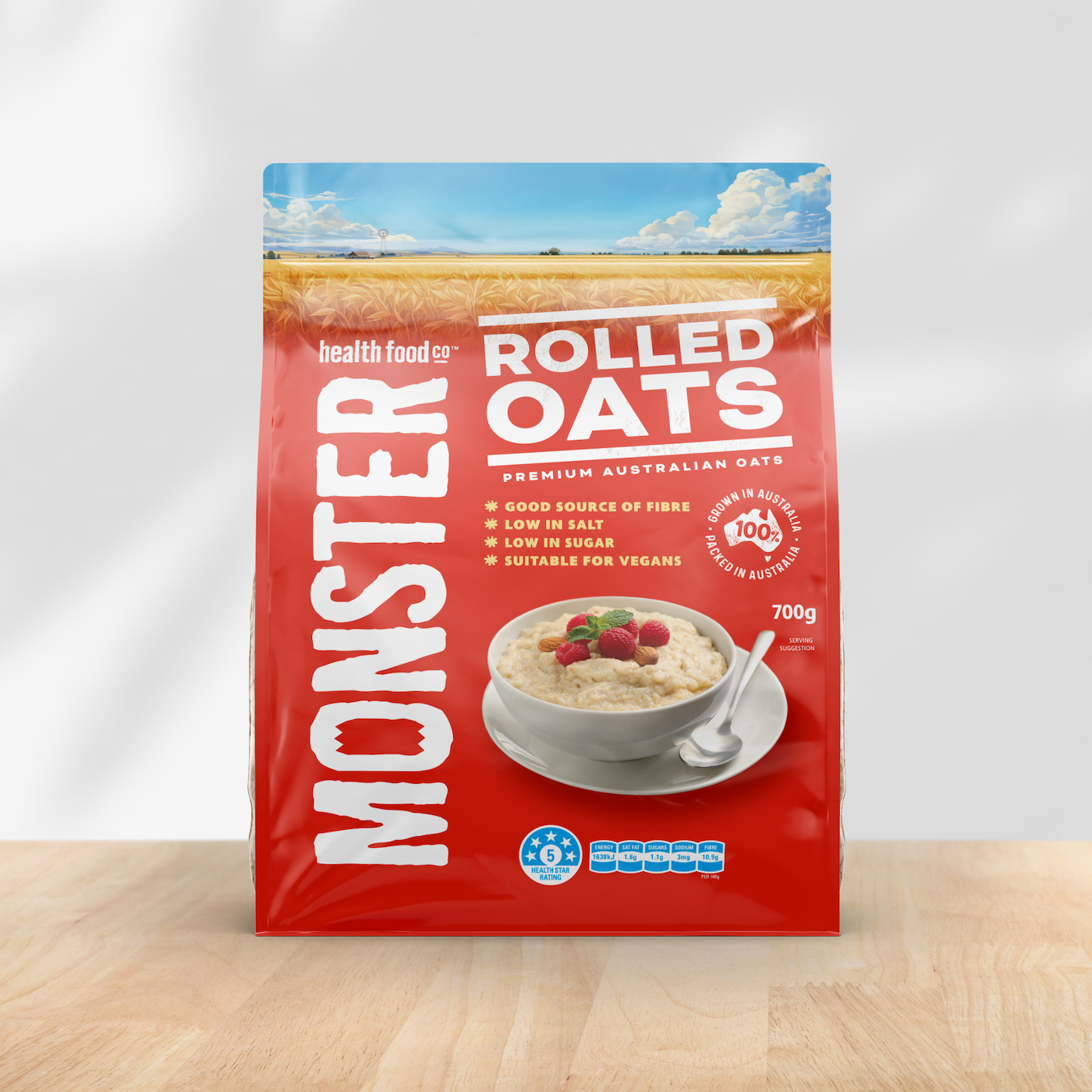
Monster’s large, vertical logo is an iconic and very distinctive feature of their packaging, which gave us license to drastically change the colour strategy of this new range without losing clear branding consistency between the two ranges. An essential need given the existing equity the brand has. We used bright, vibrant colours to differentiate between the three variants, and evolved the simple wheat silhouette from the Muesli range by engaging a local illustrator to create a beautiful, emotive, full colour illustration of a quintessentially Australian field of oats.
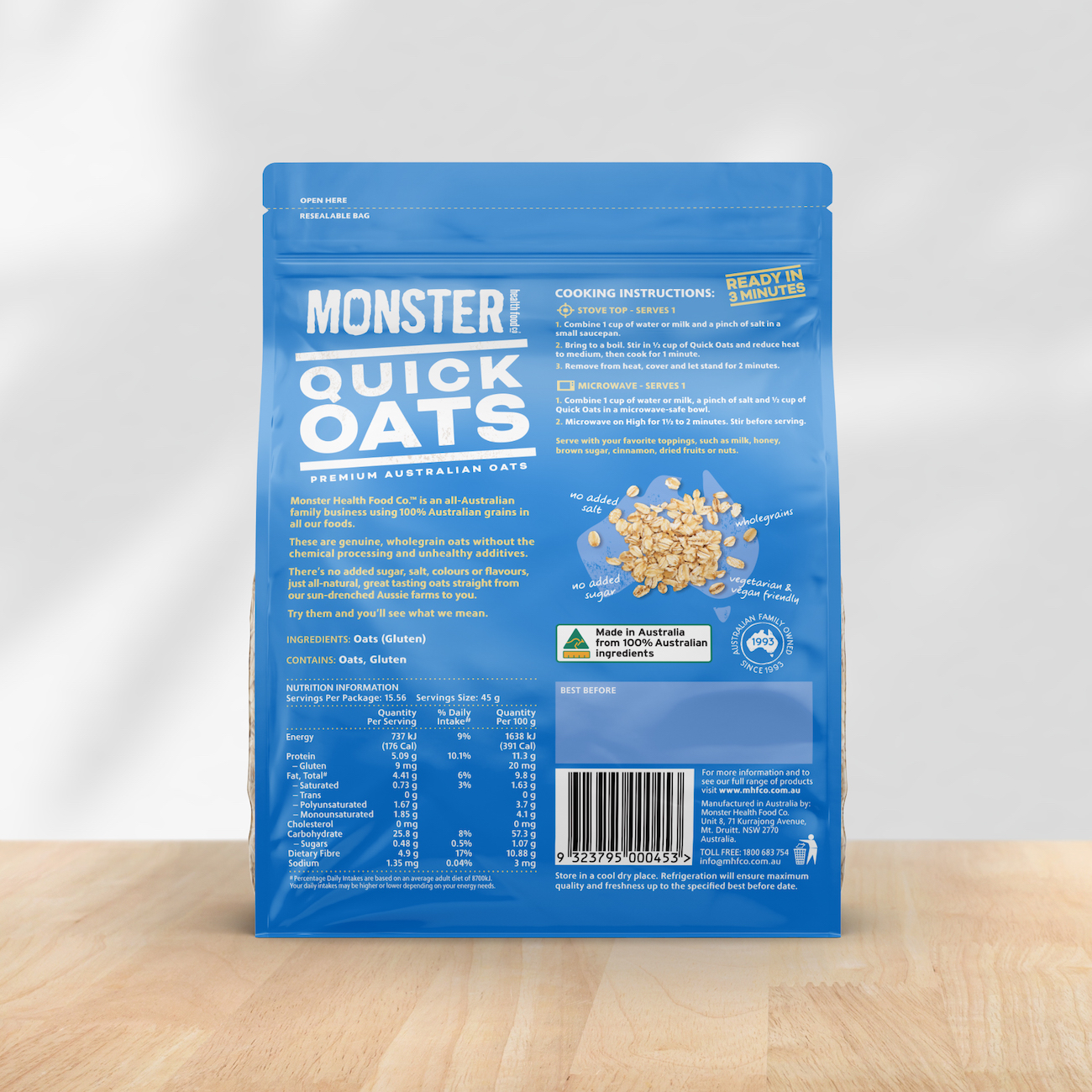
We created some strong visual differentiation between variants by injecting some fun into the product photography. Both the Quick Oats and Instant Oats packs have images that playfully add a sense of movement and speed, contrasting nicely with the more sedate Rolled Oats image. This not only clearly differentiates each product, but also helps to bring to life the idea of being quick to prepare. These images add even more dynamism to what is a unique and impactful range that screams genuine, contemporary and Australian.
CREDIT
- Agency/Creative: Asprey Creative
- Article Title: Asprey Creative Reimagines Monster Health Food Co’s Oats With Vibrant Colors and Playful Imagery
- Organisation/Entity: Agency
- Project Type: Packaging
- Project Status: Published
- Agency/Creative Country: Australia
- Agency/Creative City: Melbourne
- Market Region: Asia, Oceania
- Project Deliverables: Food Photography, Illustration, Packaging Design
- Format: Pouch
- Industry: Food/Beverage
- Keywords: Packaging, Design, Oats, Muesli, Health Foods, Food Photography
-
Credits:
Executive Creative Director: Peter Asprey


