


Pure Food Alliance are a family owned Australian business producing sorbets, ice creams and other fruit-based treats for a wide range of global markets. They have produced a sorbet range which, unlike many of their competitors, is made using only freshly picked fruit. In other words, no fruit concentrate stored in a factory for years then rehydrated into something that kind of tastes like fruit! Their unique process involves the fruit being pulped and snap frozen right on the farm, often only minutes after it’s picked. That’s about as fresh as it gets!
They asked us to build a positioning for this brand, create a brand name, then create branding and packaging for this new product range. It was clear to us that with this sort of genuine, no-nonsense approach to their product, Pure Fruit Sorbet’s brand strategy needed to be bold. We aimed to communicate a clear message – it’s all about purity, integrity and confidence.
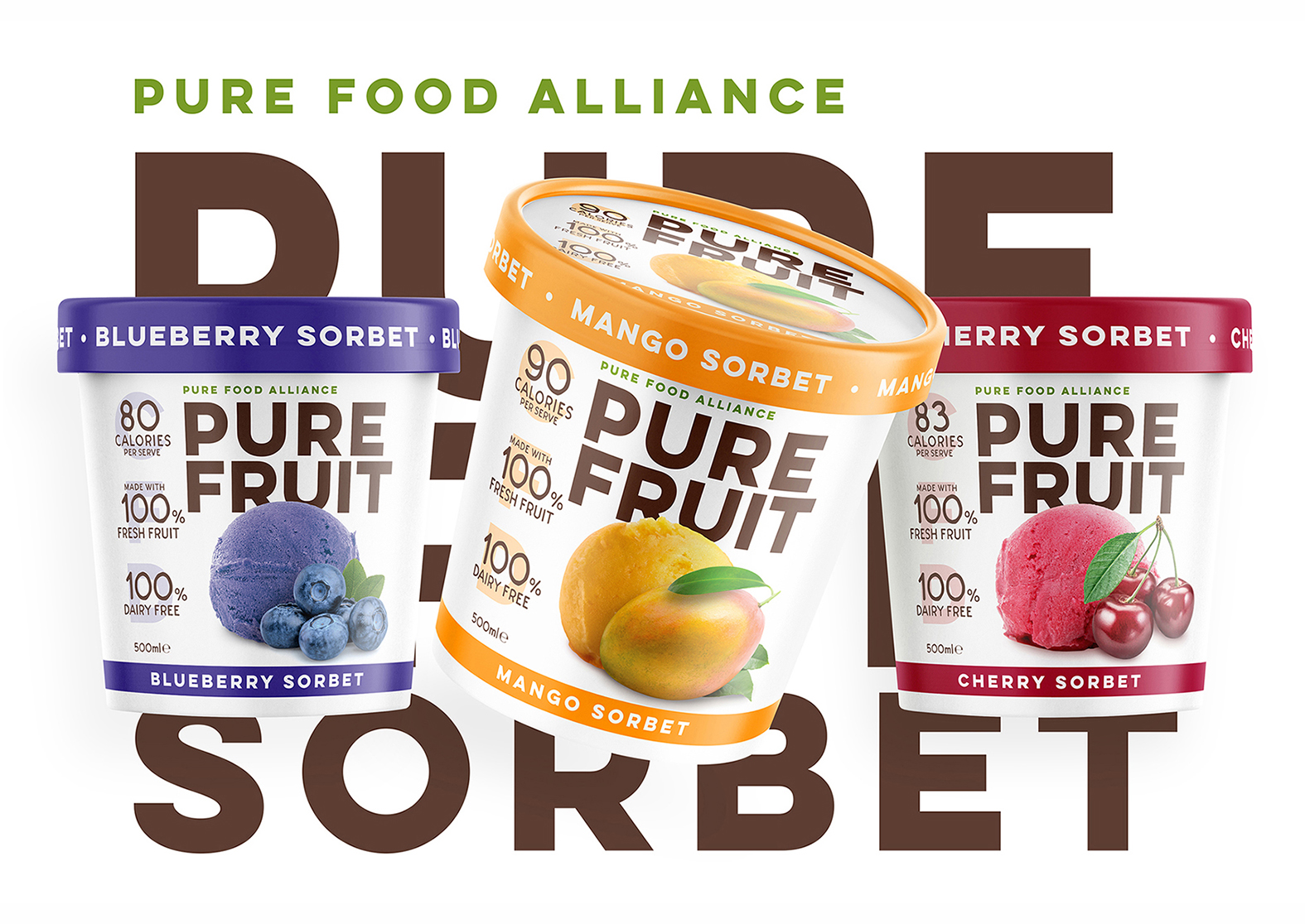
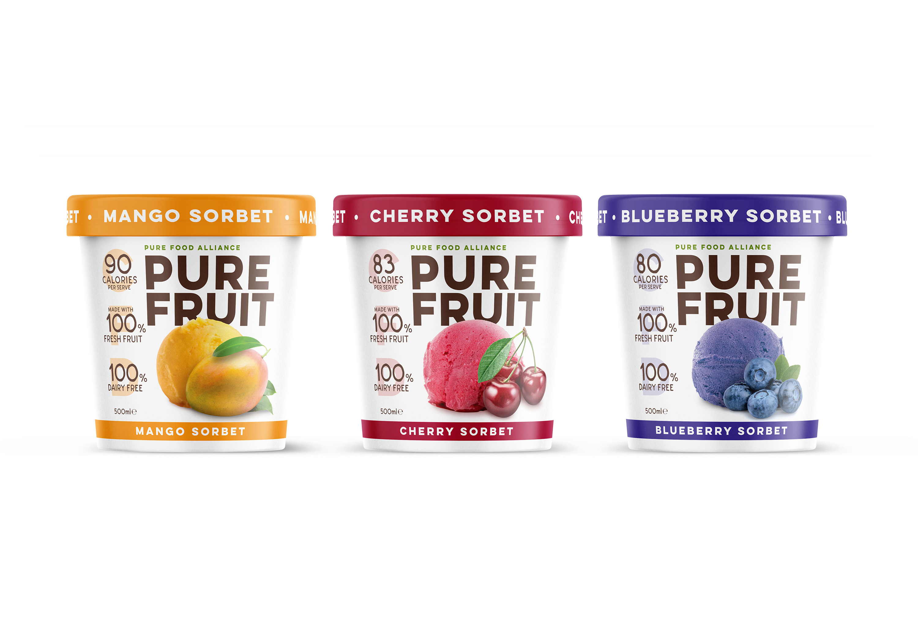
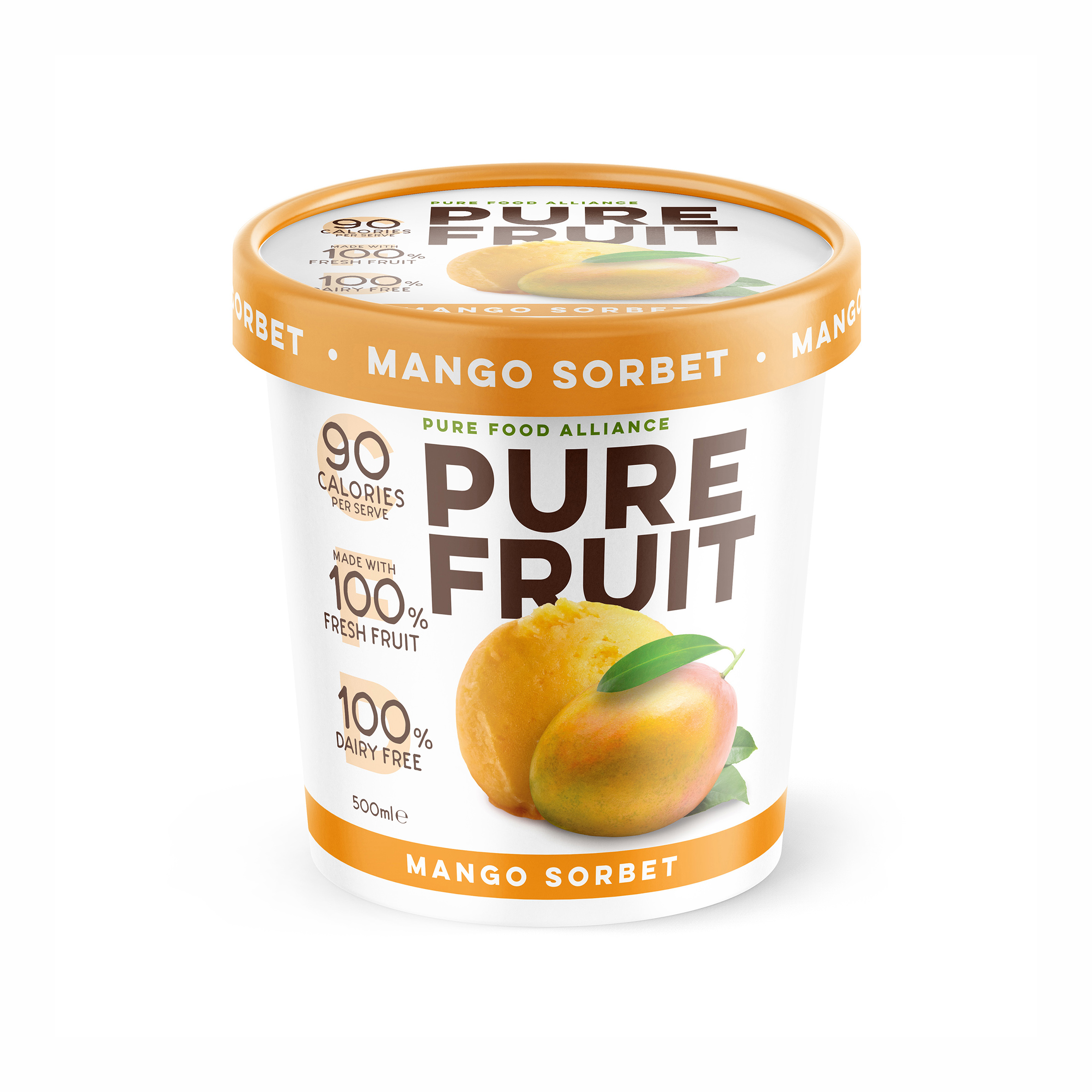
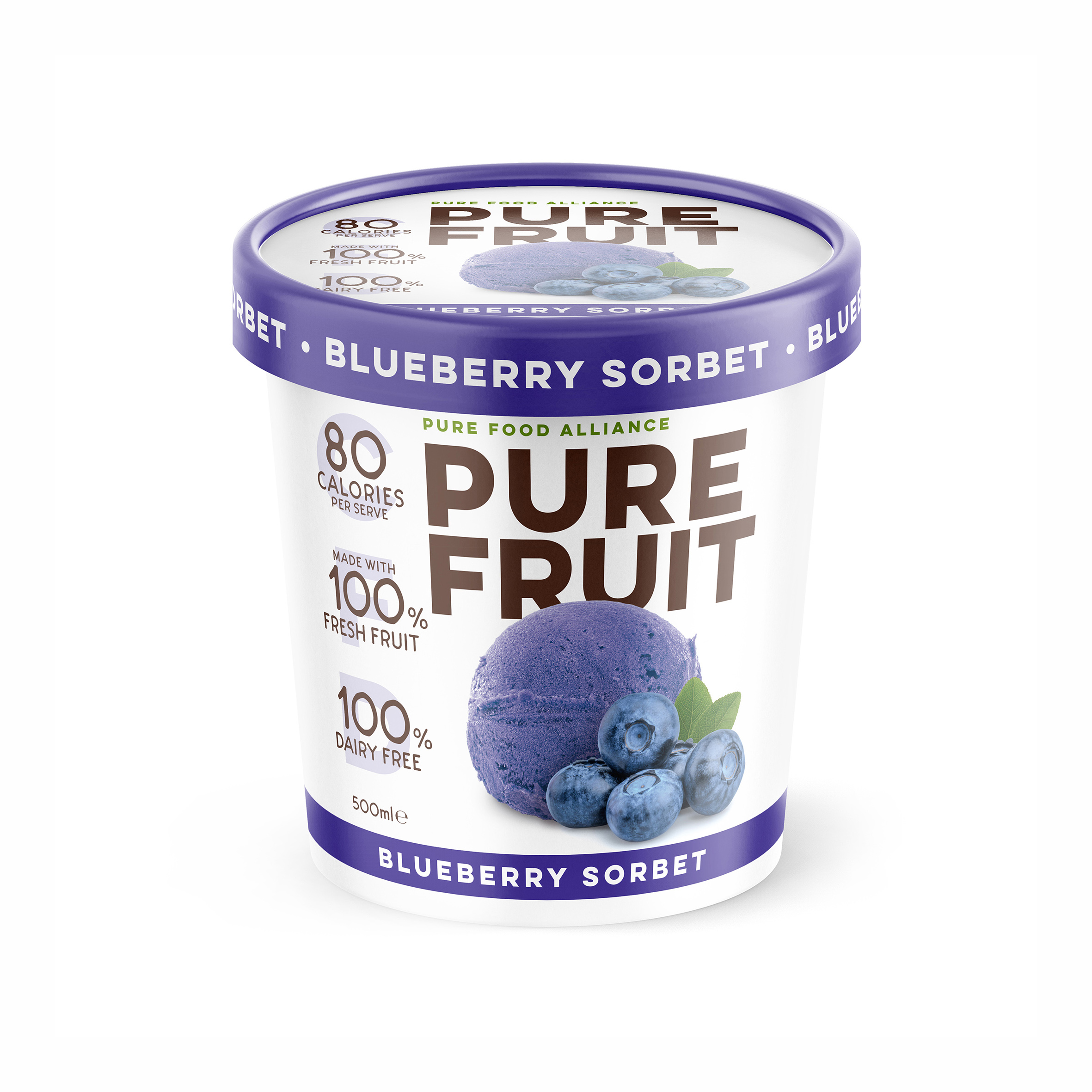
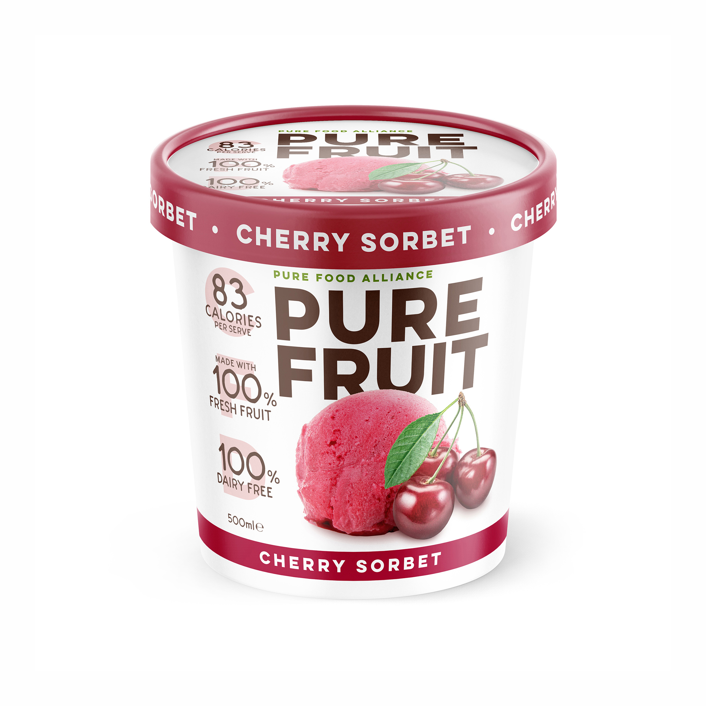
Firstly, in naming this product range, we realised that sometimes being able to own a unique brand name is less important than telling it like it is – pure fruit. It’s not just a name; it’s a declaration of what their brand stands for – unadulterated, genuine fruit goodness. It’s loud, proud and confident, and tells you all you need to know.
We adopted a minimalist approach to branding and packaging. Three fundamental elements guided this strategy: a distinctive brand mark, an irresistible promise of taste, and explicit health claims. Brand typography is bold, sans serif and timeless, product cameos are deliberately kept simple and not over-styled or embellished, and the health claims focus only on the three core motivators that consumers are looking for in this category. This deliberate simplicity is not only aesthetically striking but also strategically designed to differentiate this product from ice cream as a healthier alternative, without compromising on taste appeal.
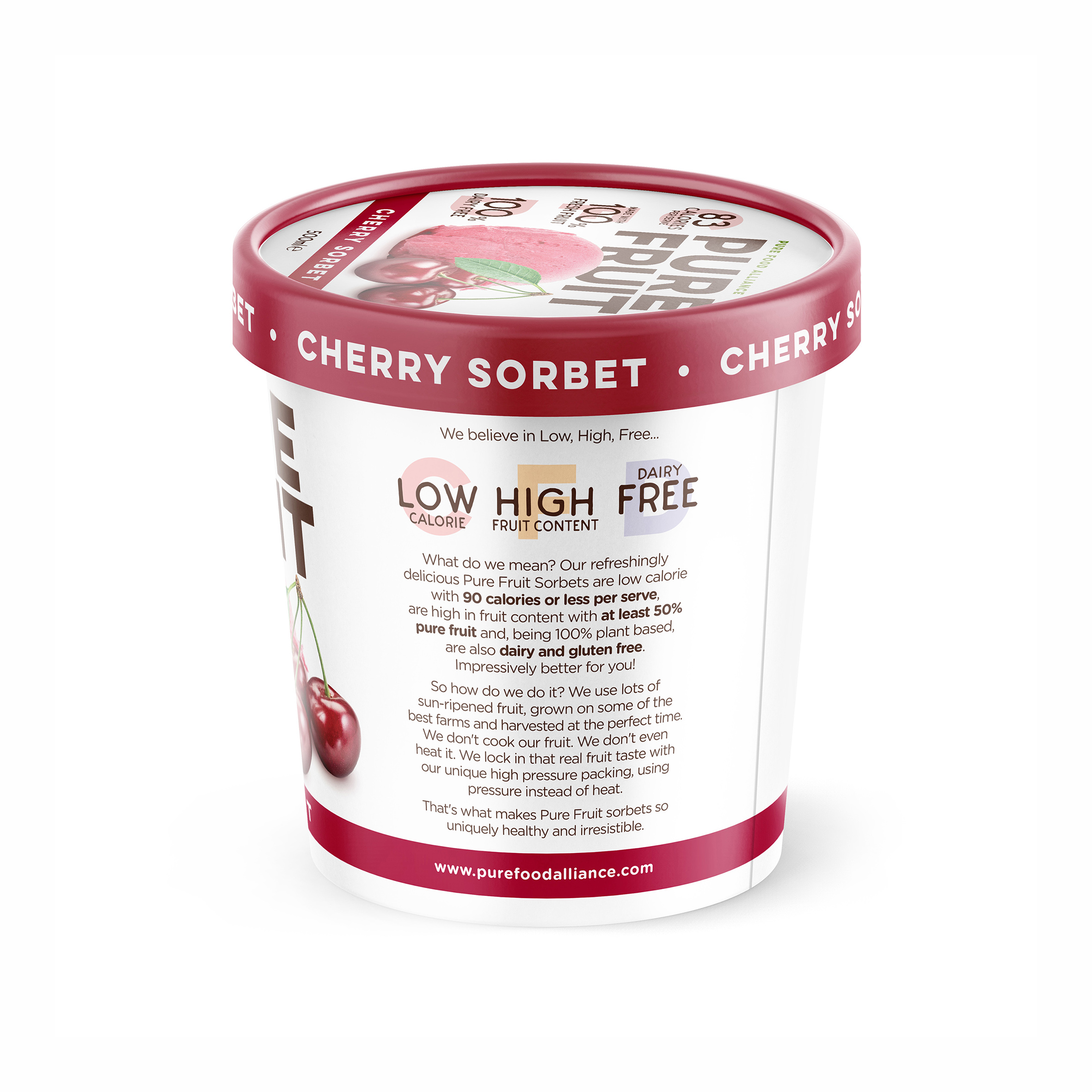
The narrative of the back of pack romance copy is written to support a mnemonic we developed to encapsulate the three health claims. The ‘Low High Free’ device conveniently summarises calorie count, the amount of protein and the fact that the product is dairy free as a mantra for the brand and integral to its positioning. This artfully straightforward messaging engages consumers and positions this sorbet uniquely in the market, giving consumers another reason to believe and helping to initiate trial of the product. It has the added advantage of being a very useful off-pack marketing tool.
Pure Fruit Sorbet’s launch into Australian retail was a huge success, with the entire range being sold out within three weeks. To say it’s a hit is an understatement.
CREDIT
- Agency/Creative: Asprey Creative
- Article Title: Asprey Creative Design Pure Fruit Sorbet’s Bold Branding and Packaging Triumph in Global Markets
- Organisation/Entity: Agency
- Project Type: Packaging
- Project Status: Published
- Agency/Creative Country: Australia
- Agency/Creative City: Melbourne
- Market Region: Oceania
- Project Deliverables: Brand Creation, Brand Design, Brand Naming, Brand Strategy, Packaging Design
- Format: Cup
- Industry: Food/Beverage
- Keywords: Sorbet, Ice cream, Fruit
-
Credits:
Creative Director: Peter Asprey


