


With a Total Reach of 1.5 Million Social Media Followers, a Ranking Among the Top 5 Online Sneaker Stores in Europe and After 12 Years as a Forerunner in the Sneaker Community, It Was Time for the Sneaker Pioneers From Asphaltgold to Give Visual Expression to a New, More “adult” Self-image. Even Though Asphaltgold Is Typically Responsible for Perfect Styling Itself, They Trustfully Placed the Order for Their Complete Re-design in the Hands of Design Studio Arndt Benedikt. The Frankfurters Created a New Logo, Defined the Typeface Environment and Developed a Holistic Visual System for All Design Tasks.
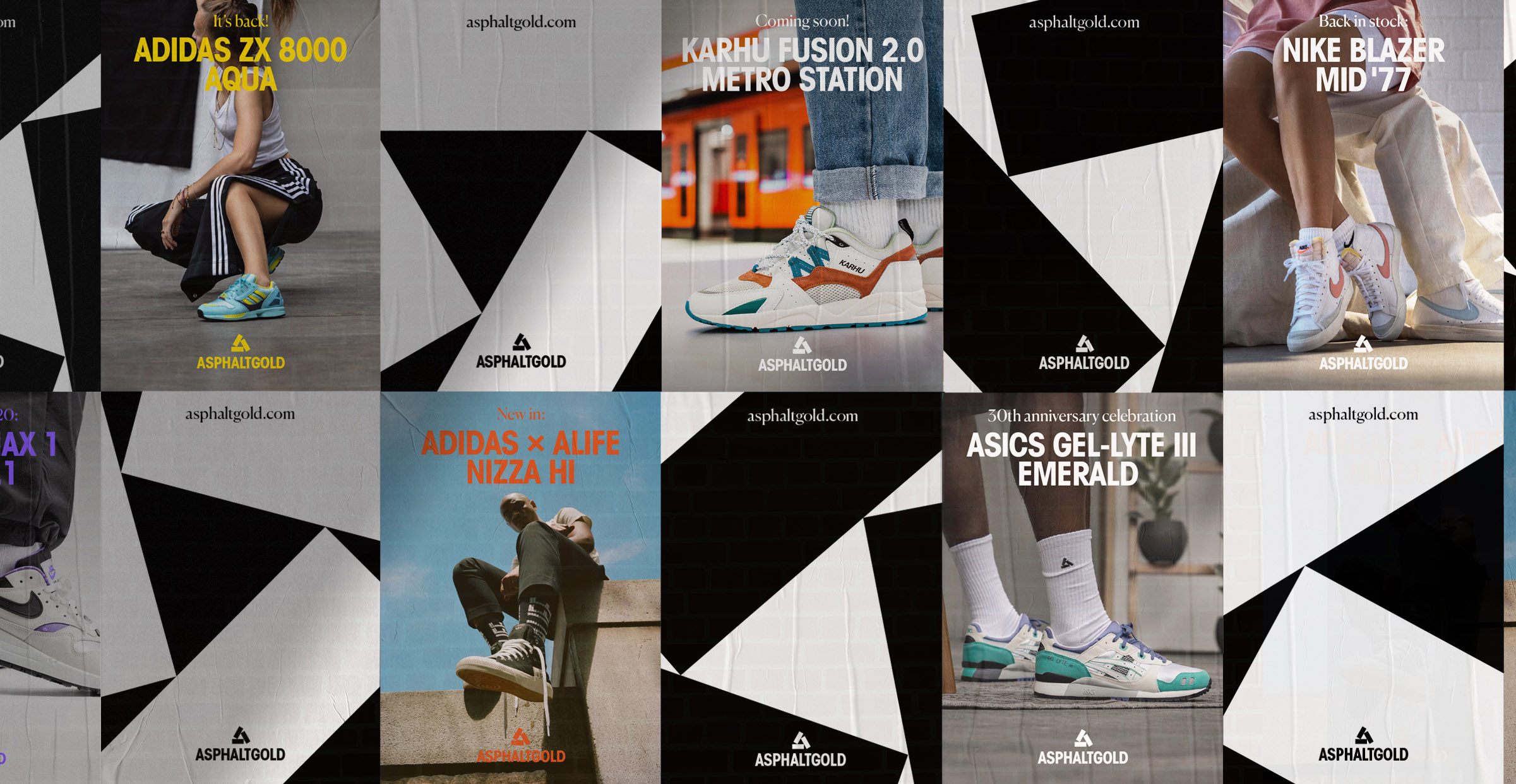
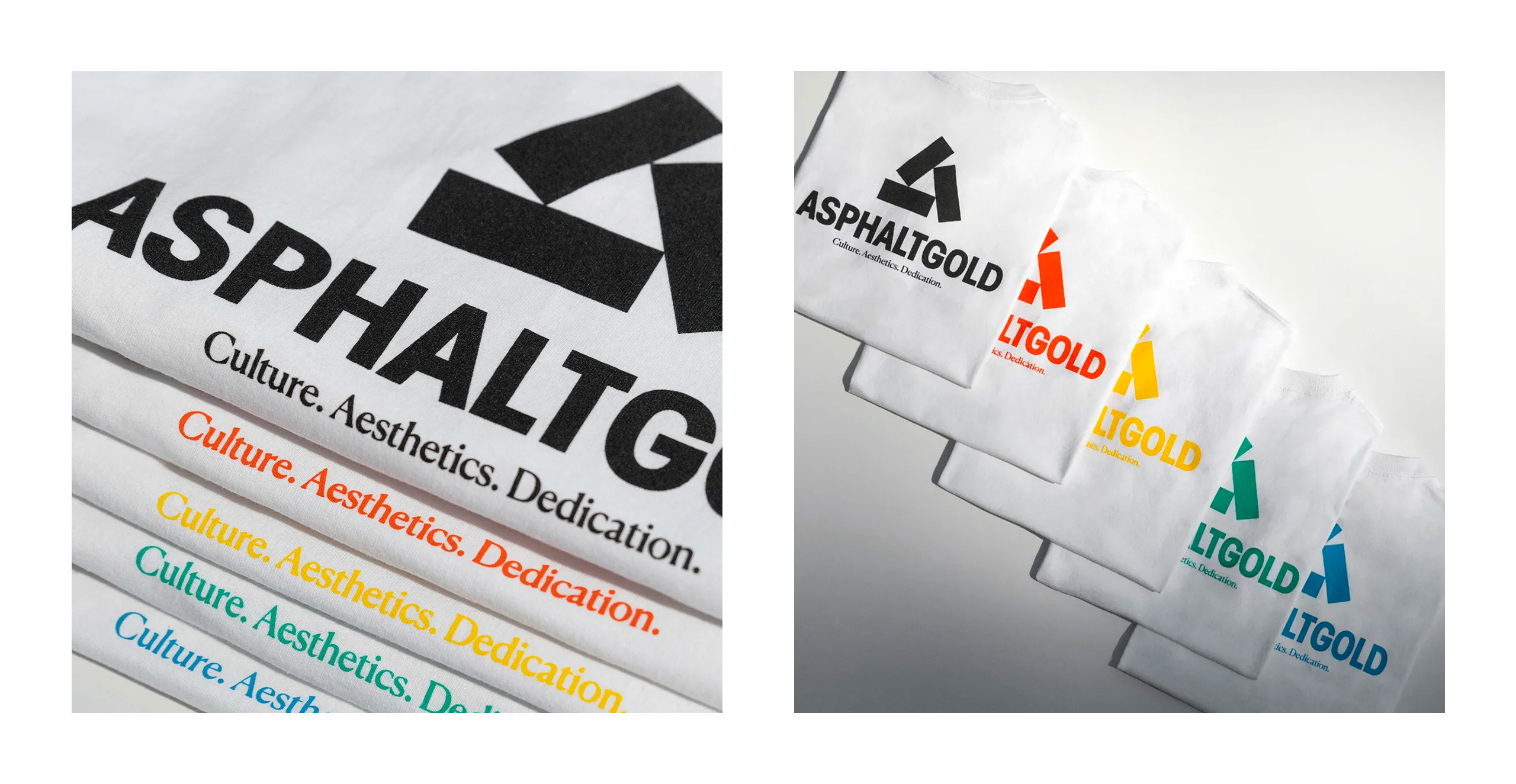
The “stack” Logo Forms the Creative Core of the Design. As the Three Components of the Logo Form an a and at the Same Time Stand for the Subject Areas That Asphaltgold Covers in Terms of Content and That Play a Major Role in Daily Work: Culture, Aesthetics & Dedication. In Addition to the a, the Logo Deliberately Evokes Numerous Associations From the Sneaker Universe: From Stacked Shoe Boxes to the Profile of a Sneaker Sole to a Monumental Pyramid Symbolism That Takes Into Account the Significance of Asphaltgold in the Sneaker Community With a Wink.
The Font Used for the Word Mark Reflects Above All the Aesthetic Approach of Asphaltgold. At the Same Time, the Relatively Long Brand Name Can Be Used in a Space-saving Way by Choosing a Narrow Running Grotesque.
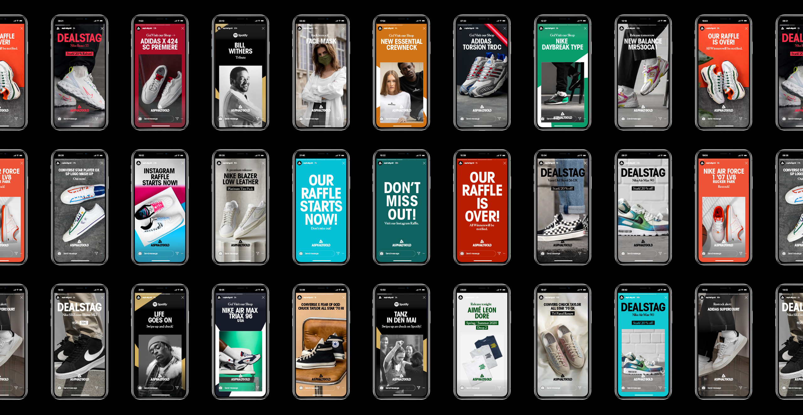
By Rotating and Cutting Out the “stack” Logo, Arndt Benedikt Has Developed a Playful Mechanism That Enables a Design That Is as Simple as It Is Variable. In Terms of Usability, It Was Particularly Important That the Logo and the Visual System Function Comprehensively Across Media, I.e. In All Digital and Analogue Applications and at All Touch Points. Accordingly, the “stack” Can Also Be Printed or Embroidered Smoothly in Apparel Applications.
Considering the Typographic Elements, the Selected Font Mix With Clear Hierarchies and Defined Areas of Application Contributes to the Typical Asphaltgold Look. Clear Guidelines and Comprehensive Design Templates Ensure an Easy to Use Design on a Daily Basis While Strengthening the Recognition Value at the Same Time.
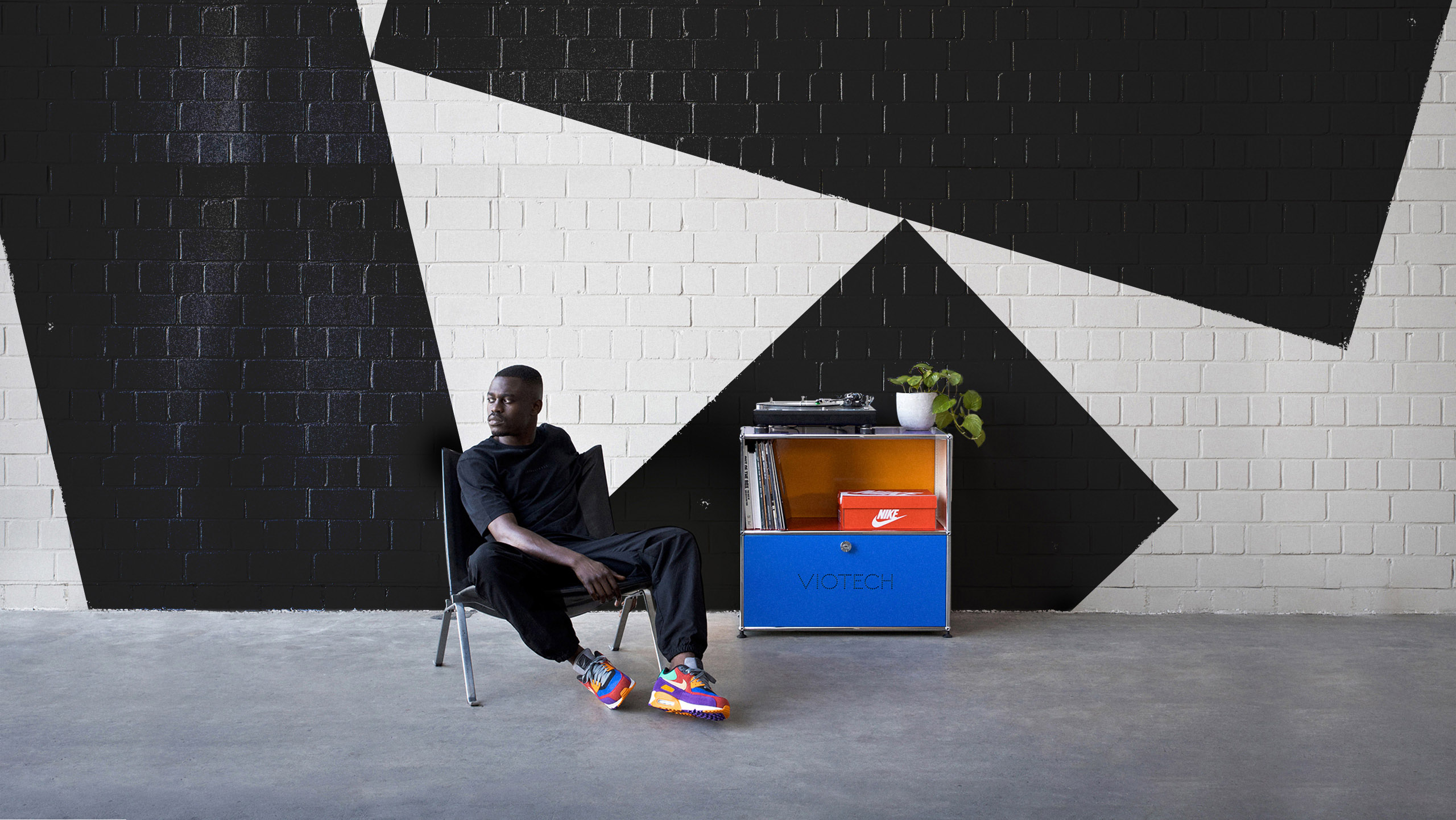
Taken as a Whole the Main Focus Was on Achieving a Clear, Tidy Look That Not Only Addresses the Classic Sneaker Topics Yet Also the Fashion Community, and Which Stands Out From the Competition. This Is Also Ensured by the High-quality, Elegant and at the Same Time Approachable Image World.
![]()


CREDIT
- Agency/Creative: Arndt Benedikt
- Article Title: Asphaltgold Sneaker Shop Redesign By Arndt Benedikt
- Organisation/Entity: Agency, Published Commercial Design
- Project Type: Identity
- Agency/Creative Country: Germany
- Market Region: Europe
- Project Deliverables: Brand Guidelines, Brand Identity, Brand Redesign, Brand Refinement, Brand Strategy, Brand World, Graphic Design, Identity System, Rebranding, Research, Tone of Voice
- Industry: Retail
- Keywords: Asphaltgold, sneaker, shop, retail, fashion, urban, urban culture,


