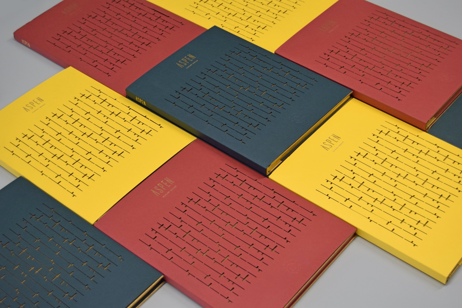
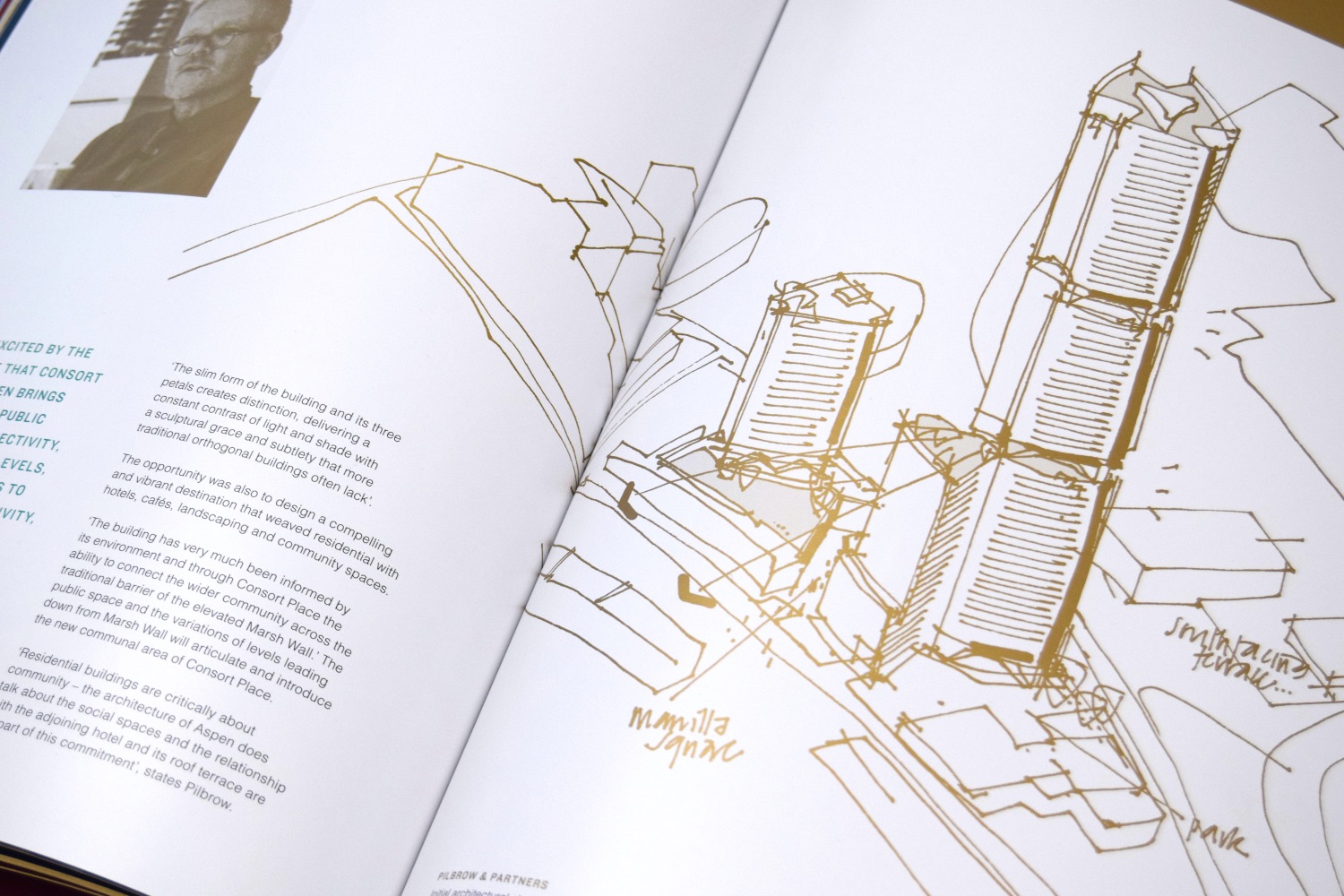
Aspen is a significant new residential tower adjacent to Canary Wharf, London. Designed to be the centrepiece of a new public space, the brief entailed development of a name, brand and supporting literature for the successful launch in both the UK and overseas.
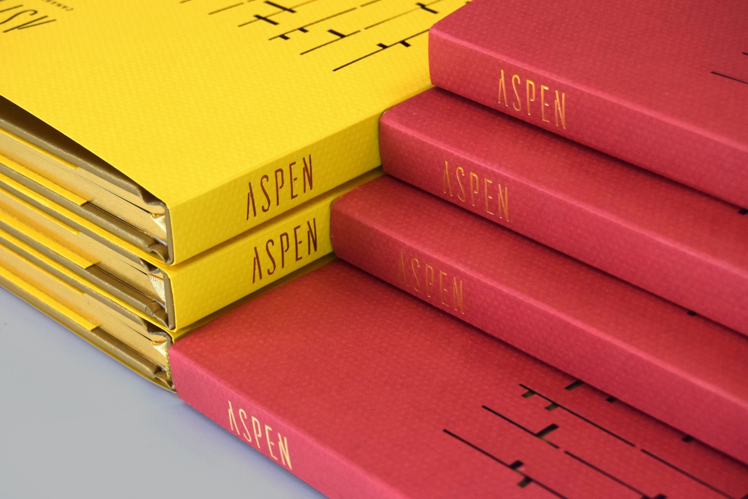
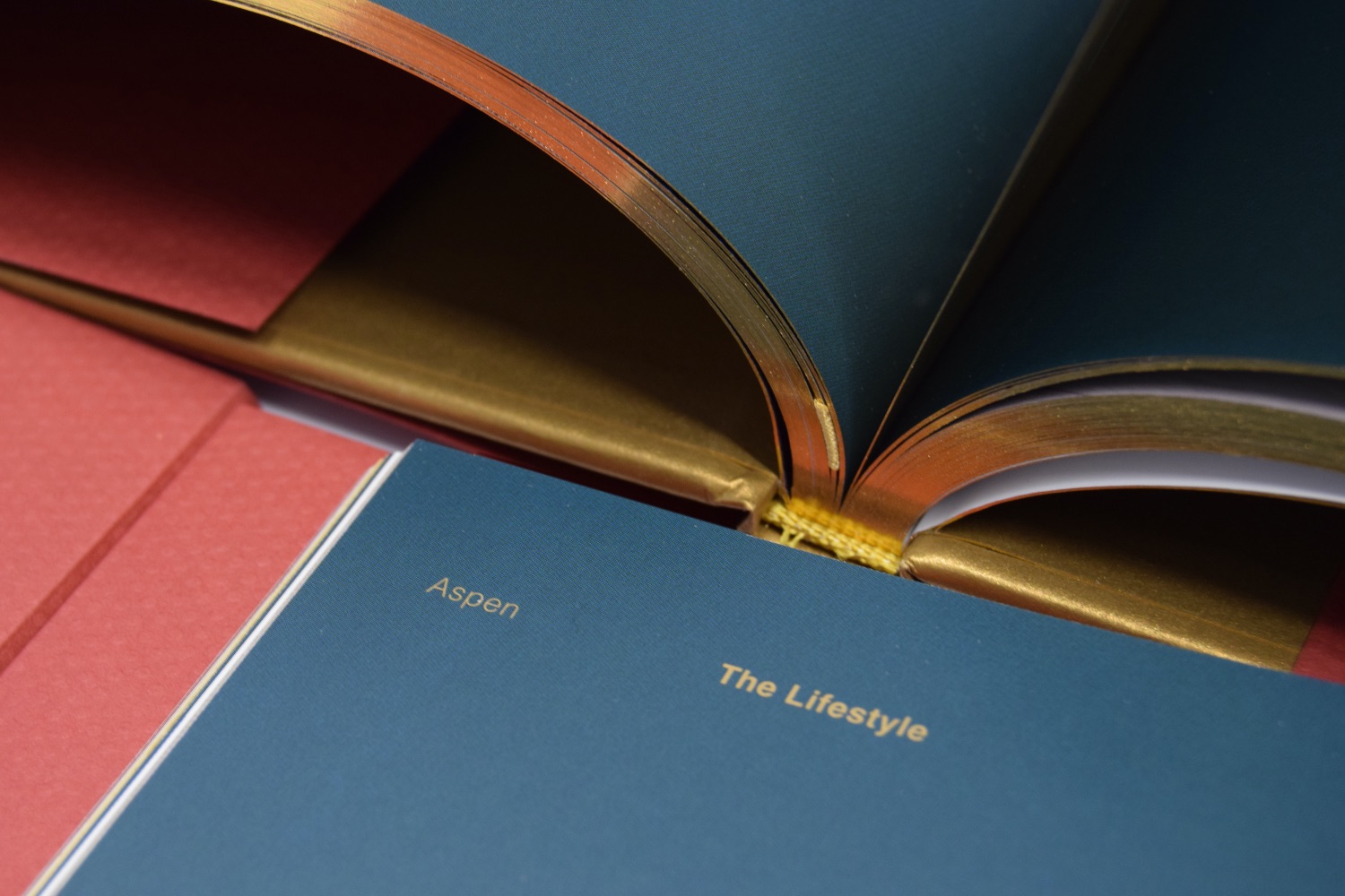
To maintain a sense of authenticity, the name Aspen references the local timber trade heritage, and crucially the shipping of aspen trees into Canary Wharf during the 18th century. Elegant and symbolic of adventure and expression, the visual language seeks to reflect the building’s unique architecture and ambition of the lifestyle promised. Subsequently, an abstracted visual language based on the bark of the aspen tree was created, used as a die-cut pattern on the dust jacket of each principal brochure.
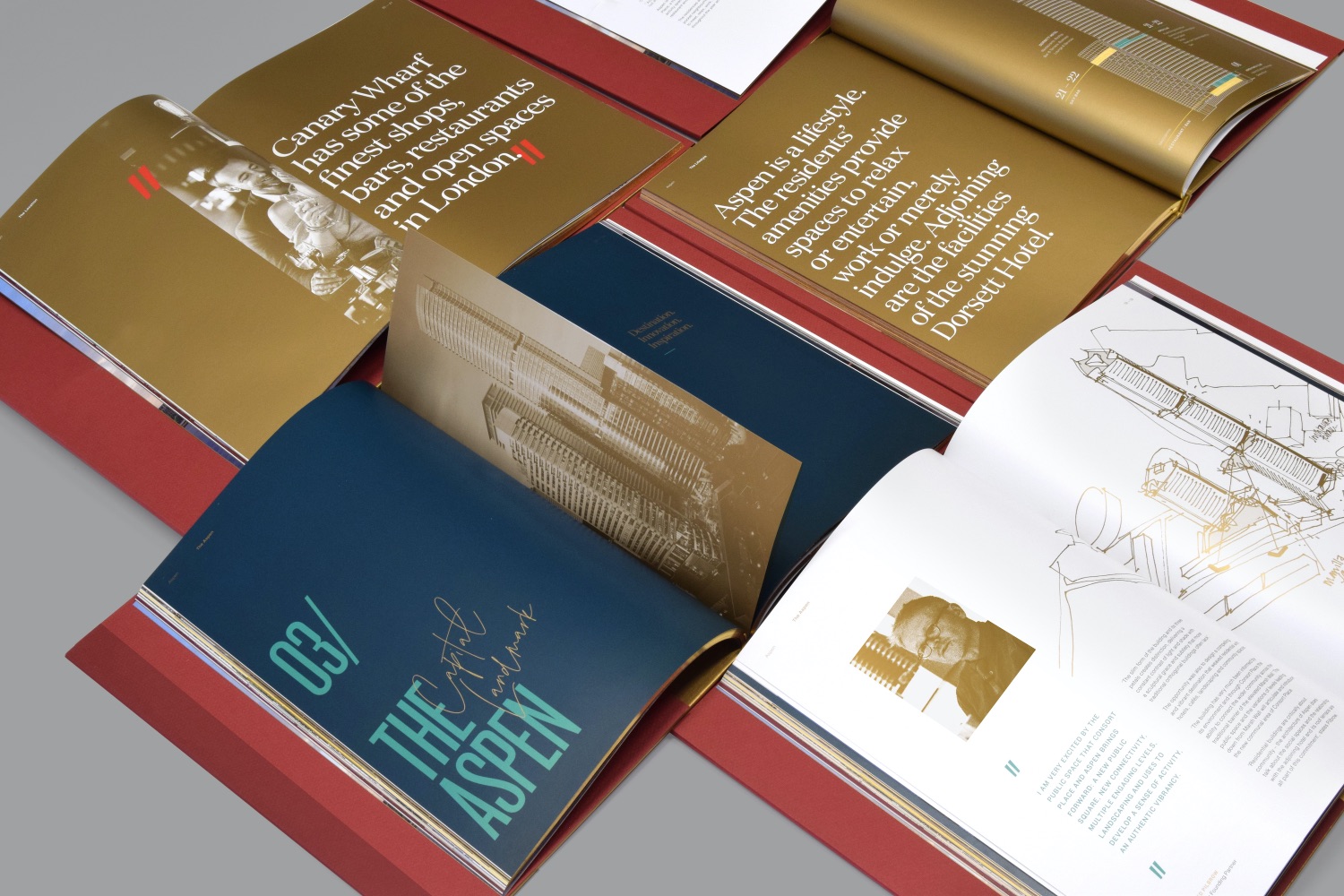
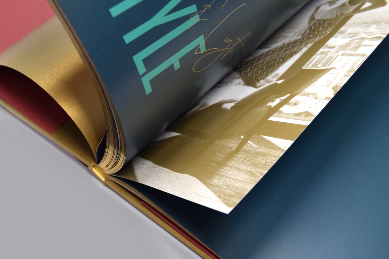
The brochure itself was printed in five colours, including a metallic bronze, edge painted in gold and utilising half pages as dividers throughout. A local photographic shoot also took place, delivering metallic duotones and aiding to establish a sense of place. The objective of the brochure and its design was to provide evidence of the developer’s commitment to design, craft and excellence of finish; appropriate to the price and, as importantly, competitive against other projects being marketed at the same time.
CREDIT
- Agency/Creative: Socrates Communications
- Article Title: Aspen London Graphic Design for Communication
- Organisation/Entity: Agency
- Project Type: Graphic
- Project Status: Published
- Agency/Creative Country: United Kingdom
- Agency/Creative City: London
- Market Region: Global
- Project Deliverables: Graphic Design
- Industry: Construction
- Keywords: WBDS Agency Design Awards 2021/22
-
Credits:
Client: Far East Consortium
Creative Lead: Eduardo Nunes
Creative Director: Andrew Derrick


