Asda invited us to pitch to re-position their Smart Price and Farm Stores range into one distinctive and cohesive proposition.
The objective was to shake up the category and re-invent the visual language for opening price point design.
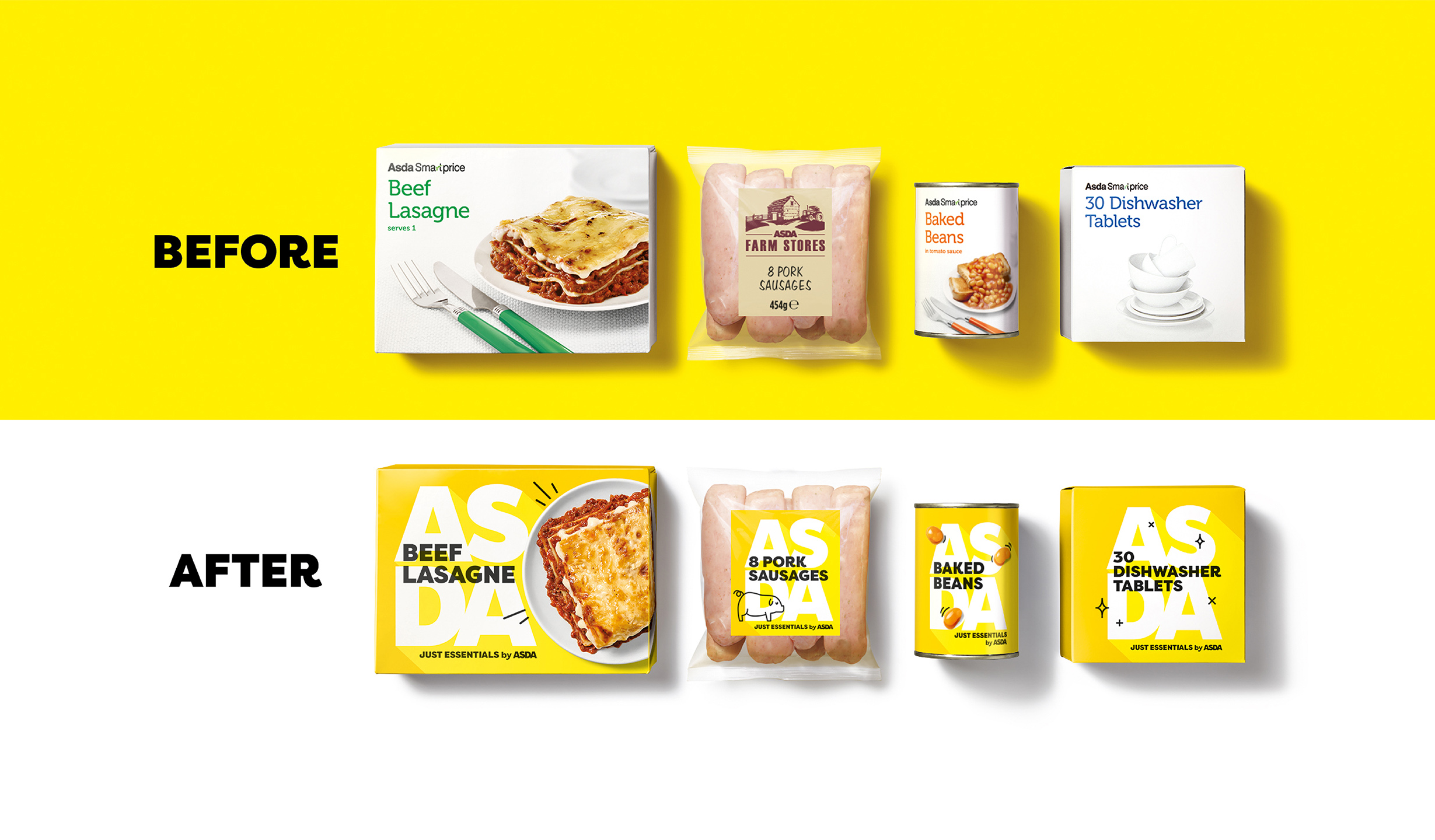
The existing design felt tired, stale and dull. The white, value design held negative brand perceptions, with customers feeling ashamed to buy into the range. The new design needed to feel simple, honest and optimistic, setting a strong foundation for Asda’s quality perception, starting at the bottom shelf.
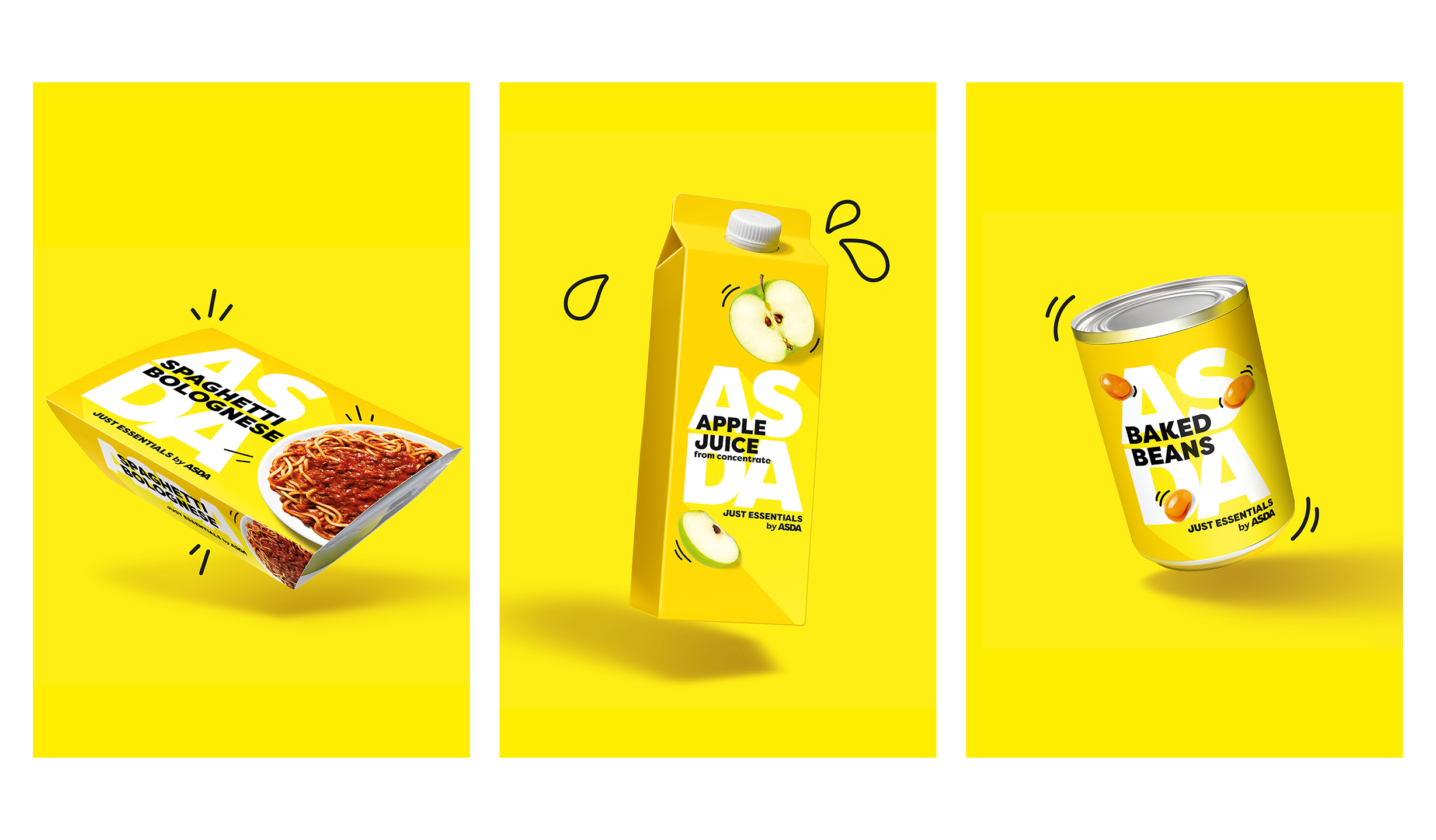
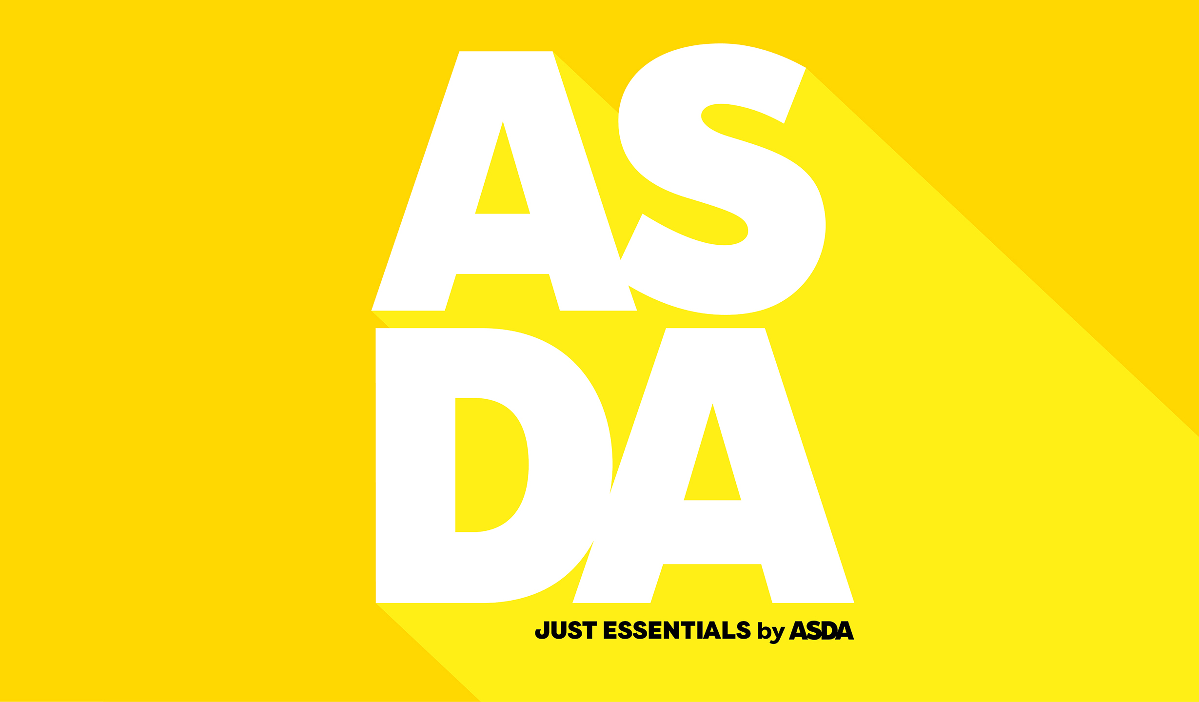
Putting the Asda brand mark front and centre of the design reinforces that this is not a range to be ashamed of. The joyous, sunshine yellow feels optimistic and shines off shelf in contrary to the typical white category code. The combination of clean typography feels utilitarian yet friendly, with the brand sign-off and playful illustration style adding warmth and humour to what could have been a soulless design.
Critical to this brief was creating a proud design architecture that could not be confused with the mid-tier offering, whilst avoiding negative perceptions.
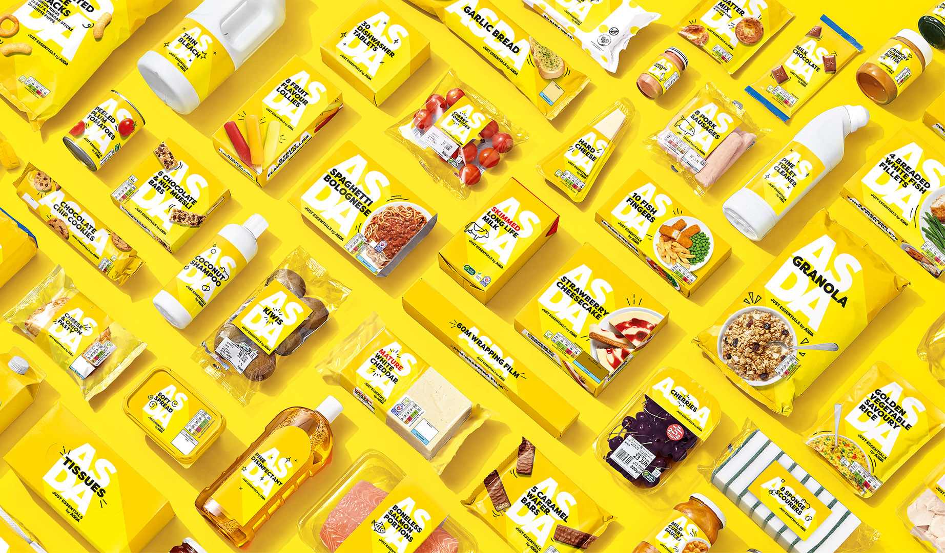
Asda invested heavily in increasing and diversifying the budget friendly range. It now stretches into every household category from beans to bleach, cat litter and even shampoo, keeping price sensitive households running with all their weekly staples.
To combat the increasing cost of living, we worked closely with Asda and their suppliers to handover almost 300 SKUs in under 6 months. Set to be the largest value range in the market, our vibrant and iconic design now stands out proudly in many shopping baskets and homes across the UK, putting an end to consumers hiding value brands in the bottom of their trolleys and helping their pounds stretch further. Now that’s something to be proud of.
The new Just Essentials range took the internet by storm, trending across news sites and social media platforms. Celebrated for its timely launch, combatting the cost-of-living crisis and its bold, fresh and distinctive design.


CREDIT
- Agency/Creative: OurCreative
- Article Title: Asda Just Essentials by OurCreative
- Organisation/Entity: Agency
- Project Type: Identity
- Project Status: Published
- Agency/Creative Country: United Kingdom
- Agency/Creative City: Leeds
- Market Region: Europe
- Project Deliverables: Animation, Art Direction, Brand Architecture, Brand Creation, Brand Design, Brand Guidelines, Brand Identity, Packaging Design, Packaging Guidelines, Product Photography, Rebranding
- Industry: Retail
- Keywords: Brand identity, brand design, packaging design, Asda, Just essentials
-
Credits:
Creative Director: Jon Dignam
Senior Designer: Joe Wallis
Managing Director: Kim Van Elkan
Account Director: Sara Pollard
Account Manager: Alice Firth
Visualiser: Chris Charlton
Production Director: Paul Porter


