


Asahi Technologies is a New York-based software development company with over 10 years of experience and clients from a wide range of industries. The company was founded by a software engineer with a passion for mathematics and computer science, who spent over two decades specializing and perfecting himself in this field.
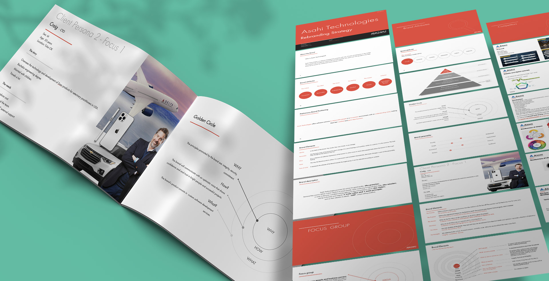
Software development is a very competitive and dynamic field. Within the re-branding strategy we made a detailed analysis of direct competitors but also the internal analysis of the Asahi brand at that time.
Taking into account the values and principles assumed by the company, we managed to create a unique and authentic personality, translated both visually and through key messages.
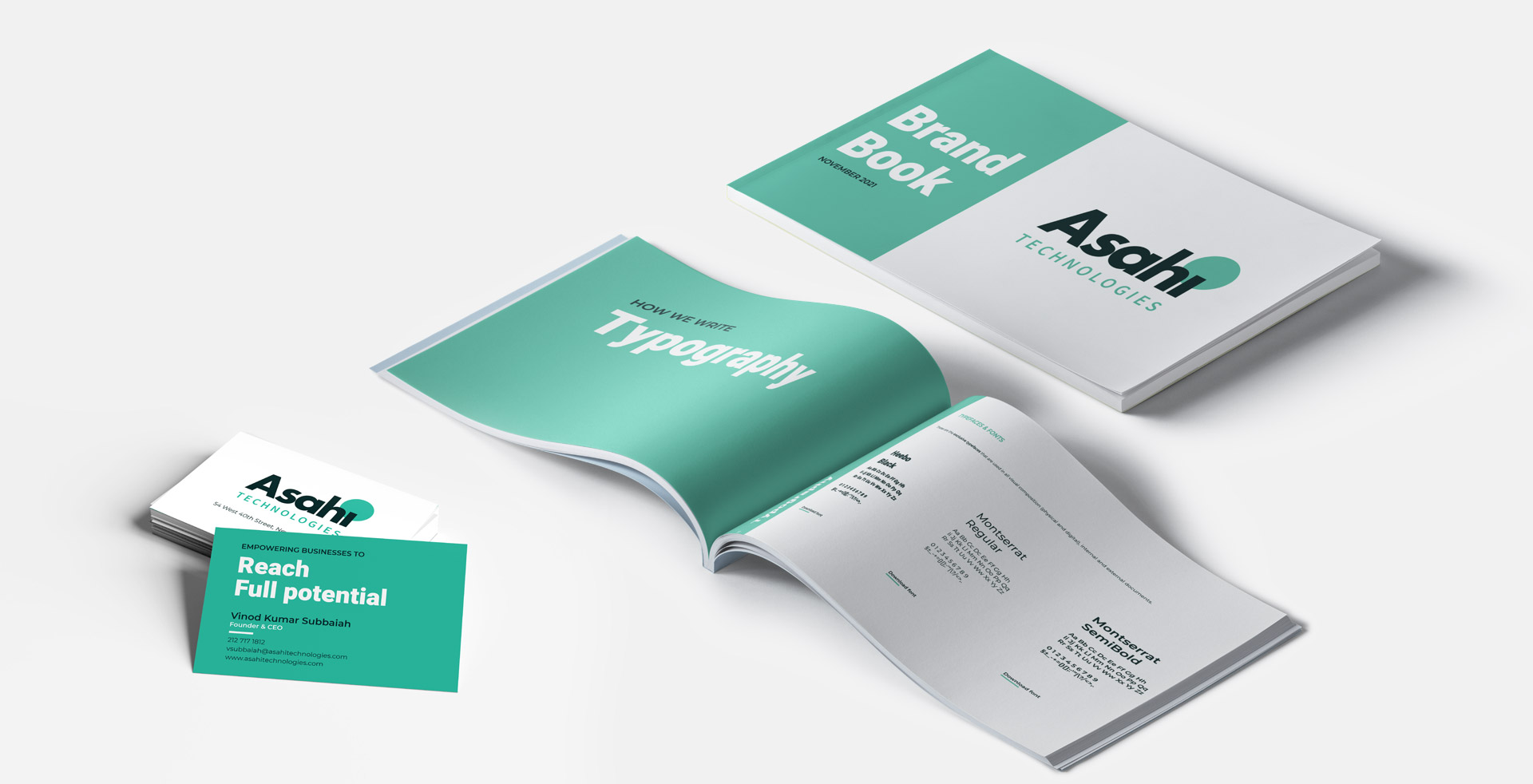
In the rebranding strategy, the whole foundation of the brand was established (purpose, mission, vision, values, pyramid, target group, voice and tone of voice, personality, archetype, positioning, attributes, description, uniqueness, story, etc.).
Following these elements we developed three visual concepts that we refined and edited until they reached the perfect shape that best represents the dimension of the brand.
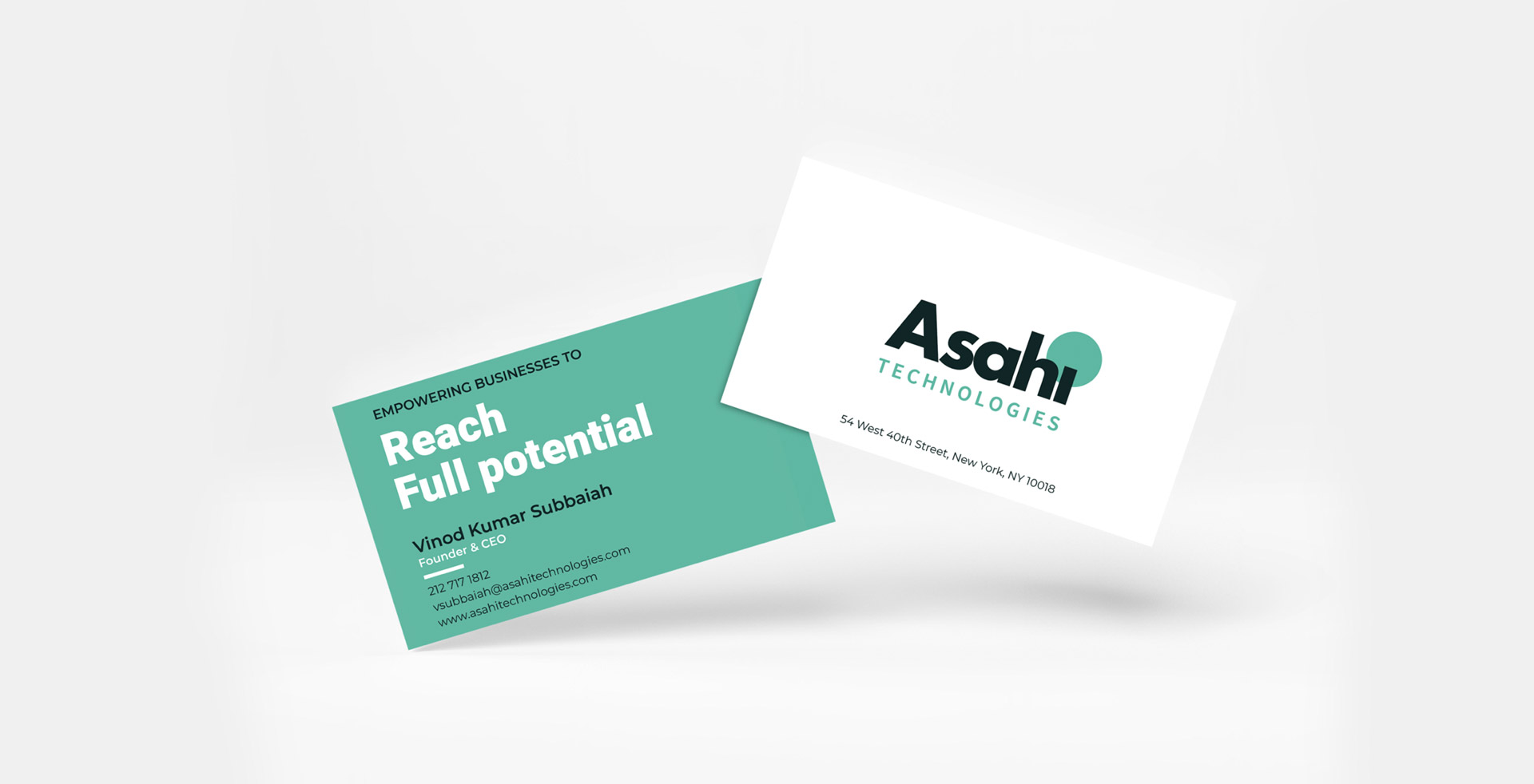
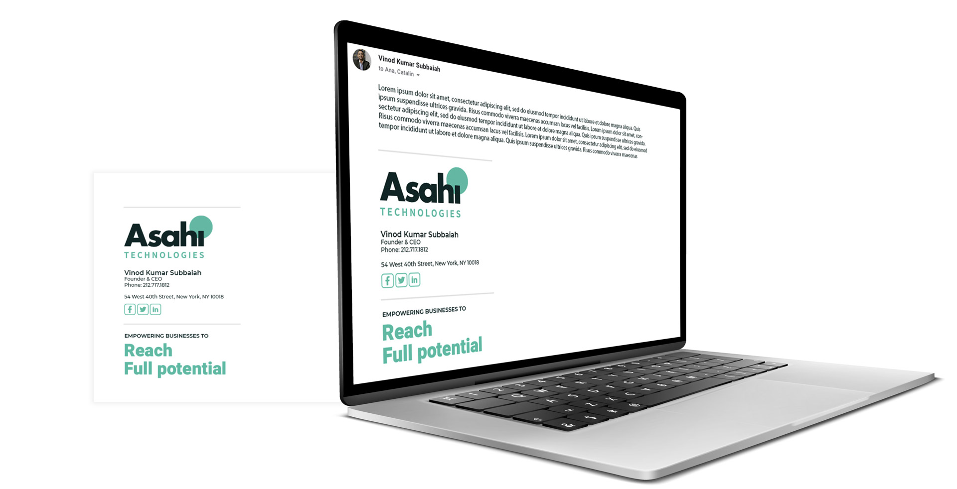
Logo:
The developed logo was the source of inspiration for the site’s theme.
Asahi means “morning sun” in Japanese. Asahi Technologies represents a new beginning, innovation and evolution.
The topaz green color suggests the feeling of cool and fresh calm of the morning.
The circle behind the text symbolizes the sun, but applied to the website conveys the feeling of breathing, growth, evolution.
The bold letters of “Asahi” illustrate strength, while the small letters give it a friendly and approachable feel.
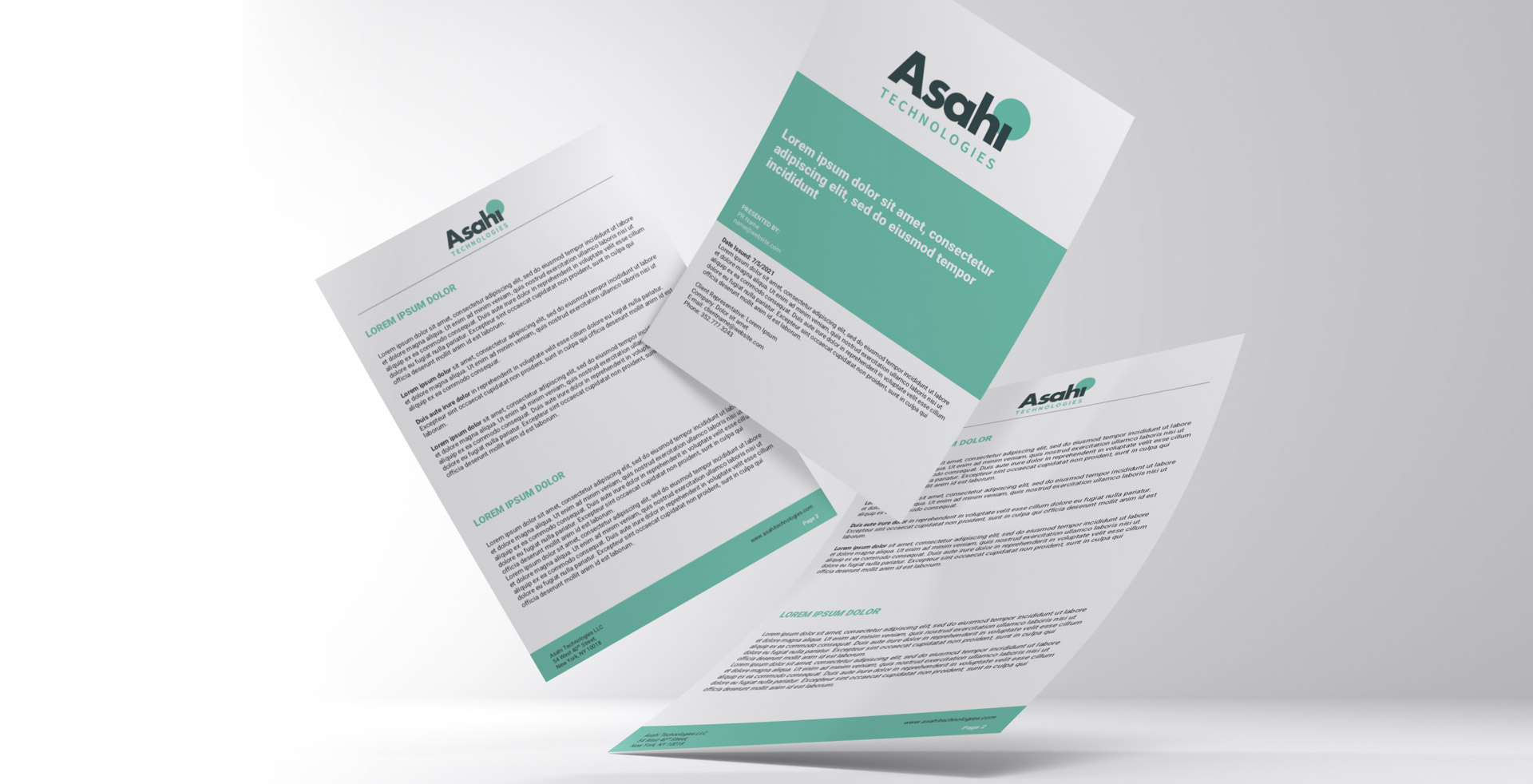
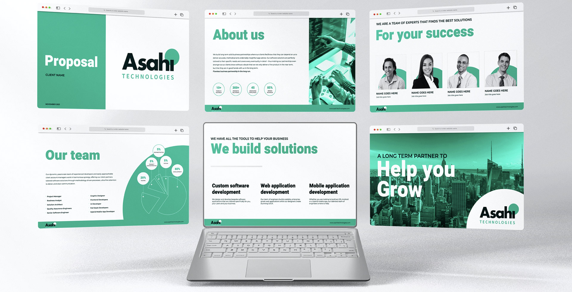
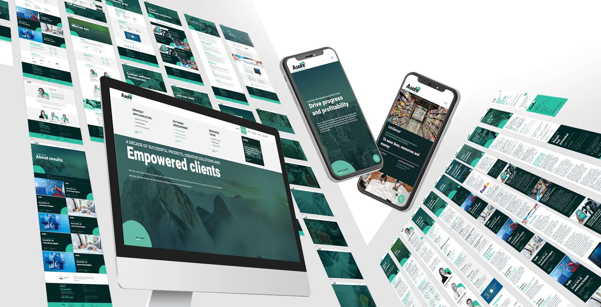
The Website:
The website is the main method of advertising and presentation of the company. Therefore it must reflect with accuracy the brand, the services and the team behind it.
It also had to contain vital information about the services as well as the client portfolio.
The volume of content on the site is very large, but the structure and design easily guides the visitor, highlighting the main messages of the brand.


CREDIT
- Agency/Creative: Armeanu Creative Studio
- Article Title: Asahi Technologies ReBranding
- Organisation/Entity: Agency
- Project Type: Identity
- Project Status: Published
- Agency/Creative Country: Romania
- Agency/Creative City: Bucuresti
- Market Region: North America
- Project Deliverables: Brand Architecture, Brand Creation, Brand Design, Brand Guidelines, Brand Identity, Brand Redesign, Brand Strategy
- Industry: Technology
- Keywords: Rebranding, American company rebranding, web design, branding strategy, brand design, brand identity
-
Credits:
Brand designer: Catalin Armeanu


