


About
At the end of the 2022 Perekrestok chain addressed Ohmybrand with a task related to the private label Green Line.
For two years our agency has been creating this brand’s identity.
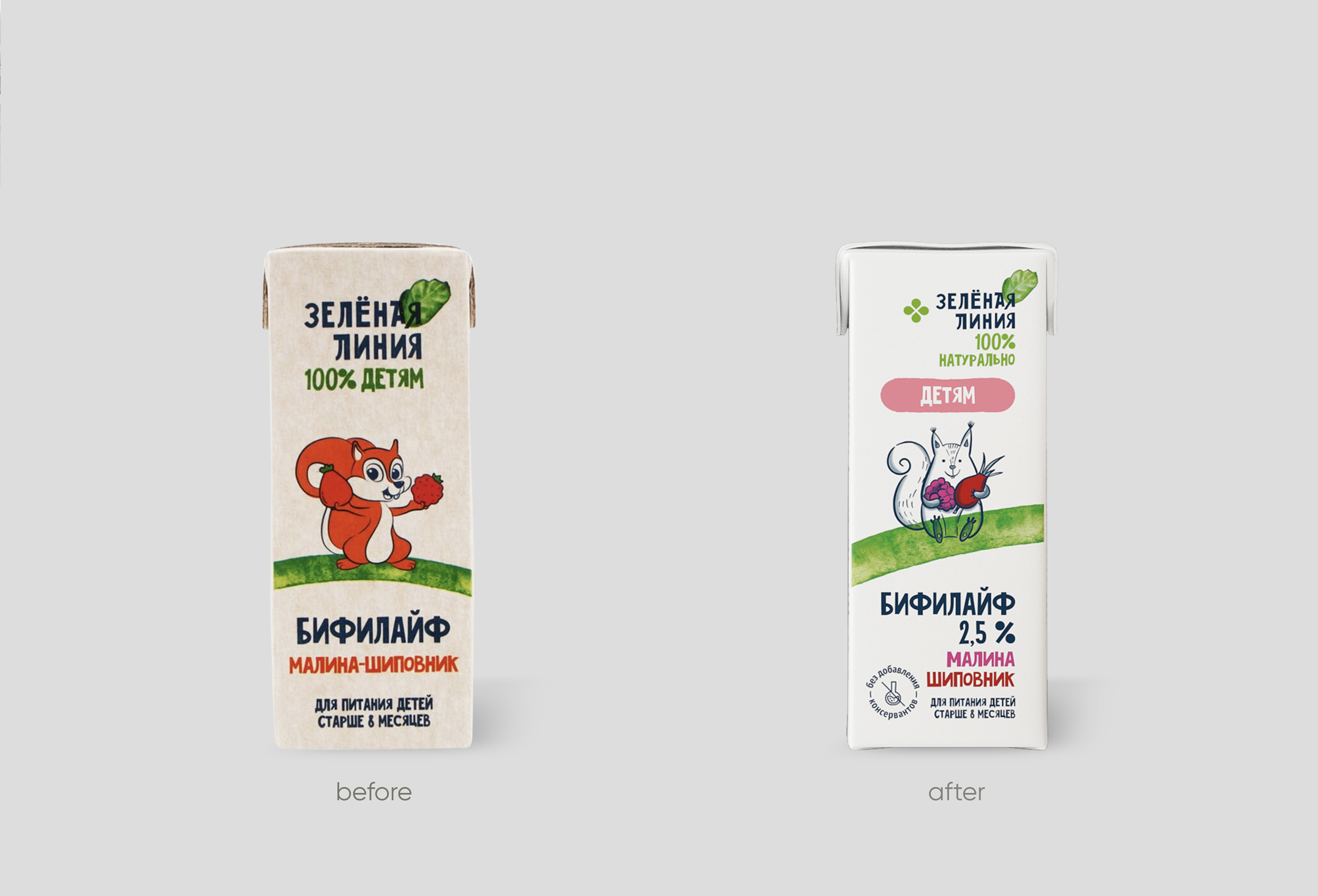
The marketing team of Perekrestok, buyers, category managers and manufacturers little by little had been changing and adding to the originally minimalistic concept, of course, having only the best of intentions. Eventually, it began to smear and lost its original style. Moreover, Green Line kept expanding its product range and developing new categories. Ultimately, having a brand refreshment became a priority, and once again we got an opportunity to work with Perekrestok.
The main challenge was not to lose the consistency of the project in the process of multi-layered coordination.
What did Ohmybrand agency do:
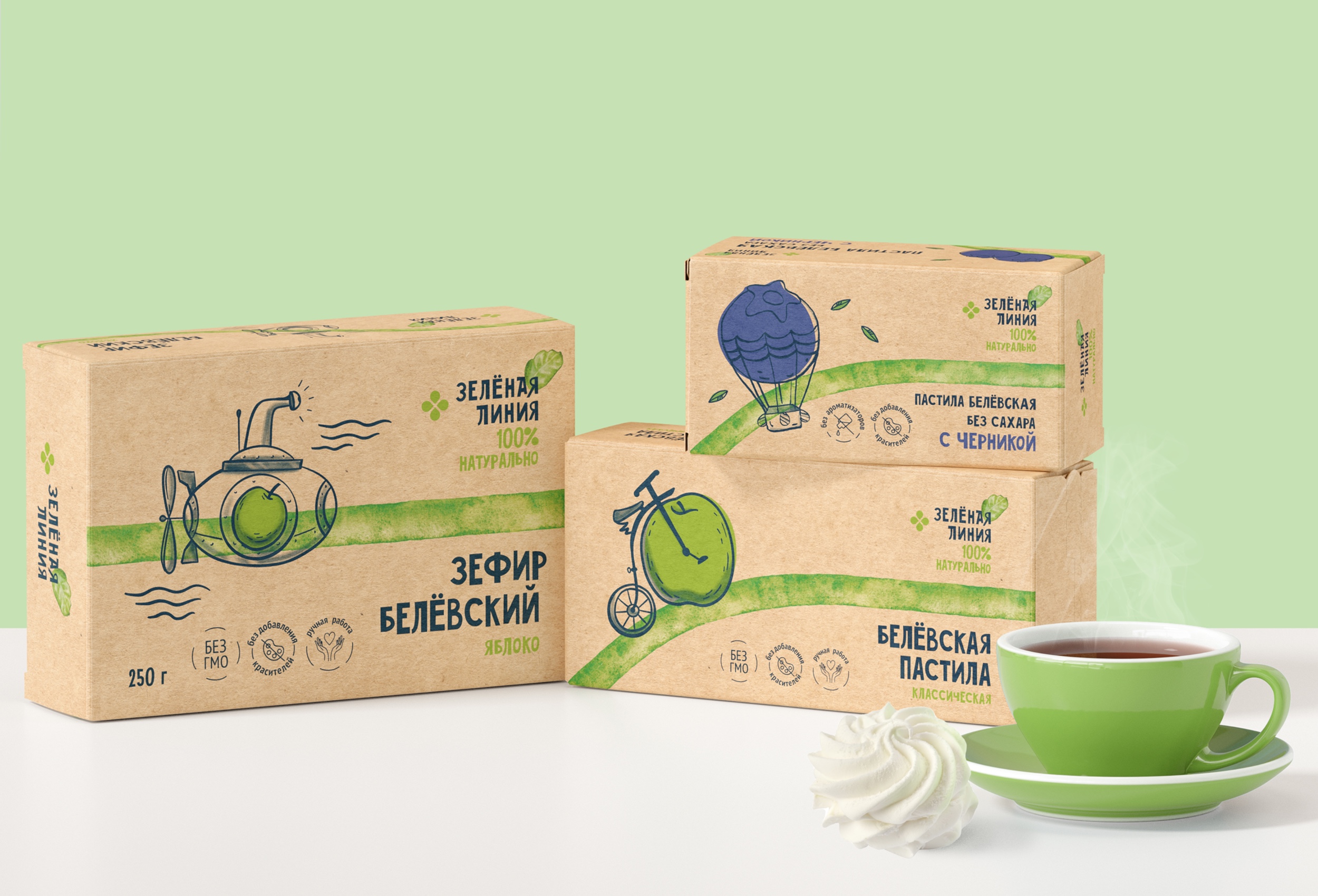
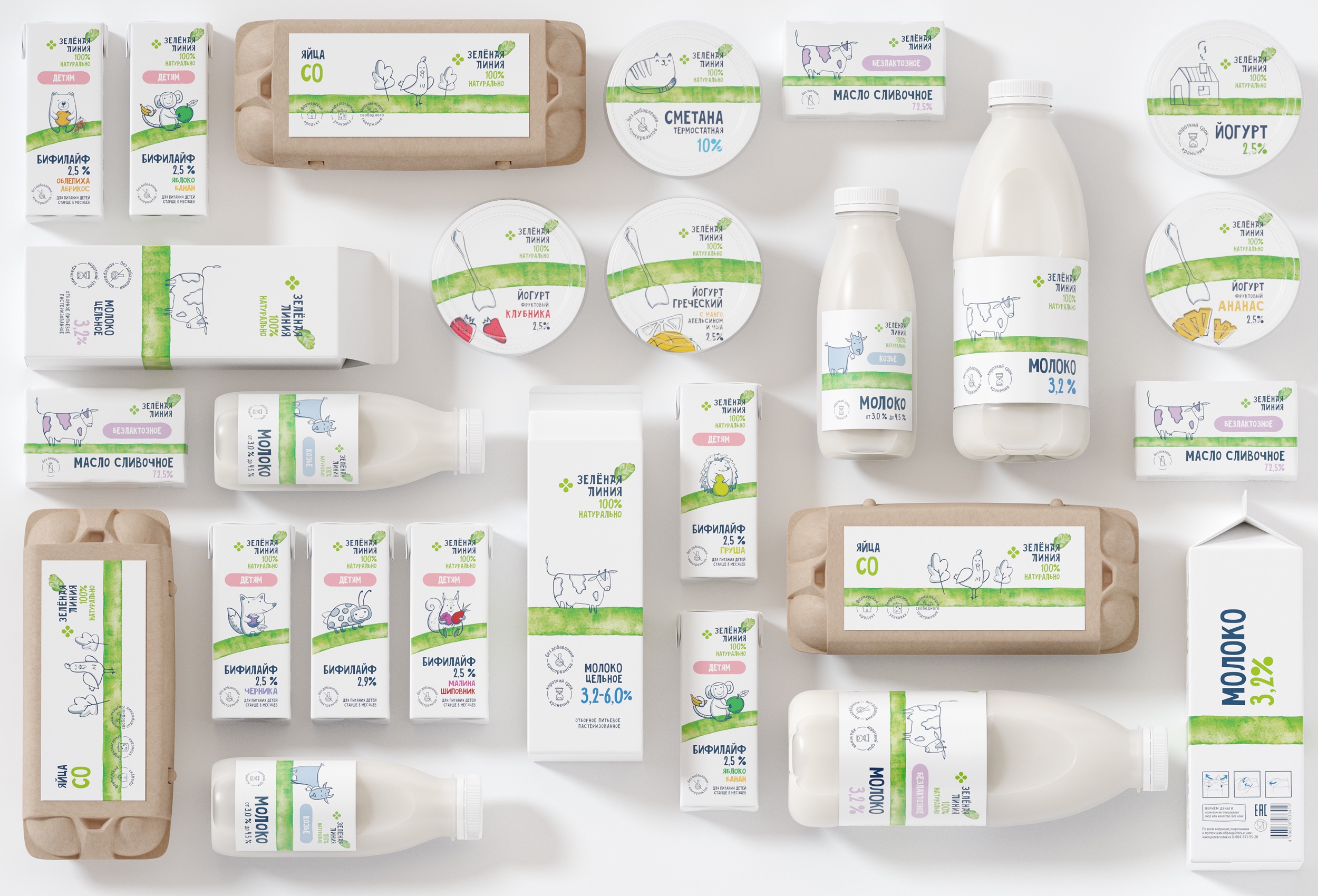
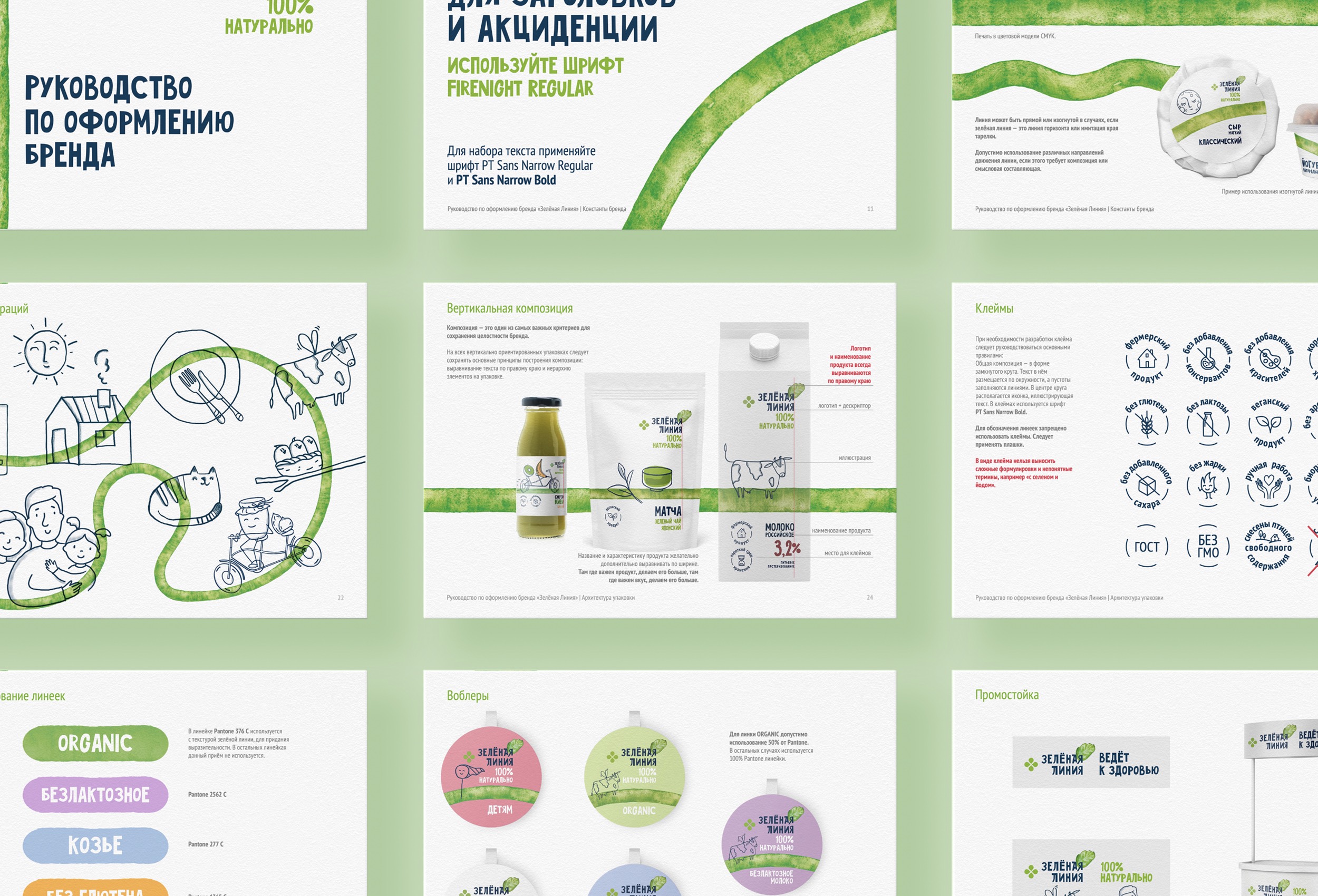
We analysed all categories of products, reworked the material selection and design principles for each category and finally created a brand book with the new, stricter rules.
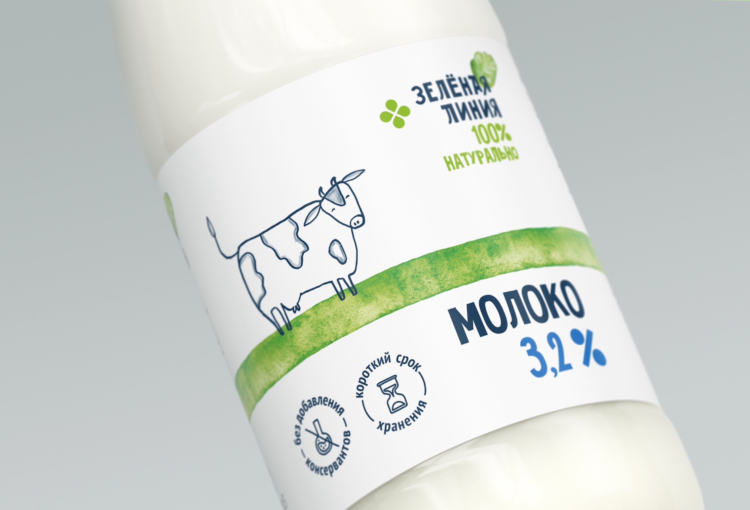
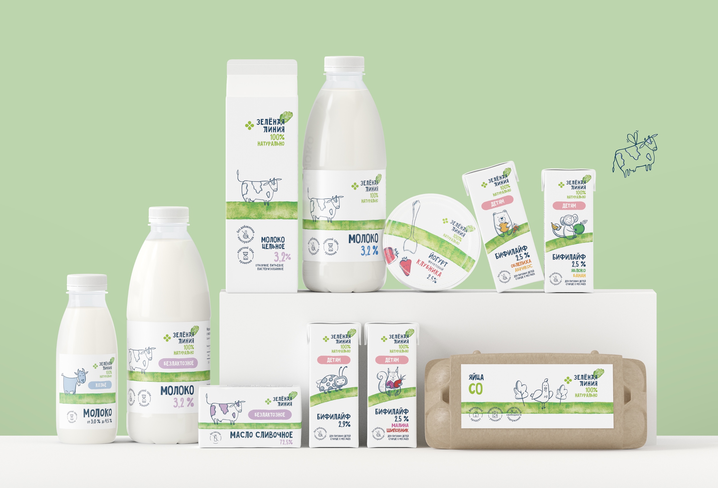
Green Line became one of the leading private labels of Perekrestok, which takes full responsibility for the quality of products under this brand’s name. From this moment onwards affiliation of Green Line will be highlighted by the Perekrestok logo in the same block as the Green Line logo.
Fonts and the Green Line as the main design element were left unchanged, but we made stricter and more solid rules regarding their use.
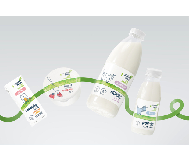
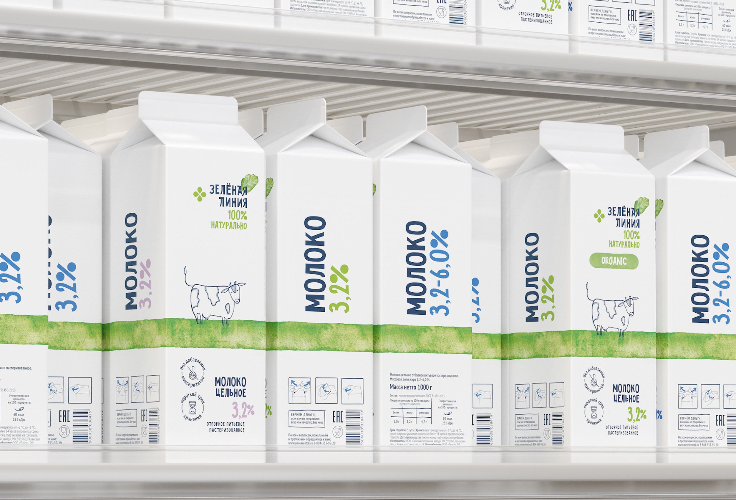
We changed the color coding between different lines of products and the products themselves due to the expanded variety inside one group, for example, lactose-free milk and gluten-free produce.
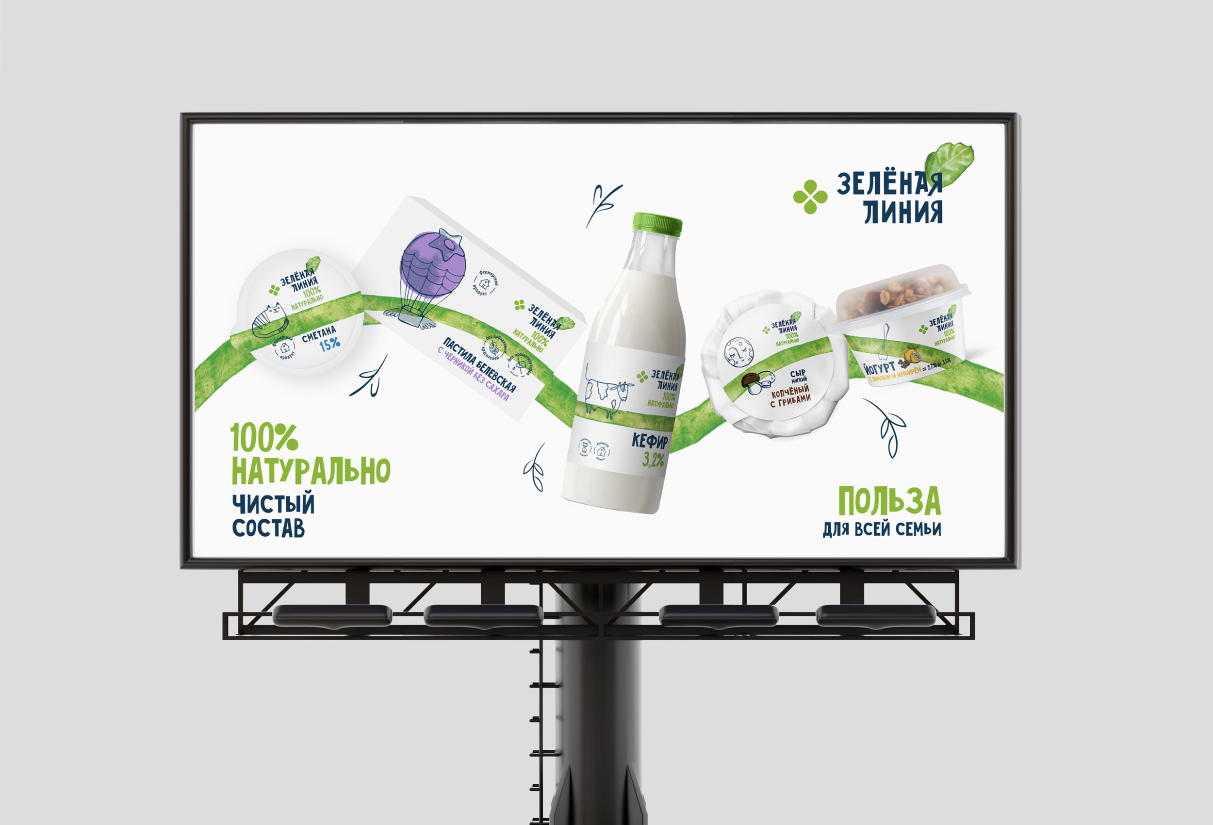
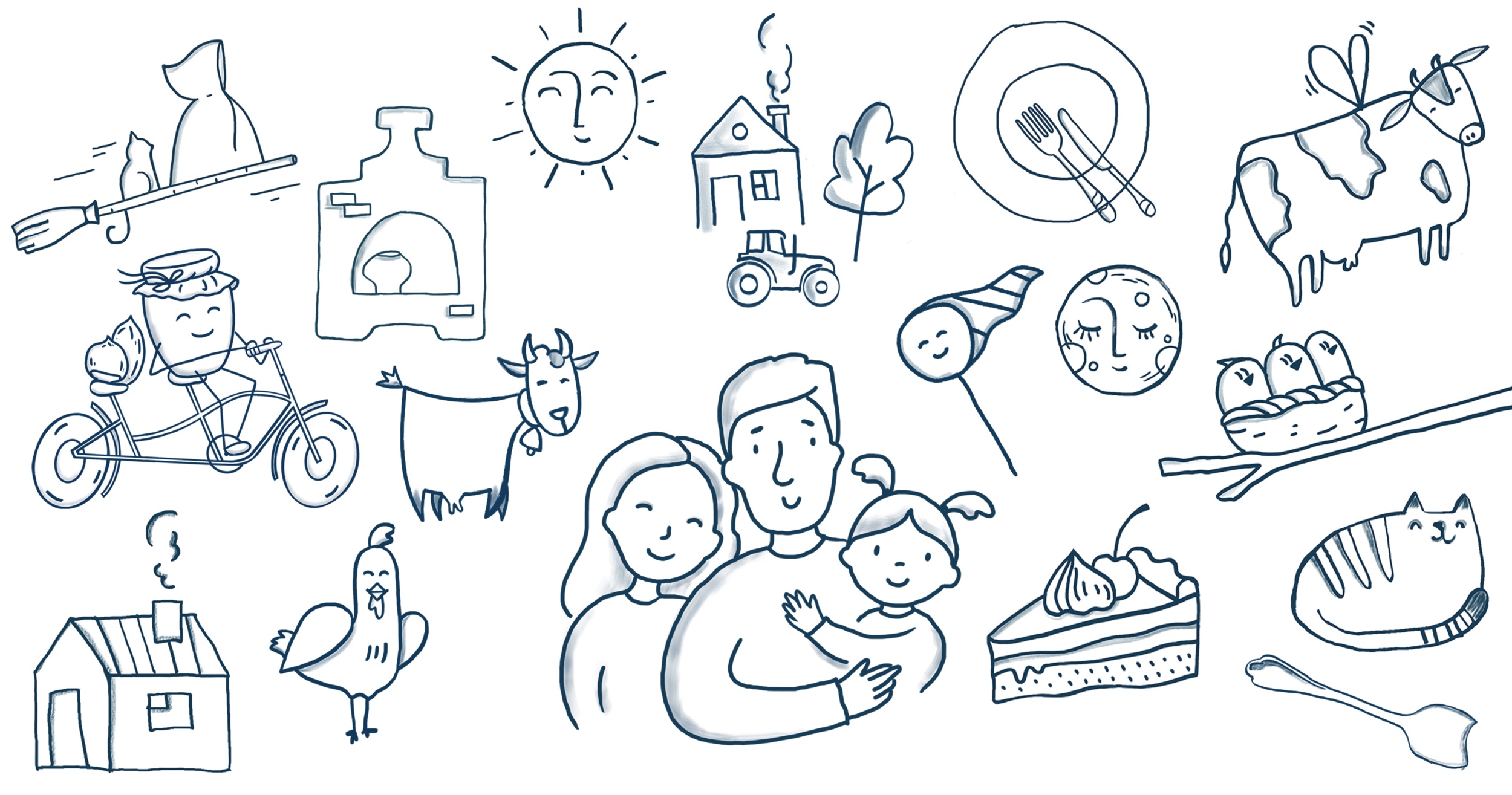
We better defined the principles of creating illustrations.
In the new guidelines we accounted for the mandatory marks and additional stamps and defined the rules of their usage, separately specified how to use the Chestny Znak stamps.
We added concept designs for new types and materials od packaging — glass bottles, doypacks, craft packagings.
We not only refreshed the design of the packaging but also the design of shelves, fridges, signs, price tags and other design elements of shops and advertising media.
Result:
The updated design is gradually applied to all of the Green Line products and is being integrated in the shops of the Perekrestok chain. The brand book will allow for more consistency of the brand looks while working with a lot of suppliers.
CREDIT
- Agency/Creative: Ohmybrand
- Article Title: As Green as Grass! Refresh of the “Green Line” by Perekrestok and Ohmybrand
- Organisation/Entity: Agency
- Project Type: Packaging
- Project Status: Published
- Agency/Creative Country: Russia
- Agency/Creative City: Moscow
- Market Region: Europe
- Project Deliverables: Brand Design, Brand Guidelines, Brand Identity, Brand Redesign, Branding, Design, Illustration, Packaging Design, Packaging Guidelines, Rebranding, Retail Design
- Format: Bottle, Jar, Tin
- Substrate: Plastic, Pulp Carton, Pulp Paper
- Industry: Retail
- Keywords: Refresh, Green Line, Retail
-
Credits:
Creative Director: Nadezhda Parshina
Art-director: Ekaterina Kaigorodova
Designer: Yulia Zhdanova
Designer: Bella Kharkova
Illustrator: Alena Hozina
Project manager: Ekaterina Kruchkova


